Обзор лучших ресурсов по разработке бренда, разработке упаковки
contact us | ok@ohmycode.ru
contact us | ok@ohmycode.ru
Established in 1863, the National Museum of Iceland in the capital city of Reykjavík and owned by the Icelandic state is devoted to Iceland’s history and culture. Originally housed in attics across the city, the museum has had its own building since 1950 and was renovated in the late 1990s. A permanent collection and exhibit, “Making of a Nation”, showcases more than 2,000 objects from the Icelandic Age of Settlement (c. 870 - 930) to today and over 1,000 photographs from the twentieth century. Recently, the museum introduced a new identity designed by Reykjavík-based Jonsson & Lemacks and Siggi Odds.
The aim of the identity was to bring this renowned institution into the modern age by transforming it into a clear, cohesive, vibrant and inspiring brand, with its feet planted firmly in the past but always looking forward, inviting a larger target group to learn and take part in Iceland’s heritage.
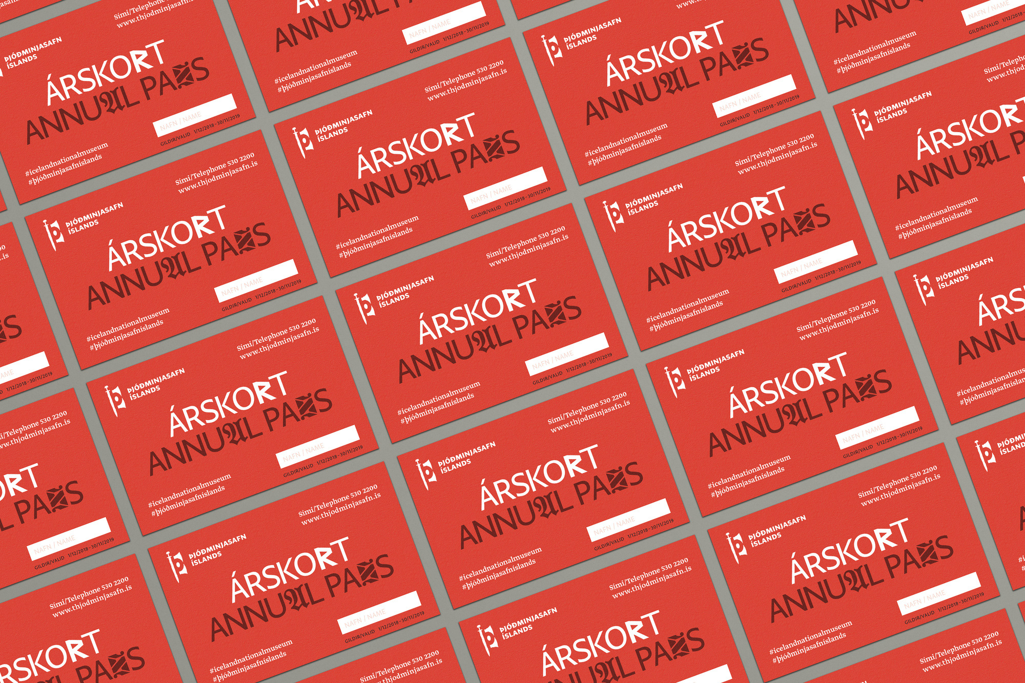
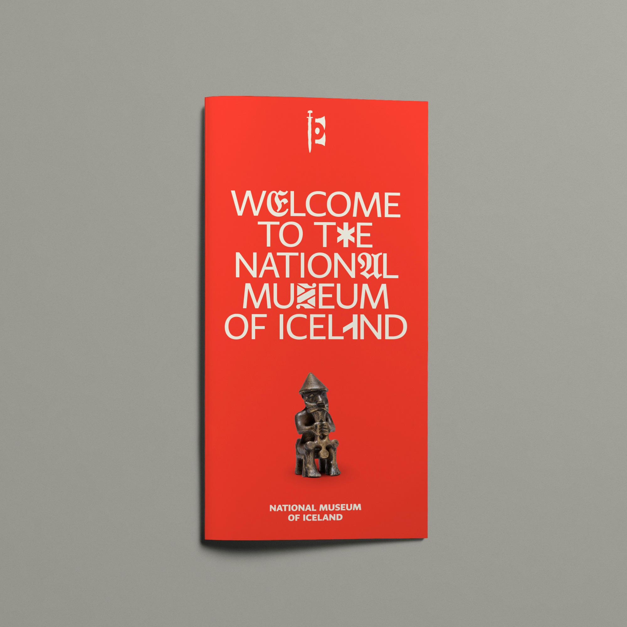
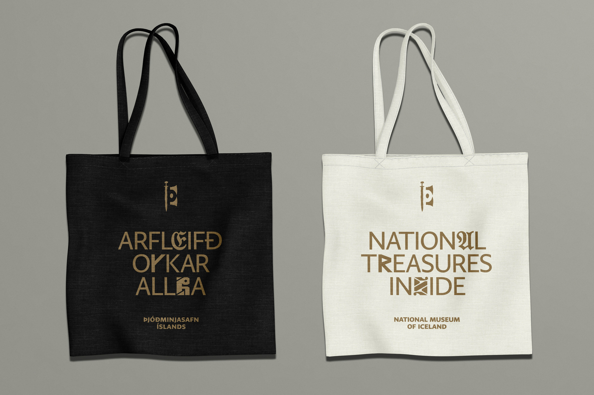
While the logo basically stayed the same, it’s worth noting what a big difference it made to switch to a single color, making the sword-sail-thing more bad-ass. I am told, also, that the icon contains a negative “Þ”, which is the initial for the Icelandic name, Þjóðminjasafn Íslands. The new wordmark is not the most exciting but it complements the icon a lot better and doesn’t look like a default font choice as in the old logo. The key orange-red color is quite nice too.
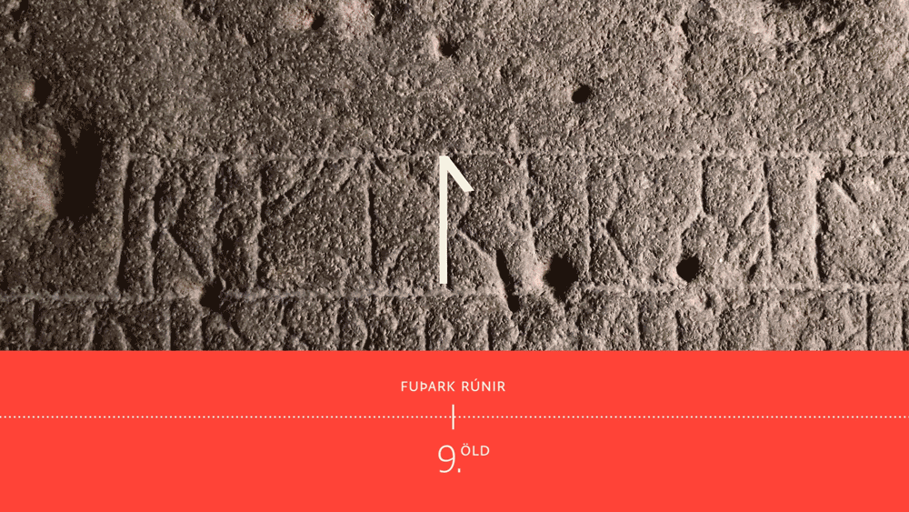
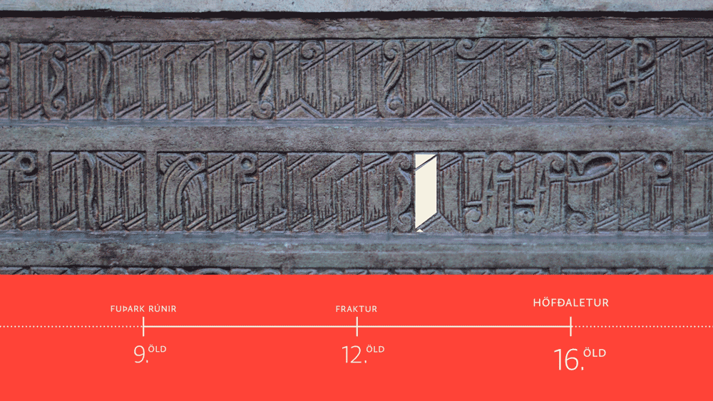
The visual identity is typographically driven, utilising a custom headline typeface which includes 4 historical typefaces. The typefaces are inspiring glimpses from Iceland’s cultural heritage: Fuþark runes, used from the 9th century; Fraktur or calligraphic lettering, used in our famous manuscripts and sagas from the 12th century; Höfðaletur (Head letters), a carved ornamental lettering from the 16th century, and sans serif typography, used in printing and digital techniques from the 19th century to the modern day.
The typographical system works almost as an educational puzzle, as the letters are interchanged for the baseline sans serif typeface, so by reading the headlines you are learning to read these historical types of writing and hopefully making you curious to learn more about Icelandic culture and heritage.
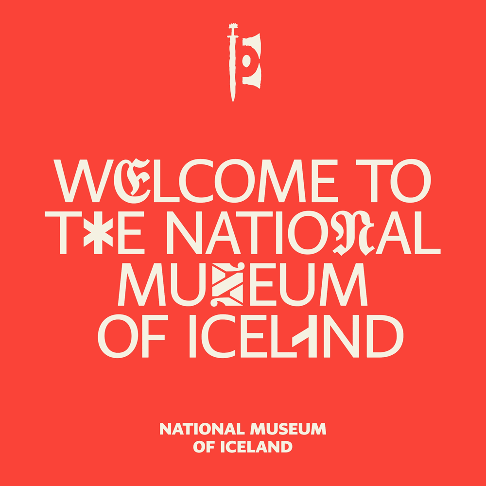
The hook of the new identity is a custom font that mixes a barebones sans serif with four historically significant alphabets. This is a clever way to infuse the identity with Iceland’s history, striking a strong balance of old and new. The spare use of the historical characters in each word or sentence nicely highlights them while also keeping them readable — certainly, some are harder than others but I think the audience can fill in the blanks when needed. Execution-wise, I like how deadpan it is and not trying to be overly cool or design-y, making it look very matter-of-fact as if this were a normal font.
A vibrant colour palette based on manuscript pigments, as well as a contemporary photographic style elevate the key objects from the exhibition to pop culture icon status, making them a relevant alternative to other entertainment in the modern time, not just competing with other museums, but even movie posters or clothing ads.
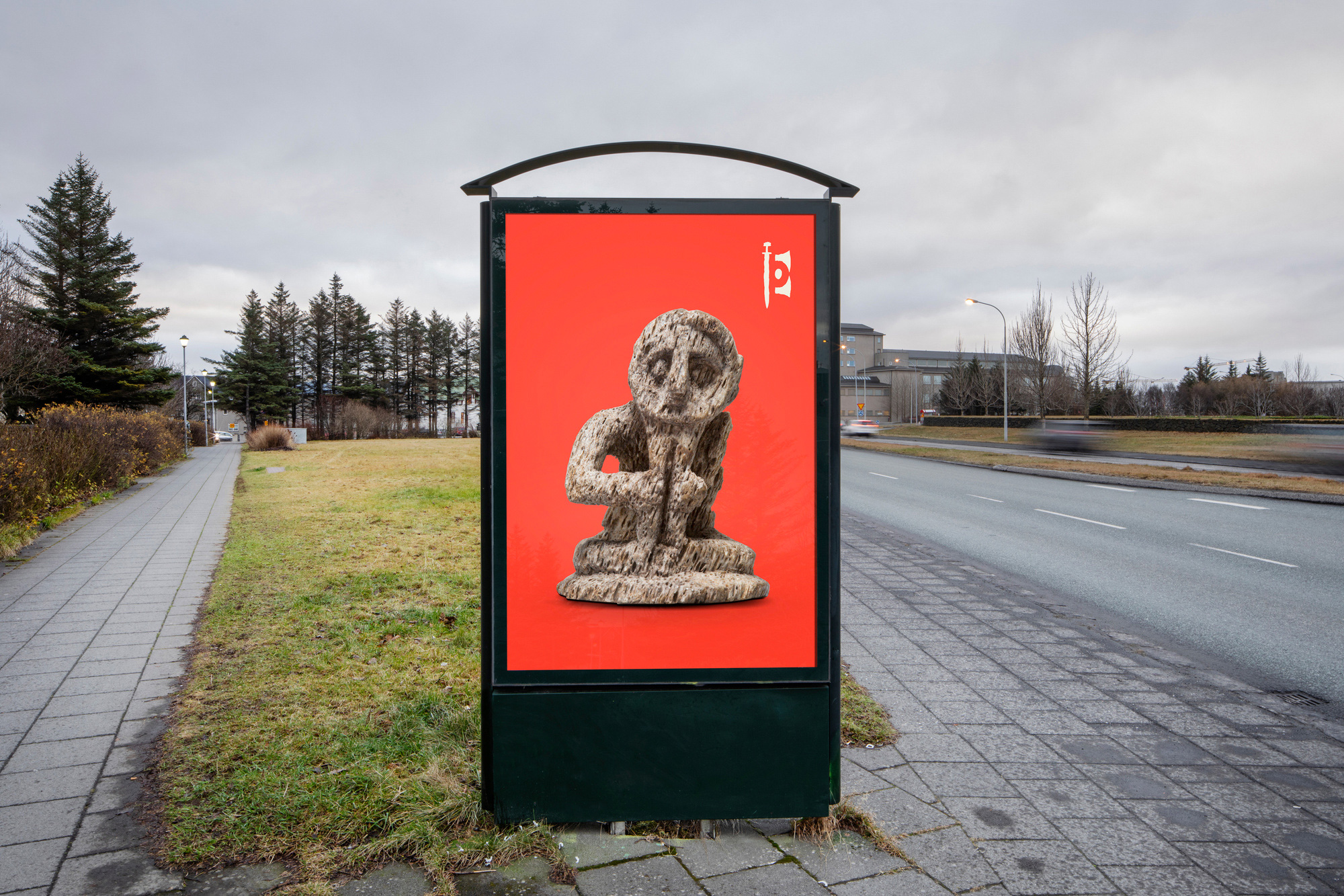
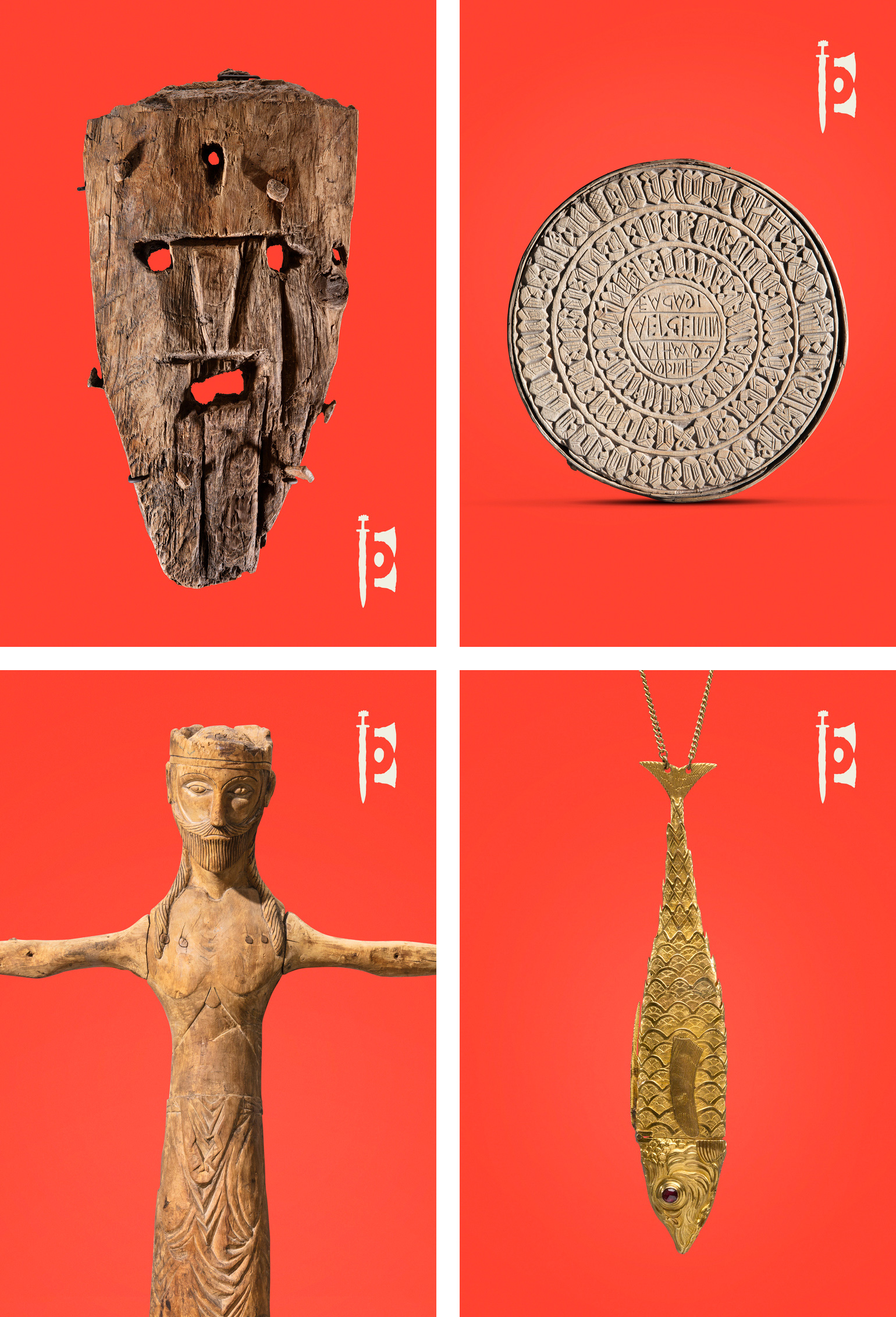
The silhouetted objects on the key color look great… with many of the objects having a brown/gold hue, they complement the red really well. And the sword icon as a stamp of endorsement looks pretty confident.
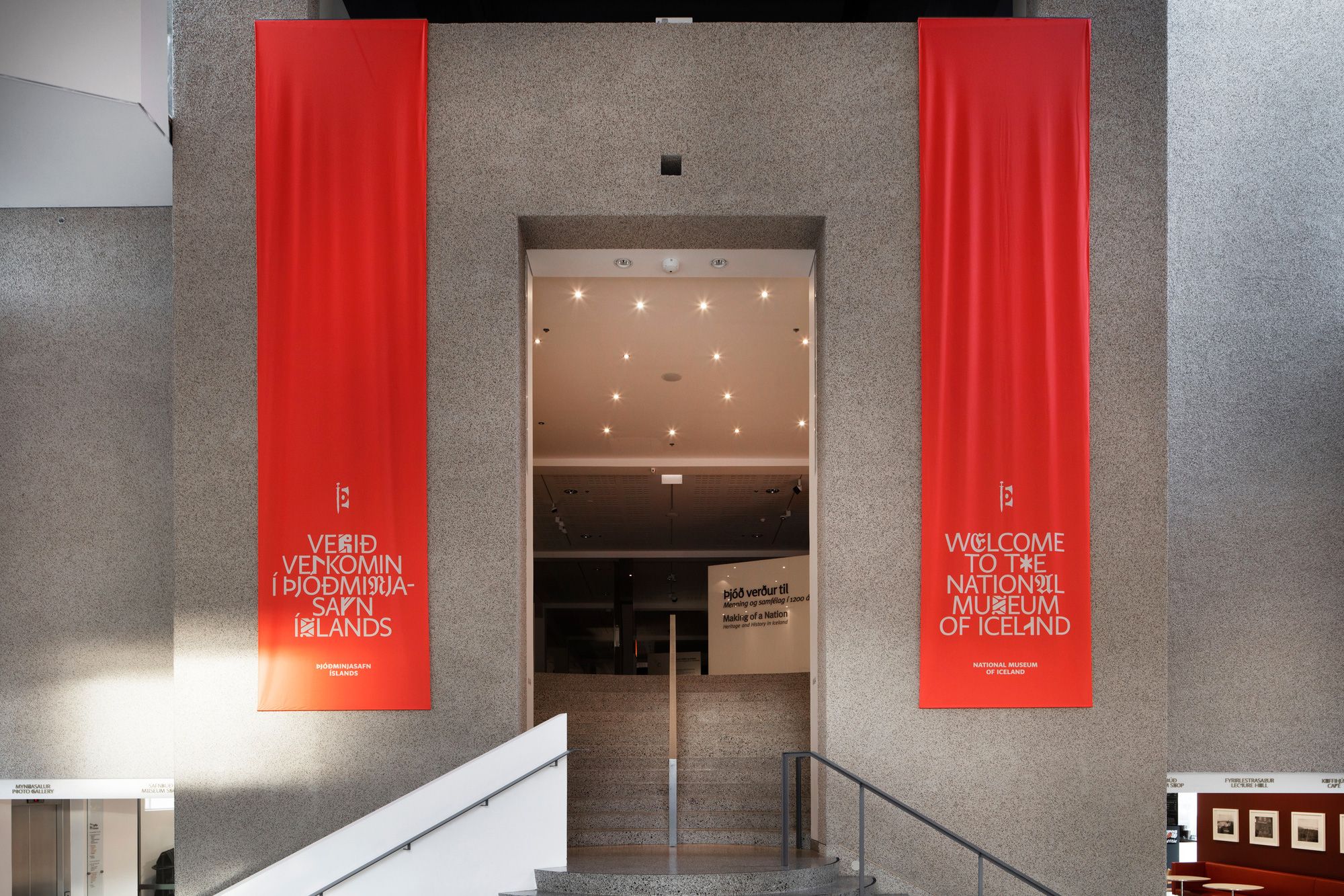
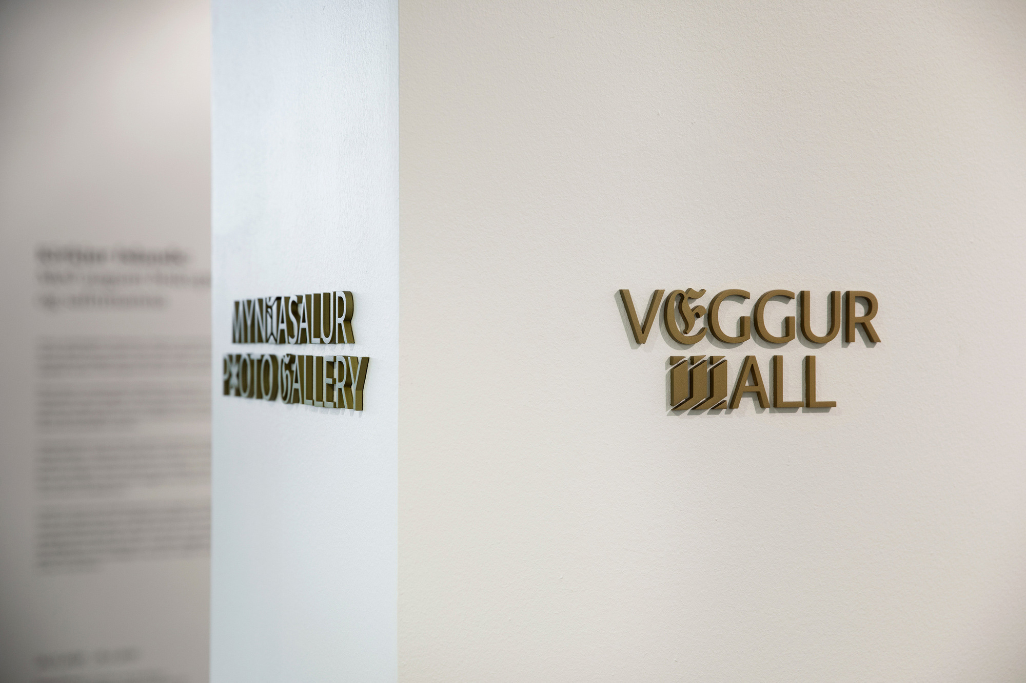
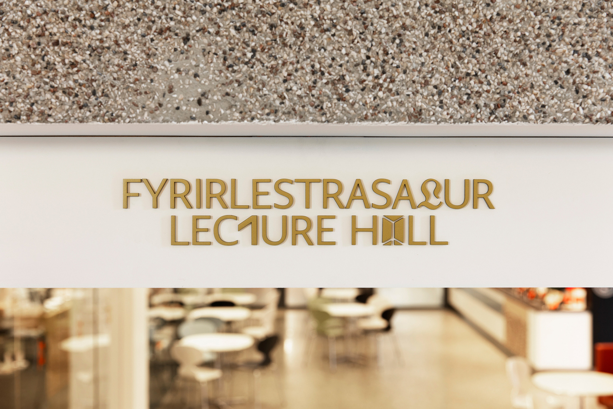
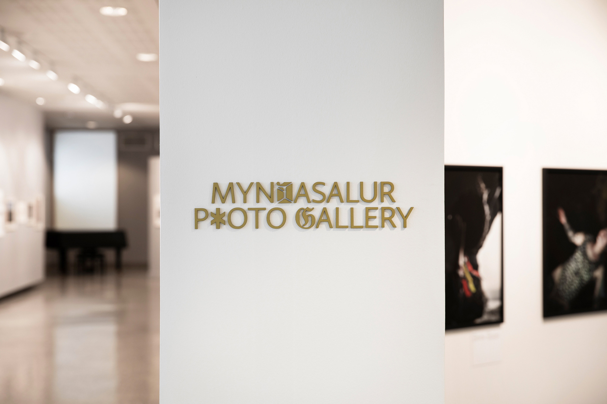
Committing to the custom font on 3D signage seems like a pretty bold move… they are in it for the long run with this relatively wild approach, and it looks great on the walls.
Overall, this is a very satisfying identity and a great example of digging out historical references and breathing new life into them while also creating something that is truly unique and authentic to the museum.

 Новости Союза дизайнеров
Все о дизайне в Санкт-Петербурге.
Новости Союза дизайнеров
Все о дизайне в Санкт-Петербурге.