Обзор лучших ресурсов по разработке бренда, разработке упаковки
contact us | ok@ohmycode.ru
contact us | ok@ohmycode.ru
Established in 1994, SMK (short for Socialinių Mokslų Kolegija or “Social Studies College” in English) is the largest, non state-owned, higher education institution in Lithuania. With two campuses — one in Vilnius, Lithuania’s capital, and the other in the port city of Klaipėda — the university counts with 2,400 students and offers study programs in the areas of informatics, health, arts, business and public administration, law, and social sciences. Earlier this year, SMK introduced a new identity designed by Vilnius-based Andstudio.
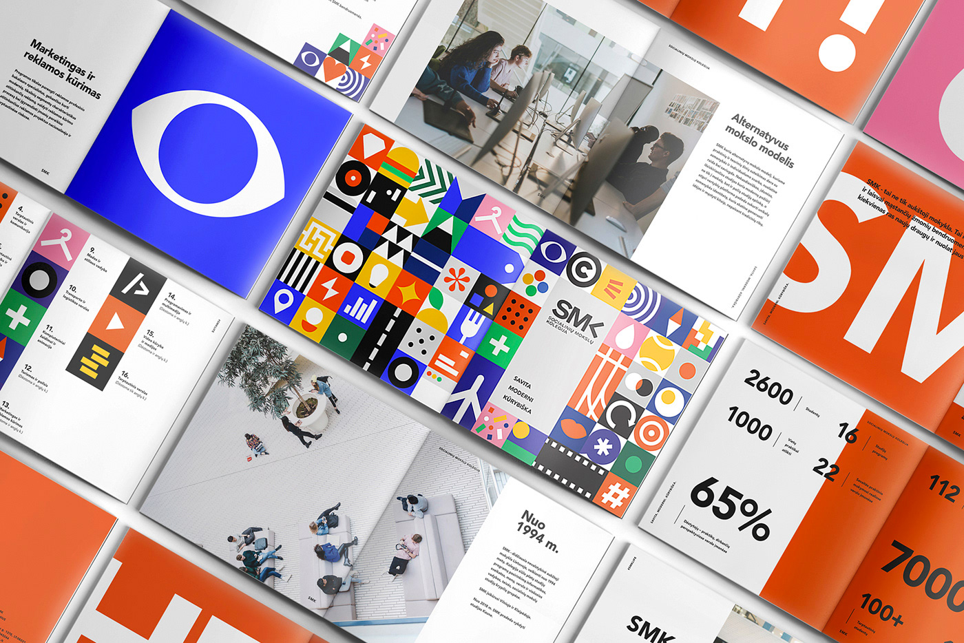
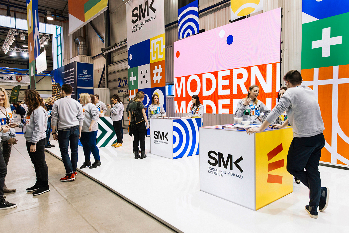
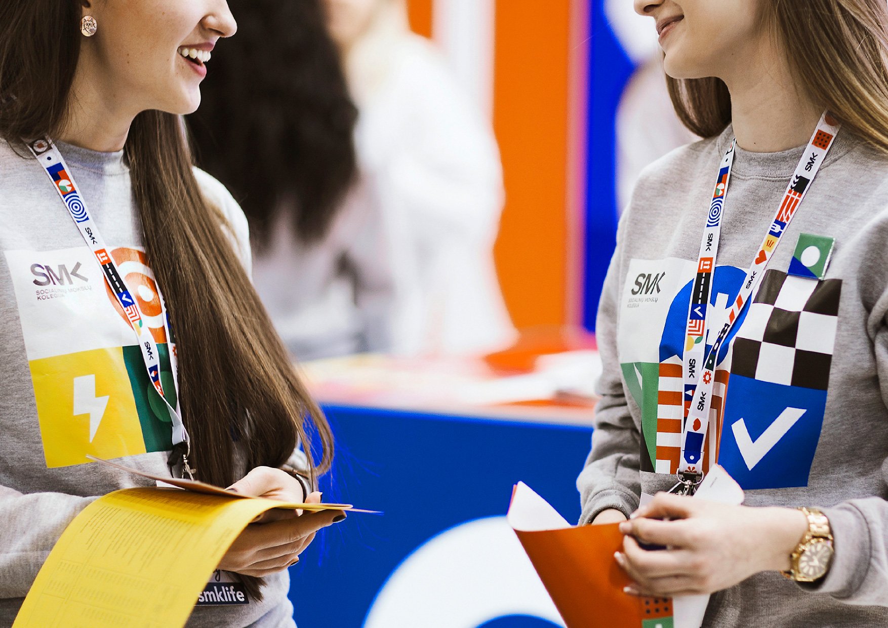
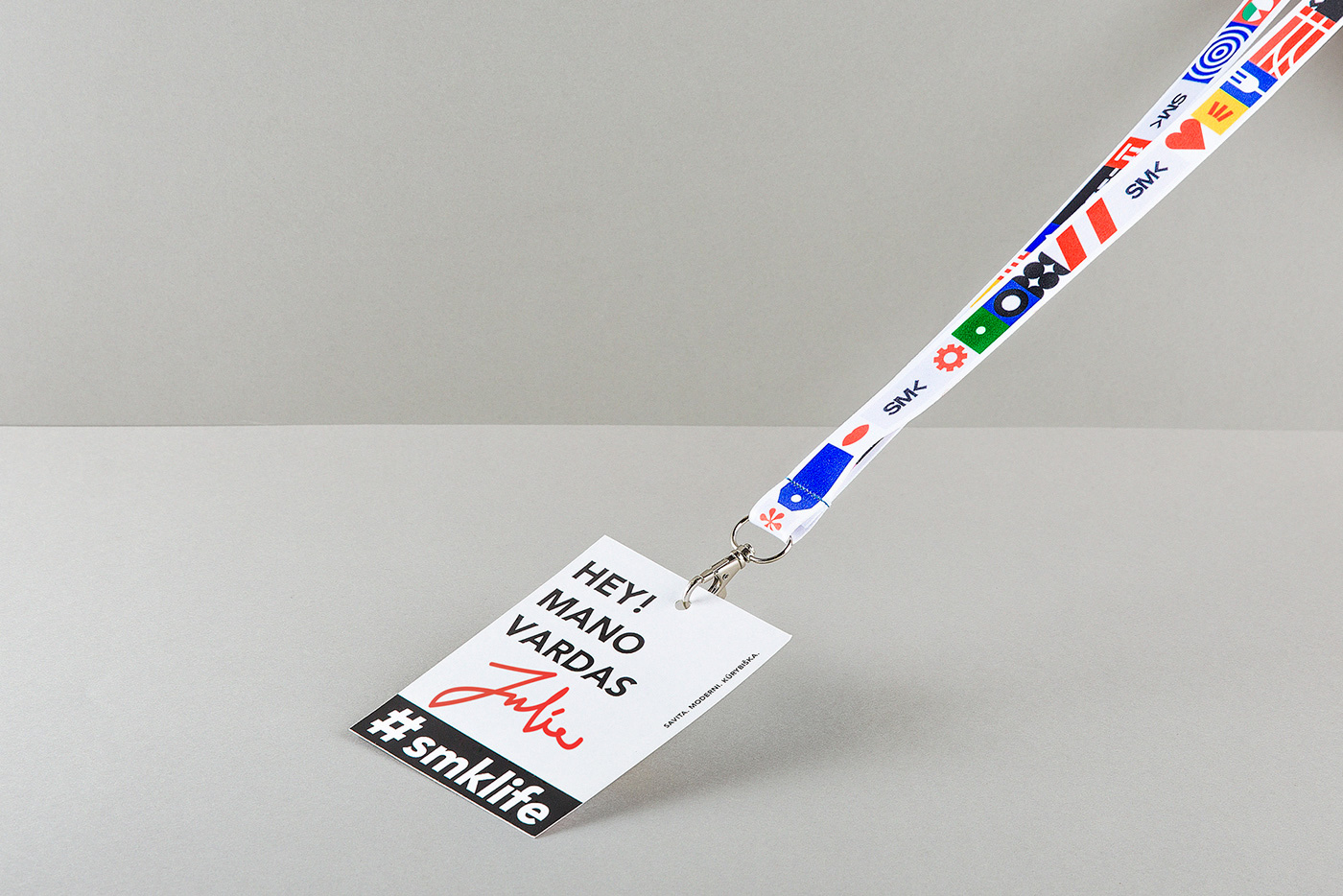
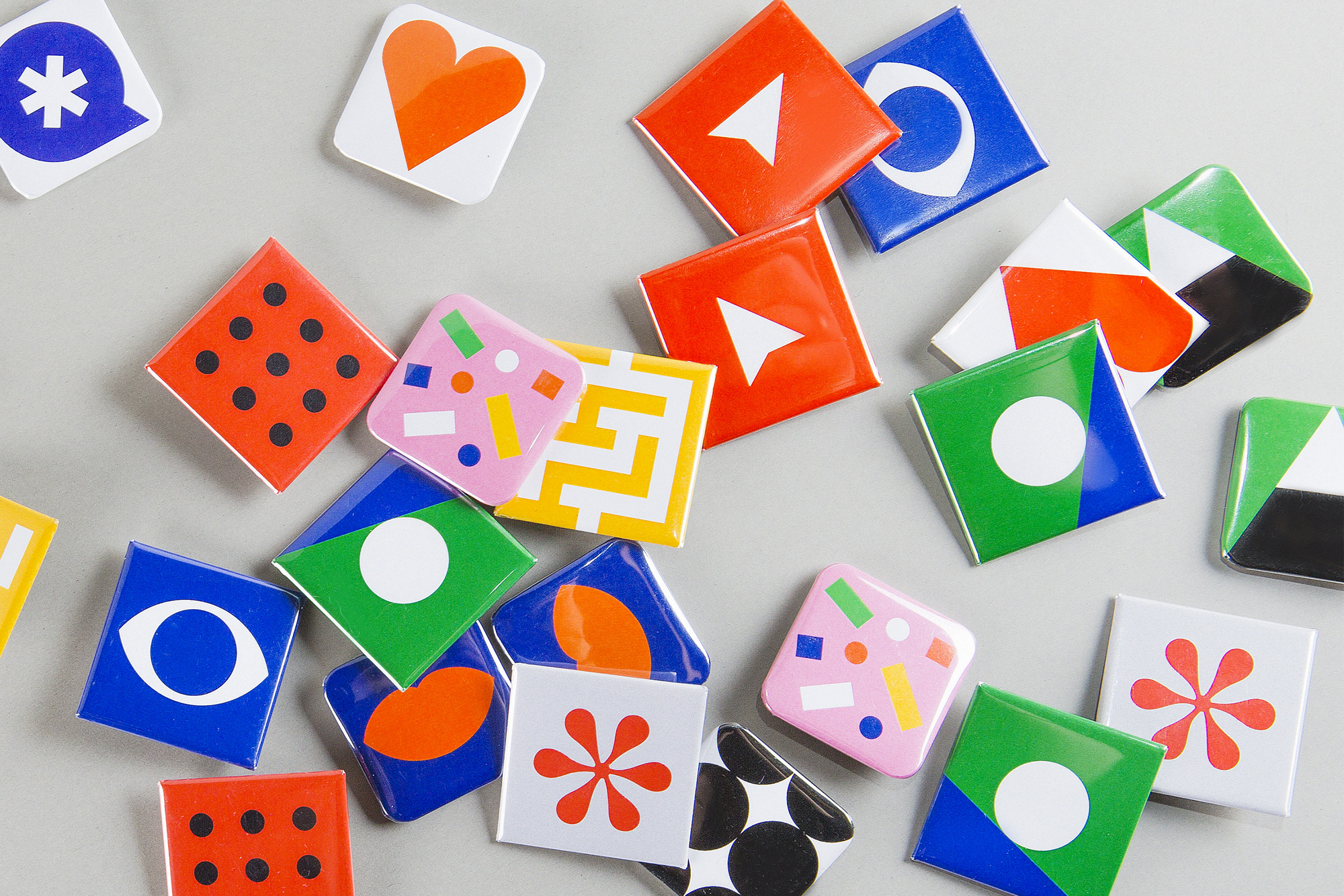
Our biggest inspiration were SMK people. Every SMK student is a unique individual, all together they are forming a vibrant, dynamic and active community. To represent every individual we created more than 200 pictograms. Together they become a graphic system that overcomes any limitations of a traditional logo and helps to recognize the brand from a distinctive set of different visual elements.
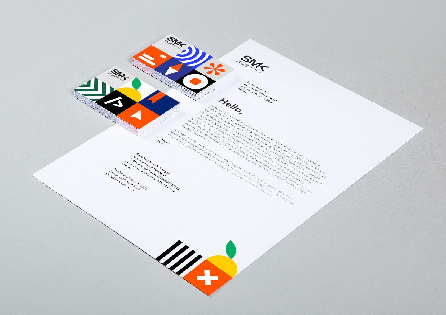
The old logo was fairly decent, cleverly balancing the “S” with an abstracted “K” to maintain weight symmetry around the “M” and place an open book underneath aligning neatly with all the letters. The new logo is a contemporary evolution that maintains the same construction sans the book, which I kind of would have to liked to see evolved in the same style. The “K” is a little harder to decipher in the new logo but graphically it’s more striking. The full name underneath could use some extra leading to let it breath a little.
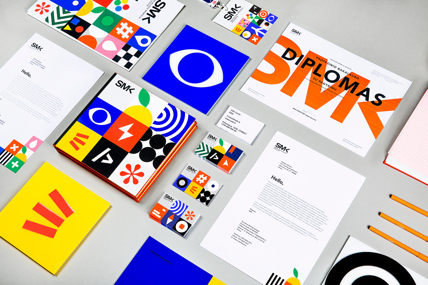
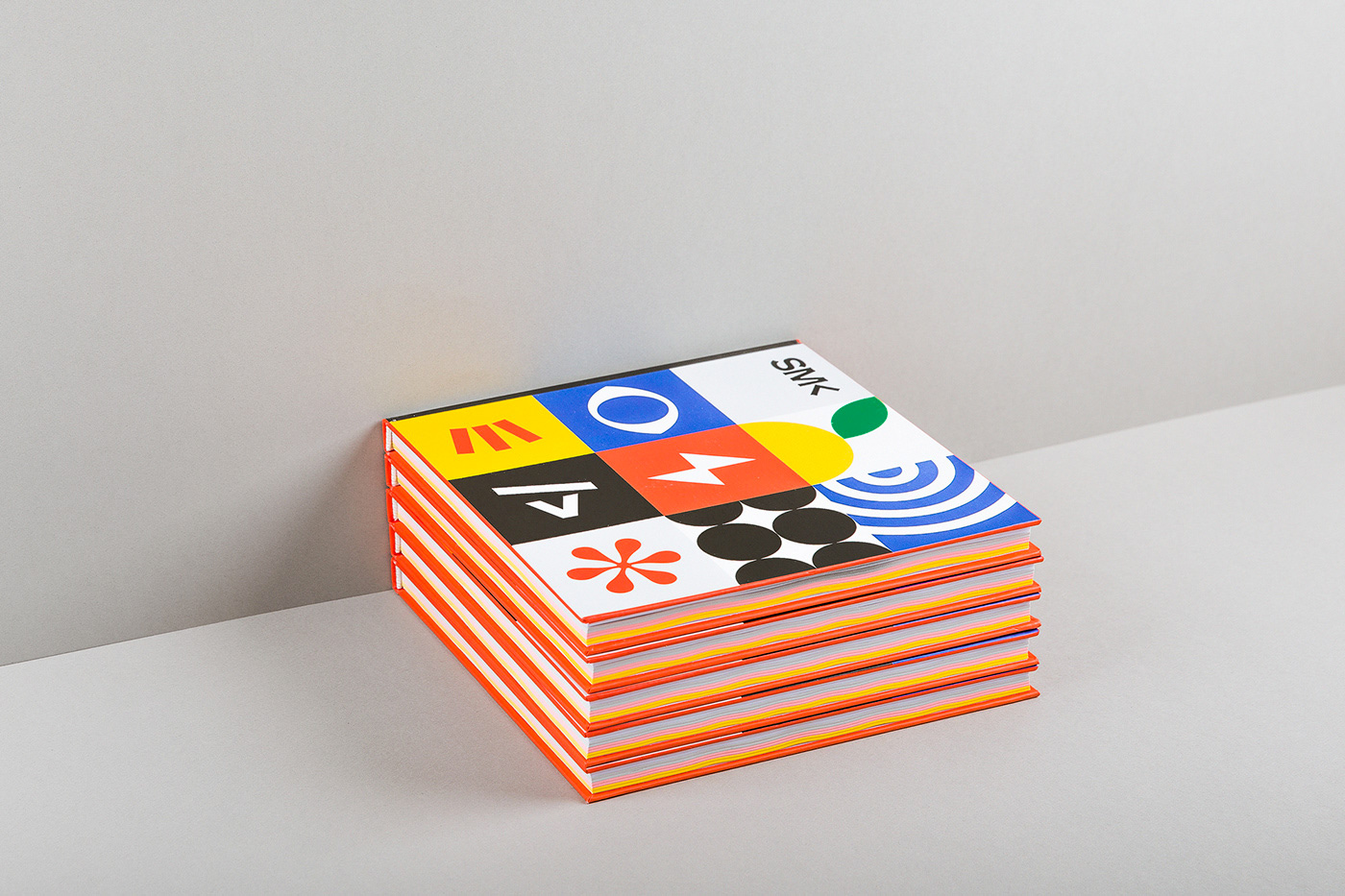
If you miss the book graphic like me, the logo is most often accompanied by a wide range of icons arranged in a grid and these become the centerpiece of the identity.
The different study programs get their own set of icons, some are literal, some are metaphorical, some are head-scratchers (but that’s fine). Apart from these, there are a few dozen others to convey your mood, personality, and habits.
[Through an] app SMK students can create their own unique symbol. 4 easy steps of games and tests and the application generates a personal logotype. The exported logotype can be used on any university paper work, social media or merchandising.
I like the concept and the result is visually stimulating and energetic. I don’t know if the icons could have been more cohesive somehow? Or perhaps it’s the lack of cohesiveness that makes it work? Or even further, these ARE cohesive? Nonetheless, the intention is good and, in application, they clearly help establish a distinctive personality.
The whole identity system is based on University’s mission, core values, modern approach and open-mindedness. It also becomes a symbol of constant change, where every person has the possibility to create his own unique SMK visual identity.
At a glance, or for a student seeing this for the first time without the context of what the icons mean, the design can feel random or gratuitous and some of the icons — like the orange with a leaf — make you question what in the world this is all about. But at the same time, the design helps SMK look very different from other educational institutions in an attractive, energetic, and youthful way.
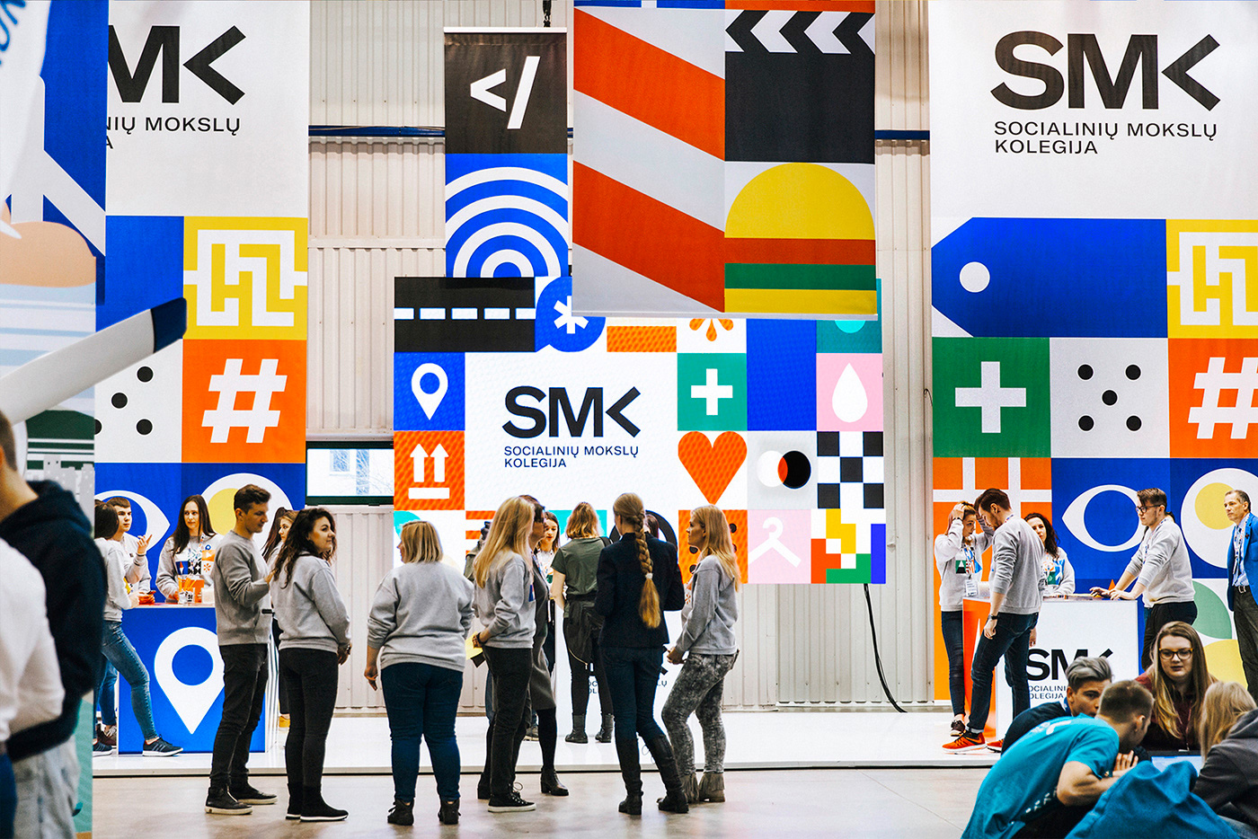
I would totally flock to their exhibitor space at what looks like a college fair. Regardless of what I wanted to study, I would go see what that was about.
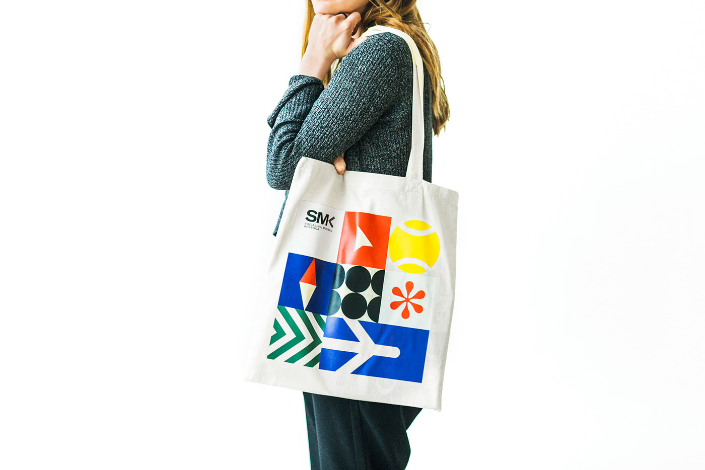
Overall, I still wonder if the icons are right or if they are too overpowering or distracting in that they demand to be decoded — like, why is there a tennis ball and an airplane on the tote bag? — but, shutting down logic, I find this to be entertaining, exciting, and bold.

 Новости Союза дизайнеров
Все о дизайне в Санкт-Петербурге.
Новости Союза дизайнеров
Все о дизайне в Санкт-Петербурге.