Обзор лучших ресурсов по разработке бренда, разработке упаковки
contact us | ok@ohmycode.ru
contact us | ok@ohmycode.ru
Established in 1939, Little League is a nonprofit organization based in South Williamsport, PA, that organizes local youth baseball and softball leagues throughout the United States and the rest of the world. The first organized youth sports program in the world, Little League started with three teams and 30 players. Today, approximately two million boys and girls, ages 4 to 16, play Little League in in all 50 states and more than 80 countries. The parent organization branches into regional centers that in turn oversee districts (a geographical area usually encompassing 10-20 leagues) that in turn provide guidance to local leagues, which are the heart of the organization, that furnish physical facilities, volunteer services, and resources to provide the programs that make up the local, day-to-day experience for most Little Leaguers. Last week, Little League introduced a new identity designed by Columbus, OH-based Ologie.
Little League has a section on its website dedicated to explaining the new identity.
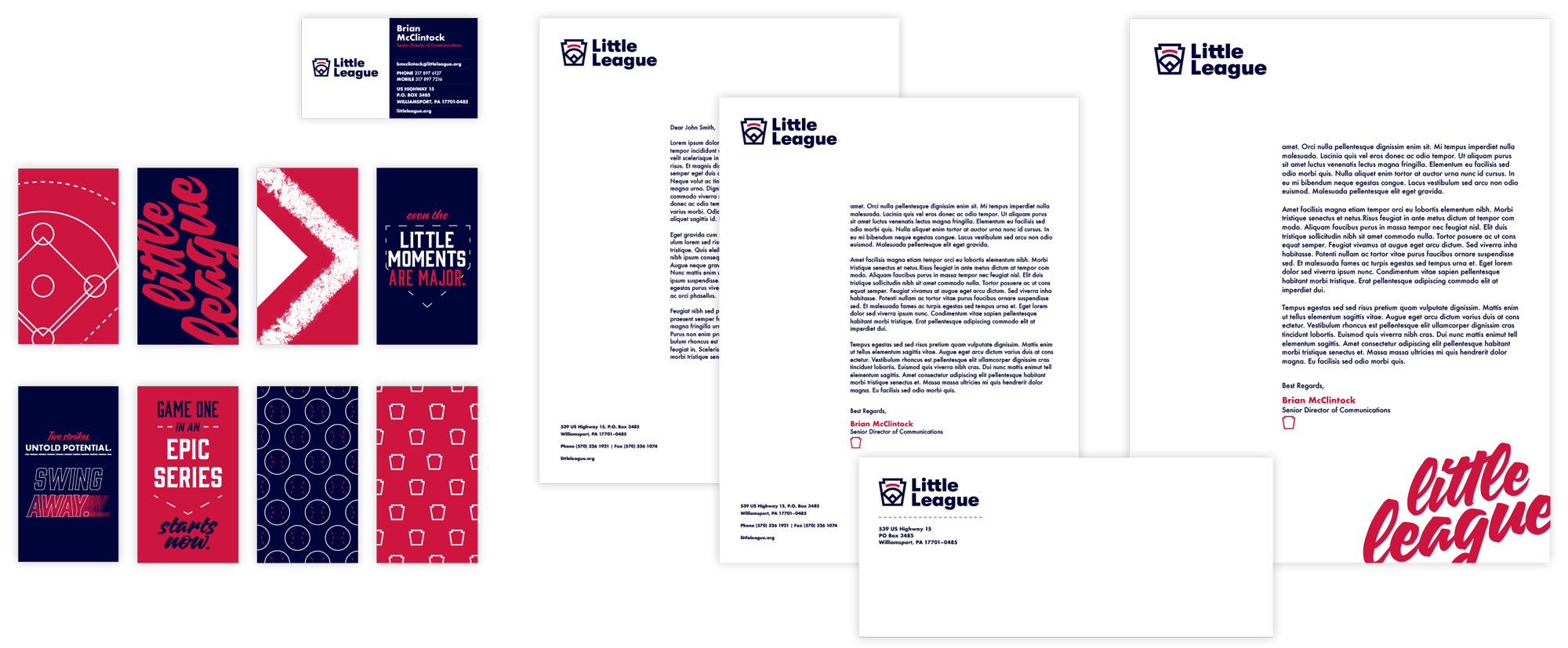
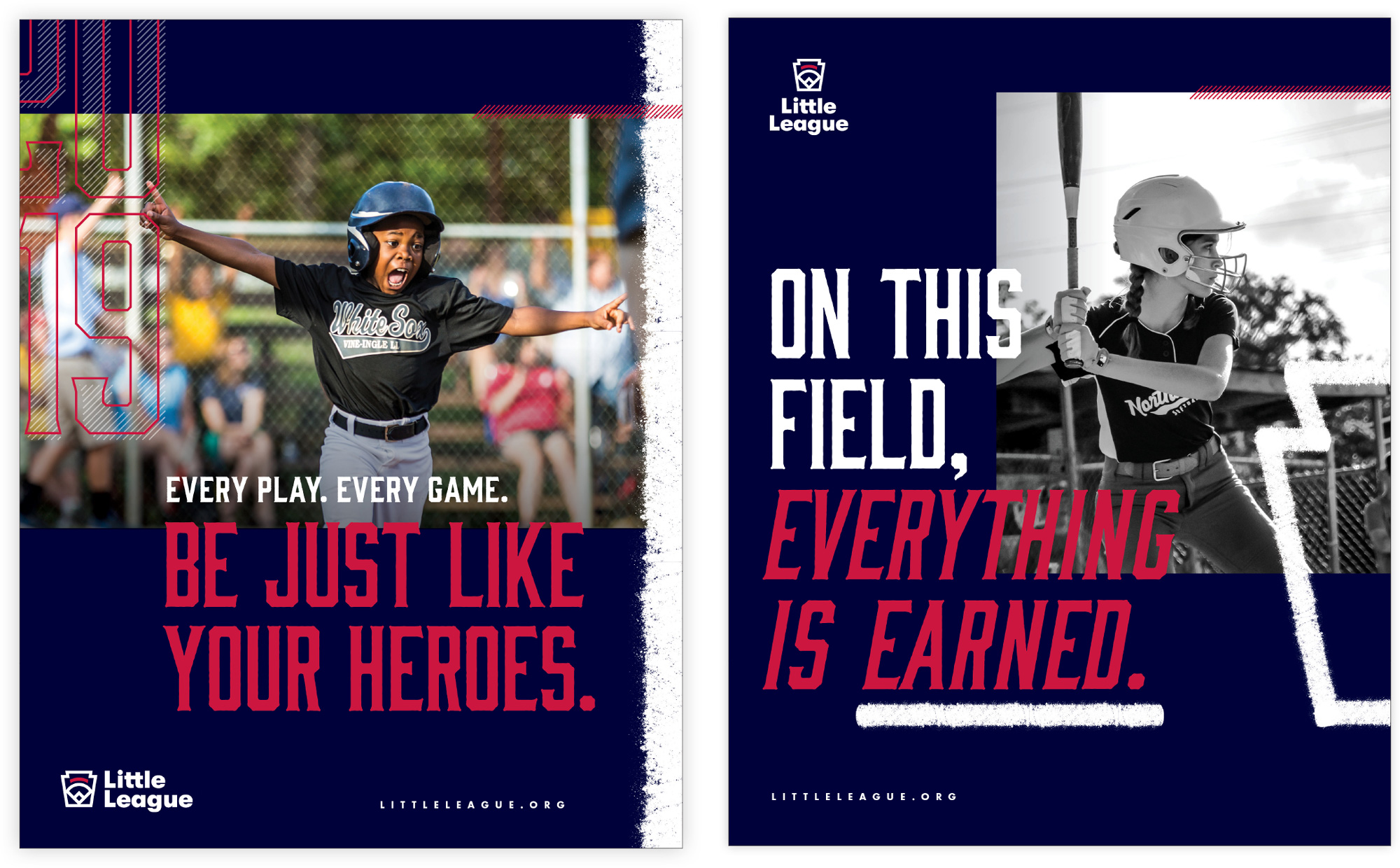
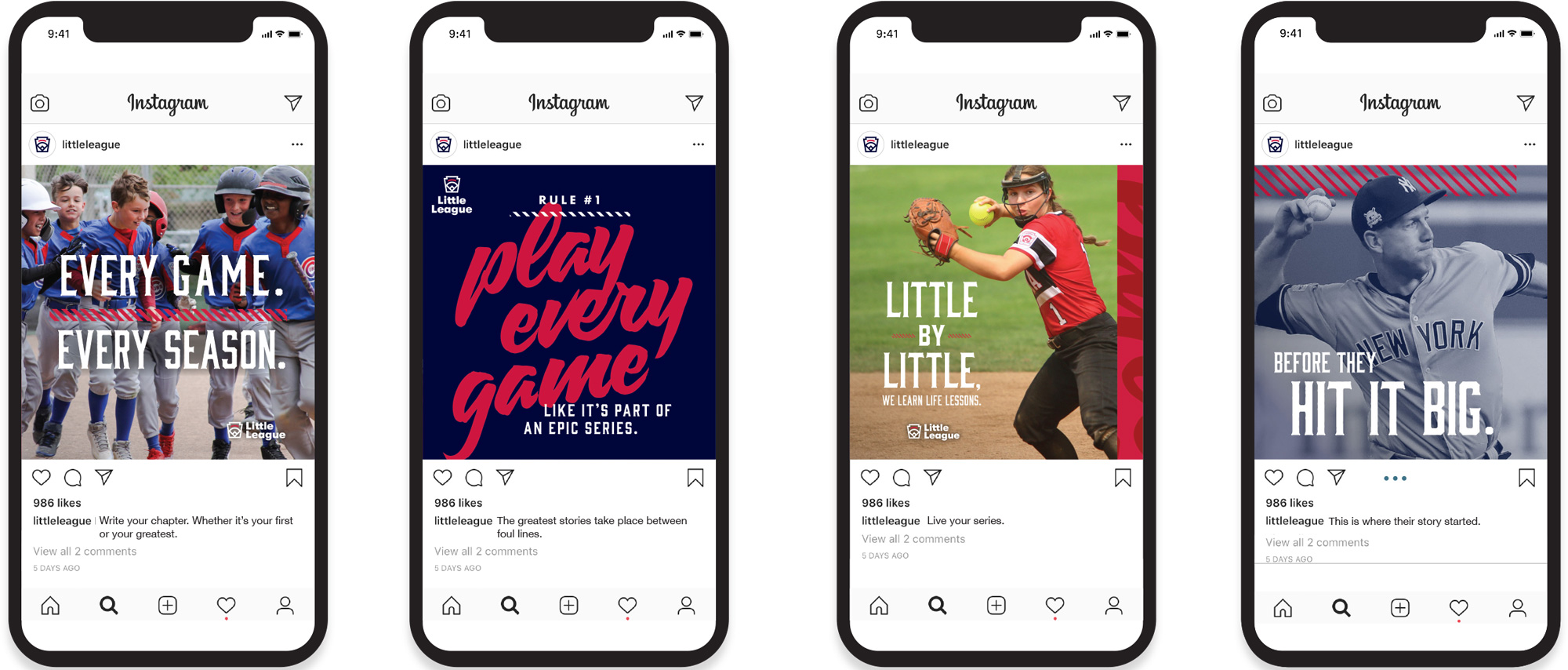
Working with midwest branding and marketing firm Ologie, Little League took the field and began modernizing their mission, logo, and look. Most prominent—the evolution of the keystone symbol—is a streamlined take on a logo that’s remained essentially unchanged for decades. Harkening back to its heritage, a sketch by founder Carl Stotz, the new emblem is focused and flexible, balancing history with utility. It works with other design elements across colors, dimensions, and uses to convey a consistent message. Based on the logo, a new, inclusive identity system and secondary palette were built for each division of play: Baseball, Softball, as well as their Challenger division for children with physical and intellectual challenges. Rounding out the toolkit with fonts, graphic elements, and a defined photo style allowed the brand to keep color and composition impactful and focused. Throughout the process and in the execution, Little League never lost sight (took their eye off the ball?) of what was most important: dialing up the fun for those playing the game, and giving everyone space to tell their story and make their memories, whether it’s their first or their greatest.
Inspired by Carl Stotz’s original keystone sketch, our emblem is a modern interpretation of the heritage of Little League.® Its structure has been streamlined for flexibility across all media, as well as to represent all Baseball, Softball, and Challenger leagues equally.
The old logo had become more about the motto than the sport by having that visually overpowering ring with the values spelled out which, sure, it’s a nice sentiment as those are traits that can help make good human beings but it felt more like a grown-up organization, reminding me of the old Rotary logo. The new logo drops the ring and the motto — which I imagine took some convincing — and brings the focus back to the baseball diamond and the keystone outline. (In case you are wondering what’s up with all the keystone shapes lately, it’s because both of these organizations are based in Pennsylvania, known as The Keystone State.) The execution is great, with a bold, minimalist approach that makes good use of the inside shape of the keystone to fill it with the diamond and a red curved stripe that’s reminiscent of the red ribbon that held “LITTLE LEAGUE” in the previous two logos. The wordmark is great too, with its chunky, serious-but-playful presence. It looks like it’s a customized version of Futura? I’m not sure. Together, the icon and wordmark, make an excellent pair.
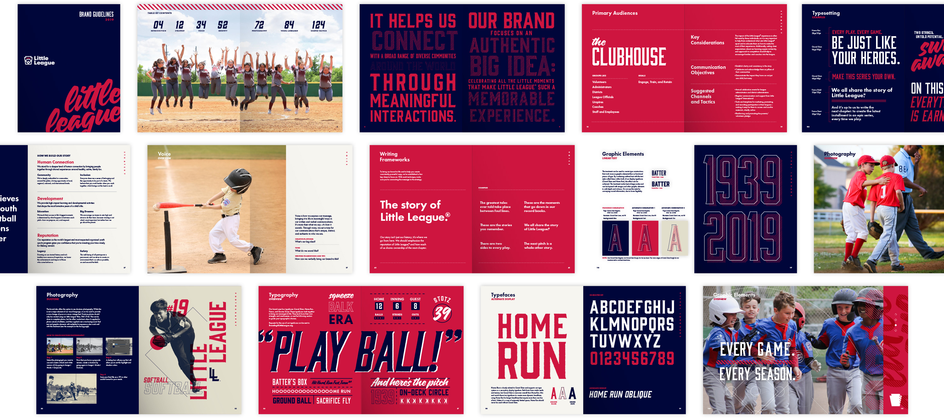
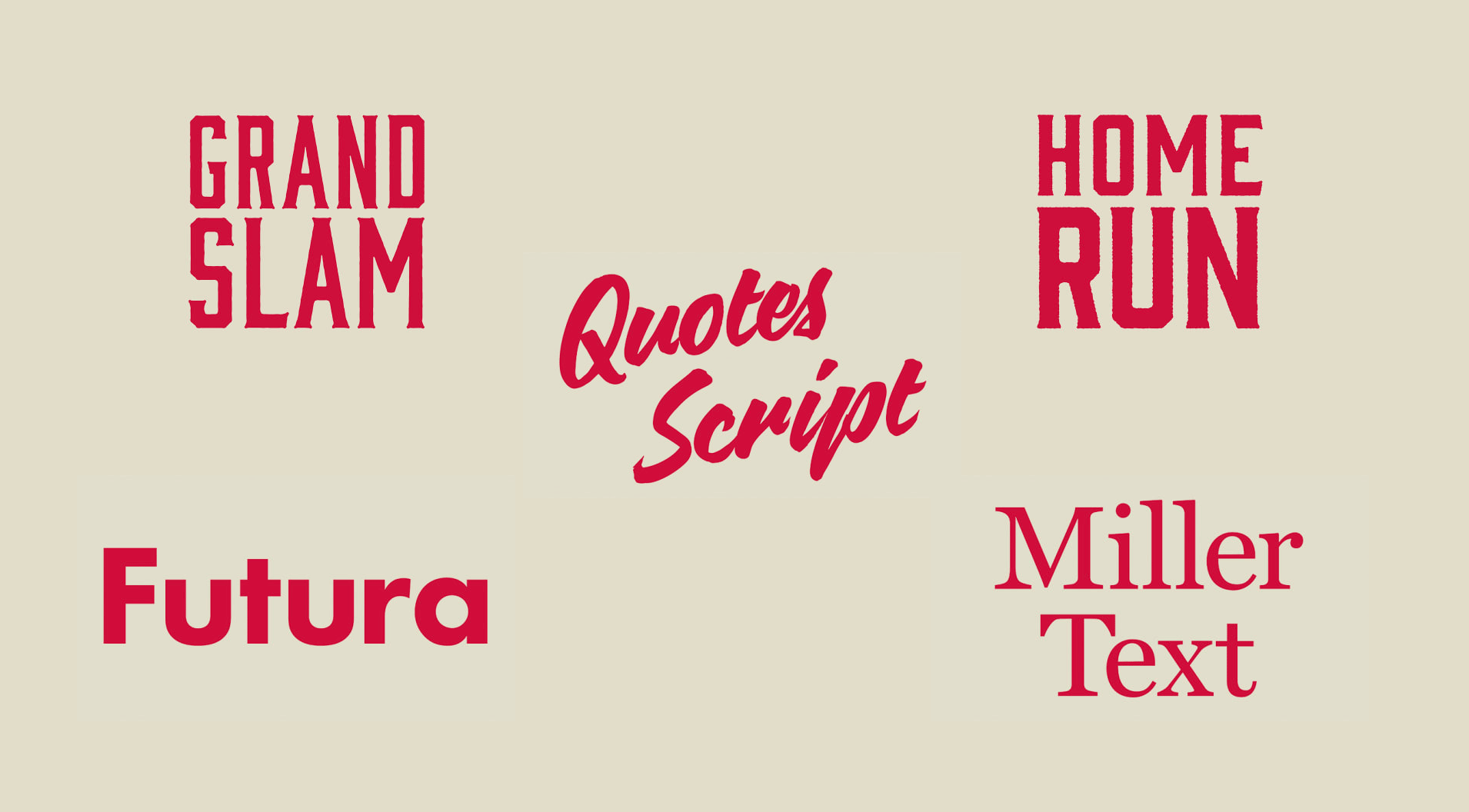
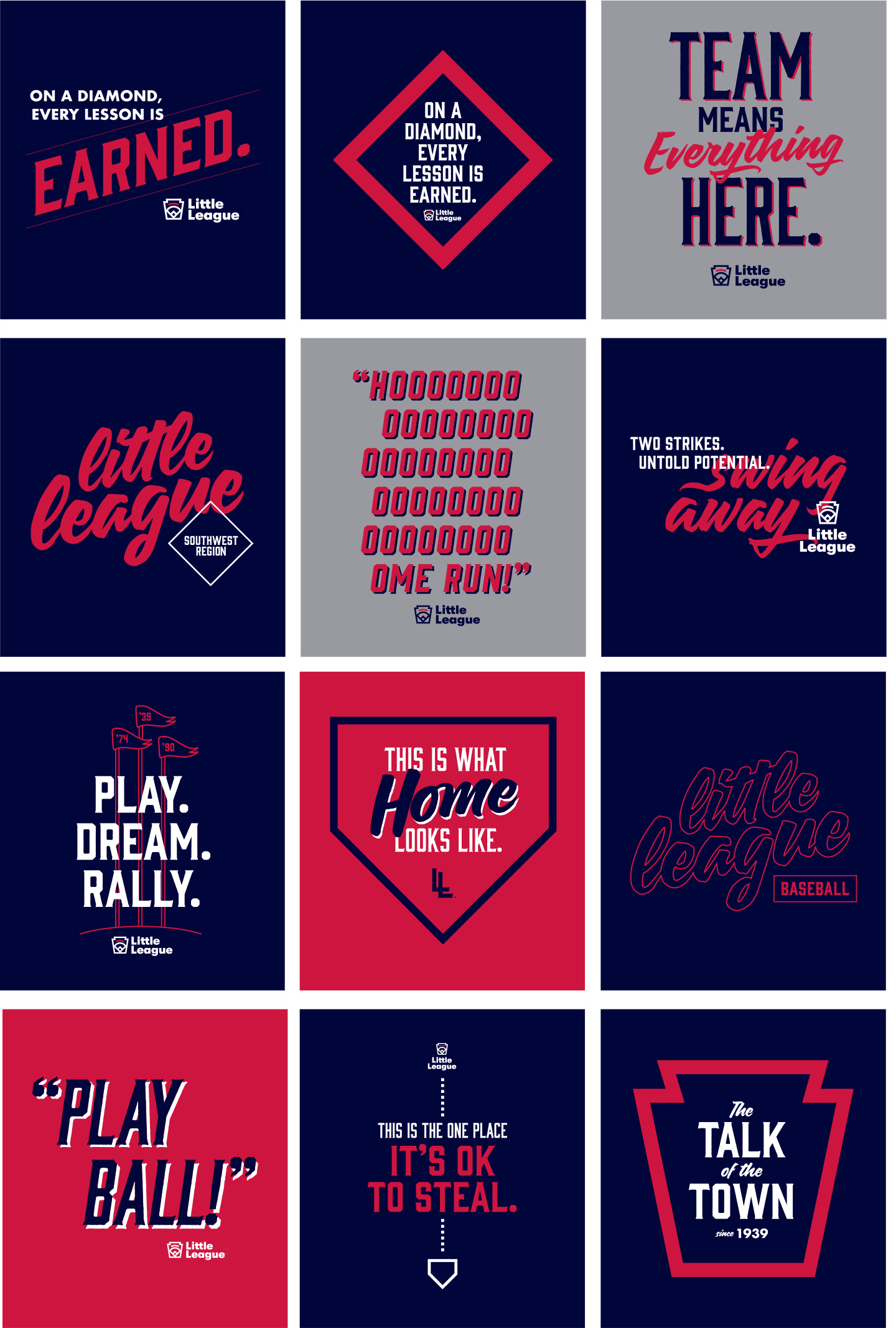
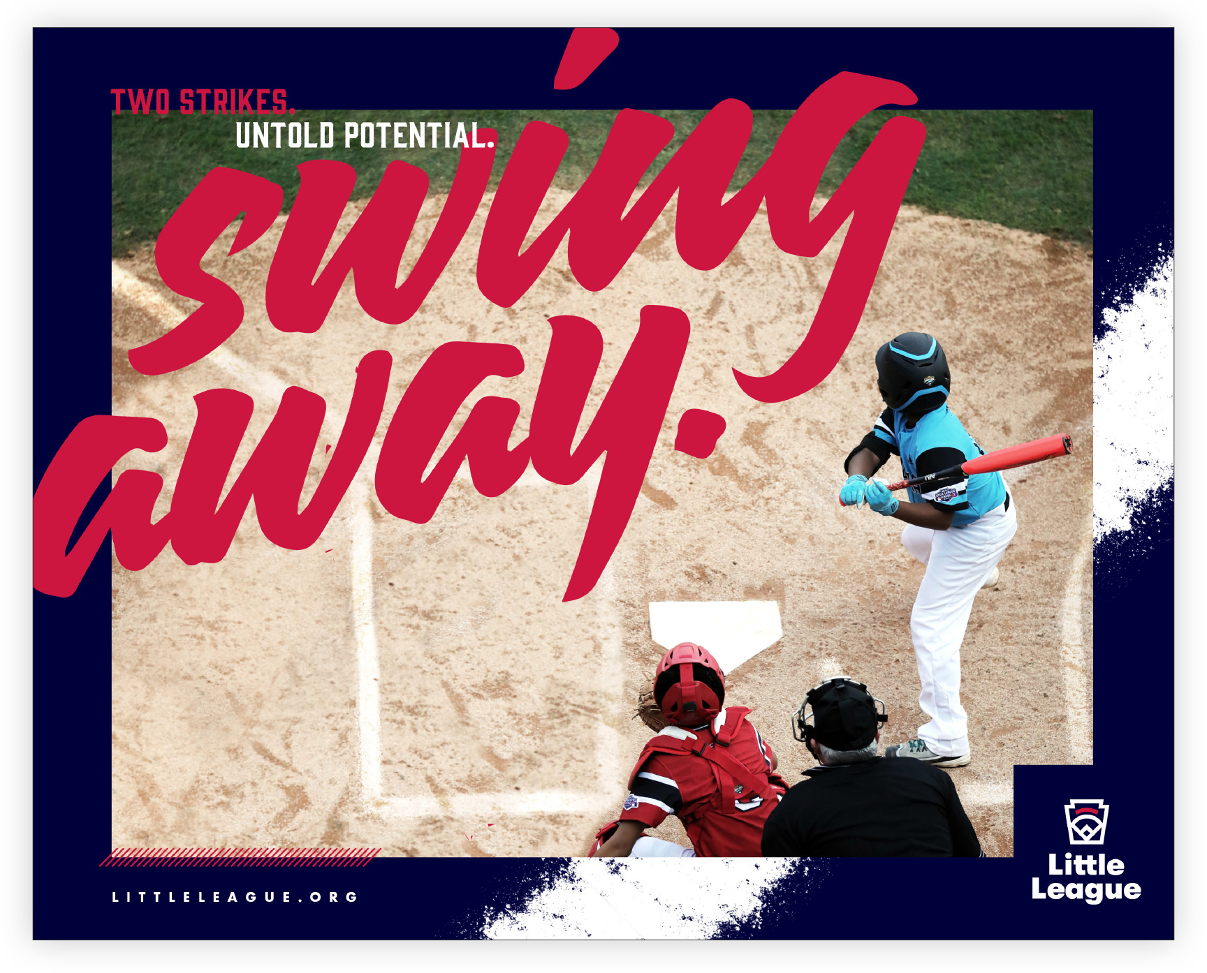
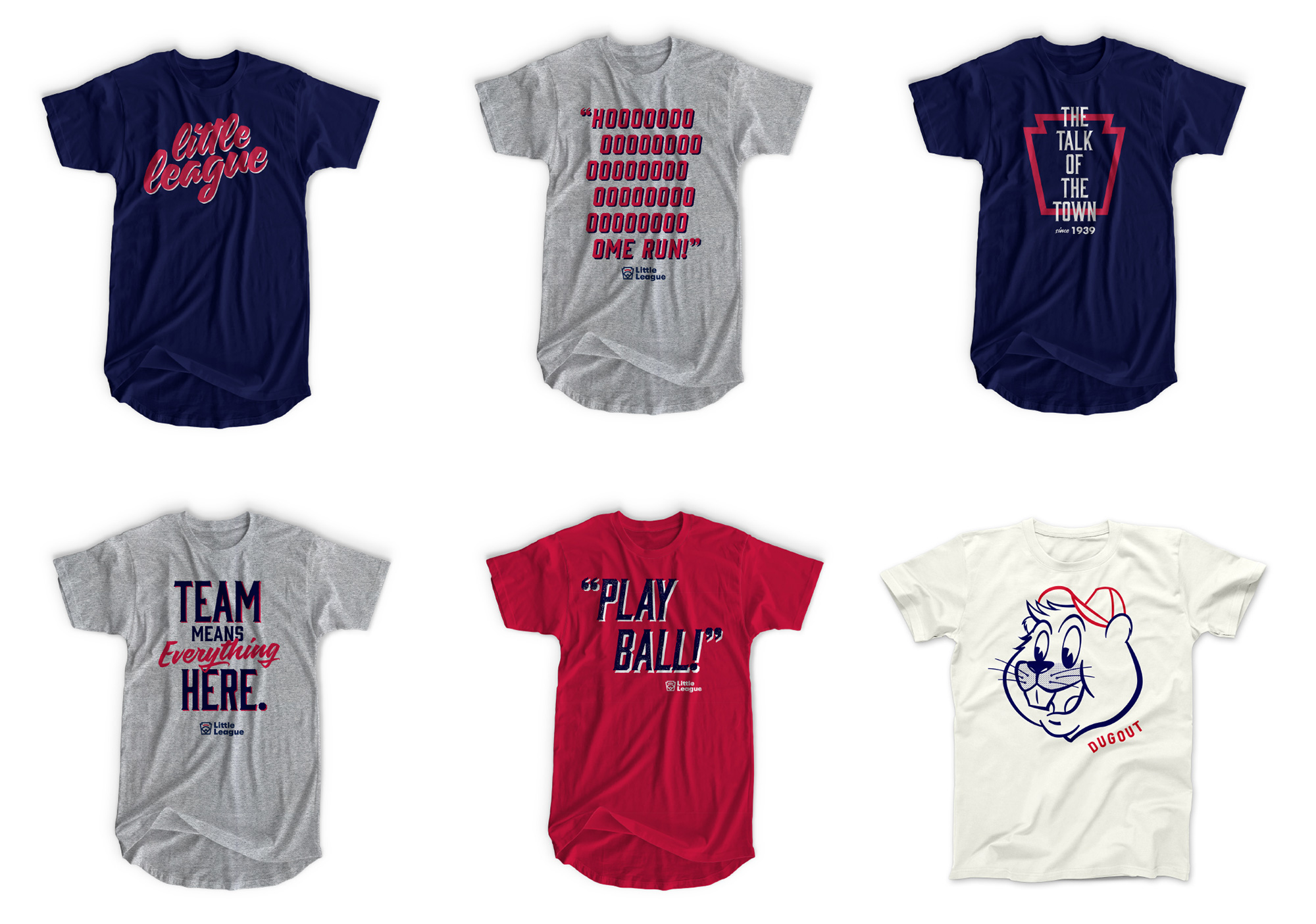
In application, the identity introduces five different typefaces that can come together in a variety of ways that are fun and energizing and in an aesthetic that feels appropriate for the league. I wouldn’t say I like them as it’s not necessarily my vibe but I definitely appreciate how well this works. I think the one element that throws me off is when they use Quotes Script really large and perhaps I would like to see some more Futura Bold in there as headlines instead of Grand Slam/Home Run… so, um, yeah, it seems *I* would change a lot. This is all solid and makes a great kit of parts that the thousands of leagues can use in different ways and I can totally see moms/dads wearing t-shirts with any and all of the type treatments above.
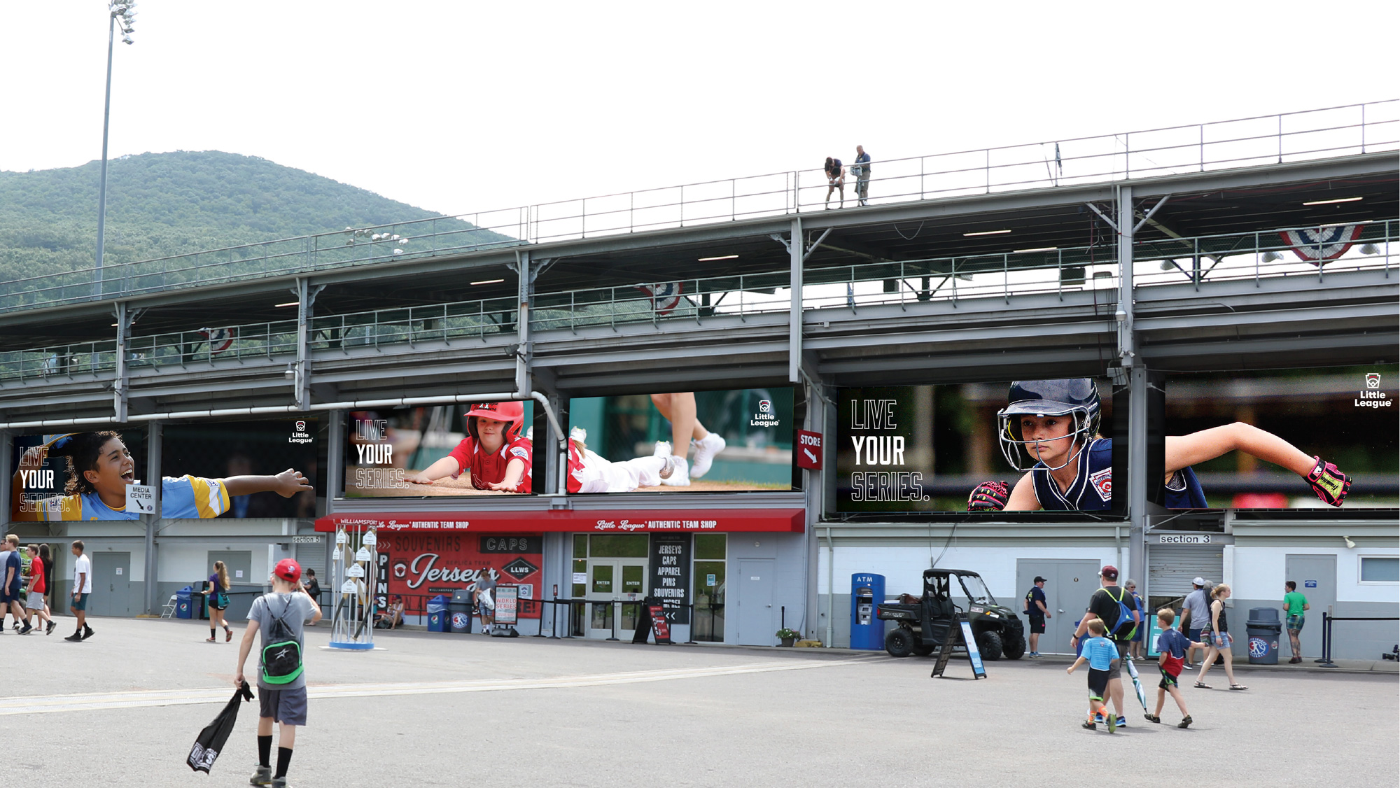
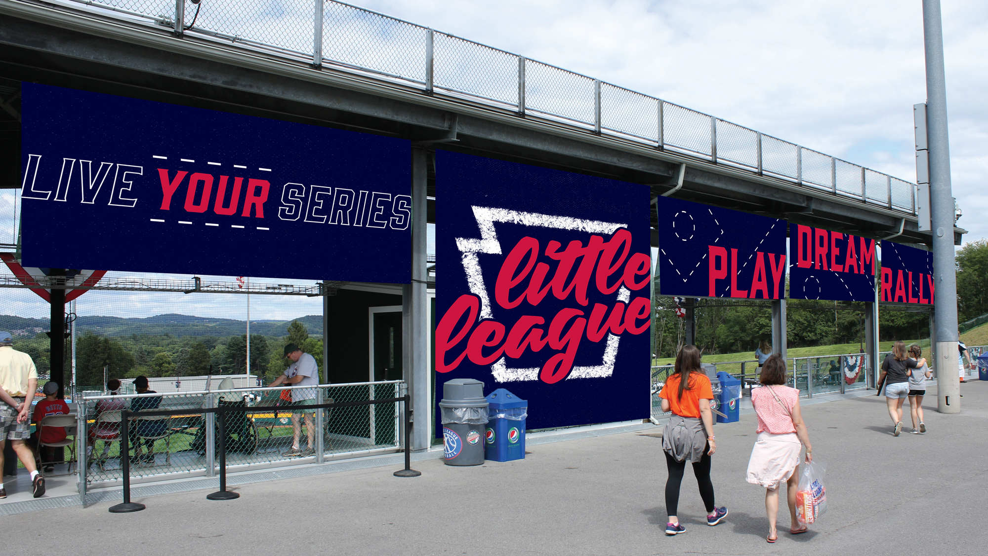
Overall, this strikes a great balance of establishing a bold and serious yet playful and accessible presence at the institutional level while creating a more exuberant visual language for the day-to-day experience for kids, volunteers, and parents.
 each year since publication began in 2006

 Новости Союза дизайнеров
Все о дизайне в Санкт-Петербурге.
Новости Союза дизайнеров
Все о дизайне в Санкт-Петербурге.