Обзор лучших ресурсов по разработке бренда, разработке упаковки
contact us | ok@ohmycode.ru
contact us | ok@ohmycode.ru
Established in 1930 (originally as Advertising Age), AdAge is a global media platform focused on “curated creativity, data and analysis, people and culture, and innovation and forecasting”. Originally published as a broadsheet newspaper, AdAge still has a strong print presence, pumping out 24 issues a year of the eponymous magazine to more than 60,000 subscribers as well as now having a major online presence with 2.4 million unique visitors a year to its online content and over 3,000 attendees to its numerous events across the year. A part of Crain Communications, AdAge also manages Creativity (magazine and online publication) and DataCenter, a cache of industry data. Last September, AdAge introduced a new identity designed by New York, NY-based OCD.
The move from Advertising Age to Ad Age was a no brainer. It was past time for the masthead to align with the vernacular. The lettering was crafted by Tobias Frere-Jones. It is based on the original 1930s masthead.
The old logo wasn’t bad but it wasn’t good either. To me it always looked like an old-school, old-fashioned, Mad-Men-era-holding representation of the advertising industry. Neither the logo nor the magazine ever felt fresh or contemporary even if the content was. The new logo, despite being based on a nearly 90-year-old logo, feels infinitely more energetic, engaging, and contemporary. Drawn by Tobias Frere-Jones the logo is a wonderful modern interpretation of Kabel and while it still operates within the minimalist sans serif trend, the “g” gives it a unique and memorable twist and the way that “g” is sort of pinching the “A” is extra delicious.
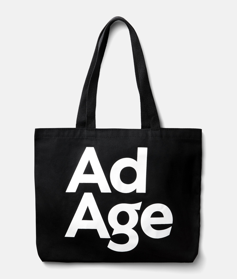
The logo has a nice flexibility to be stacked or rotated vertically as well as being paired with the myriad events/initiatives/sister-products that AdAge produces and adapting to being in a primary or secondary role.
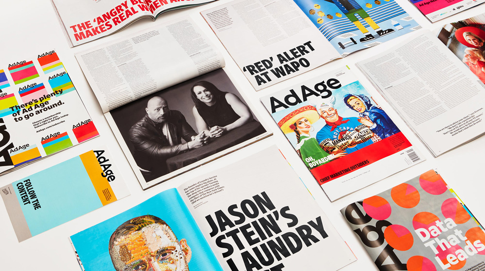
Ad Age brand architecture was reorganized into a three-tiered system that prioritized the content that is most important to readers: Creativity and Datacenter. Tier 2 is primarily events and awards. And Tier 3 is everything else. Tier 3 uses a type-only treatment of initiatives to reduce logo clutter.
Each Tier 2 event is supported by a custom banding system. The first to roll out was Ad Age Next with a warm palette and consistent band height.
Advertising moves fast. The news moves faster. Ad Age needed a rinse-and-repeat system that looked fresh everytime. The typographic tool kit leans into Ad Age’s newspaper heritage; three typefaces and a commitment to easy-reading columns on all platforms.
The bands of color further supported efficiency. When you need a design element, you have all of the stripes. When you need the design to get out of the way, you have fewer stripes. The seventeen-color palette brings variability.
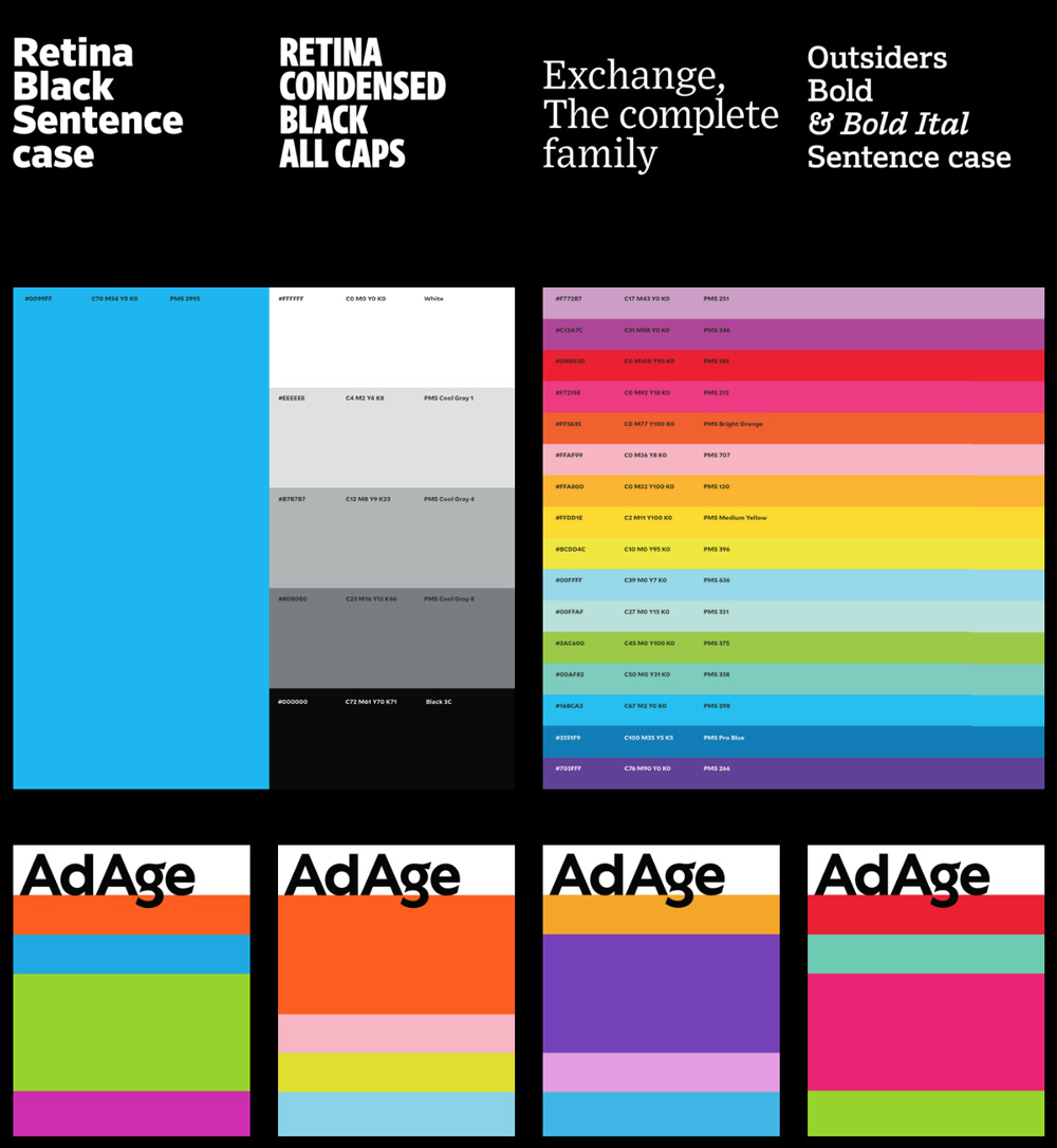
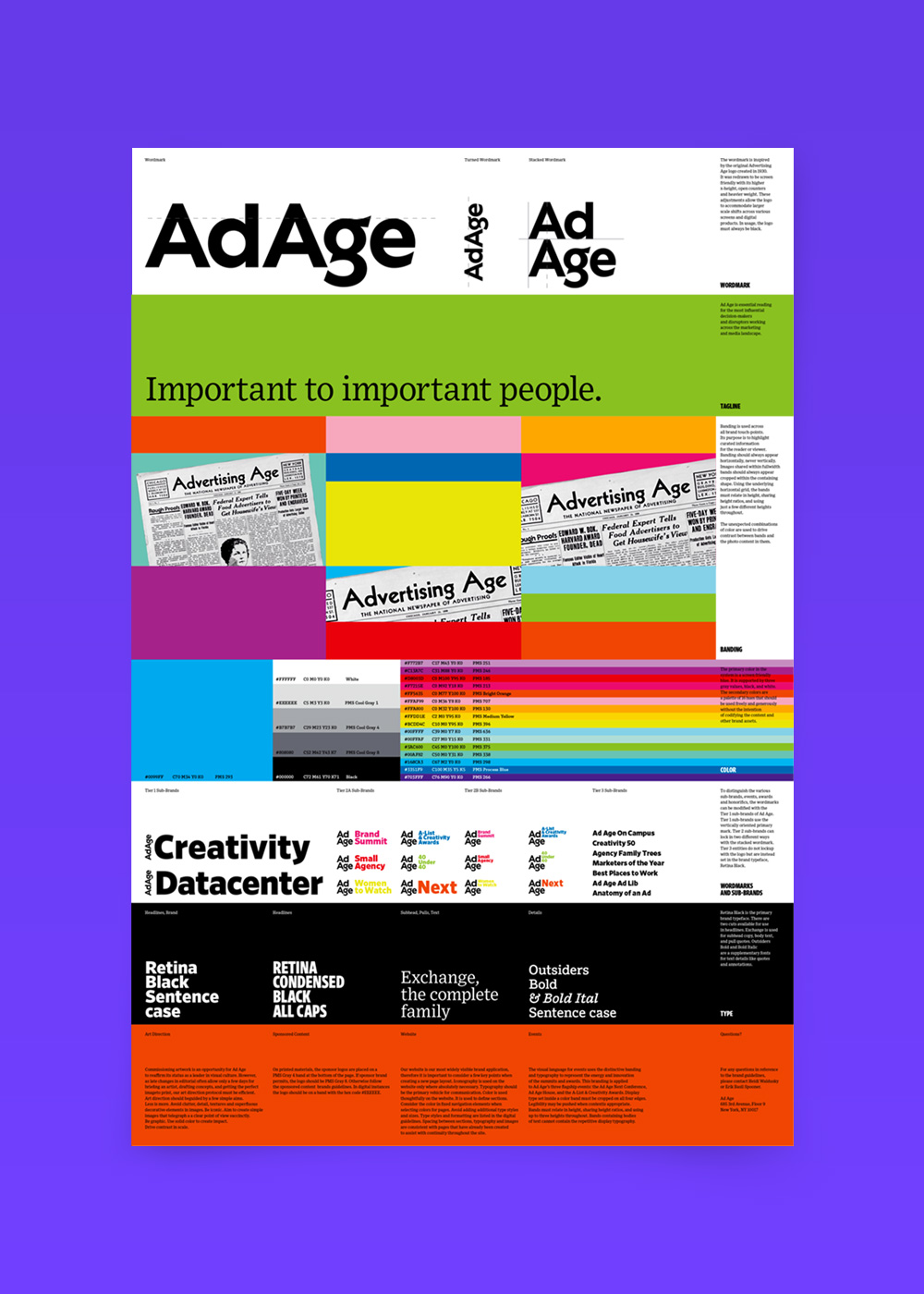
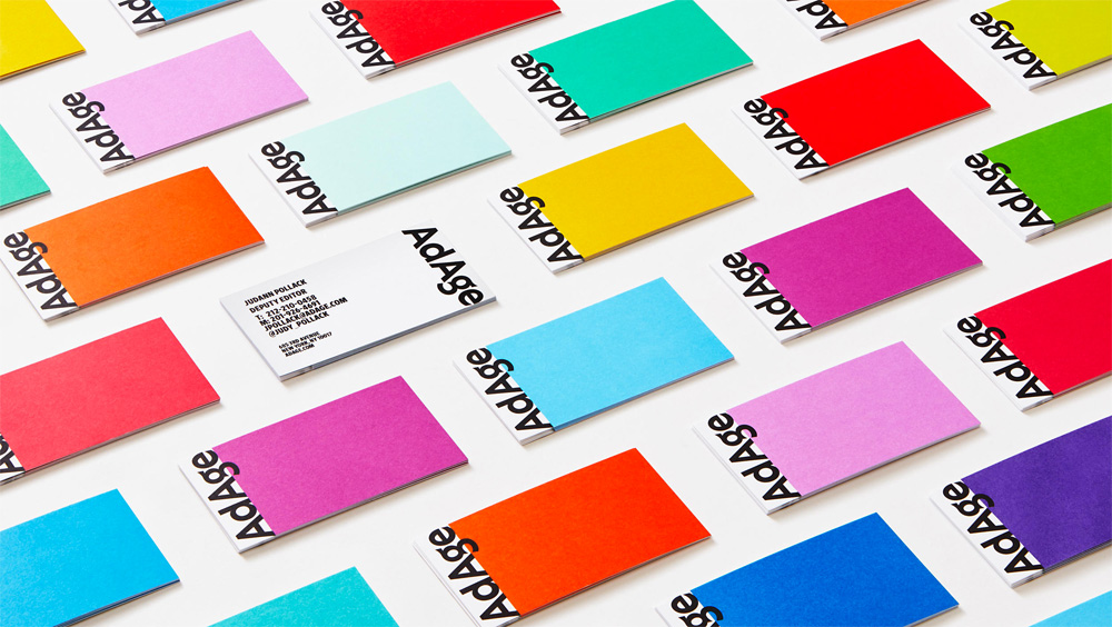
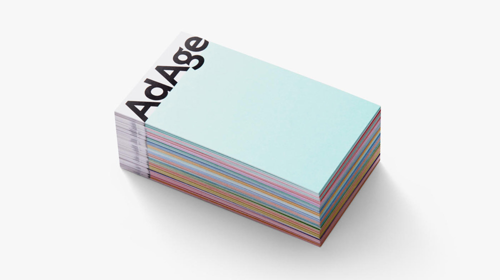
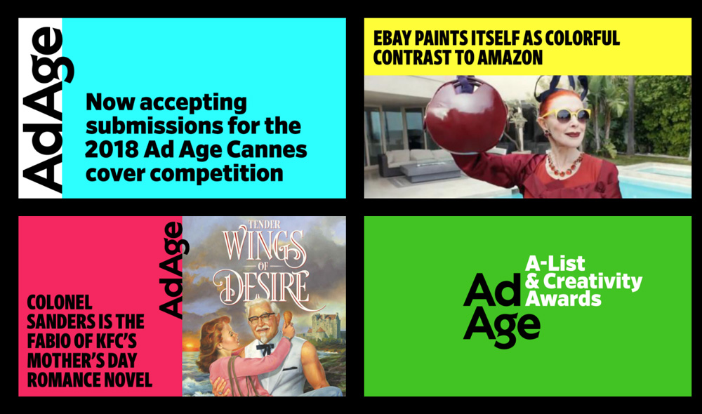
The identity is based on a system of colorful and bold stripes with the logo sitting prominently on the top or the side along with a solid use of clear and bold typography, giving it flexibility to adapt to banners, newsletters, social media posts, and more.
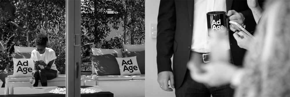
Oddly, I really want one of those pillows.
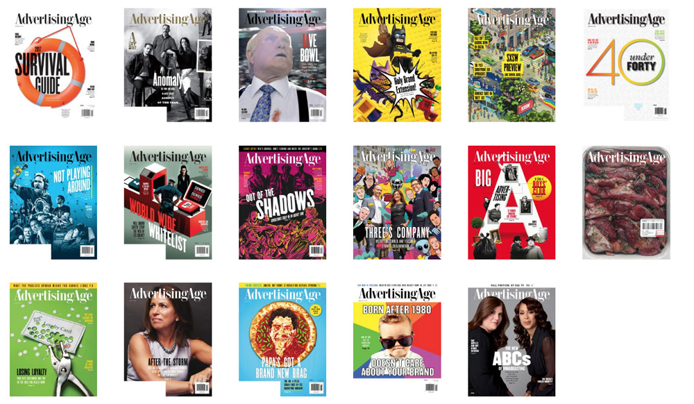
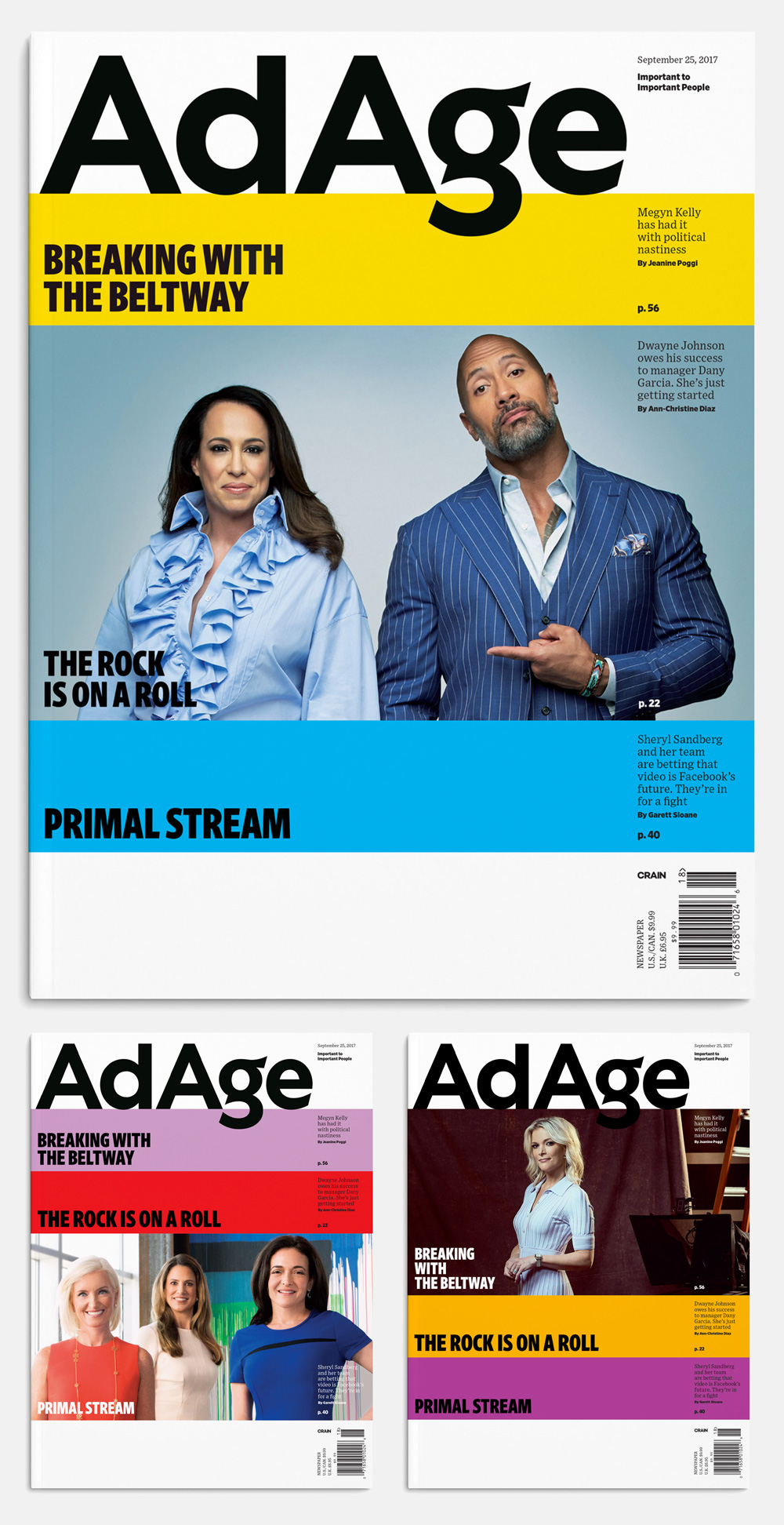
The magazine is a major improvement with the covers having a really bold presence and now that the logo isn’t 5 miles long, “AdAge” sits big and proud at the top. The story callouts on the cover are nicely handled inside the color bars and the serif, Exchange, adds a great touch of classiness. Overall, this is a very positive evolution that breathes new life into what looked like a really tired, out of touch brand.

 Новости Союза дизайнеров
Все о дизайне в Санкт-Петербурге.
Новости Союза дизайнеров
Все о дизайне в Санкт-Петербурге.