Обзор лучших ресурсов по разработке бренда, разработке упаковки
contact us | ok@ohmycode.ru
contact us | ok@ohmycode.ru
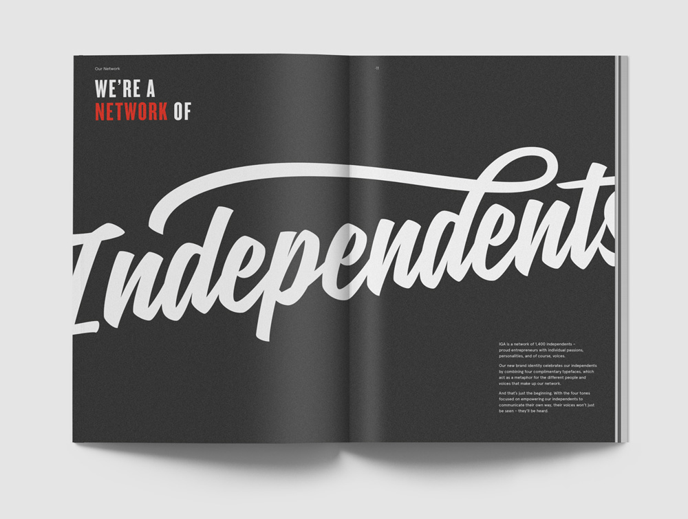
Established in 1988, Independent Grocers of Australia (IGA) is a chain of supermarkets in Australia that in contrast to regular supermarket chains — and in particular to local competitors Woolworth and Coles — all stores are independently owned and completely different from each other, with each store setting their own prices, promos, and range of products. Owned by Metcash, an Australian grocery distributor, IGA has over 1,400 locations across Australia and is part of American-based Independent Grocers Association (with the same IGA acronym and same logo) that has over 5,000 stores in over 30 countries. Recently, IGA (the Australia one) introduced a new identity designed by the Sydney office of Interbrand.
While customers can walk into any Woolies in Australia and expect it to be just like all the others, every IGA has the freedom to choose its own products, prices and ways of doing things.
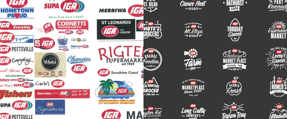
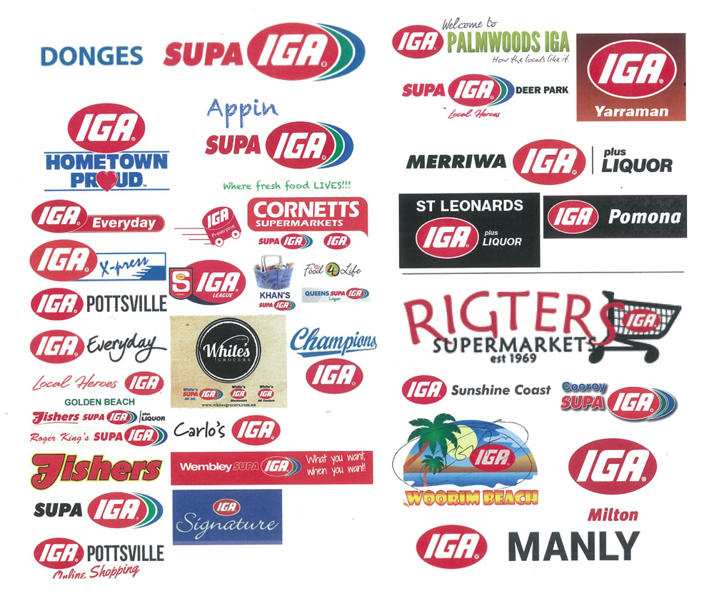
Put simply, no two IGA’s are the same. And in an industry that’s focusing more on convenience, price and consistency than ever, that disparity poses a problem.
The temptation was to scrap it all; the local promos, one-off oyster bars, and seemingly infinite variations of the IGA logo. But there was something undeniably charming in it. The locals loved the promos. Brett’s customers loved their oysters. And despite a combined century’s worth of branding experience, we started to love all those logos. IGA didn’t need less of what made it different. It needed more.
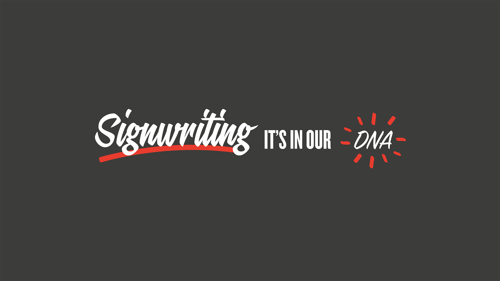
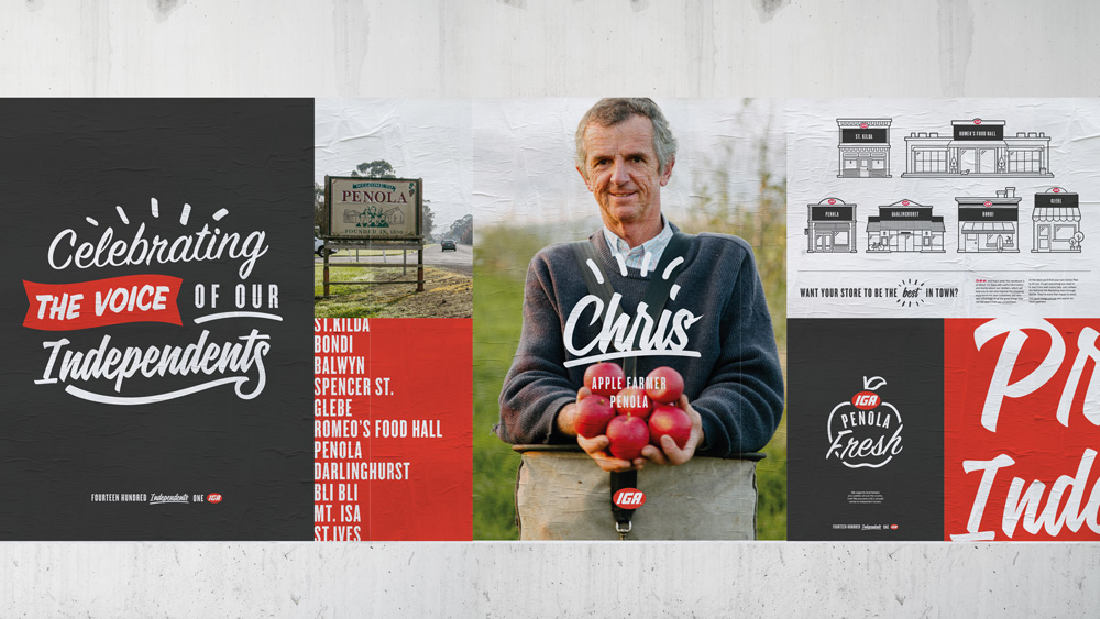
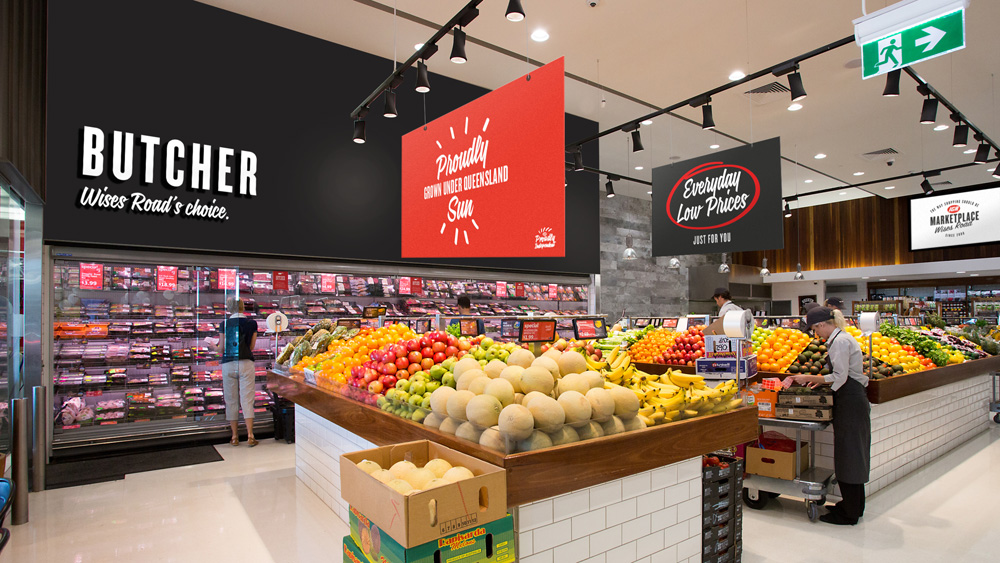
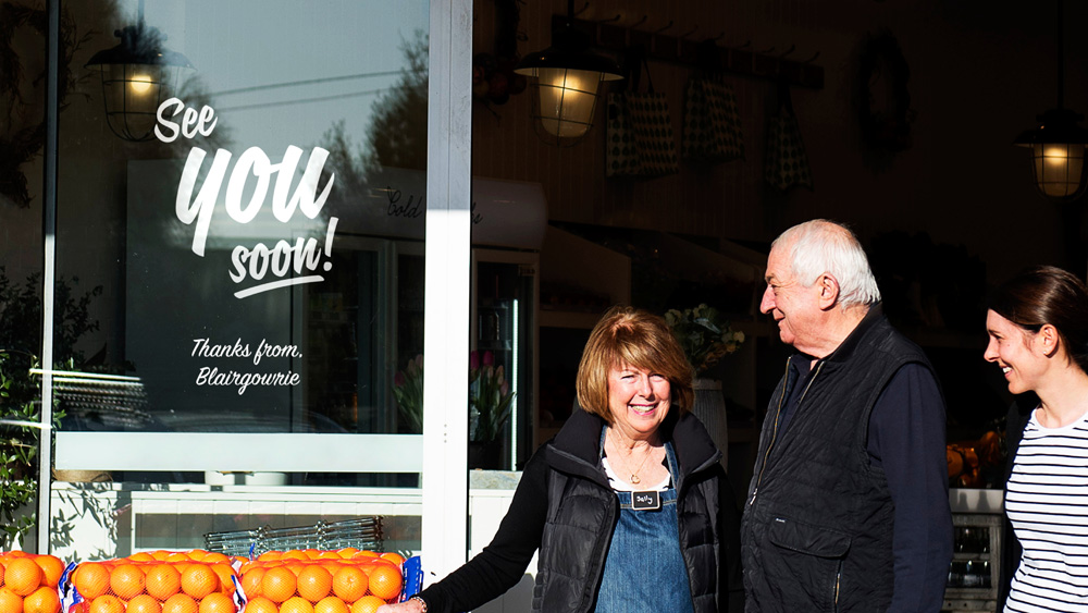
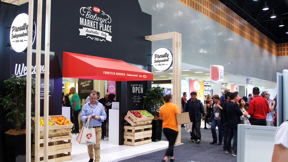
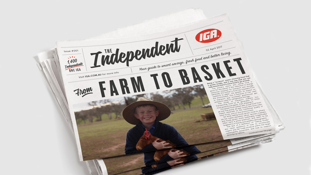
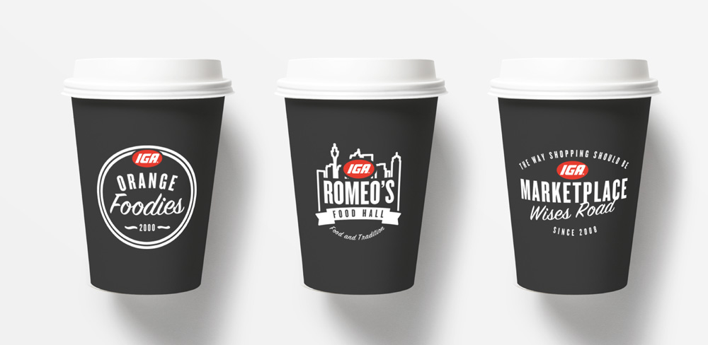
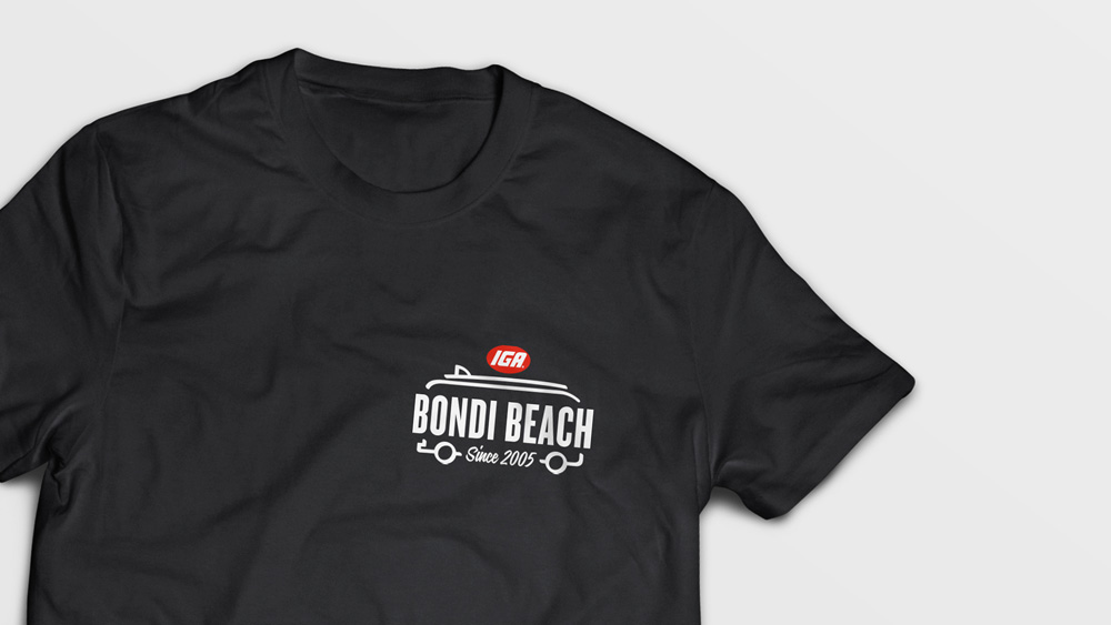
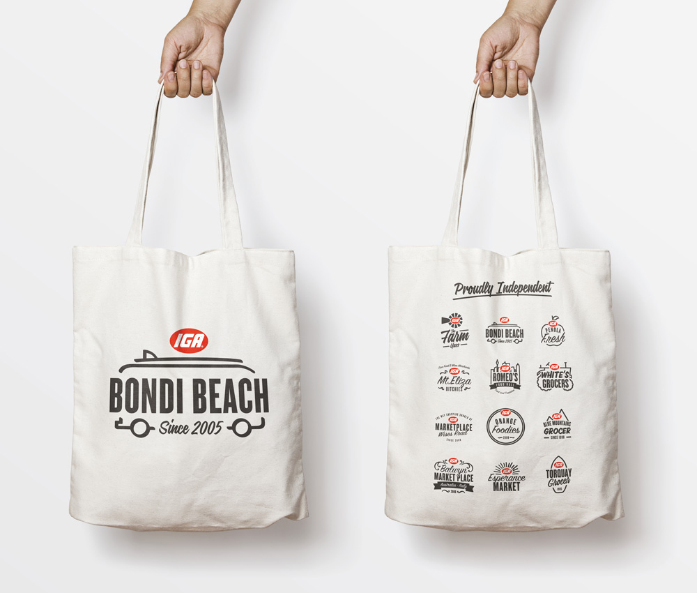
Based on signwriting - the warm, personal, hand-crafted art form that’s been part of local store DNA from the very beginning - the identity represents IGA’s mission to bring the heart and soul back into grocery shopping. The typeface is supported by an illustration toolkit. Adaptable and accessible, it empowers every store owner to create their own designs, messages and yes, even logos, without making the IGA brand suffer.
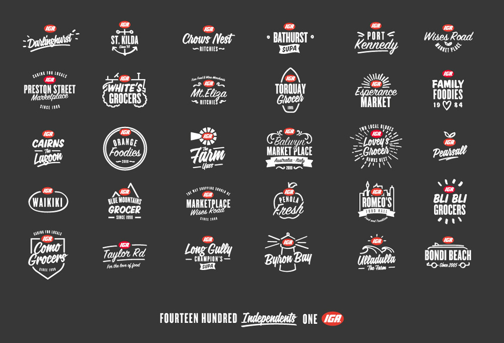
It does not take a logo connoisseur to realize the dire situation that the old logos found themselves in, each more impossibly garish than the next. What they lacked in sophistication, though, they made up in charm; I mean… that “Woorim Beach” one? Get me a heather gray t-shirt in L with it on it, please. But I digress. The new logos do a great job in maintaining the charm of individual and expressive logos while establishing both a highly flexible and graphically consistent system that gives the each store a continued sense of independence and of ownership in how their store presents itself. It will be interesting to see what happens when the other 1,370 stores make their own logos (vs. the 30 shown in this post that) but there definitely seems to be a playful system in place that will keep things neat and attractive. I especially like that the “clear space” around the IGA logo is none and that you can draw leafs, mountains, and tractors around, under, and above it.
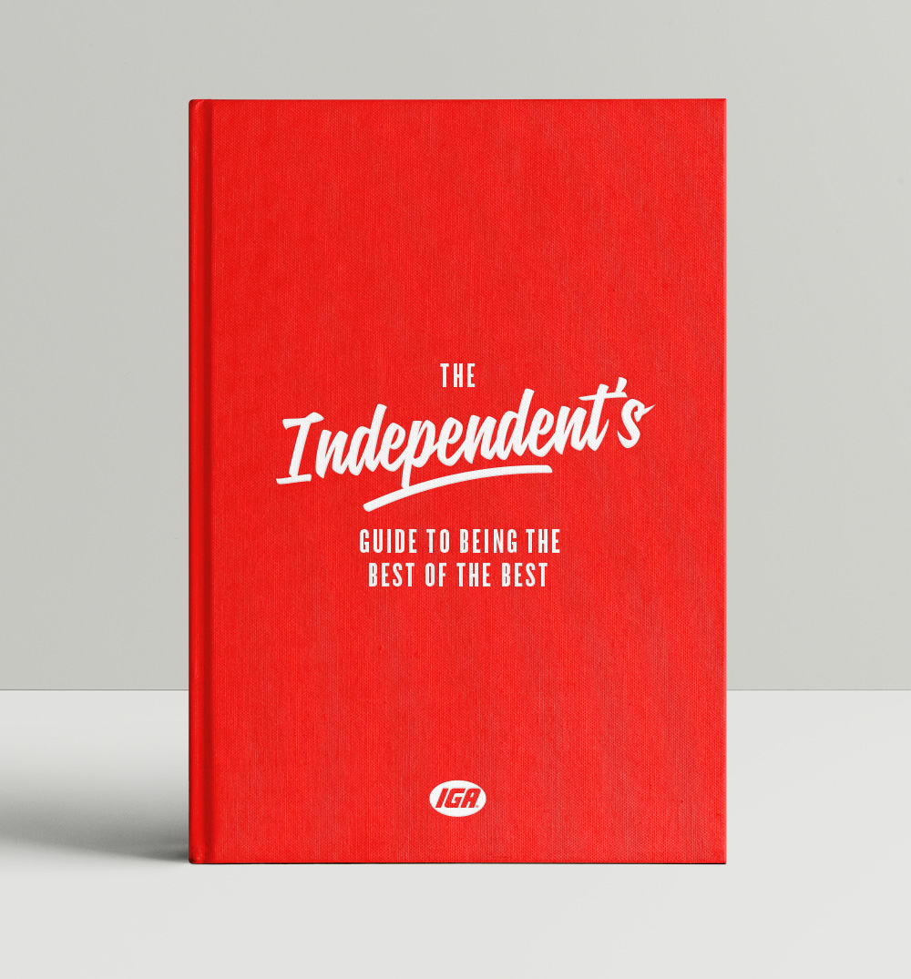
Of course, logos can’t stock the shelves for you - no matter how many you have. The most rewarding part of the project was working with the store owners themselves, helping them find new and meaningful ways to improve the experience for their customers. Thankfully inspiration wasn’t hard to find - IGA’s best and brightest offered enough tips to fill a book. So… we did. Now, every IGA has the platform - and the playbook - to be the best store in town.
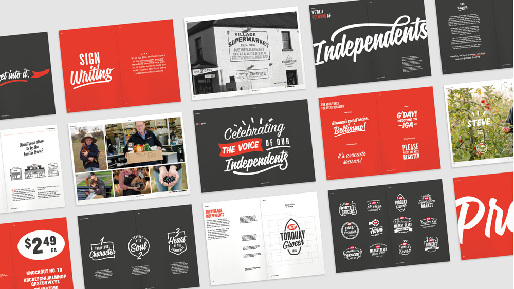
The visual (and philosophical to a degree) toolkit that relies on sign painting and its inherent warmth and individuality set a great tone for IGA and it does it in a way that is fairly simple and straightforward so that any store can apply it successfully.

We’ve seen the combination of scripts and a condensed sans serif a hundred times over so that may not seem as original but as a system to deploy independently it will provide ease of use and yield consistent results that will look great for as many stores as possible as they keep fighting the good fight of staying independent as conglomerates get more conglomerate-y every day.

 Новости Союза дизайнеров
Все о дизайне в Санкт-Петербурге.
Новости Союза дизайнеров
Все о дизайне в Санкт-Петербурге.