Обзор лучших ресурсов по разработке бренда, разработке упаковки
contact us | ok@ohmycode.ru
contact us | ok@ohmycode.ru
Established in 1850, American Express is a global services company that provides payment, travel, and expense management solutions for individuals and businesses of all sizes. In numbers, American Express, covers “more than 112 million business and consumer Card Members, 18 million American Express accepting merchants, hundreds of acquirers and 120 bank partners that connect through the American Express Network globally across 130 countries,” making it the the world’s largest card issuer by purchase volume and, perhaps not as well known, it’s also one of the world’s largest travel networks. Yesterday, American Express introduced a new identity designed by New York, NY-based Pentagram partner Abbott Miller.
The identity redesign is part of a new global brand platform — called “Powerful Backing: Don’t Do Business / Don’t Live Life Without It.” — that also includes an advertising campaign by mcgarrybowen, shown at the end of the post.
Pentagram has refreshed the American Express visual identity, reasserting and amplifying the brand’s visual expression. The project sought to retool the iconic Blue Box logo, introduced in 1975, and to derive a typographic language that could also live outside the Blue Box, providing a bolder, more confident expression of the brand. The work was initiated as part of a larger communications project that highlights Amex as a diverse business and essential part of consumers’ lives.
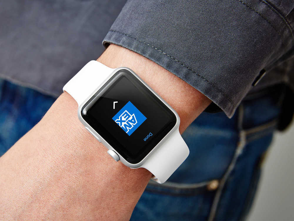
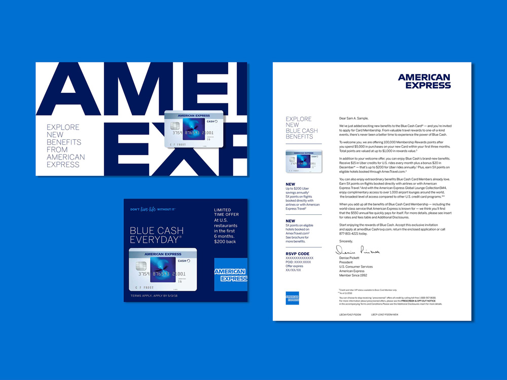
The identity preserves and enhances the iconic Blue Box logo, immediately recognizable as American Express. The composition of the Blue Box has been kept in place: two bars of outline lettering crossing through the center of a blue square. The designers redrew the letterforms and finessed the details of the inherently complex logotype, to render it in a bold, clear way that functions at both a large and small scale. The update also introduces an alternate logo for small-space digital use, such as Twitter and Instagram icons. This version of the Blue Box crops the larger wordmark to capture the “AM EX.”
In principle (or in concept or at first glance), old and new logos are the same — much like what we’ve seen with recent redesigns like Lufthansa, Ericsson, and ALDO — with minor but significant design changes, most of them done for performance purposes. The old logo was a remarkable 43 years old so it’s surprising it has held this well for so many years. I doubt the gradient was introduced back then but it’s a good thing that it’s one of the first elements that has gone away in the new logo as it only added visual noise to an already busy logo. Beyond that, the changes do require some zooming in and special attention but they are all equally beneficial. The “R” has been given a more dramatic, angled leg instead of the droopier, Helvetica-esque “R”. The “S”s now have a cut on their top ending to help them feel less boxy. The “CA” and “EX” pairs have been separated for better readability. And, among a few other changes, the white outline around the type has been cleaned up for a less bumpy contour. All the changes are beneficial and create a crisper logo.
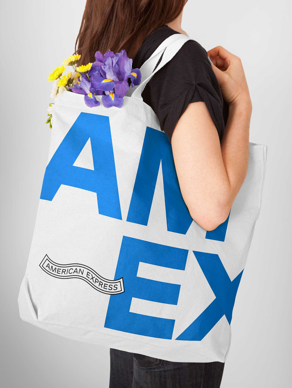
The newest, most significant contribution (in my mind) to the identity is the introduction of the alternate logo that only reads “AMEX”, a well-known and often-used shorthand for “American Express”. I really appreciate how this new logo is derived from the main one, retaining the key graphic differentiators (blue square, angled type, white outline) and staying undeniably recognizable as American Express. I love this version and I think it has the potential to become the de facto logo that people will come to associate with American Express in a few years’ time.
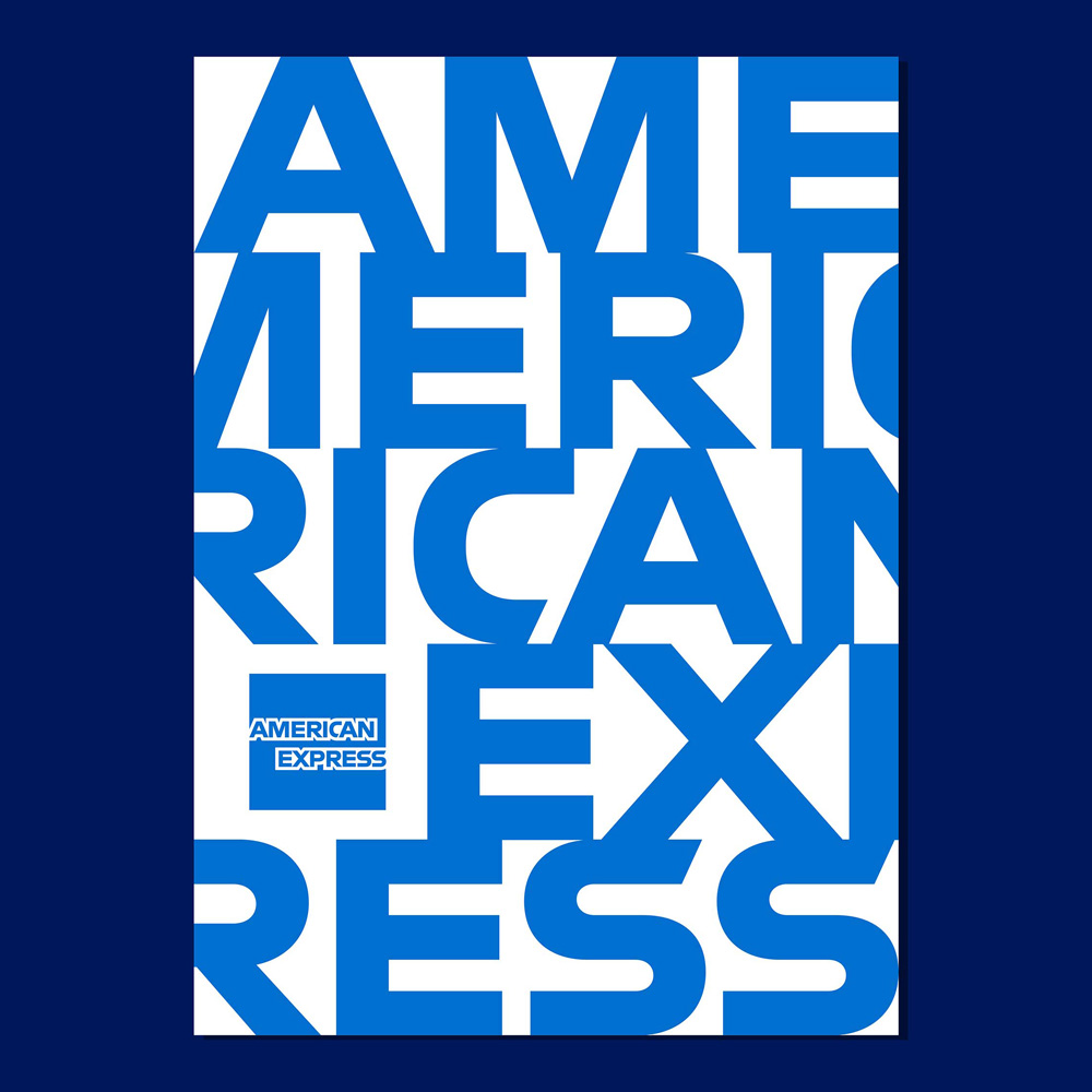
The classic outlined lettering of the Blue Box logo was redrawn with a non-outline version that operates outside the box. Working with the type designer Jeremy Mickel, the team developed lettering that was faithful to the spirit of the original logo. The logotype has single-line and stacked versions, custom drawn in various scales for visual continuity and legibility at different scales.
The standalone wordmark looks quite great too, although it makes that “CA” pair stand out more than it should, revealing its slight awkwardness.
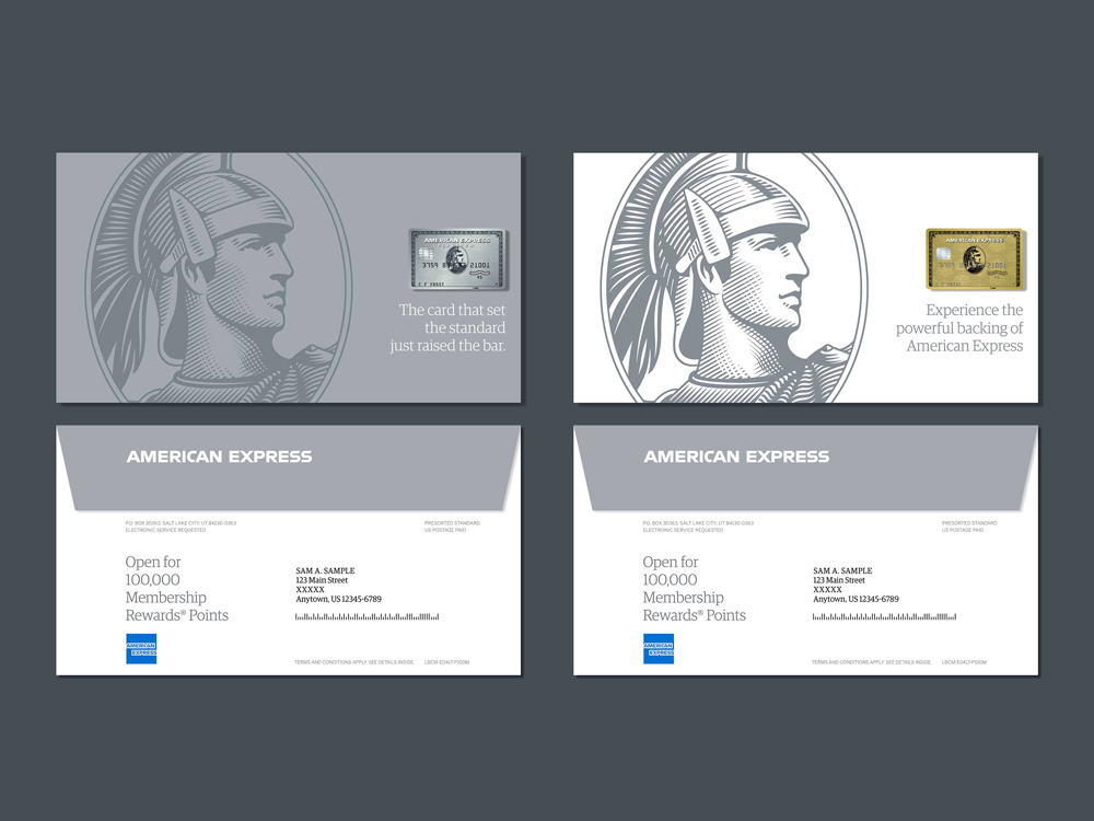
The visual identity celebrates the remarkable design heritage of American Express in a smart and stylish way, building on an extraordinary 168 years of brand equity and iconography. The new brand platform has maintained and magnified its unusually rich collection of brand elements, including its distinctive Centurion and World Service pattern.


Not much to say about this guy other than he looks sharp. Major bonus points for NOT inverting the Centurion mark but actually making a proper adjustment for it to work on dark backgrounds (see below).
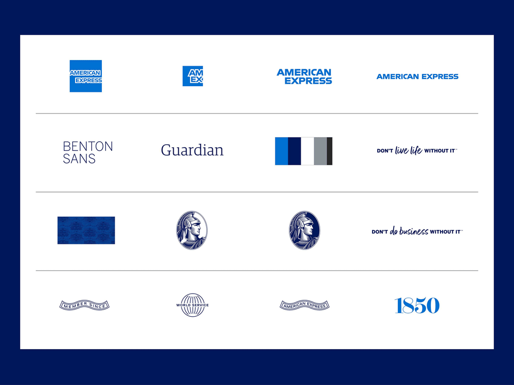
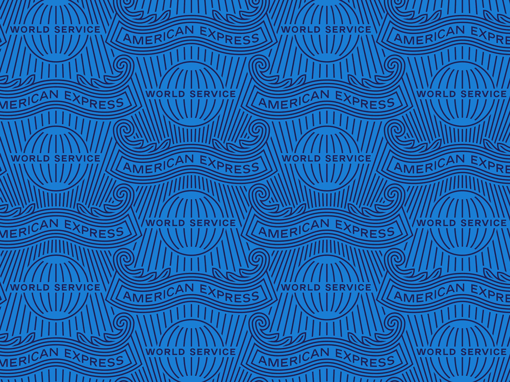
Looking at the chart of identity elements, there is a great balance of vintage and contemporary aesthetics that help convey the long history of the company while making it feel like they are a key part of today’s world. Perhaps that’s too rhapsodizing but I do like that chart. Although I like the “World Service” pattern more! I have always been a fan of it and now it looks a little bit more sharp and the tone on tone application is great.
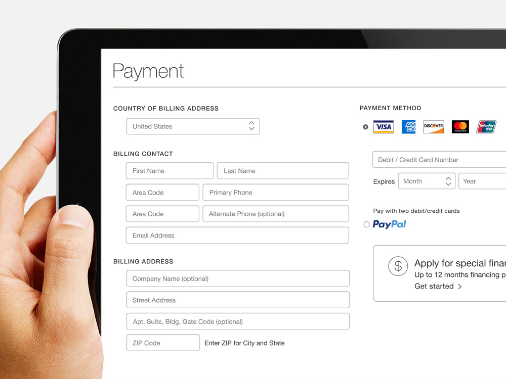
To me, the image directly above is one of the most significant demonstrations of the effectiveness of the redesign and in particular of the alternate logo. Usually, in most checkout pages, the American Express logo is shrunk down to unreadable levels as a payment option next to the much more visible VISA and Mastercard logos. Now, with the “AMEX” version, the blue square remains the key distinction as it always has but consumers will actually get to read it, further entrenching the American Express name. In the image below, I would also love to see the AMEX version, as it would eclipse all the other logos in terms of recognizability… it could even be a case of Pentagram out-Pentagram-ing Pentagram with the AMEX logo being more visible than Michael Bierut’s Mastercard redesign. Winky emoji.

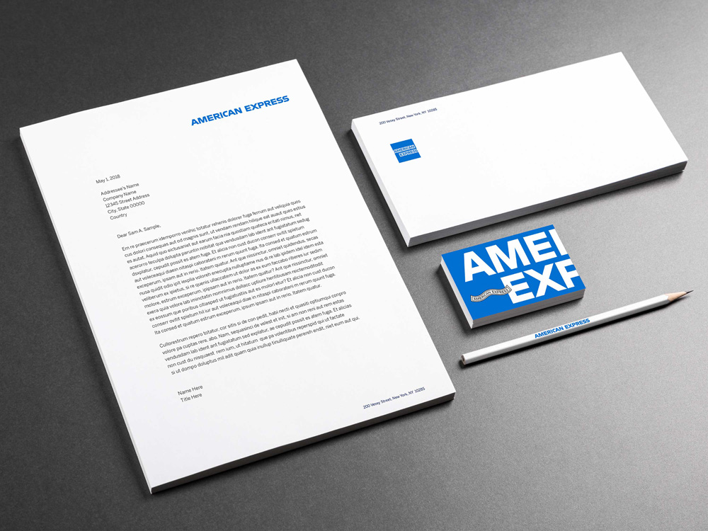

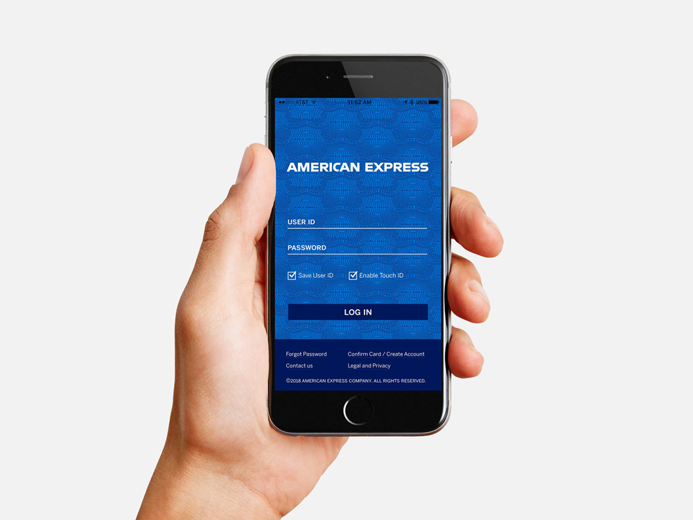
The identity applications are bold and striking, making good use of all the elements in different ways and combinations. The introduction of the dark blue is quite nice as well.
Today, American Express unveiled a new global brand platform and marketing campaign that reflects how people live and work today, called “Powerful Backing: Don’t Do Business / Don’t Live Life Without It.” The campaign celebrates the new reality that life and business are increasingly interconnected, and the unique role American Express can have in supporting people today.
The brand platform and TV spots by mcgarrybowen are slightly confusing — not in message but in their writing. It’s too much wordplay in a way that isn’t immediately clear or endearing, even becoming annoying in the 1-minute ad, like, just spill it out and tell me to get an American Express card, I’ll do it just to get you to stop turning sentences around. Even trying to unpack the brand platform is awkward, “Powerful Backing: Don’t Do Business / Don’t Live Life Without It“… so don’t do what without what? But, if you go back to the identity elements chart, I do like how they have visually manifested this with the handwritten font and it works best when separated into two sentences. I kind of also like the feel of the ads with this treatment although, again, some of the sentences are just painful to read, even if I try to allow myself to be less grammatically retentive.
Overall, and back to the identity, this is a great redesign that maintains the core recognizable elements of the brand and expands on them to offer a more cohesive and attractive brand that extends nicely and effectively across American Express’ myriad services and touchpoints.

 Новости Союза дизайнеров
Все о дизайне в Санкт-Петербурге.
Новости Союза дизайнеров
Все о дизайне в Санкт-Петербурге.