Обзор лучших ресурсов по разработке бренда, разработке упаковки
contact us | ok@ohmycode.ru
contact us | ok@ohmycode.ru
Established in 1912, the Ekaterinburg Opera and Ballet Theatre, recently renamed Ural Opera Ballet, is one of the oldest opera theaters in Russia, located in Ekaterinburg, the fourth-largest city in the country. Named after the Ural Mountains (which lie West of the city) the Ural Opera Ballet is housed in an ornate baroque theatre and, as its name implies, presents both opera and ballet productions, focusing on global and local classics like La Boheme, Carmen, and Madama Butterfly, Giselle, Swan Lake, and The Nutcracker. The new identity for the new name has been designed by local firm Voskhod.
A new identity was necessary for repositioning the theater as a successful modern cultural institution that shapes the trends of opera and ballet art not only in Russia but throughout the world. We were inspired by bright performances and the history of the theater, located in the heart of the Ural industrial region. Expression of theatrical performances was reflected in a dynamic sign imitating dance movements, sound and light vibrations.

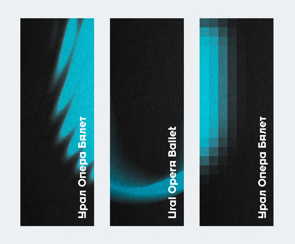
The old logo was what you would expect from an old theater, with its stately typography and a literal depiction of its building. Other than the tiny ornaments it was fine — boring but fine. The new logo is a major, drastic departure that undeniably signals that this isn’t your parents’ or your parents’ parents’ ballet and opera anymore. The logo has two contrasting elements, an industrial-looking wordmark and a soft “U” monogram with implied motion. It’s a strange combination and the wordmark could have probably been a lot tamer to allow the “U” — which is more interesting and attractive — to be the (un)focus of attention. The flip side to that argument is that the odd wordmark is part of what makes the identity feel more avant garde.
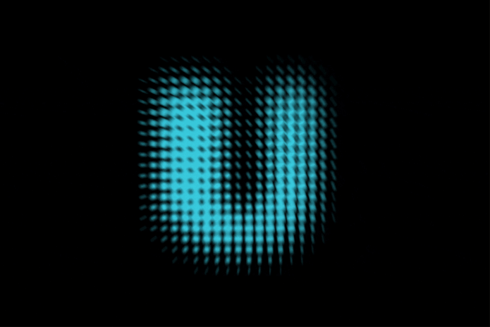
I really like the “U”s, both in static and animated forms. Obviously, they come alive in motion and with music, but I think the static logo manages to convey a similar energy. The wordmark, if we accept that that’s the way to go, is sort of interesting but not entirely pleasing. The “A” in “Opera” throws me off because it’s the only instance of unicase so I keep wanting to see other characters be uppercase. The combination of rounded and squared-off characters makes for a decent metaphor for the tension experienced in opera and ballet performances.
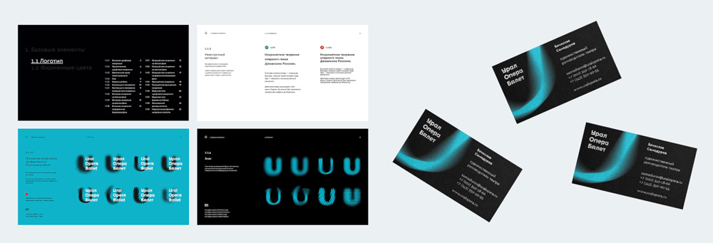
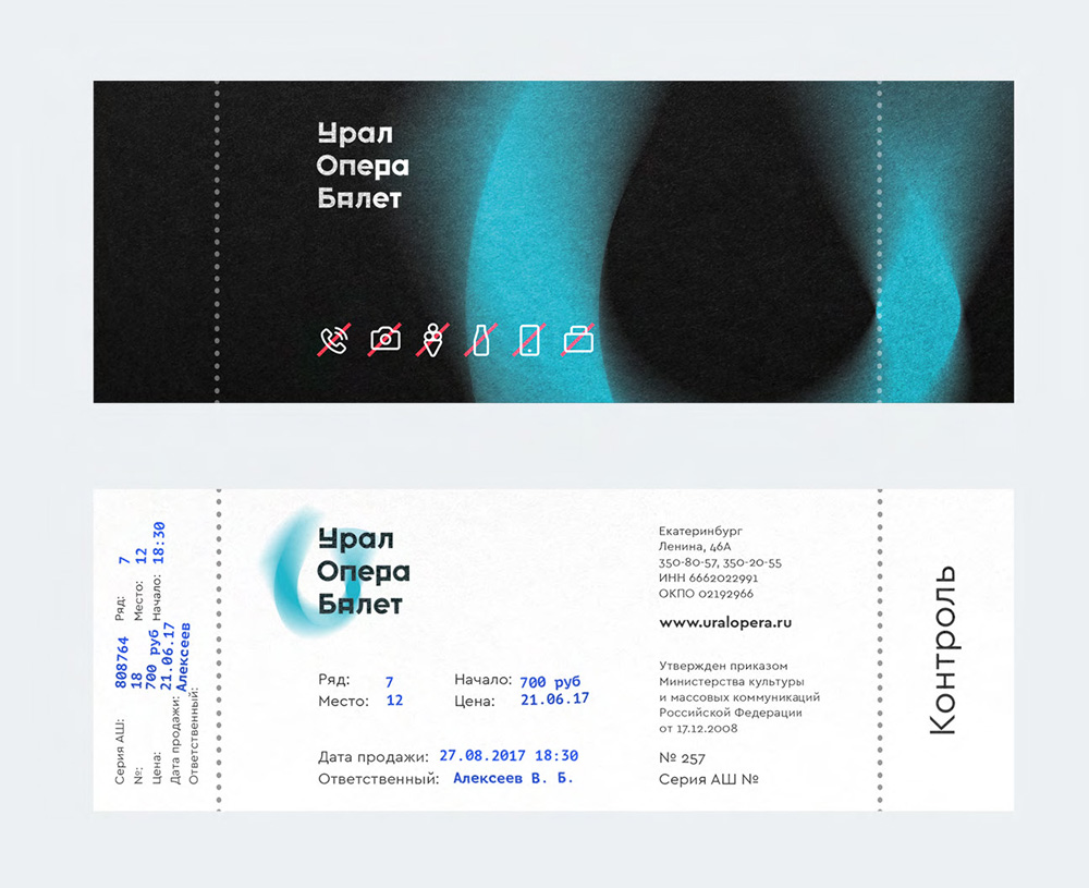
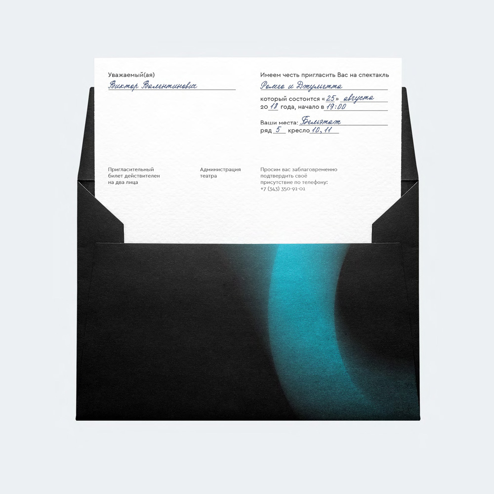
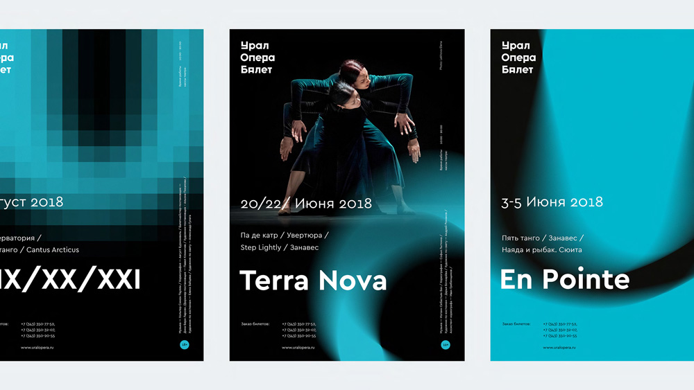
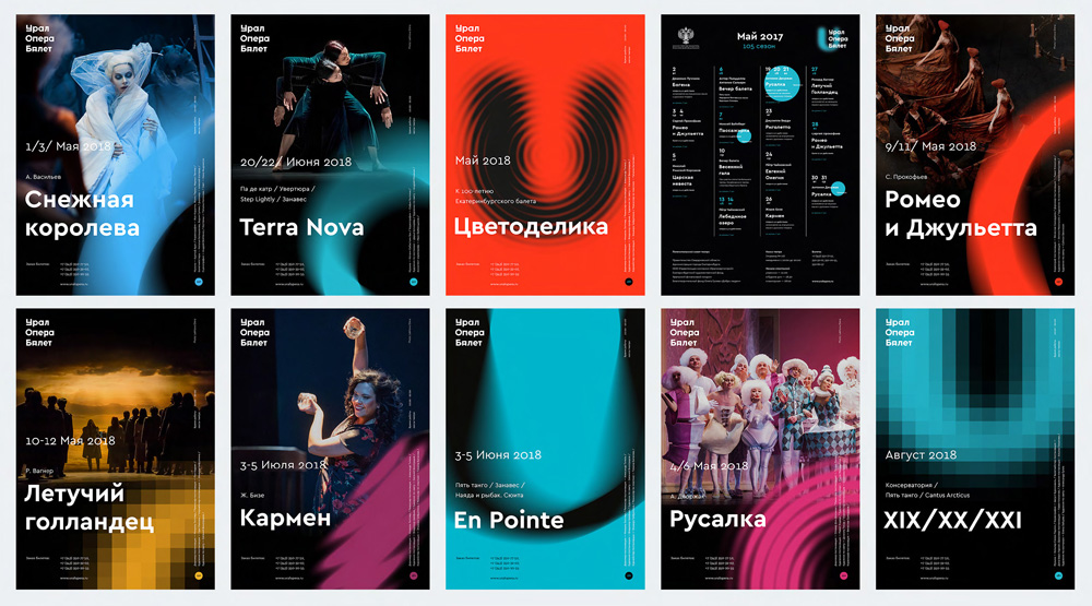
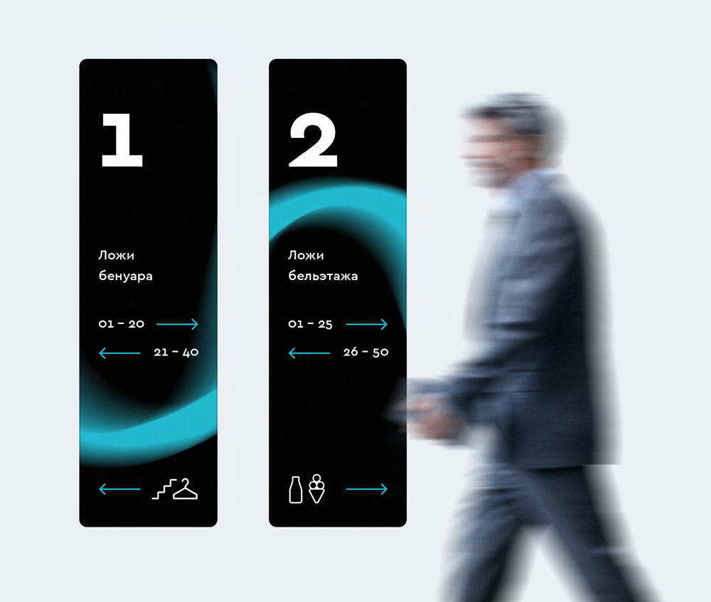
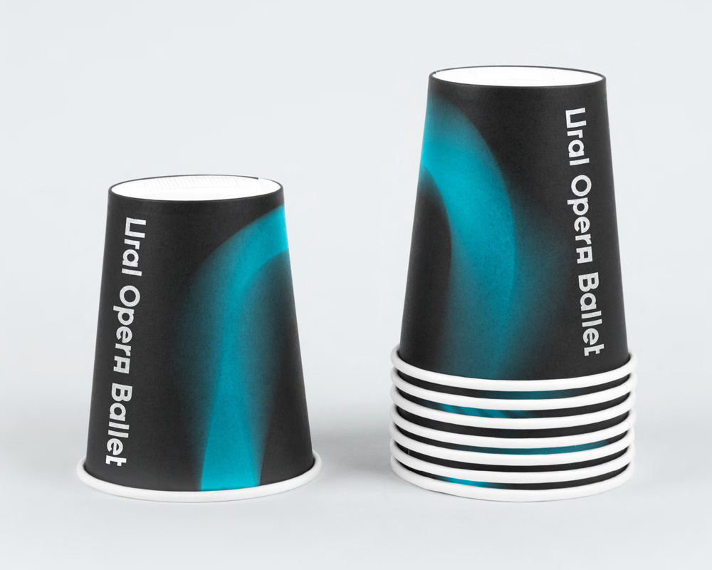
The applications are quite cool with the blurry “U”s going big and bleeding off some of the layouts, laying on top or under content, creating richly layered compositions. With the posters, the only thing I would question is that maybe they lack a clear “This is Ural Opera Ballet!” statement since the “U”s are so different and would not necessarily be seen as all being part of the same thing. But with paper cups like the ones you’ll see below, all is forgiven.

Overall, this is a fun, exciting, and daring but-not-alienating identity that makes a bold statement about the new name of the organization.

 Новости Союза дизайнеров
Все о дизайне в Санкт-Петербурге.
Новости Союза дизайнеров
Все о дизайне в Санкт-Петербурге.