Обзор лучших ресурсов по разработке бренда, разработке упаковки
contact us | ok@ohmycode.ru
contact us | ok@ohmycode.ru
First brewed in 1876, Budweiser is one of the best-selling beers in the United States and probably one of the most recognized beers here and abroad. Budweiser is the flagship brand of Anheuser-Busch, that reportedly holds a 48.3 percent share of U.S. beer sales to retailers. (If this intro sounds familiar, since you remember every single paragraph I write, it’s recycled from this 2011 post, the last time Budweiser made a significant design change.) Set to be fully implemented by end of February, Budweiser began rolling out a new look in September, designed by Jones Knowles Ritchie (jkr), the same firm that designed the last version and the recently reviewed Bud Light. Typographic details by Toronto-based Ian Brignell.
Both AdWeek and DesignWeek have stories worth reading with some commentary from jkr.
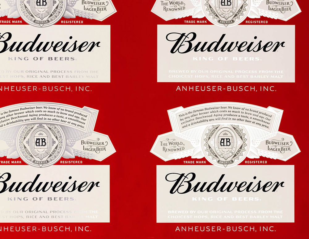
As has been the case with most big brands, Budweiser has stripped back all unnecessary decorations and finishes off of the logo. In this case, the process reveals an elegant and classic script wordmark that looks far better than it has in decades. The letters look so crisp and curvaceous with the “B” now standing out beautifully instead of being jammed into the bow tie shape, which also looks remarkably good as a single-line stroke. From here, things just get better.
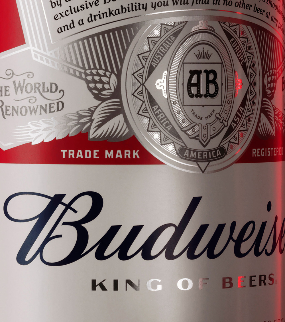
“Budweiser as a beer is one of the hardest to brew,” says Hall. “It takes roughly 30 days. We wanted to apply the same effort to design principles as to brewing. So we spent twice as long, drawing every piece of type and vector art by hand, such as the medallion, leaves, grains and hops. We put effort into caring about every last detail.”
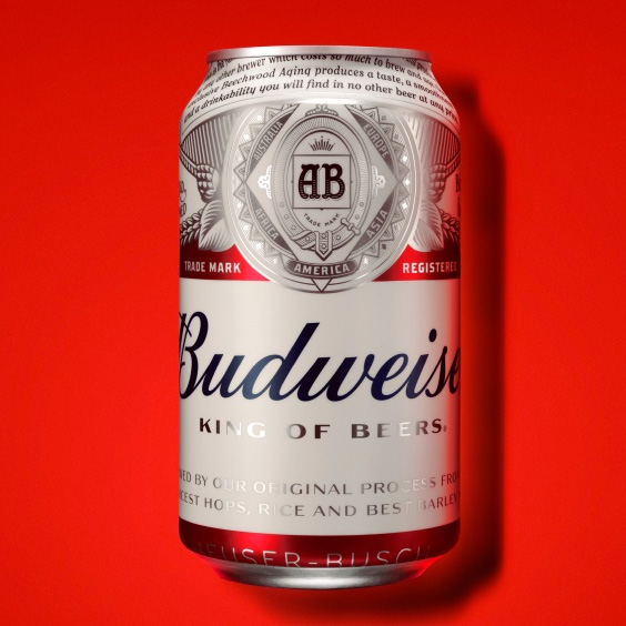
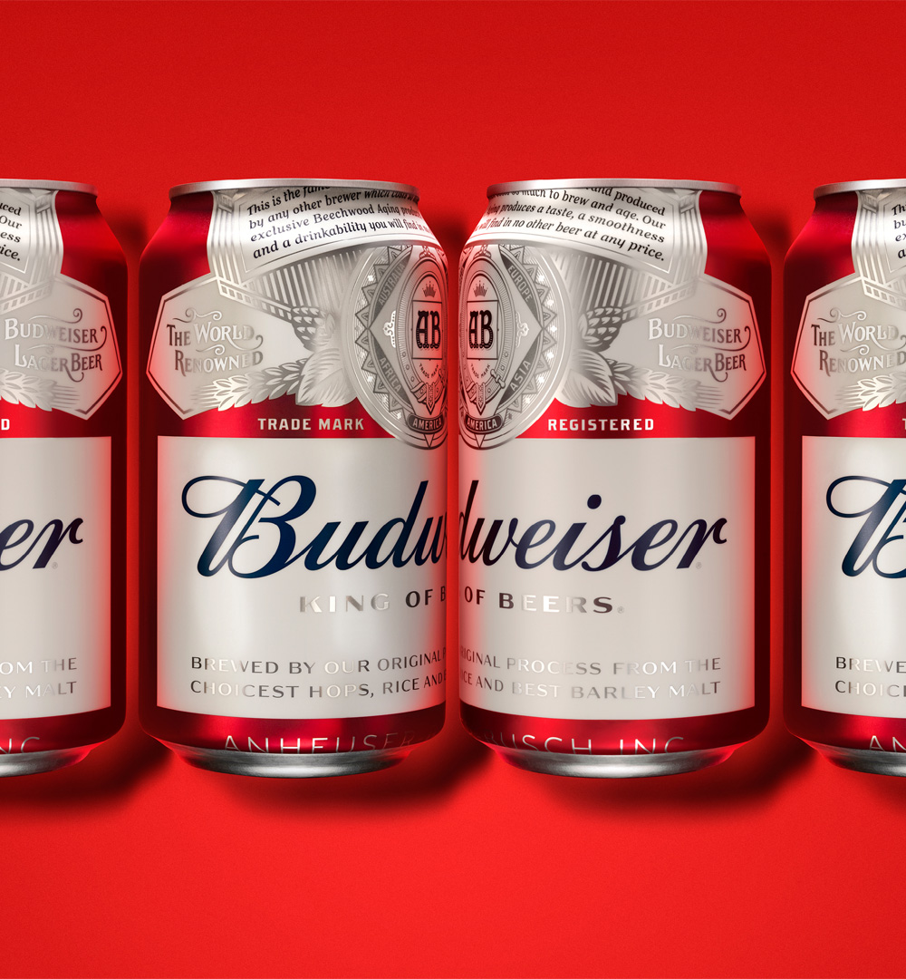
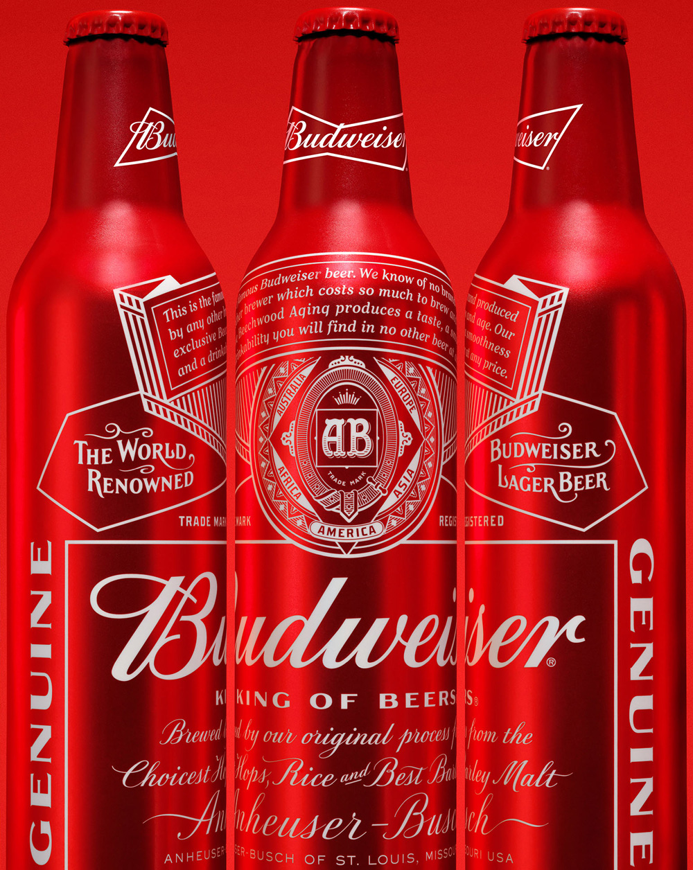
The can redesigns had gotten a fairly decent reception in 2011 and, in a way, it aimed for some of the same goals as does the new one, but it still suffered from too much designing. The new can establishes consistency with Bud Light by having the seal and legend tightly cropped on the top of the can and in this can it might even look better than it did for Bud Light (which already looked hot). The logo spans wide beyond the visible edges of the can, which is really rare as I’m sure most can-clients want everything to be visible inside the can. The logo has so much space that you could put a bunch of those Clydesdale horses to pasture around it. The “King of Beers” tagline has changed from the overused Bank Gothic to something custom and glorious. The combination of elements, the spacing, the muted colors, it’s all just absolutely great.
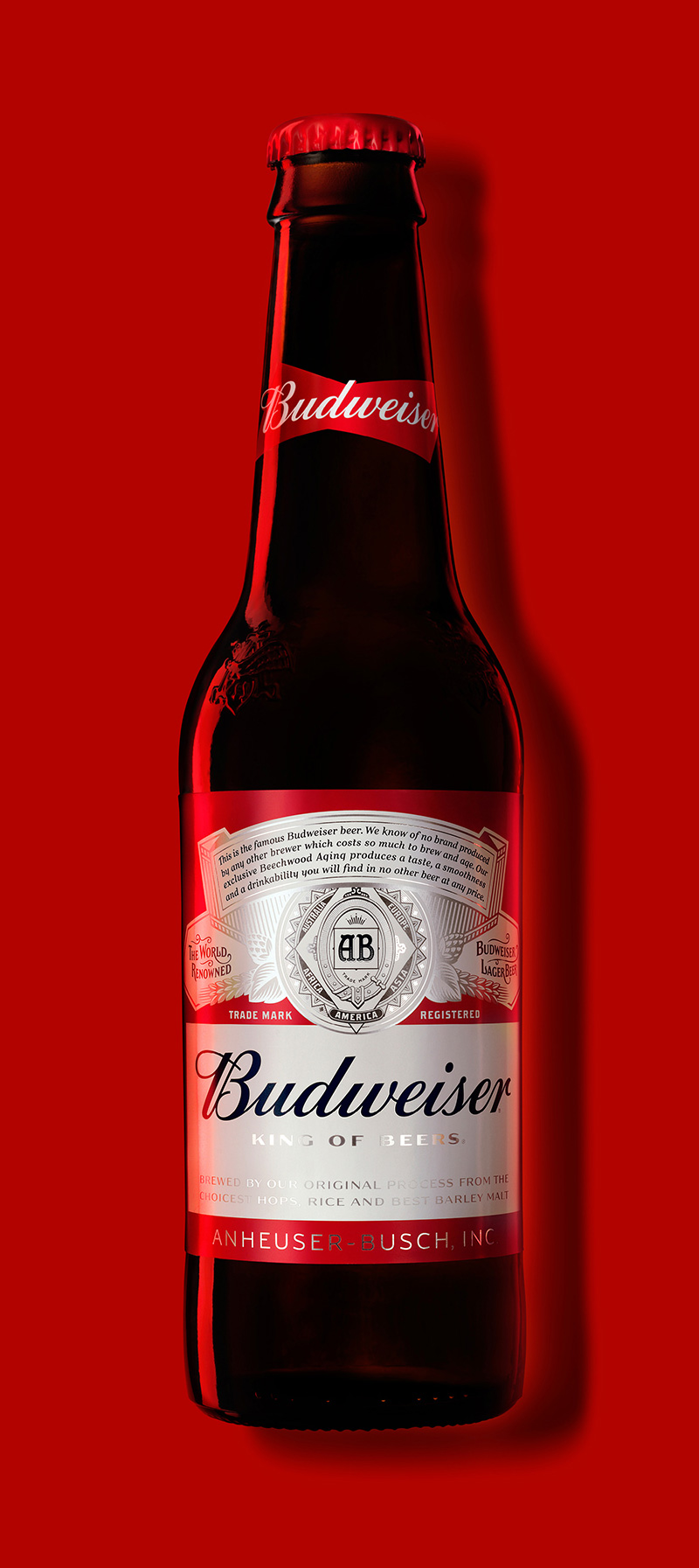
Interestingly, on the bottles, the same tight cropping and over-sized elements don’t apply. Still, it’s great. Great. Great. Great.
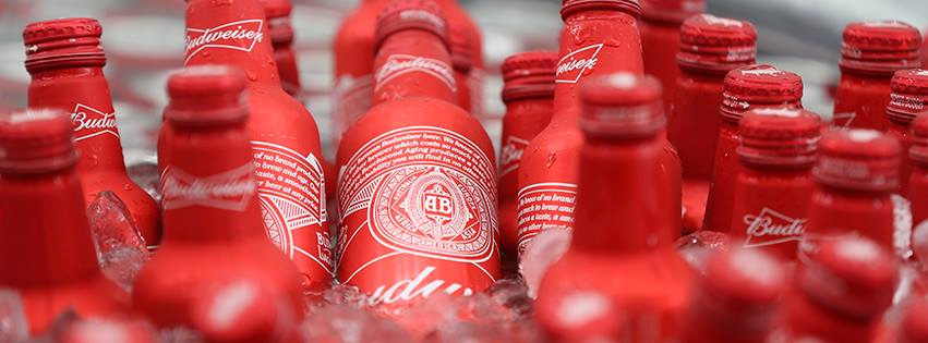
No idea what these are, other than that they look like those metal bottles Coca-Cola released a few years ago that then became all the rage but when things look this good just keep piling on the hero photography. Want more? Yes. There is more.
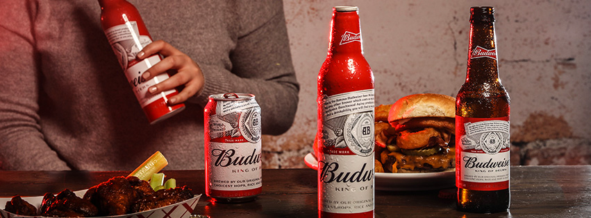
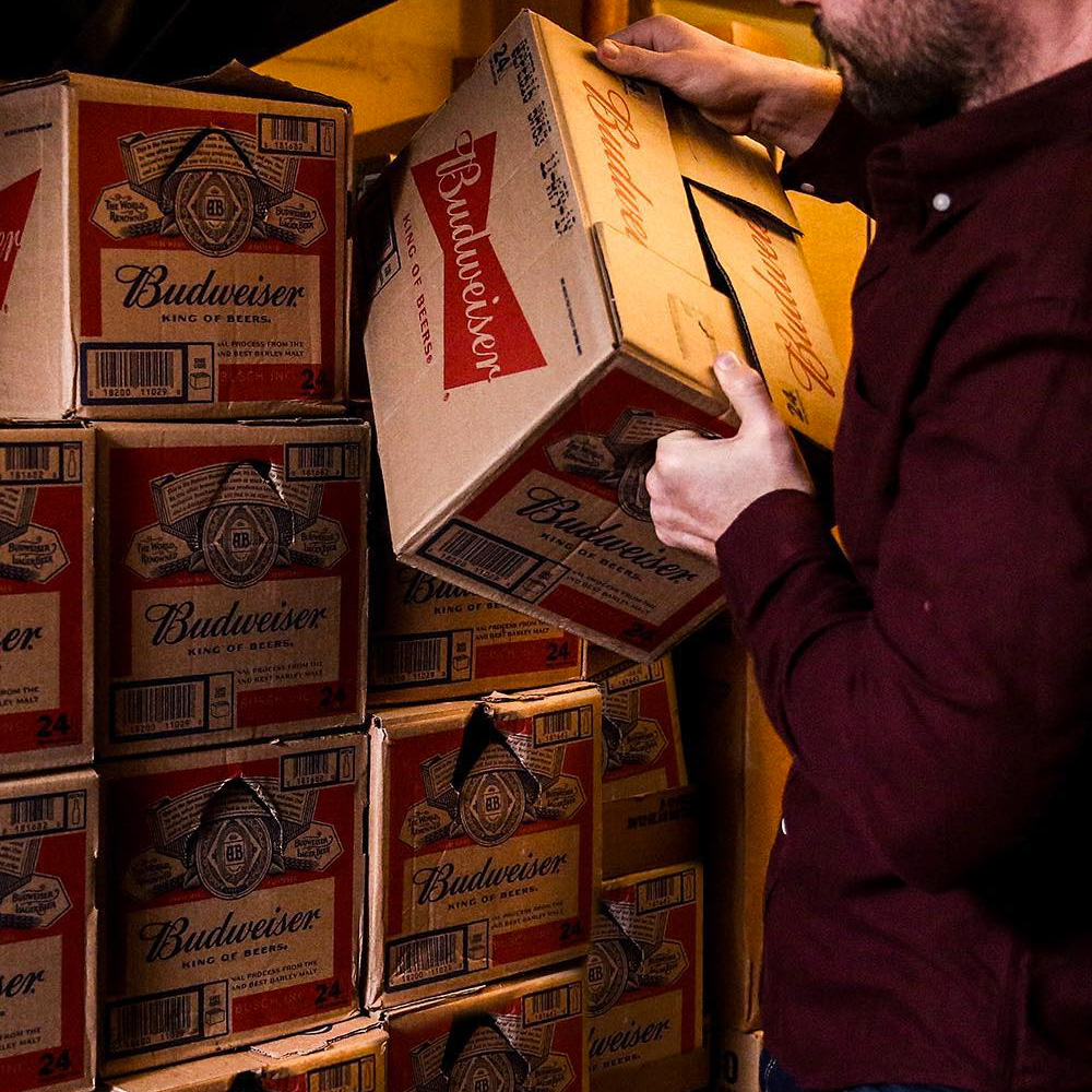
Usually by the time product shots hit the Facebook cover images, things have gone south and don’t look so good, but all of the above are spot on. More you say?
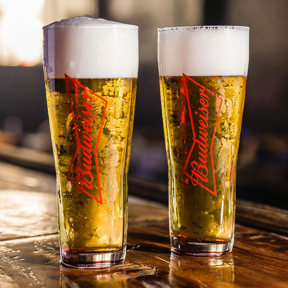
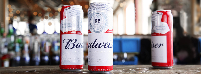
Budweiser’s Instagram account is full of moody bar-based photos showing off the new look and, again, it looks great. I realize I’m starting to sound like a broken record but this is really outstanding work. There is no high-end concept going on and there is no heavy-handed demographic-targeting agenda, it’s simply a commitment to designing the absolute best-looking packaging possible with attention to detail at every turn. No other mass consumer product looks this good and polished on the market right now. Well done, Budweiser, well done.

 Новости Союза дизайнеров
Все о дизайне в Санкт-Петербурге.
Новости Союза дизайнеров
Все о дизайне в Санкт-Петербурге.