Обзор лучших ресурсов по разработке бренда, разработке упаковки
contact us | ok@ohmycode.ru
contact us | ok@ohmycode.ru
Established in 1946, the Montréal Alouettes are a professional football team based in Montréal, Québec, that compete in the East Division of the Canadian Football League (CFL). One of the original teams of the CFL, the Alouettes have folded twice, once in 1981 and rebuilt as the Montreal Concordes (for four years, then returning to the original name), and another time in 1987 not coming back until 1996. Through the ups and downs, the team has won six CFL championships, the last one in 2010. This week, the Alouettes introduced a new identity designed by Québec City, Québec-based GRDN Studio.
“Taking this step goes well beyond a rebranding exercise; we have defined the identity of the entire organization,” said Alouettes President and CEO Patrick Boivin. “This new identity can be summarized in one word: MontreALS. We came to the conclusion that our DNA must reflect Montreal’s DNA even more. We intend on better connecting with Montrealers in different areas that define our city such as music, gastronomy, fashion and culture, among other things.”
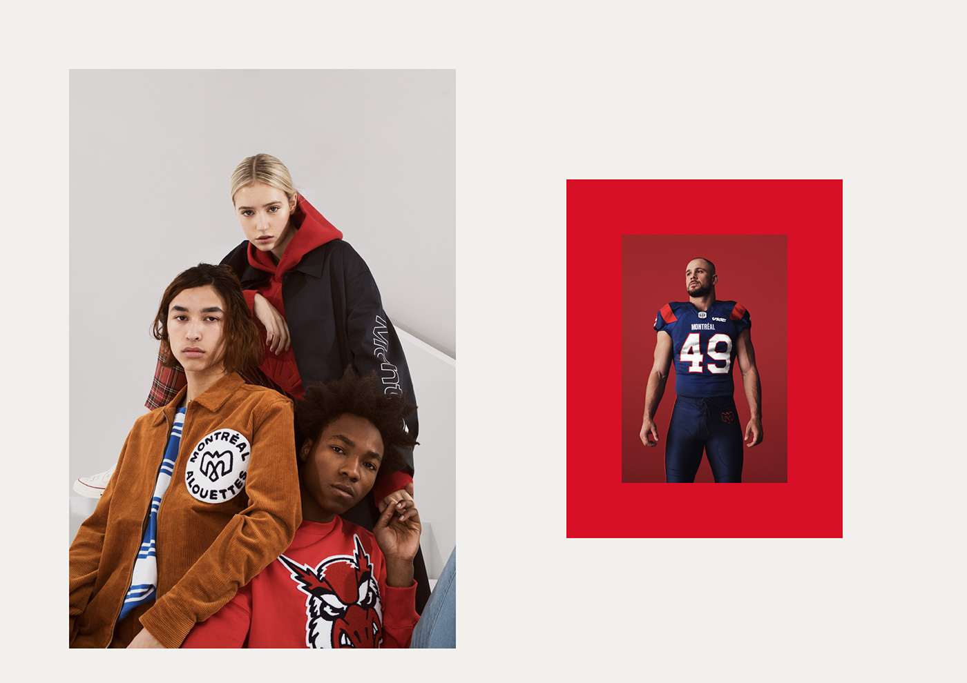
The old logo was pretty bad and looked like a high school team — I do admit that I find it kind of charming (in a funny way) how the legs of the “A” are the legs of the bird as it rushes forward. So, nothing lost in moving away from it. The new logo revolves around an icon that amazingly manages to be an “M”, a plane, a bird, and a nod to the fleur-de-lys all while shoving sport logo conventions to the gutter. If this icon had been designed in the 1950s it would be in the Design Canada movie, which is a way of saying it’s pretty damn great. The wing shapes are perhaps a little exaggerated but it’s a minor quibble as I really like its simplicity, starkness, and how well it works as a stroke-only mark. The type in a circle is okay… it’s a hard, long set of words to kern nicely on a curve — the “ALO” combination is a prime example. The icon also needs to be nudged down a tad so that it’s centered visually not mathematically.
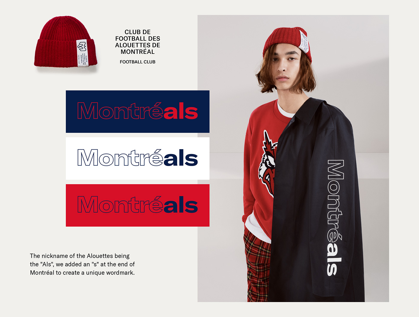
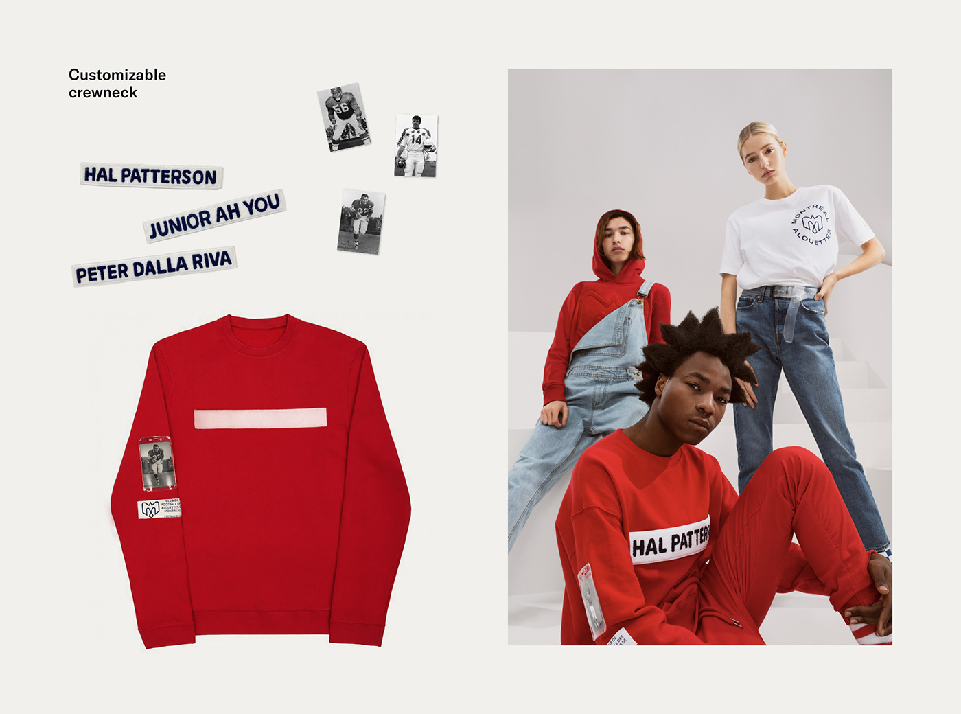
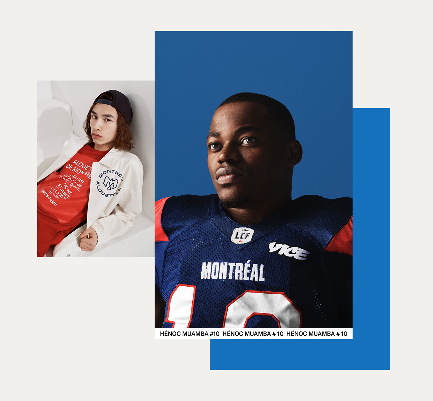
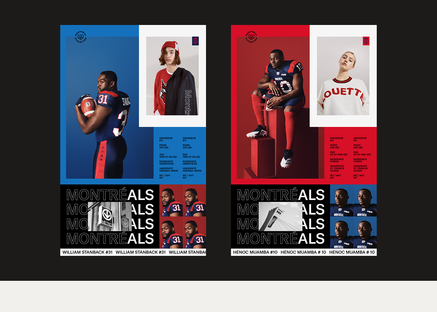
The identity adds a “MontréALS” wordmark, typeset in GT America Extended (as is the rest of everything), that introduces a stroked-type treatment that is used throughout the identity. I like the concept of building the nickname of the team into the city as it’s probably the only team in the CFL that can do that.
While MontreALS represents who the Alouettes are, the Toujours Game slogan, which came out during the 2018 season, represents the organization’s state of mind. Just like Montreal, the Alouettes are a proud, passionate and resilient team that has guts. This motto was created by VICE, which Sébastien Boulanger called upon to illustrate with the proper words the concept which defines the Alouettes identity.
“When we were doing research to grasp the Alouettes identity, we identified a parallels between the organization and Montrealers,” said Paul Labonté, Creation Manager at VICE. “Whether it’s the players, the employees the fans, Montrealers from past and present generations or new residents, it takes resilience, passion and openness to live in Montreal. Toujours Game is that lifestyle, that attitude which consists of being ready to embark and face adversity, in the summer or the winter. It’s in the Alouettes DNA and it only exists here.”
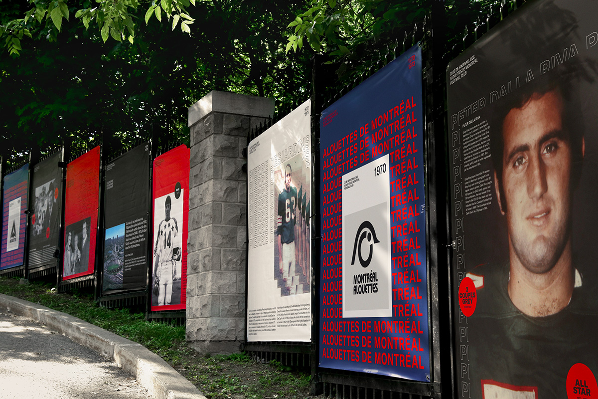
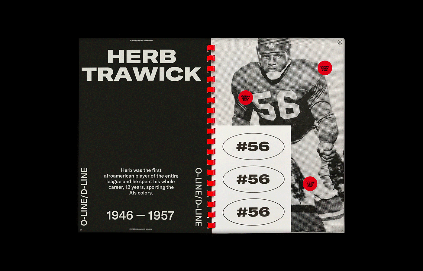
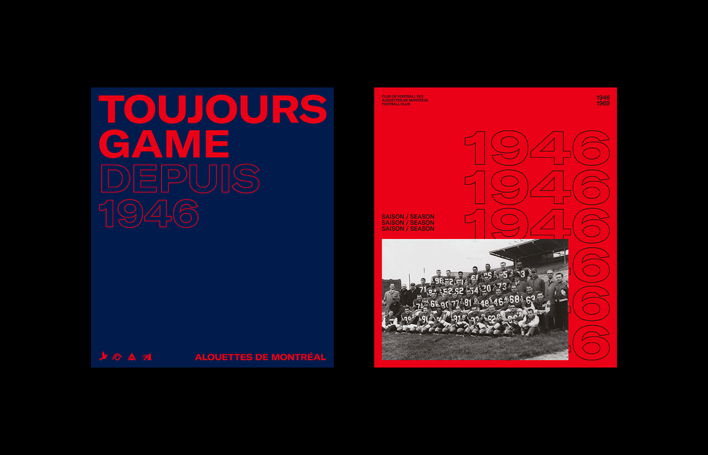
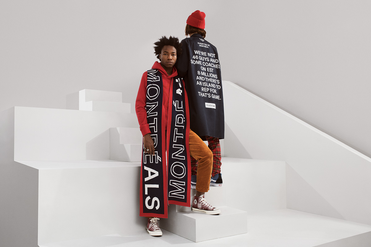
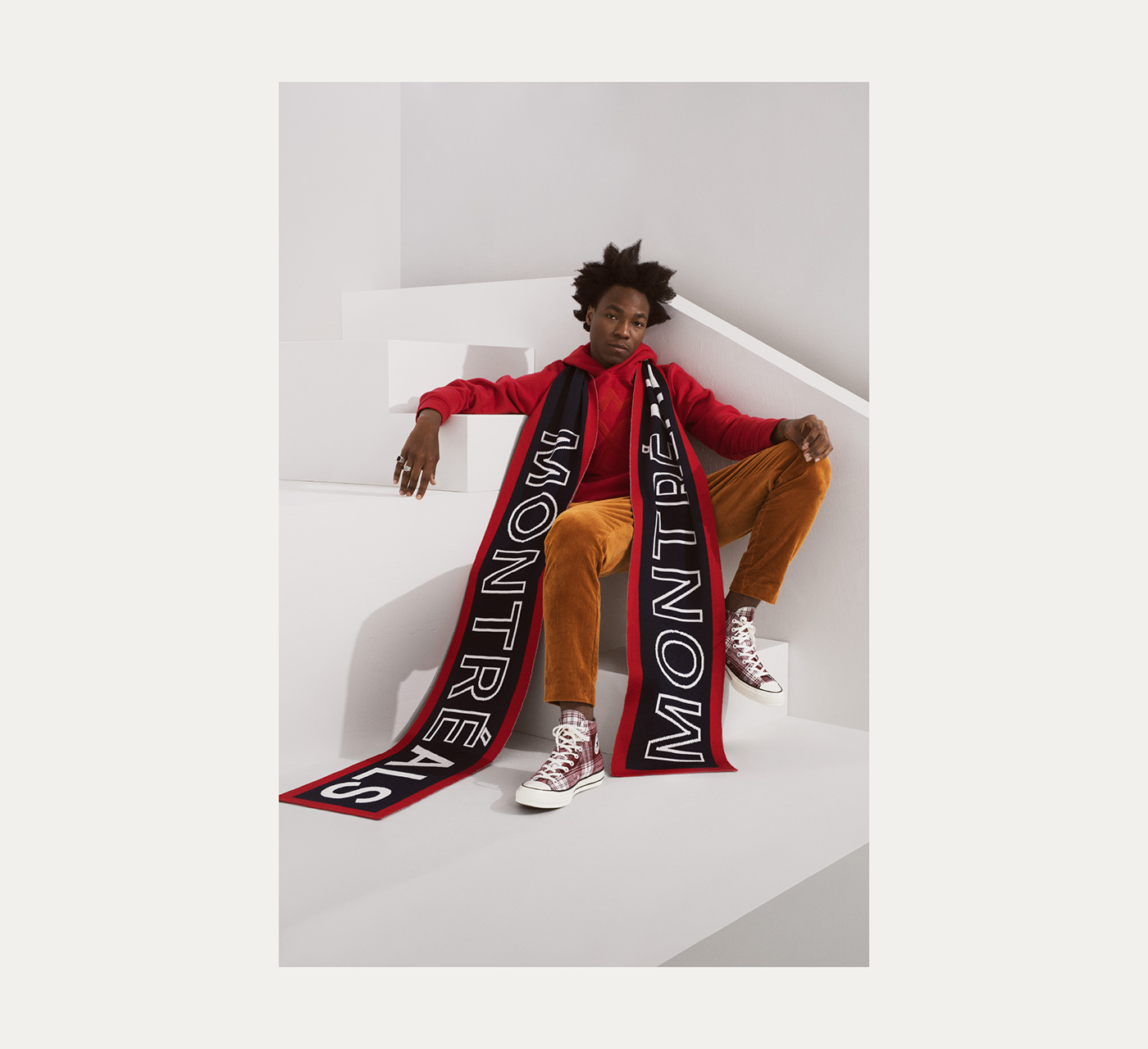
The posters and the book and spreads above are the closest we get to some applications. If you are a fan of identities that repeat words and sentences, you are in for a treat. I personally don’t find it too interesting — I like the visual effect, sure, but I think it’s a way of compensating for a lack of substance as well as being too hard of a trend. But, yeah, I’ll admit I like looking at it and that it creates an interesting blend of old school and new school for the team, especially with the pairing of the vintage photos and what are arguably newfangled graphic treatments. Things get a little weirder from here…
If you ever wondered what a football team would look like if a design firm and VICE had a graphic baby, wonder no more, this is literally it. And, to be perfectly honest, I am completely torn on whether I love this or hate this. My eyes are all like “Yeah! Hell yeah! More!” but my brain is all like “But, why?” and my fingers are all like “So, what you want us to write?”.
I really like the intersection of fashion and football… I think this somehow manages to combine the deadpan affectation of streetwear with the raw energy of the sport in a successful way. But I wonder how universal the appeal of this is — I’m not sure the average Molson Canadian-drinker would be rocking a floor-to-ceiling-length scarf-slash-rug. This is somewhat clearly an effort to make the Alouettes the urban-style team of the league and there is some coolness in that but is it appropriate for the general Montréal-football-loving population? I’m not sure.
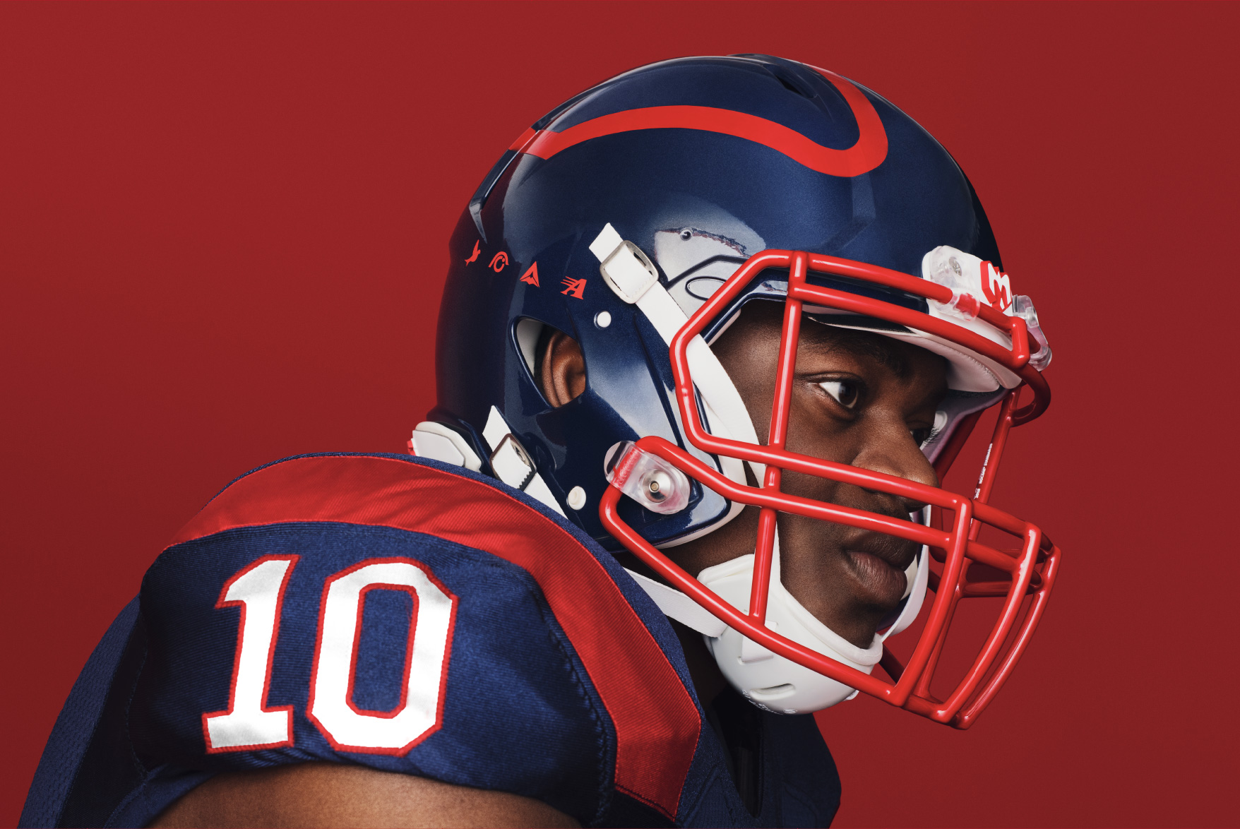
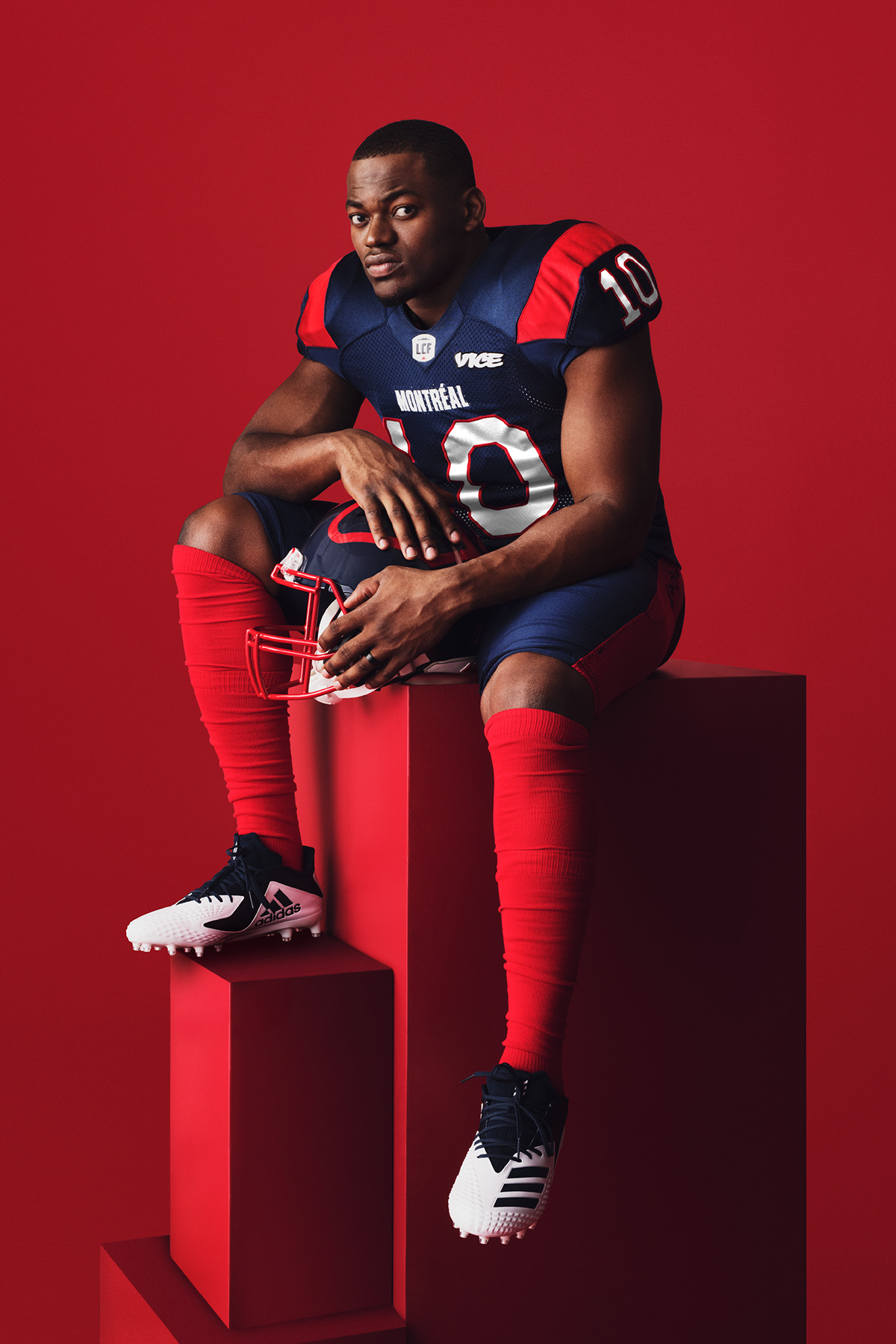
Oh, and look, there is uniforms too. They are okay. I do like the detail on the helmet of using the team’s old icons as a nod to its history.
Overall, as expressed, I’m torn on this one. There are aspects I love (like the icon) and aspects I hate (like the sad look of all the models as a way to sell football). I do appreciate the effort to do something so outside of the norm but maybe it took the team one realm too far.
Thanks to Antonin Brault Guilleaume for the tip.

 Новости Союза дизайнеров
Все о дизайне в Санкт-Петербурге.
Новости Союза дизайнеров
Все о дизайне в Санкт-Петербурге.