Обзор лучших ресурсов по разработке бренда, разработке упаковки
contact us | ok@ohmycode.ru
contact us | ok@ohmycode.ru
Established in 2014, Back Market is a marketplace — reportedly the first and largest — focused on bringing thousands of refurbished electronic devices and appliances from certified professionals to consumers. The hottest item, of course, are phones — including iPhones, officially approved by Apple to be resold with them — but also include laptops, cameras, drones, TVs, and other small appliances all sourced from the world’s best refurbishers and by partnering with manufacturers. First available in France, Germany, Italy, Spain, and Belgium, the online shop entered the U.S. market in 2018 where “sales are growing ten times faster among Americans after six months of business than they did at the same juncture in Europe” and now has over 150 employees across offices in Paris and Bordeaux, France, and in New York, NY. Recently, Back Market introduced a new identity designed by Koto.
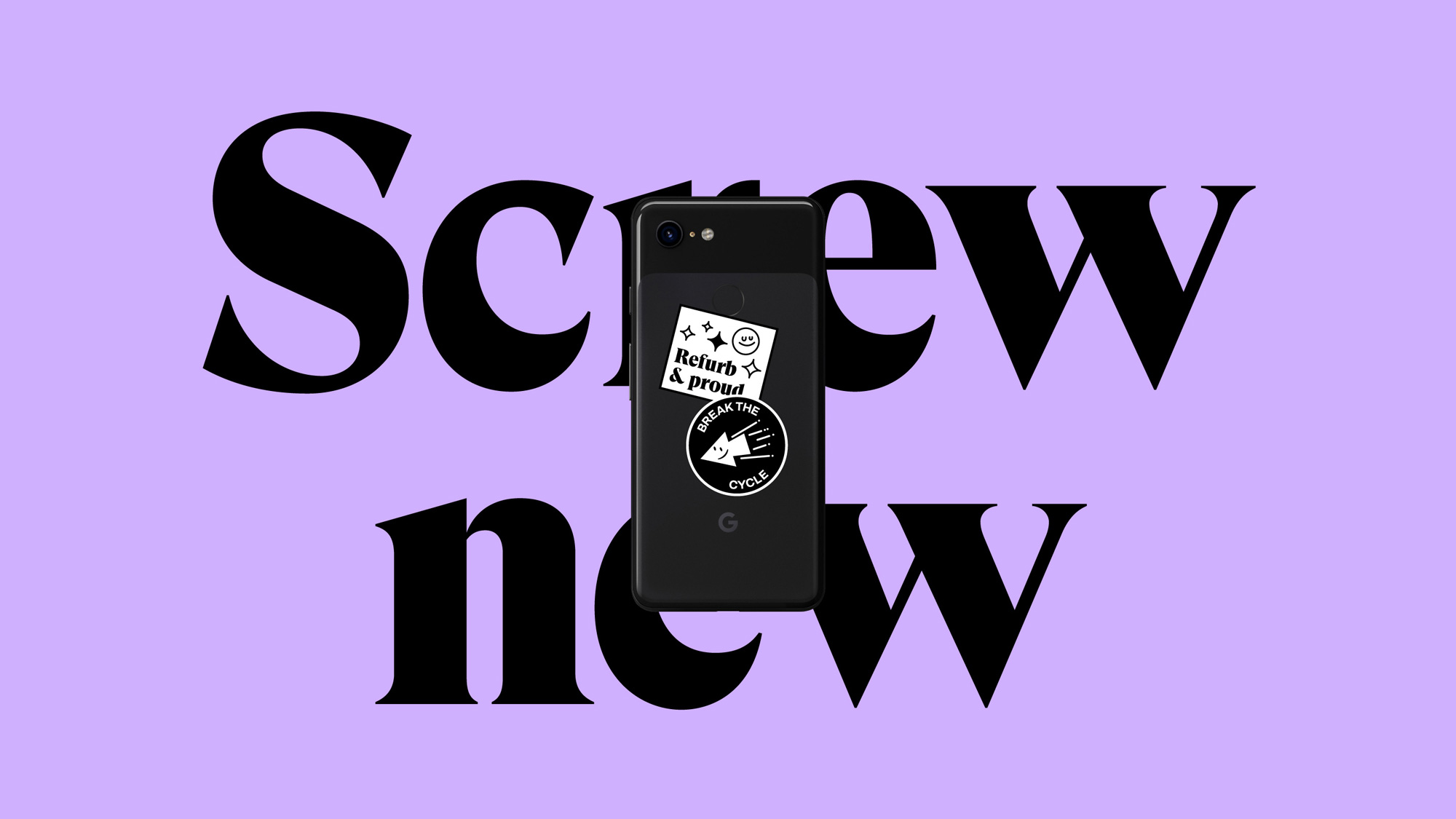
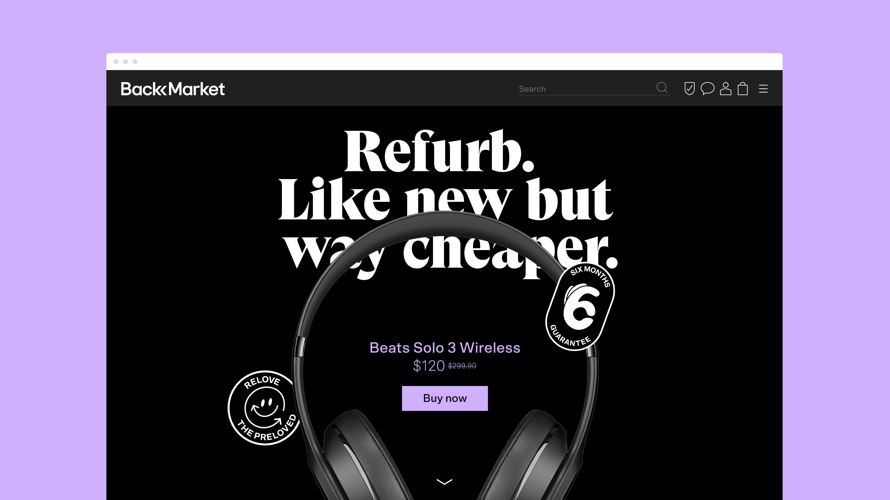
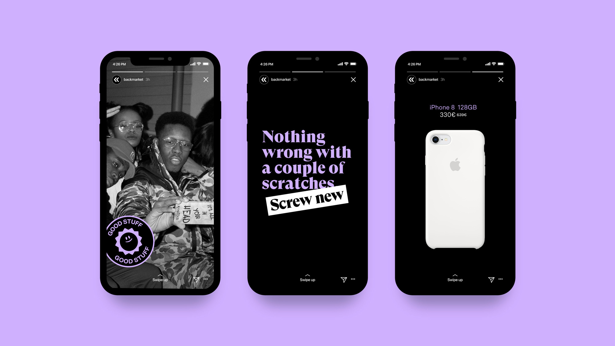
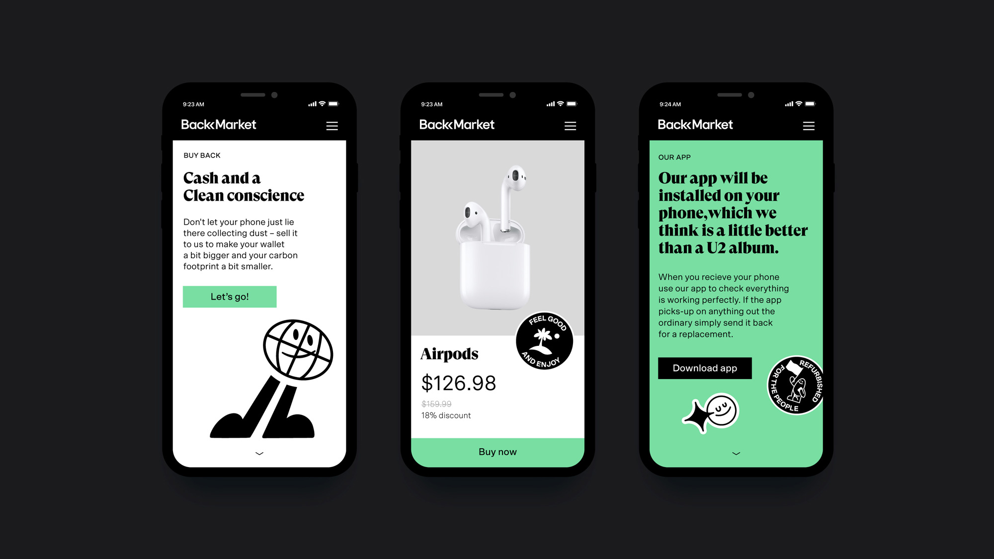
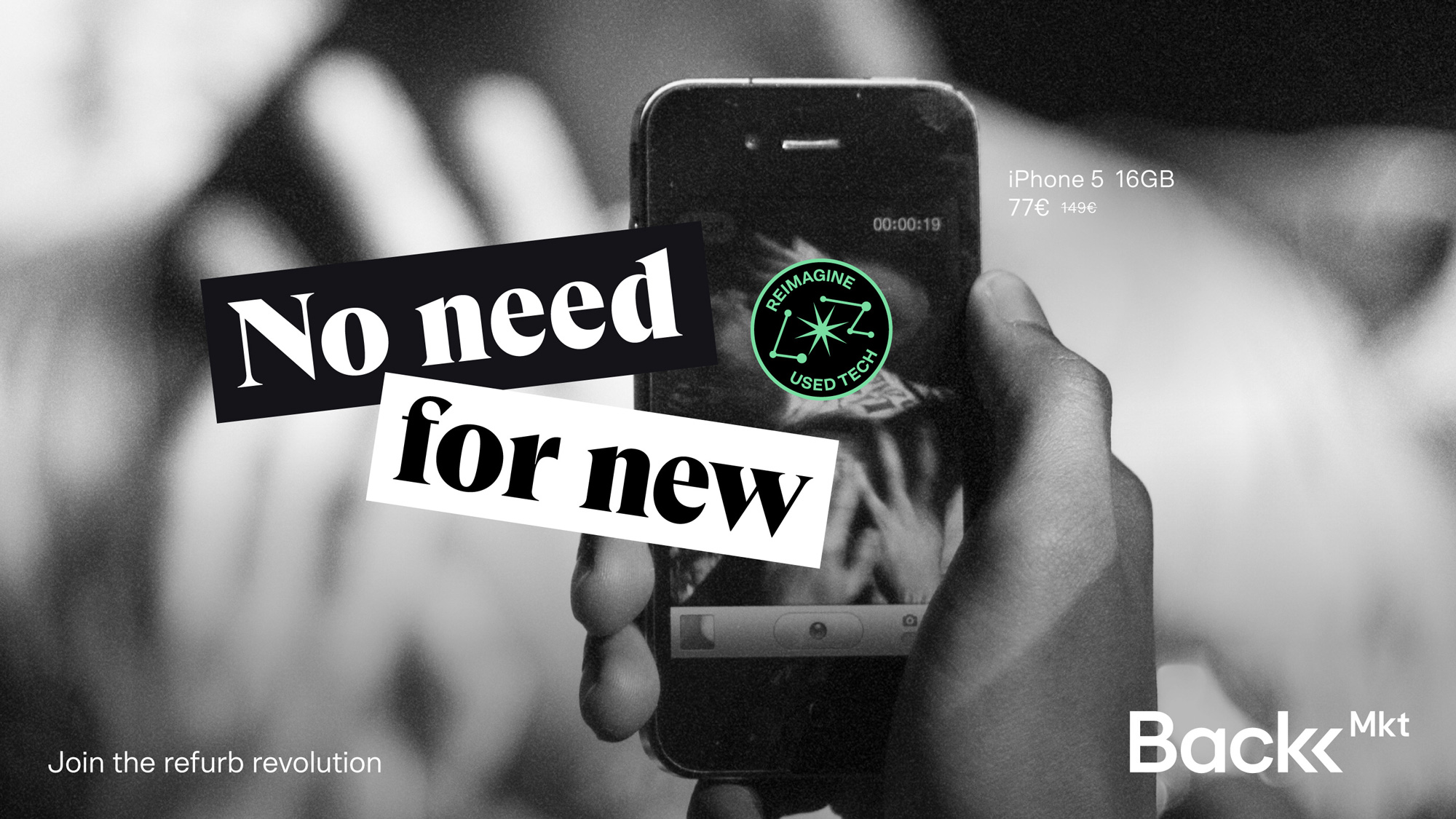
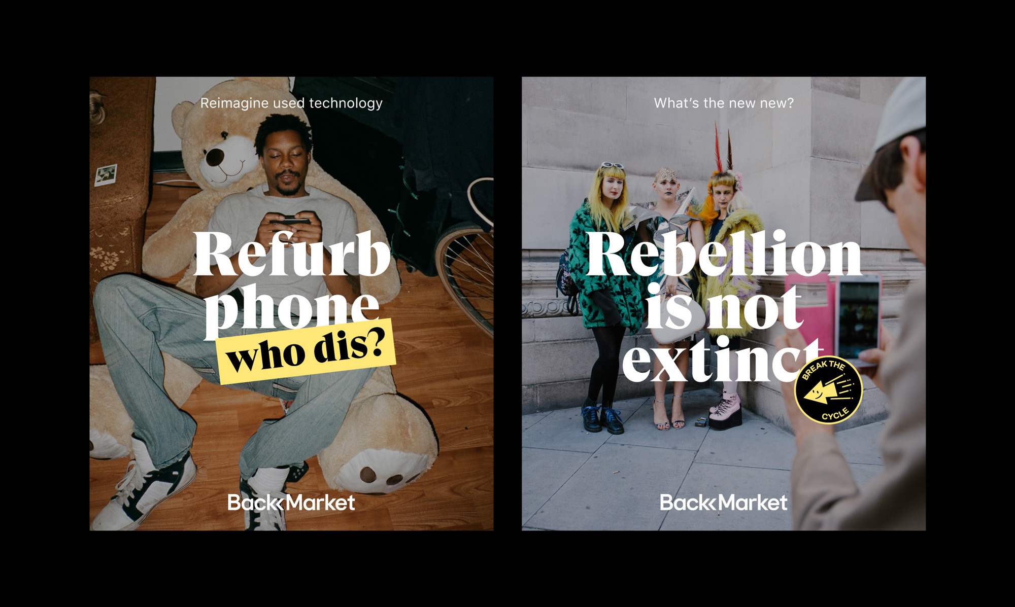
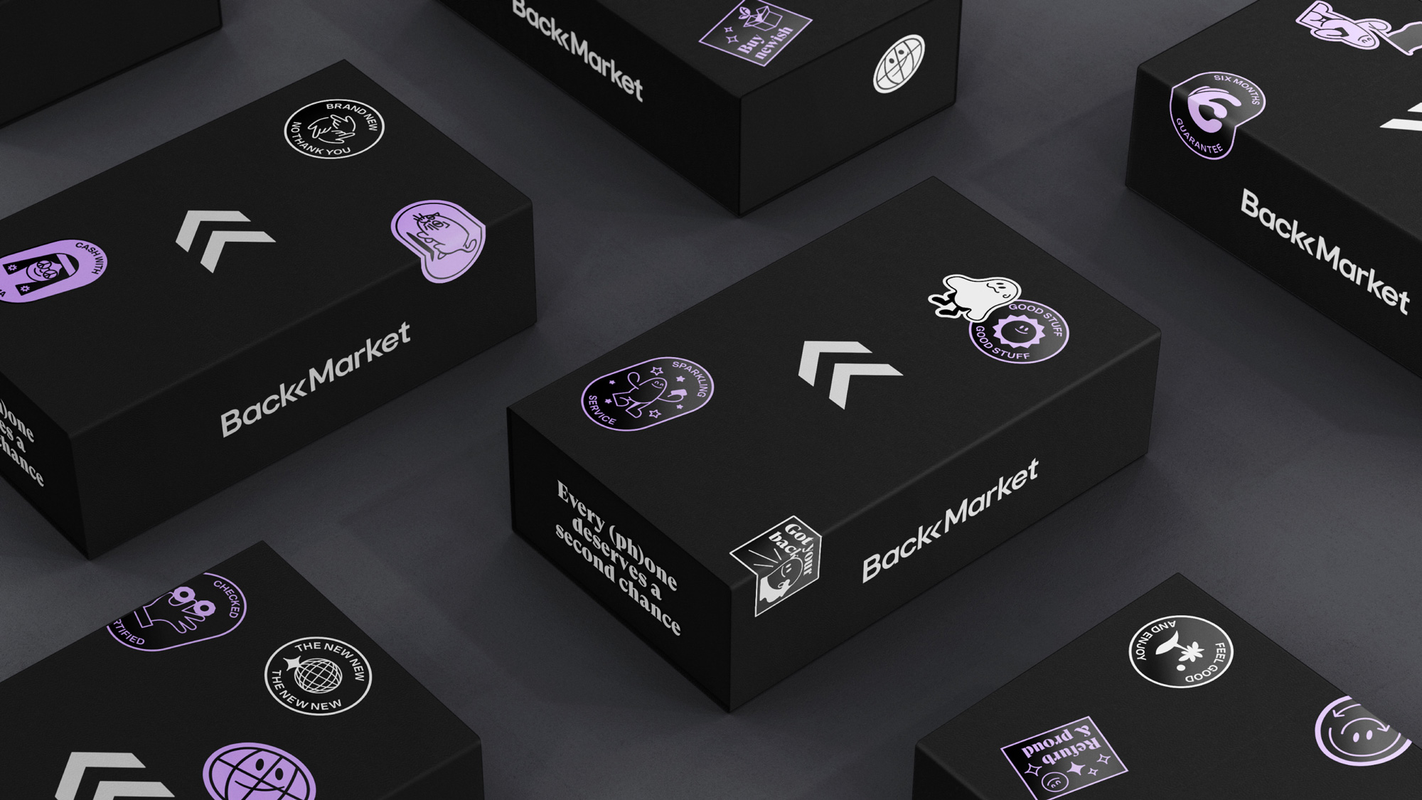
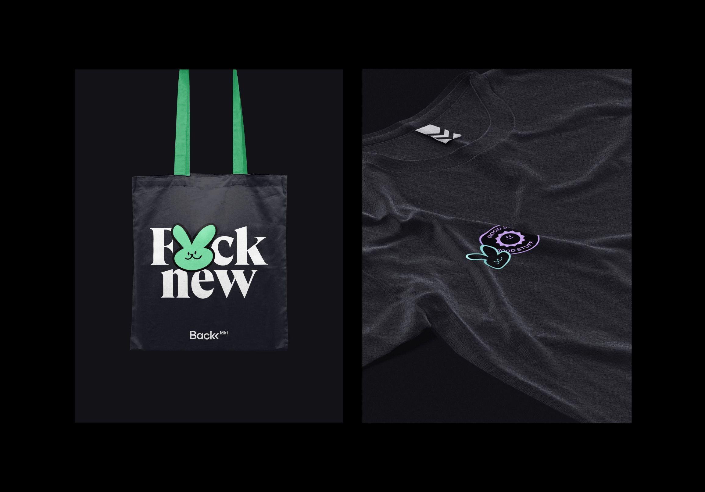
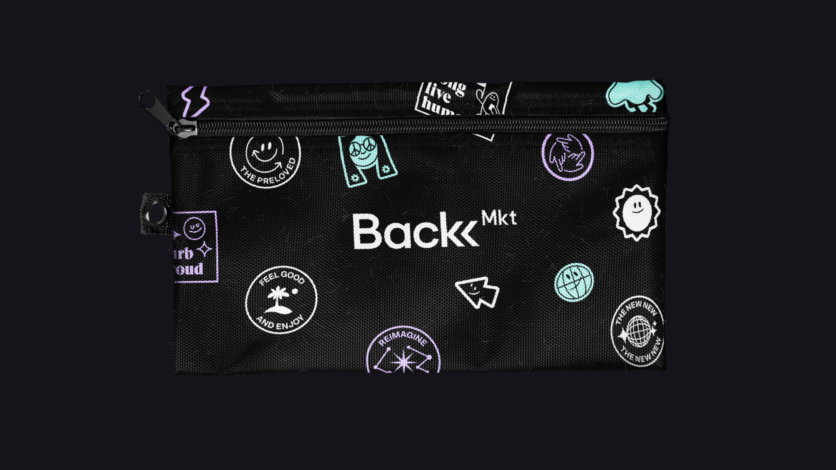
The identity lives and breathes rebellion, embracing the so-called flaws in the product and positions using Back Market as a tiny protest against the system. A diverse set of stickers carry slogans and sayings, bringing endless variation to applications whilst giving customers and merchants a chance to participate in the identity. These stickers, matched with the bold tone of voice, help to support Back Market’s image as a liberator, freeing the world from tech obsolescence.
The old logo had a decent idea with a loop conveying a sense of something of being repurposed or redirected at a point where it might have gone off course or, in this case, the trash. The execution could have been a lot better as a way to engender more trust with consumers. I would have totally had second thoughts of buying from them with that old logo. The new logo comes as no surprise in a sans serif uniform but there are a couple of quirks that make it a little more interesting than usual. The double chevron around the “k” is a nice subtle metaphor for “rewind”, as in giving these products a second fresh start. The execution is quite well done and doesn’t hinder the readability of the name. The straighter “r” and angled notches on the “a”s give this some added personality. I also like how this logo feels a little more “clandestine” in its all-black configuration as an ode to the name, which sounds like “Black Market” (which was probably on purpose when it was picked). The more prominent identity element, though, are a set of stickers…
The stickers are fun and nicely done. Although they are a bit random — a rabbit, an “OK” hand sign, a globe with legs, a… ghost? — the design aesthetic is consistent and both the single-color approach and the bold serif further help unify them.
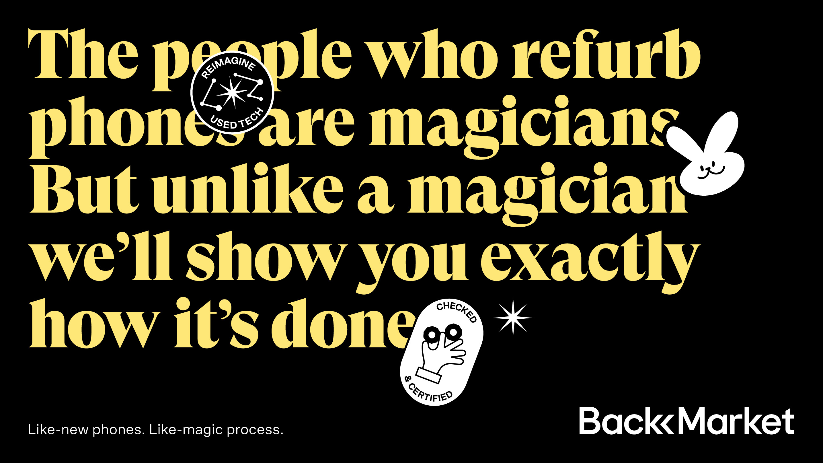
We wanted to reflect the natural humour, up-beat attitude and passion of the team in the identity, but at the same time are careful to display the products in a way that show off their true quality and value - professionally refurbished to an ‘as-good-as-new’ standard. Eclectic art direction and refreshingly honest copy capture the true nature of how we use technology. Ultimately Back Market prove that whilst e-waste and obsolescence are subjects that should be taken seriously, there’s no reason we can’t have fun while doing it.
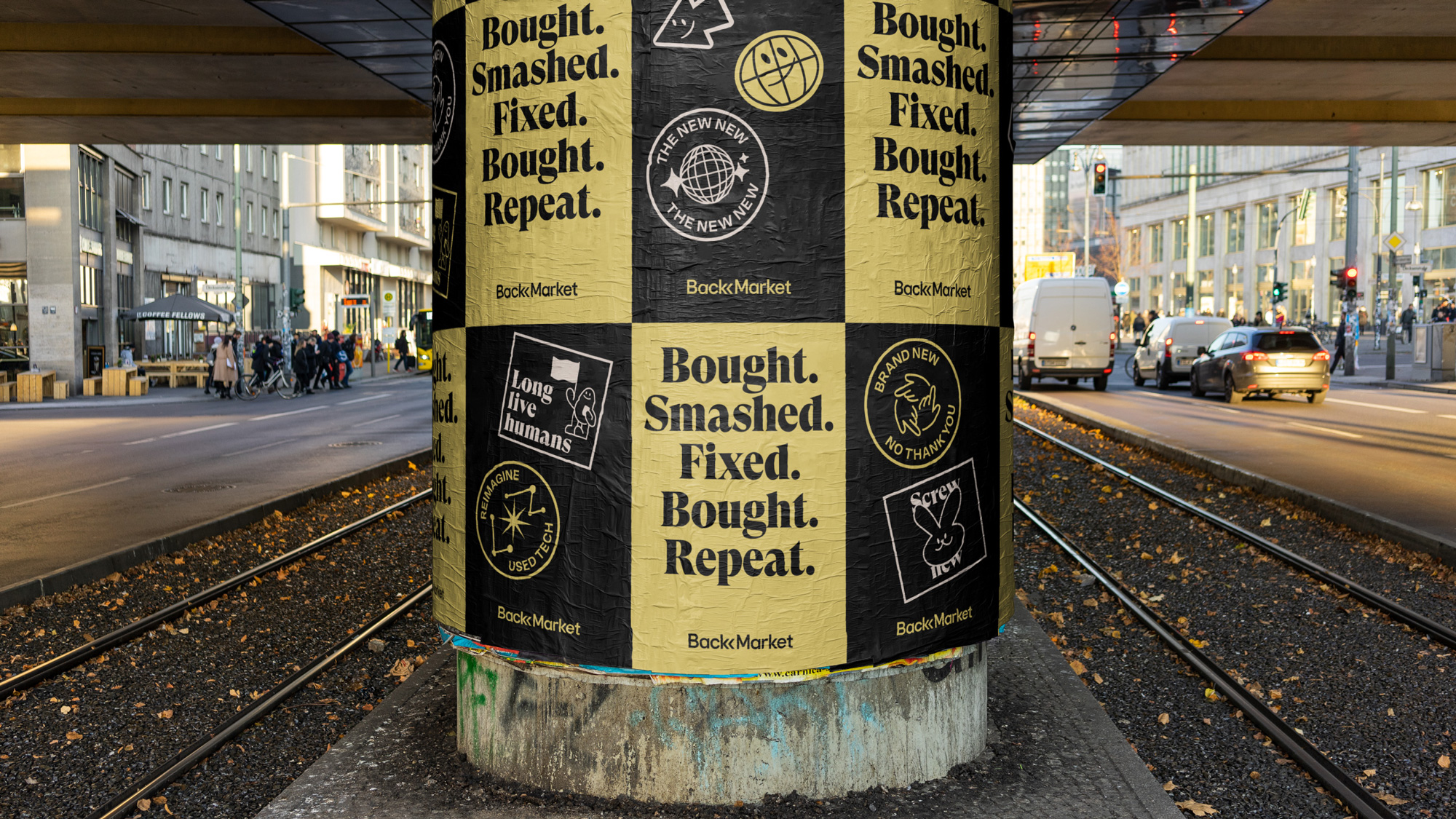
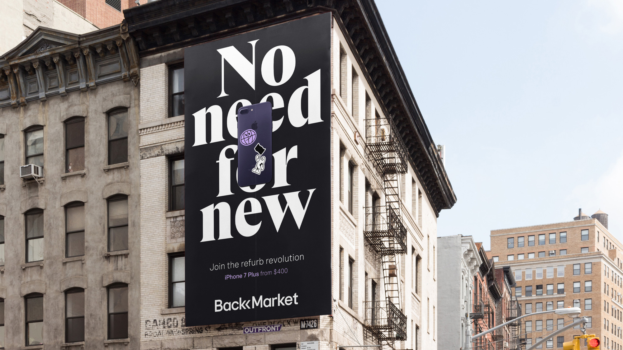
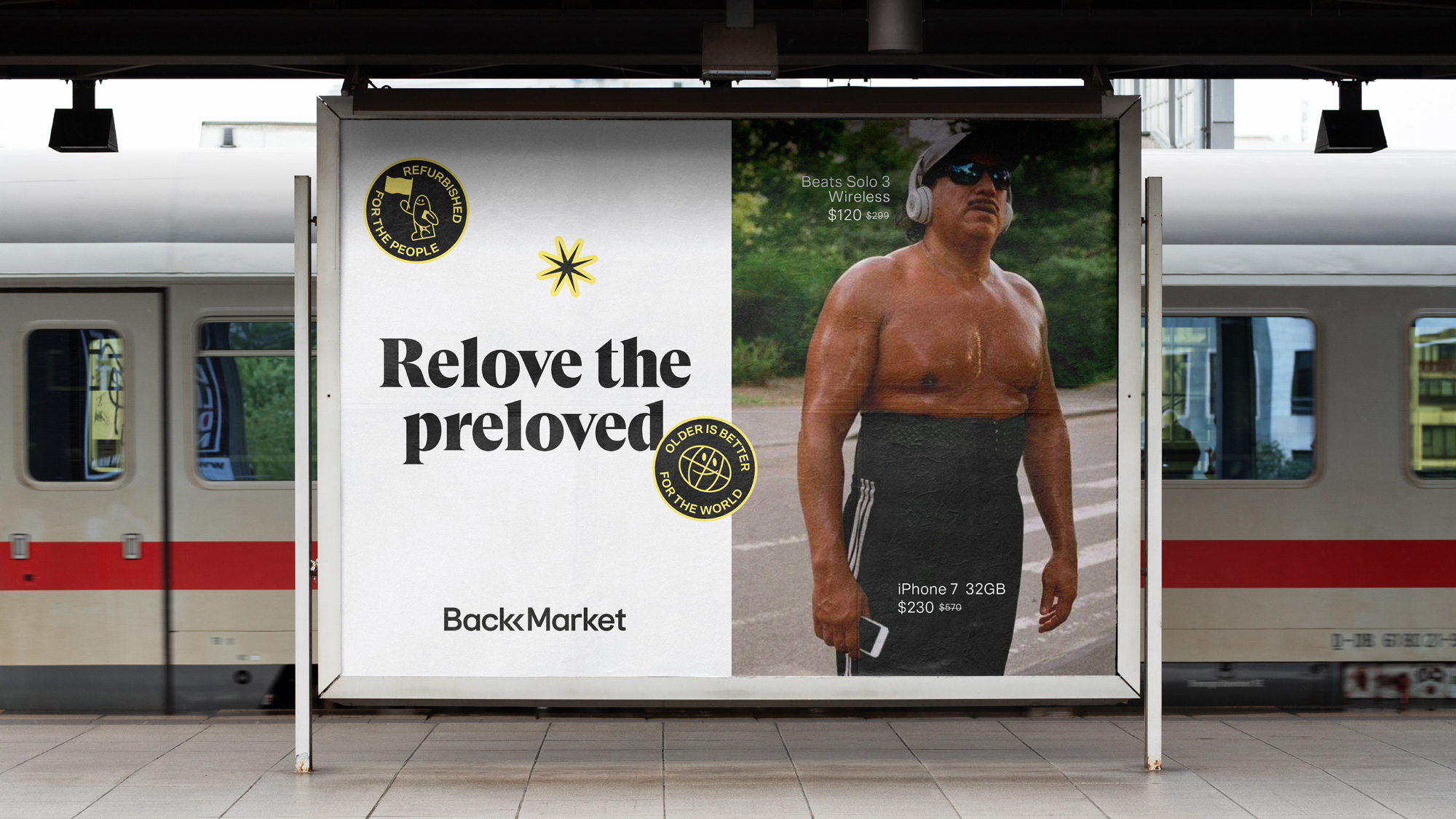
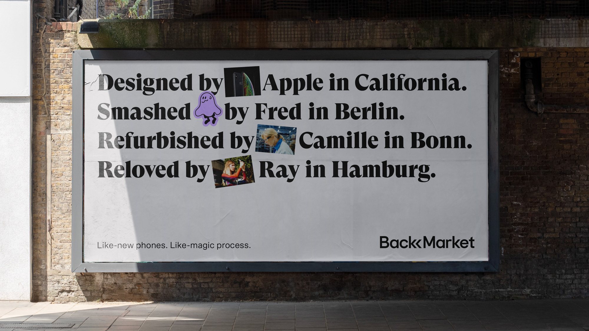
The applications have a broad range of variations, which is both good and bad. The former in that it provides a wide range of expressions unified by the typography and stickers. The latter in that some things feel like they belong to different companies — for example, the sweaty dude ad is more VICE-like whereas the big billboard above it is more, say, Samsung-like. Also, I’m still undecided whether the combination of such disparate elements is working or not: you have stickers that have one aesthetic, a serif that has a different feel, and photography with yet another vibe. I kind of like the irreverence of putting them together without being self-conscious about it but it’s also… odd.
Overall, what I really like about this is that it gives Back Market a narrative beyond “we sell cheap, not-new tech” and instead builds an aura of “stick-it-to-the-man” by making the act of buying cheap, not-new tech fun, engaging, and replacing any stigma of buying used with empowerment and excitement.
 each year since publication began in 2006

 Новости Союза дизайнеров
Все о дизайне в Санкт-Петербурге.
Новости Союза дизайнеров
Все о дизайне в Санкт-Петербурге.