Обзор лучших ресурсов по разработке бренда, разработке упаковки
contact us | ok@ohmycode.ru
contact us | ok@ohmycode.ru
Launched in 2008, Evernote is a mobile app for taking notes, clipping web pages, organizing, making task lists, and archiving. Developed by Evernote Corporation — a global, privately-owned company headquartered in Redwood City, CA — the app now has over 225 million users who have generated more than 8 billion “notes” and works natively in 25 languages. Amazingly, Evernote has not been bought by Google, Facebook, Microsoft, Apple, or Keurig Dr Pepper. Yesterday, the company introduced a new identity designed by DesignStudio in collaboration with their in-house group.
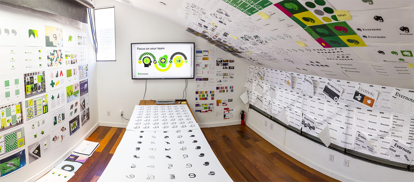
[We] asked our partners at DesignStudio to go for range, to frighten us, make us uncomfortable. Explore everything from slight revisions to an outright “rip and replace.” The exercise was exhaustive, from researching other elephant marks in use globally to pushing the boundaries of abstraction.
The exploration garnered plenty of strong opinions and debates, but ultimately, it brought us back to the idea of a considered design evolution rather than a radical shift. It was the right thing to do. We wanted to signal change, not shoot ourselves in the foot. Our customers, community, and employees had a soft spot for Mads. So after significant effort, and because we had a collaborative and understanding partner, the conversation turned to what was and wasn’t working in our current logo and wordmark, and how to refine it.
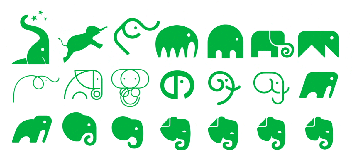
While Mads had aged fairly well, there were some structural issues to iron out. First, we wanted to round out his geometry, to soften the edges and make him feel more balanced. This provides for more flow in the negative space and ultimately optimizes white space around the mark. We looked at losing the fold in the ear — which evokes both the dog-eared page of a book and the common icon for a document — but chose instead to honor our past by doubling down on its significance and increasing the size. Both of these decisions helped with scaling and recognition issues. We rounded the trunk into a spiral, a symbol of progress, and added a more defined slope in the forehead to give a sense of forward momentum. We softened the eye as well, going for approachability and a sense of serenity as opposed to the previous crescent shape which had been described alternately as “smiling” or “angry.”
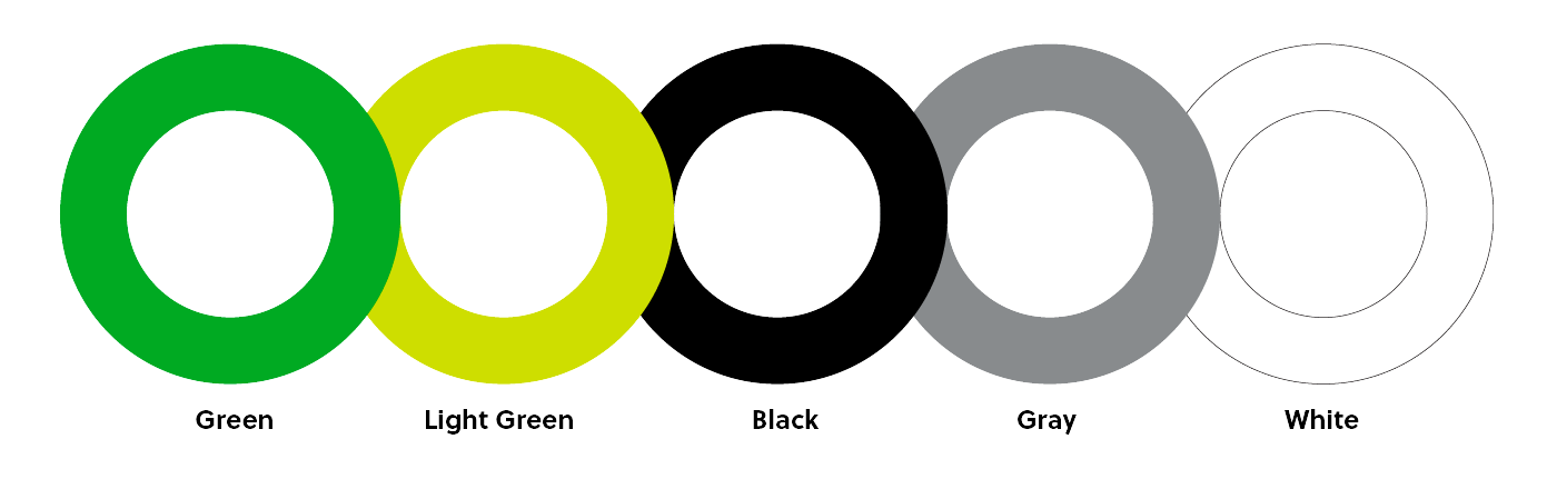
Finally, we addressed color. Given that our two most recognizable assets were Mads and the color green, the combination of the two was a no brainer. To our surprise, everyone thought Mads was already green. He’s wasn’t, nor had he ever been. He was always grey — as elephants are. But his grey color against a green gradient had poor contrast and felt a little dated. So we made him our signature color, and changed that color to a more pure green than we’d used previously. After further shaping, finessing, and debating the tiniest details, we arrived at the place that felt right.
We debated and explored moving to a sans serif face. It seemed more modern and representative of the technology space as a whole. But when we saw those treatments next to Mads, they felt flat, lacked character, and didn’t seem like us. […] We ultimately landed on Publico, a serif typeface that takes many cues from contemporary type design yet still has a timeless feel. Rendered in 100% black, it stands up to and accentuates the pure green logomark. It aligns perfectly with our DNA of confidence and clarity, and the balance between elements is beautiful.
It’s interesting to see all the elephant icon explorations and that, even when some of them are visually cooler or graphically more interesting than the old icon, it does feel like it was the right decision to stick closely to the icon that has become part of the growth of the app and the company. It’s all about associations and none of the cool new elephants feel like they represent Evernote. That doesn’t mean Evernote can never change its icon but, at this point, it’s sensible to go through an evolution.
The revised icon is much better, with a more organic trunk, slightly floppier ear, gentler eye, and a more exaggerated dog-ear fold that is much better resolved than before. The icon looks great big and small. Changing the elephant to be green instead of gray is a brilliant move because there are no green elephants, obviously, so this makes Mads a little more unique.
The choice of Publico as the wordmark is… not quite right. There is a sharpness to it that doesn’t contrast well with the roundedness of the icon. I admit that if they had gone with a geometric sans serif I would have complained about it being yet another geometric sans serif but it probably would have yielded more visual consistency. But, overall, it’s not bad, and it gives Evernote a more mature and editorial look.
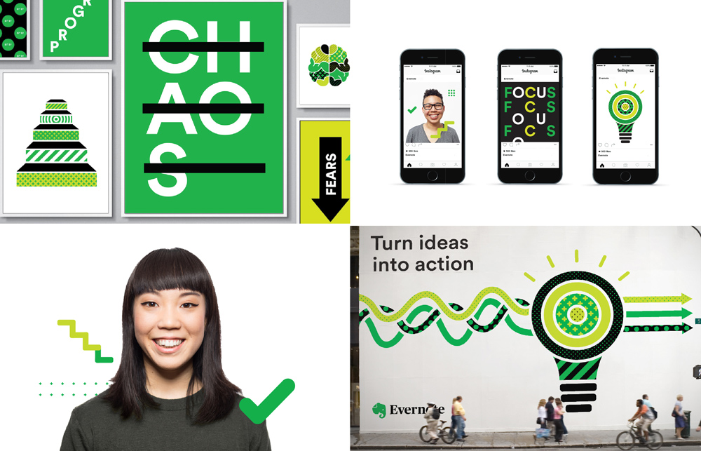
The patterns were inspired by ideas related to our brand: teamwork, integrations, potential, achievement, and of course, what matters most. The shapes that comprise these patterns have the flexibility to be pulled out as standalone graphical elements, scaled down to act as texture, scaled up and cropped for abstractions, and used as masks to highlight product screens or act as a container for photography. Most importantly, they’re meaningful, perhaps not consciously to the viewer but through clear associations that work on a deeper level. And from time to time we’ll just sprinkle them about. It’s a little something we call “Ever Better Dust(TM).”
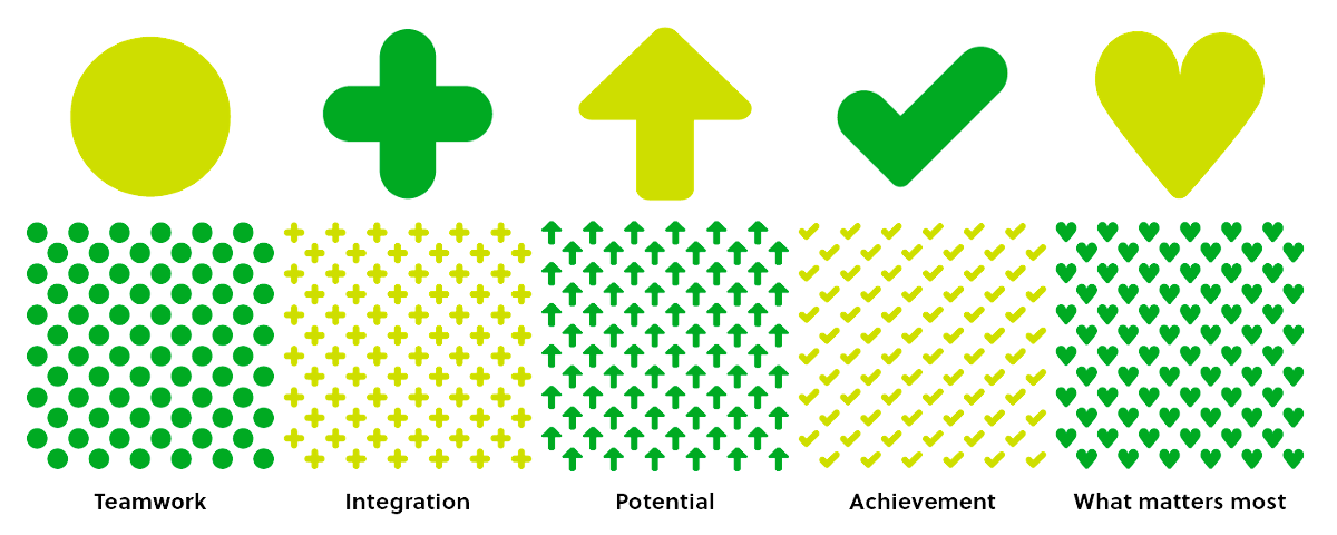
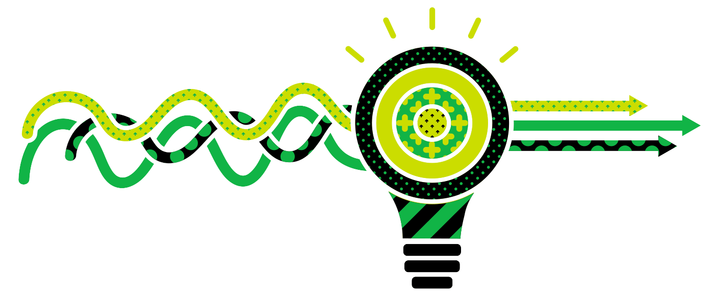

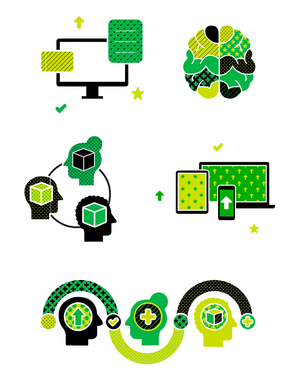

The patterns and illustration style are a great new system for Evernote. They feel friendly and accessible while also still within the current trend of bubbly, happy illustrations but just different enough to stand out. The photo treatments above — of stock photos — are pretty cool. Some of the illustrations, like the brain one, are questionable but overall they have a great style and they look excellent animated (as shown in the video at the end). I also like that, even though in application the circles, plus signs, check marks, arrows, and hearts come across as basic icons, they have a solid concept behind them.
Overall, this is a solid evolution. It’s not the most exciting or sophisticated we’ve seen — i.e., Lufthansa or Hyundai — but as far as a redesign for a mainstream app goes this is thoughtful and cheerful.

 Новости Союза дизайнеров
Все о дизайне в Санкт-Петербурге.
Новости Союза дизайнеров
Все о дизайне в Санкт-Петербурге.