Обзор лучших ресурсов по разработке бренда, разработке упаковки
contact us | ok@ohmycode.ru
contact us | ok@ohmycode.ru
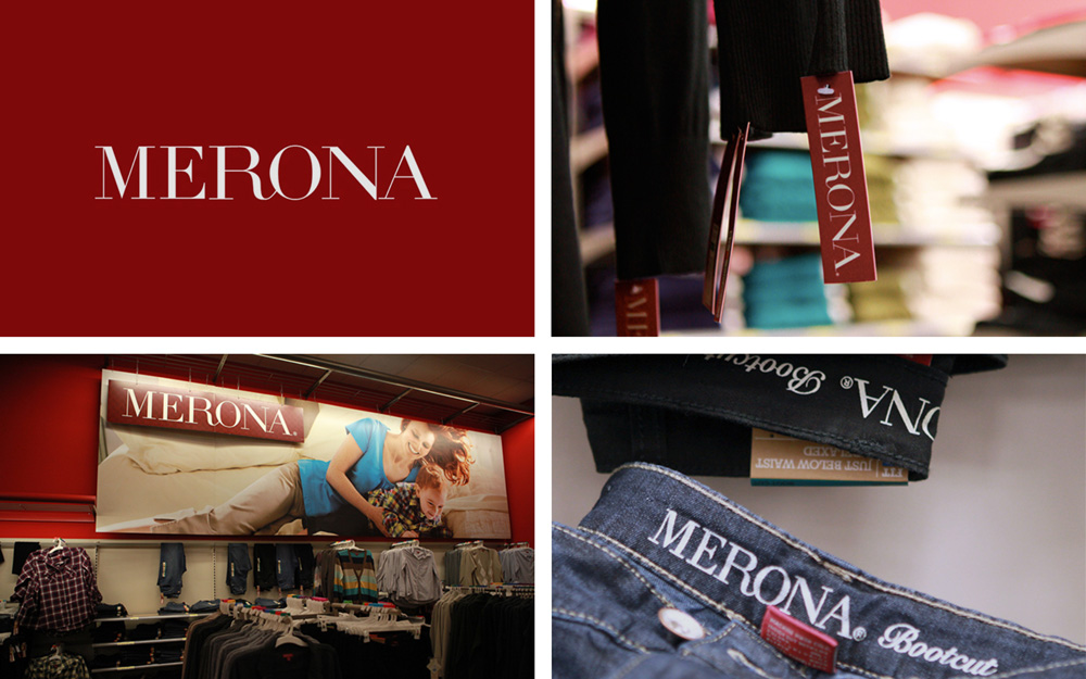
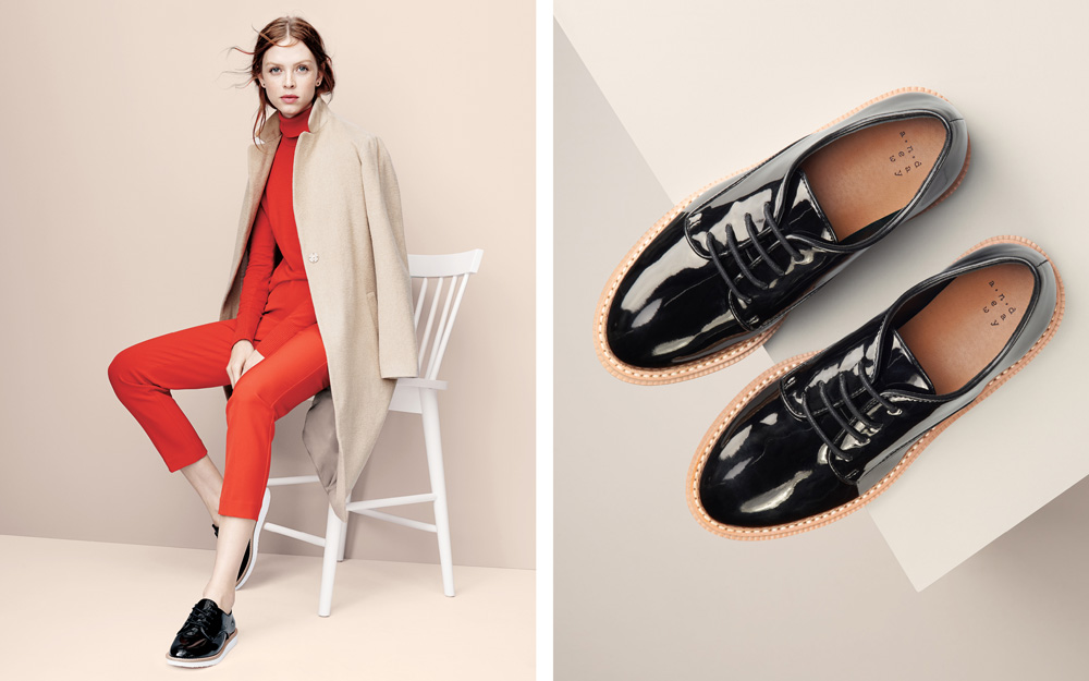
Launched in Fall 2017, A New Day is one of twelve new in-house brands being launched by Target over a period of two years and will focus on women’s ready-to-wear apparel, ranging from tops to bottoms to accessories. It’s a kind of J. Crew meets Zara meets Target’s friendly prices combination. While not a direct evolution, this new line replaces Target’s previous women’s brand, Merona. The new identity for A New Day has been designed by New York, NY- and San Francisco, CA-based COLLINS.
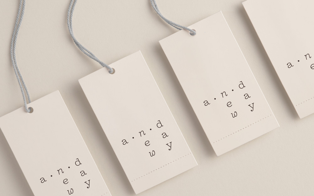
We helped name this new apparel page turner “A New Day” — personifying the idea that Target guests view every day as a new chapter in their life—a new chance to write their own story. The acronym A.N.D. is also leveraged as secondary naming approach to emphasize that the clothing line is made to be combined with and punctuate each guest’s own, unique style story.
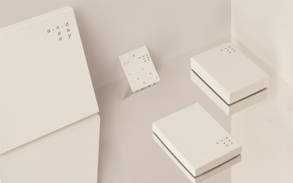
There is no direct comparison to Merona so not worth analyzing the old logo but worth mentioning how un-youthful it looked, with its old-fashioned contrasting serif. A New Day, on the other hand, exudes youthfulness. The clothes have a great freshness to them that’s well reciprocated by the identity. Typeset in a monospace layout, the logo is airy and contemporary with its use of a thin slab serif font. I’m not sure the “new” in italic makes a difference or not, positive or negative… it’s just kind of there. I like how the logo plays with the name being able to be read as “and”, subtly conveying the idea of mixing and matching pieces. The main bone-peach-off-white indescribable color is quite nice and a welcome respite from the bold-vibrant-in-your-face color trend.
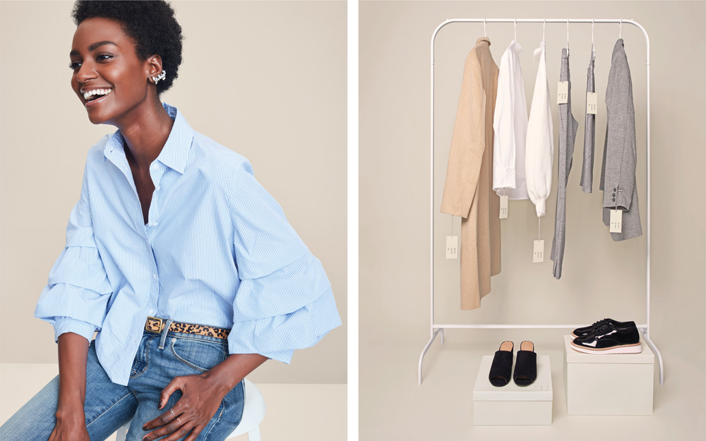
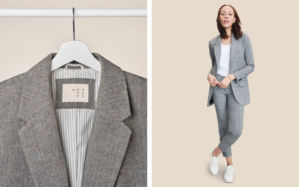
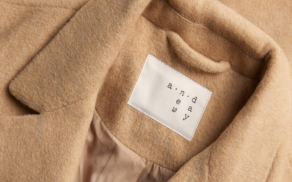
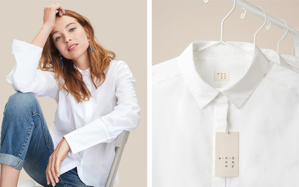
Despite it’s relative fragile presence — it’s not a thick wordmark or bold symbol — the logo looks great in all kinds of apparel-labeling situations from embroidered on a label to stamped on the inside of a shoe.
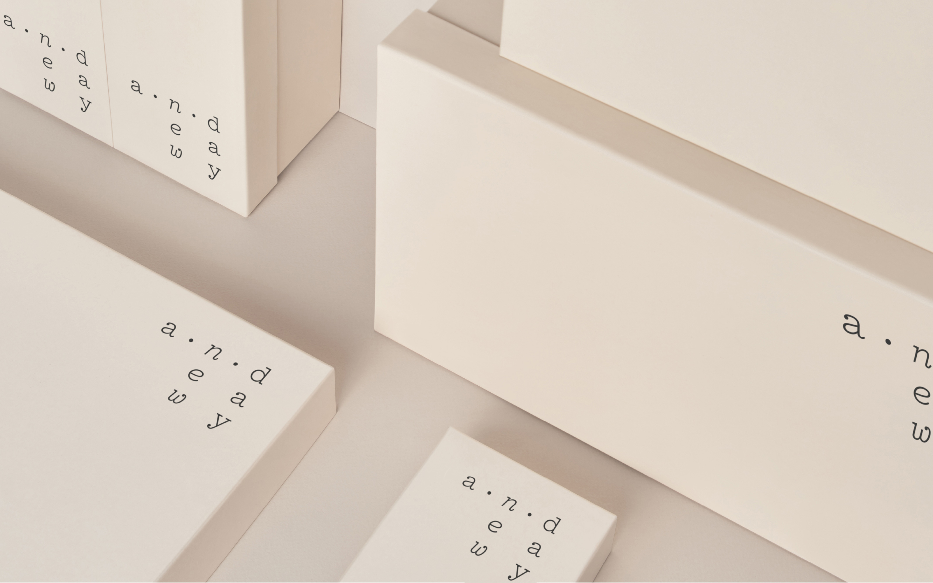
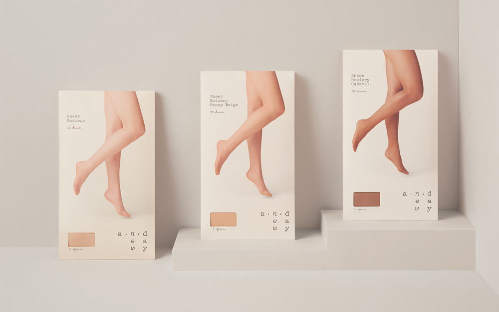
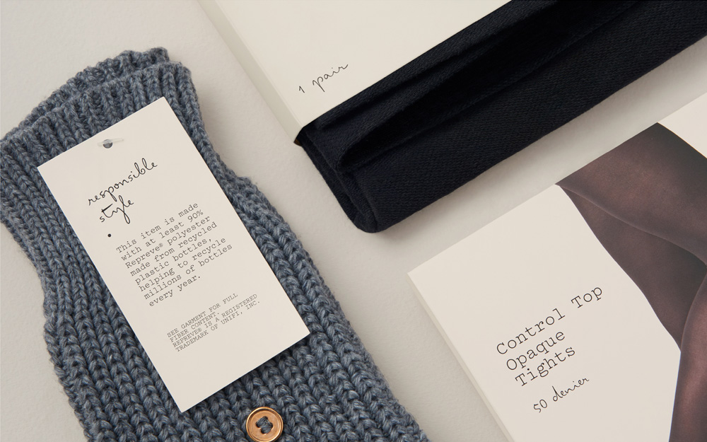
For the packaging that needs more content, there is an introduction of a great script typeface that complements the typewriter-y brand font and softness of the color. The integration of the product photo in those hosiery boxes is pretty masterful too.
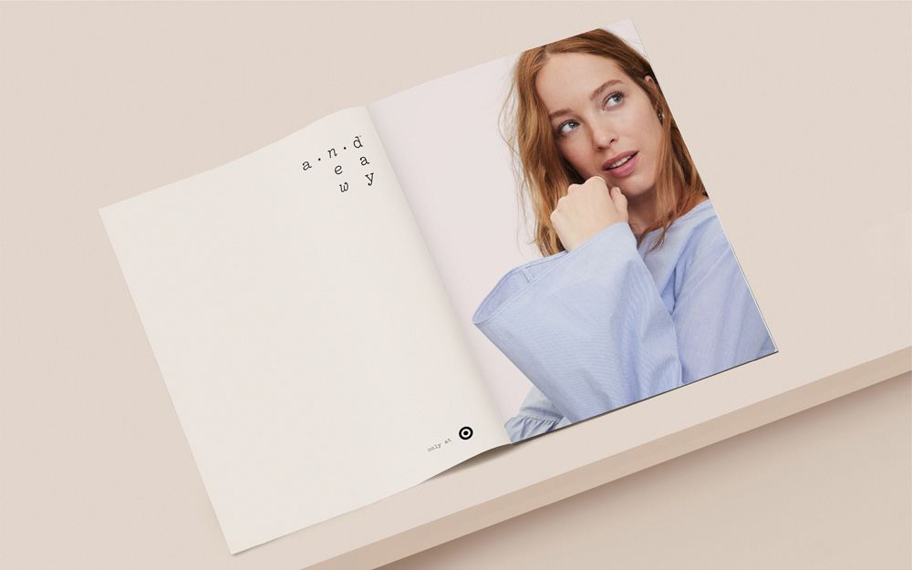
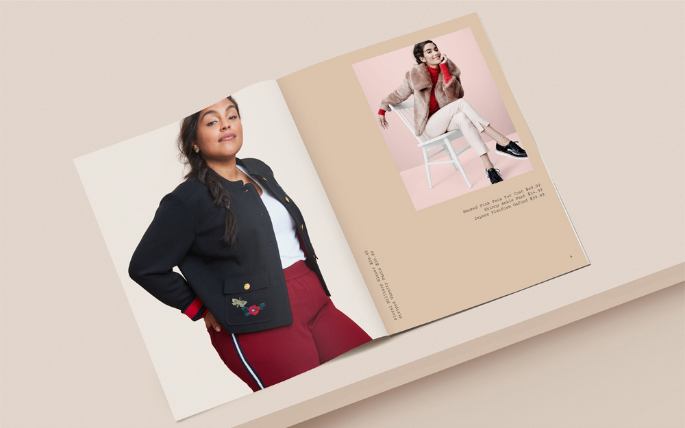
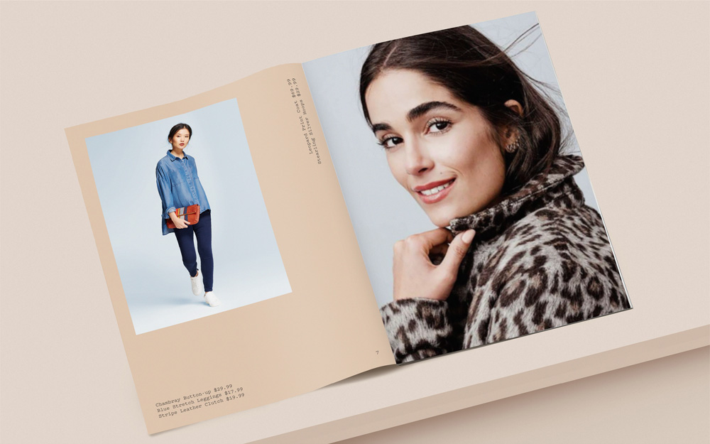
Overall, this is a really great brand launch and positioning, aptly portraying the line as fashionable but approachable and unpretentious. It’s also worth mentioning what a great job Target is doing both with A New Day and men’s brand Goodfellow in genuinely showing diversity and accessibility through their models (colors, shapes, sizes, hairstyles) without feeling insincere or as if there is a quota to be met. It is, maybe, after all, a new day.

 Новости Союза дизайнеров
Все о дизайне в Санкт-Петербурге.
Новости Союза дизайнеров
Все о дизайне в Санкт-Петербурге.