Обзор лучших ресурсов по разработке бренда, разработке упаковки
contact us | ok@ohmycode.ru
contact us | ok@ohmycode.ru
Established in 1920, Fédération française d’athlétisme (“French Athletics Federation” in English, FFA for short) is the governing body for athletics in France. It is responsible for the promotion of the sport, including running, jumping, throwing, and walking; the organization of competitions, from track and field, road running, cross country running, to race walking; and the management of the French National team in international competitions. This past July the organization changed its name to Athlé and introduced a new identity designed by Dragon Rouge.
The new logo is directly related to the origins of our sport and Olympism. Voluntarily different from the logos of the other federations and the actors of the sport in general, it is representative of a new generation of federations, which is more in a modern dimension, anchored in its time.
A nod to the sources of Athletics, the Athlé logo represents:
- its historical origins with the angular bias of typography reminiscent of ancient writings.
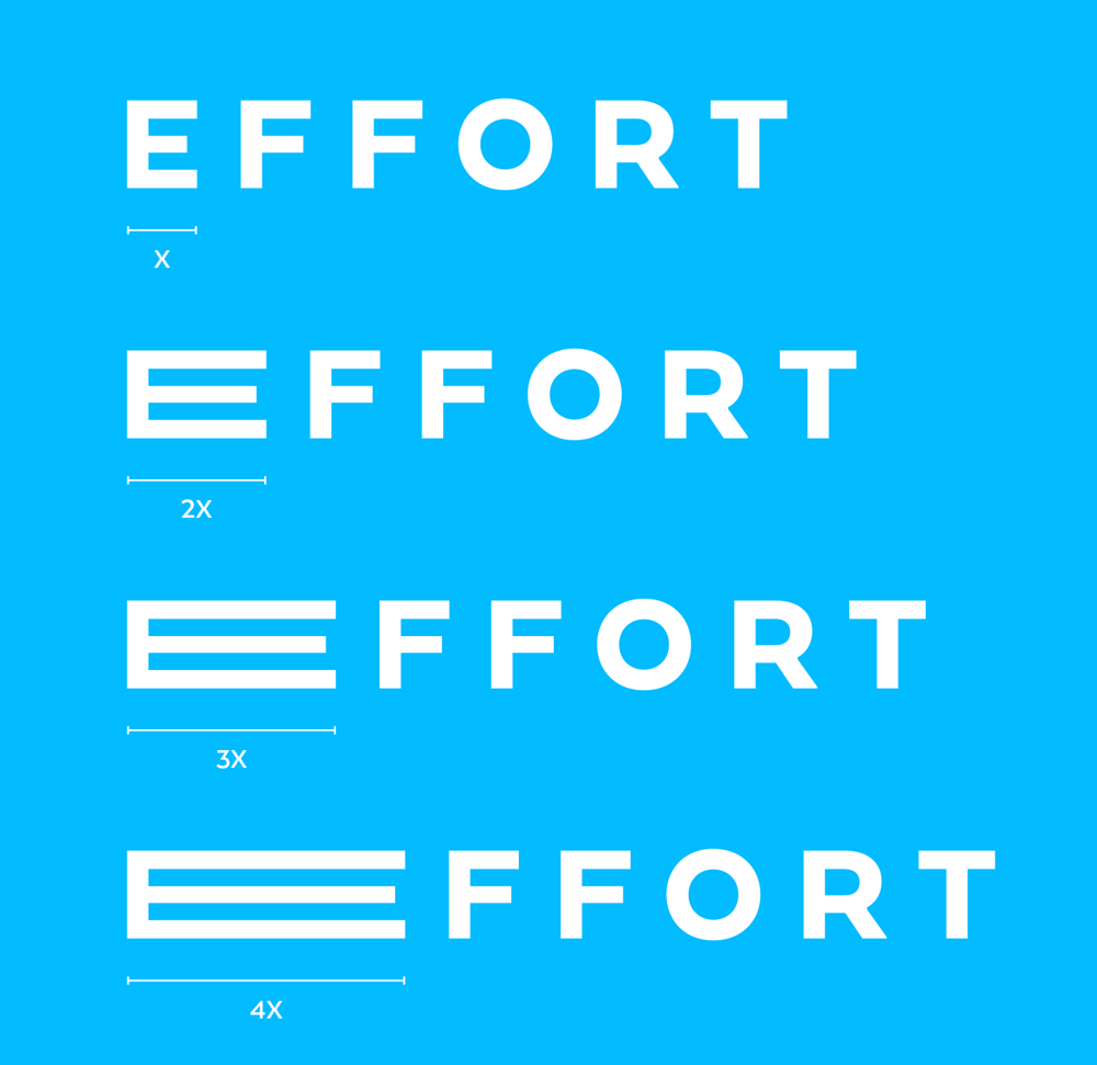
- the effort of the disciplines in the strength and the evidence of the word that has been compacted.
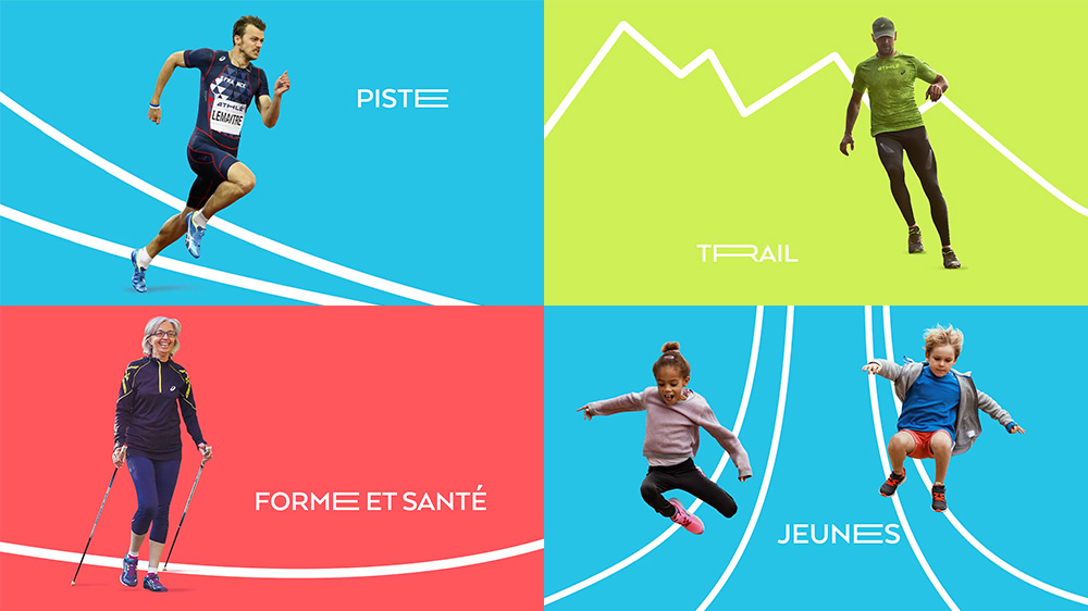
- the dynamism of the structure in the flexibility of the letters which adapts to the subjects of communication.
It symbolizes the whole Federation: its athletes, its fans and all the people of the association.
The old logo was about what you would expect from a national sports organization: very official-looking, not terribly inspiring. Other than dramatically-arched rooster, everything was generic and sort of random in the old logo, including the purple color — a mix of France’s blue and red I presume? The new logo is a drastic departure not just for the organization but for logos in general. As I write this I’m still unclear in my feelings about it. I want to like it but there is something unbalanced about it and very weird about it, even when its purpose is to clearly be weird. I think it might be the heavy “e” at the end. Or it could be the centerpiece “H” and its slightly angled stems. Perhaps there is something lost in translation, but the rationalizations make no sense; I could see perhaps this new logo referencing Greek letterforms but all the other references are lost. It’s daring for sure. The variation with the partner logos is cool in principle but very odd-looking in execution.
I’m not sure about the name either but I will differ to our French-speaking readers to comment on that. It seems like an unfinished thought or as if, say, the Fédération Française de Basket-Ball changed its name to “Basket”. I’ll shut up before I further reveal I do not understand the French language.
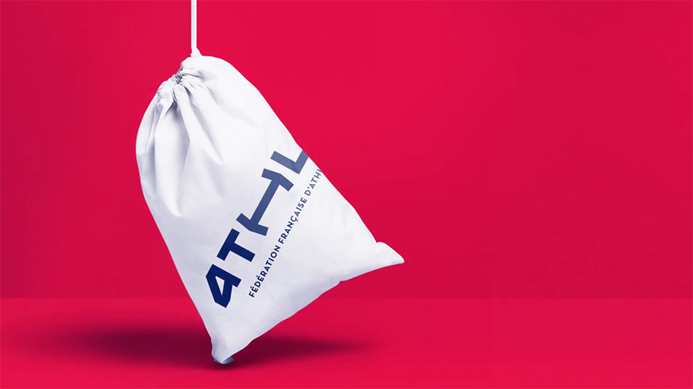
The wordmark is accompanied by the full name of the organization below it, typeset in Arquitecta, which, in its Art Deco-ness in uppercase, grounds the wordmark through a more classic element. Arquitecta is then used as the supporting typeface for the identity with some elongated variations in some letters — tying it back to the elongated “H” in the wordmark, I assume. The result is kind of cheesy and, paired with the silhouetted photos, it starts to look more like a chain of gyms than a national organization.
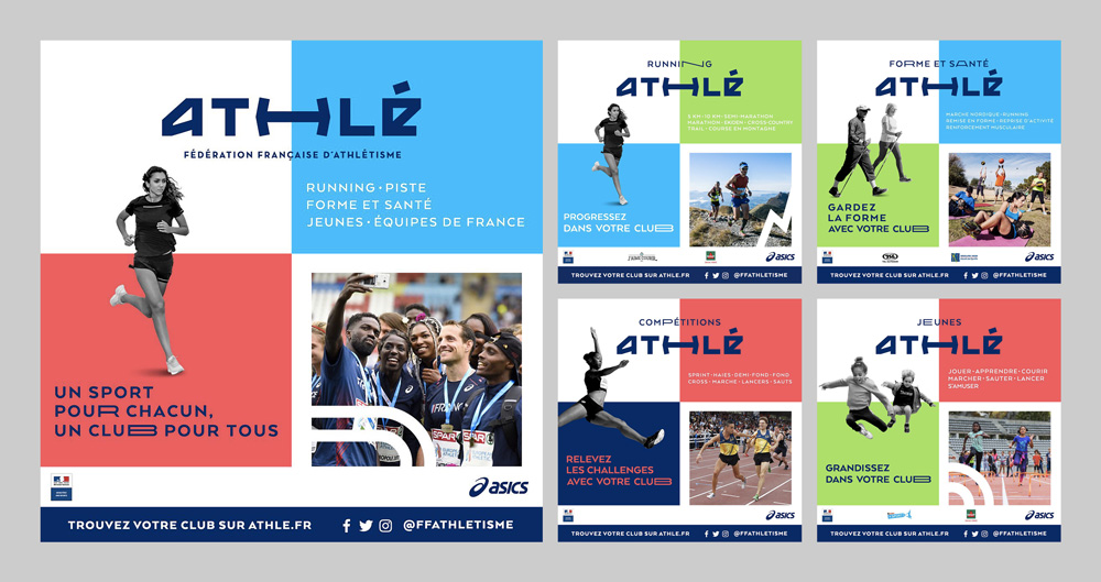
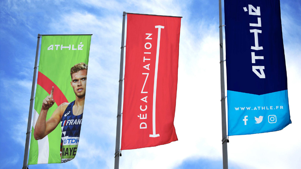
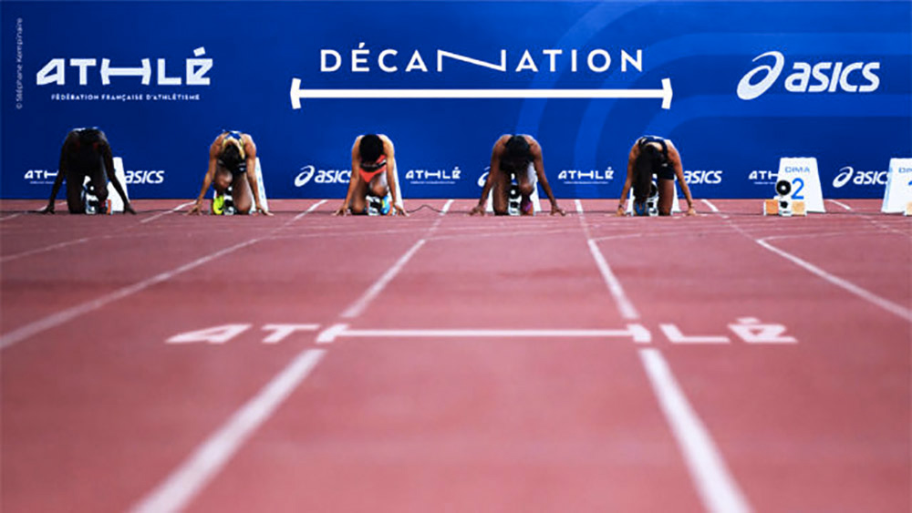
Some of the more official applications are better and more convincing — the banners image almost makes me a convert and the social media graphics strike a better balance of effusiveness and official-ness. Overall, this seems to be positioned more like a lifestyle logo and identity with the intention of gaining a wider audience but maybe the Adidas-ing should be left to the Adidas-es of the world, not national governing bodies.
Thanks to Brandemia for the tip.

 Новости Союза дизайнеров
Все о дизайне в Санкт-Петербурге.
Новости Союза дизайнеров
Все о дизайне в Санкт-Петербурге.