contact us | ok@ohmycode.ru
contact us | ok@ohmycode.ru

Opened last year, Live Wire Park is an elevated adventure park nestled in Great Otway National Park in southern Victoria, Australia. The park is off the grid and designed to have a minimal impact on the environment, fueled by solar power and with all water collected and treated on site. One of its main attractions is a 525-metre-long (0.32-mile-long) zip line, along with 53 mid-air trails, suspended bridges, tree-scaling activities, and a 10-meter (32-foot) bungee jump. The identity for Live Wire Park was designed by Prahran, Victoria-based Self-titled.
The brand idea of ‘Nature Supercharged’ informed the signature colour - the green of the forest dialed up to 11, as well as the visual and verbal language of Live Wire Park.
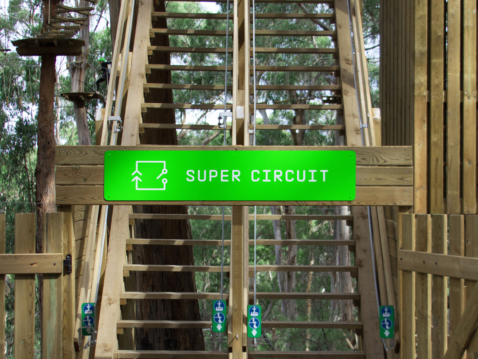
The linear typography and iconography was drawn from references to circuit diagrams.
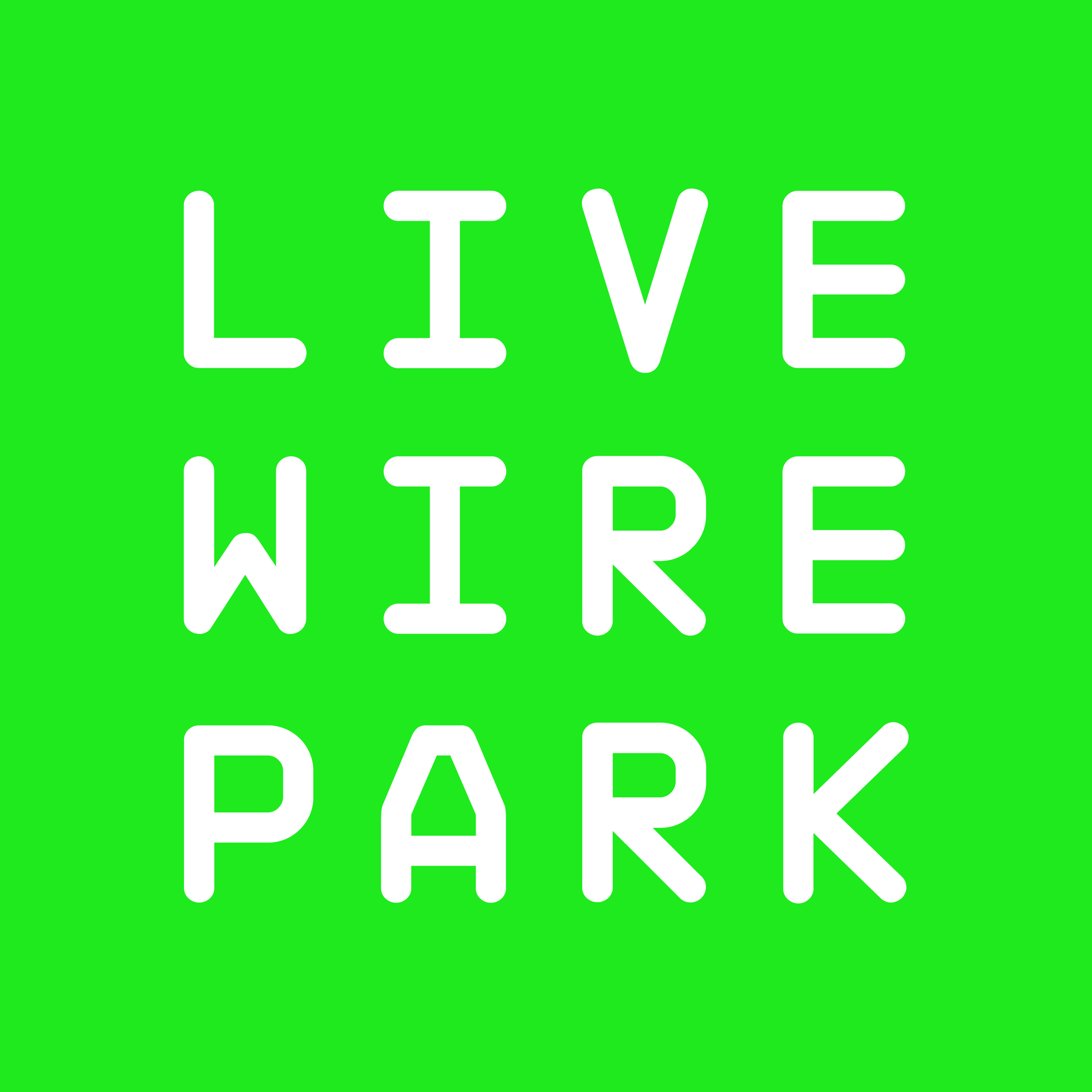
Nature adventure park logos are typically a combination of zip-lining human silhouettes, trees, swooshes, and a Six Flags-ride-aesthetic that makes them all look the same. This one, in a monospace techie font signals a different kind of experience. On its own there is not much to it but I like that — in its four-letters-per-word arrangement — it conveys a certain precision and operating excellence attitude that the Tarzan-like lettering in the logos of most parks doesn’t quite achieve.
The super extra crazy bright green is super extra crazy bright and I will totally buy its rationalization as the “green of the forest dialed up to 11”. Also, as you will see in the applications, unlike “that blue”, this green can be replicated in print and product applications, making the transition from digital to physical pretty convincing.
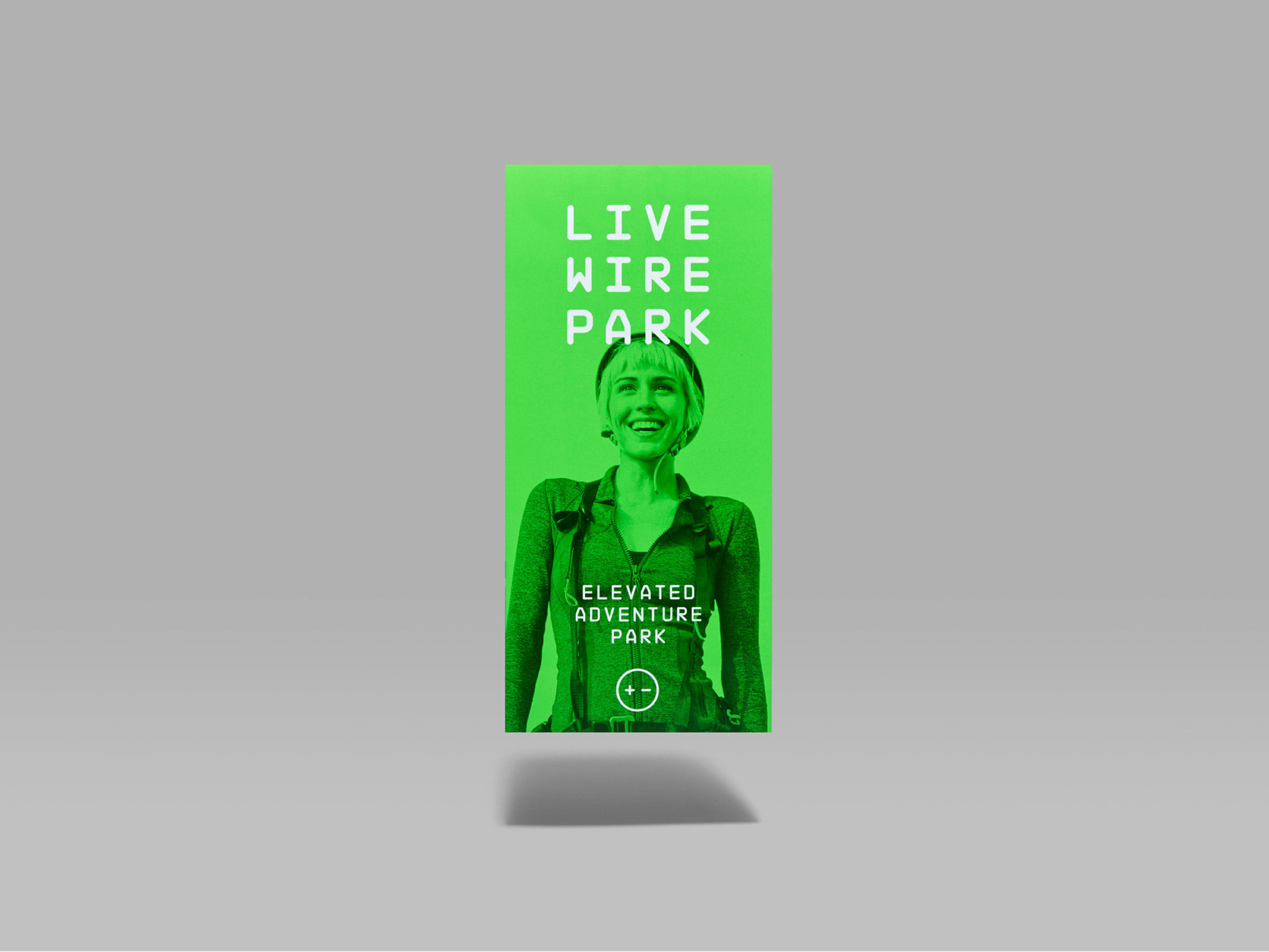
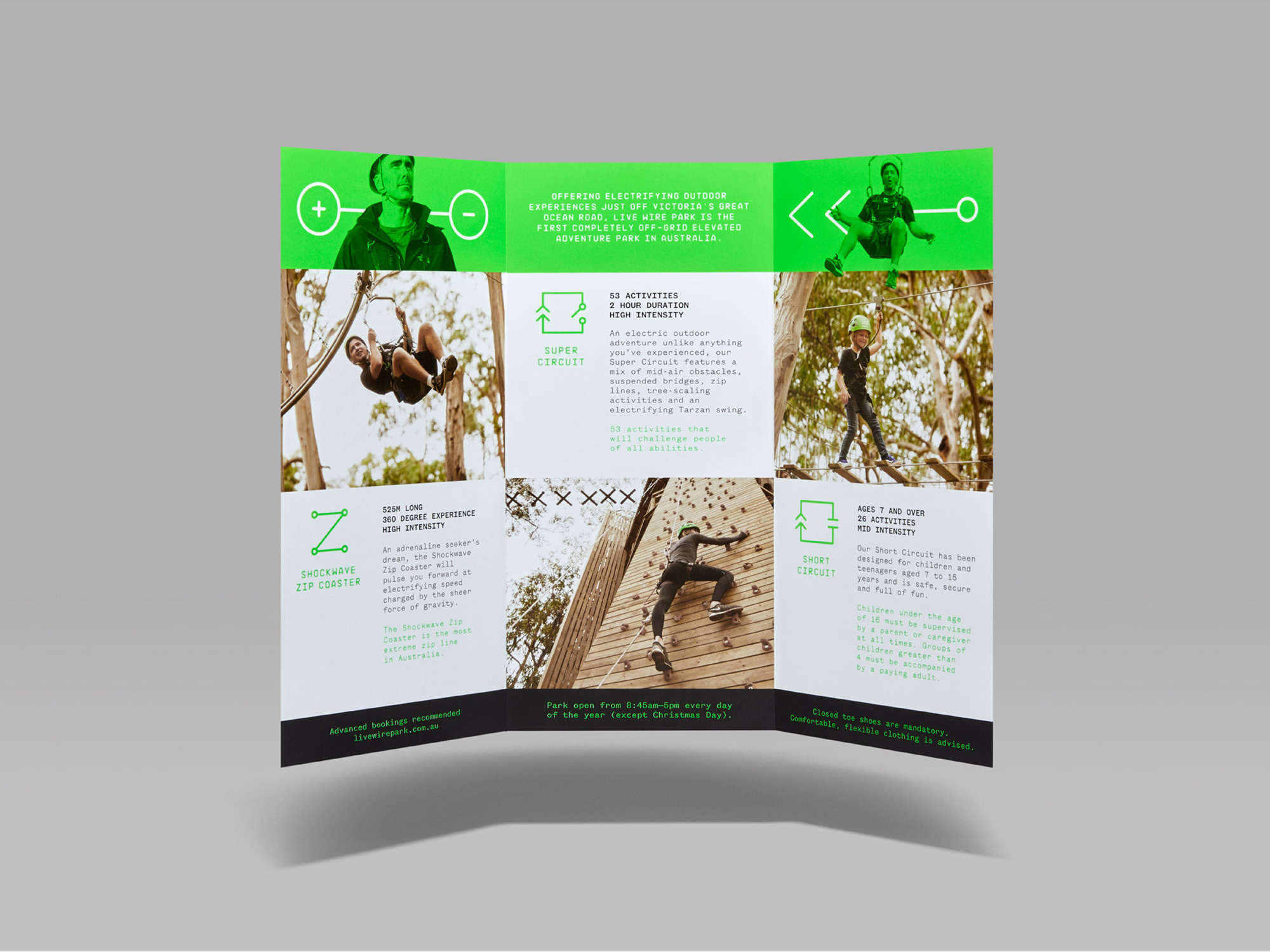
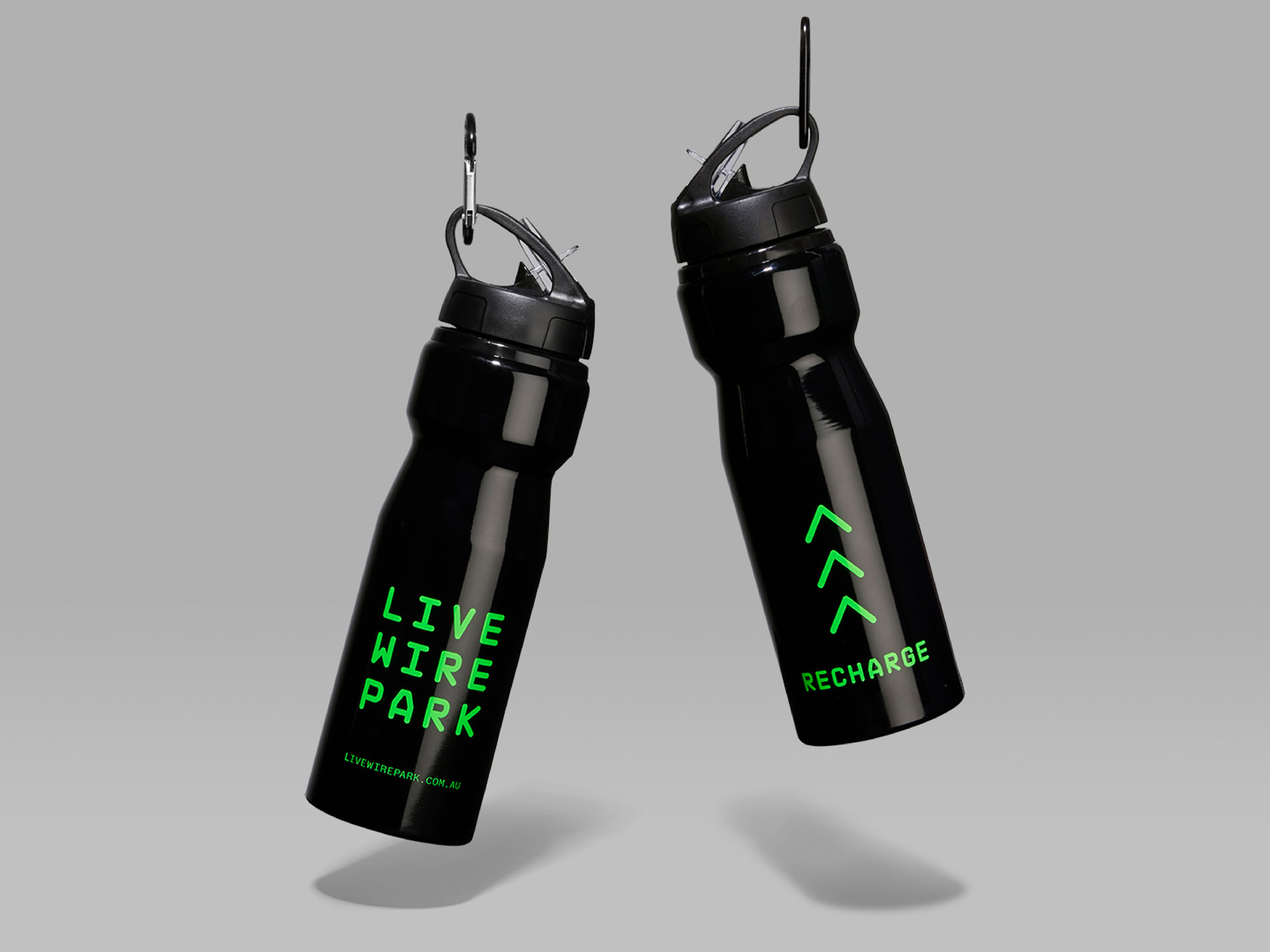
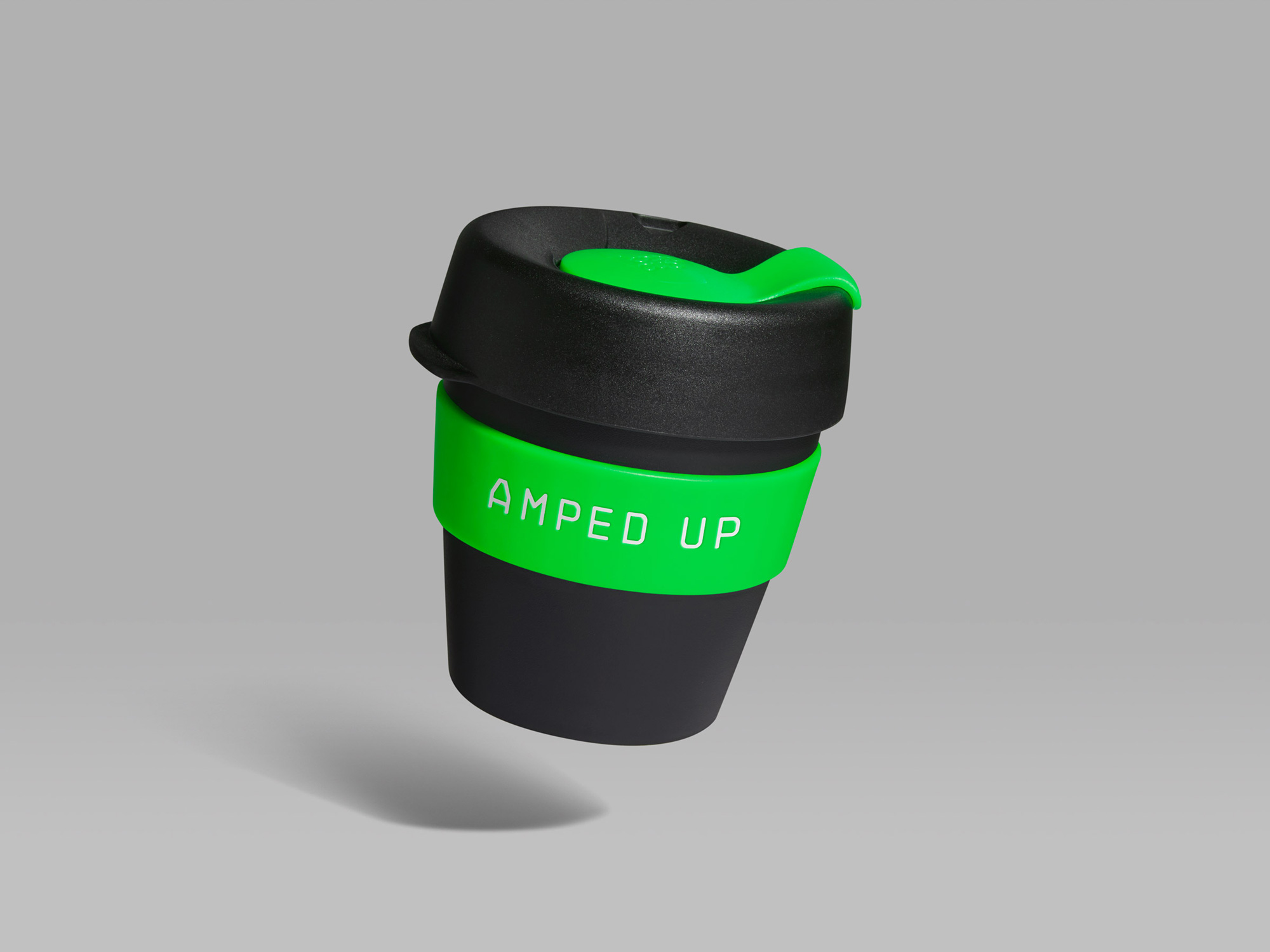
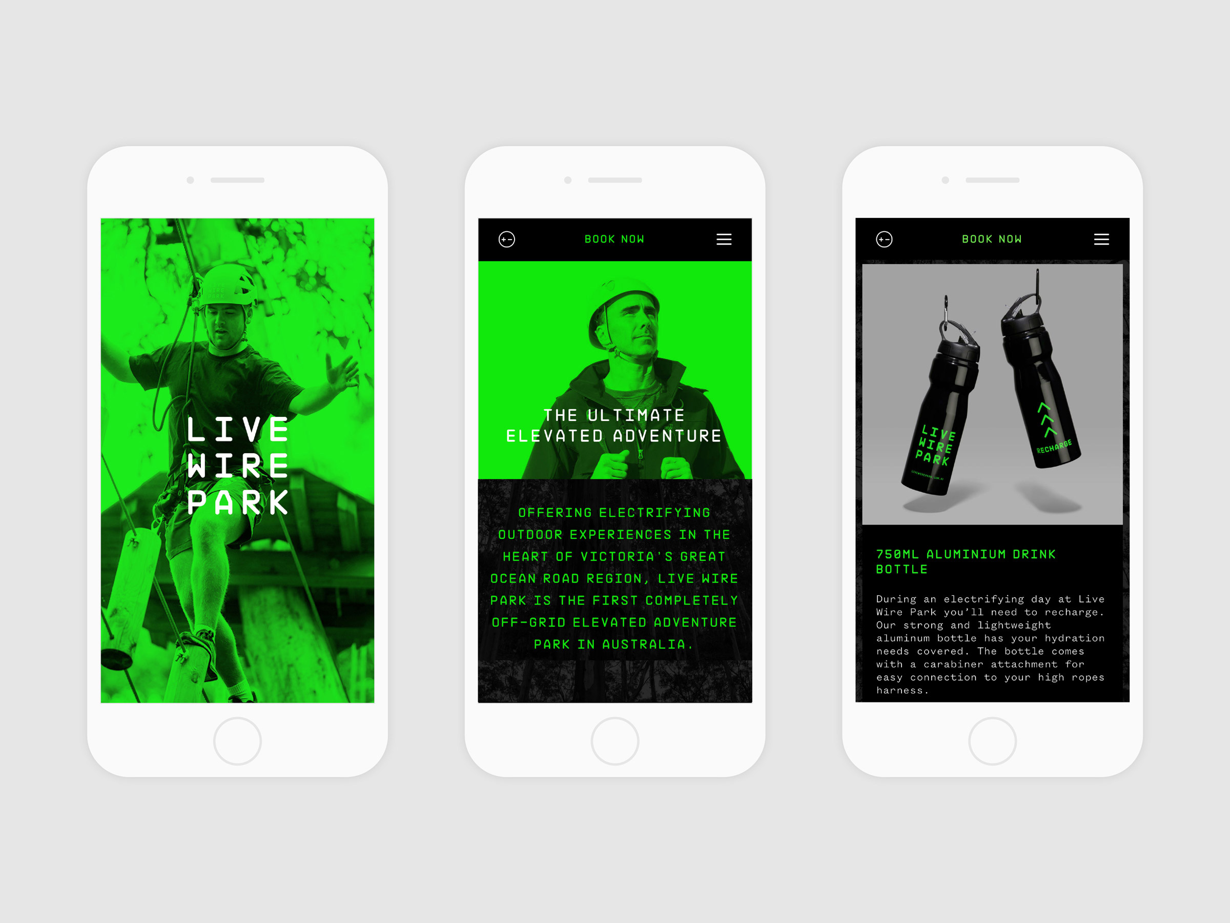

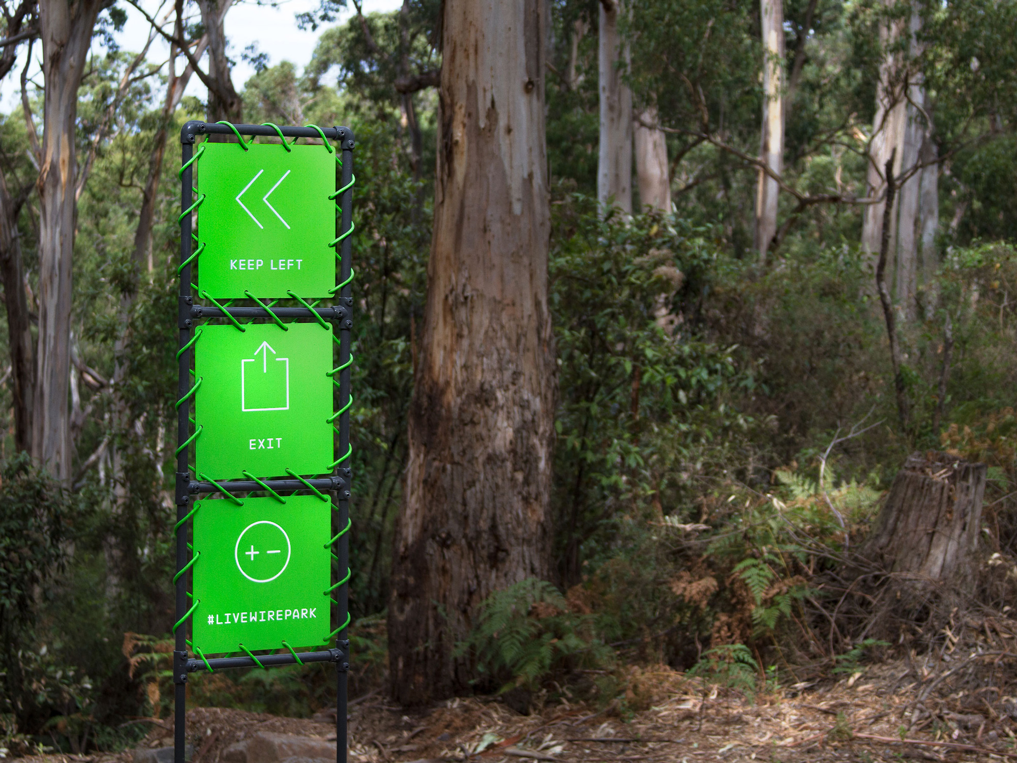
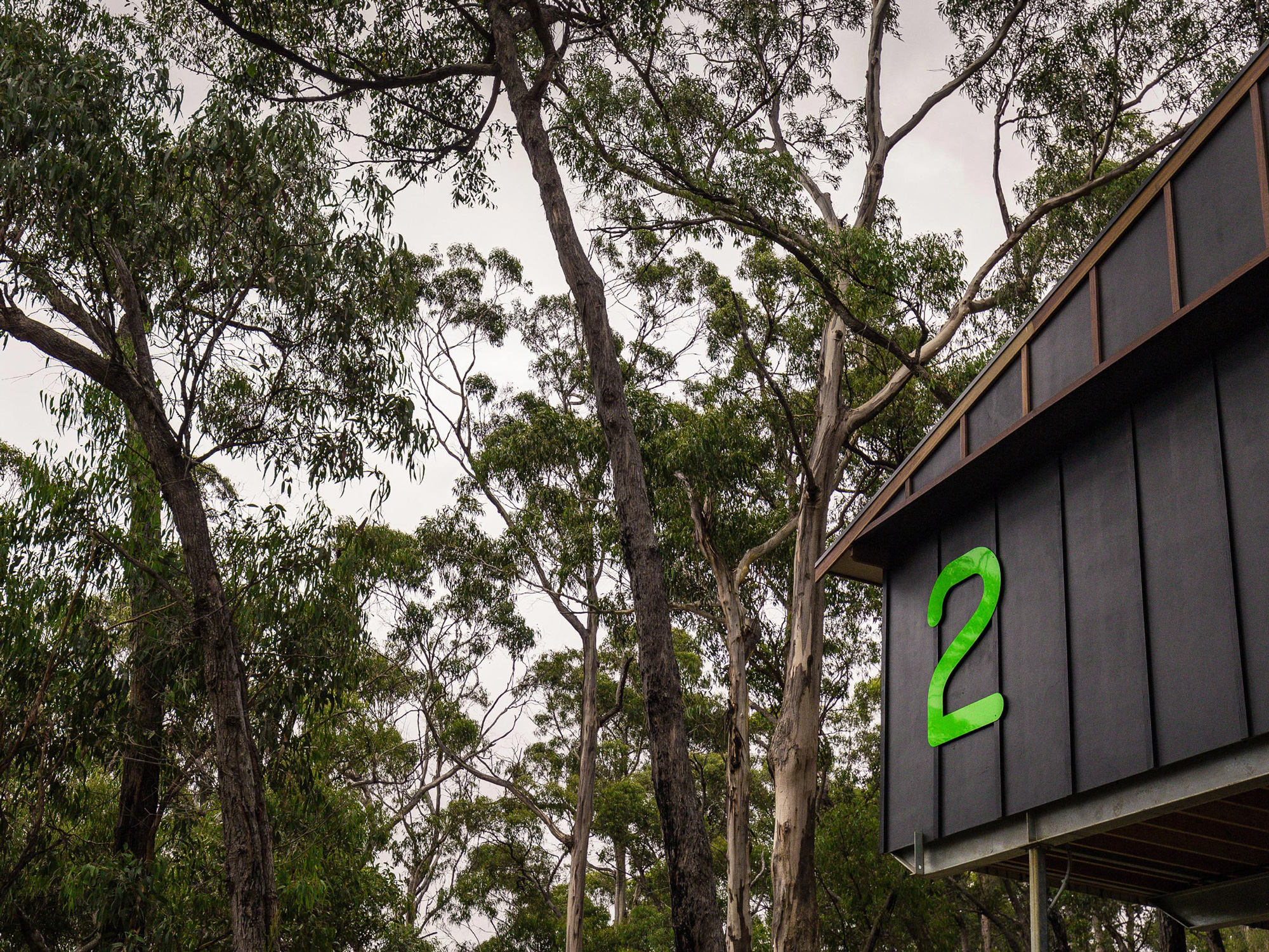
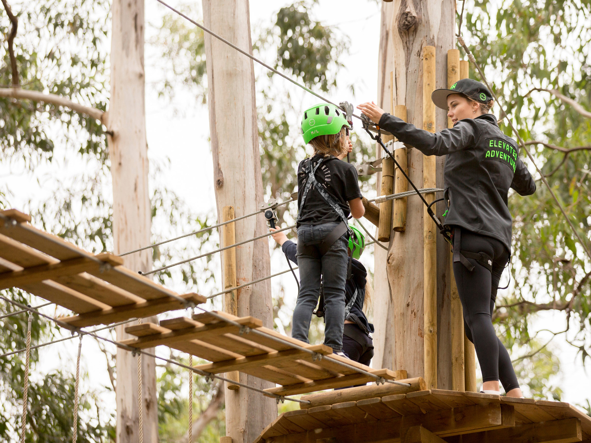
The system is basically the monospace font, cool photos, and lots of green and black. Simple but fun. The real treat of this project is in the application on site with bursts of bright green that contrast intensely against the beautiful nature backdrop and the wooded structures of the rides. All the different materials in the fluorescent green (thread, acrylic, tape) are great and help “brand” the forest in a unique way.
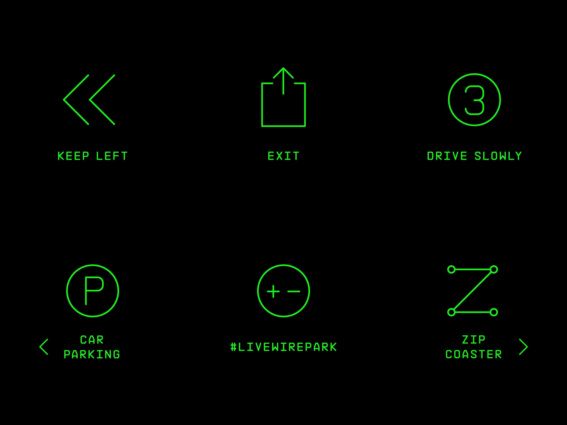
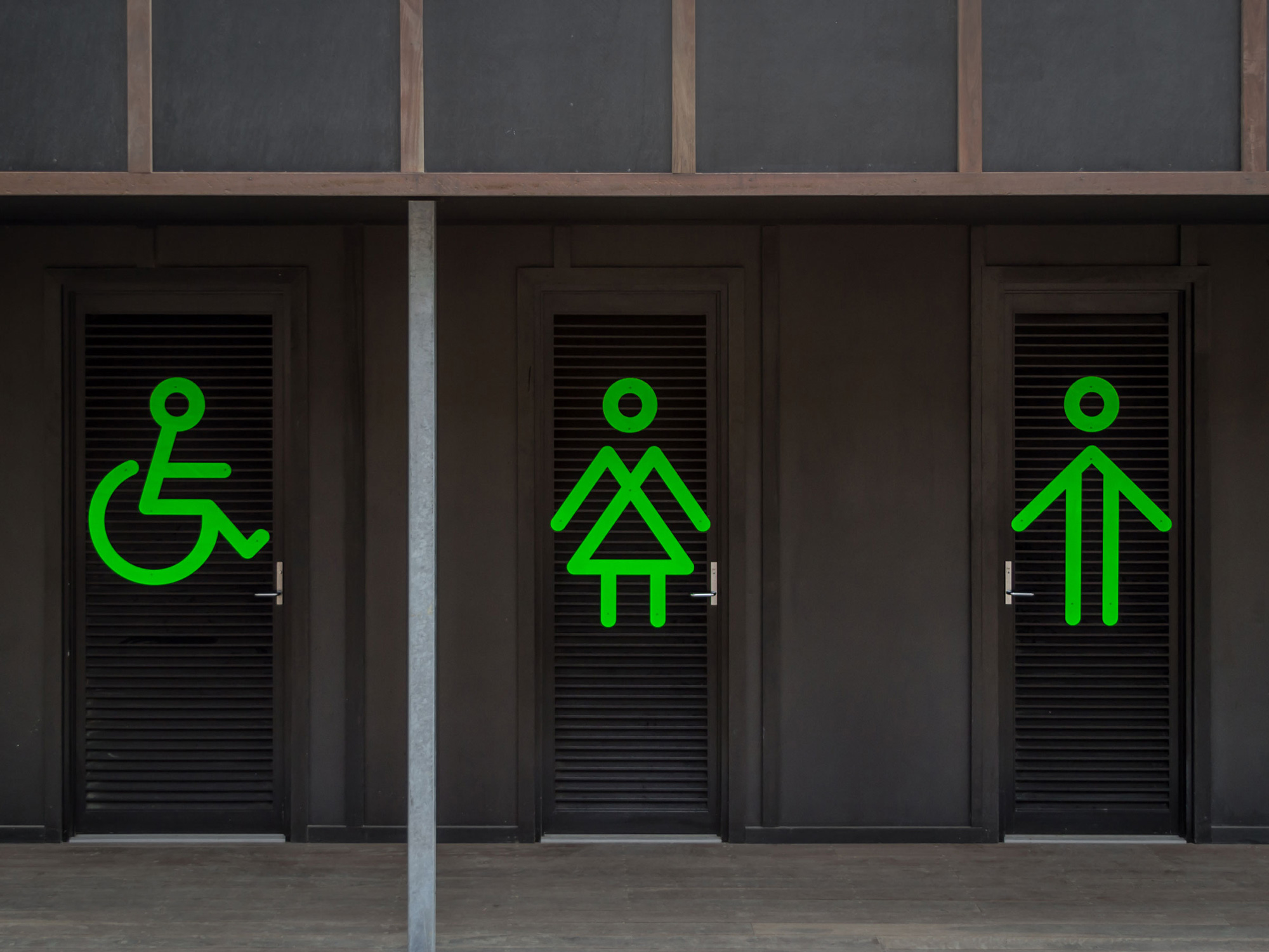
A cost effective and pragmatic signage system was devised to brand the environment and help visitors guide themselves around the park.
Where most high ropes parks use the same standard helmet, Self-titled sourced signature green models and branded them. Perfect for brand exposure in all those selfies. Crew wear high quality hats, beanies and customised apparel.
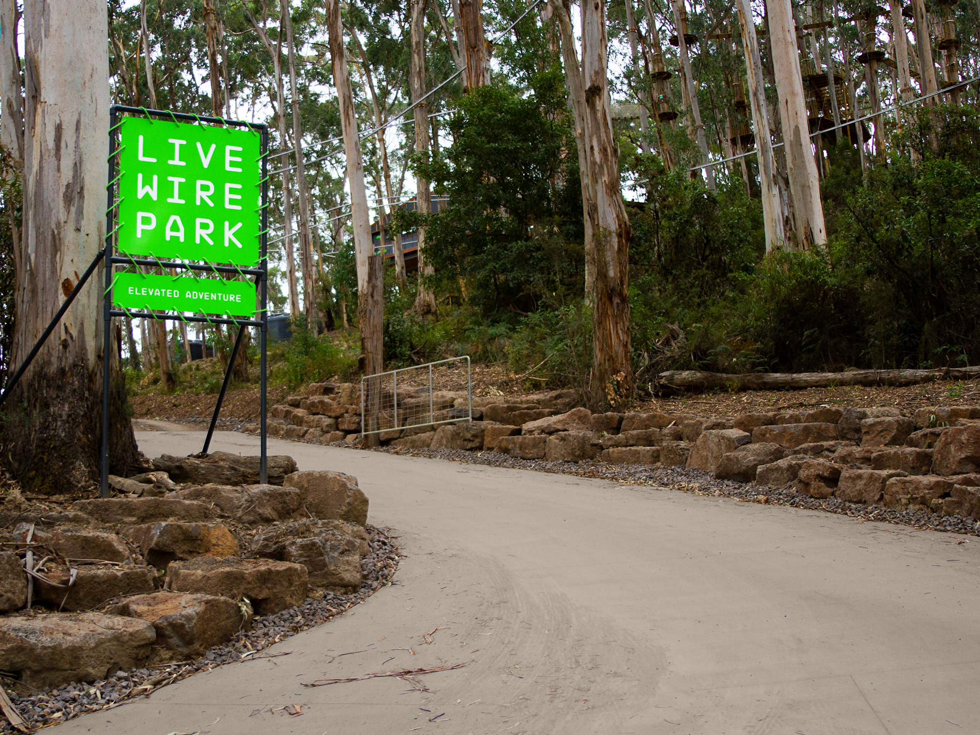
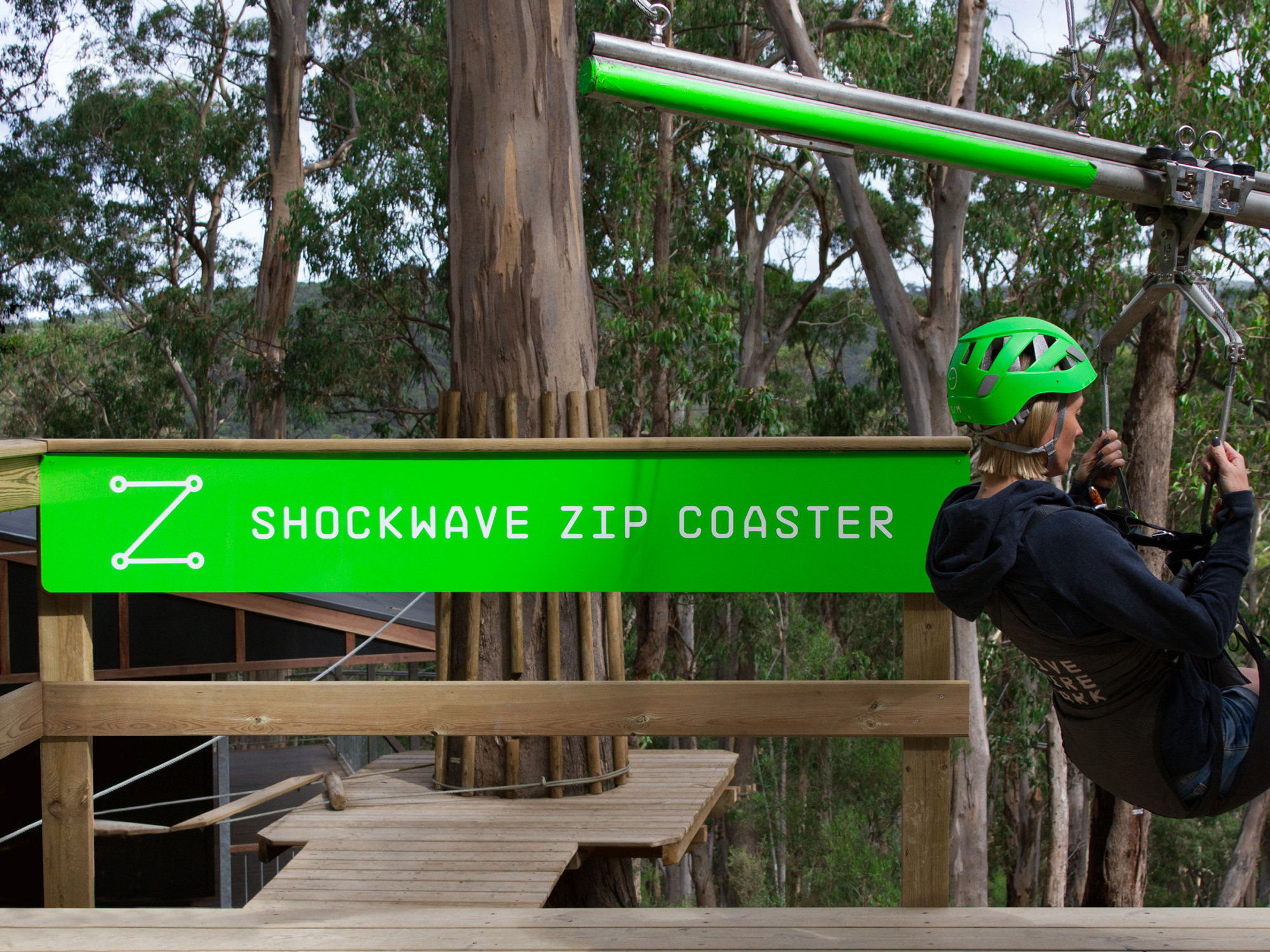
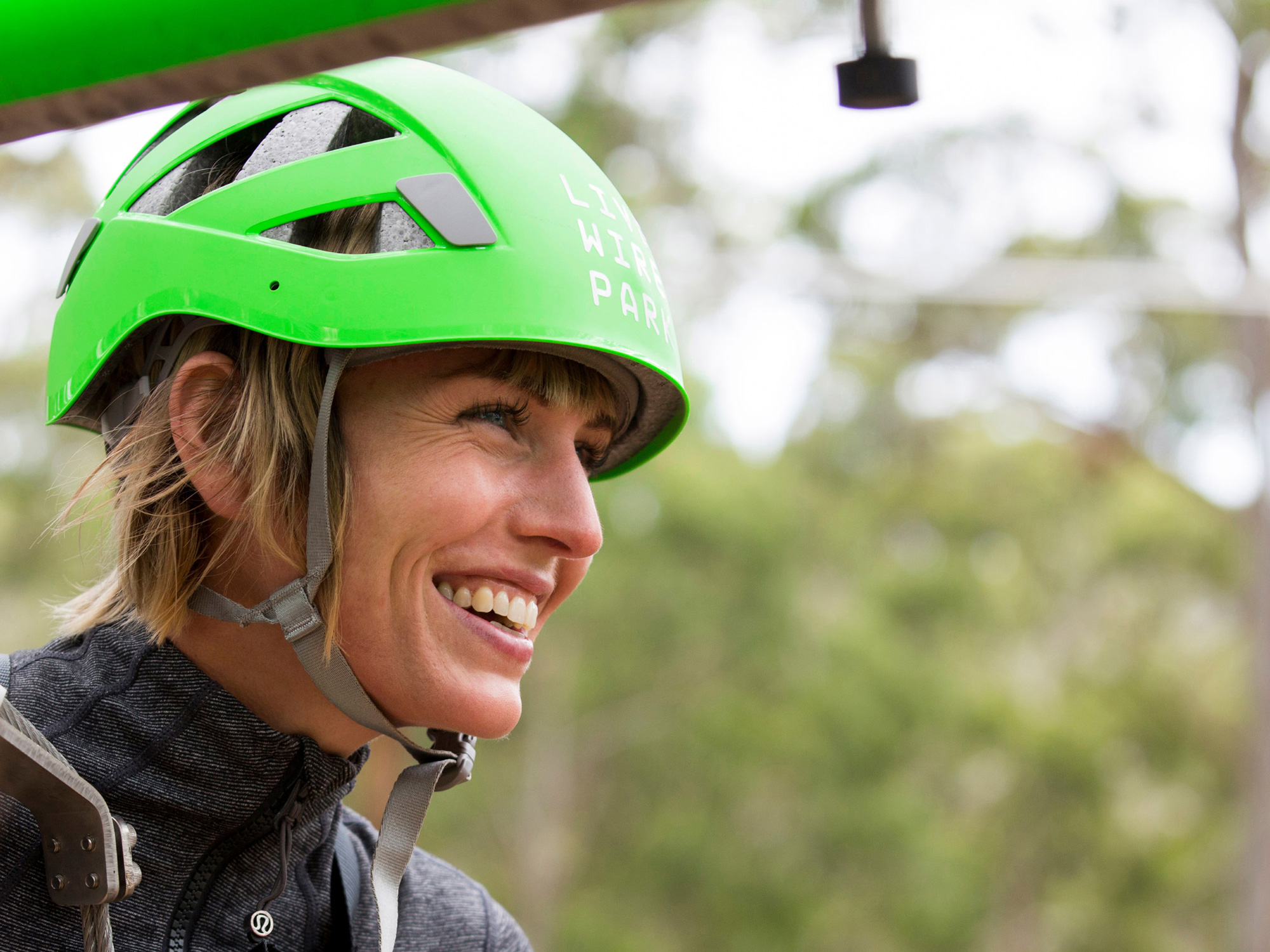
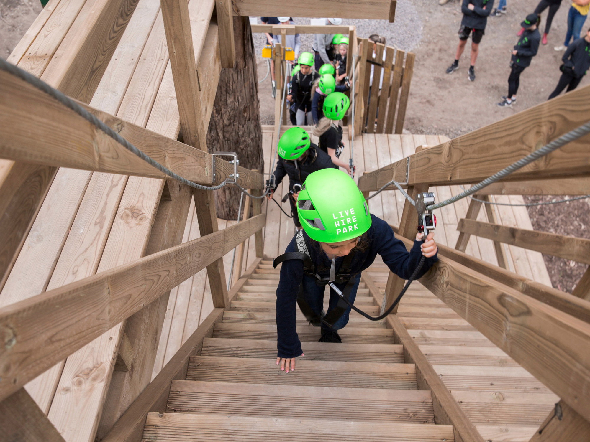
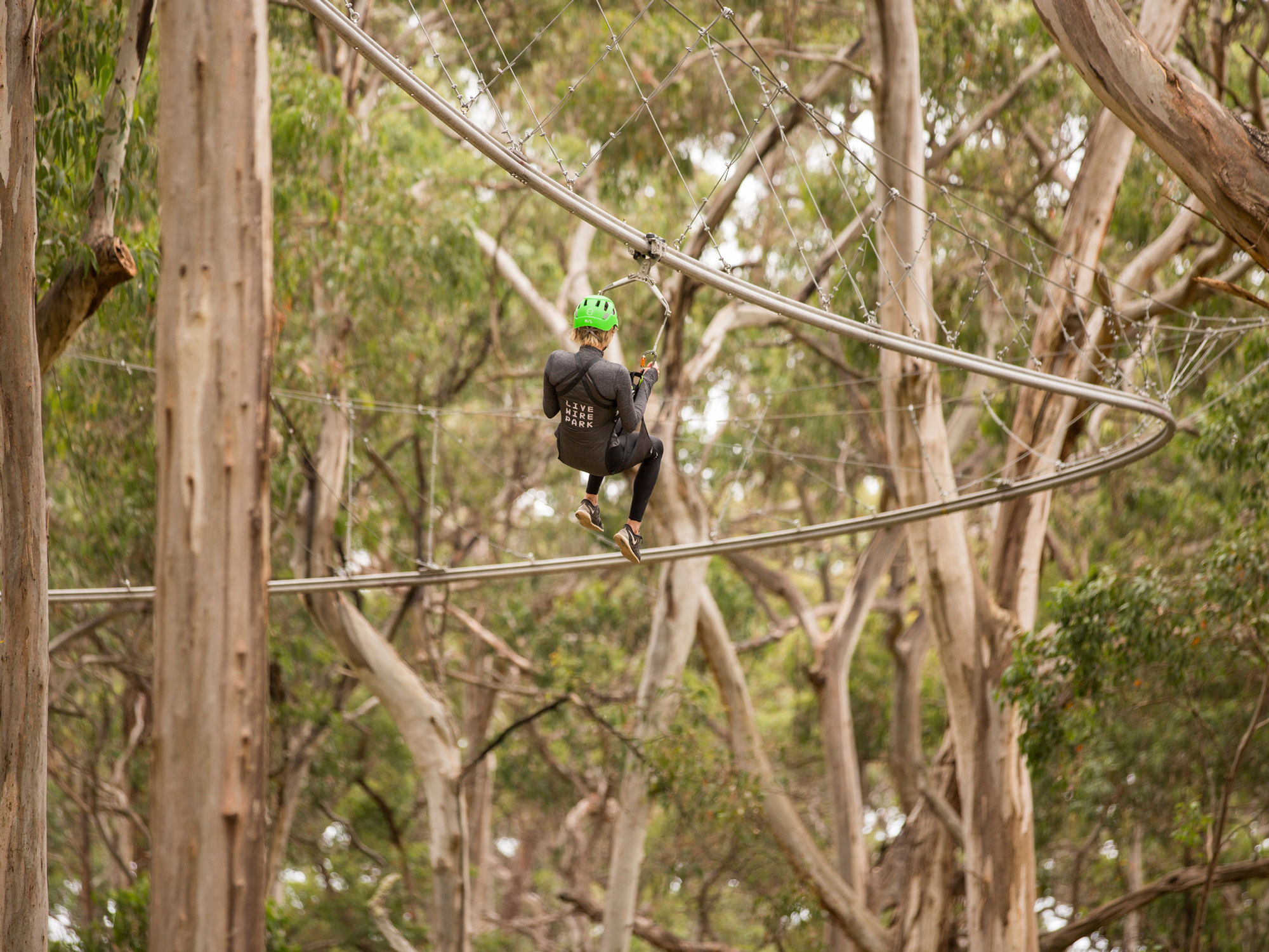
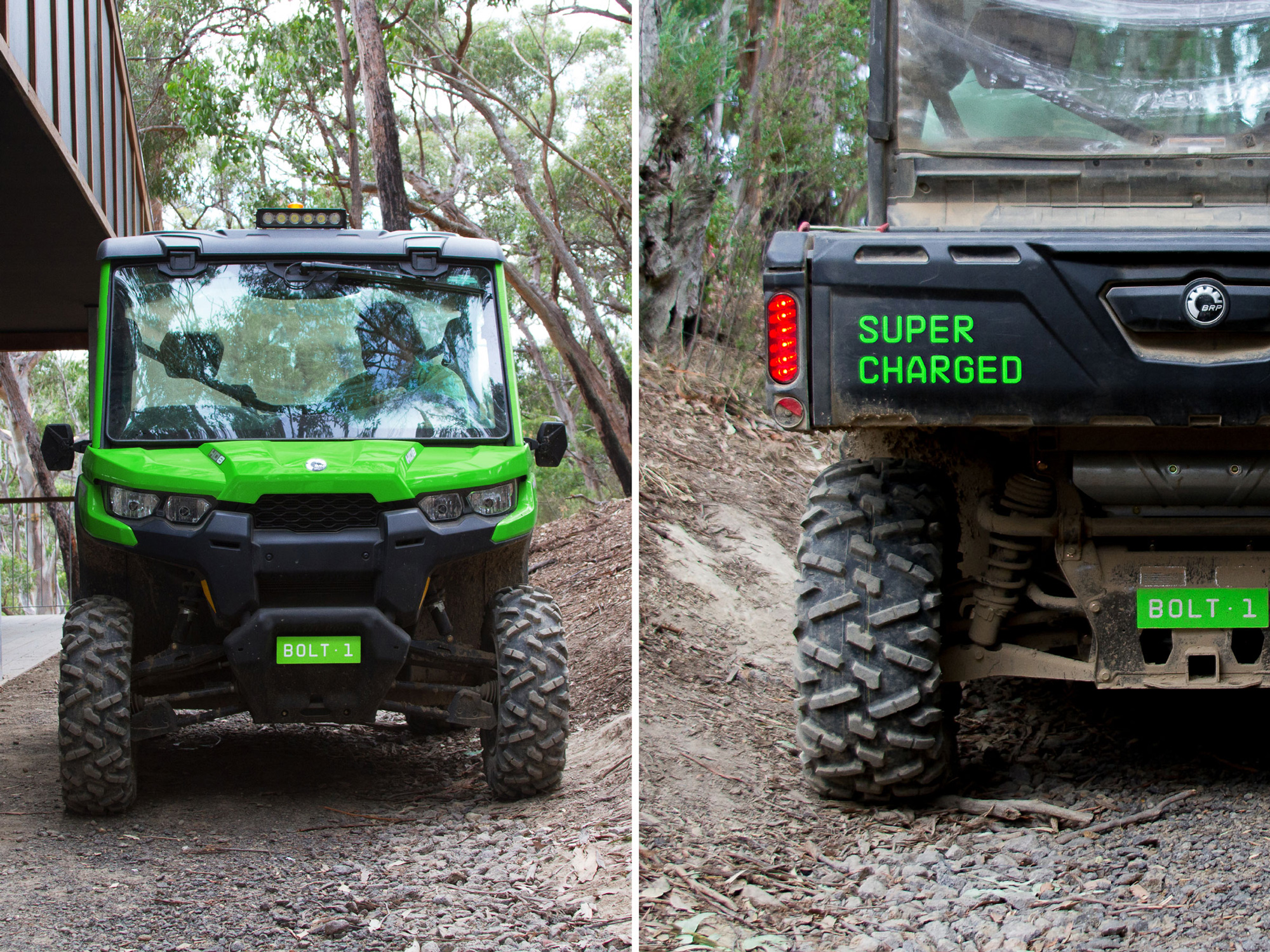
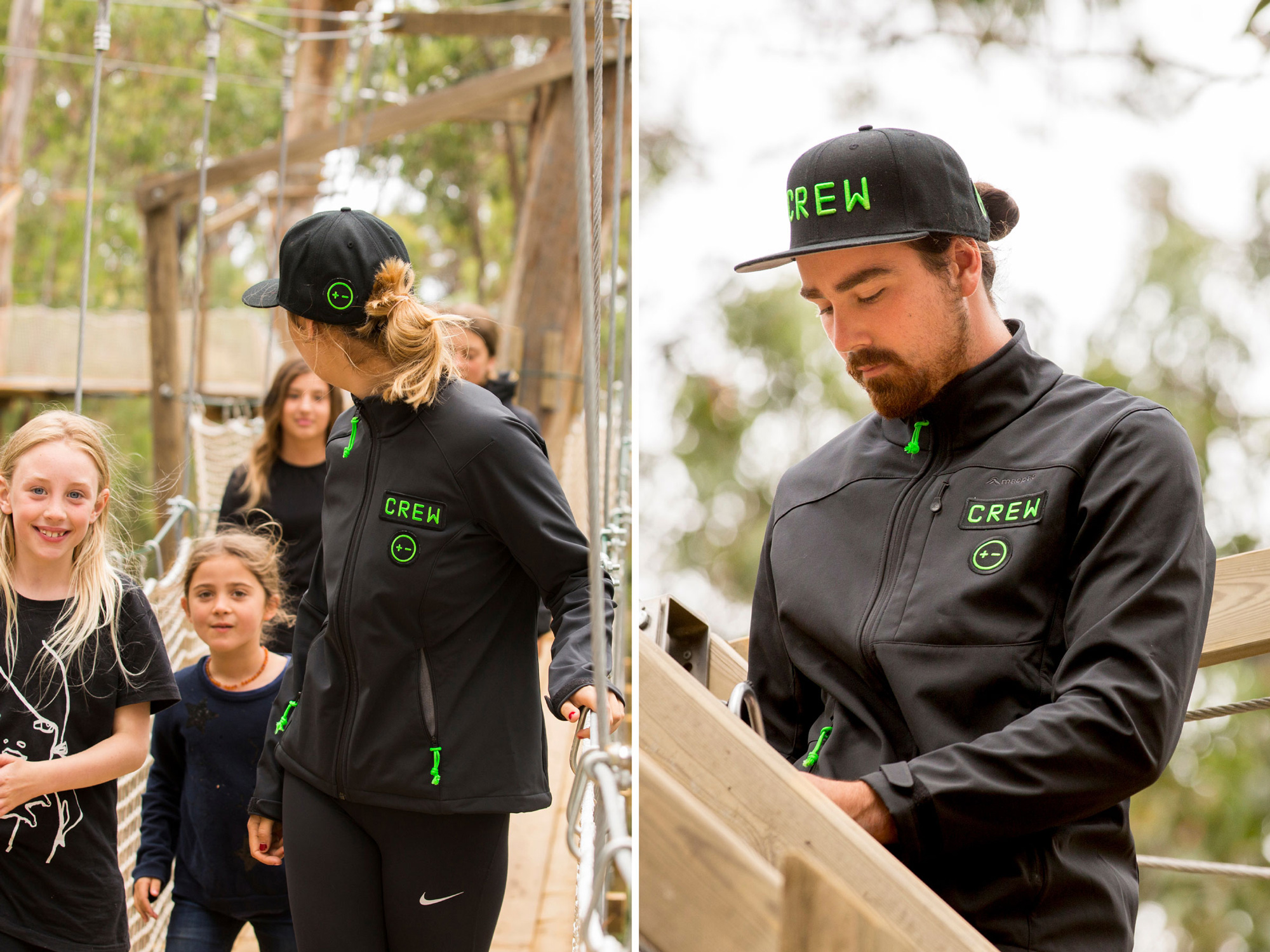
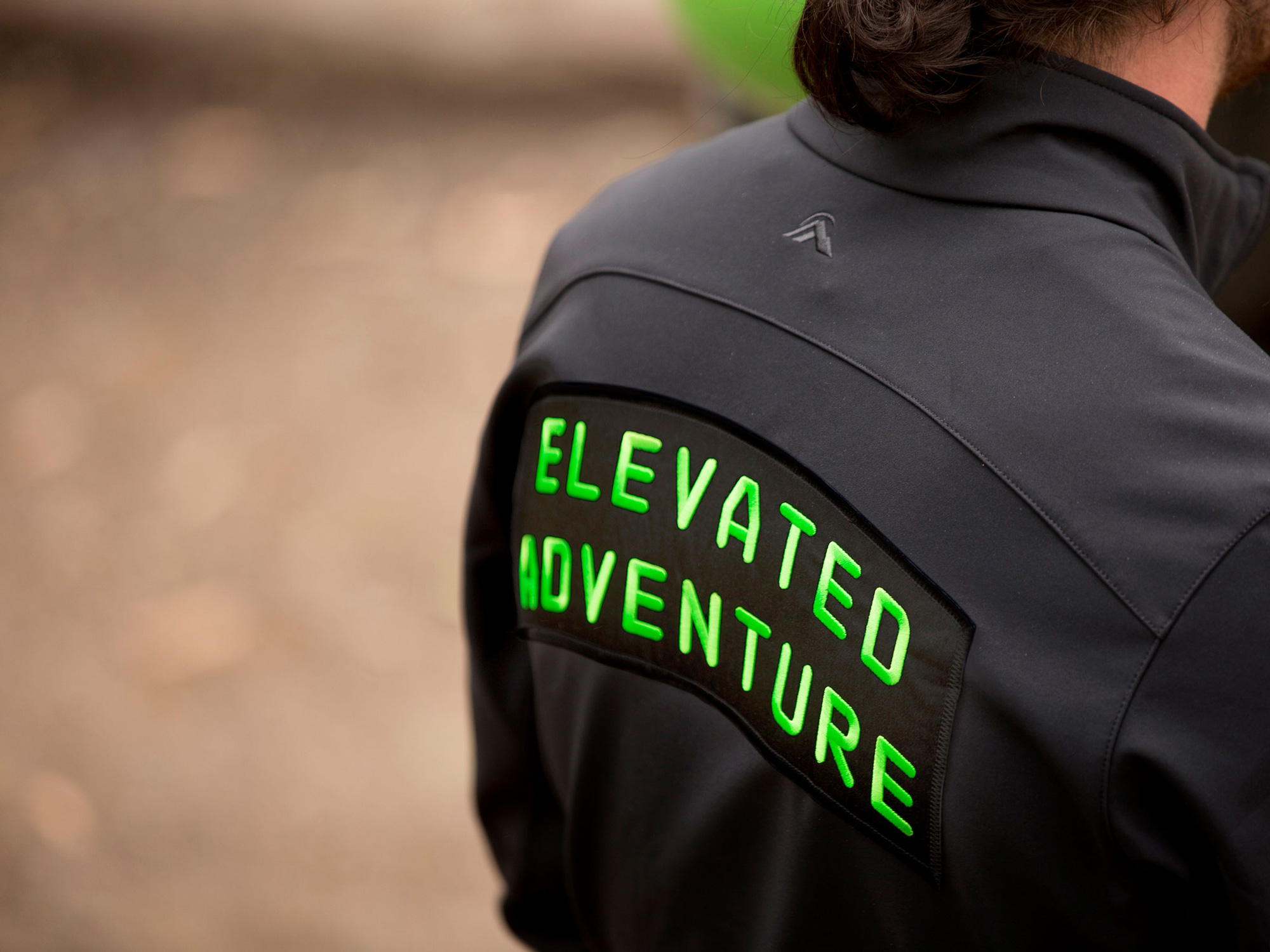
While I’m sure that the bright green helmets cost more, it’s such a smart investment as it’s bound to be the park’s main brand ambassador as people post their selfies on social media. Attention to detail like the string on the zippers also being green is fantastic. Overall, this is a great identity that avoids the clichés of the industry and offers something as unique as the park itself.

 Новости Союза дизайнеров
Все о дизайне в Санкт-Петербурге.