contact us | ok@ohmycode.ru
contact us | ok@ohmycode.ru
Established in 2018 and launched earlier this year, North Star Film Alliance (NSFA) is a joint venture between the countries of Estonia, Latvia, and Finland to promote the region as a filmmaking destination. Servicing global film and TV productions, the NSFA touts a number of key benefits from shooting in the region: diverse and unique nature, architecture for all kinds of scenes, hubs for transportation to Asia and the rest of Europe, highly educated and skilled professionals, cost-effective production, peace and quiet, and top-notch technology (including, apparently, the world’s best drone pilots). The area got some recent attention when Christopher Nolan filmed parts of his upcoming move, Tenet, in Tallinn, Estonia. The identity for NSFA has been designed by Helsinki, Finland-based BOND
The green screen, familiar to everyone within the industry and beyond, and its neon green, became the plot twist that is surprising, yet understandable. Something, that doesn’t require Hercule Poirot to explain our thinking:North Star Film Alliance is the backdrop, the enabler, set for whatever vision.
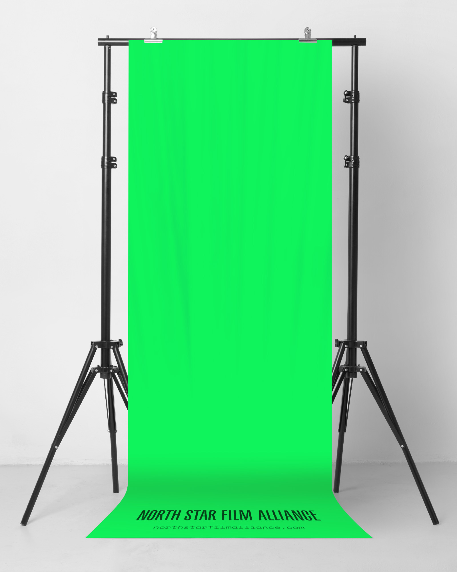
North Star Film Alliance is not the lead character, but plays a supporting role, creating the backdrop for the primary action. Regardless of the nature of the production. And still shines brightly on its own too.
For this idea we scripted the simplest possible visual form, capturing NSFA’s purpose and role as straight-forward way as possible.

There is not much to the logo and if this was the “before” version of a new logo for something else I would probably criticize it for, well, not being much but as part of the bigger identity it establishes the NSFA as a supporting character looking to fit into any production necessary without being too obtrusive with its own presence although the bright green does make you pay attention to it. So, yeah, the logo is not much to look at or get excited by but even then, it’s a nice enough piece of condensed typography.
Also starring: film-related typography, and clever messaging that speaks to the industry insiders.
The latter helping to engage with people on a personal level, functioning as a killer conversation starter within an industry, where personal connections mean the world.
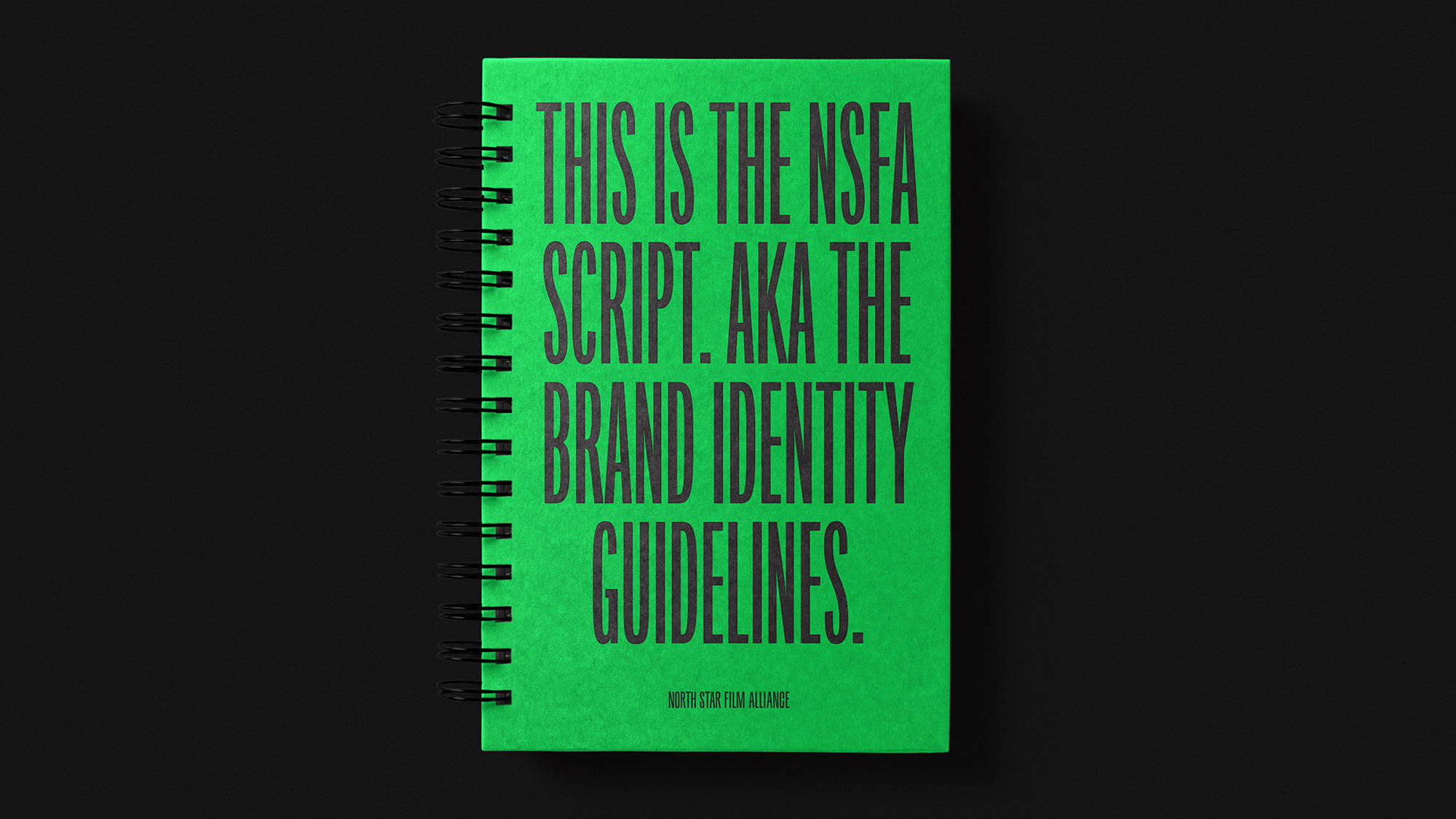
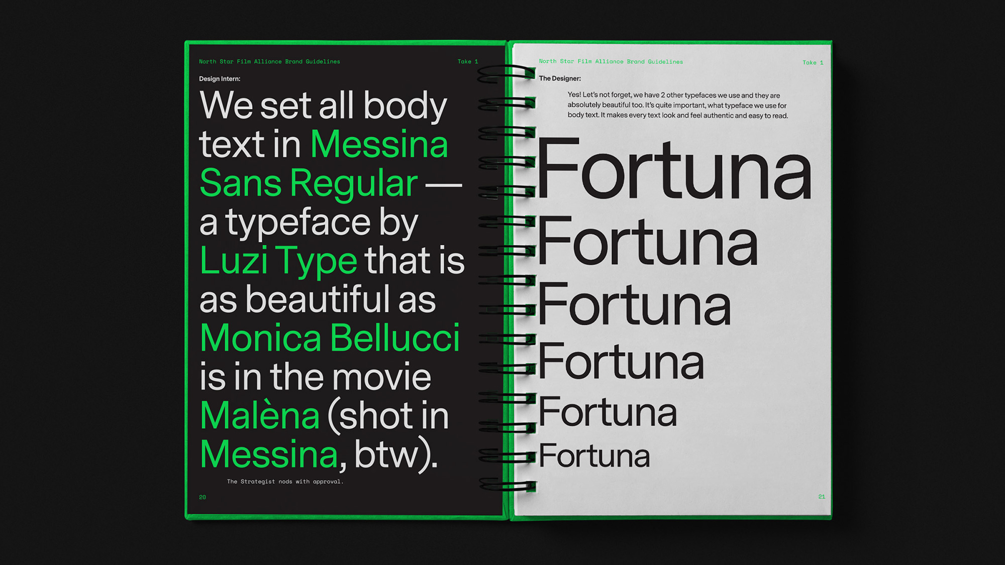
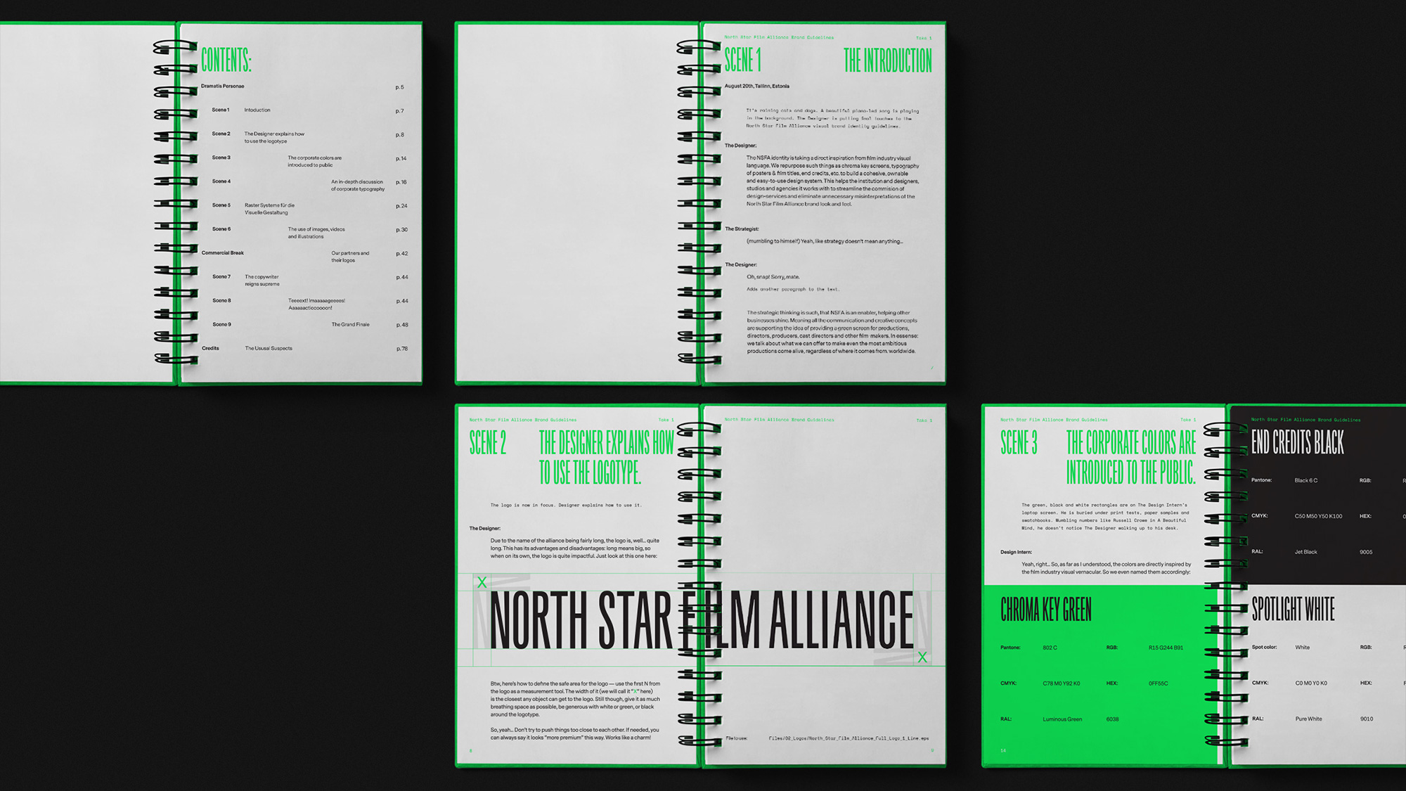
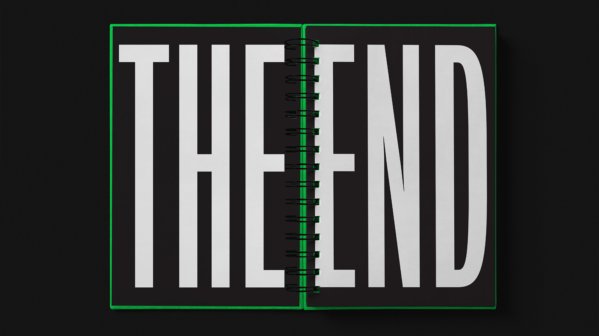
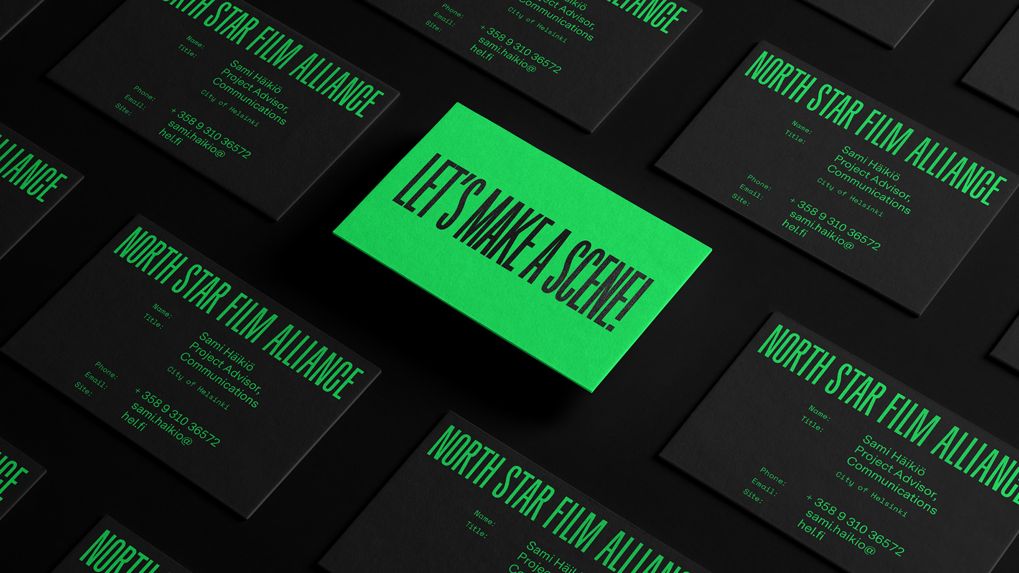
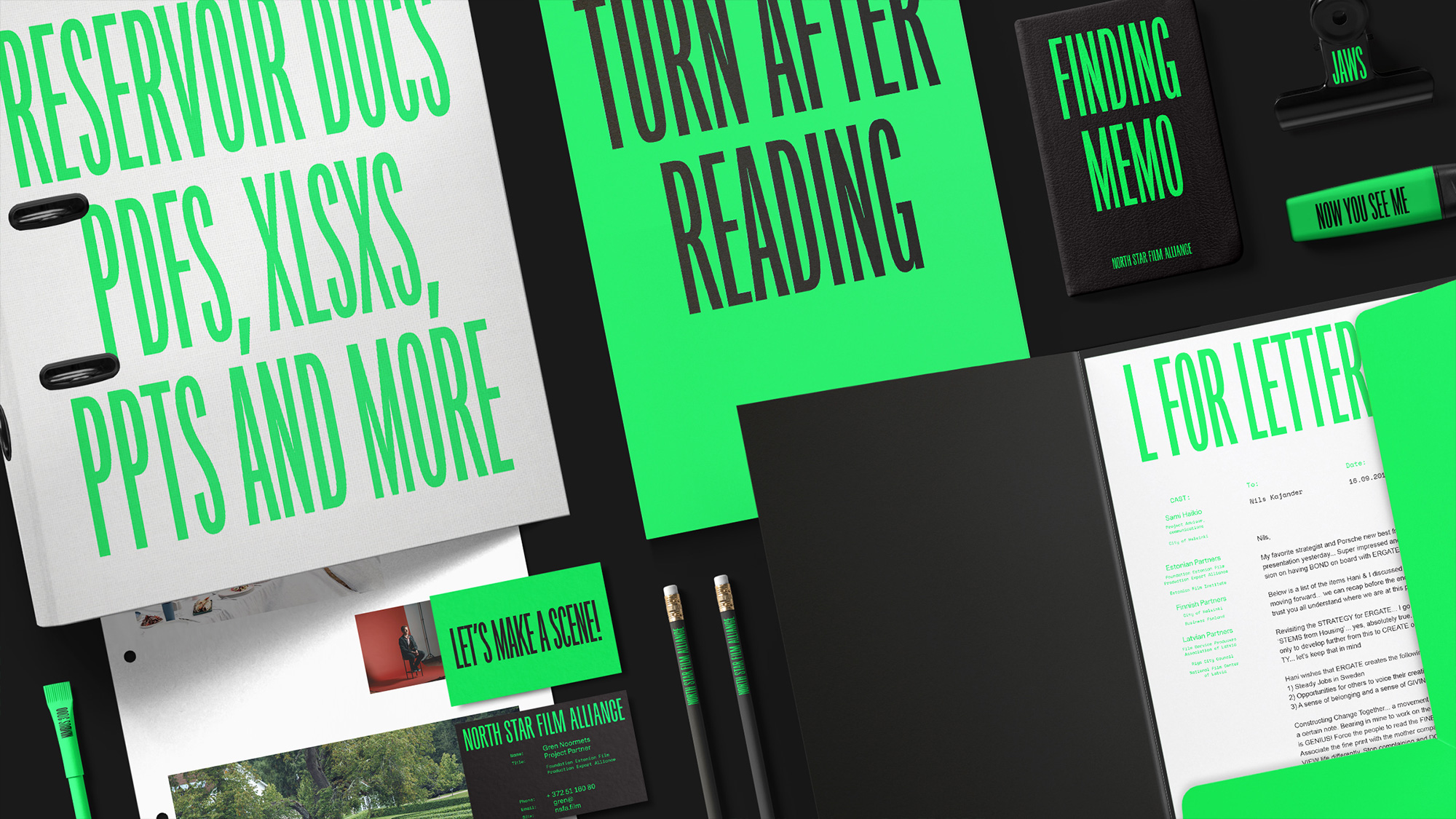
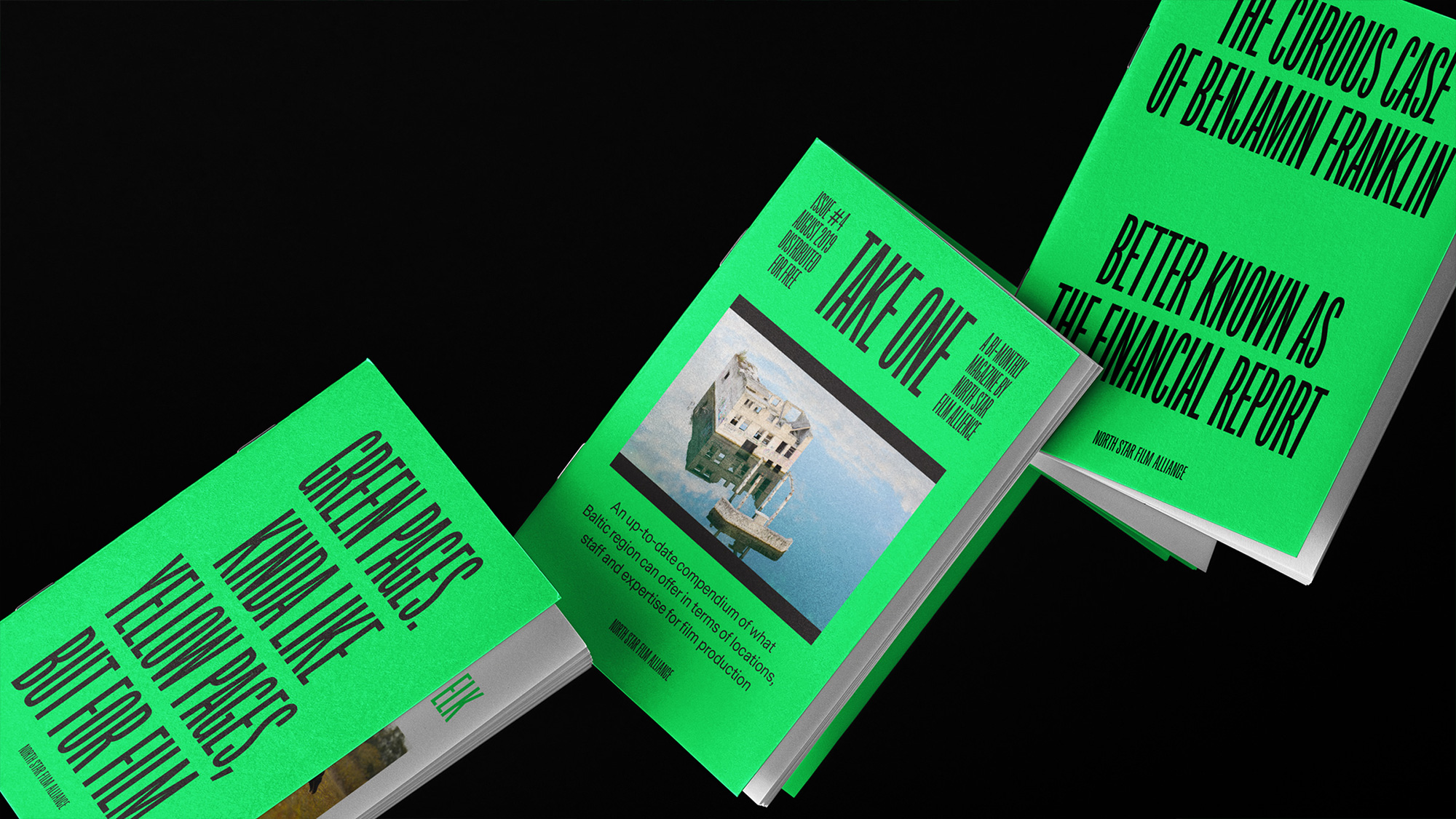
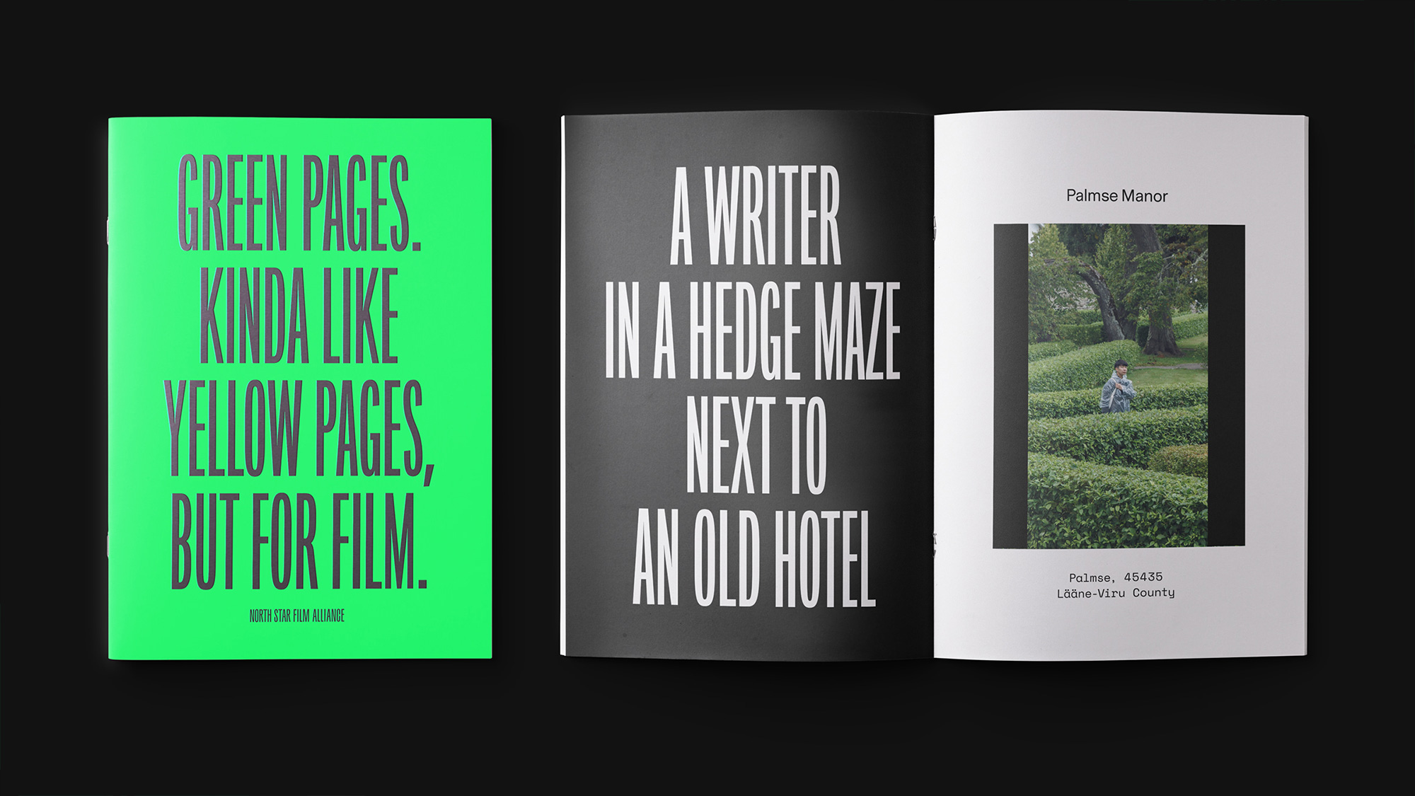
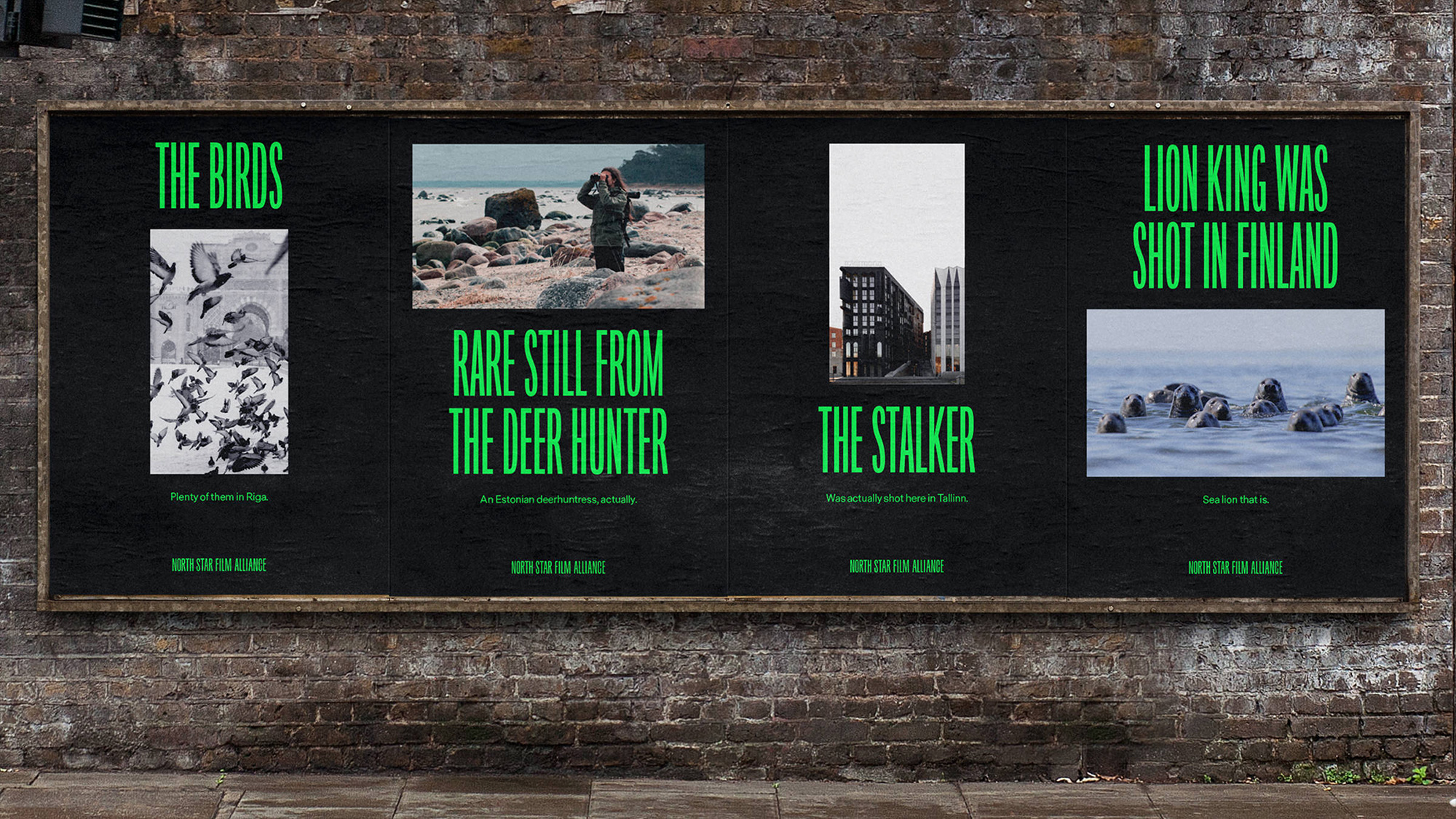
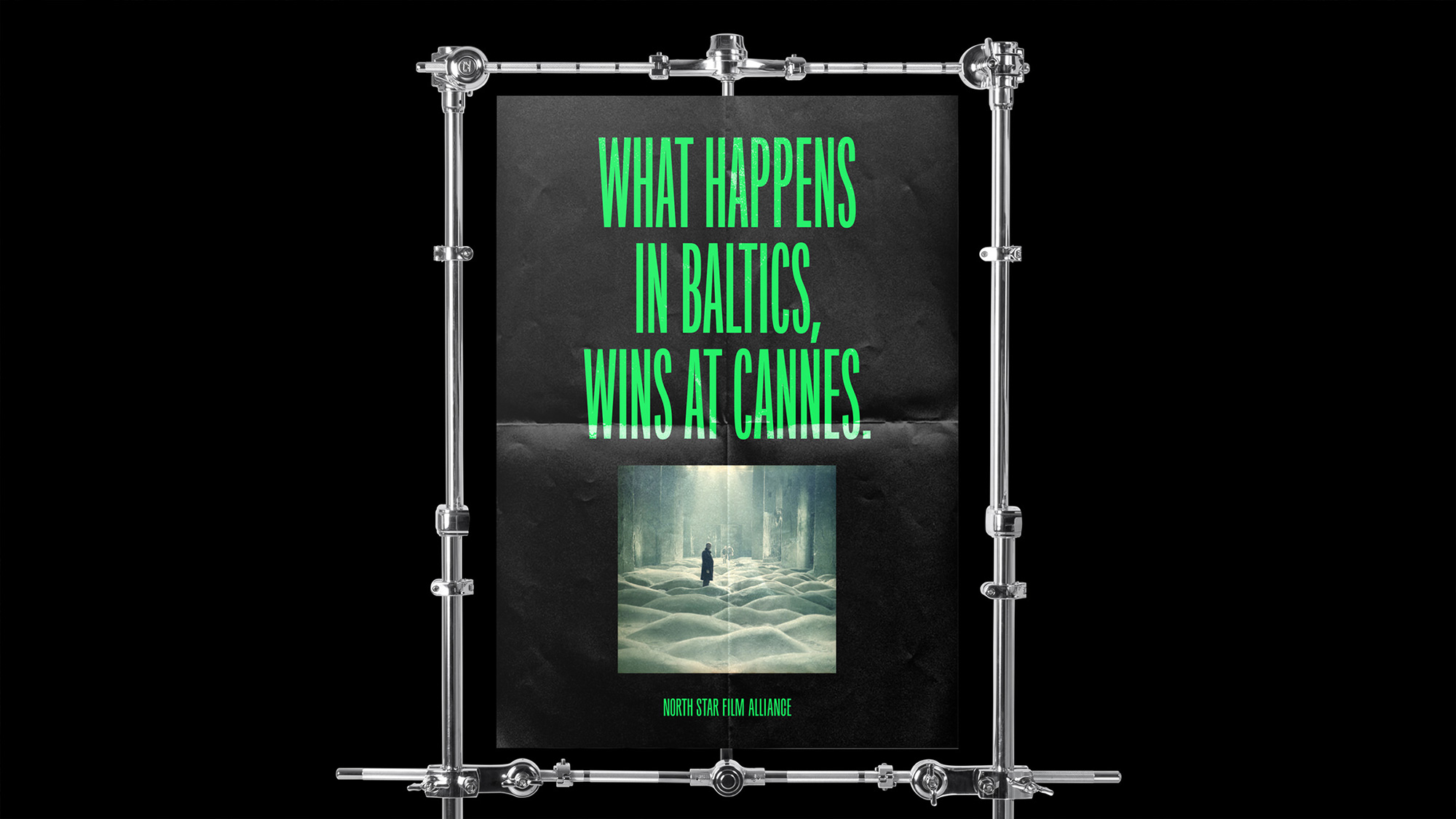
While the logo is typeset in another sans serif (with the high waistband of the “R” and more closed endings of the “C”), the identity uses Production Type’s Origin Super Condensed throughout all the applications along with Luzi Type’s Messina as the supporting text family. The applications are almost annoyingly simple, with big, centered, uppercase type and oddly-sized masks for photography and… well, and that’s it, but the copywriting really steps up to make this far more engaging than it would have been if it were just marketing speak. Perhaps it can be one too many movie puns in one project but they are definitely enjoyable. The green and black combo can be tiring — reading the text on their website is literally an exercise in retinal endurance — but, I’ll admit that it has always been one of my favorite color combinations and the appropriateness of its use for this project is enviable.
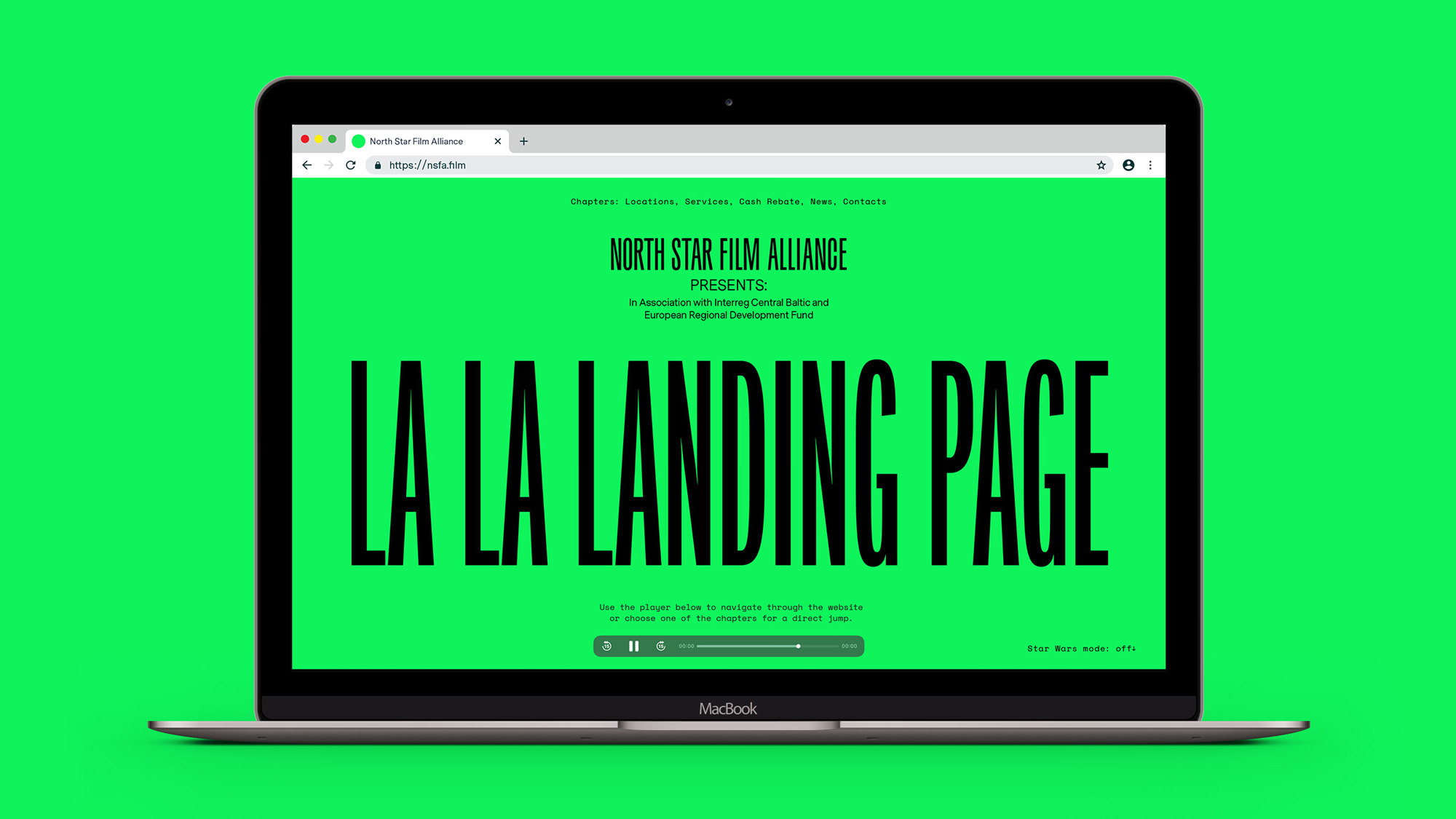
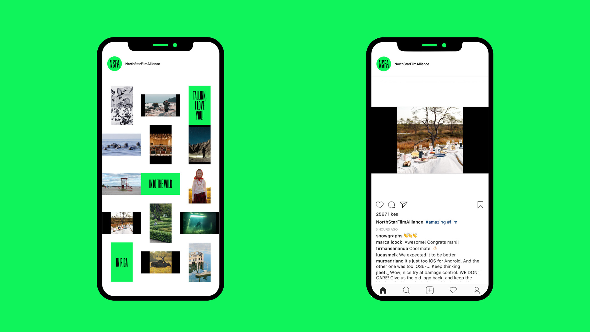
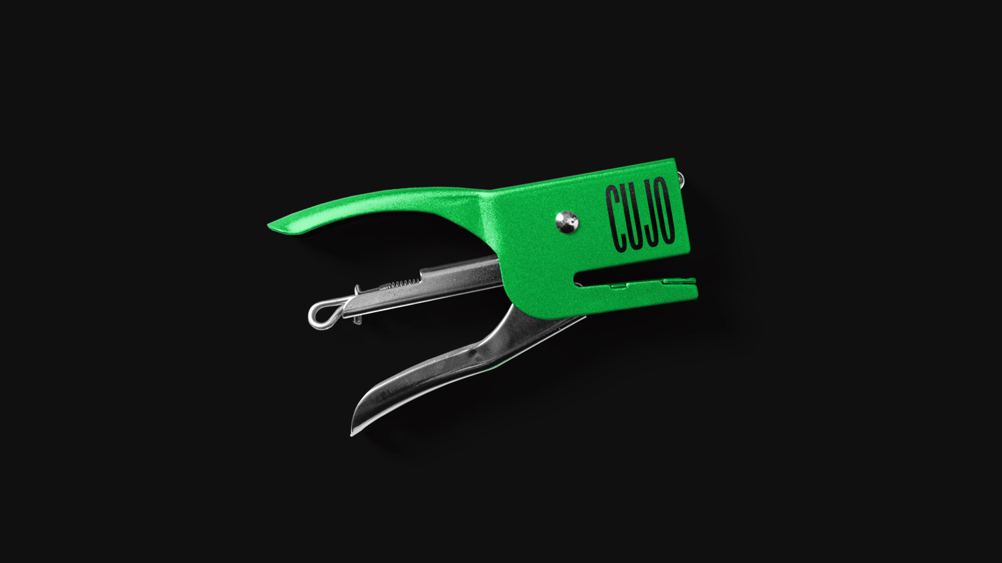
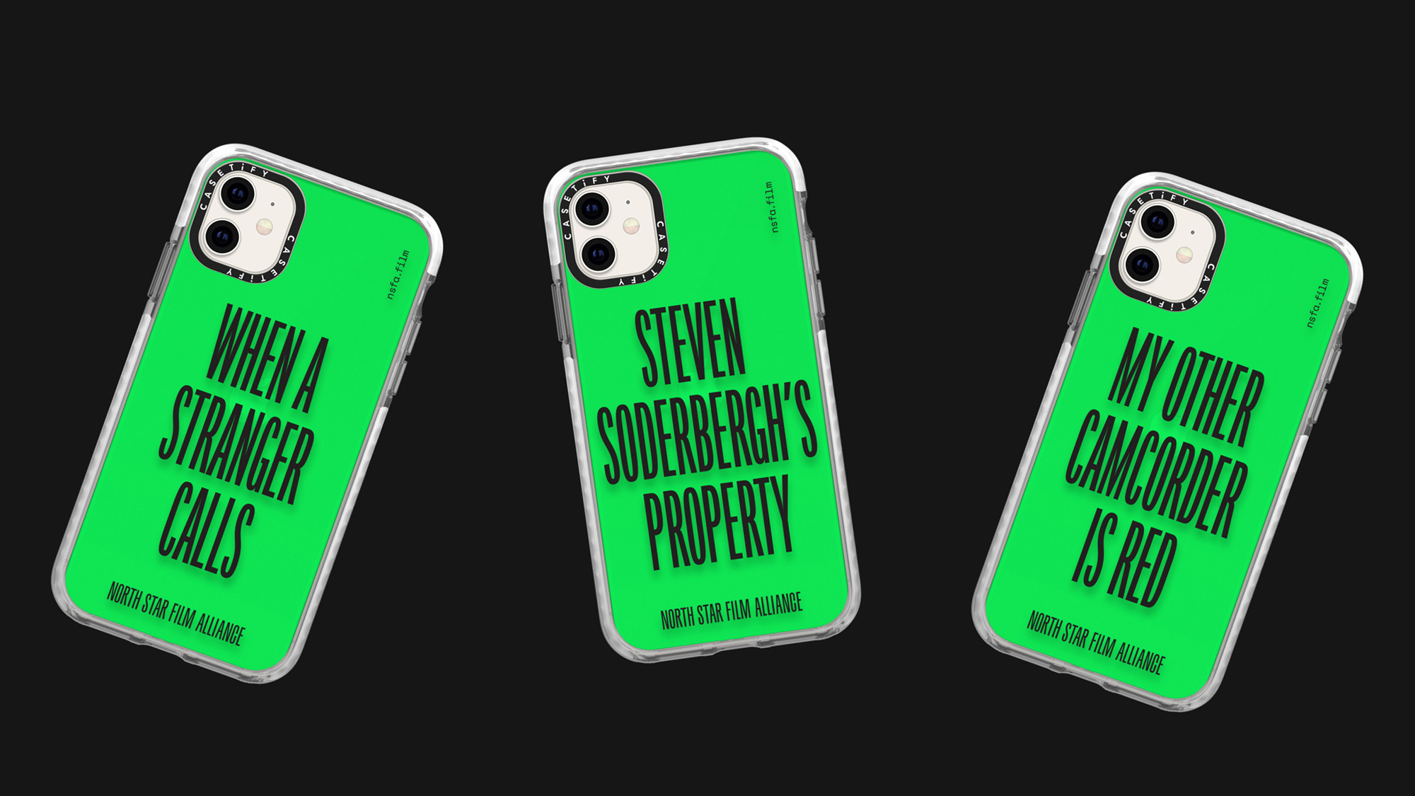
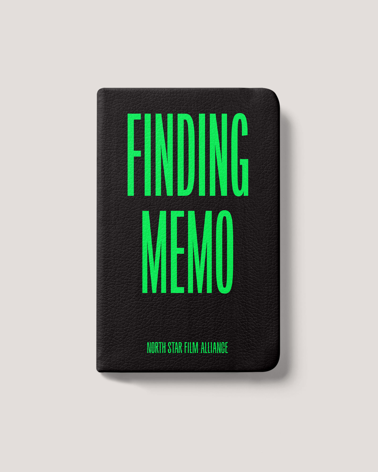
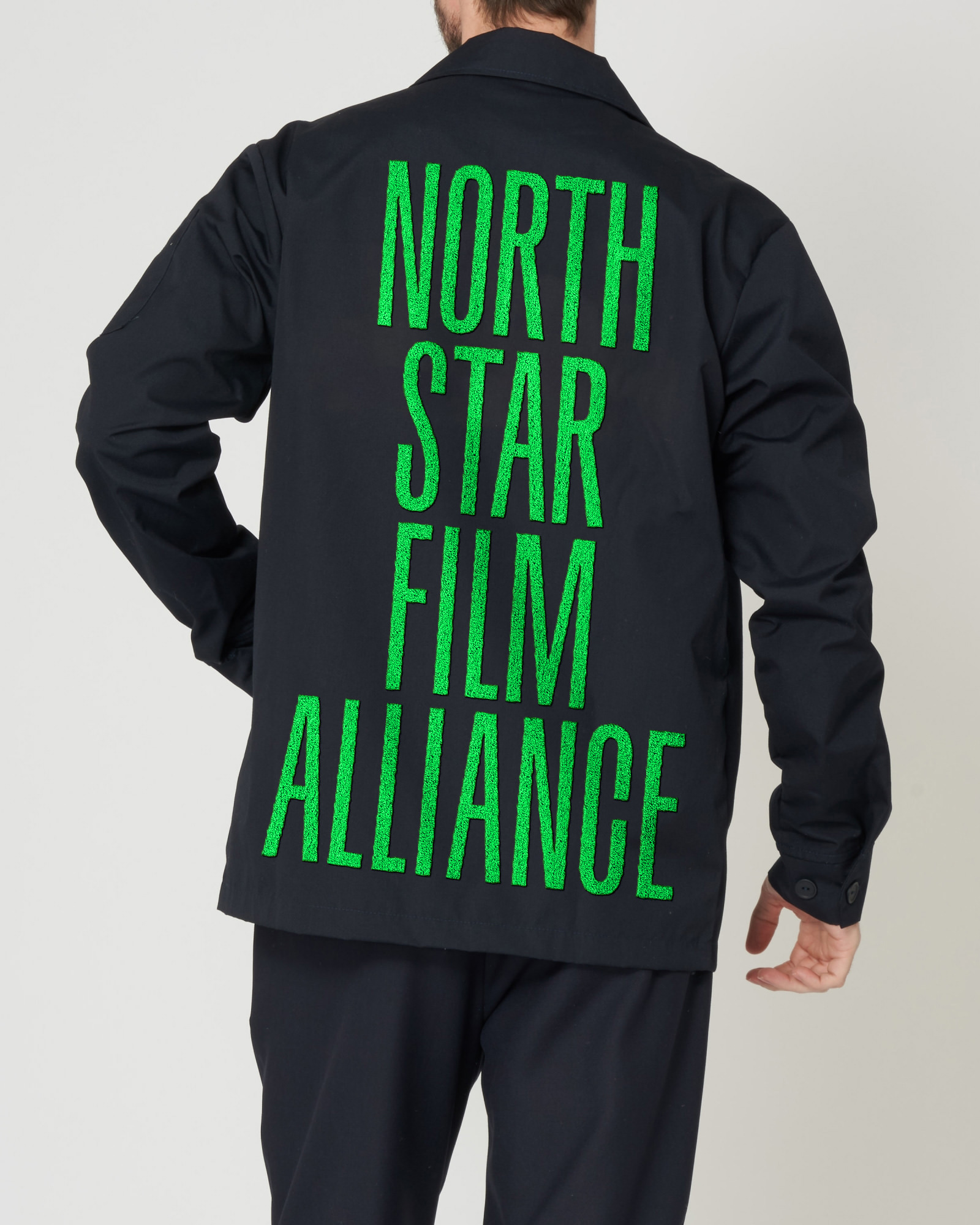
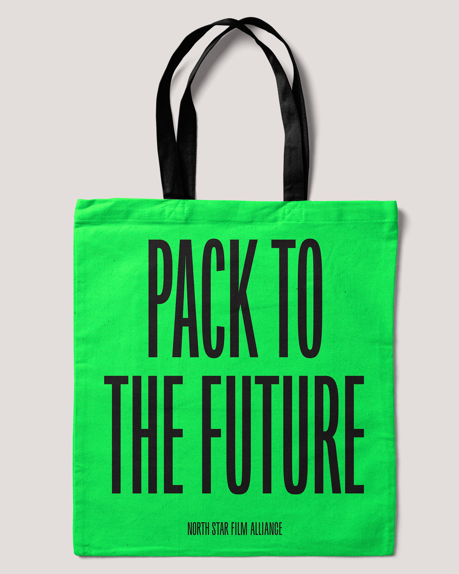
Overall, this has a bold energy to it that makes the NSFA feel like a lively, active partner to engage with while also making the underrated destinations of Estonia and Latvia feel much more accessible and energetic.

 Новости Союза дизайнеров
Все о дизайне в Санкт-Петербурге.