Обзор лучших ресурсов по разработке бренда, разработке упаковки
contact us | ok@ohmycode.ru
contact us | ok@ohmycode.ru
Broadcasting rights in Europe (except for Russia and France) for the PyeongChang 2018 Olympic Winter Games this past February were acquired by Discovery Communications to be broadcast through Eurosport, which will also broadcast the next editions of the Summer and Winter Olympics through 2024. Eurosport’s PyeongChang 2018 effort included 4,000 hours of coverage, 900 hours of live action, and up to 1,000 social-first short-form video assets generated each day with a cumulative 386 million people experiencing the Games through Eurosport platforms. The identity for the coverage was designed by London, UK-based DixonBaxi.
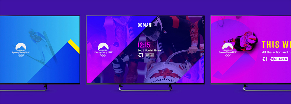
With a mission to inspire and engage a younger audience, DixonBaxi partnered with Eurosport to deliver its Games-time campaign, taking strong cultural cues from the South Korean location of the Games. Injecting a ‘K-pop’ spirit of hyper-neon colours and vibrancy into the brand experience, they created a radically different cross-platform identity - the antithesis to the typical frost bitten white winter imagery - transforming the entire Eurosport brand into Games-mode over the fortnight of the games. As the first fully digital first Games across Europe, it demanded a suite of tools that would withstand the rigour of every mobile touchpoint. DixonBaxi crafted everything for Eurosport from social kits, to graphic systems designed for maximum mobile legibility.
The logo represented a strategic alliance between Eurosport, the Olympics and PyeongChang 2018. A simple, graphic silhouetted mountain provided the visual metaphor to unite three logos into one iconic mark. The angular shapes in turn inform the broader visual identity of bold graphic slices that create a dramatic, infinitely flexible look across digital, studio set design, on-air and OOH advertising.
The logo includes the wordmark from the official PyeongChang 2018 Olympic Winter Games logo, topped by Eurosport’s logo, topped by one piece of original design in the form of a minimalist set of mountains knocked out of a circle. Nothing too exciting — certainly better than NBC’s rendition — but since it’s a short-lived logo and its main goal is to communicate that this is about the Olympics on Eurosport in a quick, efficient way, this does the job quite well and establishes the bold, hard-angled aesthetic for the rest of the identity.
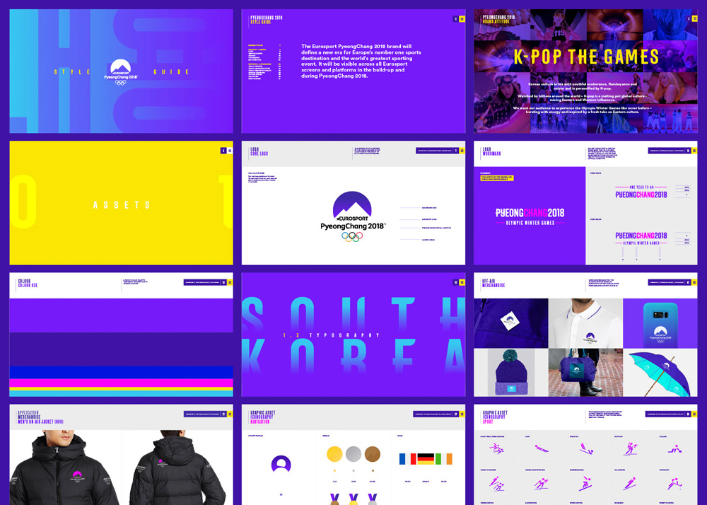
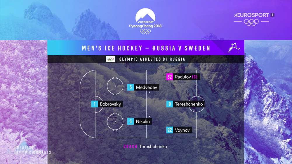
The unique forms of the Korean written language - Hangul - provided fuel for the typography and pictograms. DixonBaxi commissioned A2Type to cut a bespoke Hangul inspired font ‘ES Pyeongchang 2018’. With the typeface design established, they then used the forms as the foundation to crafting an exclusive suite of pictograms for every sport from Big Air to Curling. The pictograms and typeface beautifully complimented each other and delivered a distinct and iconic communication layer atop the fluid graphic system, infusing a Korean spirit into the brand experience.
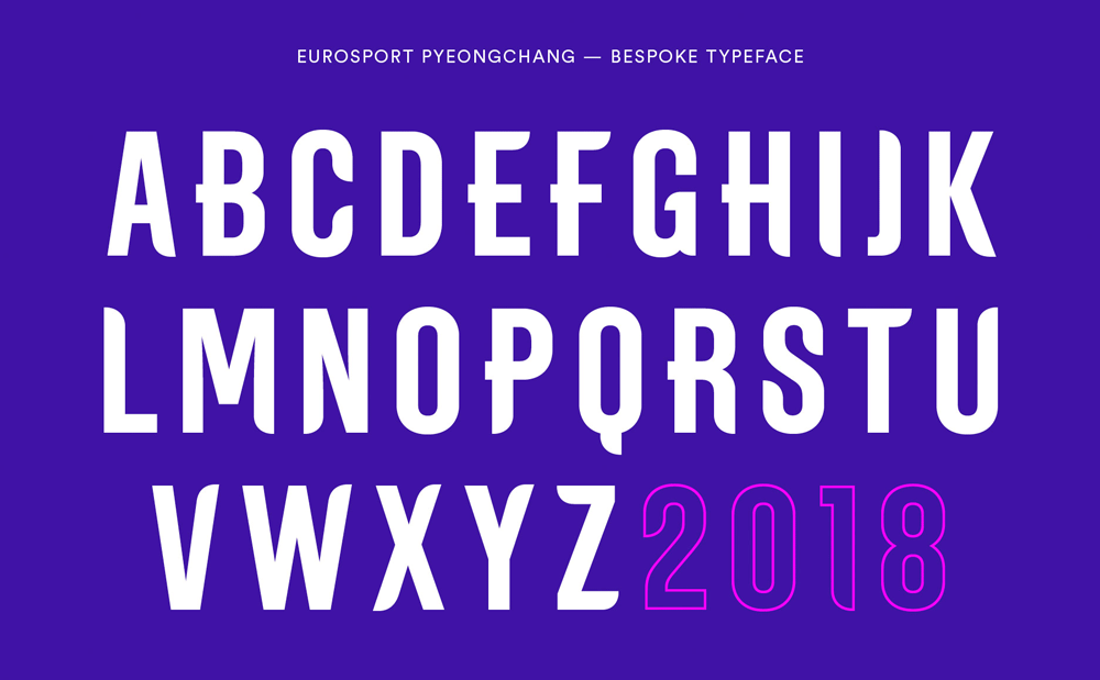
The custom font looks good small or from afar when the half-square, half-rounded endings of the letters are less noticeable. That “M” troubles me so much and, in general, there is a very weird clash of contours in each letter.
The pictograms have a fun energy and they are all nicely integrated through the angles and by echoing the rounded corner gestures of the font.
DixonBaxi collaborated with specialist Director of Photography James Medcraft to film and photograph the athletes bathed in UV light while firing gallons of specially formulated UV paint at them to represent snow, speed and the extreme nature of the sports. The result was a series of visually striking images that captured the energy, grace and intensity of the Olympic Winter Games.
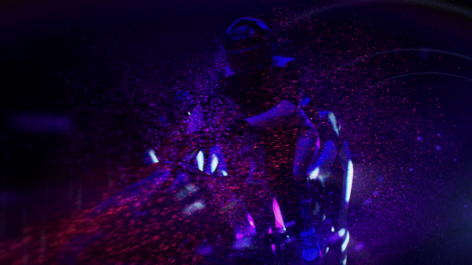
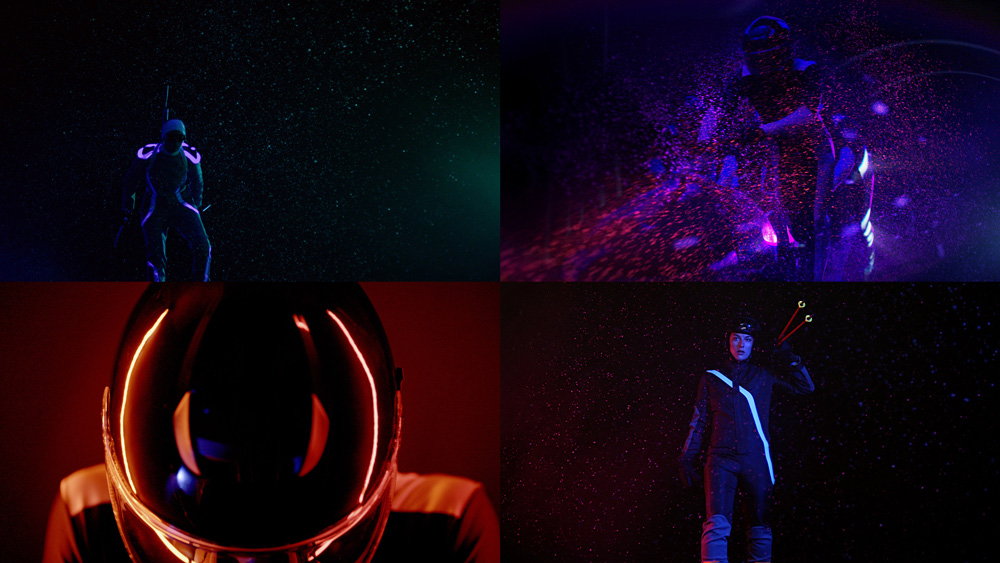
The custom athlete imagery is loads of fun and exciting. It’s as if TRON and Daft Punk had a baby. The neon-infused images provide a great backdrop for the applications.
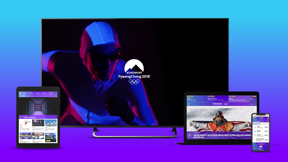
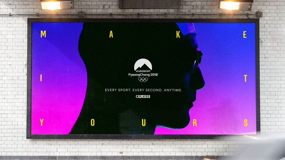
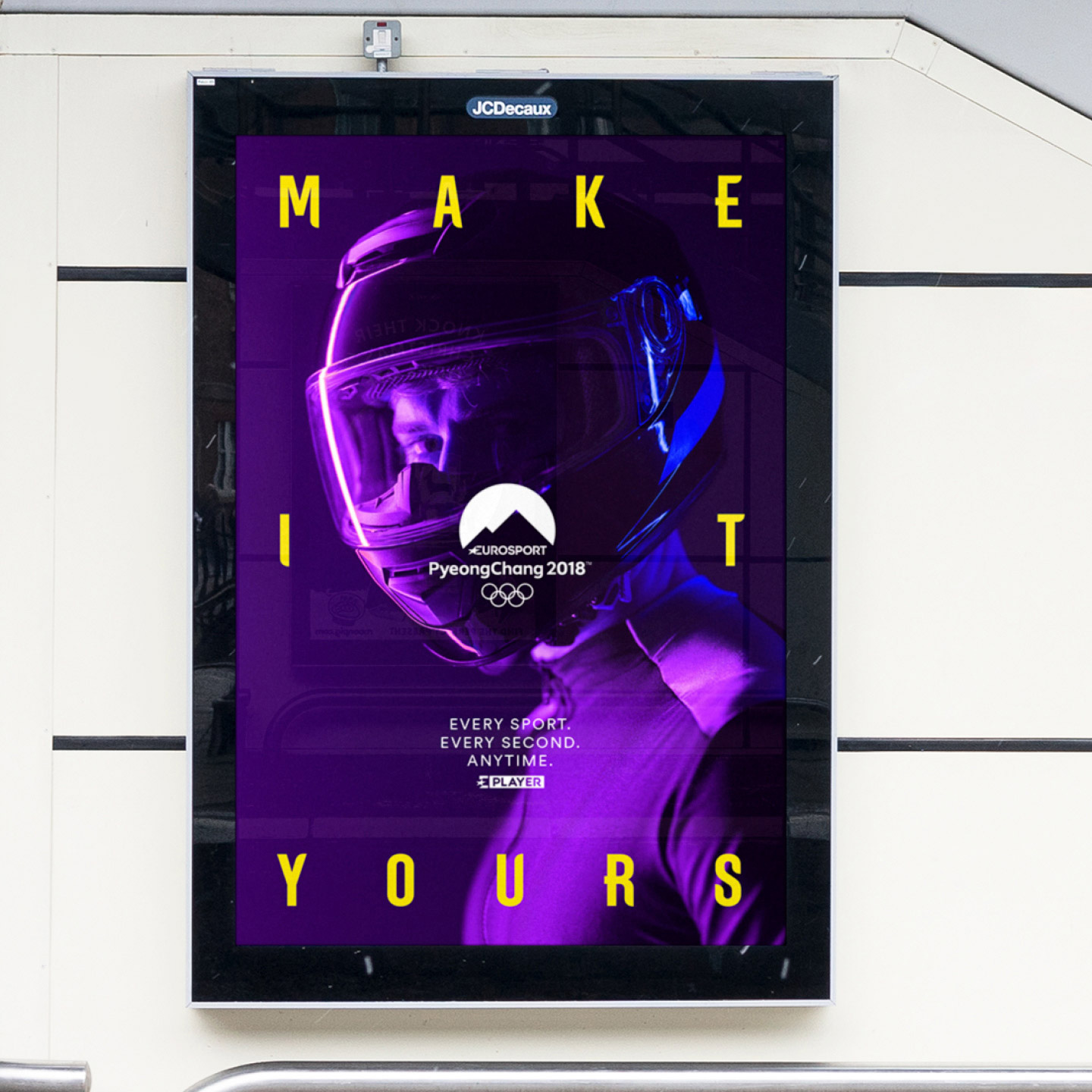
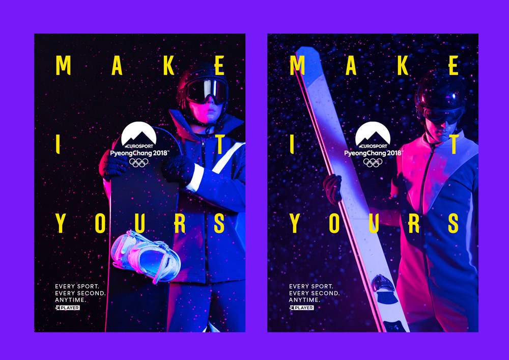
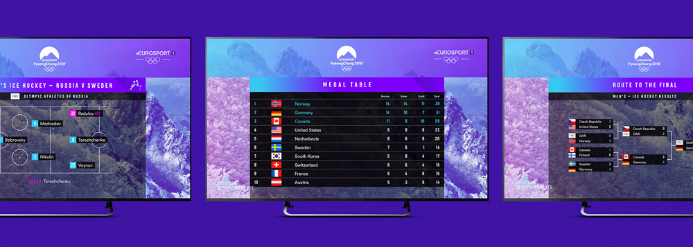
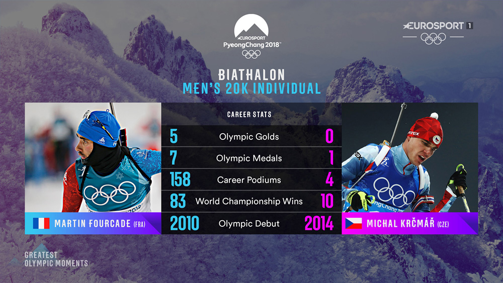
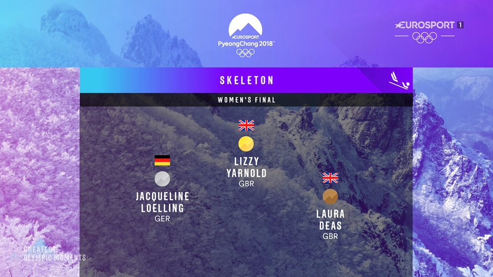
Despite my lack of enthusiasm for the font, I do admit that it looks good on the posters and provides a strong point of contrast to both the background images and the logo. In the broadcast graphics, below, it certainly stands out from the usual screen graphics.
As usual, DixonBaxi’s motion work (0:56 mark in the video above) is great, providing a wide but consistent palette of motion behaviors that make a strong use of the angles and the identity elements. Overall, this has a pretty great energy and a vibrant aesthetic that effectively and entertainingly helped funnel some of the host country’s cultural touchpoints through winter sports.

 Новости Союза дизайнеров
Все о дизайне в Санкт-Петербурге.
Новости Союза дизайнеров
Все о дизайне в Санкт-Петербурге.