Обзор лучших ресурсов по разработке бренда, разработке упаковки
contact us | ok@ohmycode.ru
contact us | ok@ohmycode.ru
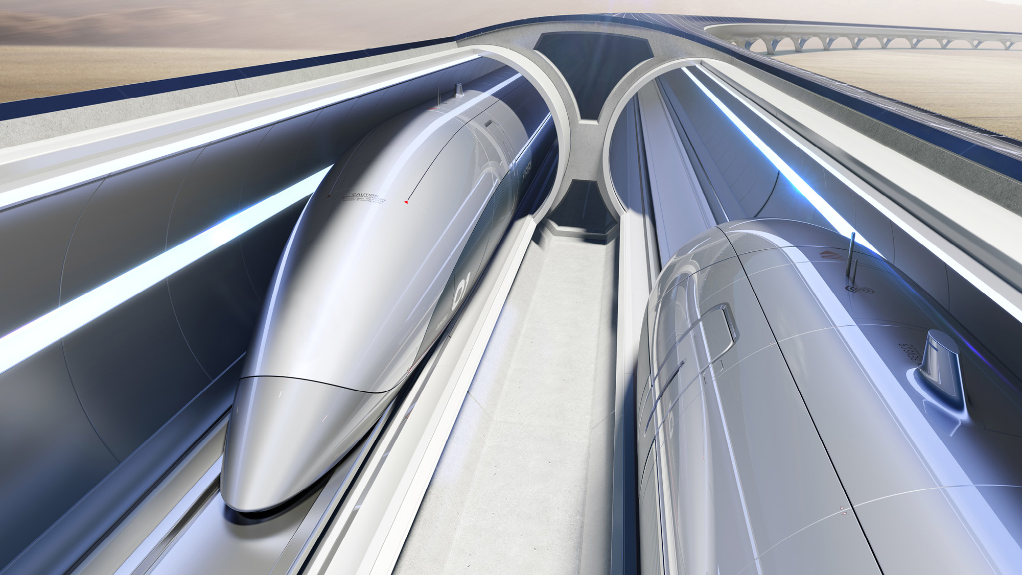
Established in 2013, HyperloopTT (the TT stands for Transportation Technologies) is, as its name sort of implies, a transportation and technology company focused on realizing the “hyperloop” — a “sealed tube or system of tubes through which a pod may travel free of air resistance or friction conveying people or objects at high speed while being very efficient” — a concept popularized and open-sourced by Elon Musk encouraging other companies to build on the idea and technology. As one of those companies, Hyperloop is a global team comprised of more than 800 engineers, creatives, and technologists, that has developed a frictionless electromagnetic levitation technology that can propel passengers and freight at up to 760 miles per hour (1223 km/h), making traveling in pods inside tubes at hyper speed a reality. With a full-scale testing facility in Toulouse, France, the company has at least 10 projects around the world in the works, many of them still in the feasibility study phase, including a HyperloopTT between Chicago, IL, and Cleveland, OH, and a 3-mile elevated system in Abu Dhabi, UAE, expected to begin construction this year. Entering a significant phase of growth, HyperloopTT has introduced a new identity designed by Saffron.
Honing in on the tangible benefits HyperloopTT will bring to passengers’ lives, the concept is built around the creation of ‘More’. By delivering the next breakthrough in mobility, Hyperloop will make peoples’ lives more frictionless, empowering people to have more time, choice and freedom.
The brand identity moves beyond tropes of speed which crowd the market. Instead, the brand assets employ a principle of ‘more’ to create a distinctive wordmark, iconic symbol and design toolkit that differentiates HyperloopTT from competitors, essential during this stage of their rapid progress.
Equipped with a visual language and inspirational art direction that reflect their vision, the talented international team can bolster their revolutionary technology with the added security lent by a coherent experience. The guidelines set the course for an identity that will help the company build credibility with a consistency across all platforms.
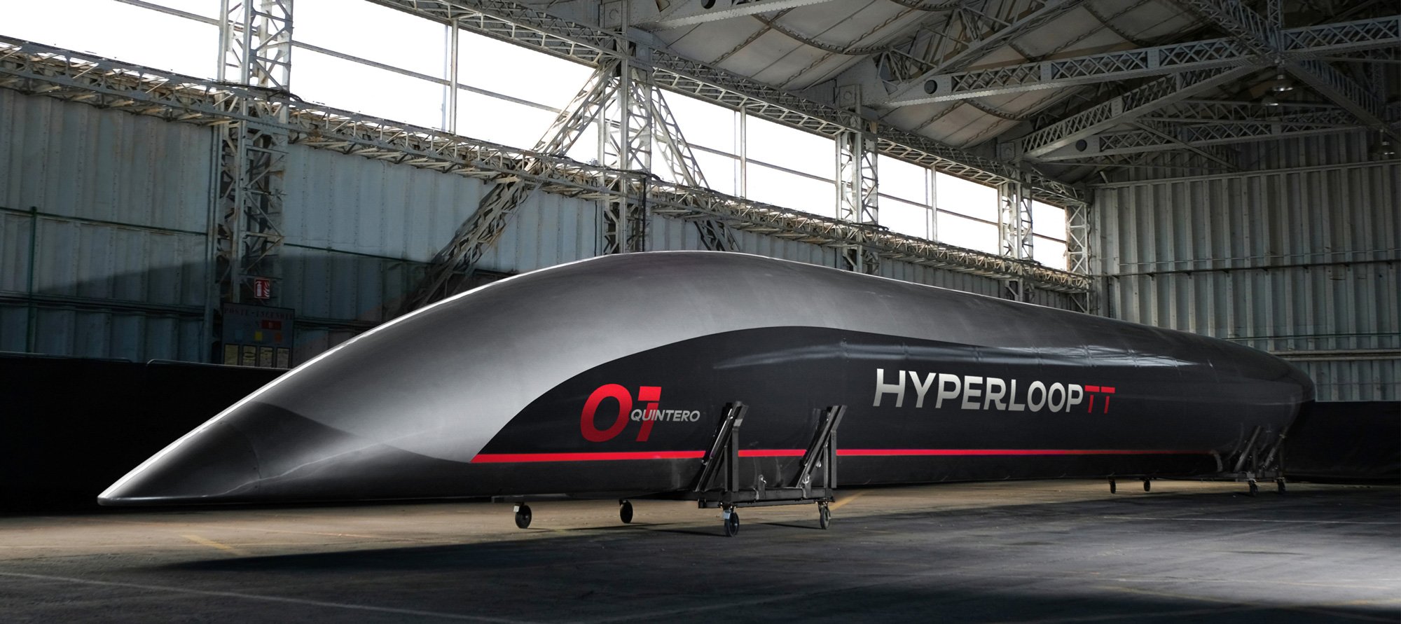
The old logo was the Terminator’s version of fast, with a futuristic wordmark with spikes and pieces missing. Granted, it was fine, but not very sophisticated. The new logo corrects that with a slick- and precise-looking wordmark that, while not visually super exciting, is very nicely crafted and while it’s a traditional bare sans serif it has two details that make it unique. The flat swash of the “R” is unexpected and surprisingly good, mostly because it’s right before the “L”, so it echoes the long horizontal stroke. The “T”s add a great sense of dimensionality by casting a shadow on the stems making it look as if the two horizontal strokes are floating, just like the pods. It’s a great logo that subtly hints at the key aspects of the company while looking dead serious. The animation is all kinds of good with the horizontal strokes of the “T”s moving as if they were inside the tunnel.
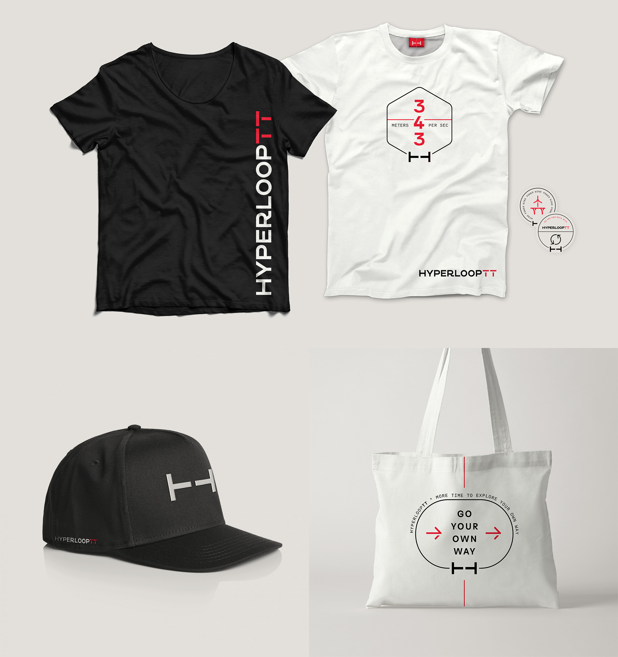
I’m not really sure when or where these badges are used but it’s my favorite part of the project. I know badges are overdone and usually gratuitous but these have a very unique aesthetic and look like something you would see on the side of a rocket ship but also reminiscent of vintage travel stickers on leather luggage. Really digging these.
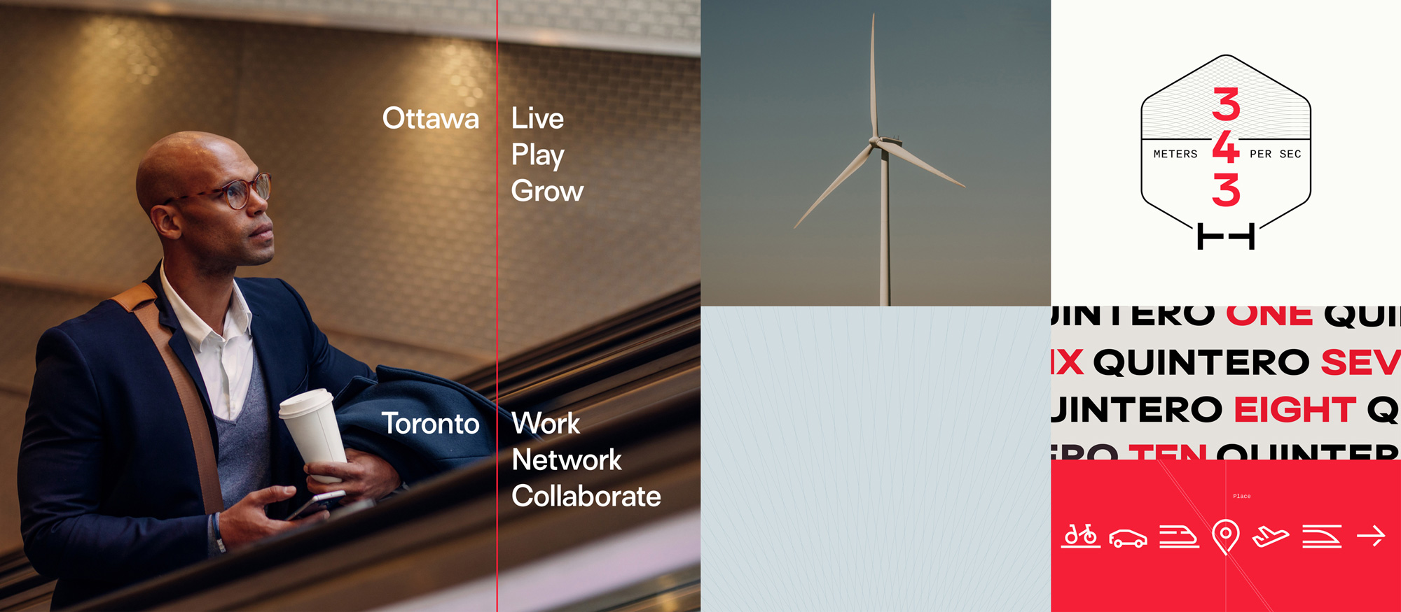
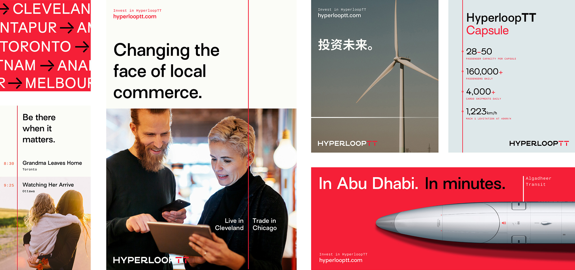
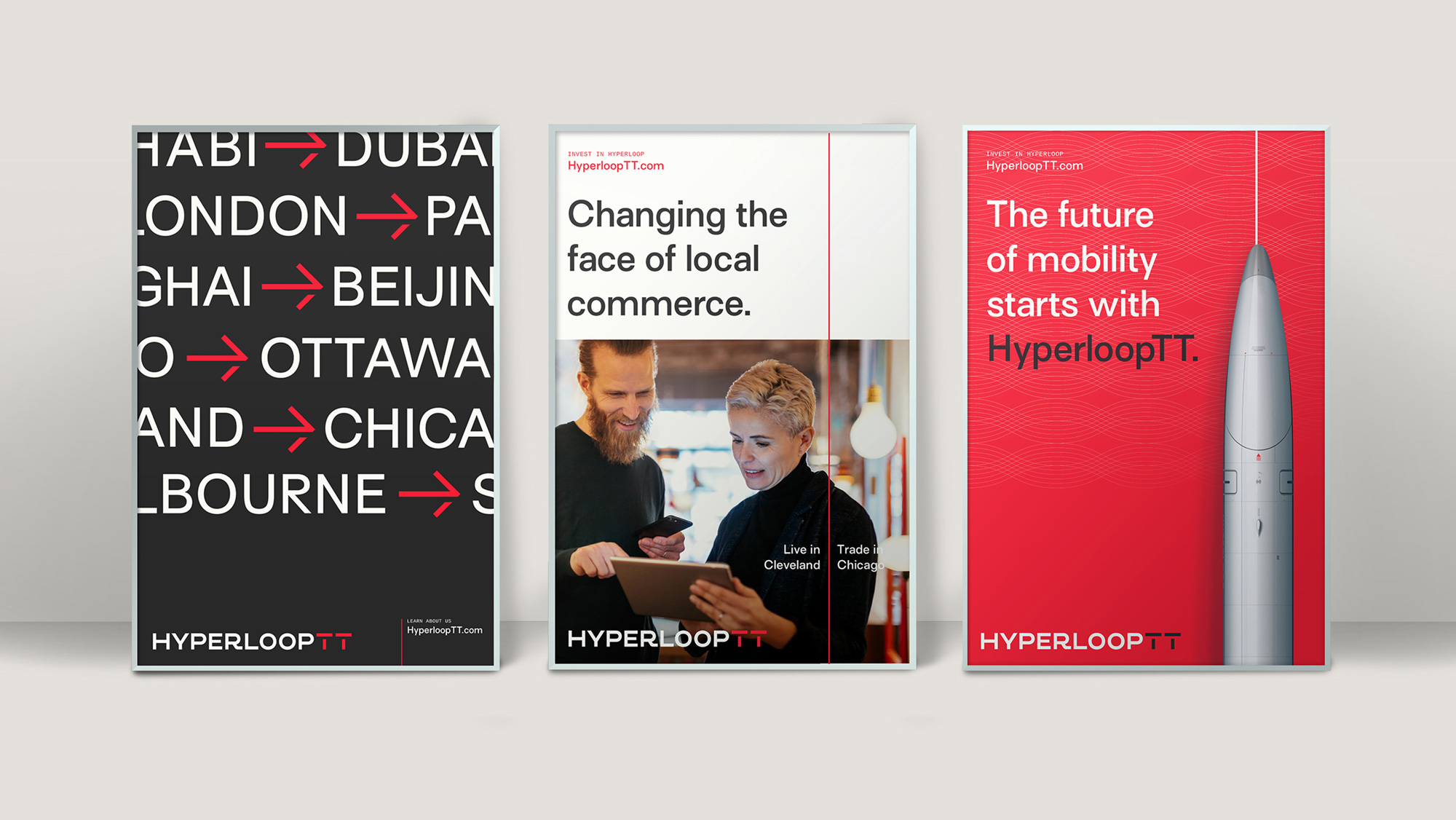
The applications are simple but quite nice with the thin red line that runs vertically serving as a unifying identity element as well as the visual representation of the “More” concept, which, to be honest, is the one thing that seems a little off… To me, traveling fast would be more about “less”: less time, less stress, less waste. But, I dunno, I’m no brand strategist and, in the end, this all looks very convincing.
Overall, this looks and feels exactly like a company building the “frictionless electromagnetic levitation technology” of the future, today.
 each year since publication began in 2006

 Новости Союза дизайнеров
Все о дизайне в Санкт-Петербурге.
Новости Союза дизайнеров
Все о дизайне в Санкт-Петербурге.