Обзор лучших ресурсов по разработке бренда, разработке упаковки
contact us | ok@ohmycode.ru
contact us | ok@ohmycode.ru
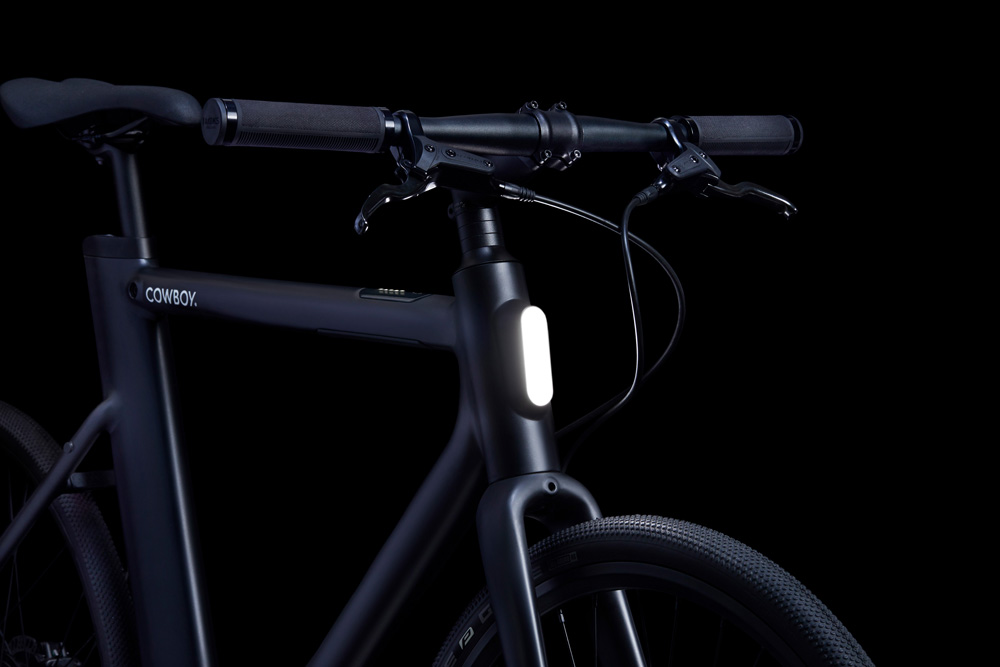
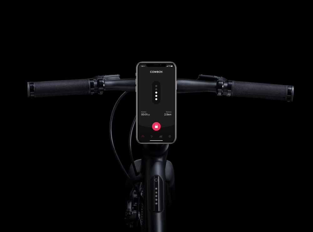
Established this year, Cowboy is a start-up focused on designing, manufacturing, and retailing electric bikes. Based in Brussels, Belgium, they have launched their first bike: a stunning $2,000, all-black bike with an intelligent motor-assistance system, a removable battery, the slickest safety lights ever, and relatively light 35-pound weight. A companion app serves as the “key” to lock and unlock the bike and provides a live dashboard, navigation, GPS tracking, and ride stats. The identity for Cowboy has been designed by Ueno.
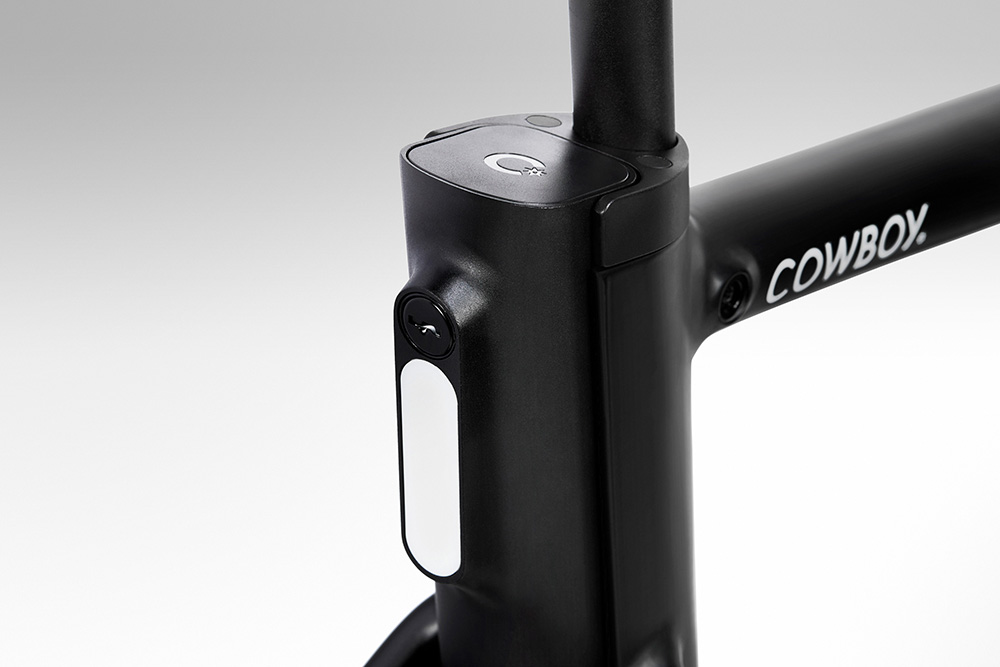
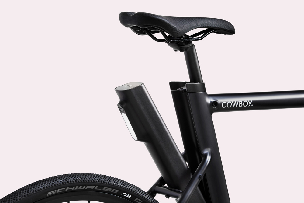
“Cowboy” is a word that comes loaded with connotations. We purposefully avoided predictable Western references, but the logo gives subtle nod to the spur, the small spiked wheel that riders use to urge their horses forward.
A pink cowboy? Why not? It’s fun, unexpected, and stands out.
The name, conceived by Cowboy themselves, works great as the name for a bike, especially a bike made and sold in Belgium — there is something pretty funny about that — and it instantly gives the bike a personality that, when coupled with the minimal design of the logo, becomes fun, contemporary, and a little high-end. Choosing the spur as the only Old Western visual motif and treating it as elegantly was really the only approach to not make this look cartoonish. In a way, the wordmark is almost like the spate of minimal fashion logos we’ve seen recently but the spur punctuating it makes it infinitely more enjoyable. The “C” monogram with the spur is quite nice too and it looks great on the bike. The pink color complements the black in a lively and exciting way and upends any preconceptions of pink not being a color associated with cowboys.
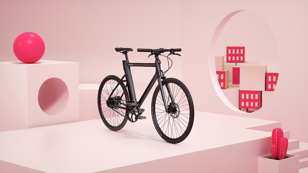
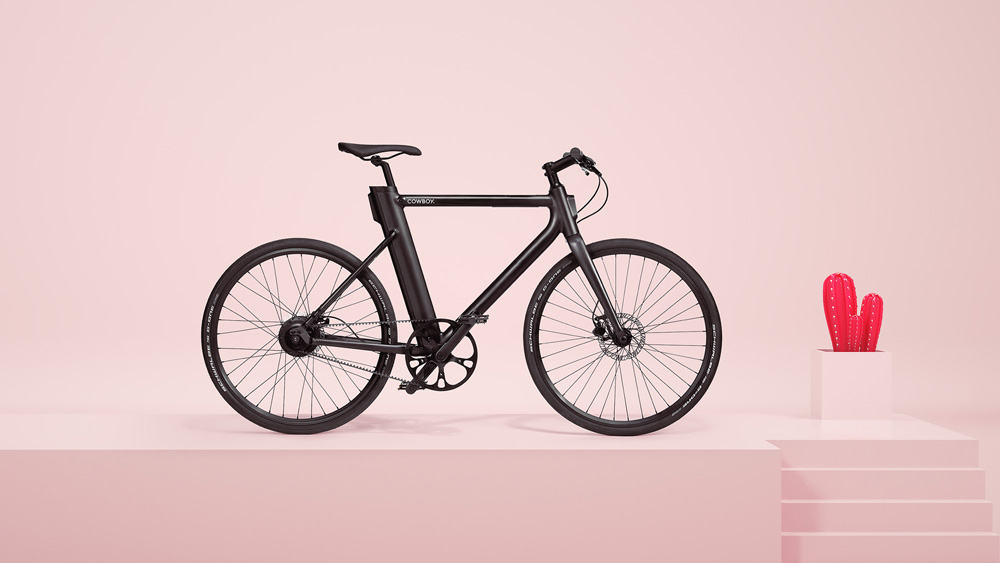
The bike is really amazing and I love how subtle the branding details are. I’m not sure about the digital renders with the cubes and spheres and pink cacti to present it but I’m not completely against it either; I think there could have a been an even simpler way to present the bike with less distractions.
Cowboy isn’t just a bike. It’s also a mobile app. An integral part of the product, the app is probably where owners will be in closest contact with the brand. The client spent time with our product designers in Reykjavík to hone the user experience and features, resulting in an app that Cowboy riders use to prevent theft, control the bike’s various features, and navigate using GPS.
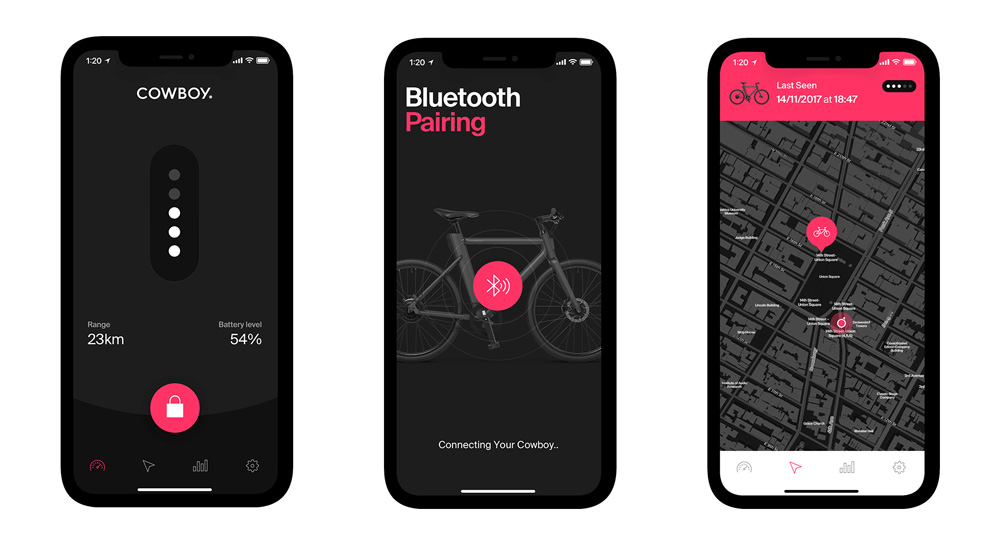
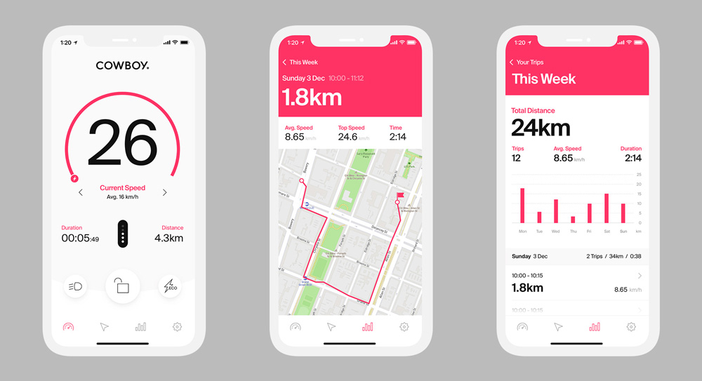
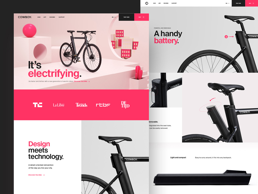
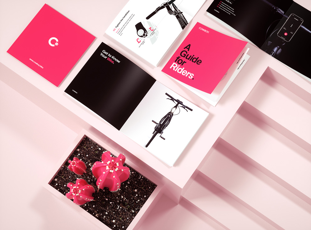
The app, website, and brief look at a printed piece are well done but the one thing that throws me off about all the executions is the use of Helvetica (or something Helvetica-ish) as the overall font that, I think, clashes with the geometric approach of the wordmark — a style that never appears anywhere else again. The way and amount in which Helvetica is used changes the personality a lot, from a cool lifestyle brand to something more corporate and dry. Overall, though, the impression this makes as a new product launch is an attractive and intriguing platform to sell a bike named Cowboy.

 Новости Союза дизайнеров
Все о дизайне в Санкт-Петербурге.
Новости Союза дизайнеров
Все о дизайне в Санкт-Петербурге.