Обзор лучших ресурсов по разработке бренда, разработке упаковки
contact us | ok@ohmycode.ru
contact us | ok@ohmycode.ru
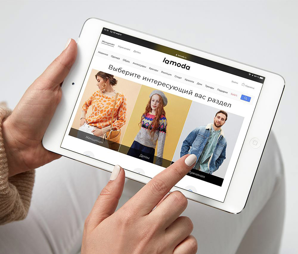
Established in 2011, lamoda is the leading online retailer in Russia and CIS (Commonwealth of Independent States), with approximately 20 million unique users per month, offering over 4 million products from 3,000 international and local brands of clothing, shoes, accessories, cosmetics, and perfumes. Based in Moscow, the company employs over 4,500 people in Russia and CIS and as part of its infrastructure it has its own courier network, lamoda express, providing next-day delivery to more than 65% of its customers in Russia, Ukraine, Belorussia, and Kazakhstan. Recently, lamoda introduced a new identity designed by Moscow-based Shuka.
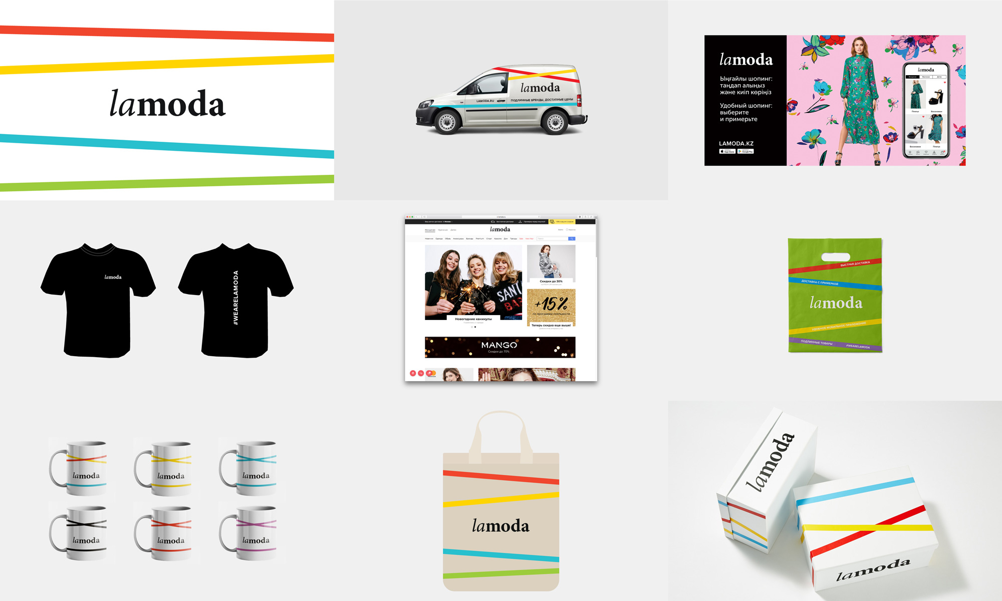
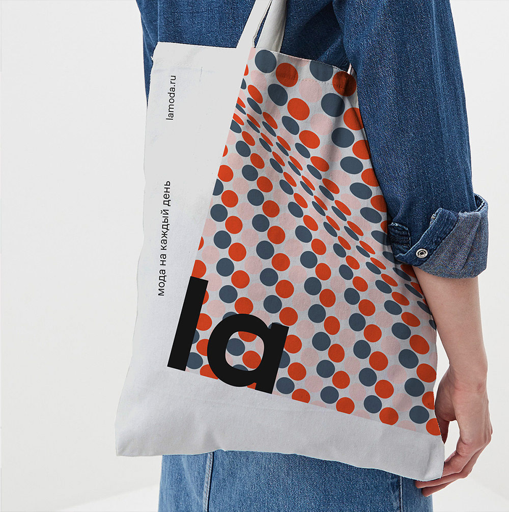
We revisited all business units of Lamoda (website, app, delivery service, and planned offline stores) and developed it a consistent visual system. We took the old logo as a brand’s heritage, preserved the idea of italic article (“la”) and used it to add an irony to the communications. Made it the brand image. The new angle of «la», repeated in the key visual, is a metaphor of changes in Lamoda’s perception that makes it emotional — «la» as a vocable, an exclamation.
The old logo was not great by any means and it could have probably been a lot worse but it did have a dated 1980s fashion approach that seems like a strange approach for an e-commerce platform launched this decade. The new logo honors the original with an interesting twist on the italic angle by tilting “la” in a quirky, unexpected way. Maybe it de-emphasizes the word “moda” (fashion in Italian) more than the old logo did but now that it’s the biggest online retailer I don’t think it’s too much of an issue. The new logo also uses an out of the ordinary typographic approach with rounded square counterspaces, exaggerated ink traps, and an extended structure that may not be to everyone’s liking but I’m digging it.
Using “la” as the icon is kind of bold — it would be like a company using “The” as its icon and quick identifier — relying mostly on its tilt to be recognizable. Judging at least from the website’s favicon, it’s surprisingly convincing.
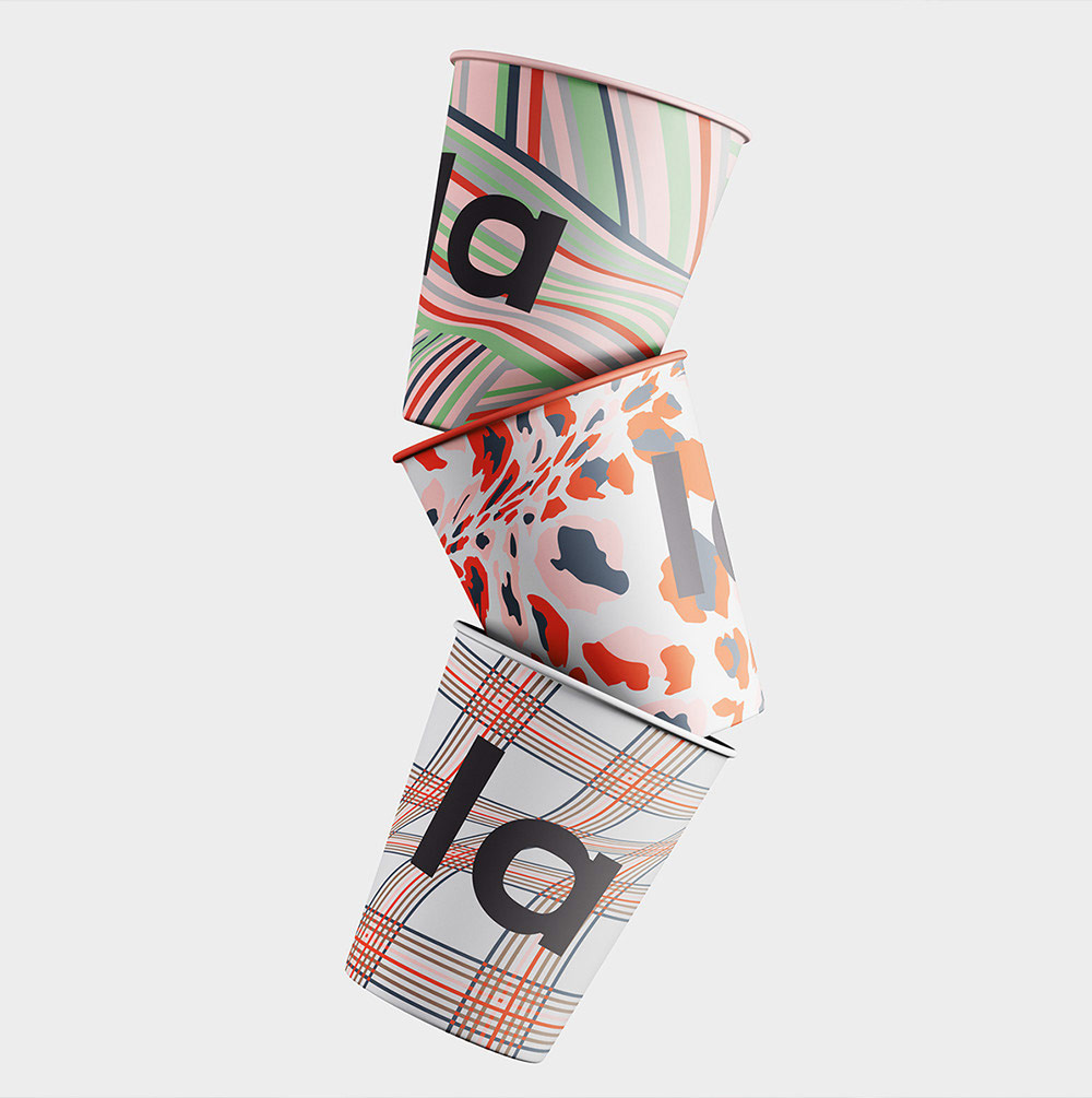
We revisited classic patterns of textille industry by which fashion designers are inspired sinсe 20th century.
Color palette is based on the associations with the natural materials. Recurrent color is vitalized Red — energetic, yet calm and gender-neutral.
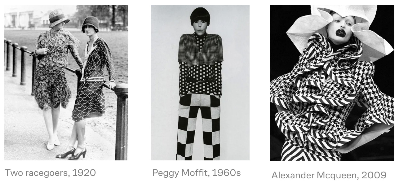
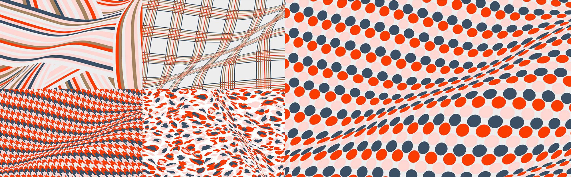

The patterns are cool-looking and do manage to evoke fashion-ness, looking like prints most of the audience would associate with clothing and accessories. If there is one issue is perhaps that it ties it a little too much with high fashion and could perhaps limit the expectations of what’s available from the online retailer. The angled crops of the patterns — that allude to the old identity’s stripes — help make the approach feel more dynamic, youthful, and varied.
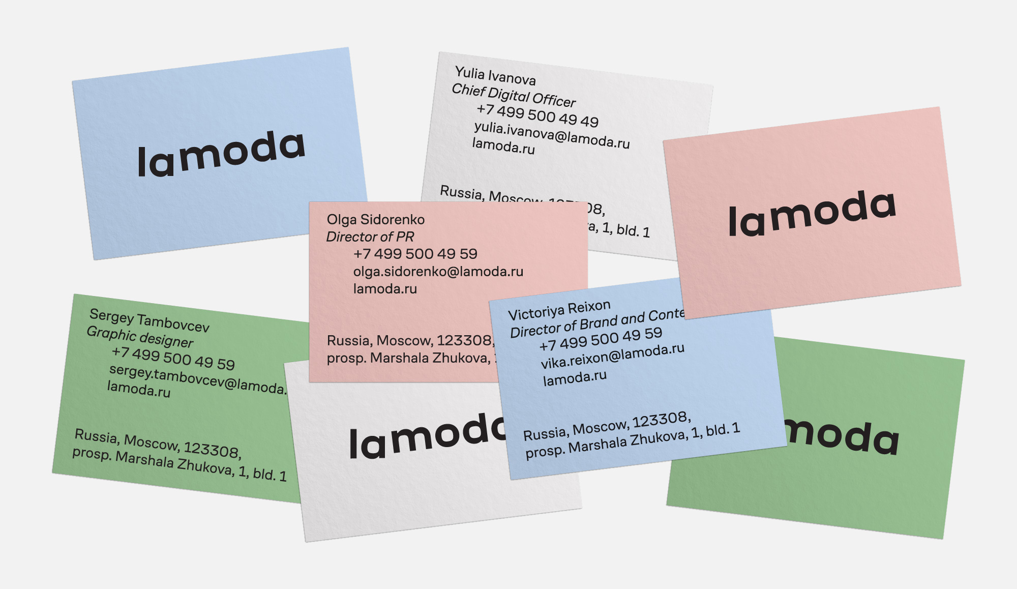
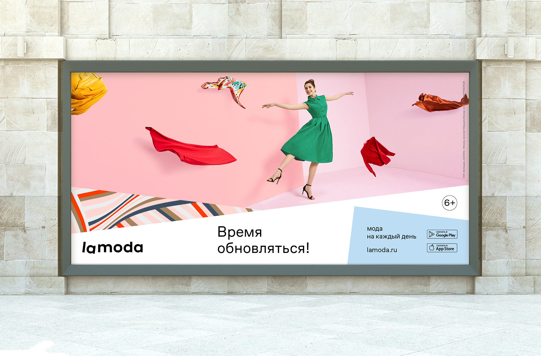

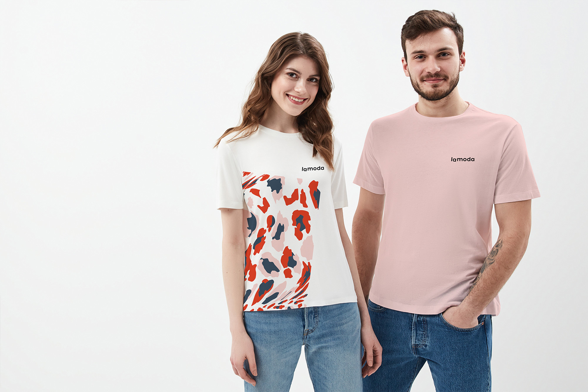

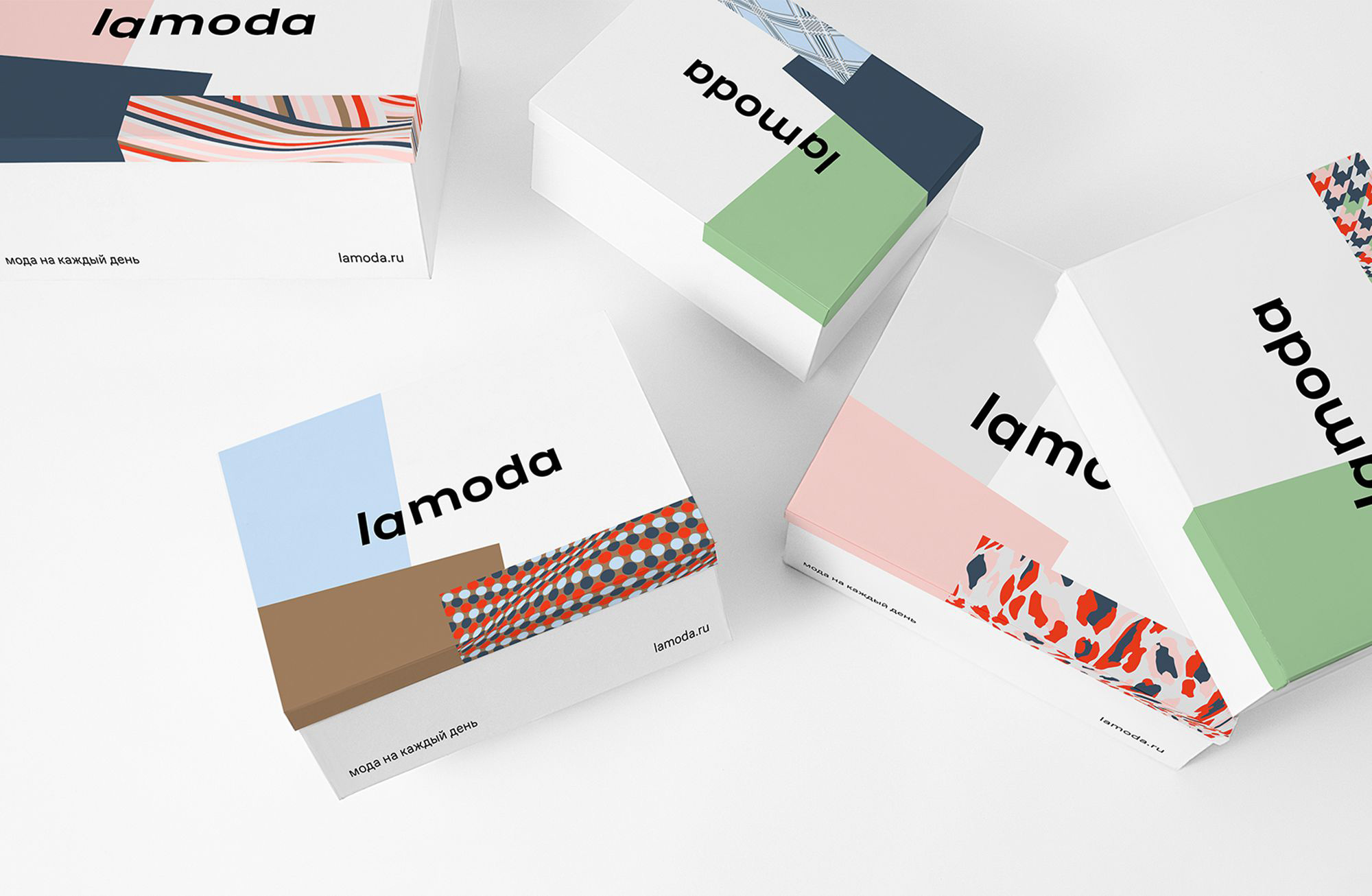
Applications like the business cards and website are able to dial down the graphic-ness for a more corporate look while other applications have a fun variety to them with the density of the patterns changing and using the angles to frame information and photography. Overall, this is a big improvement over the old identity, giving lamoda a stronger brand that can play along (and keep up) with all the other brands that live within it.

 Новости Союза дизайнеров
Все о дизайне в Санкт-Петербурге.
Новости Союза дизайнеров
Все о дизайне в Санкт-Петербурге.