Обзор лучших ресурсов по разработке бренда, разработке упаковки
contact us | ok@ohmycode.ru
contact us | ok@ohmycode.ru
Established in 2018, the Premier Lacrosse League (PLL), which started playing its inaugural season this June, is a new professional league for lacrosse. Founded by professional lacrosse player Paul Rabil (who used to play in Major League Lacrosse) and his brother Mike Rabil, the PLL has six teams that instead of each being based in a city are all part of a tour that travels each weekend to different cities for the duration of the season, which lasts 14 weeks, comprising 10 regular-season weekends, 1 all-star weekend, and 3 playoff weekends. The identity for the league was designed by Brooklyn, NY-based We Are Bill, who also named and designed the identities of the six teams. (Team uniforms were designed by Adidas.)
The league logo needed to live up to the calling. We created a crest inspired by the shape of a lacrosse goal in perspective, a strong mark conveying the authority this league will carry. Within the crest is a lacrosse head with motion marks, paying homage to lacrosse being the fastest sport on two feet. Last, we developed a custom typeface for the letterforms in the crest that was powerful, fast and fierce. A bold mark for the new standard in lacrosse and professional sports.
The new logo is not great, unfortunately. The icon starts out well with a strong shield shape that tapers subtly towards the bottom, creating a strong, dynamic shape but its contents are a not very well executed. Half of the icon contains half of a lacrosse head — the net-y part of the stick — that, whenever I glance quickly at it I see half a human ear instead, with the two lines looking like they are depicting audio or volume. Even if we chalk that up to me being weird, the drawing of the head is clunky — I feel like it would need to be stylized more somehow. The stripes behind it are okay. On the other half of the icon is “PLL” in a squat, spiky concoction that’s pretty awkward and the large counter spaces created by the “L”s yield an odd composition. Then there is the wordmark which looks oddly nostalgic with a slight Art Deco structure and has no evident visual connection to the icon, much less to the “PLL” in the icon. The kerning is also subtly jarring all over the place. I’m a little sad that this post starts with a negative review of the league logo because the team logos are all kinds of fun.
As a tour-based league, we knew the teams were not going to be tied to a specific city, so we had to develop naming inspiration that would allow the teams to exist as the league is today, but also be able to connect to geographies in the future if the league decided to move in that direction. We thought of teams as their own characters, each with a unique persona we wanted to bring to life and spark drama on game day.
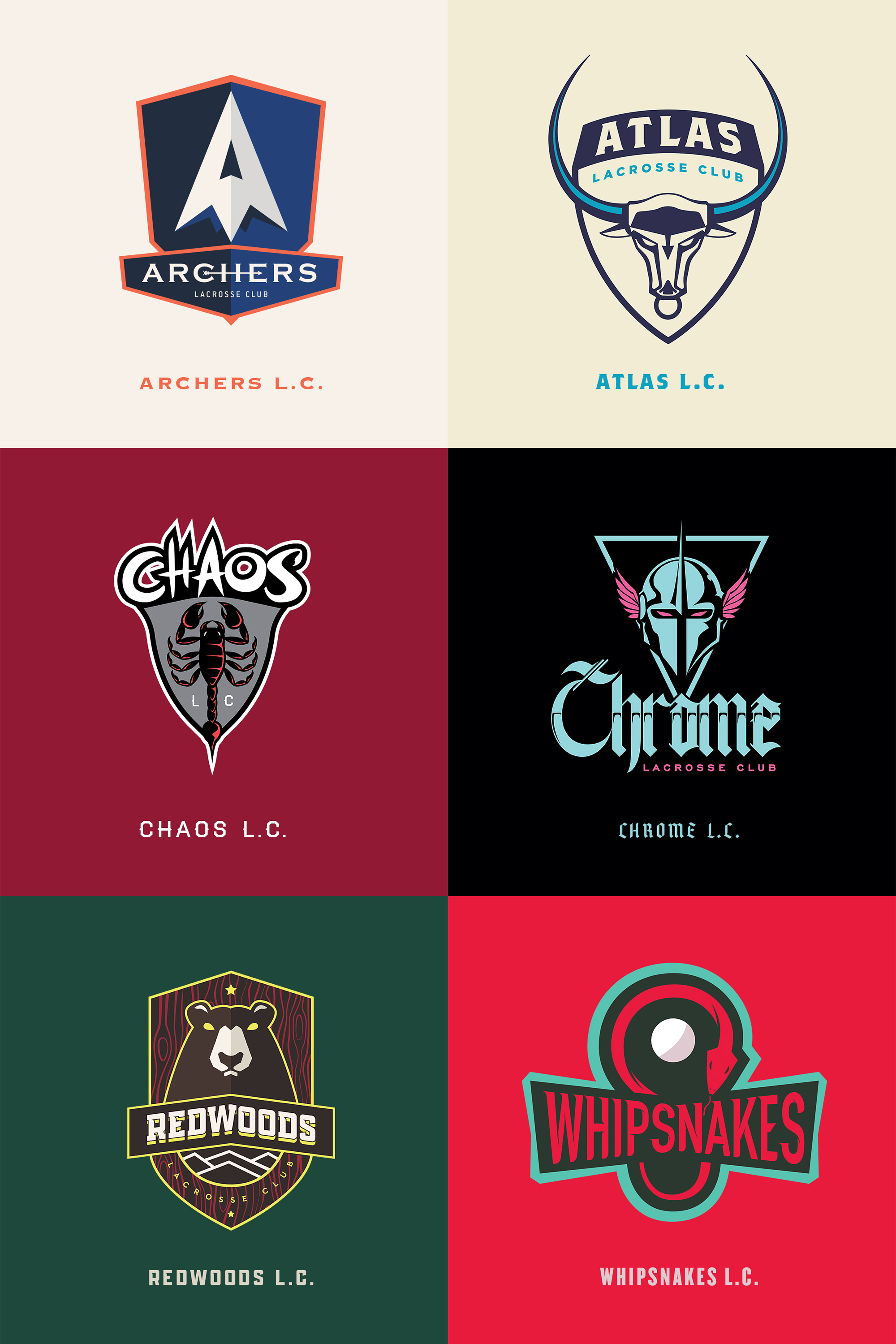
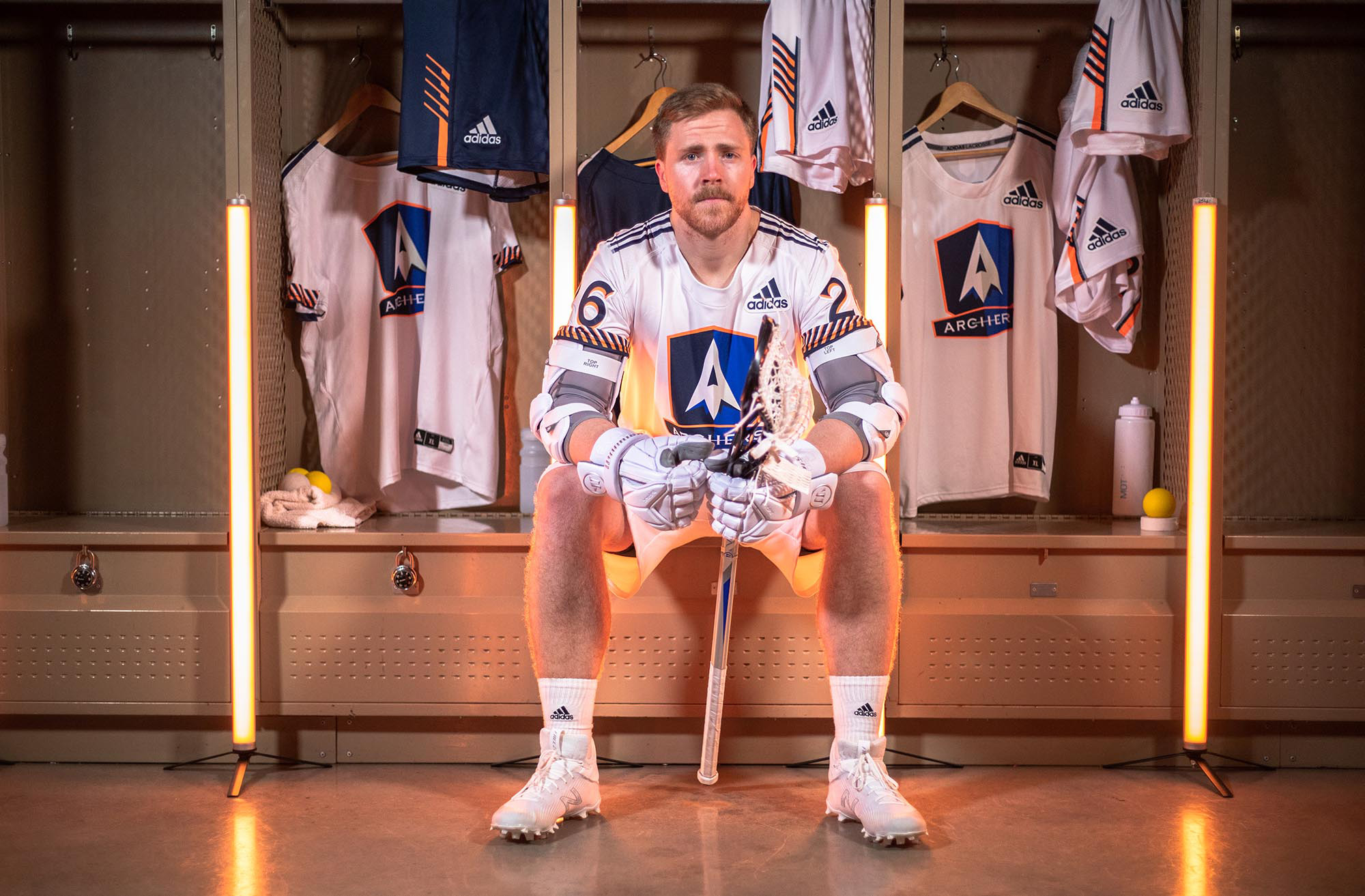
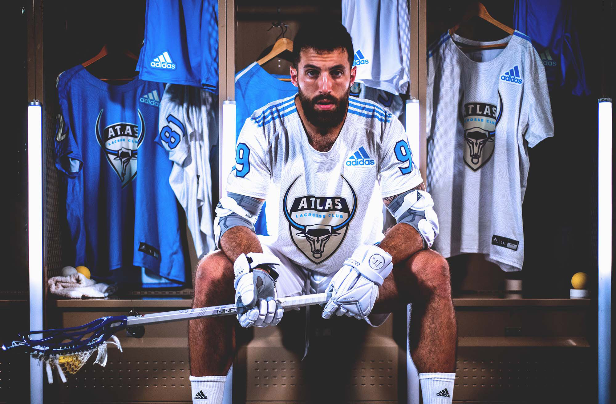
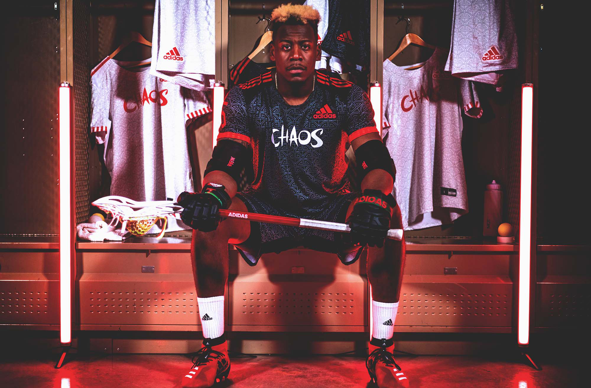
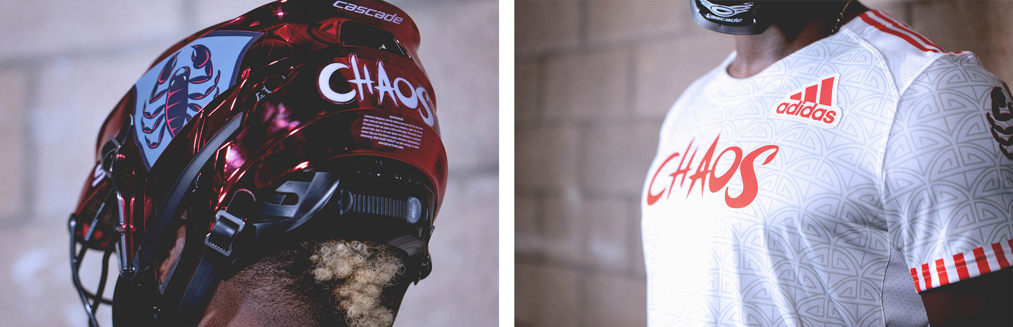
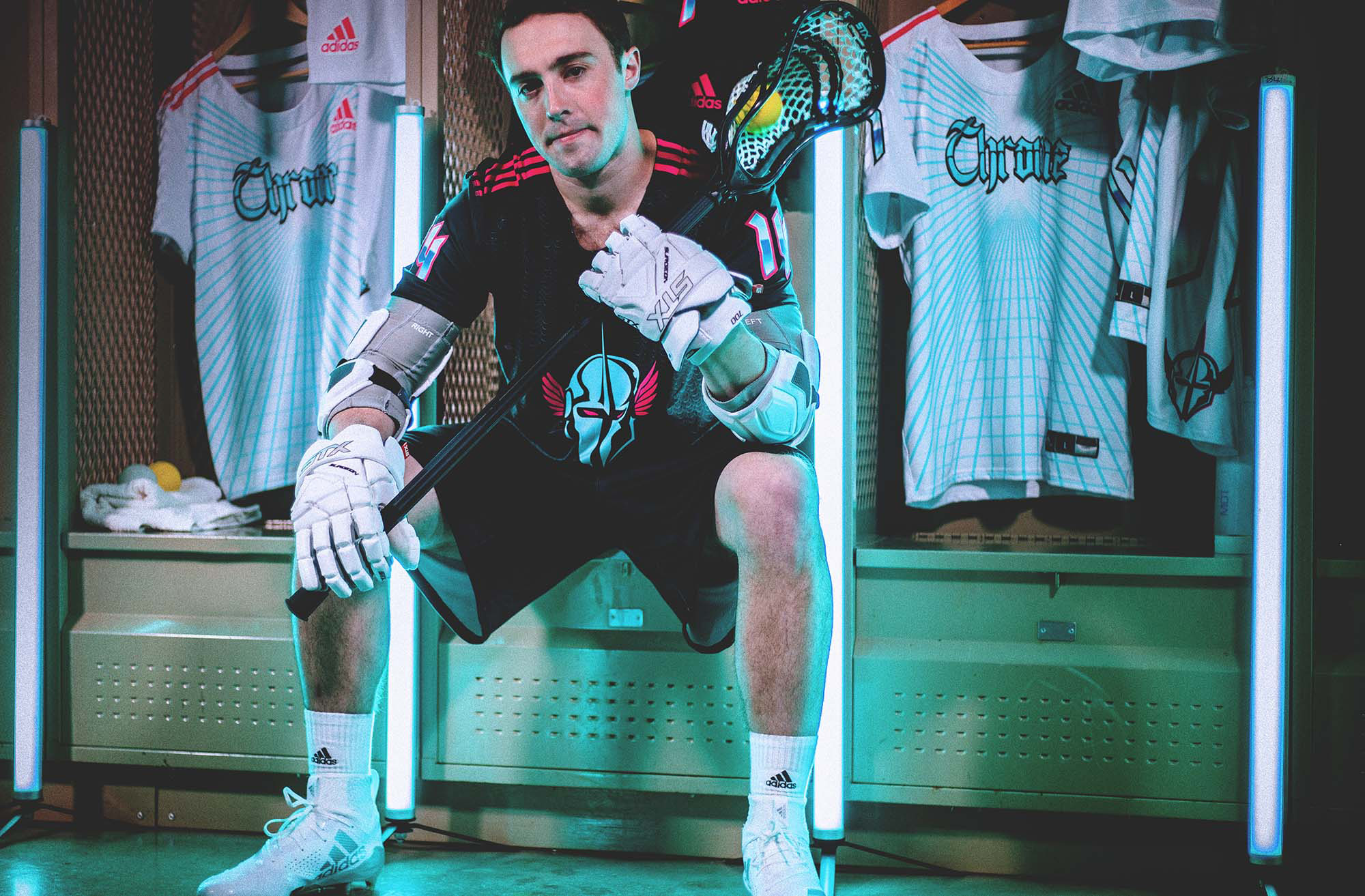
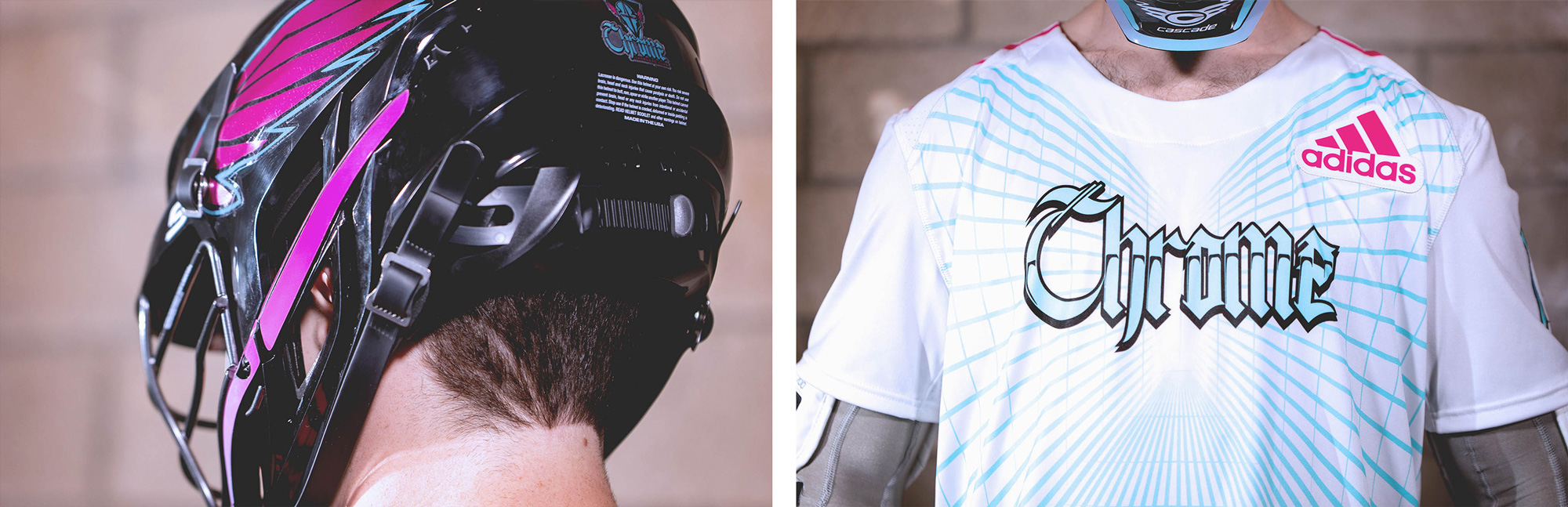
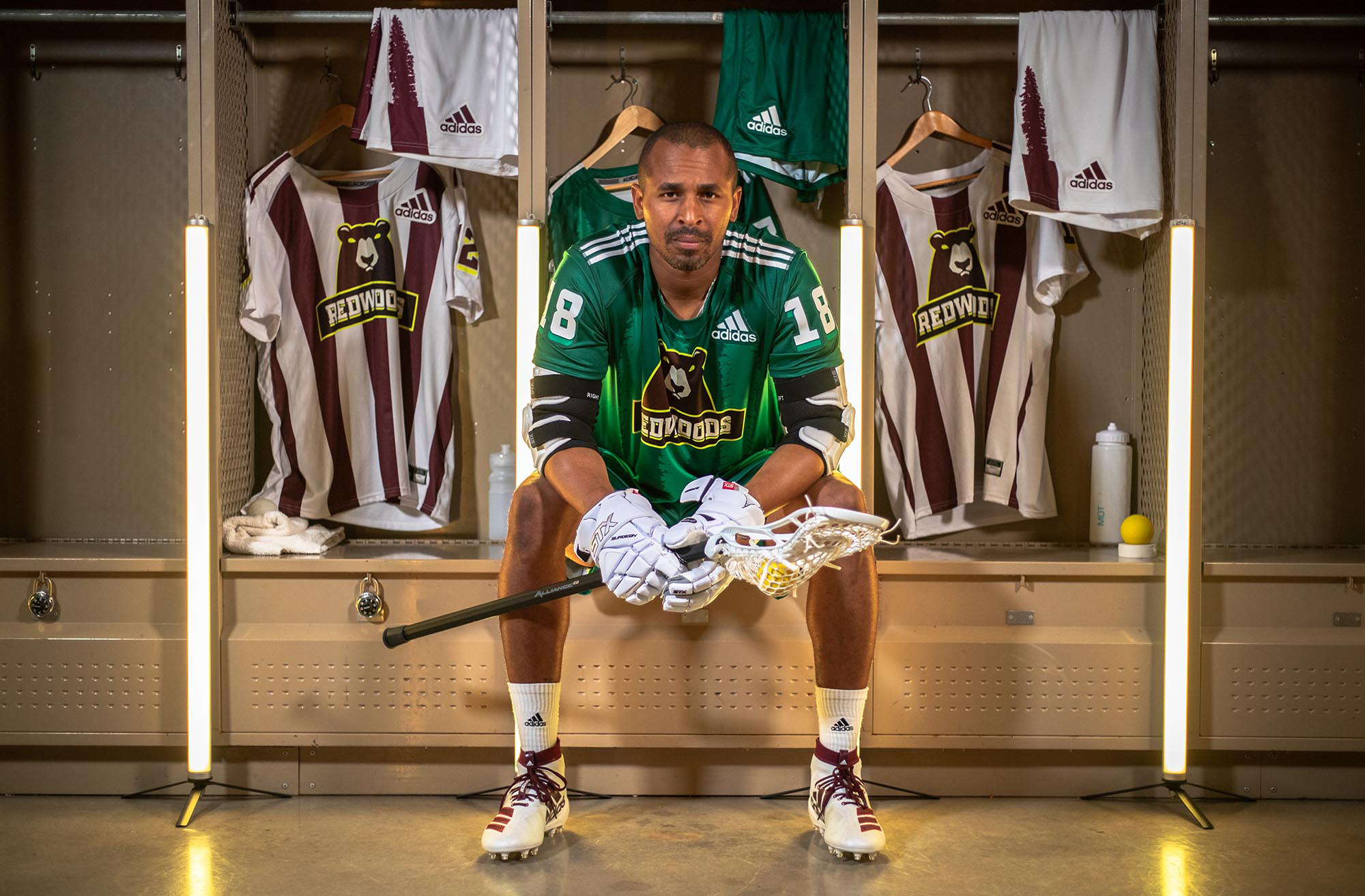
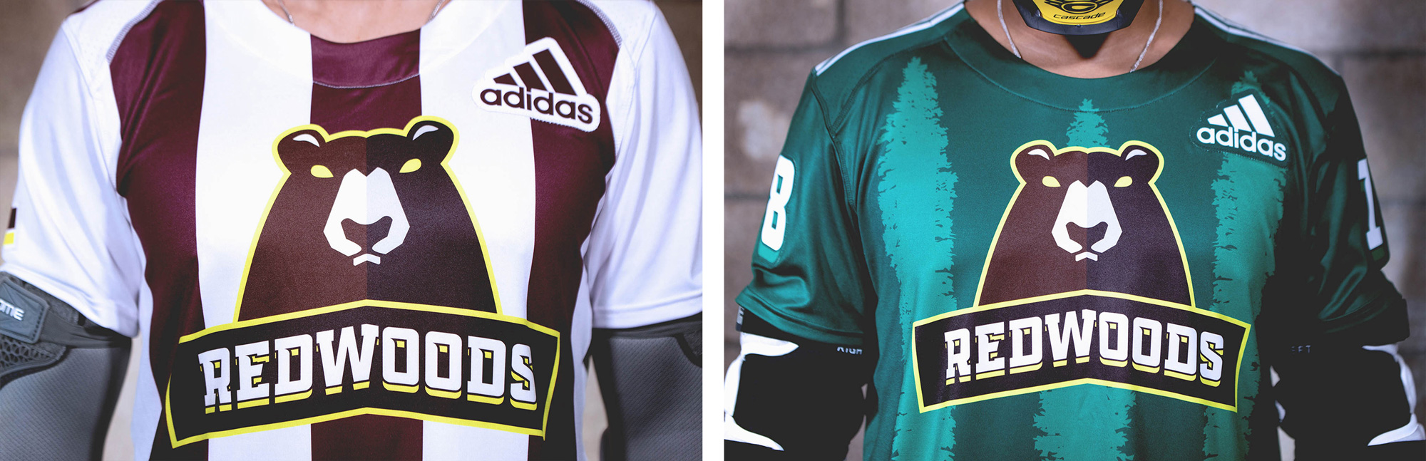
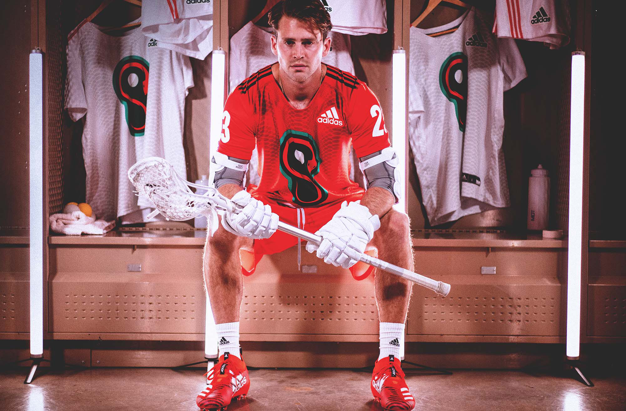
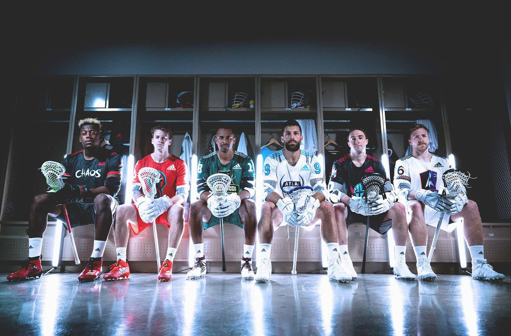
Some of you may remember that I linked to pictures of the uniforms back in May — these were designed by Adidas based on the identity elements created by We Are Bill. I have thrown in a few pictures of them in here to accompany the logos. (There are more photos here.) So, here we go… six more logo reviews for the price of one.
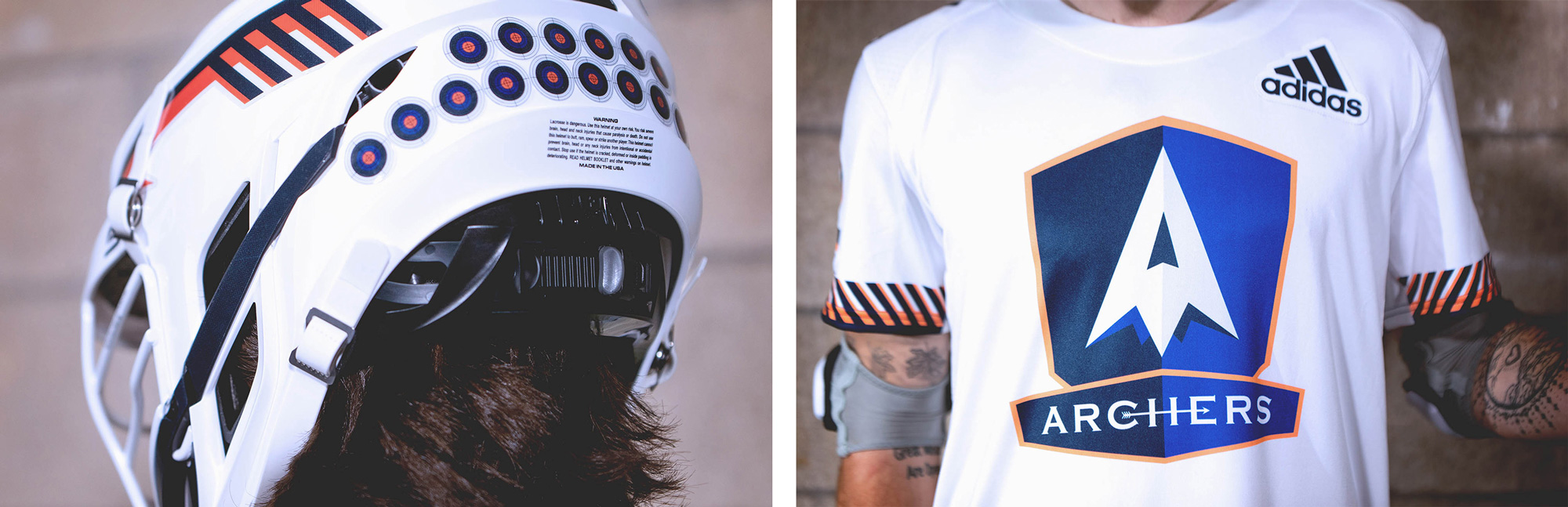
Our inspiration for the Archers came from the precision, dedication and intensity of a classical archer archetype. Lacrosse fans will draw parallels to players as archers on the field of play. We gave a nod to vintage sport styles but pulled it forward with an attention to composition and colorways that created contrast and drama.
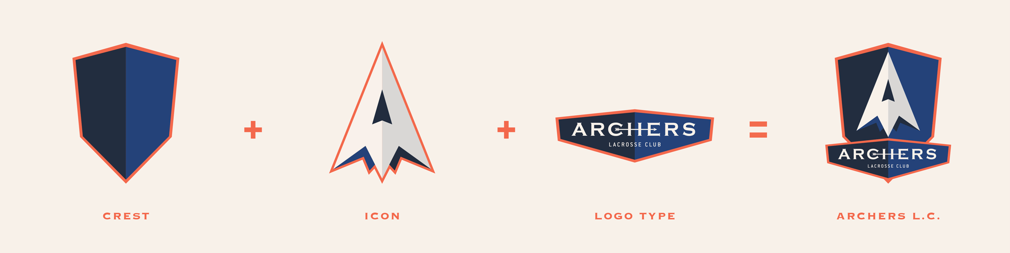
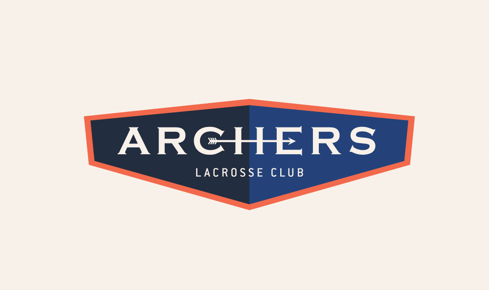
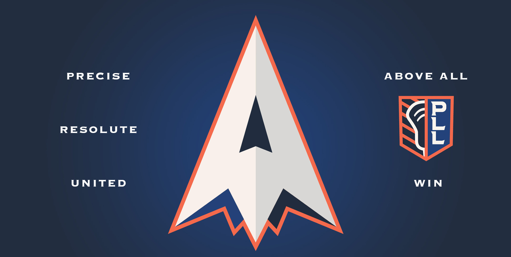
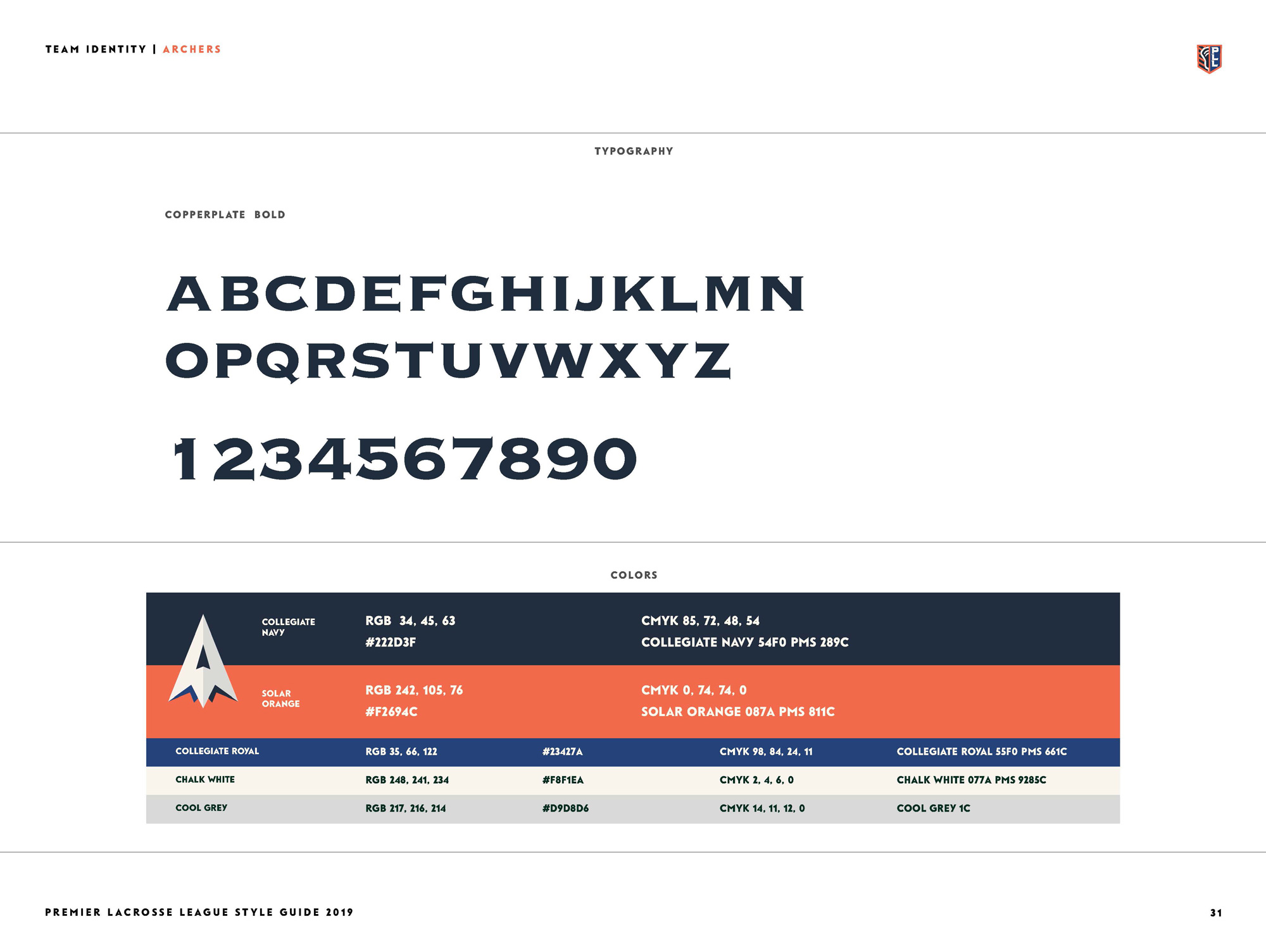
I like the mix of the “A” with an arrowhead, which is sort of an obvious approach but it’s nicely executed here with a very sharp point. The wordmark, in Copperplate, is cool with an arrow stretching from the center of the “C” to the “E” and acting as a crossbar. Not sure about the double holding shapes (one for the arrowhead and one for the wordmark) but I can deal.
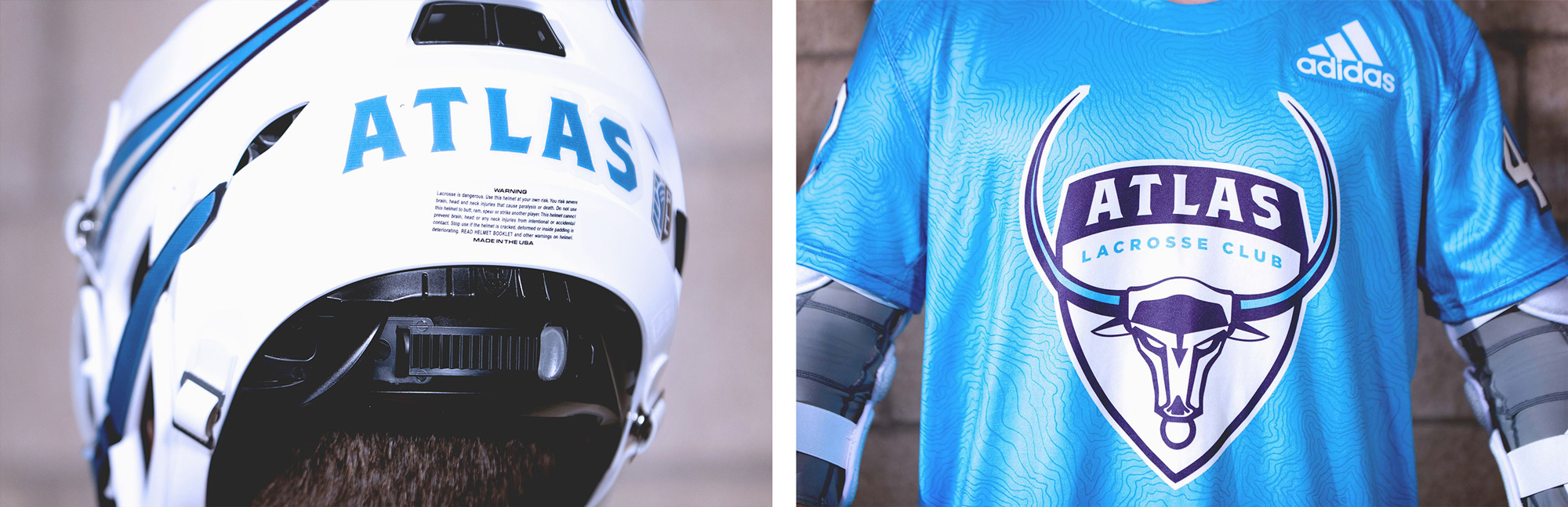
Atlas is a Greek god who holds up the world. We loved the name we’d created and through our exploration, we found we had a great opportunity to move beyond the traditional yet static imagery associated with Atlas to portray lacrosse’s dynamic game play. We asked ourselves, “What if Atlas was conceived today, what would he be?” The Bull emerged. The horns wrap around the mark as if holding a globe above it. The logo mark needed to be simple, yet impactful. The type is custom-designed to integrate with the bull icon.
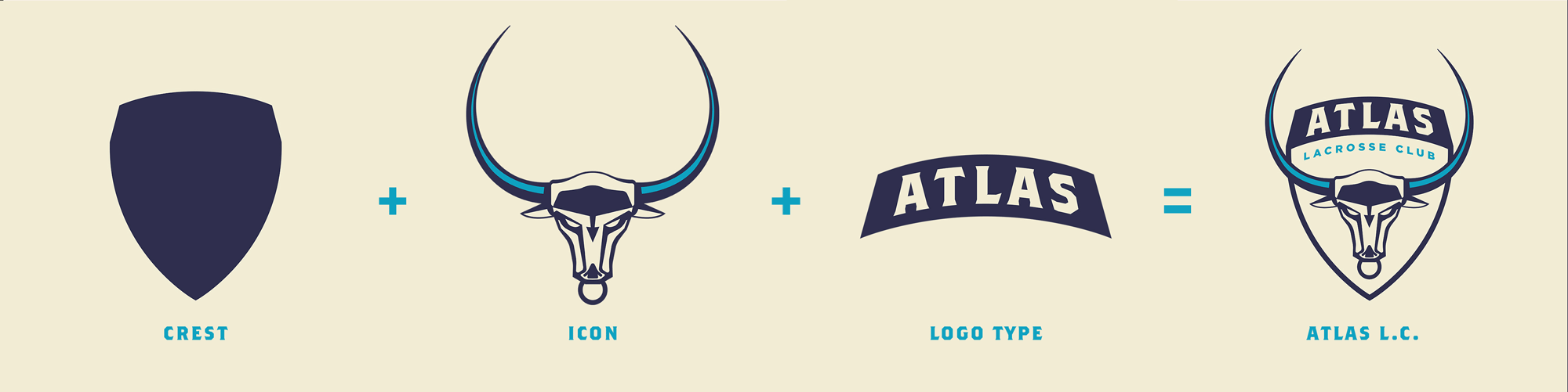
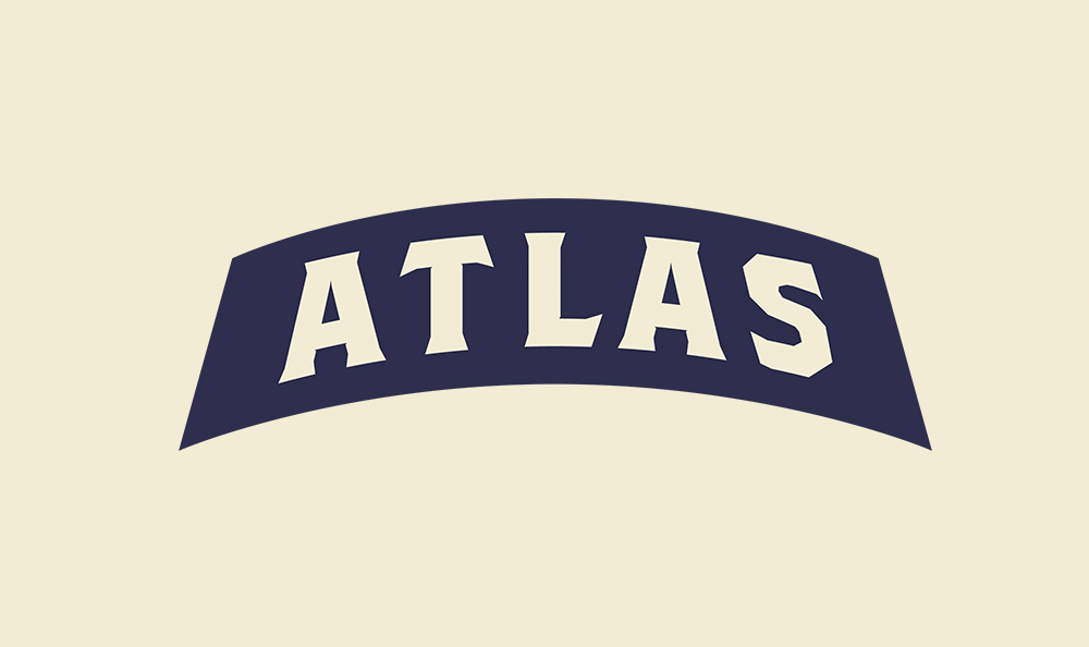
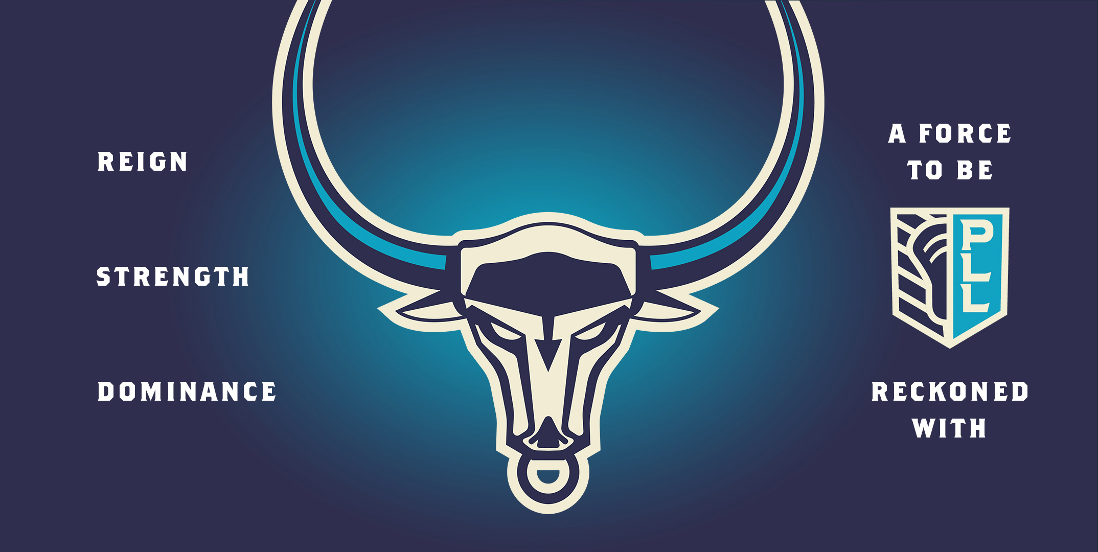
The idea of reimagining Atlas as a bull with its horns hinting at the idea of the human arms holding the world is a fun twist although I have to admit I did not get that reference just from seeing the logo. The bull’s face could have been a little better but it does convey quickly that it’s an angry bull so that’s good. The composition with the shield and the wordmark is pretty good on this one, with the type nestled in between the horns.
For Chaos, we personified the intensity, intimidation, and raw emotion of chaos in the body of a scorpion. We saw a big opportunity to do something interesting with the typography that was unexpected in the sports category. The energetic word mark is inspired by an act of carving or tagging. In Chaos, we wanted to really push the boundaries of team sport graphics.
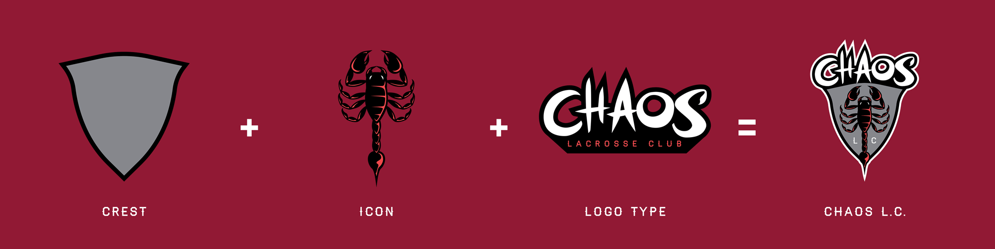
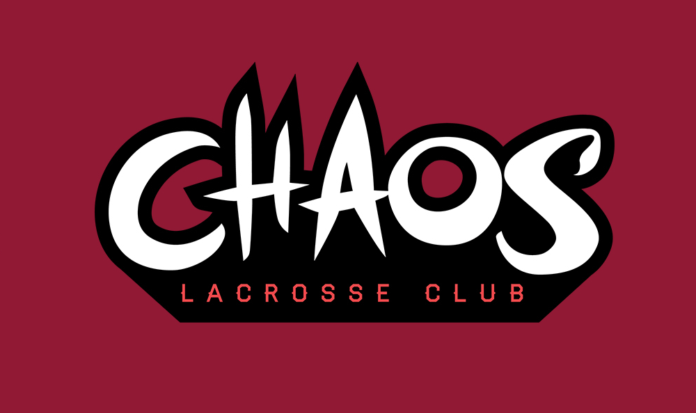
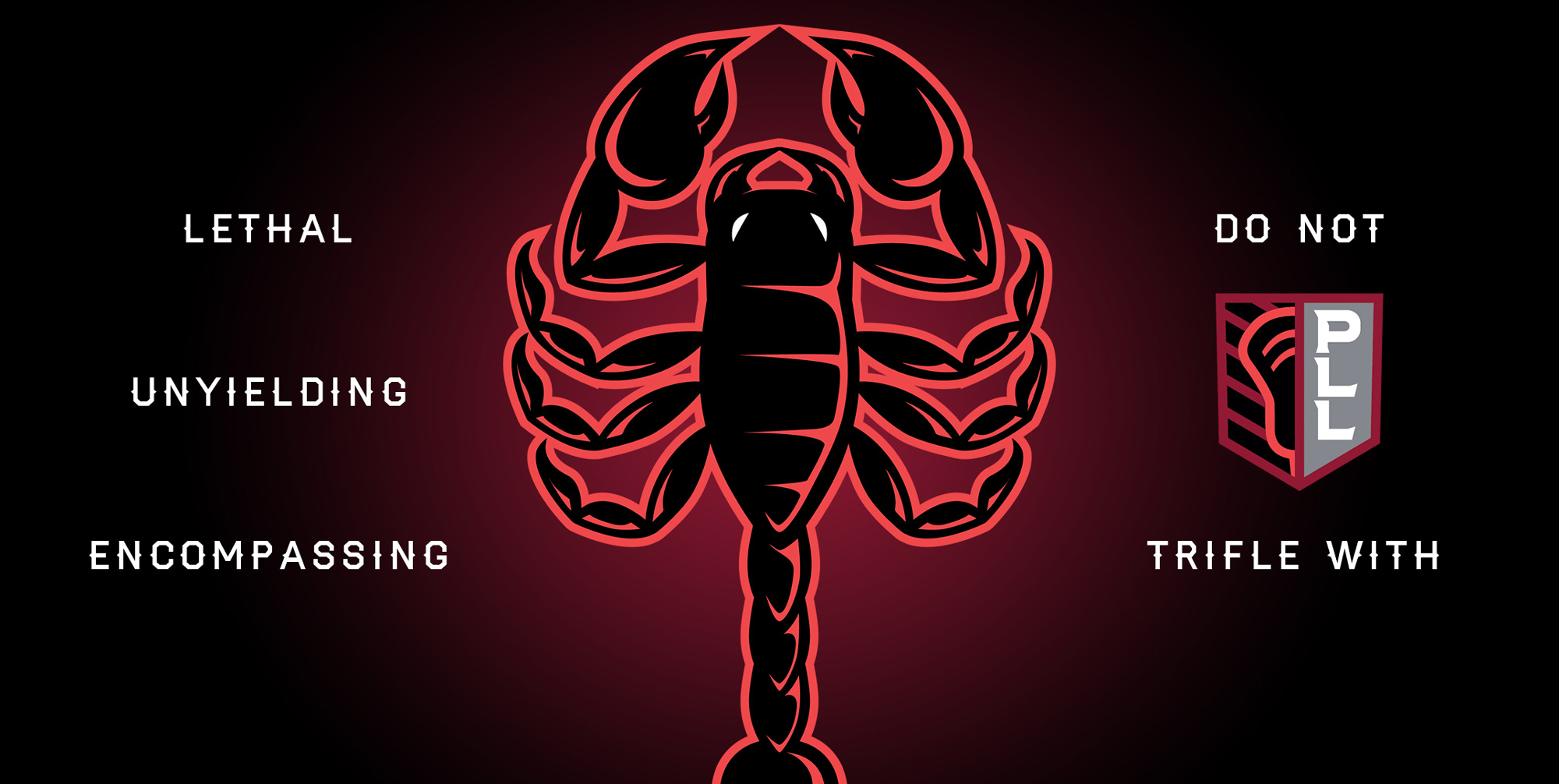
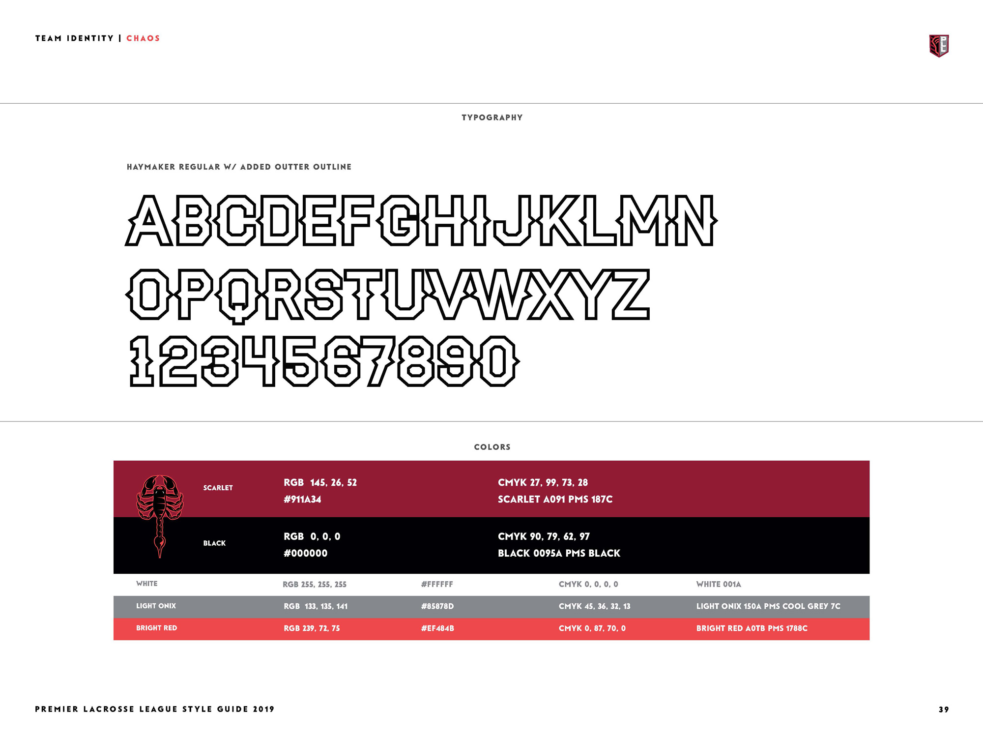
This is my favorite. I like the scorpion drawing and I love the wordmark, which is kind of silly fun. The integration of the elements into the crest is really good too.
For every team, we envisioned them facing off in battle, inspired by the origins of the sport in North America. That is the root of our identity for Chrome, armed and ready for battle. We wanted this mark to feel more current than a traditional armored helmet, so we took design cues from the 80’s, and our favorite superheroes and comic books. We chose the color palette to push the design to a place few people would expect.
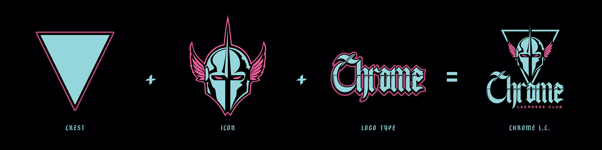
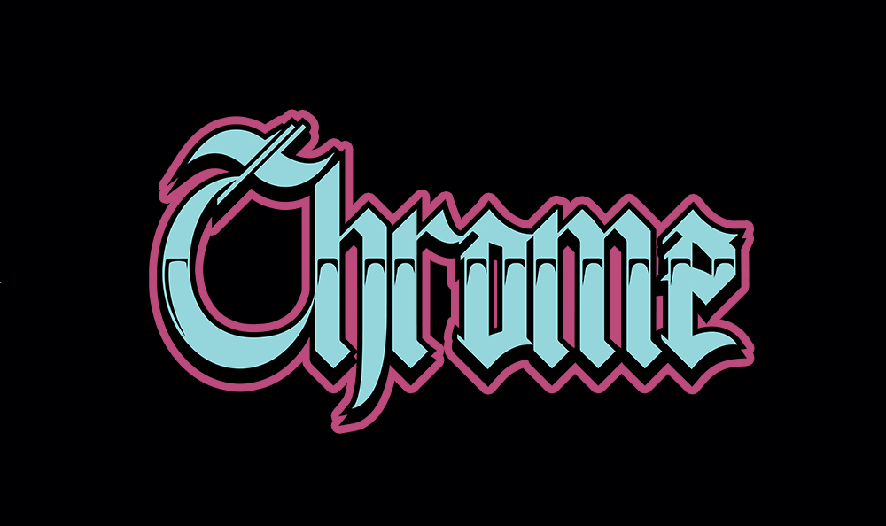
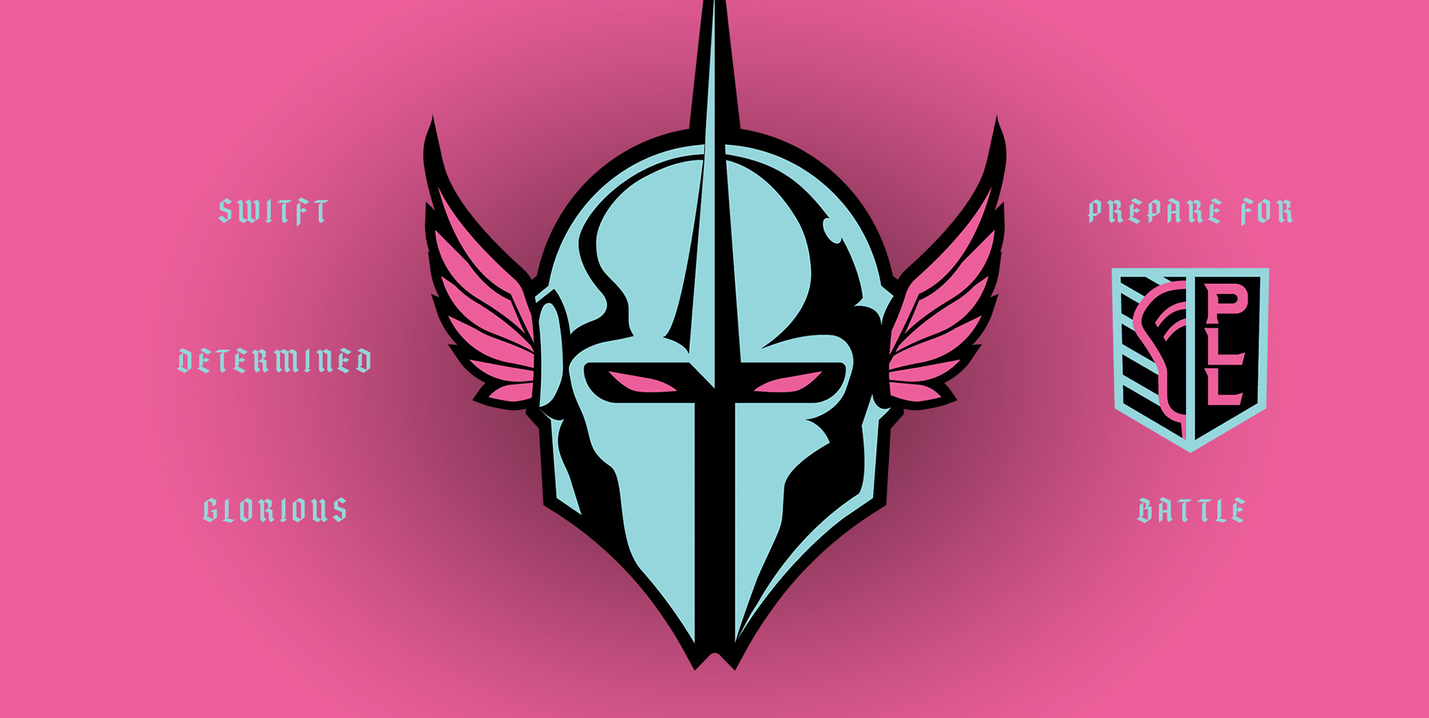
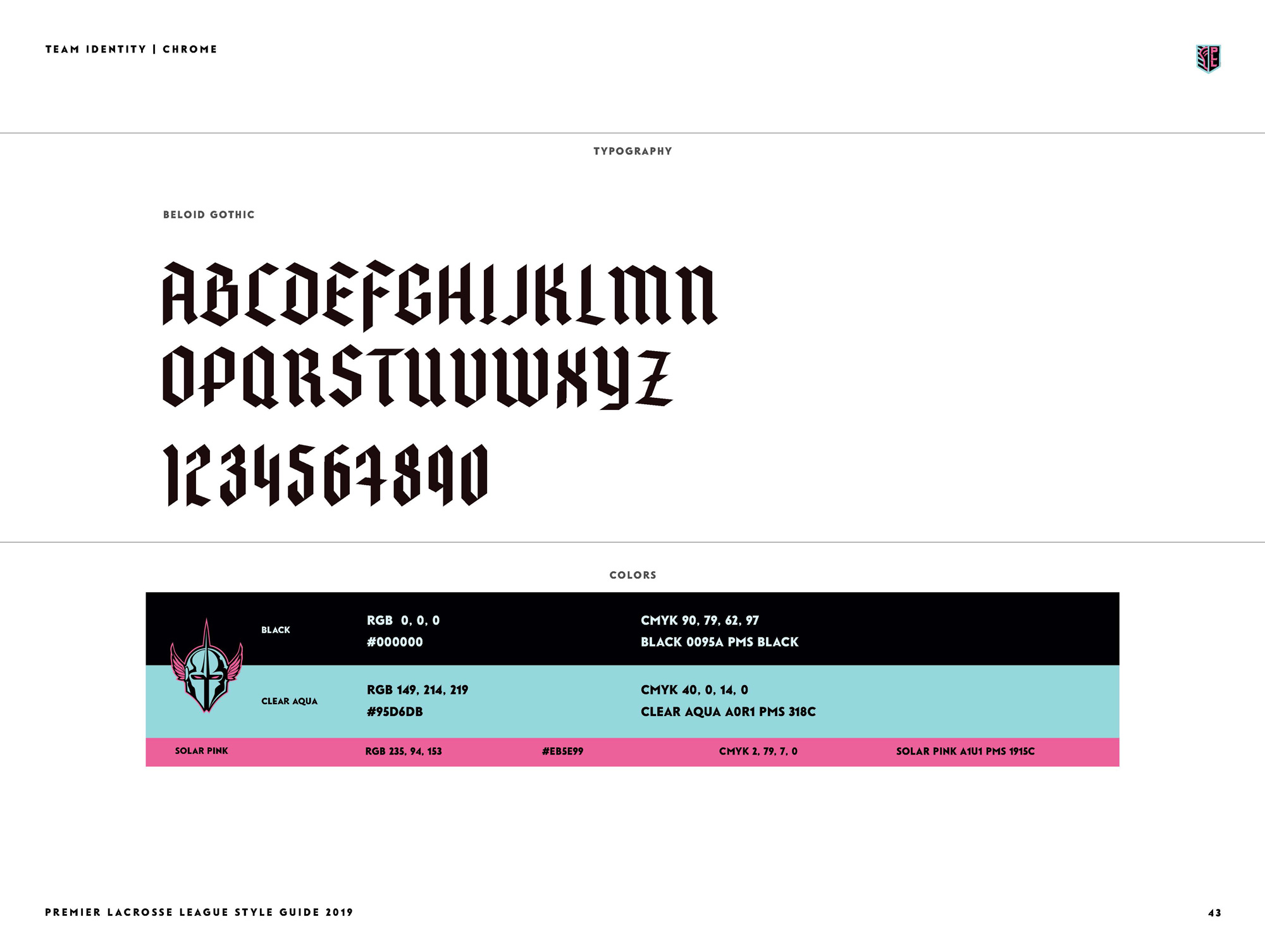
This would be my second favorite as it has a 1980s vibe with the color combo and I love the chrome effect on the blackletter wordmark. The mask thing is a tad creepy but I think that’s part of why I like it — not for its creepiness but because, overall, in the team logos, there is a sense of “let’s just roll with it, put it out there, and see what happens” without a lot of censoring.
Redwoods are powerful, towering and impressive trees. This was an inspiring place from which to create a new team identity. The logo mark is inspired by the brown bears that live amidst the redwoods. While the bear could have taken the form of a traditional sports logo with a snarling bear, we wanted to bring a more contemporary edge. We created a bear with a stoic, composed intensity in his eyes and posture.
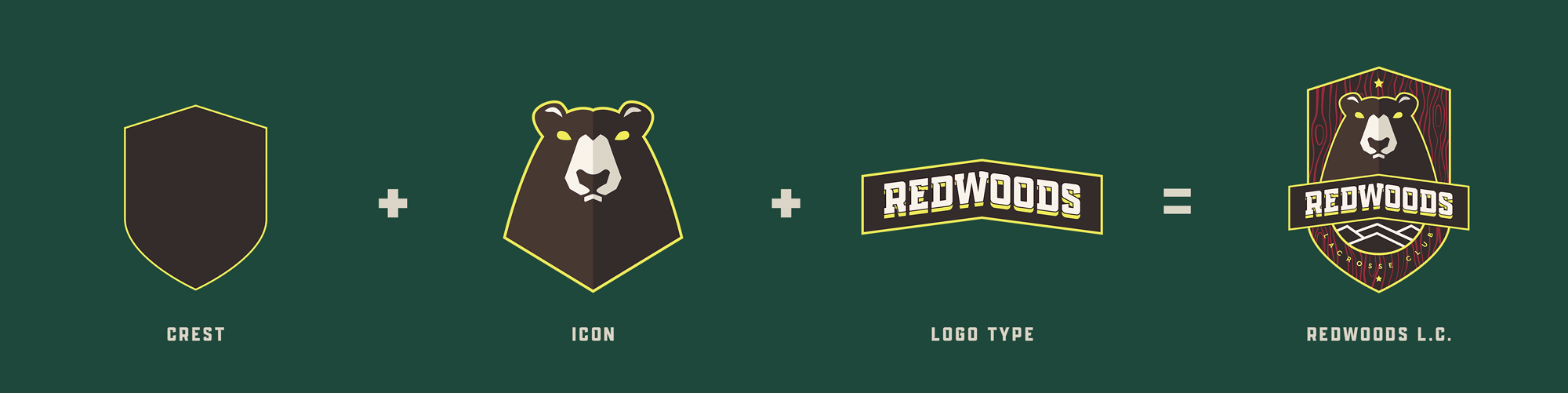
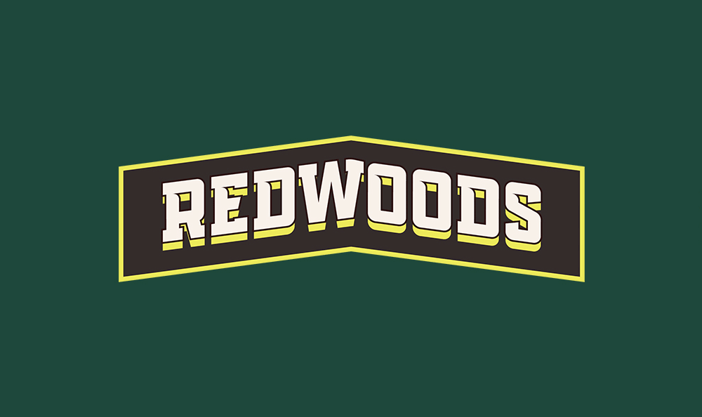
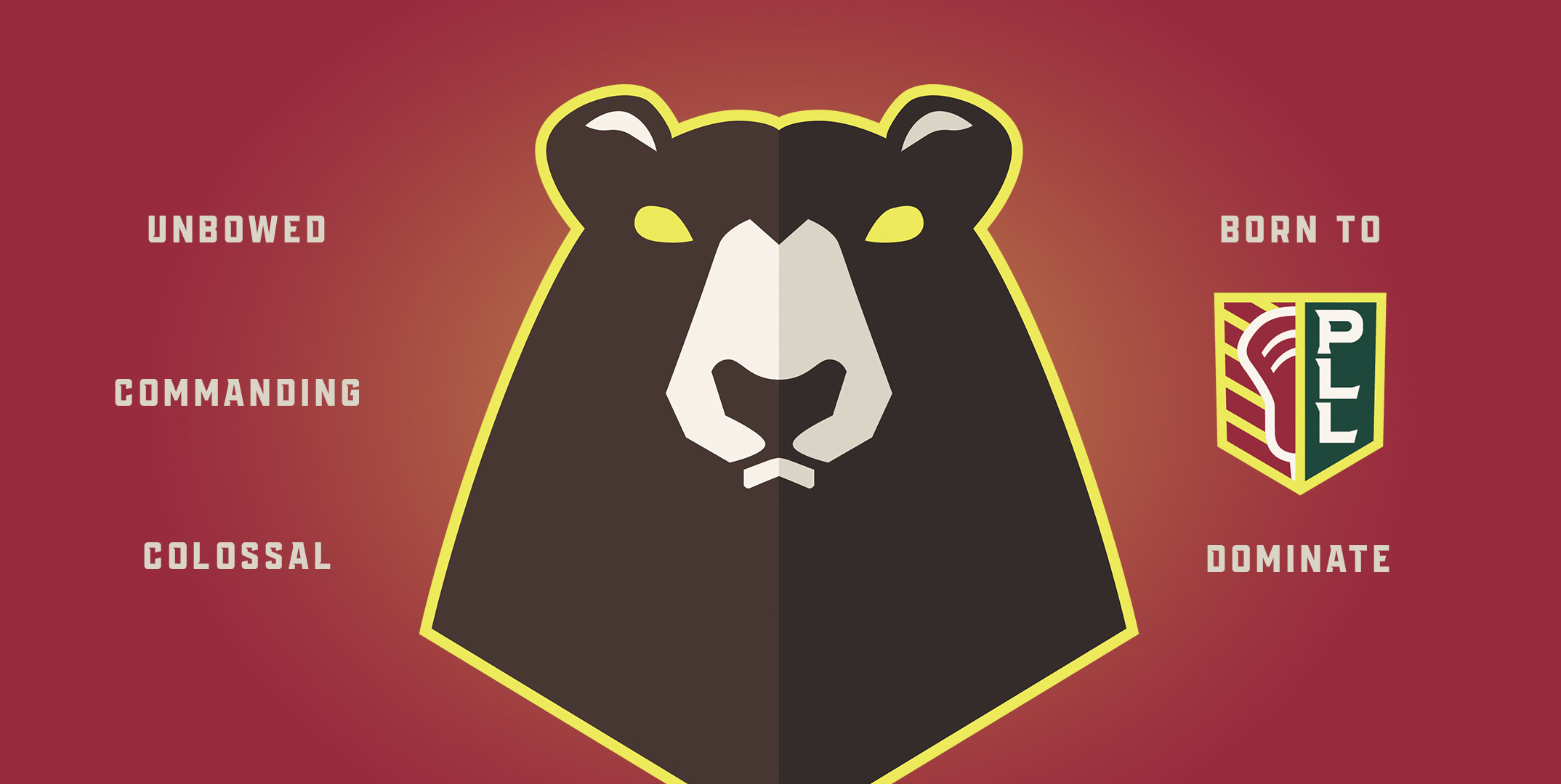
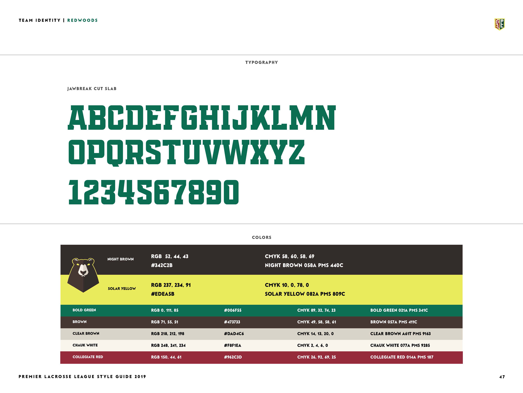
Probably my least favorite. I feel like the bear is too thick… I know bears are big, but this one just feels like it has a fat neck and is angrily watching TV. The type got a little too complex with the spiky slabs with a stroke with a shadow and split into a chevron. I like the woodsy pattern they put in the crest though.
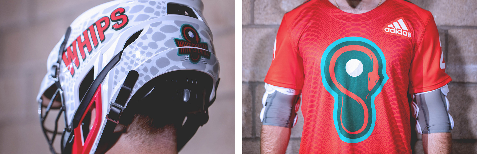
Whipsnakes are a little-known breed of snake endemic to America. We liked using species with the same North America origins as the sports of lacrosse itself. The Whipsnake is uniquely fast, with rapid cuts to strike its target prey. For the logo, we set out to capture that speed and motion yet in a form that spoke to the sport. The snake takes the shape of a lacrosse head. The letters are designed with the same intentionality.
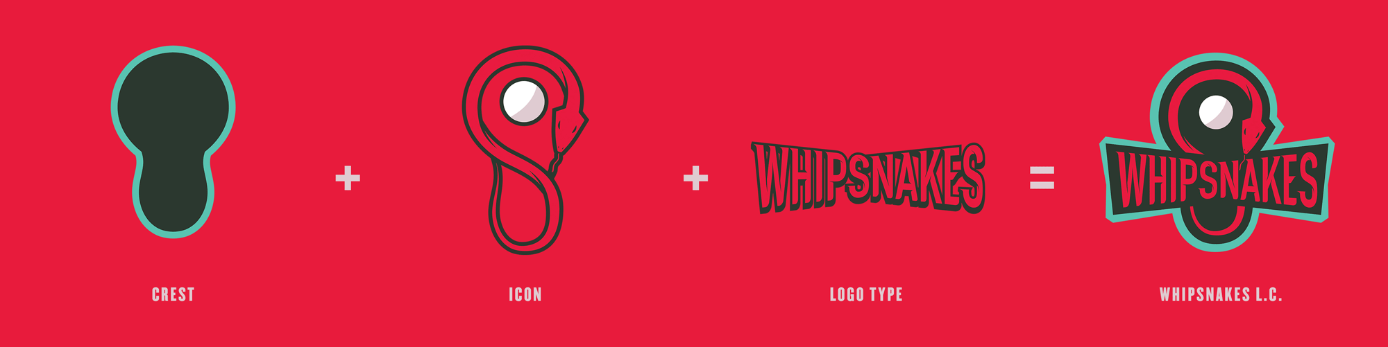
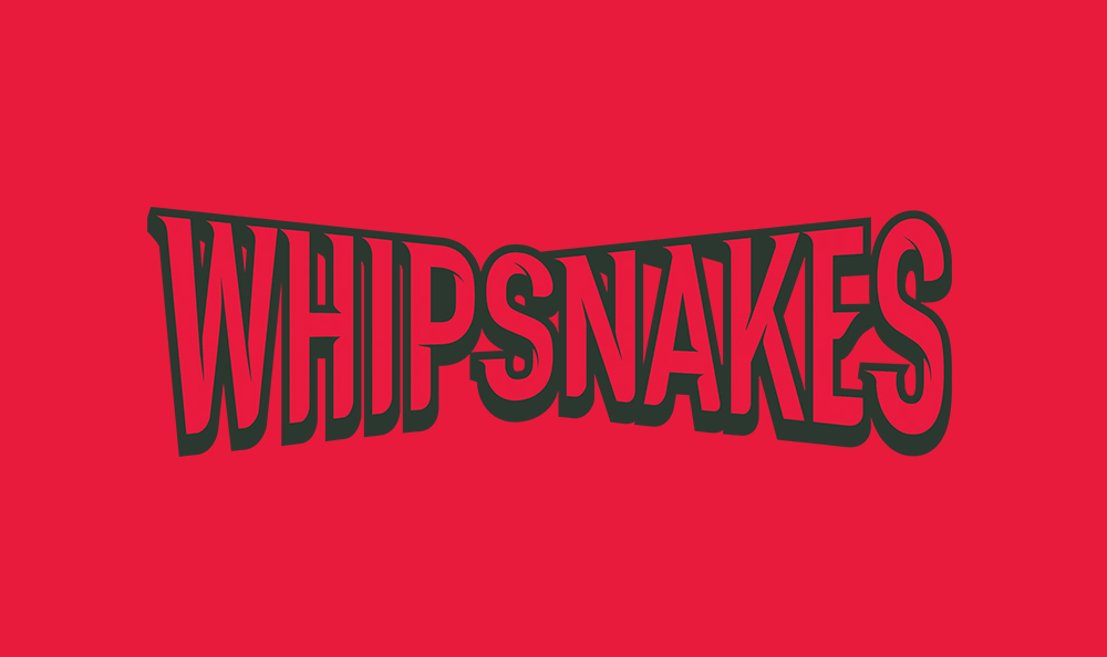
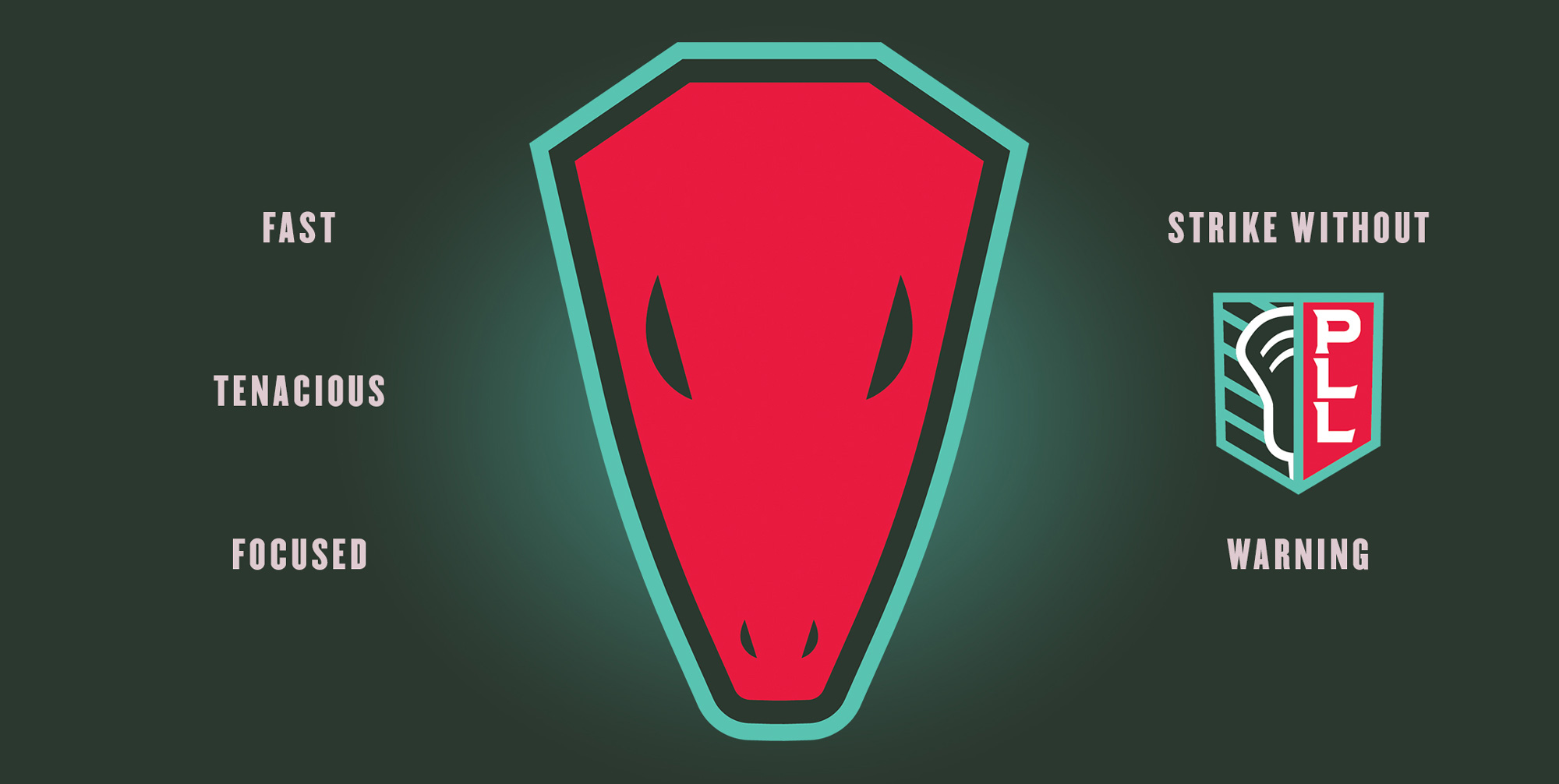
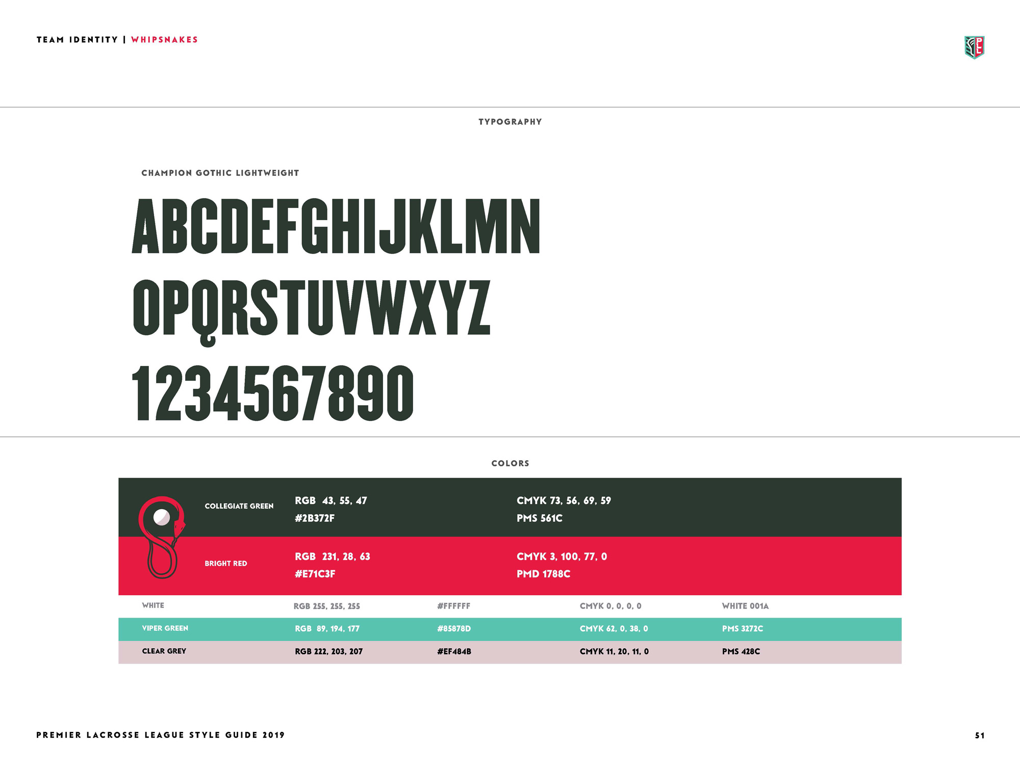
This one is cool, with a snake curled in the shape of a lacrosse head. The wordmark had the right idea but its shadow and perspective is confusing. Not a fan of the standalone head but a HUGE fan of the scales in the uniform.
This was clearly a fun job and it’s overall successful in the creation of six unique identities that all have the same ingredients that allow for all teams to be presented equally. Even though they are indeed fun and loose, I do feel like the execution could have been a lot better throughout and perhaps six team identities plus one league identity was too much, too quick to be able to devote much more time to development and refinement. On the flip side I like the slightly unfinished look of the teams, which make them look more authentic, almost like an adult recreational league that made some bitchin’ uniforms and it’s just a bunch of guys playing for the fun of it, instead of the super polished, corporate tone of the NBA or NFL. Also, I just spent a good 15 minutes watching highlights of the games, which I had never done for lacrosse, so score 1 for the PLL.

 Новости Союза дизайнеров
Все о дизайне в Санкт-Петербурге.
Новости Союза дизайнеров
Все о дизайне в Санкт-Петербурге.