Обзор лучших ресурсов по разработке бренда, разработке упаковки
contact us | ok@ohmycode.ru
contact us | ok@ohmycode.ru
Established in 2016, Obby is an online platform, limited to London, that helps people discover the best classes, courses, and workshops the city has to offer. Obby allows teachers to list their class and people to search through the listings across multiple categories of classes, including art, crafts, tastings, mindfulness, performing arts, and photography, for whether you want to improve your knife skills or your Cuban salsa dancing moves. Recently, Obby introduced a new identity designed by London-based Koto.
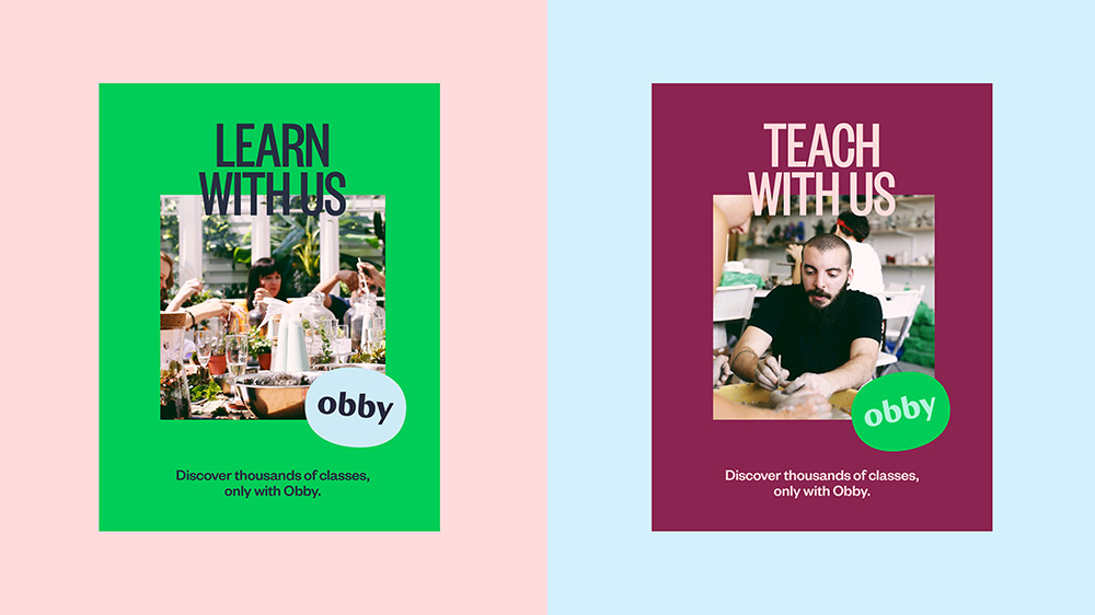
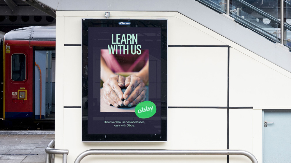
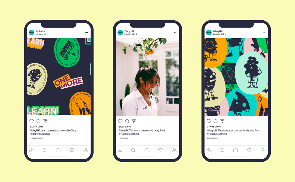
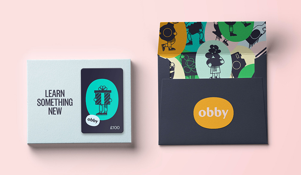
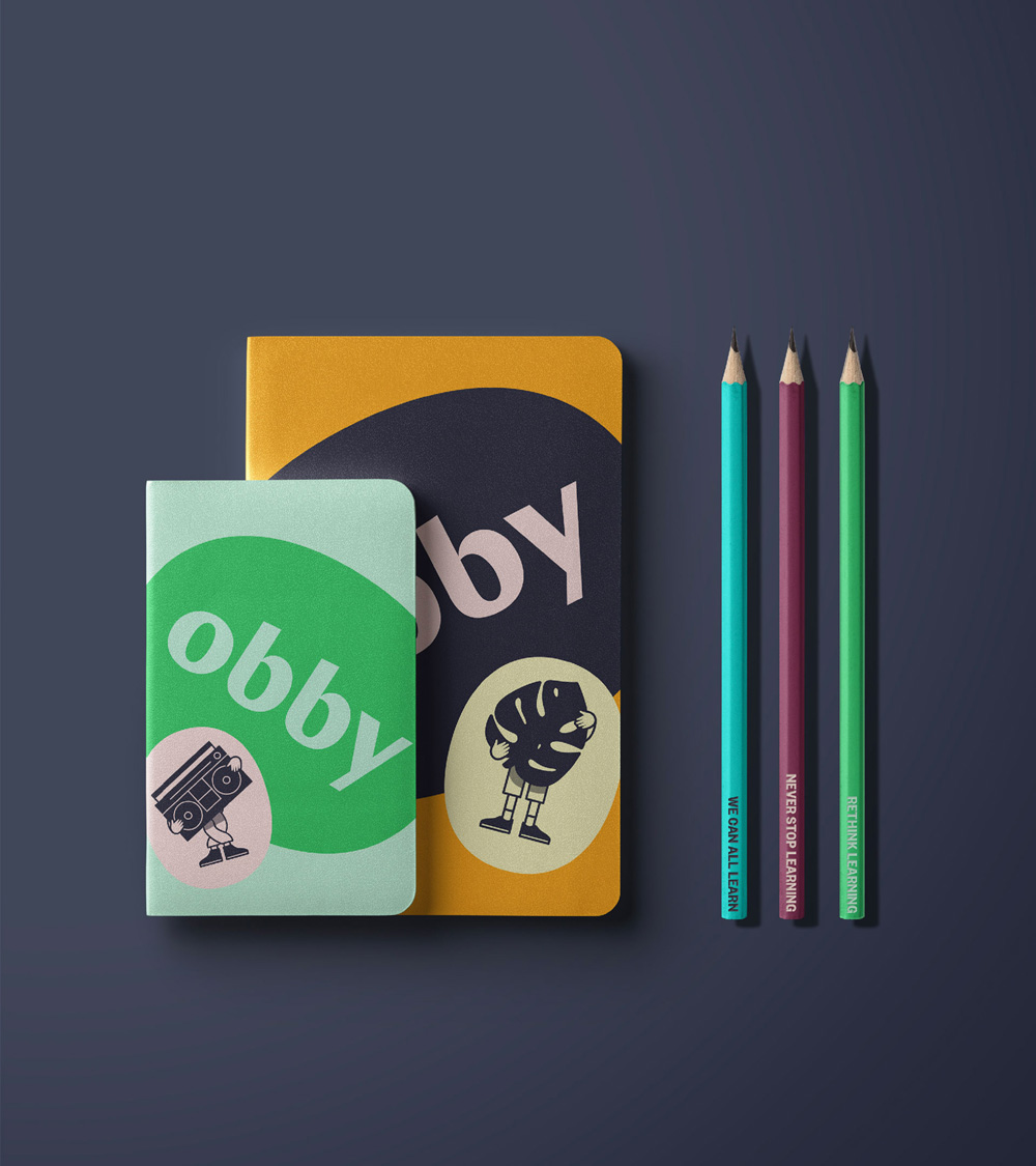
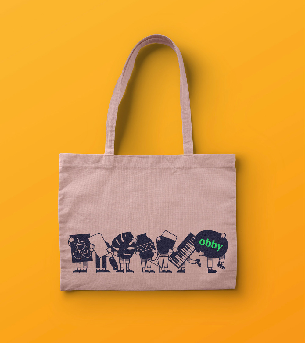
The new brand is bold, energised and focused. It avoids all sense of worthiness or seriousness that often accompanies adult learning, while still feeling both accessible and expert. An identity system based on badges keeps people coming back for more - motivating them to hone their skills in a particular subject or to try something else entirely. Each experience is further brought to life though eye-catching online guides and high-quality photography of real classes taking place.
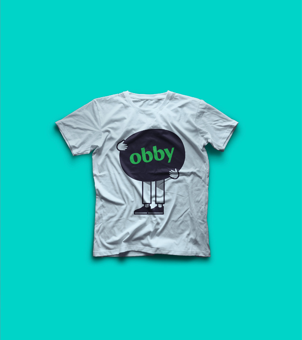
The old logo could be categorized as fine (nothing overly terrible nor overly good) but it did look as if the IHOP and Amazon logo had a geometric sans baby and that baby was looking at you creepily through the two “b”s as its eyes and a smile underneath. The new logo, commendably, avoids any other attempts at the two “b”s looking like eyes and instead goes for a classier approach using a chiseled serif that exudes a craftier vibe. The holding shape is lovely in its ambiguousness of what shape it is or isn’t. In a way, the logo doesn’t say much about the company (the company’s name not saying much about the company either doesn’t help) but it certainly looks more polished and sophisticated that then helps support and balance out the more playful identity.
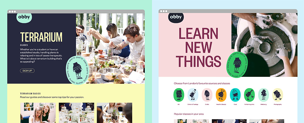
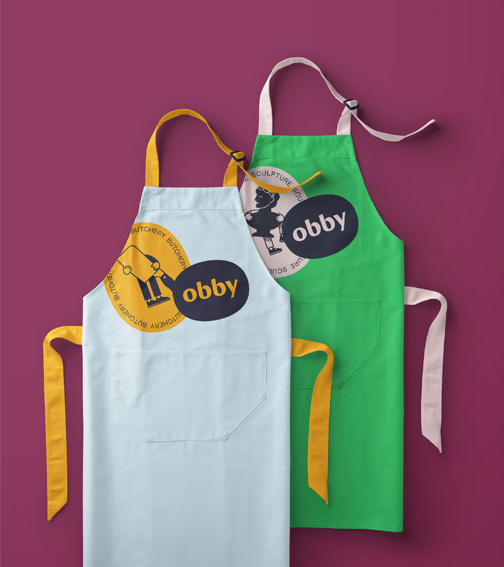
Anyone with the right knowledge of a subject can join Obby’s pool of teachers, and those eager to learn can take one of their classes. The new identity celebrates this vibrant community of talented, interested people. It centers on an illustration style that shows Obby teachers passing on their skills and love for their subject. This also acts as a useful system for categorising and showcasing the thousands of classes on offer.
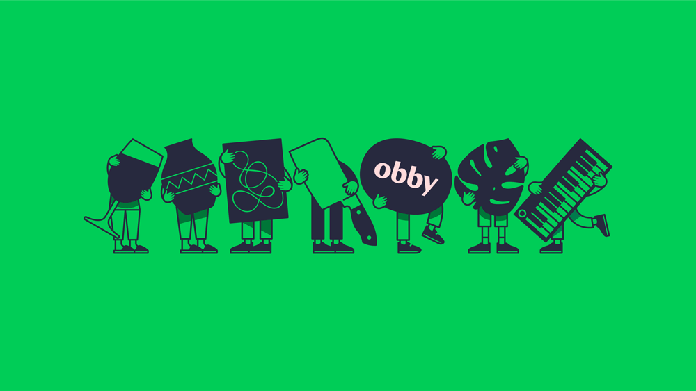
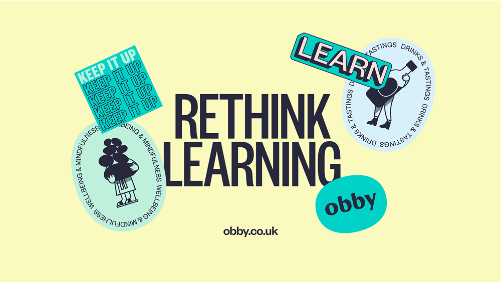
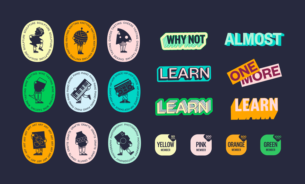
The identity comes to life through a great series of illustrations of people holding larger-than-life objects that broadly capture the various types of classes. It takes the usual faceless, line-art style and uses it in a new way conceptually that feels novel, refreshing, and fun. The illustrations are used on their own or in also-ambiguous holding shapes for some cool badges and they are paired with Instagram-esque typography “stickers”. The combination is unexpected but works quite well.
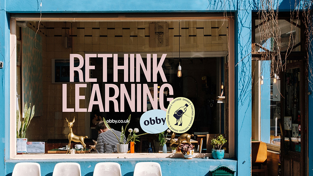

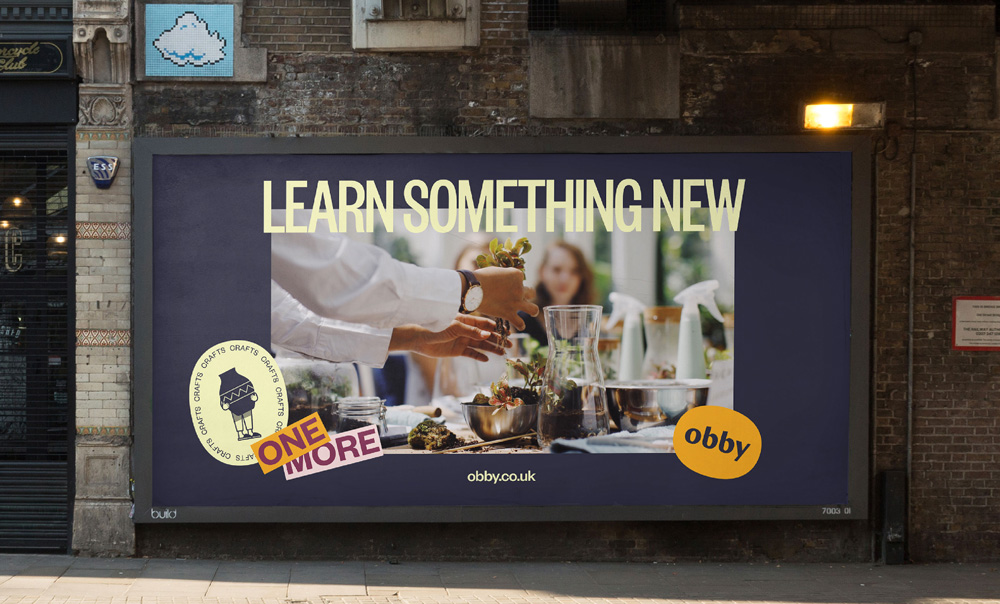
To deliver the system, the layouts use big borders and tall, condensed typography to bring attention to the photography and helps unify the different photos available from the different classes. The more stickers there are on these, the more engaging they look.
Overall, this is both classy and a little quirky, giving Obby an engaging visual platform to connect teachers with learners.

 Новости Союза дизайнеров
Все о дизайне в Санкт-Петербурге.
Новости Союза дизайнеров
Все о дизайне в Санкт-Петербурге.