Обзор лучших ресурсов по разработке бренда, разработке упаковки
contact us | ok@ohmycode.ru
contact us | ok@ohmycode.ru
Established in 1971, Century 21 is one of the most well known brands in real estate, comprised of approximately 800 independently-owned and operated franchised broker offices in 80 countries worldwide with more than 118,000 independent sales professionals. Last week, Century 21 introduced a new identity, no design credit given.
A redesign microsite is available here.
“This is just the beginning of the bold ambitions we have for challenging existing conventions in real estate relationships and to progress the industry in ways that favor the consumer yet directly help our agents and brokers break through the clutter and noise and win in the markets they operate in,” said Cara Whitley, chief marketing officer, Century 21 Real Estate. “Our rebranding campaign is more than a logo; it is recognizing that every broker and affiliated agent has their own way of doing things that work for them, and providing a clean and clear stage for their individual personalities and unique stories to be told.”
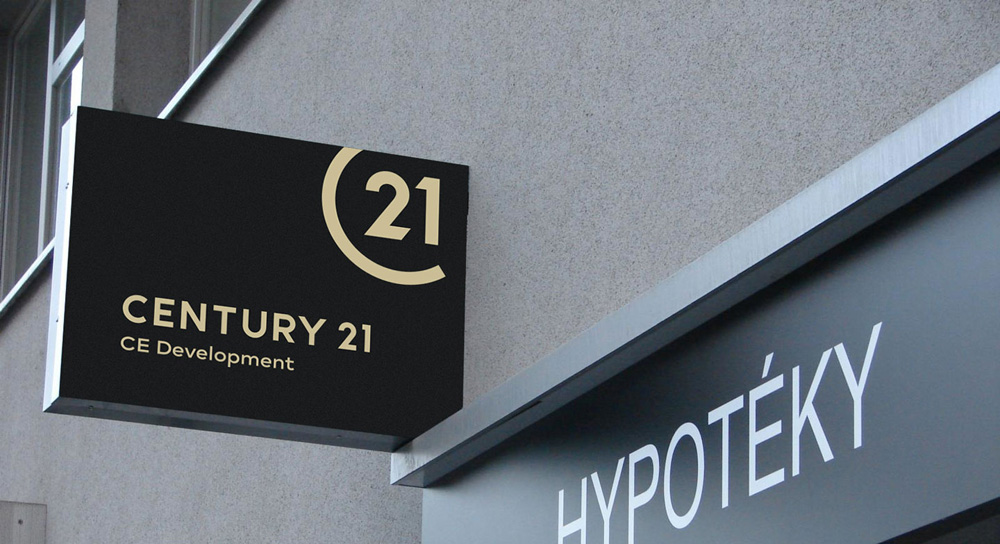
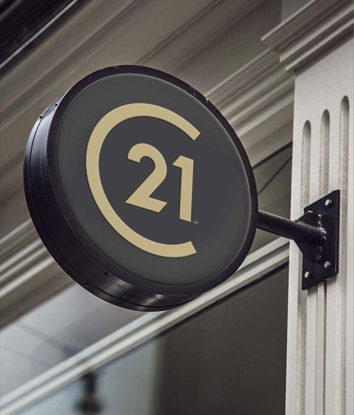
As part of the brand campaign, Century 21 Real Estate introduced a sophisticated new logo. The logo features a refreshed color palette that stays true to its iconic gold and black scheme, while also embracing new graphics. By eliminating the complexity and dated iconography, the new identity gives CENTURY 21 System members a clear stage for their unique personalities and styles to shine through, while still providing a simple and timeless “gold standard” seal of approval. Additionally, the new logo enables the brand to project a modern view that makes it relevant to consumers buying other properties, such as apartments or commercial spaces.
The old logo was pretty bad, even accounting for its nostalgic value and the 1970s typographic trend of smashing letters together, negative space be damned. None of the letters in the logo integrated harmoniously in any way, starting with the bold “C” flowing into the “e” and that “ry” combo was barely useful. Now, you can argue that it’s one of the most recognizable logos in real estate but so is the shape of an eggplant in the grocery store and that don’t make it good. What the old Century 21 logo had is equity and recognizability but it wasn’t a good logo.
The new logo (the full wordmark) isn’t great and it removes pretty much any aesthetic connection with the old logo — except the shape of the number “1” — which may be a little too drastic but it provides a clean slate for its franchises and agents. I feel like the old logo carried a burden of being old and dusty and imposed a dated aesthetic on how their listings were presented, as if everything they sold was a house built in the 1950s but had not been kept up. The new logo is bland, sure, but it broadens the spectrum of the properties it actually represents. Execution-wise the wordmark is fine; the only thing that bothers me is the leg of the “R”, which should stick out a little further to the right so that the bowl doesn’t feel so big and about to tip over.

The monogram, though, is really nice and the best element of this redesign, introducing a tight little unit that will be as easily recognizable as the old house logo in a short period of time. It may not seem like the most original thing in the world but competing against RE/MAX, Keller Williams, or The Corcoran Group — other major real estate companies — this stands out sharply and boldly. The execution is spot on too, with the angles of the “C” aligning neatly with the “1” and matching those of the “2”. The color combination of gold and dark gray is much more pleasant than the old yellow and black and gives both the wordmark and monogram a more high-end feel.

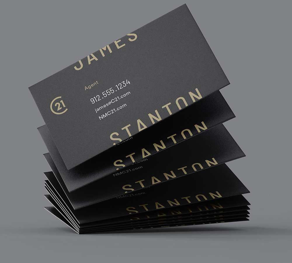
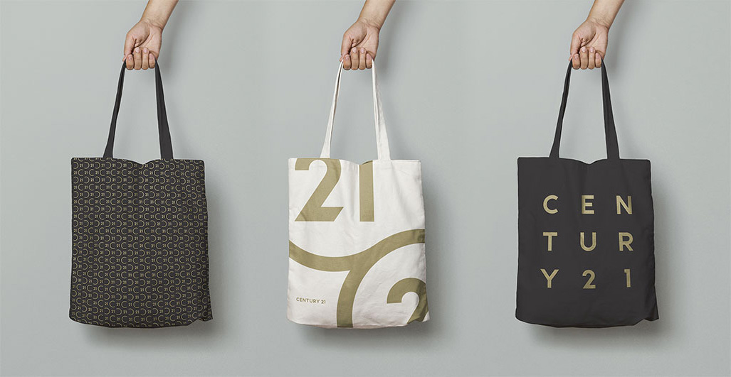

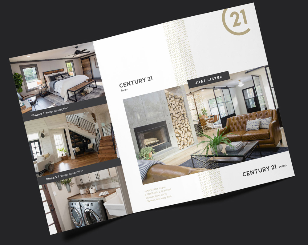
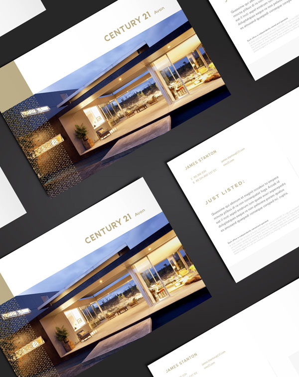
The print applications look slick and contemporary. The introduction of a condensed typeface works well with the wider, squarer structure of the wordmark and monogram and, although ambitious when it comes to providing a system for franchisees to execute, the cut-off names and typography is fun. The monogram pattern at times looks a bit cheesy or like a distraction (as in the listing brochure) but it’s a nice element to have.

The yard signs look good too and I like how they have used the monogram cropped. It will be interesting to see how this holds up in reality, once franchisees start taking liberties but as proof of concept, these are solid.
I wasn’t sure if I should have included the video above since it’s not part of the actual new brand launch but I think it shows Century 21’s inclination to make its design and brand a bigger, and more interesting, part of their efforts, even if they can’t help themselves with some of that cheesy stock footage. That video notwithstanding, I think this is a terrific redesign that brings Century 21 into, you know, the twenty-first century, and elevates the status of the brand to a more upscale, more in-tune-with-the-times position.
Thanks to Josh Miles for the tip.

 Новости Союза дизайнеров
Все о дизайне в Санкт-Петербурге.
Новости Союза дизайнеров
Все о дизайне в Санкт-Петербурге.