Обзор лучших ресурсов по разработке бренда, разработке упаковки
contact us | ok@ohmycode.ru
contact us | ok@ohmycode.ru

Established in 1995 in Edmonton, AB, Canada, BioWare is a video game company specializing in role-playing games and its variation, massively multiplayer online role-playing games. After some initial success, BioWare was acquired by Electronic Arts in 2007 and continued its rise with multiple franchise titles that did very well, leading to the opening of two additional offices, one in Austin, TX, and another in Montréal, Québec. Things were going swimmingly on the surface until the release of Anthem earlier this year, which had high expectations and was considered a flop but the more damaging aspect was a story by Kotaku (the Brand New of video games, LOL) that exposed the intense working conditions at the company for the two years leading up to its release where many people had to take leaves of absence due to stress and, for many, their anxiety was off the charts. Whether that has changed or not, I don’t know, and whether the redesign is a signal of change or an attempt at distraction, I don’t know either, but I like to be optimistic, so let’s proceed with the former. Last year, BioWare quietly released a new logo and has now rolled out a wider identity designed by San Francisco, CA-based Tolleson in collaboration with Electronica Arts’ in-house team.
Video game developer BioWare is known for elevating the art of interactive storytelling by creating worlds of adventure, conflict, and companionship that inspire you to become the hero of your story.
The finned “B” initial in the original logo inspired a stylized approach to the new visual language. The strong diagonal cut in the “B” monogram yielded a sense of pathing through with confidence, while simultaneously serving as a visual metaphor for pages within a storybook. Venturing through the portal and into the sublime worlds created by BioWare, the adaptive “B” allows for endless expressions of content. A set of unique colors is used to represent each of the four iconic franchises: Dragon Age, Anthem, Mass Effect, and Star Wars.
The old logo had a superficial “hardcore” look with all the exaggerated spikes coming out of the bold, squat letters, which presented some questionable decisions like the awkward “A” and lowercase “i” in a small caps composition. It certainly looked the part of a video game company making them shoot-y games. The new logo is a much more tame version that maintains the spikiness of the original but in much smaller doses and on a decent typeface. For me — someone who hasn’t play video games since the original Madden NFL game came out on the Sega Genesis — the logo looks like a solid update simply because it’s not the muscle flex the old logo was but I imagine for gamers who see the new logo as the game boots up it might be a letdown as it doesn’t have the pump-itude of the old one. To counter that, there is a cool monogram that I imagine will play a bigger “consumer” role whereas the full wordmark will be more of the “corporate” mark.
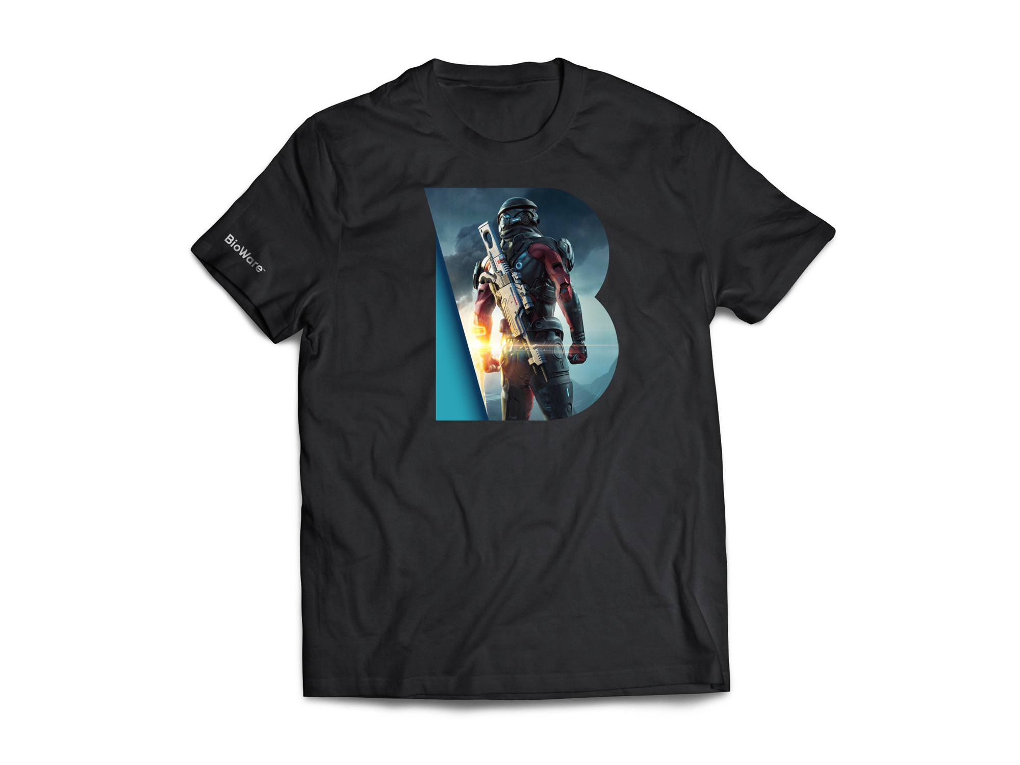
Building off of the “B” in the logo, the new monogram introduces dimension through a simple cut that emanates from the angle of the original spike. It’s fairly random, to be honest… like, what are the two parts of the “B” supposed to be, mean, or reveal? To be honest too, I really like how the blue “B” looks on black. If I stop questioning its construction or meaning, I dig it a lot and once I’m in that accepting place I can dig the additional colors, the putting of characters in front of it, and the logo-as-window application. Nothing is particularly groundbreaking but it all has a techie/gamey feel that’s relatively exciting.
There is plenty to like in those last four seconds of the animation as the monogram appears and morphs into the wordmark. I would be excited to play whatever came after that intro.

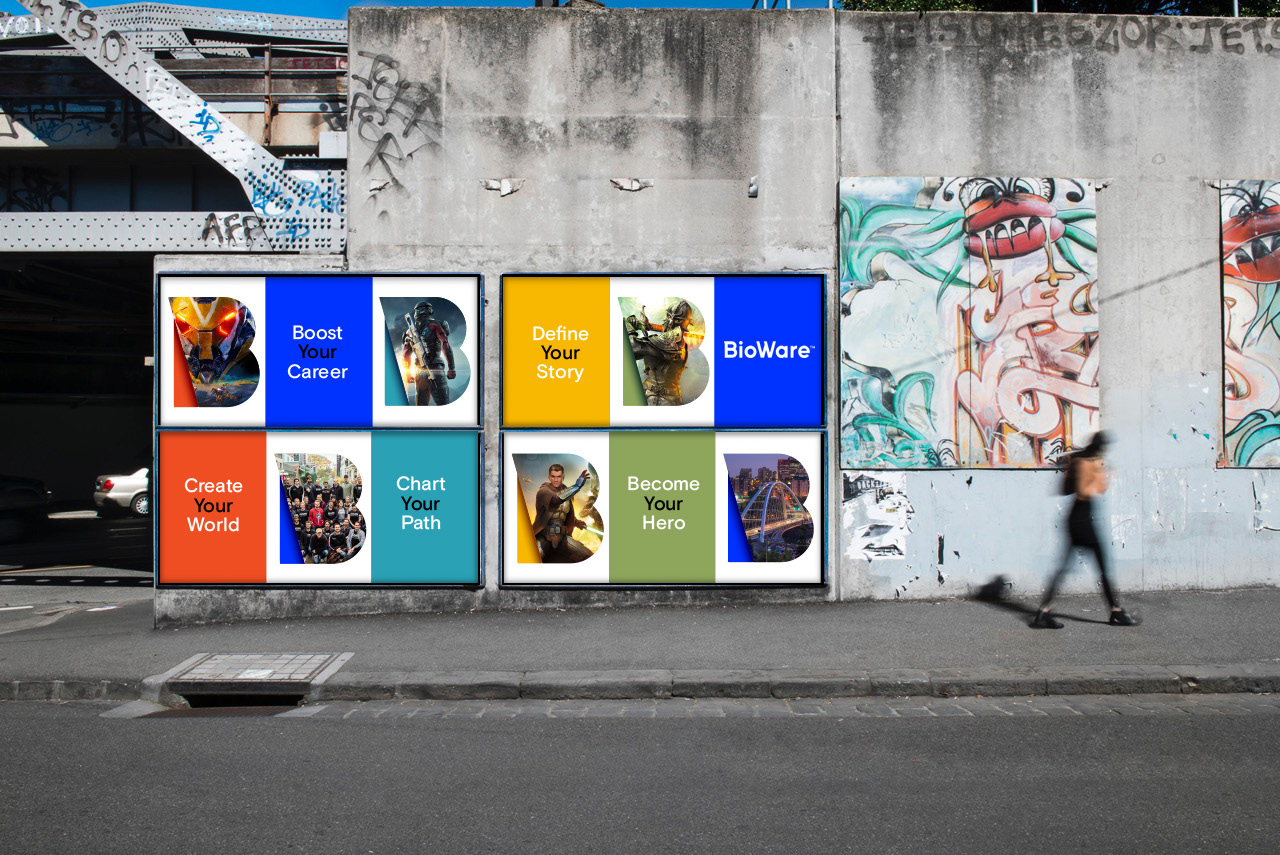
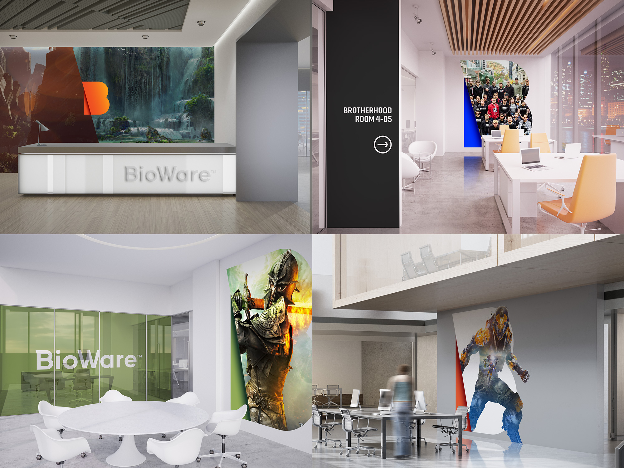
The few applications shown are not very exciting… especially those posters where the accompanying typography to the monogram is no much more exciting than a health insurance range of posters. In general, this all seems to lack a number of rounds of actual development.
Overall, the logo signals a maturity of the company and whether that is actually reflected in the company culture, I can’t attest to but the logo at least brings the aggressiveness level down a few notches while the monogram amps up the action at a modest testosterone level.
 each year since publication began in 2006

 Новости Союза дизайнеров
Все о дизайне в Санкт-Петербурге.
Новости Союза дизайнеров
Все о дизайне в Санкт-Петербурге.