Обзор лучших ресурсов по разработке бренда, разработке упаковки
contact us | ok@ohmycode.ru
contact us | ok@ohmycode.ru
Established in 1800, the Library of Congress is an agency of the legislative branch of the U.S. government whose mission it is to “document the history and further the creativity of the American people and which record and contribute to the advancement of civilization and knowledge throughout the world, and to acquire, organize, provide access to, maintain, secure, and preserve these collections.” It is the largest library in the world, with more than 167 million items on approximately 838 miles of bookshelves. The collections include more than 39 million books and other printed materials, 3.6 million recordings, 14.8 million photographs, 5.5 million maps, 8.1 million pieces of sheet music and 72 million manuscripts. A portion of those collections are available digitally and is one of the best places of the internet. Yesterday, the Library of Congress introduced a new identity designed by New York, NY-based Pentagram partner Paula Scher.
Pentagram has designed a new brand identity that captures the spirit of the Library and its universal collections in a dynamic logotype that is a metaphor for a bookshelf or bookcase―a place to collect things―and can hold images and typography.
While it officially serves Congress and the federal government, the Library also serves as the national library of the American people. Its central mission is to provide a rich, diverse and enduring source of knowledge that can be relied upon to inform, inspire and engage. The breadth and power of its collections should be easily understood, and be coupled with an invitation for all to visit physically or virtually to take advantage of all the treasures within.
Our view here at the Library of Congress is the image of a treasure chest, filled with limitless information and services, ready to explore and amaze if you open it up.
So today, the Library of Congress is introducing a new visual brand that seizes on this concept and amplifies it. It can change to feature different collection items, stories, images and sounds. The potential is limitless, like the Library itself.
Other than the use of Trajan, the old logo was great. Designed by Chermayeff & Geismar & Haviv in 2010, the icon brought together two elements — a book and the stripes of the American flag — in a simple, effective way that felt… congressional. The new logo is interestingly very un-governmental — no blue, no red, no stars, no stripes — and as much as those things generally lead to overly American-looking identities they do help create a more instant connection between institution and government. This new logo could easily be an extension of Amazon. The objective and brief, though, are evidently to make the Library of Congress more library, less congress which would explain some of the decisions and the approach to make this look more like it belongs in the retail and cultural sector.
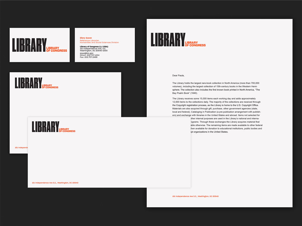
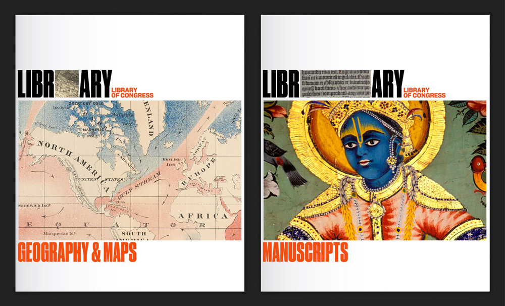
I still have a hard time with the emphasis on library as what makes the Library of Congress impressive is not the fact that it’s a library but that it’s the library of the United States. I can go to a library any day of the week I want but the library OF CONGRESS, that’s another story. Making the logo so much about “LIBRARY”, to me, plays down that this isn’t just any library. But, again, assuming that the job was to out-Library congress, then this does the job well. I like the concept of the condensed “LIBRARY” being books on shelves and, as you know, I am a huge proponent of Druk Condensed so as a piece of typography I can dig it. What bothers me, a lot, is that the word “library” is then repeated again, smaller, in the full name of the organization. I keep reading “Library Library of Congress” and it’s not entirely pleasant. I would have loved to see “OF CONGRESS” in the same style and size, given the same importance, and then you would have a huge line of metaphorical books lined up and you could also stack the words up to make it look like shelves. My guess would be that this was attempted but the lack of readability of Druk Condensed was maybe too much.
I also like the idea of interspersing “stuff” between the letters just as we all do in our personal libraries, putting book-ends, photos, knickknacks, between and around our books. The execution works great when it’s crops of a picture vs. the silhouetted objects that, even though they surely come from the LOC’s collections, some of them end up looking like clip-art. In the folder shown a couple images down, the silhouettes work best when they are more evidently historical images.
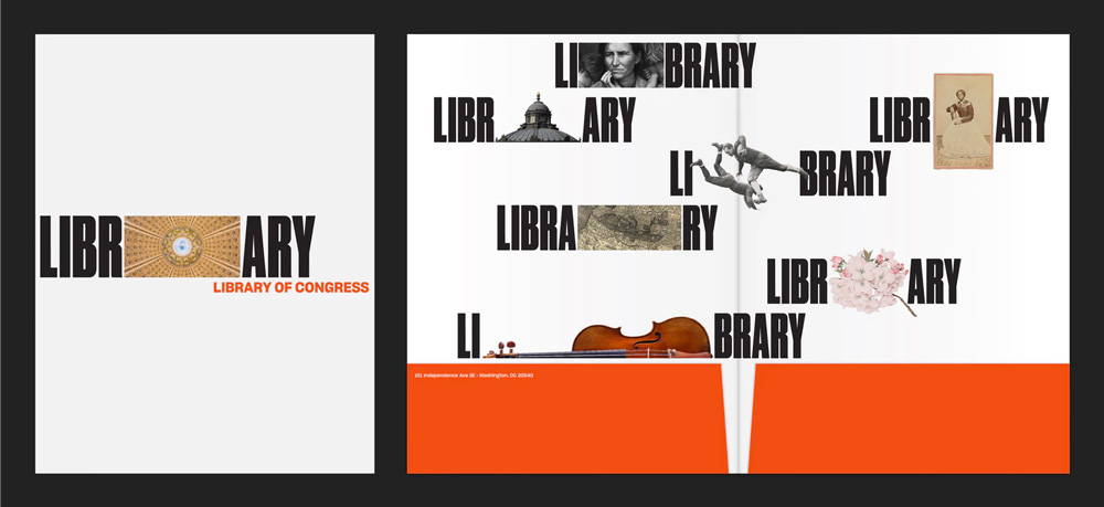
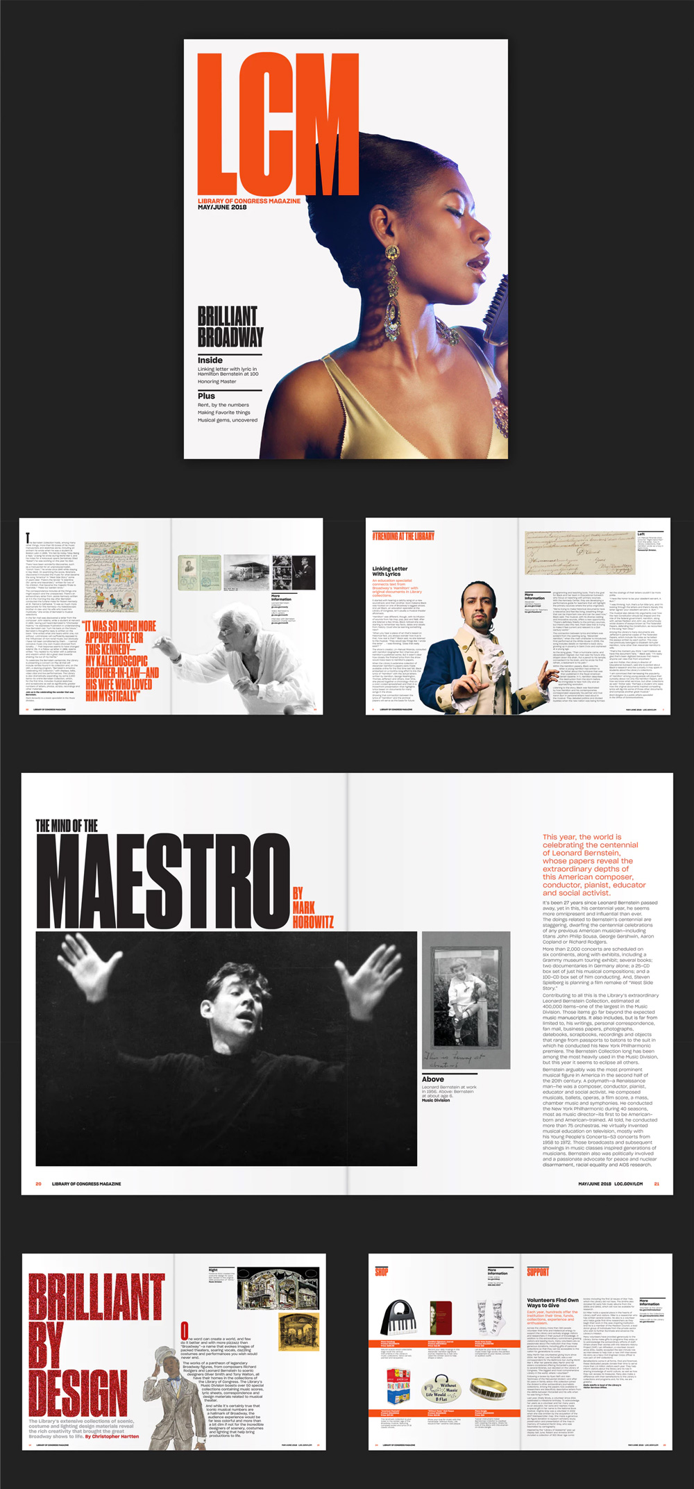
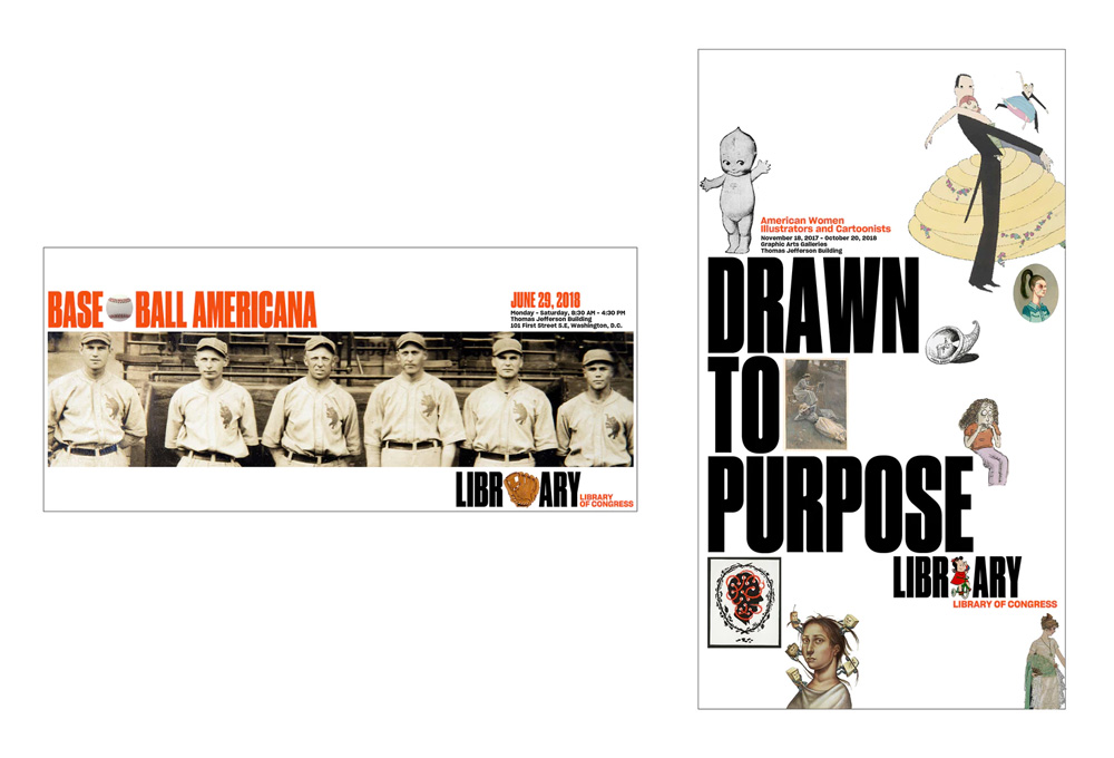
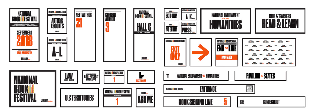
The applications have a bold energy to them thanks to Druk Condensed which, again, is bad-ass and in its condensed-ness allows for a lot of things to happen in layouts with big typography and still plenty of room for imagery. To me, the collection posters are the best kind of manifestation of the identity, with the tight, even spacing around all the elements that feel like a unit working together and the images and text playing off of each other.
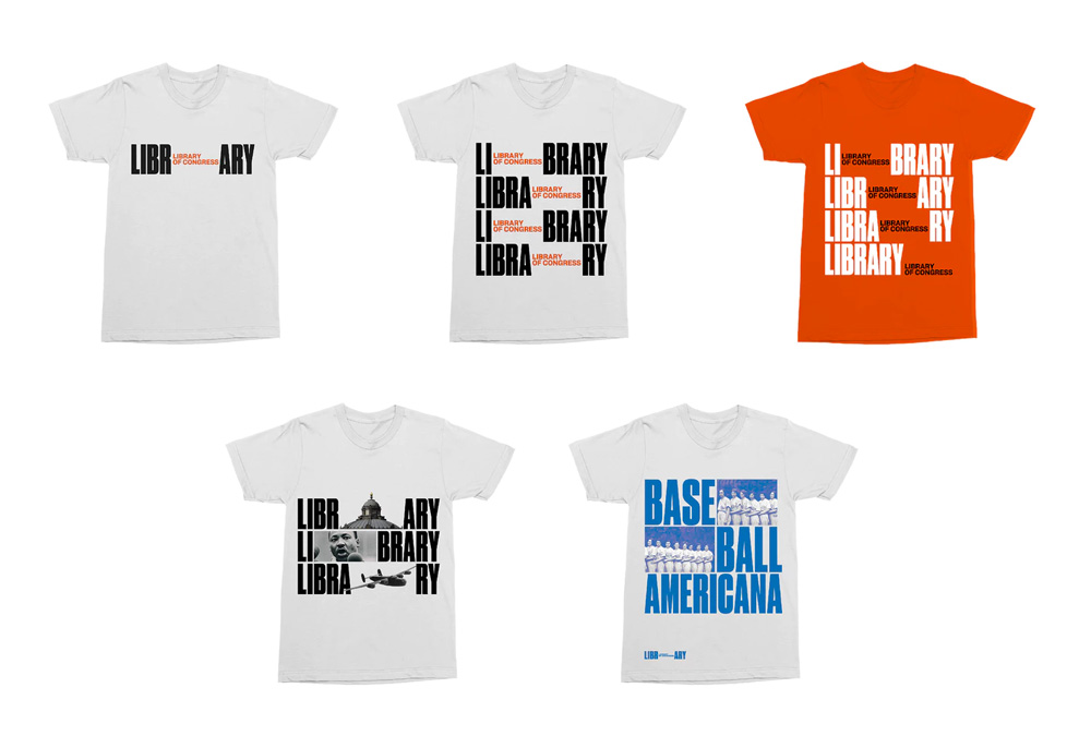
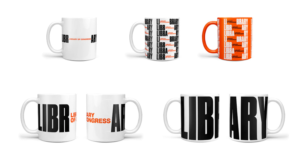
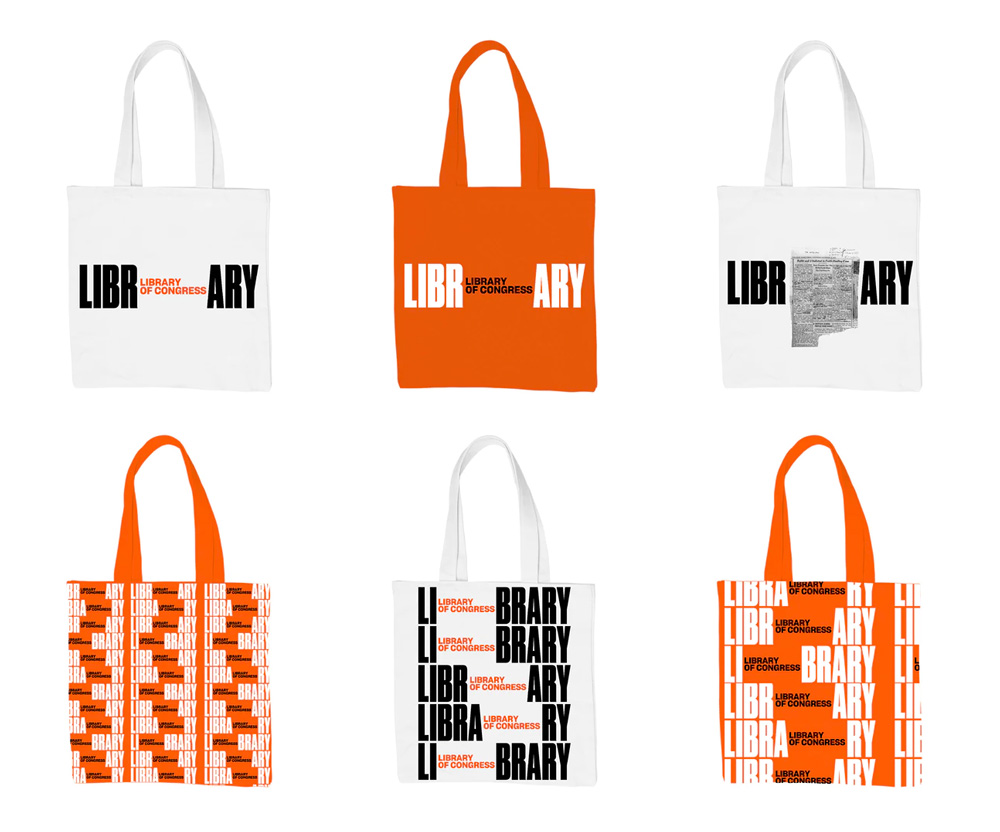
The merch renders are okay; I still react more positively to the ones that show blocks of stuff in between the letters. The ones with the repeating logo look kind of cool but also awkward when you stare at them too long trying to figure out what to write about them (as just happened to me these last three minutes). Overall, this definitely breaks through any pre-conceived expectations and limitations about what a government identity should look and act like and it also definitely solves the goal of emphasizing the library-ness of the Library of Congress but in its friendliness, accessibility, and cultural bent perhaps it has lost its status as an authority and as one of the few branches of the government that celebrates the knowledge and output of the people.

 Новости Союза дизайнеров
Все о дизайне в Санкт-Петербурге.
Новости Союза дизайнеров
Все о дизайне в Санкт-Петербурге.