Обзор лучших ресурсов по разработке бренда, разработке упаковки
contact us | ok@ohmycode.ru
contact us | ok@ohmycode.ru
Established in 1860 (not a typo), the Guardian Life Insurance Company of America (Guardian for short) is one of the largest mutual life insurance companies in the U.S.. A Fortune 250 company, with more than 9,000 employees, it provides life insurance, disability, and other benefits for more than 26 million customers. This week, Guardian introduced a new identity designed by New York, NY-based The Working Assembly.
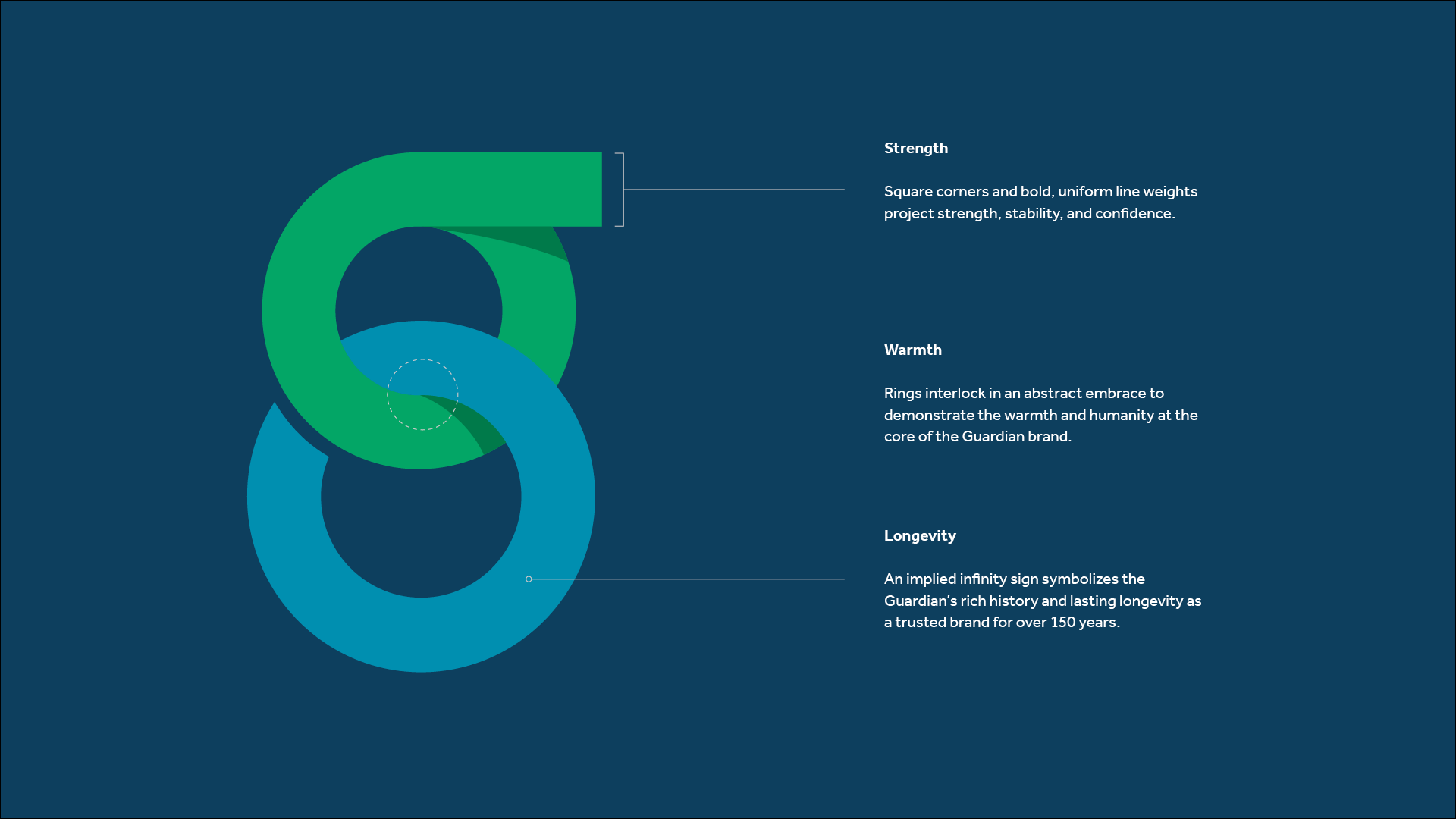
The two interlocking rings that form the basis of the new identity have been carefully crafted and thoughtfully designed to communicate three core characteristics of the Guardian brand: strength, warmth and longevity.
It’s impossible to conjure images of protection without the word “guardian.” Symbolizing strength and security, chain links represent the stability and peace-of-mind that Guardian provides to their clients, colleagues and partners.
The lowercase mark and open, sans-serif type feels friendly and human. The combination of a modern blue and green represents growth and health, strengthening and solidifying the mark without losing its approachable and pleasant character.
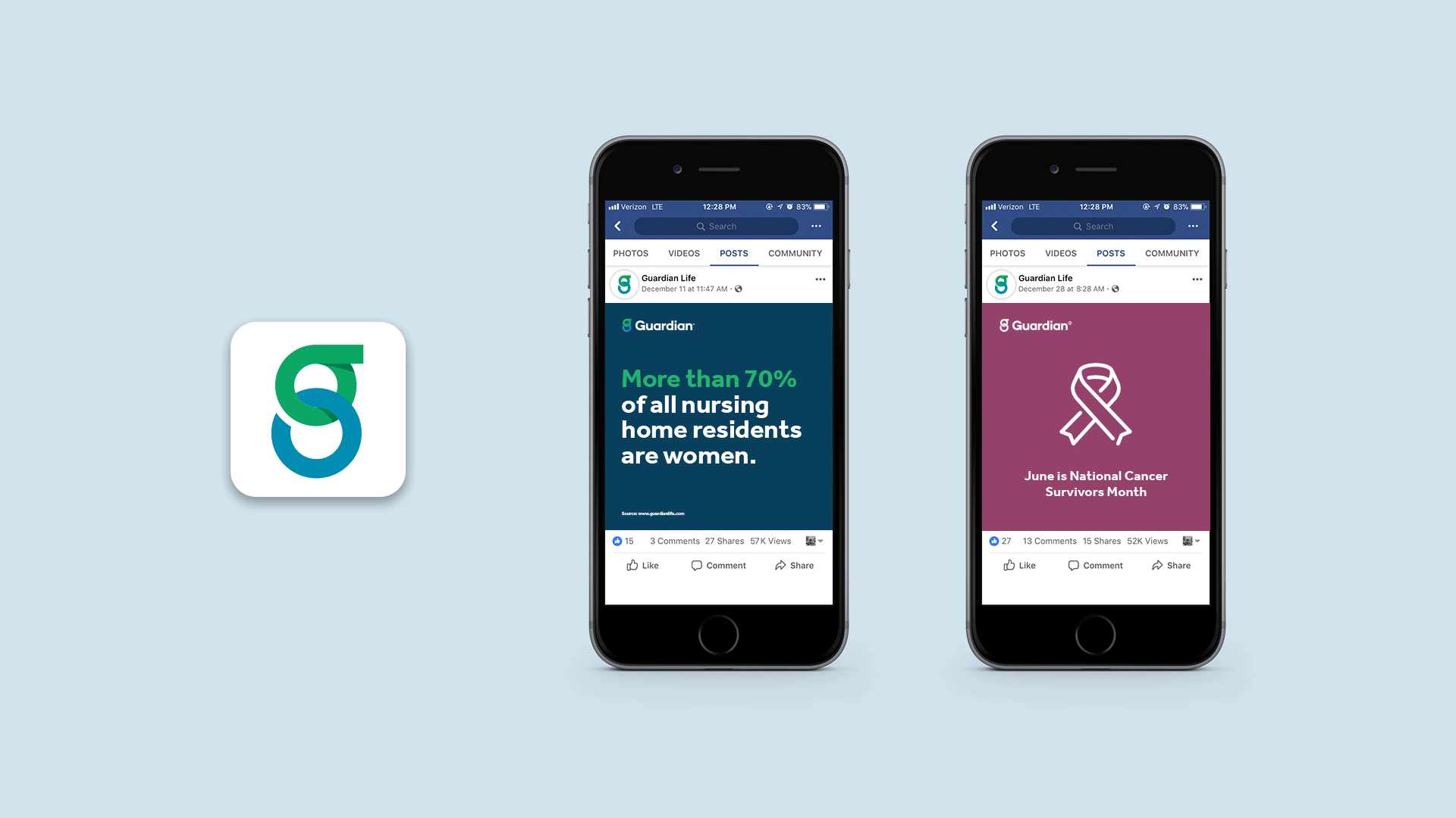
I’m one of the 26 million customers of Guardian’s life insurance and there are few uglier envelopes I get in the mail than Guardian’s, with that ugly pill-shaped logo in an awful color and a terrible swoosh/ribbon thing inside it. It’s a surprise the wordmark was relatively good. I assumed Guardian would never change its logo because it made it seem like they didn’t care about it, so it’s very unexpected to see a major change. The new logo features a friendly, double-storey “g” monogram that, with its interlocking circles, instantly conveys collaboration, connection, and other maudlin feelings that you want to think about when considering life insurance. Some of the rationalizations about it are eye-rolling but probably necessary to get this change through.
I like the monogram; it has a well-designed presence and the two similarly-hued colors work well together. The one thing that drives me a little crazy is the literal disconnect of the bottom circle: the ear of the “g” and the top overlap of the rings are handled with a subtle shadow, which looks great, but the bottom overlap is not a shadow and it’s instead a stark cut, which sort of defeats the purpose. When the logo is used on a dark background it’s not so evident, but when used on light backgrounds it stands out brightly. Point being, I think it should have been a shadow as well but my guess is that the tone-on-tone didn’t provide enough contrast for some folks, which is too bad because I think that would have made the monogram much better. In fact, hard shadows that bleed into the background color would have been pretty kick-ass (but most likely too harsh for the company).
The wordmark is fine. It’s a proper complement to the monogram in its geometric-ness and thickness. Maybe it could have been just a bit thinner so that it didn’t feel so heavily bold. Although the “G” looks somehow different from the rest of the characters I like how they integrated it by cutting its downward stroke to end at the x-height.
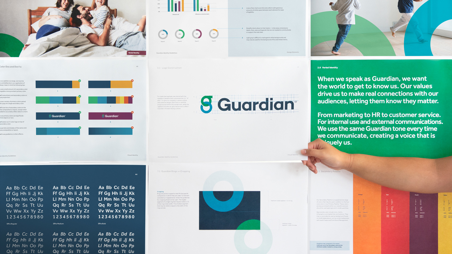
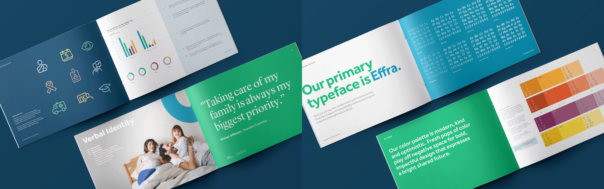
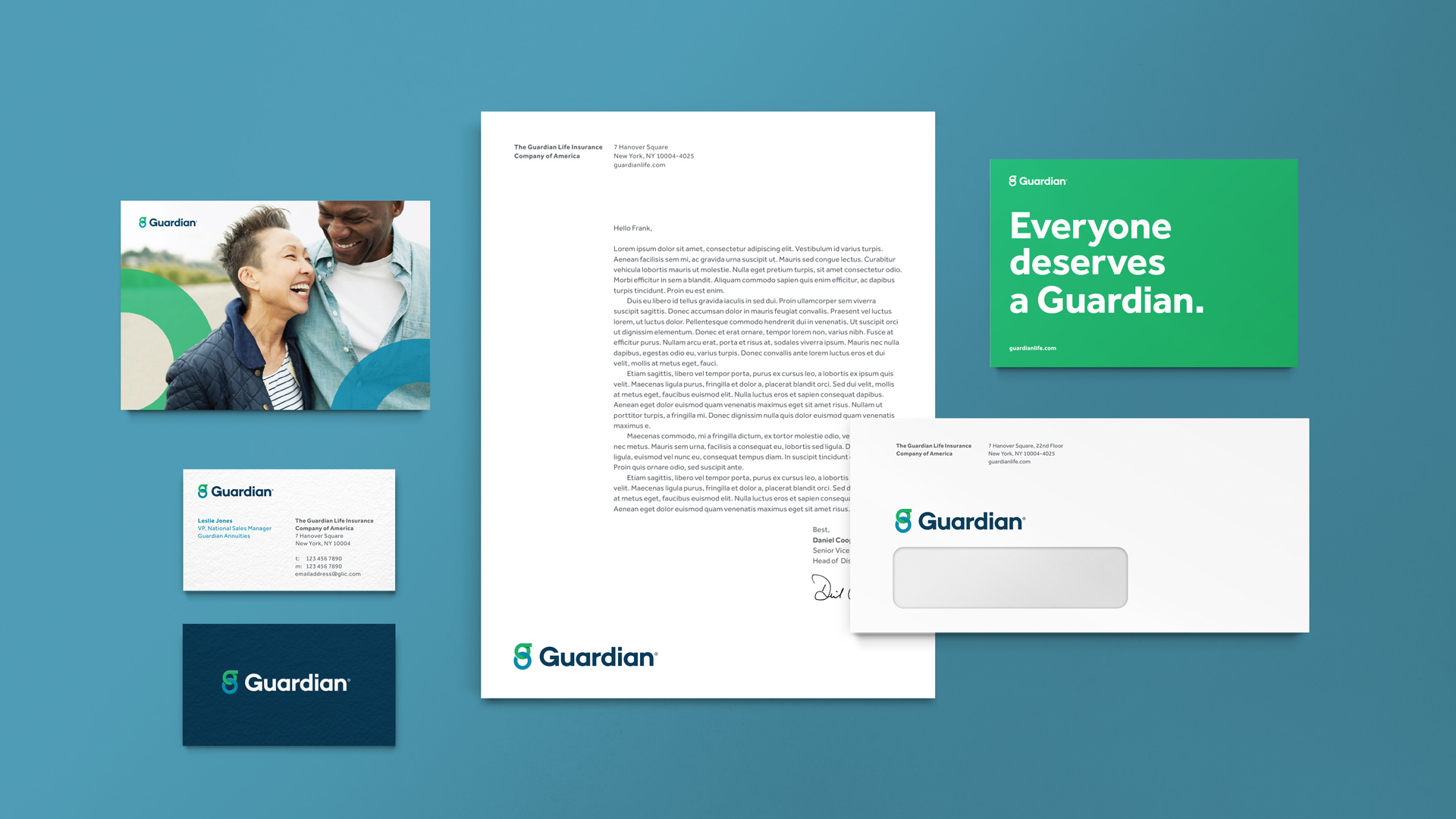
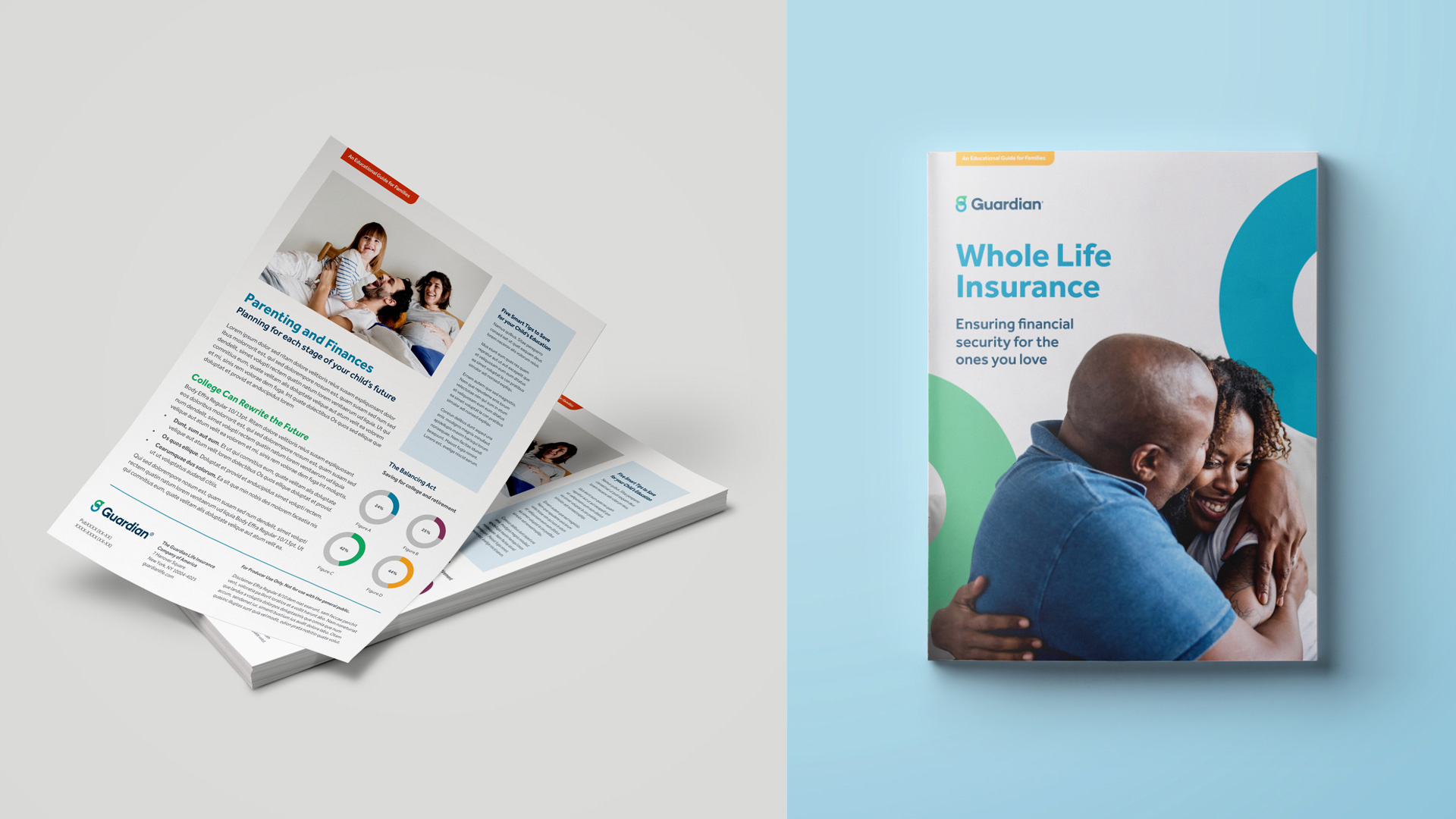
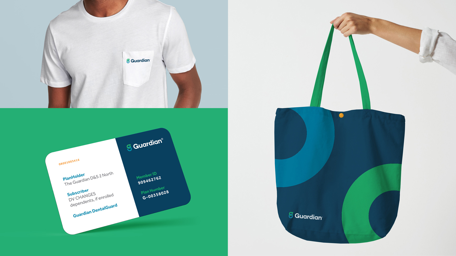
As you can see from the samples of the old identity image I was not exaggerating about the envelope I get in the mail; their materials were Bad. The new applications are pleasant. There is nothing groundbreaking or overly memorable about them and that’s a good thing. In this case, it’s about being clear, being reassuring, and being accessible. The main color palette of the blue and green of the logo plus the dark blue works quite well. As much as I hated it, perhaps I would have liked to see a gold accent somewhere to take the edge of of this looking like a hospital or healthcare company.
Overall, this is a very decent update that brings Guardian from out of the pits — graphically speaking since business-wise it’s doing quite well and this identity will help them communicate that in a better way.
Update: Some images were removed from this post after it was published at the request client and designer.

 Новости Союза дизайнеров
Все о дизайне в Санкт-Петербурге.
Новости Союза дизайнеров
Все о дизайне в Санкт-Петербурге.