Обзор лучших ресурсов по разработке бренда, разработке упаковки
contact us | ok@ohmycode.ru
contact us | ok@ohmycode.ru
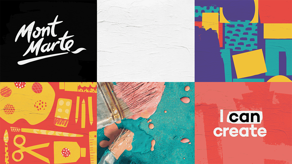
Established in 1995, Mont Marte is a manufacturer and wholesaler of art supplies, with a special focus on their affordability to a large audience. Based in Salisbury, Queensland, Australia, the company has developed a wide range of products available online (naturally) and stocked in art stores in 70 countries worldwide, including China, where they have a large presence and a warehouse/distribution center. Without a store of their own, Mont Marte offers the option of “Art Centres”, little islands of Monte Marte-branded products, to be set up in art stores. Recently, the company introduced a new identity and packaging designed by Sydney, Australia-based Hulsbosch.
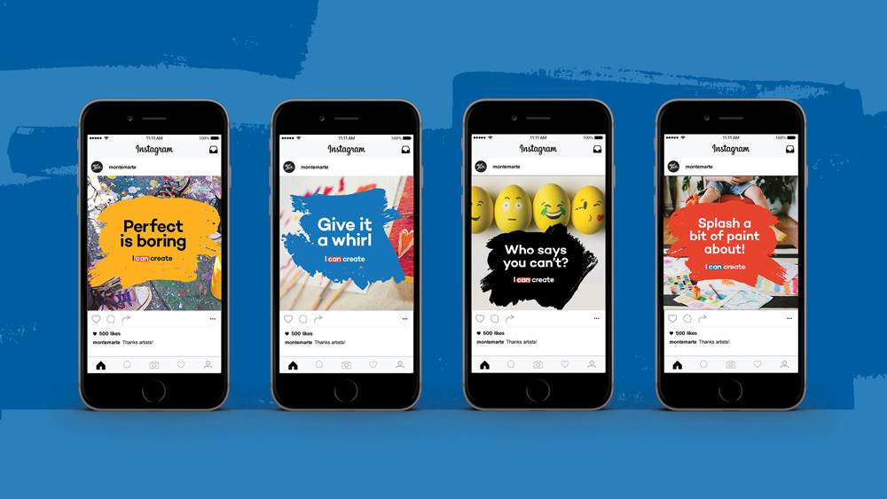
Aspiring artists, kids, hobbyists and even professional artists - anyone looking to explore their creativity, including moms looking for smart and savvy ways to entertain their kids, Monte Marte’s audience is broad but inclusive.
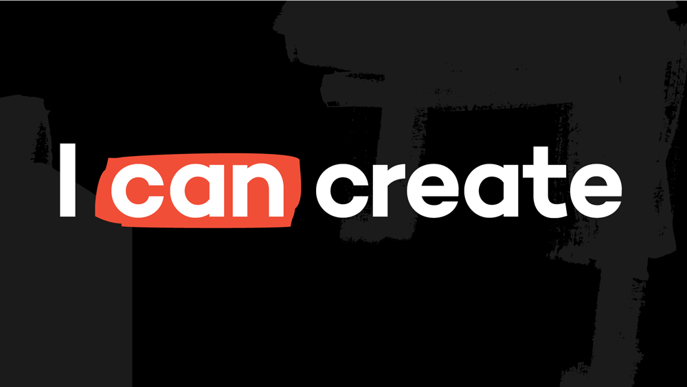
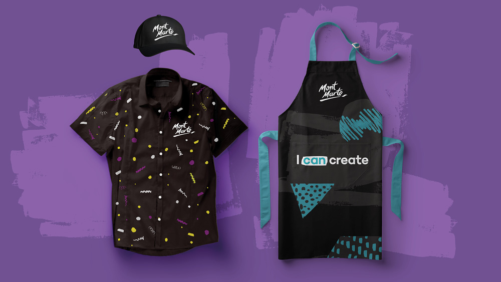
From this vision, Hulsbosch produced a brand identity that highlights an engaging tagline ‘I Can Create!’. The device promotes participation with a brand that’s a guardian of no barriers to making art and can put the fun back in its creation.
The old logo was pretty bad. Sure, it looked artsy, but the execution was very poor with more of a serial-killer-scribble look and completely unharmonious letterforms, particularly the ending “e” with its huge swash. It’s kind of amazing that Hulsbosch was able to salvage not just anything from the old logo but basically most of its essence and make it infinitely better. They kept the different “M”s, the slightly different “t”s, and even the swashy “e” and underline that they cleverly turned into an abstract brush. My only complaint would be that the final swash is too pointy, whereas all the letters have rounded corners and tips. But other than that, it’s a strong piece of lettering, that keeps the equity of the old logo.
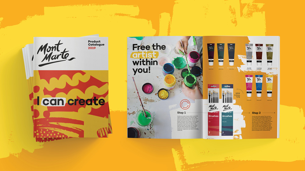
As part of the work, Hulsbosch reviewed the product organisation of the Mont Marte range. Newly created brand guidelines simplify groupings for various sub brands and distinguish each product category with straightforward navigation descriptors, ‘paint, draw, make, wear or play’.
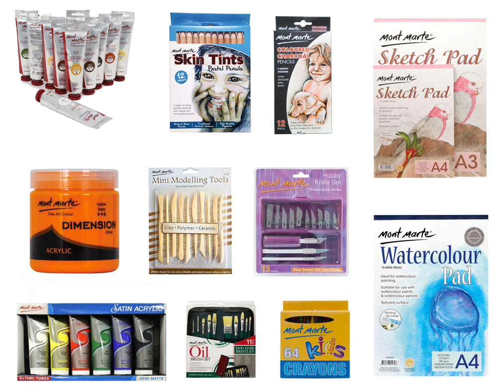
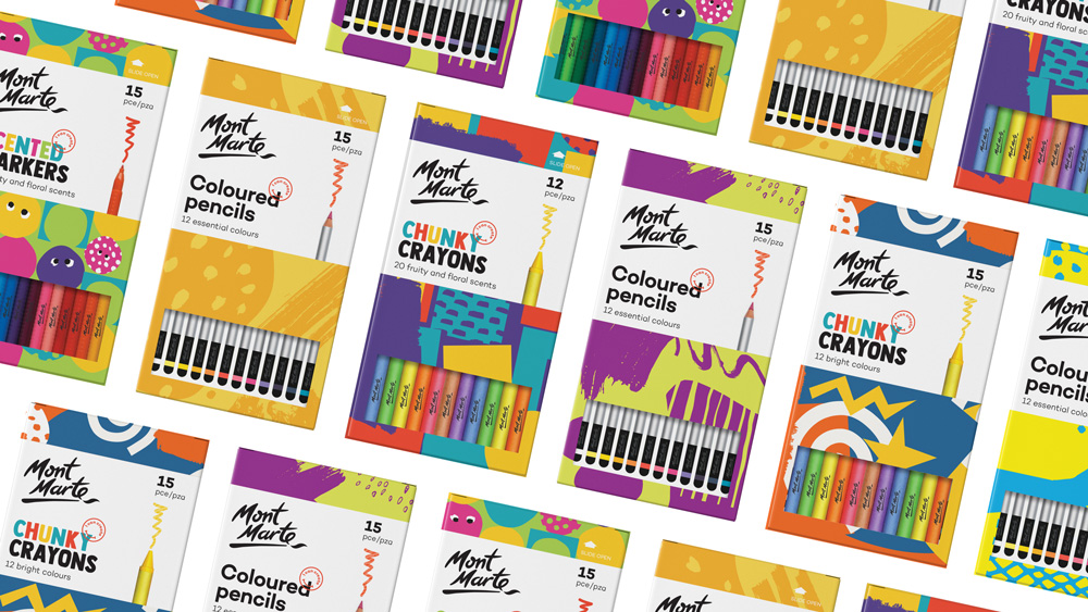
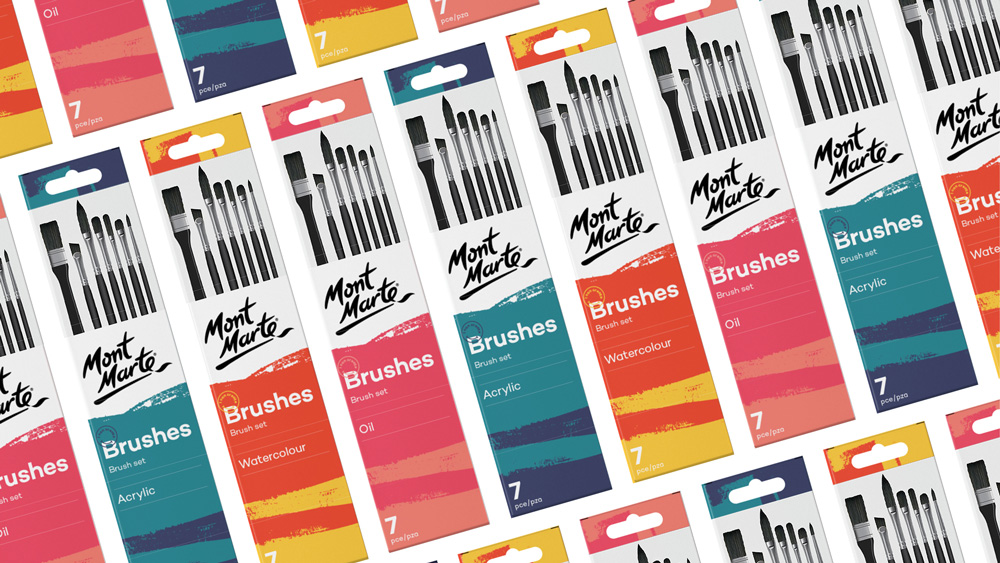
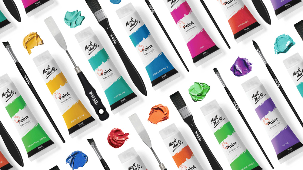
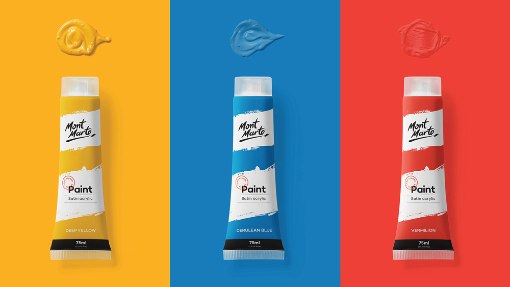
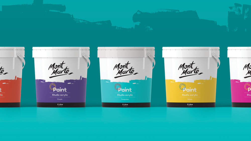
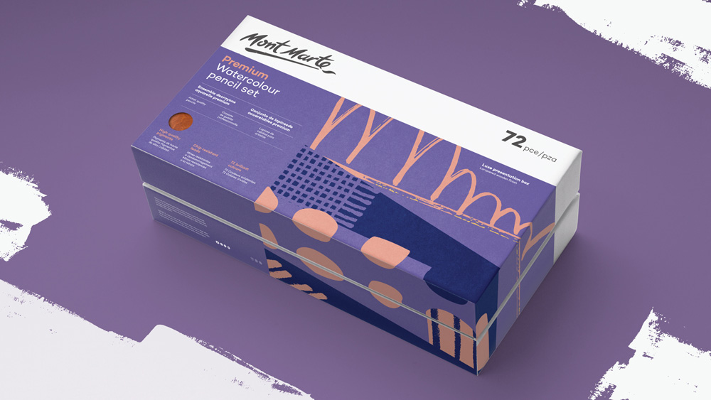
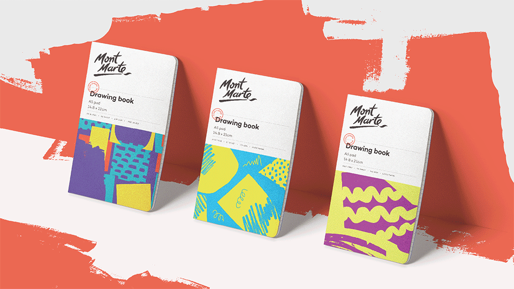
The old packaging was all over the place and hardly inspiring. I imagine it would be very hard to easily spot a Mont Marte product in an art store with that old packaging system. The new identity and packaging introduces a great series of abstract illustrations that can be easily cropped and exchanged across product lines. The hierarchy across products is vastly improved with not just a clearer and bolder presence for the logo but a consistency of elements that makes it easy to browse their products across categories. A bold geometric sans serif is used throughout the system, which looks fine but I wonder if there was something with a little more personality or visual interest to complement the rich textures created by the logo and illustrations.

Overall, this is a massive improvement and one that should help the brand become more easily recognizable as well as even more covetable with packaging that would look and make you feel good if strewn around in that happy place where you make things.

 Новости Союза дизайнеров
Все о дизайне в Санкт-Петербурге.
Новости Союза дизайнеров
Все о дизайне в Санкт-Петербурге.