contact us | ok@ohmycode.ru
contact us | ok@ohmycode.ru
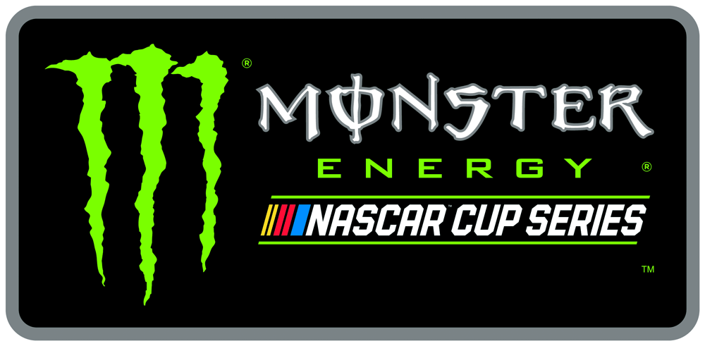
Established in 1947, NASCAR (National Association for Stock Car Auto Racing) is the governing body of motorsports in the United States, overseeing and sanctioning more than 1,200 races in more than 30 U.S. states, Canada, Mexico, and Europe. Based in Daytona Beach, FL, NASCAR has been a family-owned business since its beginnings and (according to some Google-ing) it’s the second most-watched professional “league” behind the NFL. Last month, NASCAR introduced a revised logo. No design credit given.
The NASCAR brand identity has been in development since early 2016 as part of a broader effort to refresh the NASCAR brand. It was designed to pay tribute to the storied history of NASCAR, incorporating elements of all four previous marks since the company’s inaugural season of 1948.
“Our new NASCAR mark is modern, timeless, and embraces the heritage of our sport,” said Jill Gregory, NASCAR senior vice president and chief marketing officer. “It was important for us to recognize our history and implement a piece of each previous mark in the new design. Our goal was to evolve the sport’s visual identity to make it concise, relevant and functional, while respecting and maintaining the unique qualities of the original mark.”

We are starting the year by warming up with a logo-only Review, as there are no applications to this redesign but it’s a monster of a brand. The old logo, in use since 1976, has become instantly recognizable for the organization, its races, and drivers, despite not being very good. The letterforms were a messy combination of squared-off corners and unresolved angles of the “A”s with extremely poor kerning and letter-spacing. The yellow lines were somewhat properly spaced and did convey — in a very simplistic way — “speed” but how they resolved into the red-purple-blue non-gradient was far from elegant and the name had no room to breathe inside that rectangle.
The new logo’s biggest improvement — and it is a pleasant one — is in the typography, that properly resolves the relationship between all letterforms and establishes a nice rhythm from beginning to end with even spacing and mono-width characters. The “speed” lines, though, make no sense in how they are sized or spaced… it’s almost as if it reads in Roman numerals “II II I” because of the odd grouping of colors through the spacing. There is also no relationship in their widths… I would have assumed the blue line was twice the width of the red, which I would have assumed were twice the width of the yellow but, no dice, they are not and neither are they visually balanced.

(The above shown because it’s the only other image with the new logo and shows additional characters in the alphabet of the wordmark not because of any design merit.)
Overall, it’s an improvement, mostly for reproduction as the old one reduced horribly and this version liberates the wordmark, giving it more presence and authority. There is nothing revolutionary about the logo and I don’t think there was any need for it to be so, it simply required a pit-stop for the next 40 years… or until ratings drop dramatically.
Thanks to J. Jason Smith for the tip.

 Новости Союза дизайнеров
Все о дизайне в Санкт-Петербурге.