Обзор лучших ресурсов по разработке бренда, разработке упаковки
contact us | ok@ohmycode.ru
contact us | ok@ohmycode.ru
Established in 2010, The Collective is one of the leading companies focusing on co-living spaces — buildings that combine private spaces with communal amenities (in their case: bars, restaurants, gyms, libraries, laundry, roof terraces, hot desks and more). Founded in London and now based there as well as in Berlin and New York, The Collective’s portfolio comprises 7,500 rooms with one active building in west London and two more opening this Summer, one in Canary Wharf and the other in Queens, NY, in Long Island City, with the goal of opening more in other parts of the world. Recently, The Collective introduced a new identity designed by DesignStudio.
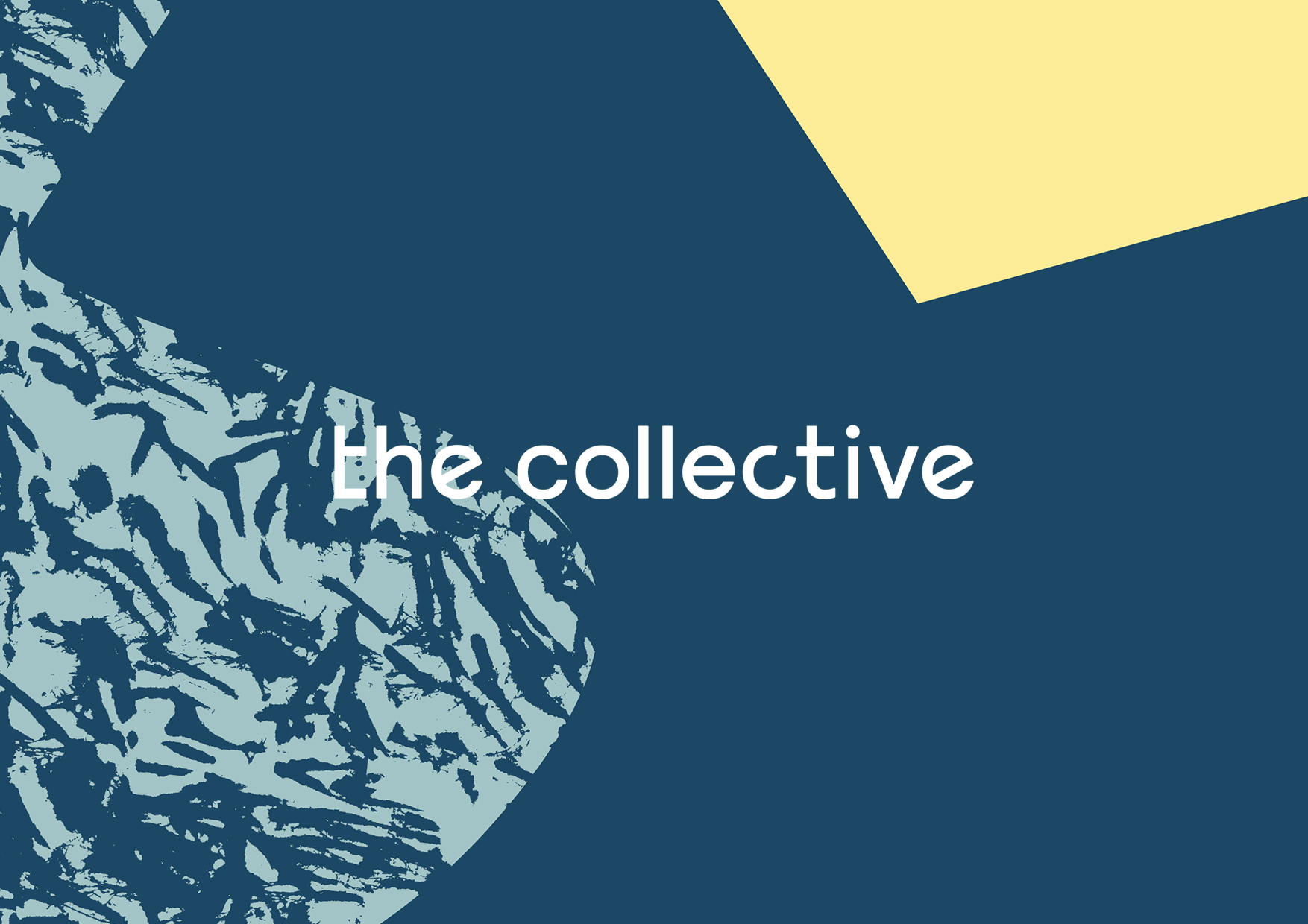
“We got to a simple design philosophy and a rule of threes, rooted in the brand’s very name: two’s company, three’s a collective. It’s an approach that combines different forms, textures and colours to represent the diverse characters and personalities that live and work there. The logo itself is warm and welcoming, combining three ergonomic shapes arranged into a composition that becomes more than the sum of its parts.”
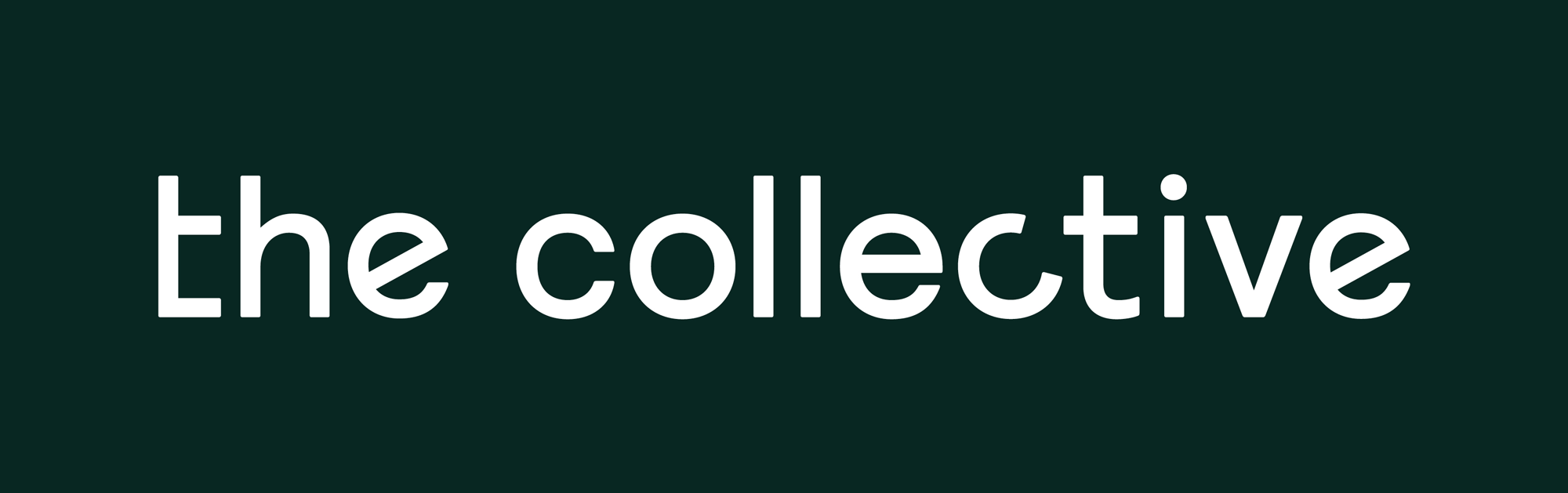
The old logo was rather unwelcoming, looking more like some kind of evil corporation rather than a place to live — I get that the icon/monogram was trying to look like a building made up of communal, happy “C”s but the result was too harsh. The new logo introduces an abstract icon of pieces of things inside a circle that potentially conveys the idea of different personalities coming together in spaces designed to create “social collisions” but that’s only if I’m feeling metaphorical, otherwise it’s kind of an odd composition which gets a little worse when used in single-color, as it does on the website, and the negative space is so strong that I keep seeing a bird. The pieces inside the circle can be reconfigured and that’s fine but I don’t think the icon is strong enough that its deconstruction is recognizable where people will go “Cool, look, the same icon is doing different things!”. The wordmark, I find very unappealing with the variations on the repeating letters; it comes across as trying too hard to say “We are different!”.
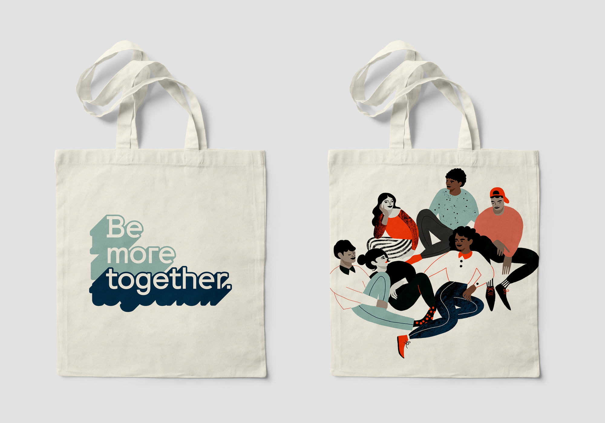
The Collective’s central idea as it moves into further cities around the globe is “Be More Together.” To bring this to life, DesignStudio partnered with type foundry Colophon and Illustrators (X-Y-Z) to add richness and dynamism to the designs. Ever character in the typeface has its own personality - with ergonomic curves and architectural lines. Additionally, each character is programmed to behave differently for different situations — a metaphor for how people can change fundamentally, as a result of their environment or the people they live in relationship to.
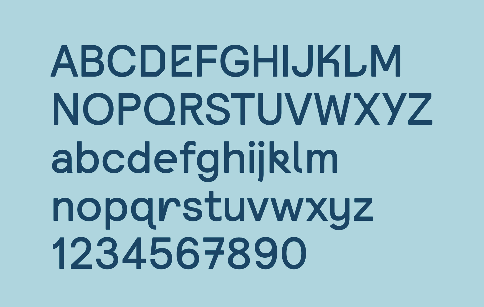
The image above doesn’t show it but the custom font has various alternates for each character which you can see by perusing the website and, like the wordmark (which comes from said custom font), I have a negative reaction to almost every character. I very much appreciate that this isn’t another geometric sans serif but I feel like this is different just for difference’s sake trying to be edgy and unique. Maybe I’m alone in my dislike for the font?
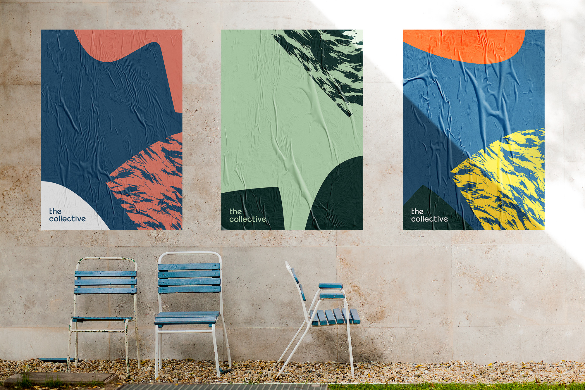
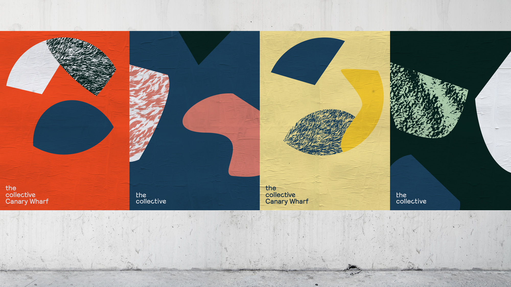
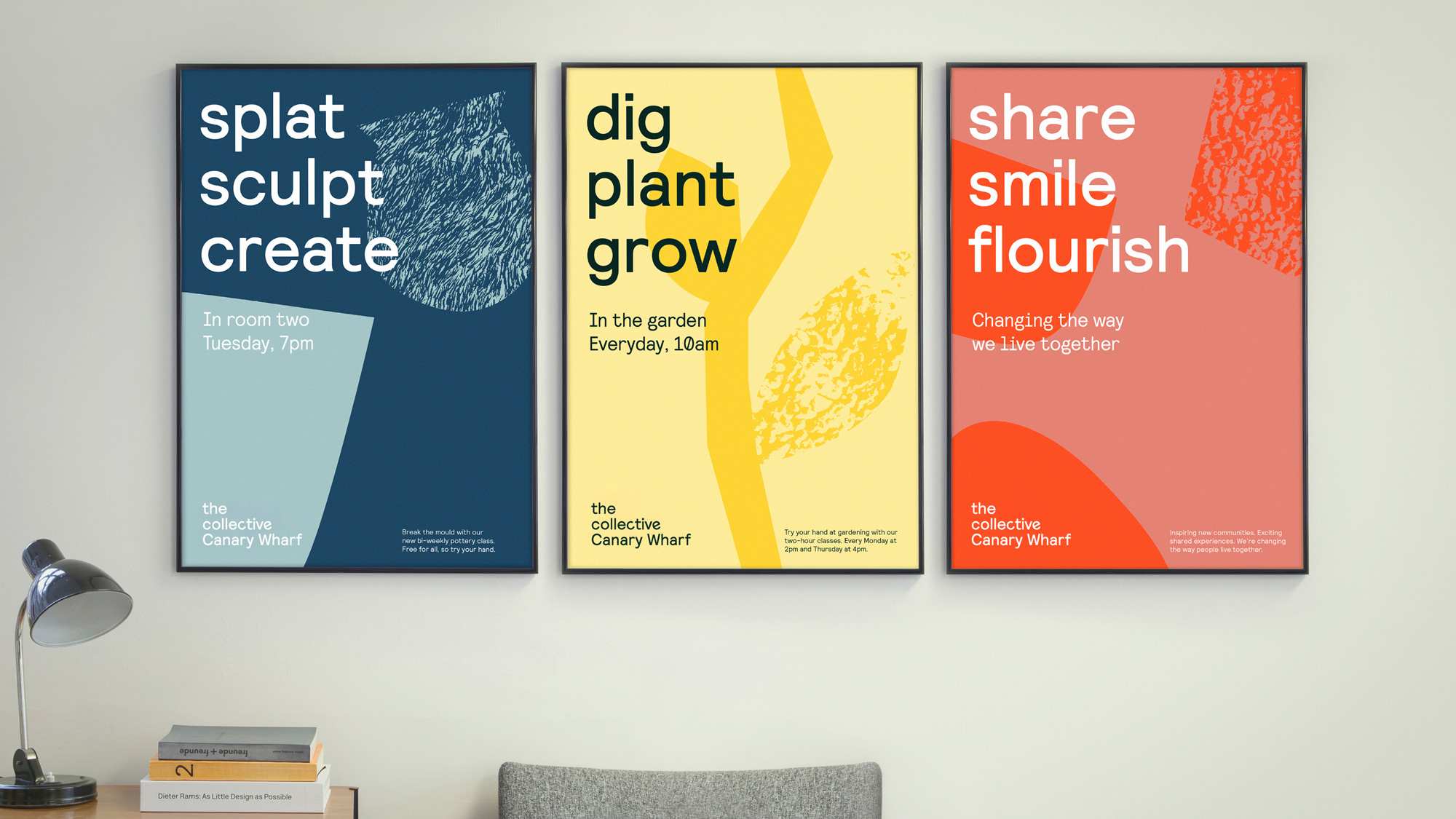
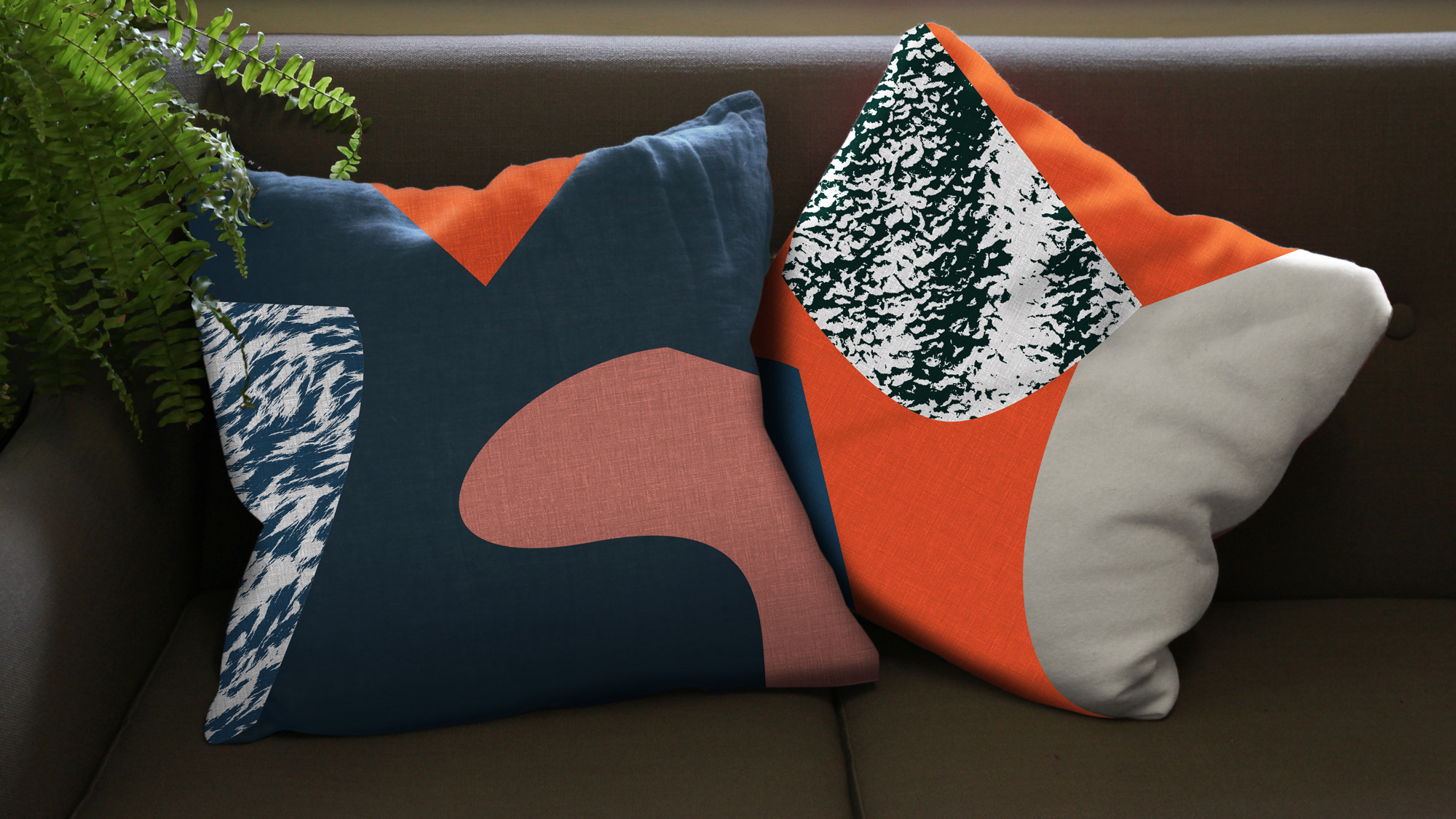
The applications are sort of interesting… the textures are cool and the compositions are energetic but if I were to give the posters a cursory glance on the street I would have no idea what they were about. The website is also kind of interesting, trying to break the rectangular-ity of websites by adding a lot of free-form shapes and throwing in illustrations and patterns but maybe it does go up to 11 when 8 would do.

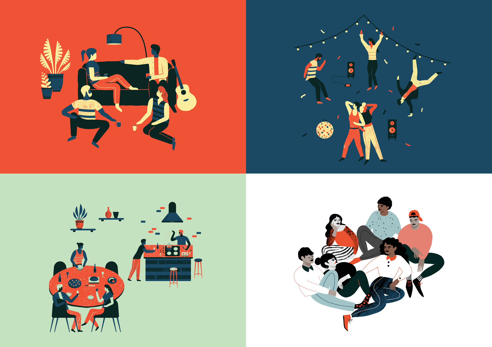

The illustrations are fine but the one directly above convinced me that I made the right life choice by not co-living and instead live in isolation from my neighbors where I don’t have to share my noodles with them while they mix things.

Overall, what I’m taking away from this identity is that I am not the target audience but for those interested in this kind of lifestyle I do think this hits the right notes in making The Collective’s buildings look like fun, groovy places that would make for a good Instagram life.

 Новости Союза дизайнеров
Все о дизайне в Санкт-Петербурге.
Новости Союза дизайнеров
Все о дизайне в Санкт-Петербурге.