contact us | ok@ohmycode.ru
contact us | ok@ohmycode.ru
Established in 1984 the Liga de Fútbol Profesional (LFP for short and Professional Futbol League in English) is Spain’s national sports association responsible for administering the first and second division leagues (both active since the late 1920s). The first division, named LaLiga, is home to some of the best soccer clubs in history, including Real Madrid, Atlético de Madrid, and F. C. Barcelona. Since the LaLiga name is more known, being the main attraction of the LFP, the organization adopted the name (and new logo) back in 2015 but had still been using the old logo through the 2015/16 season and is now taking center stage with last month’s announcement that LaLiga would be entering a 3-year sponsorship deal with Banco Santander. So to summarize: LaLiga is the parent organization of LaLiga Santander, the first division league, and of LaLiga 1|2|3, the second division league. The new logo and identity have been designed by Lima, Peru- and Madrid, Spain-based IS Creative Studio.
The goal was to design a contemporary evolution towards a strong, vibrant and dynamic identity that express the values of unity and team spirit. In 2015 the General Assembly approved the change of name from LFP to LaLiga. Working in close collaboration with Laliga, we went through a thoughtful and detailed process. We reconstructed the symbol and the ball, accentuating the shapes with rounded angles to give the brand a more friendly, warm and human approach. Also, we define the typefaces and the right proportions of the new system for the various applications of the brand.


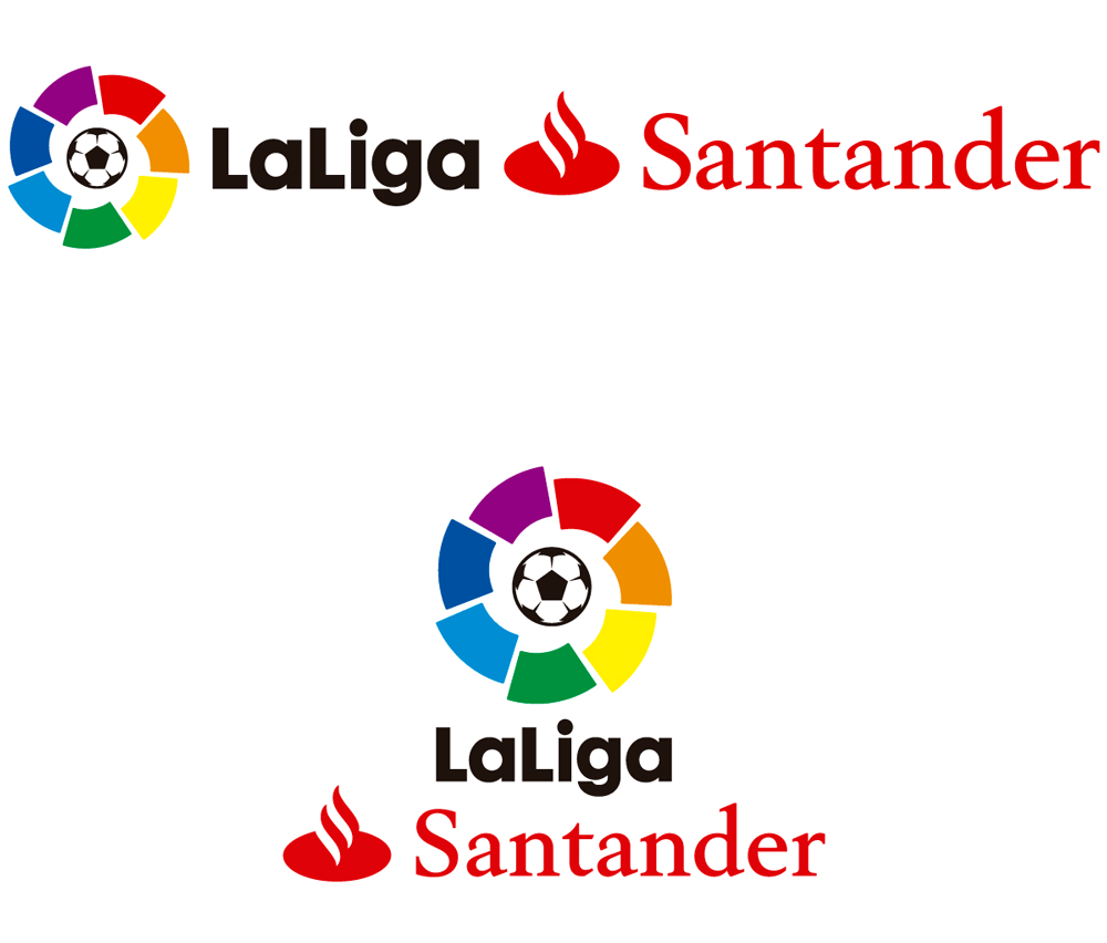
Since the main organization’s logo was changed back in 2015 and the most recent news involves the first division change, we will start here and then loop back to the changes made to the main logo. Sponsored logos are rarely a pretty thing and the old Liga/BBVA was particularly unsuccessful with the italic “LIGA” running head first into the BBVA logo. The new logo, with a friendlier “LaLiga” wordmark, would have even been better suited with the BBVA logo as well as it serves as a more functional visual segue between the icon and any other sponsor logo. The benefit of BBVA was that it was a short, wordmark-only logo as opposed to Santander’s which is long and has an icon of its own, forming a kind of logo Voltron in either stacked or horizontal versions, which is a shame because the changes to the logo are quite nice and now get overshadowed by the sponsorship.


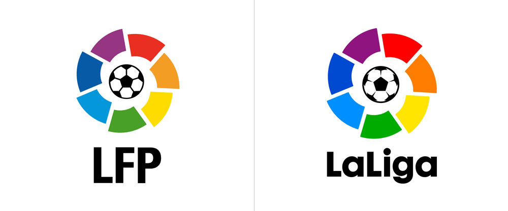
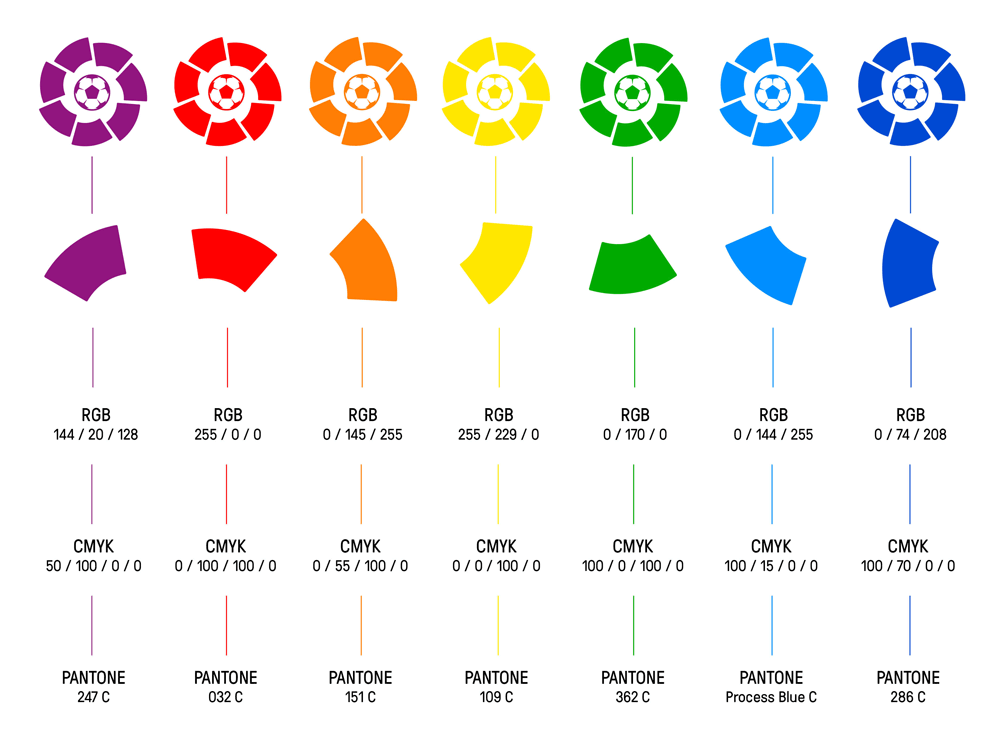
Going back to the core logo — which retains the same elements that are not particularly engaging to begin with — the changes to it are subtle. Perhaps too subtle but they improve the functionality and finesse the presence of one of the most watched soccer leagues in the world and that, to me, is always a good thing. The main change in the icon is the drawing of the ball that was previously flat into something that now has dimension and the tiniest bit of visual excitement. It makes it look less like clip-art. The fragmented ring is almost exactly the same but now has tiny rounded corners and the rotation alignment is now 100% perfect. The colors have been punched up and streamlined in how they are built in CMYK — I love those tight 4-color breakdowns that only use one or two of the C, M, Y, K options. Is tight.
The wordmark is no surprise… well, I guess it’s a small surprise in that it’s Futura and not Lineto Brown or Circular. The sizing in contrast to the icon is a little odd, with the icon looking giant but I guess it makes for the easiest lock-up applicable in the myriad ways it has to.


Only some business cards in application to show how this applies at the organizational level… these are fun simply because of the amount of color in them but the blocks of color feel heavy and the white band where the logo sits feels dated somehow. (The use of GT Pressura is okay; I don’t think it provides enough contrast, or the right contrast, with Futura though.) Overall and Santander-lock-up notwithstanding this is all a great exercise in building a logo and identity that perform better while maintaining its equity intact.

 Новости Союза дизайнеров
Все о дизайне в Санкт-Петербурге.