Обзор лучших ресурсов по разработке бренда, разработке упаковки
contact us | ok@ohmycode.ru
contact us | ok@ohmycode.ru
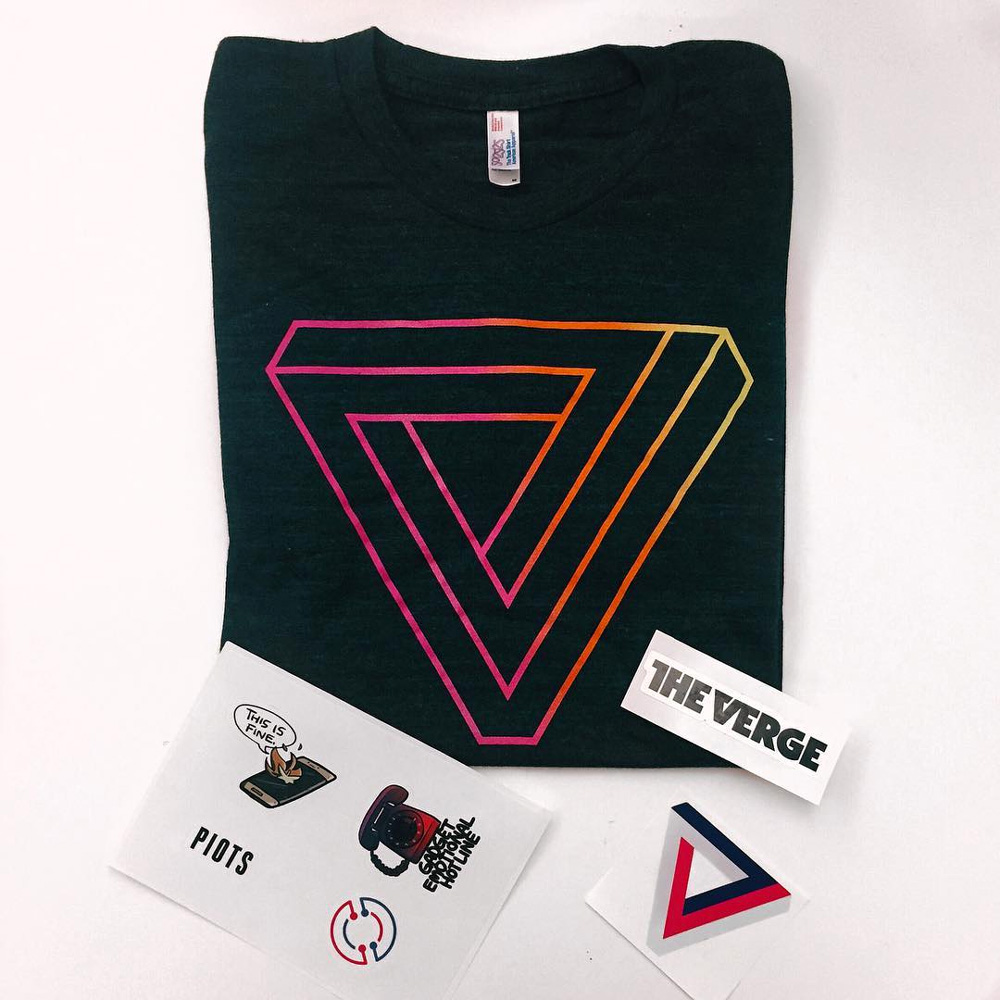
(Est. 2011) “The Verge is an American technology news and media network operated by Vox Media. It has offices in Manhattan, New York City. The network publishes news items, long-form feature stories, product reviews, podcasts, and an entertainment show. The website uses its own proprietary publishing platform with video content. The network’s content is financed through advertising and sponsorship and is managed by its editor-in-chief Nilay Patel and executive editor Dieter Bohn. The site launched on November 1, 2011. The Verge won five Webby Awards for the year 2012 including awards for Best Writing (Editorial), Best Podcast for The Vergecast, Best Visual Design, Best Consumer Electronics Site and the Best Mobile News App.” (Wikipedia)
In-house at Vox Media
The Verge announcement
2011 Brand New Review from when The Verge launched
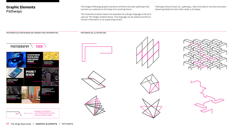
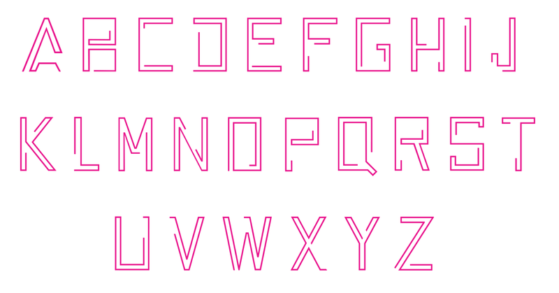
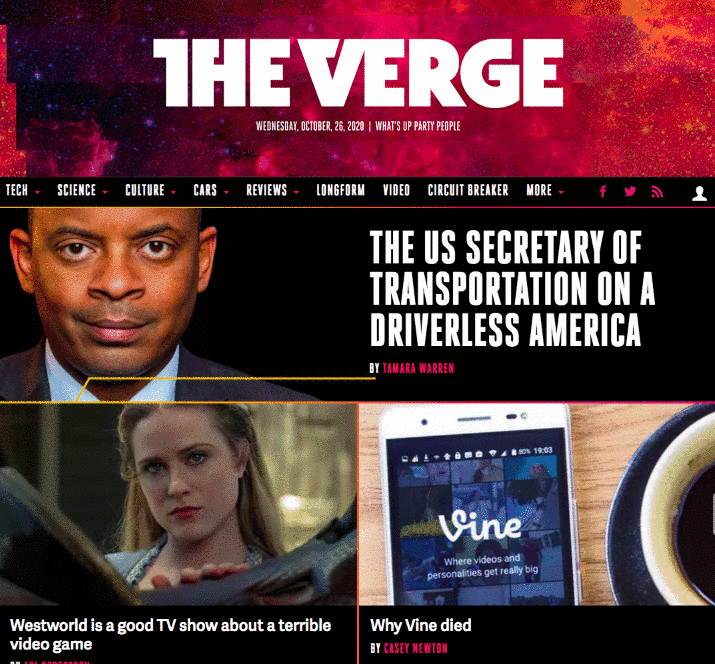
First, our new wordmark is a slight refinement — we’ve cleaned up the serifs, made it sharper, and generally brought it forward so it renders better at small sizes across mobile platforms. We’ve also tweaked the various colorways of our triangle logo, and created a new system of treatments for our various sections on all the social platforms they live on. […] Our new design system is called Pathways, and it’s built to scale from elements on a web page to motion graphics in videos to physical structures at events. It’s made to pop with bright colors and illumination; I think it looks like a neon sci-fi dream. We’ve also updated our main typefaces, from DIN Condensed to Heroic, and from Adelle to Adelle Sans — refinements that work better on small screens and improve our overall legibility while preserving the character of our brand.
The old logo was a very much on purpose riff on 1970s Herb-Lubalin-esque typography — they were a couple of years ahead of trend! — and it worked in establishing a weird dichotomy between a news site dedicated to technology and a heavily old school vibe. Mostly, it worked because The Verge is pretty great so they were able to establish a tone of voice that supported the weirdness of the wordmark and the infinite triangle. This new version gets a corporate makeover with the removal of the serifs and the straightening of the "R", leaving it stuck in a passive purgatory of old school quirkiness and post-2015 geometric sans serif-ness. It's not bad but it's not good either. It's mostly odd now. But throughout the site, they are doubling down on odd by introducing a warp-speed-1980s-orange-hued-sci-fi aesthetic that could be cool if it didn't feel so heavily manufactured to look cool or if they had just plain hired Signalnoise to do it right. There are some cool motion elements in some of their new videos but the one thing that kills me is the new line with the 45 degree angle spur used to highlight pull quotes or subheads… it's so 1990s-bad. Overall, the ambition is there but the overall vibe doesn't quite gel yet into a convincing package.
Thanks to Joshua Paines for the tip.

 Новости Союза дизайнеров
Все о дизайне в Санкт-Петербурге.
Новости Союза дизайнеров
Все о дизайне в Санкт-Петербурге.