Обзор лучших ресурсов по разработке бренда, разработке упаковки
contact us | ok@ohmycode.ru
contact us | ok@ohmycode.ru
(Est. 1997) “Leading Real Estate Companies of the World® (LeadingRE) is the home of the world’s market-leading independent residential brokerages in over 55 countries, with over 550 firms and 128,000 associates producing over one million transactions valued at $351 billion annually. Our by-invitation-only network is based on the unparalleled performance and trusted relationships that result in exceptional client experiences.”
1000watt (Portland, OR / Oakland, CA)
1000watt project page
LeadingRE news page
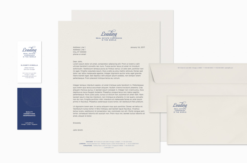
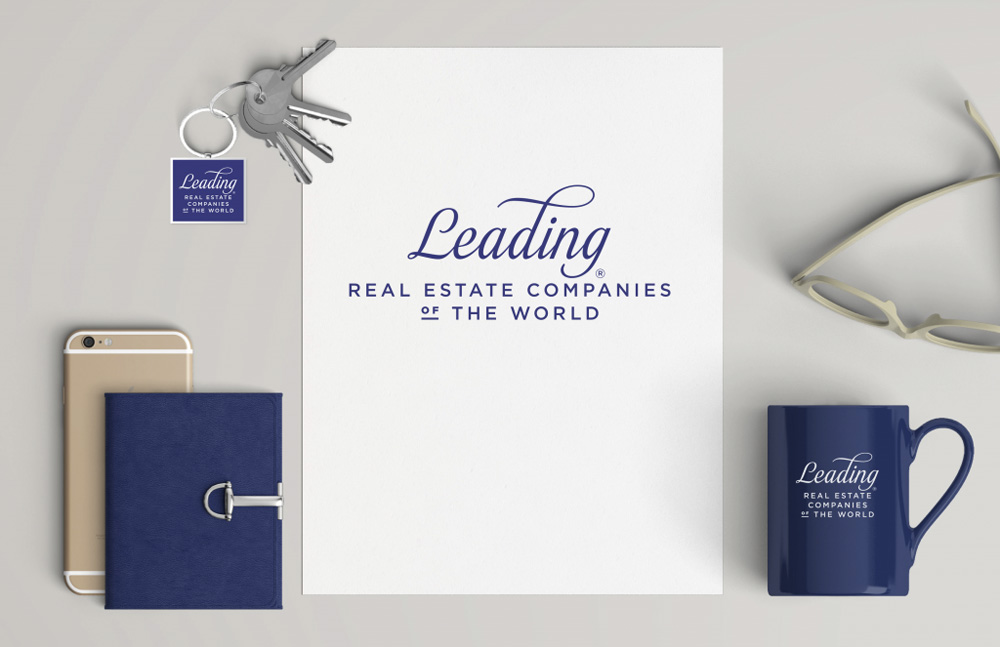
To mitigate the challenge presented by the long name, we first created a hierarchy with the seven words. “Leading” was the obvious choice. This allowed us to reduce the size of of the logo (and therefore make it more usable for LeadingRE members). We also abandoned the idea of a graphical brand mark to create more space, instead creating a custom script mark that is unique and ownable.
Although both logos have the same amount of words, the old one felt so much longer, like a full paragraph worth of logo. The heavy-handed use of Trajan didn't help, nor did the crummy woodcut of the world, nor the line, nor the italic "of". So, yeah, it was bad. The new logo succeeds in breaking up the monotony of the old one but still fails in creating a proper hierarchy that would lead to reading the logo in a way that makes sense. I do, however, have a hunch that real estate people on the inside refer to this organization as "Leading" as in "Hey, are you going to that Leading event next week?" so there might be some internal satisfaction and sigh of relief with this new logo. As someone who had never heard of this before, I read the logo as "Leading", then I ask myself, "Leading what?", with the answer being the awkward "Real Estate Companies of the World". The problem lies mostly in the name, more than the logo but the logo doesn't add much clarity. Execution-wise, it's not bad. The swash-happy script is okay (except for the "g" with its weird bottom curve) and pairs decently with Gotham. Applications are fine too. Overall, an improvement mostly because the old one was so terrible but still a far cry from a leading logo.
Thanks to Amon Daro for the tip.

 Новости Союза дизайнеров
Все о дизайне в Санкт-Петербурге.
Новости Союза дизайнеров
Все о дизайне в Санкт-Петербурге.