Обзор лучших ресурсов по разработке бренда, разработке упаковки
contact us | ok@ohmycode.ru
contact us | ok@ohmycode.ru
Established in 1860, Battersea (previously Battersea Dogs & Cats Home and originally Temporary Home for Lost and Starving Dogs) is an animal shelter with three locations in South East England: the London center in Battersea, the Old Windsor center in Berkshire, and the Brands Hatch center in Kent. Named after its location in Battersea Park — near, yes, Battersea Power Station of Pink Floyd album cover fame — Battersea takes care of approximately 7,000 animals each year and accepts any dog or cat of any age, breed, or health status, never turning one away. Funded by public donations, the organization has helped over 3 million animals in its 158 year history. Earlier this month, Battersea introduced a new identity designed by London, UK-based Pentagram partner Marina Willer with brand strategy and tone of voice by partner Naresh Ramchandani.
Under Pentagram’s strategic guidance, the ‘Dogs & Cats Home’ descriptor was dropped from the majority of communications. Instead, Pentagram placed the emphasis on the charity’s commitment to unconditionally care for all dogs and cats, and developed a brand line that acts as a steadfast manifesto for Battersea: ‘Here for every dog and cat.’
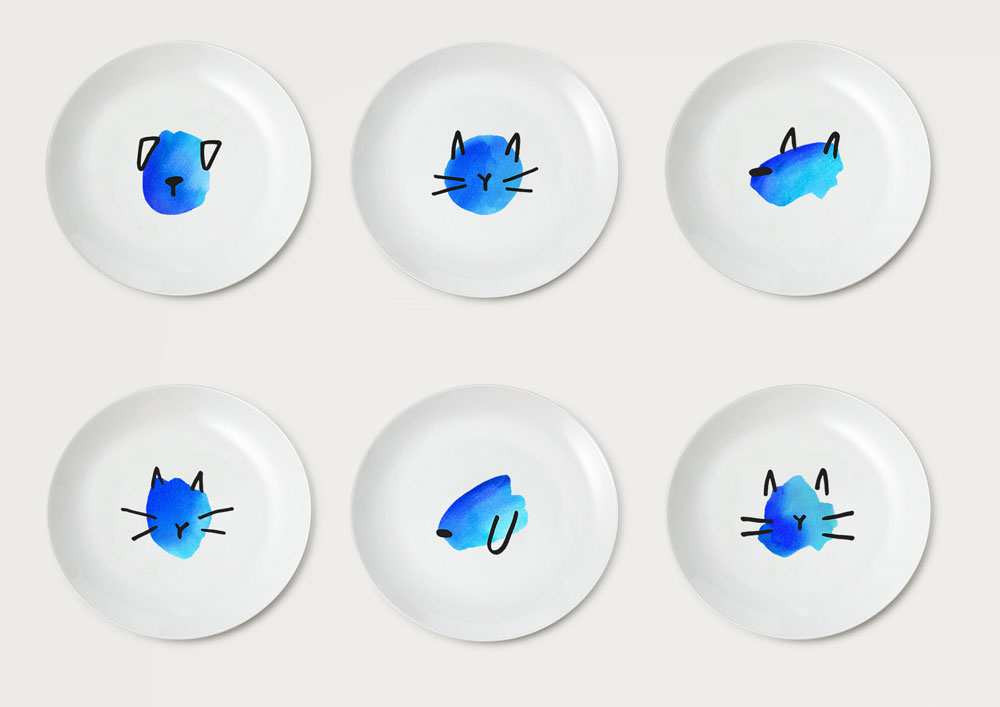
Informed by the brand idea, the dynamic visual identity created by Pentagram uses a “family” of hand-drawn watercolour illustrations to humanely emphasise Battersea’s commitment to care for every dog and cat. Retaining Battersea’s signature blue, the watercolours - made up of five dogs and five cats - are used in varying combinations, giving Battersea the flexibility to tell a rich and diverse story across all of its platforms.
The abstract illustrations are designed to subtly communicate Battersea’s story; they appeal to people’s compassion and humanity, without victimising or stigmatising the animals. While the characters are devoid of facial features, they remain expressive and retain a strong sense of individuality: celebrating the diverse range of personalities found among Battersea’s dogs and cats, while emphasising the human intervention required to make them whole.
The warmth, kindness and humanity expressed by the watercolour is balanced with a sharp Franklin Gothic wordmark, which injects an element of authority to the visual identity.
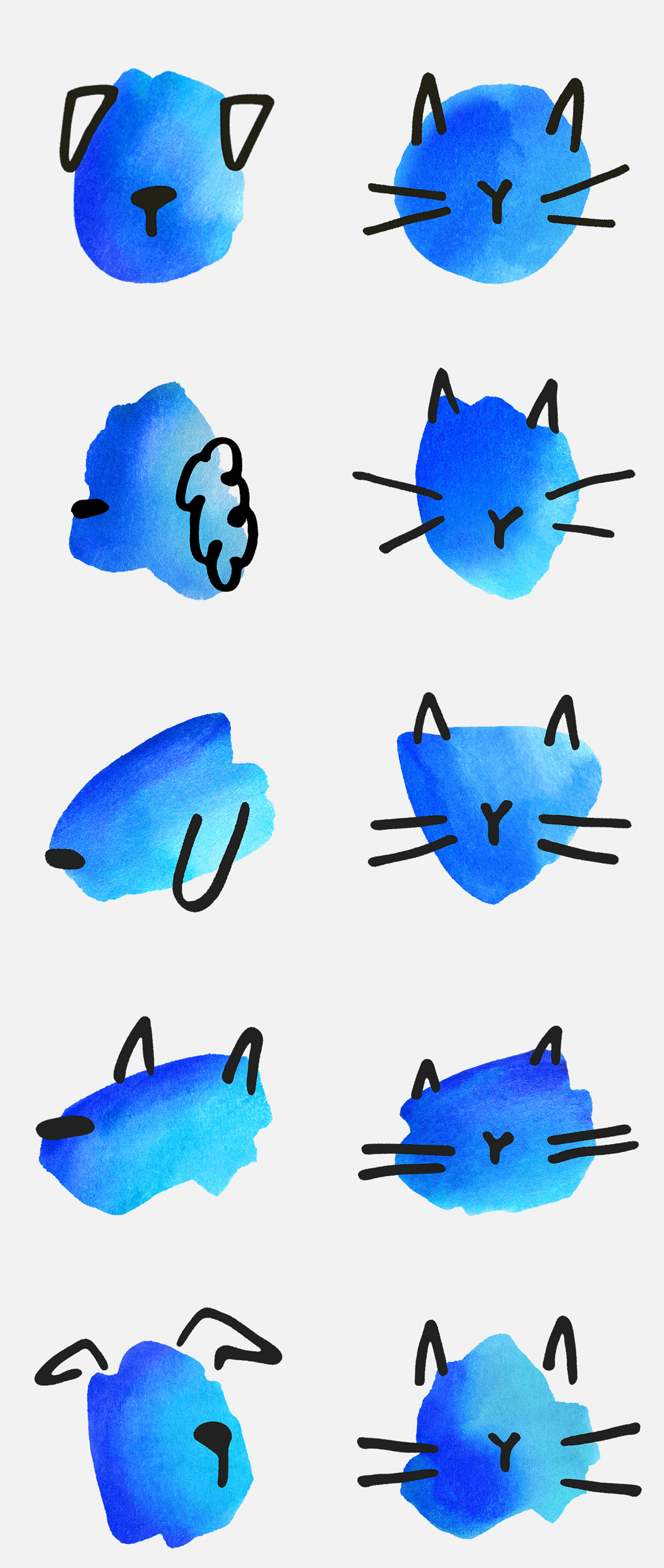
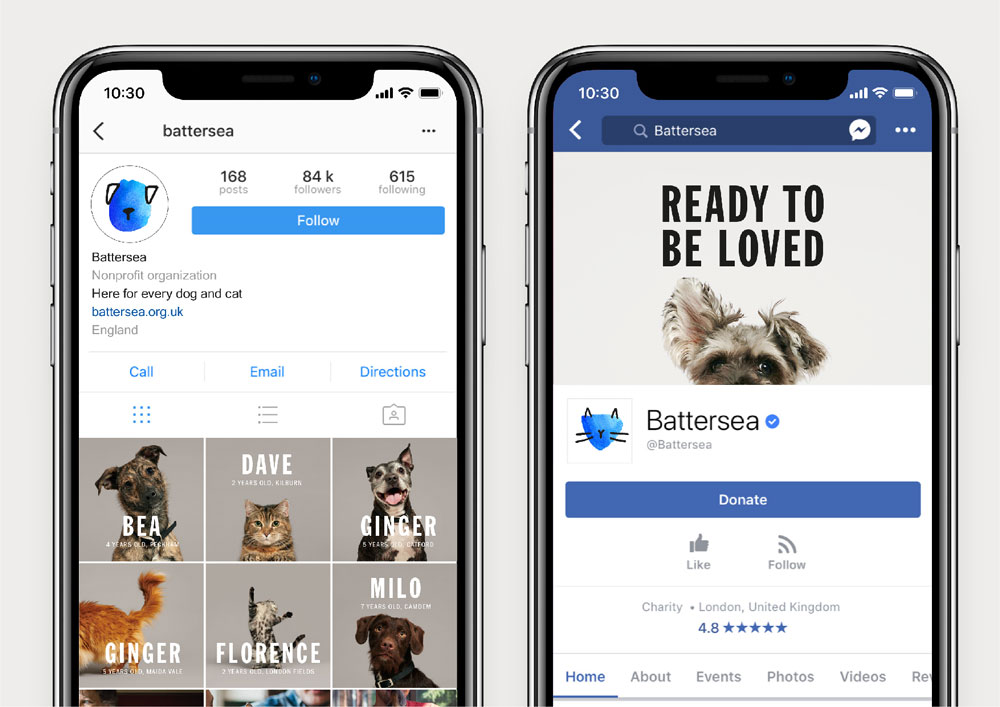
The old logo was about what you would expect from an animal shelter — some kind of depiction of a dog and/or cat — and this one was nicely done with one of each drawn cuddled together and aptly placed inside a circle with decent typography. It was much better than many other shelters and veterinary logos out there but still on the forgettable end of the spectrum. The new logo, by contrast, breaks away from the segment’s typical logos with a very charming set of watercolor heads of cats and dogs, illustrated by San Francisco, CA-based Hiromi Suzuki, that float super cutely above a strong wordmark. It’s a combination that works great with the watercolor blobs adding a touch of softness, the black ears/whiskers/noses marks a touch of whimsy, and the condensed uppercase Franklin Gothic a touch of seriousness. The logo is now more endearing, memorable, and distinctive.
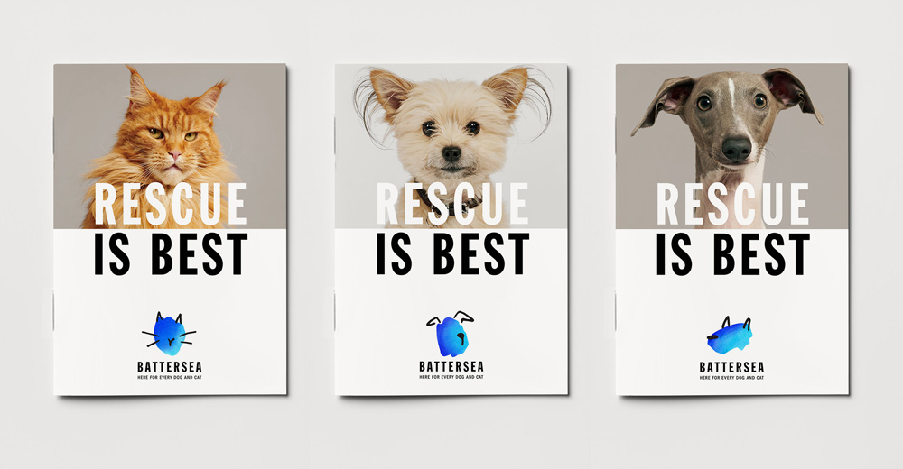
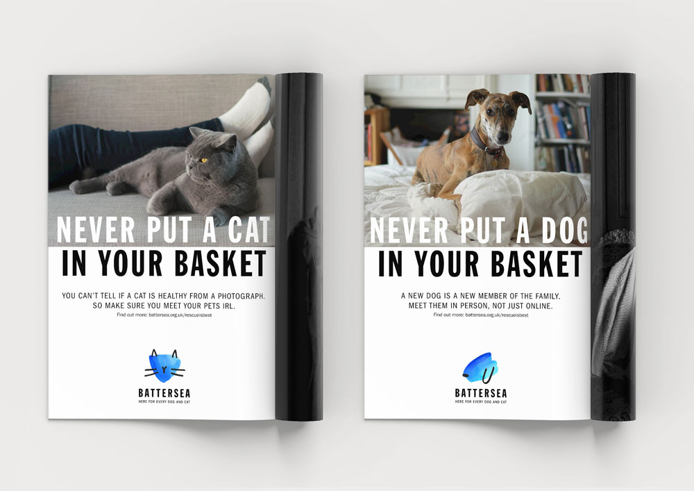
The applications are okay. I’m not crazy about the use of the extra loose headlines in the ads that echo the typesetting of the logo as they feel like don’t-do-drugs-public-service-announcement ads. It’s like they feel too alarmist when the message is actually trying to be lighthearted. A secondary typeface would have probably helped the ads so that it’s not all uppercase Franklin Gothic all the time. The illustration on the logo in the ads works as a great accent.
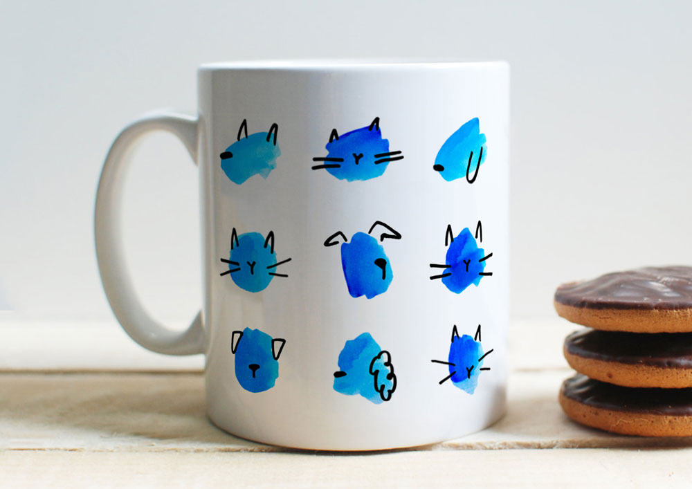
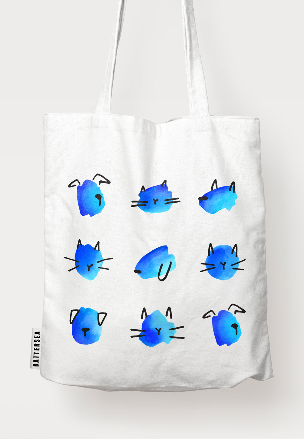
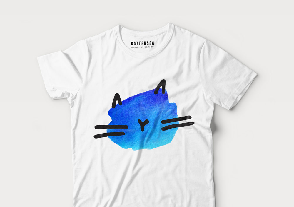
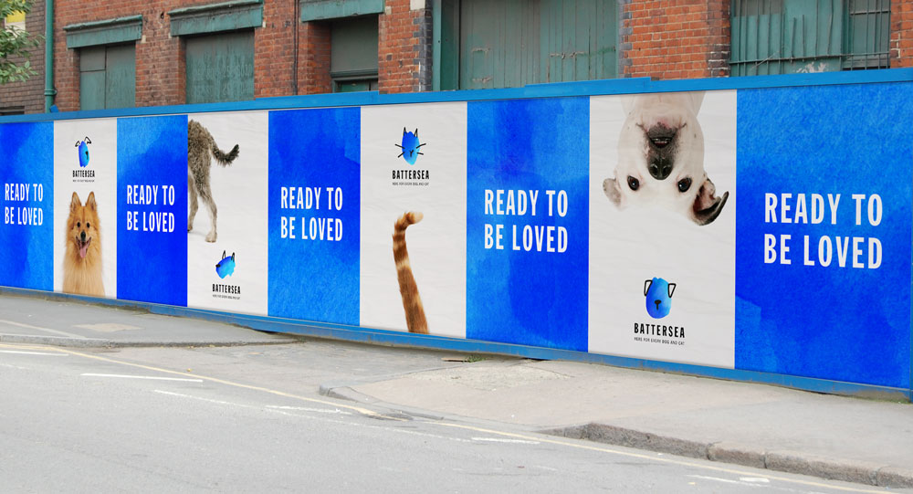
These other kind of applications, I would buy one of each, on the spot.
A key focus while developing the identity was to create a brand that could flex and adapt based on the audience. This is particularly useful for Battersea’s public-facing programmes and fundraising initiatives, which lean into the joyful part of the brand personality. ‘Muddy Dog’, a fundraising challenge from Battersea, takes a playful spin on the master identity and uses tongue-in-cheek headlines to engage with its audience. In addition, Pentagram created a playful hand-drawn typeface, Battersea Paws, to reflect this loud and fun personality.
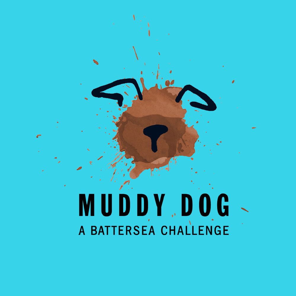
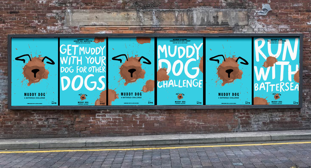
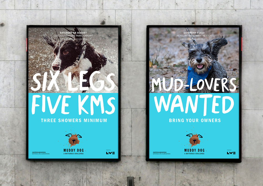
The Muddy Dog extension is fantastic, even if you don’t know this initiative logo is based on the new organization logo, it works great on its own. The palette of light blue and mud is unexpectedly cool and here we do see the use of a different font — a custom one just for this — that helps break the monotony of the other ads. Overall, this is a wonderful update for a wonderful organization that deserves all the good things.

 Новости Союза дизайнеров
Все о дизайне в Санкт-Петербурге.
Новости Союза дизайнеров
Все о дизайне в Санкт-Петербурге.