Обзор лучших ресурсов по разработке бренда, разработке упаковки
contact us | ok@ohmycode.ru
contact us | ok@ohmycode.ru
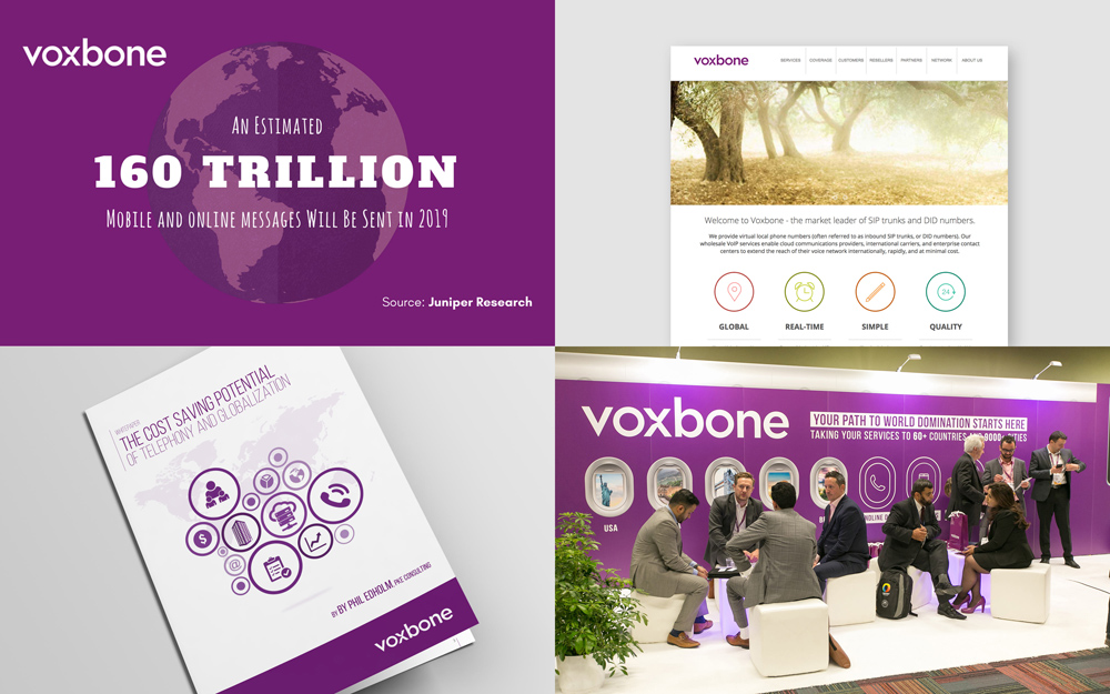
Established in 2005, Voxbone is a Communications as a Service (CaaS) provider that supports large corporations and start-up businesses with voice and messaging services in the cloud and via API. If none of that sentence makes sense to you as it didn’t do for me, here is another try: Voxbone provides companies with access to actual phone numbers in 60 countries so that those companies can set up global phone systems without dealing with each country’s processes while also providing the backbone for those companies to set up call centers, conferencing systems, and more. Or something like that. Based in Brussels, Voxbone has offices in San Francisco, Austin, Los Angeles, London, Iasi and Seoul, and counts with clients like Skype, FoodPanda, and Deutsche Telekom. Recently, Voxbone introduced a new identity designed by London, UK-based Onwards.
In the stuffy telco industry, Voxbone have always been a disruptor. So we built a positioning born from their outlier spirit; Voxbone don’t just make the insanely complex world of global communications simple, they make it ‘Strangely Simple’.
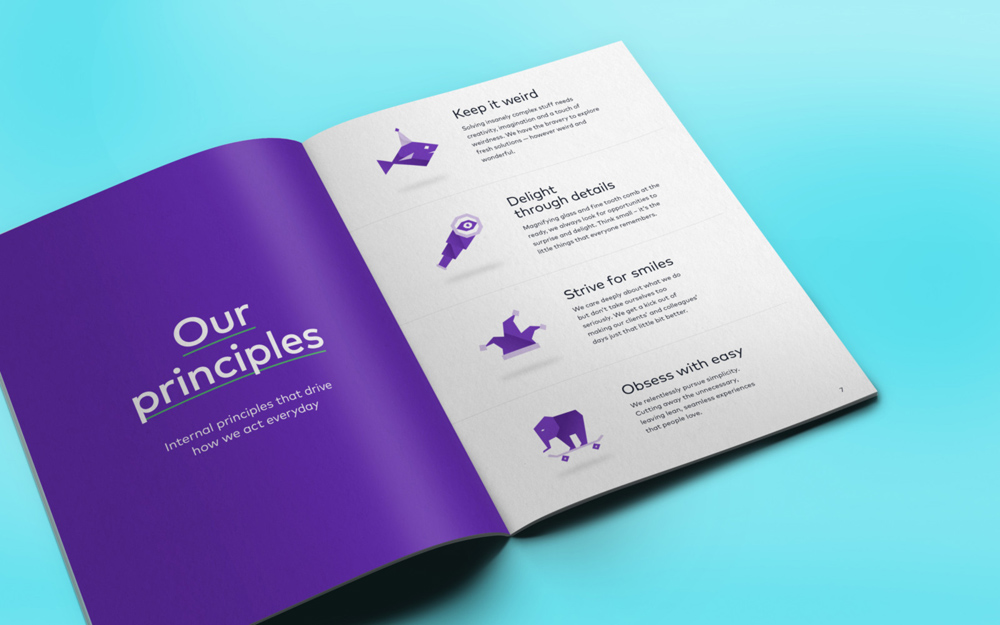
This unusual positioning became the guide for all brand creative. We developed a playful identity and tone for the brand that would bring out their rebellious spirit and amplify their eccentric personality.
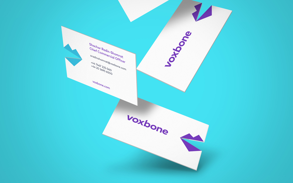
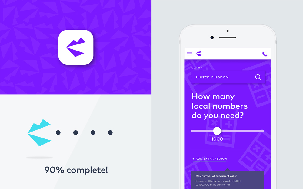
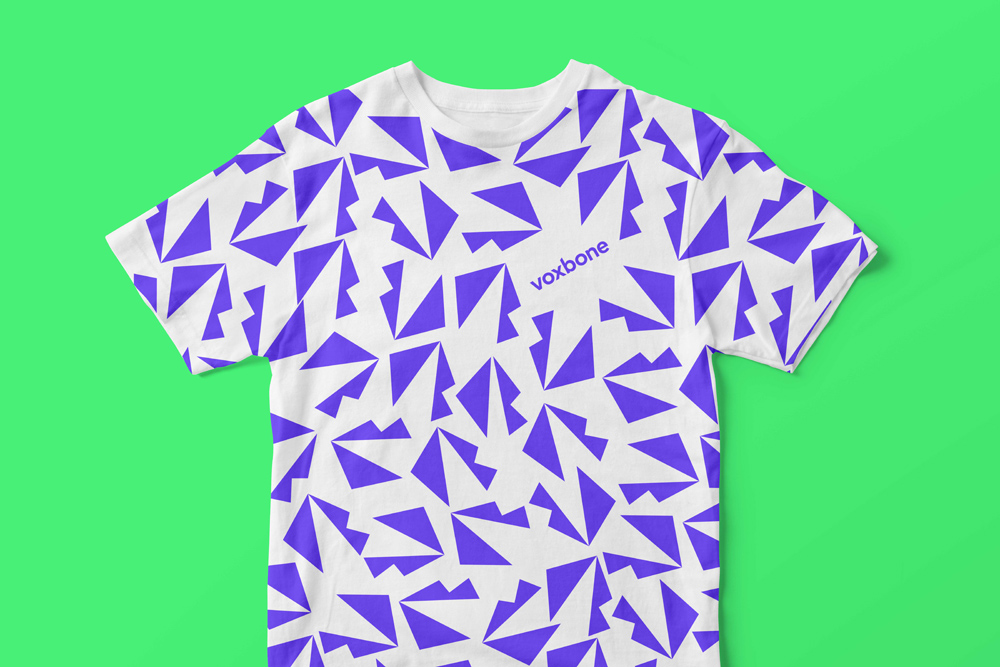
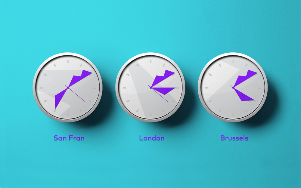
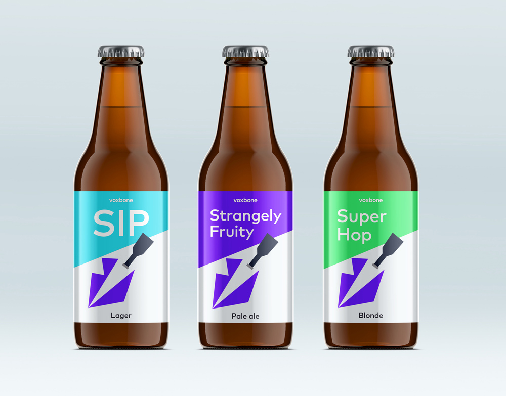
Their new logo is designed to standout instantly in a digital world. The mouth shape comes from the V and B in Voxbone as well as representing voice (Voxbone’s core product) and is designed to be used flexibly within the brand language - as a pattern, texture, pinpoint, super graphic, or as part of the illustrative language.
The old logo was pretty much fine and could have easily lasted for the rest of time without anyone complaining. The new one, though, shows what a big difference it makes to infuse a little bit of personality into a logo. Using its “V” and “B” initials, the logo features and icon/monogram in the shape of a mouth which, on paper, sounds like a terrible idea but, in execution, it yields a charismatic, slightly bratty icon that works wonders to loosen up the identity in an otherwise bland industry. The new wordmark is fine as well and mostly it provides a kind of sane segue from the old logo to transition into the more vocal new identity. The update to the purple hue is a huge improvement, since the old one was so drab.
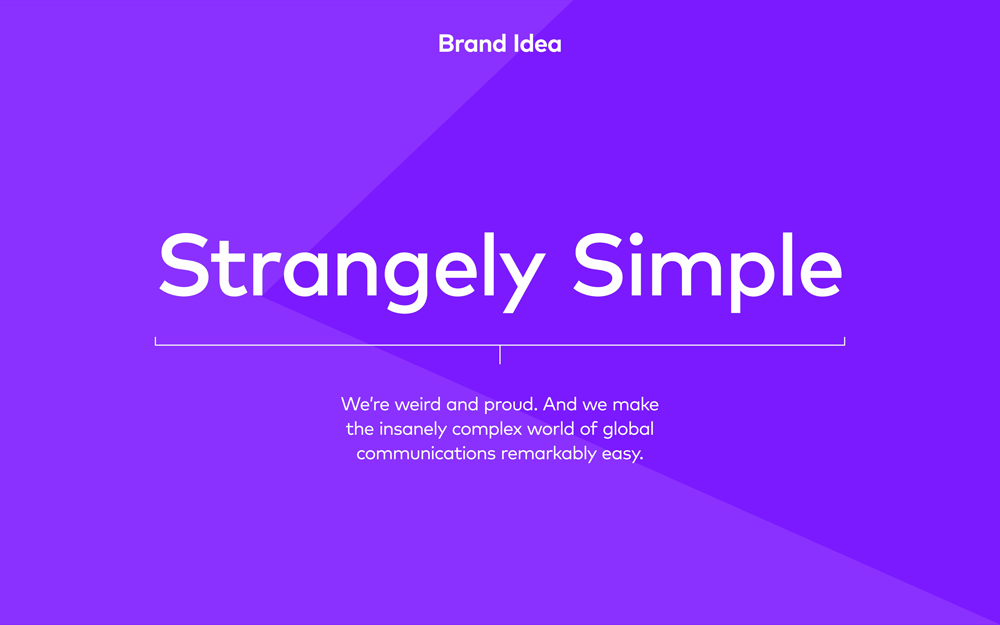
Part of what makes this identity work so well is how clear the positioning is: Strangely simple. It sets everything up neatly and the identity sticks to it by not getting overly complicated and keeping things just the right amount of weird.
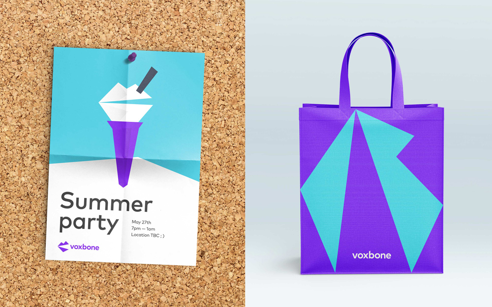
The old identity was sooooo purple and it clearly lacked cohesion. The new identity introduces a lot of flexibility through a wider and brighter color palette as well as a simplified range of typographic choices (basically, just the one sans serif).
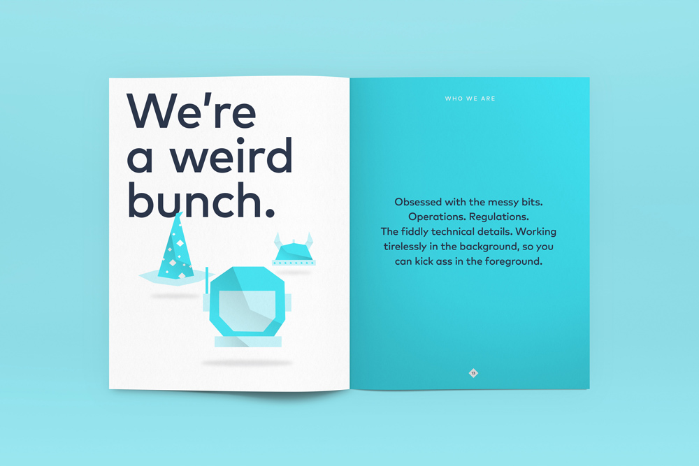
The illustrations are pretty cool and they are used nicely throughout Voxbone’s website. Actually… their website is one of the better corporate websites I have seen (from all the websites I wade through for Brand New). There is a bold energy to it as well as a range of strong details sprinkled throughout.
Overall, there is a great sense of lightness (and lightheartedness) that works great from concept to execution and the identity transforms Voxbone into something way more exciting than it used to be or even needs to be.

 Новости Союза дизайнеров
Все о дизайне в Санкт-Петербурге.
Новости Союза дизайнеров
Все о дизайне в Санкт-Петербурге.