Обзор лучших ресурсов по разработке бренда, разработке упаковки
contact us | ok@ohmycode.ru
contact us | ok@ohmycode.ru
Established in 1990, Aktuel is a furniture, tableware, and food equipment rental company in France for events of all types. With three locations, 60 delivery vehicles, and an aggregate of 215,000 square feet of inventory — that includes everything from silverware to waffle irons, stools to leather sofas, and more — the company can create rooms, kitchens, reception areas, and any other imaginable configuration for company and sporting events or any kind of conference and fair. Late last year, at Heavent, an event about vendors and consultants for events, Aktuel introduced its new identity designed by Paris, France-based Brand Brothers.
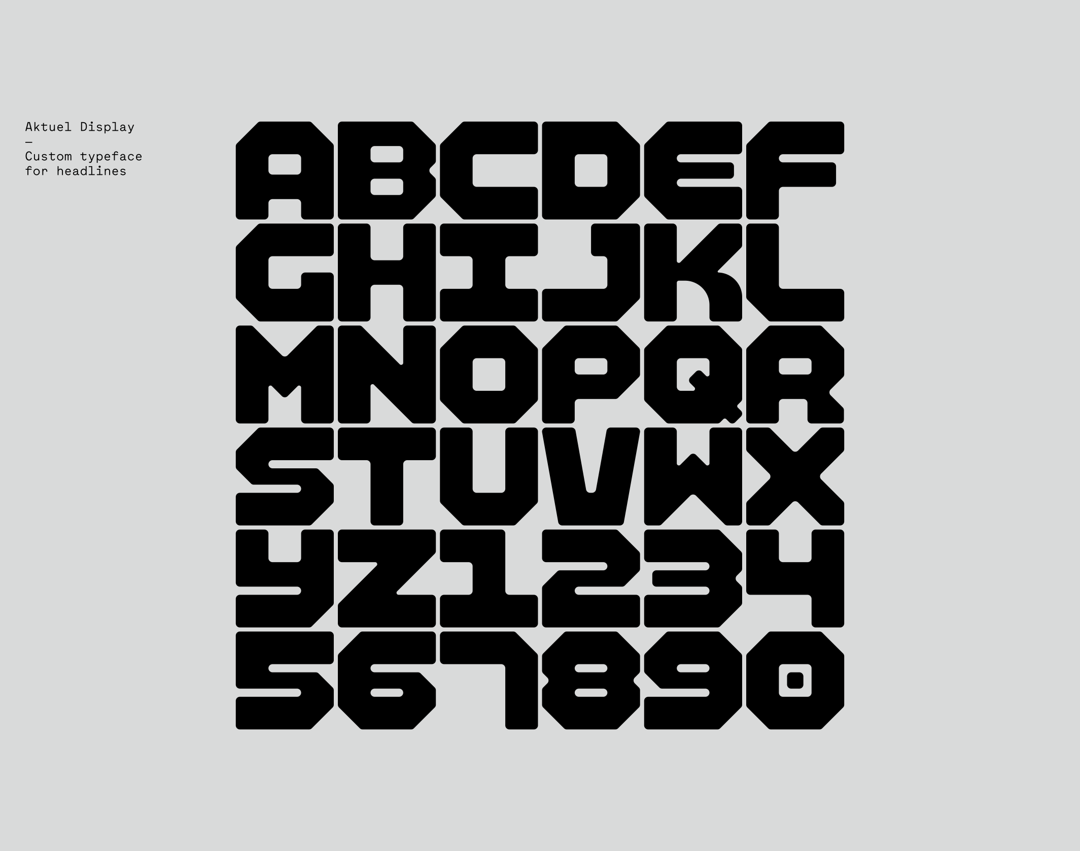
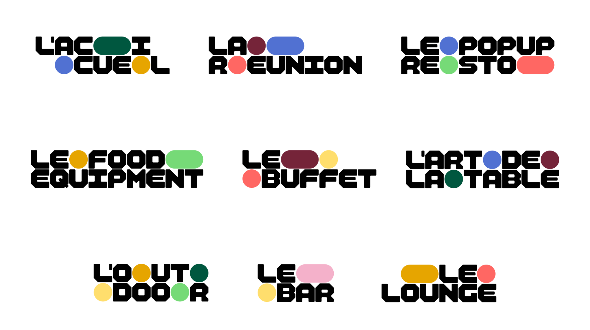
Our design work was based on two ideas: to talk about the historical activity of a space planner while developing the new strategic vision set up during the positioning work. Three major elements make up the graphic identity: a grid, a dedicated typography and a set of forms. The new logo, a typogram designed for the brand, solid and stable, is available in a new complete headline font that forms the typographic framework of the new branding. A coloured pattern, infinitely adaptable, is added to this typographic base.
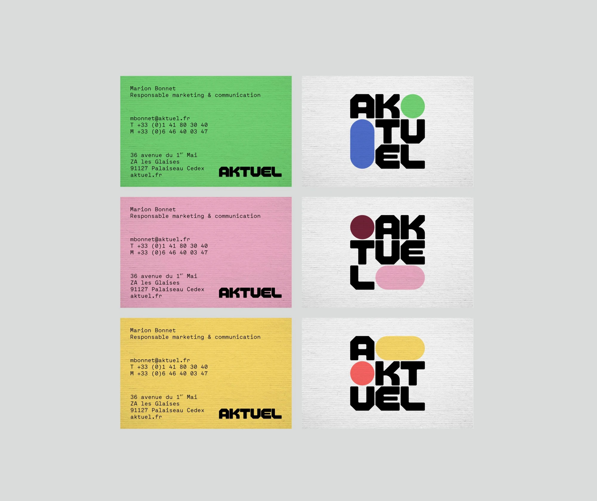
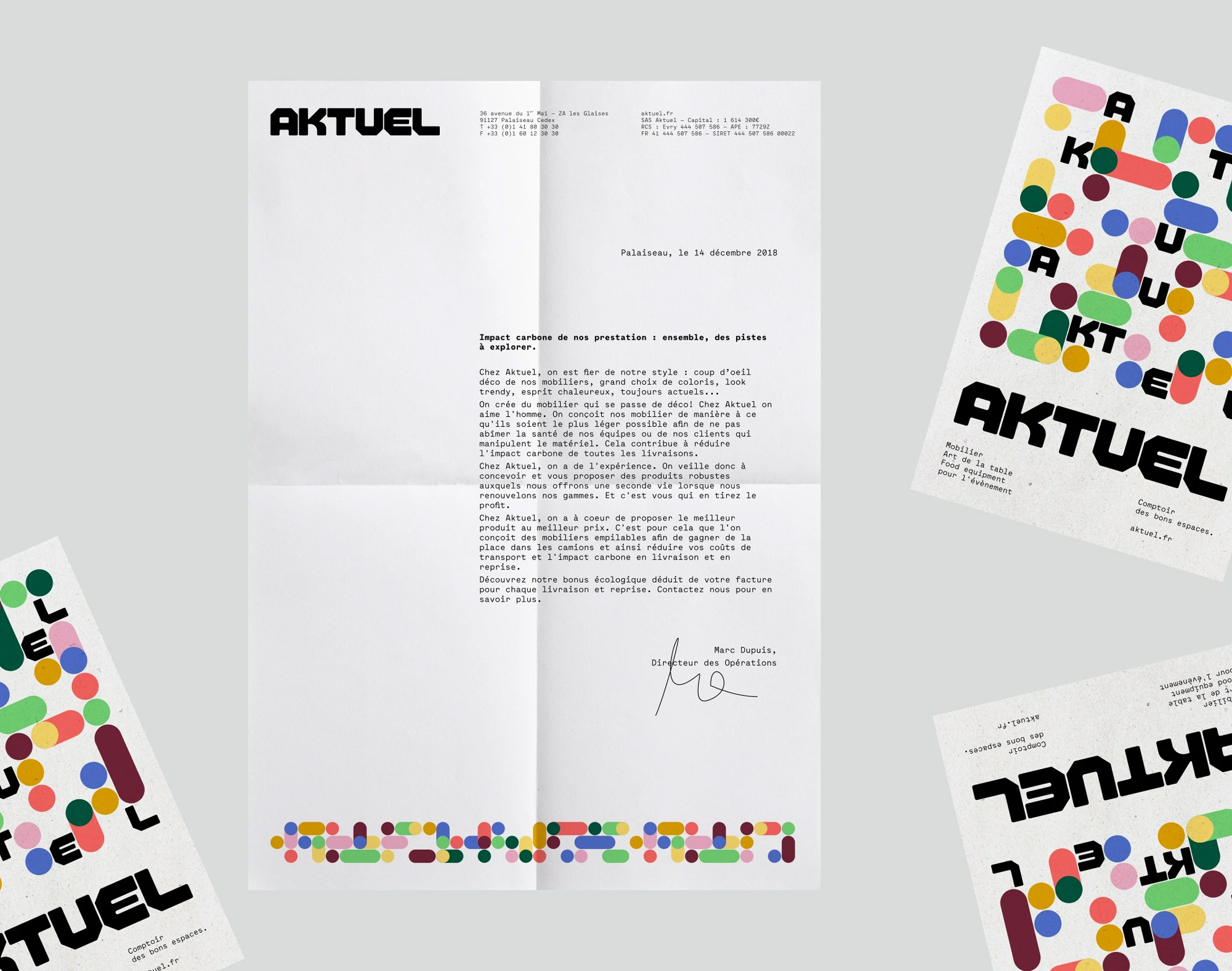
From stationery to merchandising, from the fleet of trucks to the application of the new identity on the brand’s booth at Heavent 2018, where the new branding was inaugurated, we have developed a rich and flexible system that encapsulates both rigour and empathy, and sets a distinctive style in the world of events.
I’m not exactly sure what was the point of the old logo… maybe the “E” represented things stacked inside a truck seen from the back? The typography was salvageable but the purple and green lines were confusing and badly shoehorned into the type. The new logo, in its tight configuration, conveys a sense of control and the ability to neatly fit things into spaces. Without the context I probably wouldn’t have come to that assumption and if seen independently I would have just thought “hey, cool type”. The monospace approach and angular construction of the letters have a building-block kind of aesthetic that works well with their expertise. The “K”, both in the name and full font (below), stands out as the only letter with a curve — I’m undecided if that’s a good or bad thing. I like how it softens the logo but don’t like that the detail doesn’t reoccur — and I don’t like that it doesn’t reoccur because it’s a detail I like.
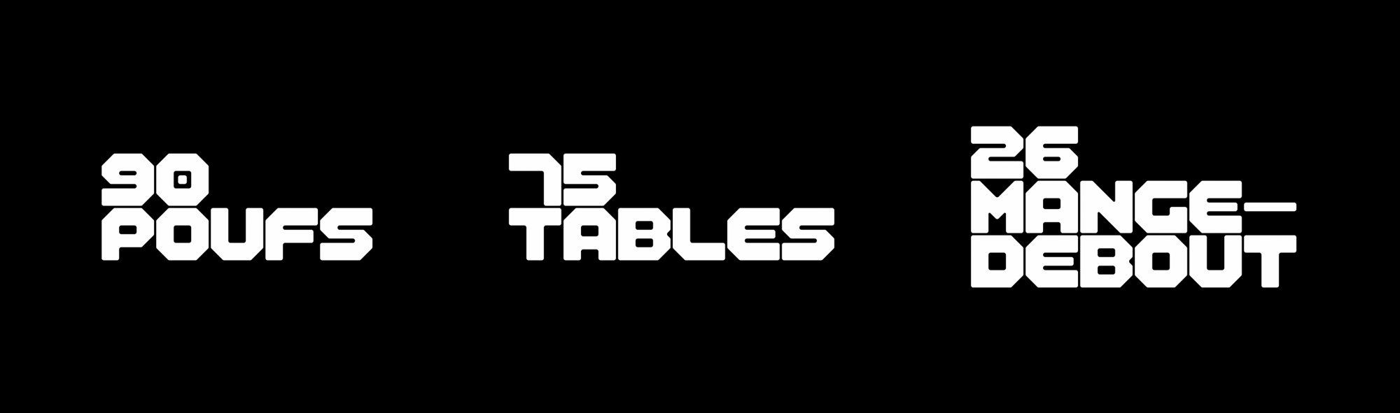
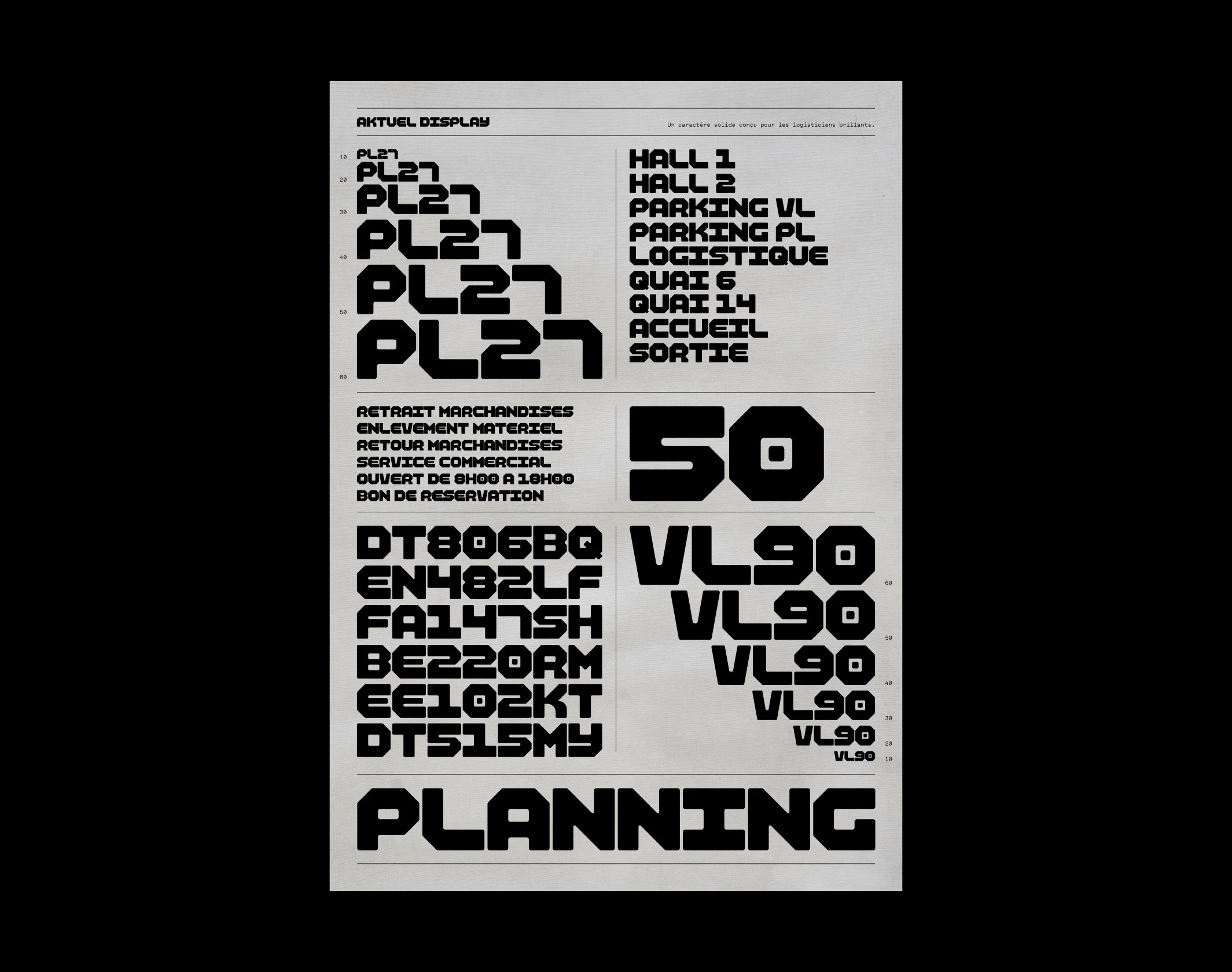
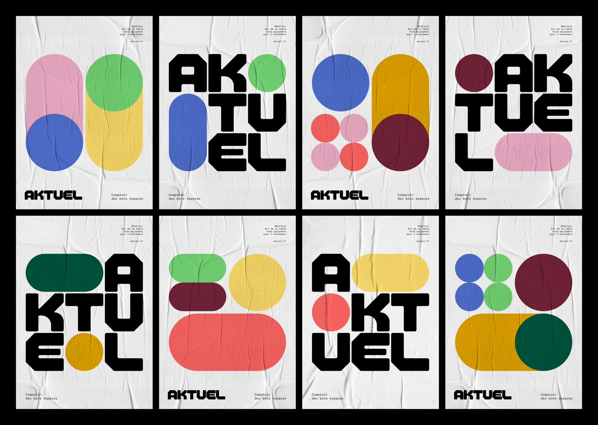
The font, on its own (and particularly in the poster-like specimen) might feel more at home in a gaming company or EDM festival but I definitely like that it breaks the convention (no pun intended) of what would be expected from an event-focused rental company. The font works much better in this context when paired with the graphic devices…
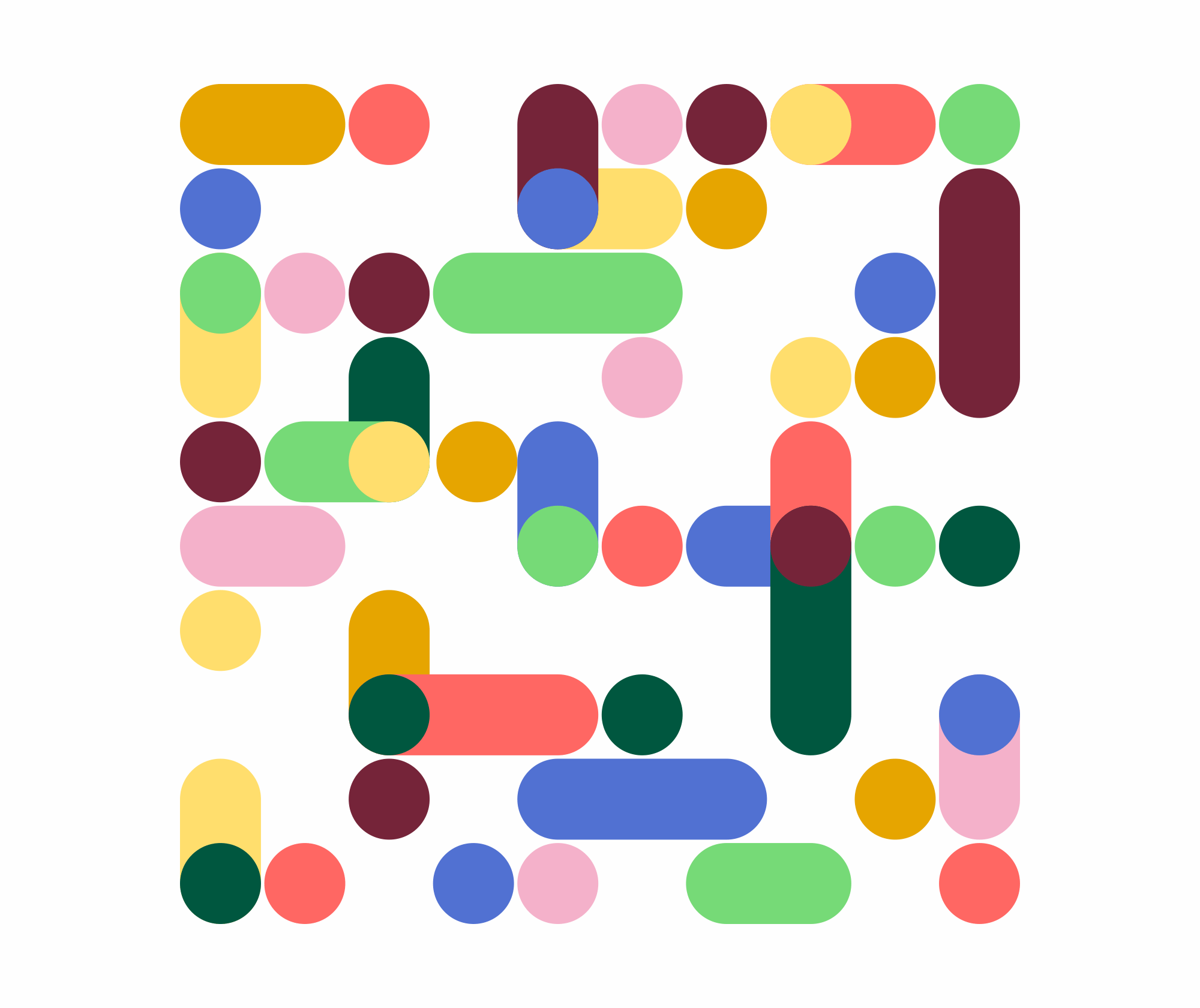
The patterns begin to more clearly convey the essence of the company, which is fitting different elements into tightly predefined spaces and, in animation, it captures the very real back-and-forth of finding the right placement within allotted spaces.
The identity takes shape when font and graphics are combined, which could be read as a metaphor for integrating Aktuel’s expertise (through the font) and Aktuel’s inventory (through the graphics) to find the perfect balance of furniture and functionality. Visually, the graphics take the rave edge off of the custom font and, as seen in the posters a few images below, give it an almost corporate feel — like a Herman Miller modular office catalog or something.
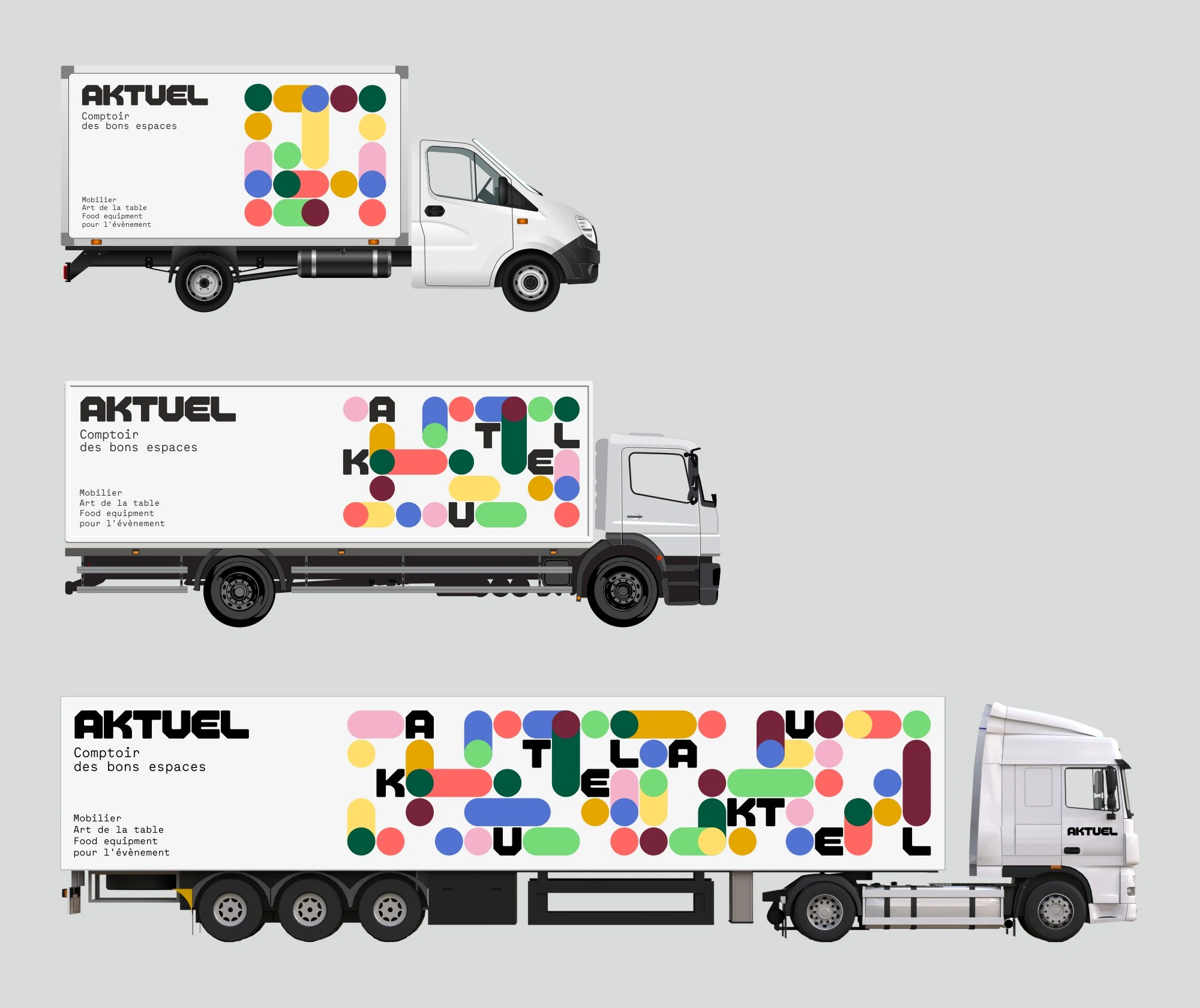
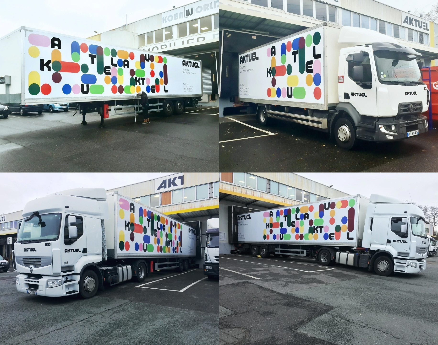
The applications are fun to look at and the livery in particular works great. I would totally almost crash if I was driving around and saw one of their trucks go by — would stare 10/10.
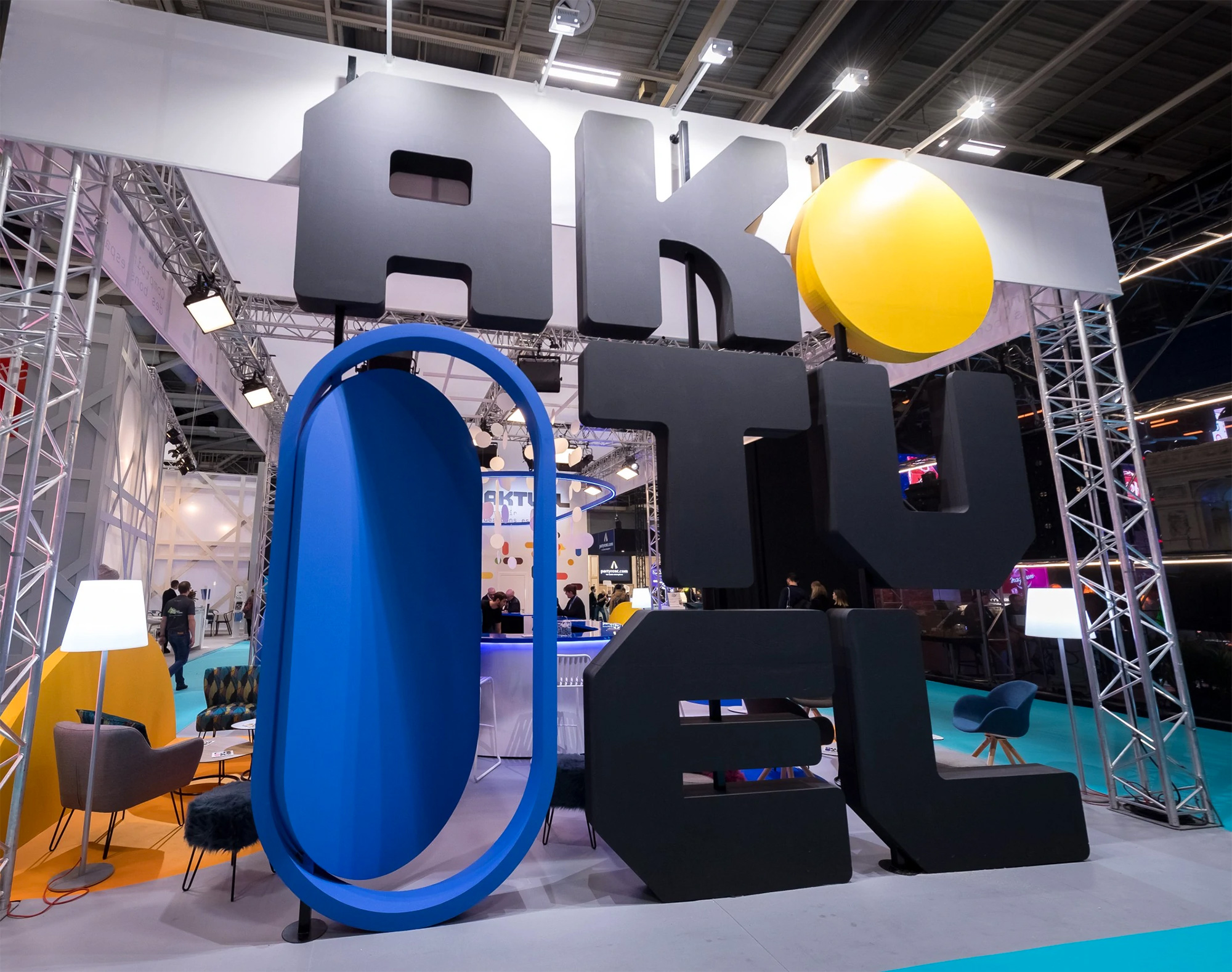
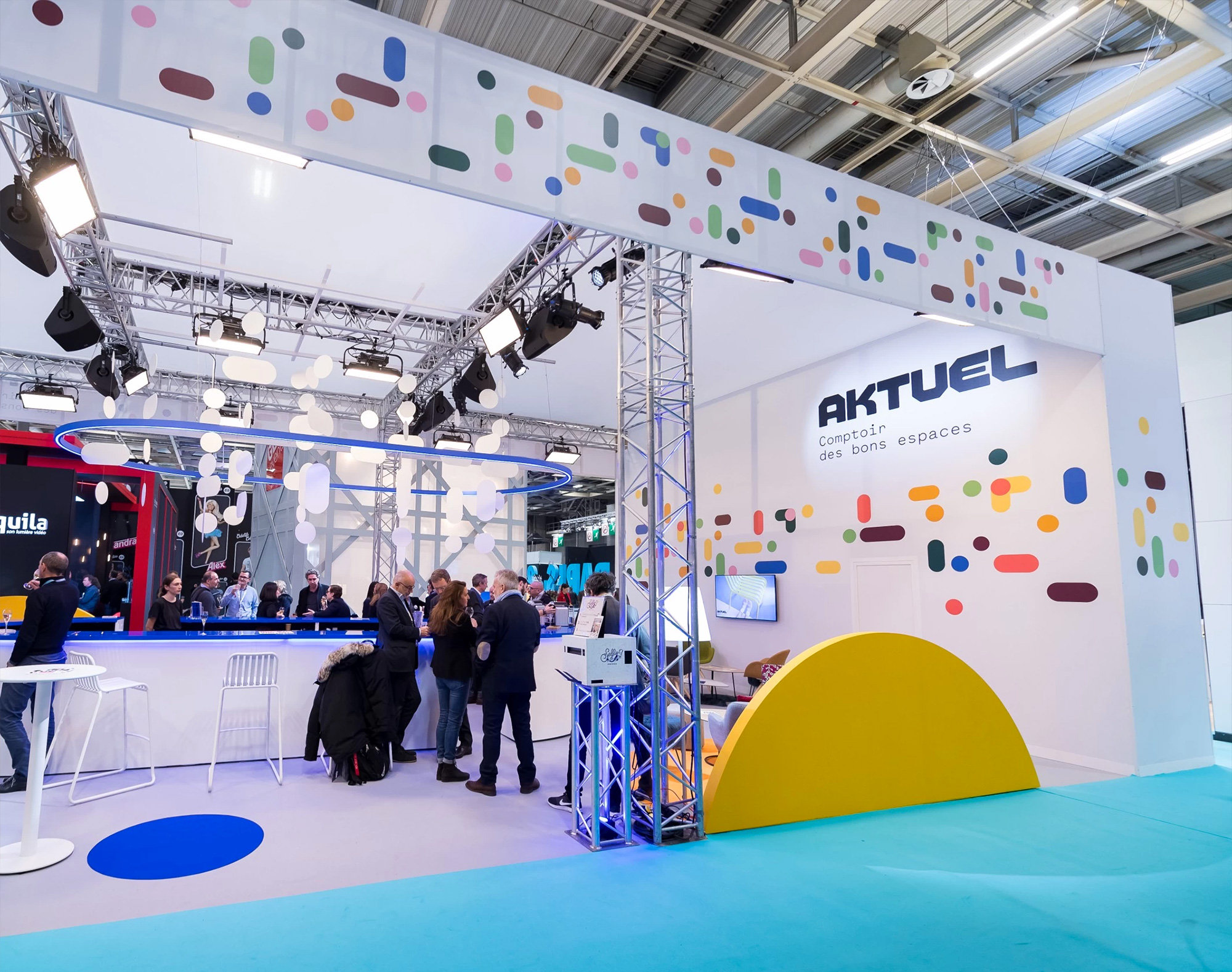
The booth is pretty fantastic, with the graphics brought to 3D life in rather cool ways like the blue shape opening like a window or the yellow half circle serving as the backing for a small living room area. Overall, this is far more fun and exciting than it probably needed to be — I’m sure Aktuel was doing fine with their old logo and identity but this adds a level of excitement and refinement to their services that is not always found in event-related companies.

 Новости Союза дизайнеров
Все о дизайне в Санкт-Петербурге.
Новости Союза дизайнеров
Все о дизайне в Санкт-Петербурге.