Обзор лучших ресурсов по разработке бренда, разработке упаковки
contact us | ok@ohmycode.ru
contact us | ok@ohmycode.ru
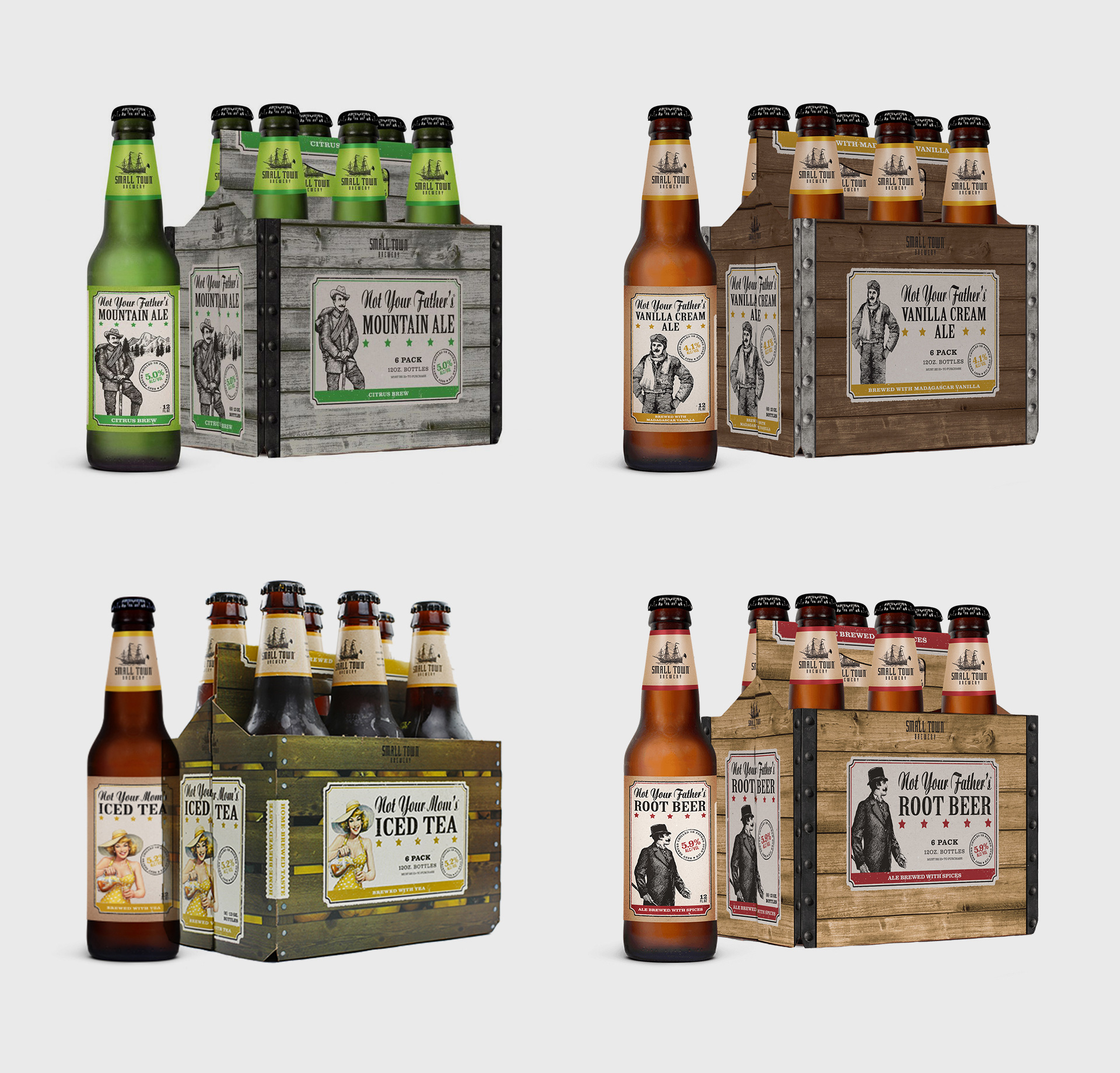
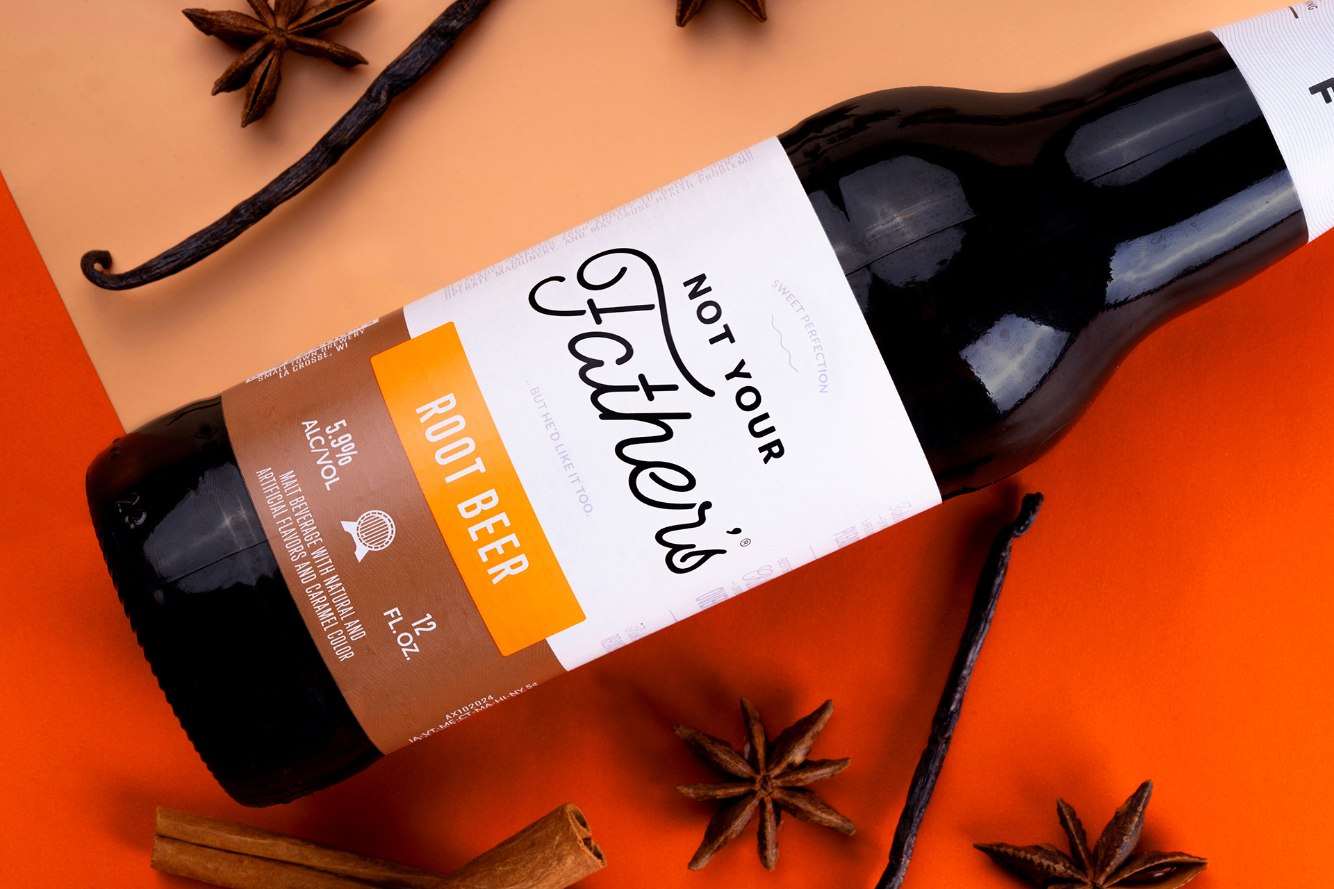
First released in 2012 in its original root beer flavor with a whopping 19.5% alcohol by volume (abv), Not Your Father’s is a brand of “hard soda” or flavored beer, depending on how you want to look at it. Created by Small Town Brewery in Wauconda, IL, the Not Your Father’s brand has grown to include lemonade, ginger ale, vanilla cream ale, and the original root beer now in a more modest 5.9% abv. In 2015, Small Town Brewery partnered with Pabst Brewing Company for distribution and the root beer became the number one selling “craft” package of that year. Recently, Pabst introduced a new logo and packaging, starting with lemonade and root beer, designed by St. Petersburg, FL-based Hype Group.
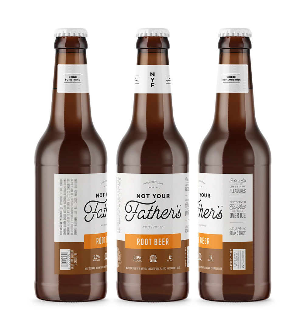
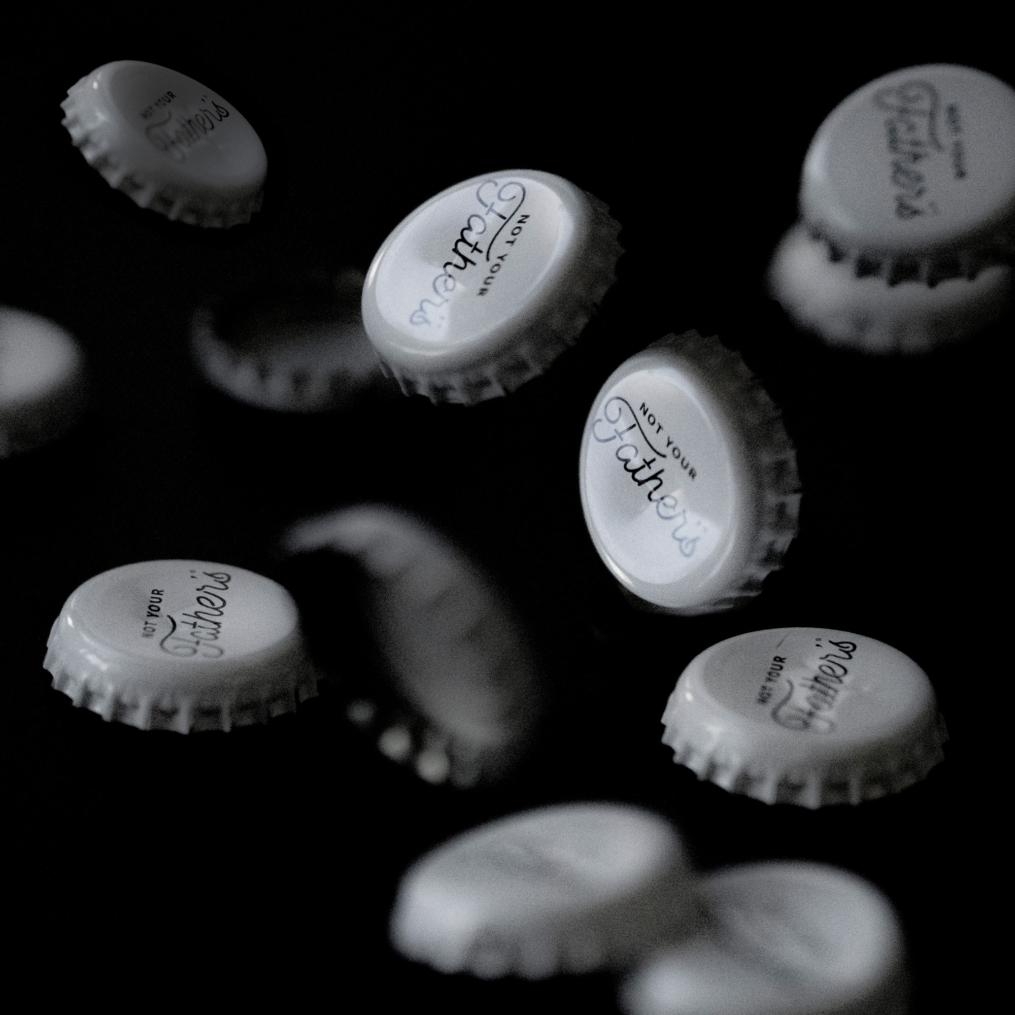
The resulting logotype is a combination of bold sans-serif with rounded edges and a custom monoline script with strategically placed separations. To make the brand more flexible, we created a shortened “NYF” mark derived from the sans serif type. This short-mark allows the brand to live beyond its lengthy name and exist in a more confined space in both vertical and horizontal applications.
The old logo, in a cheap-looking font that nobody bothered to kern its apostrophe, was pretty bad, even if we took into account its cheeky name, humble beginnings, and possibly its intention to look home-made. The new logo reflects the goal to reinvigorate the brand and make it more widely attractive through a combination of a large and friendly script lettering and unassuming sans serif. The emphasis on “Father’s” is perhaps a little strong but the light weight of it does play well and match nicely with the bold weight of “NOT YOUR”. Although I visually like the notches or reverse shadows in the script my mind keeps trying to rationalize their dimensionality and it does not compute. Nonetheless, it’s visually pleasing and a major improvement over the old. The “NYF” shorthand, which makes appearances in the packaging, is a little cold and industrial in comparison.
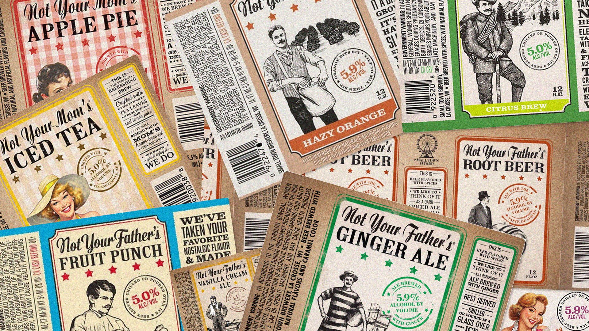
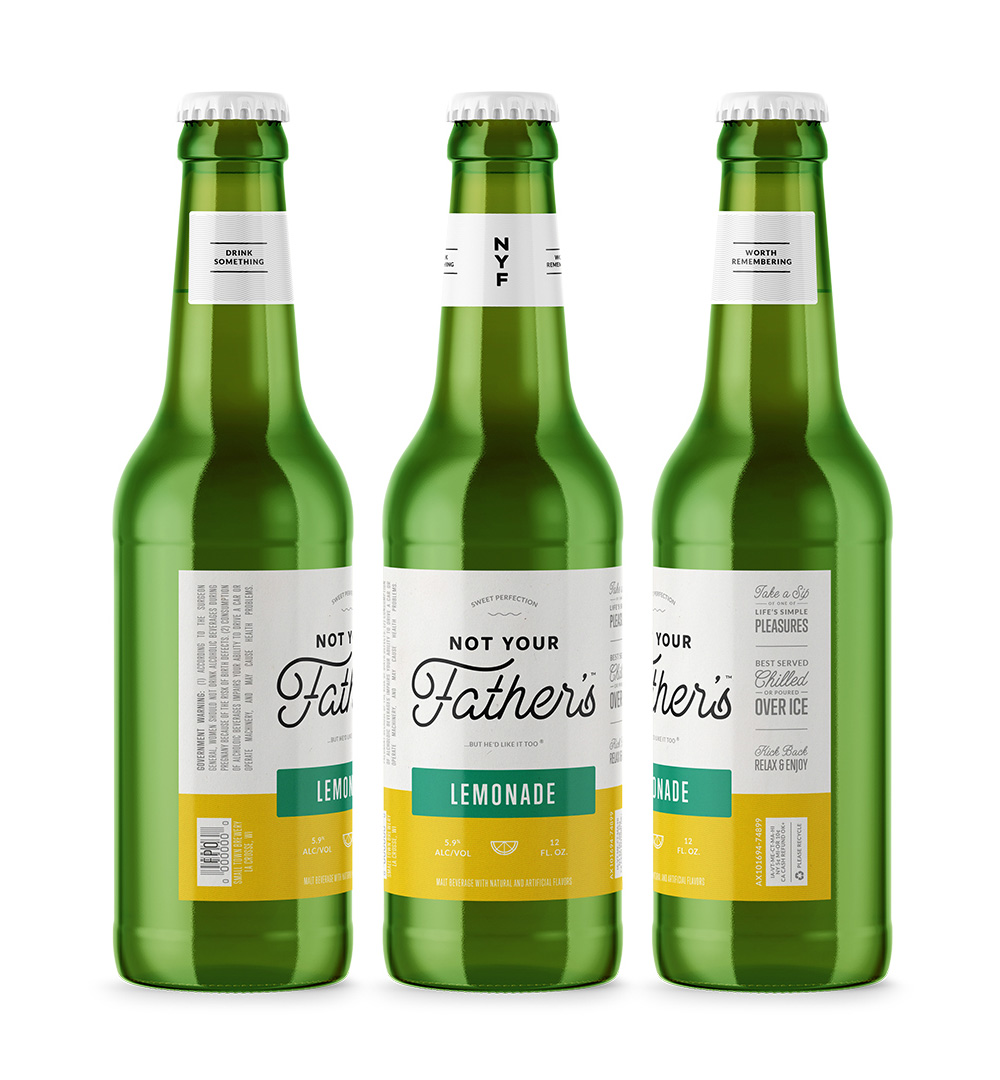
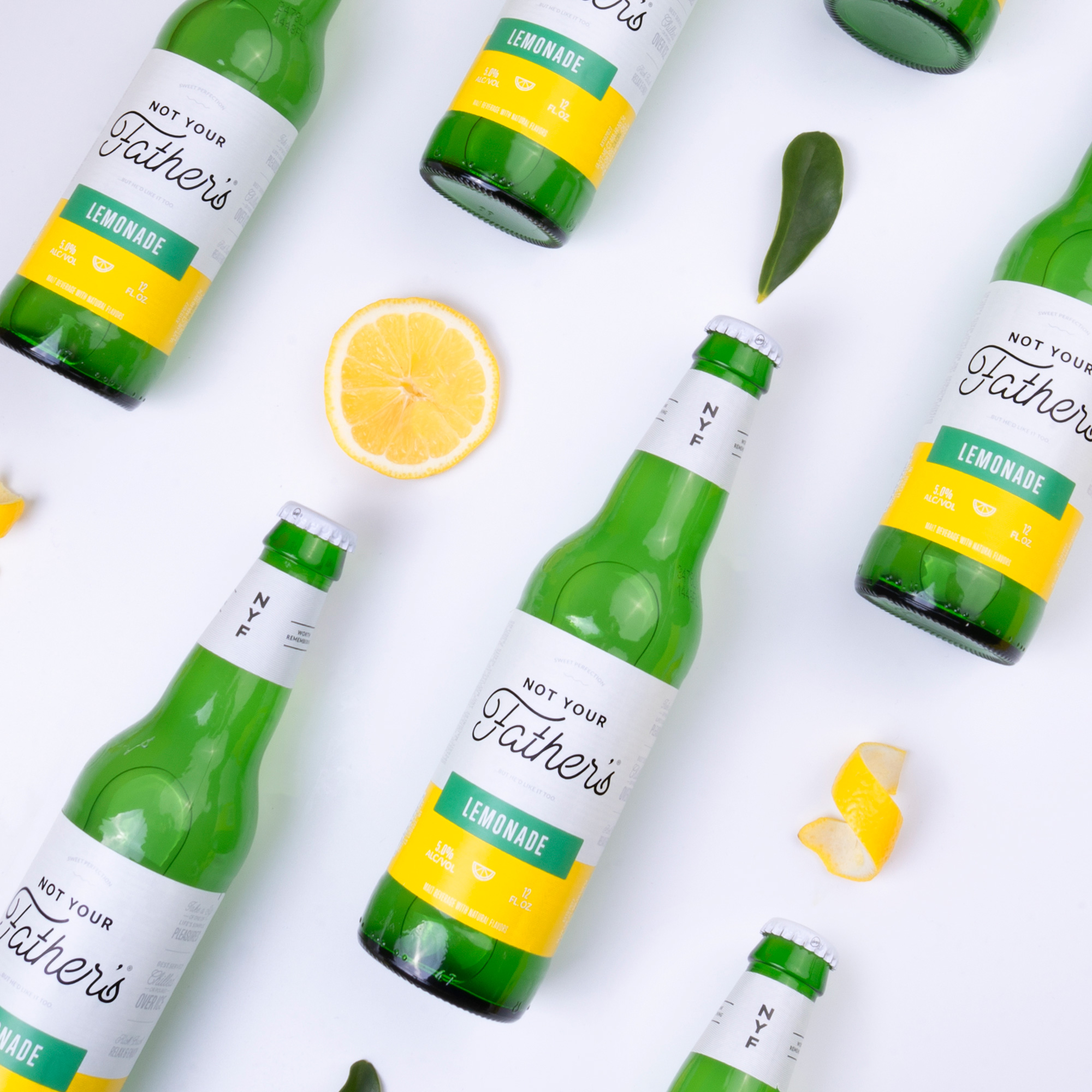
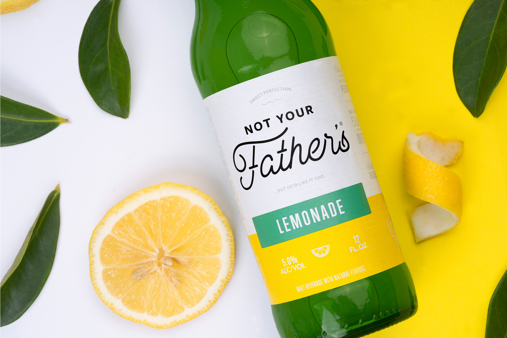
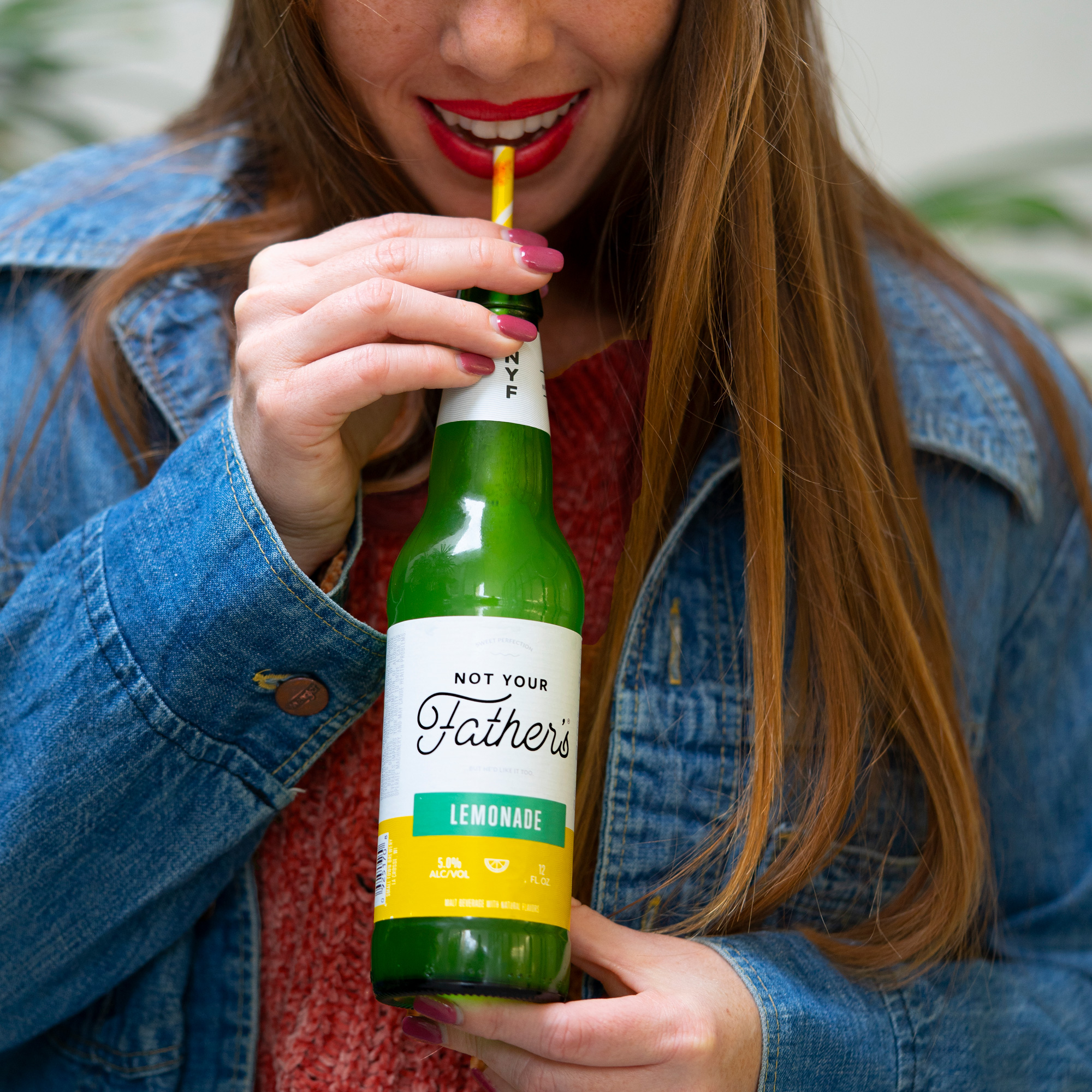
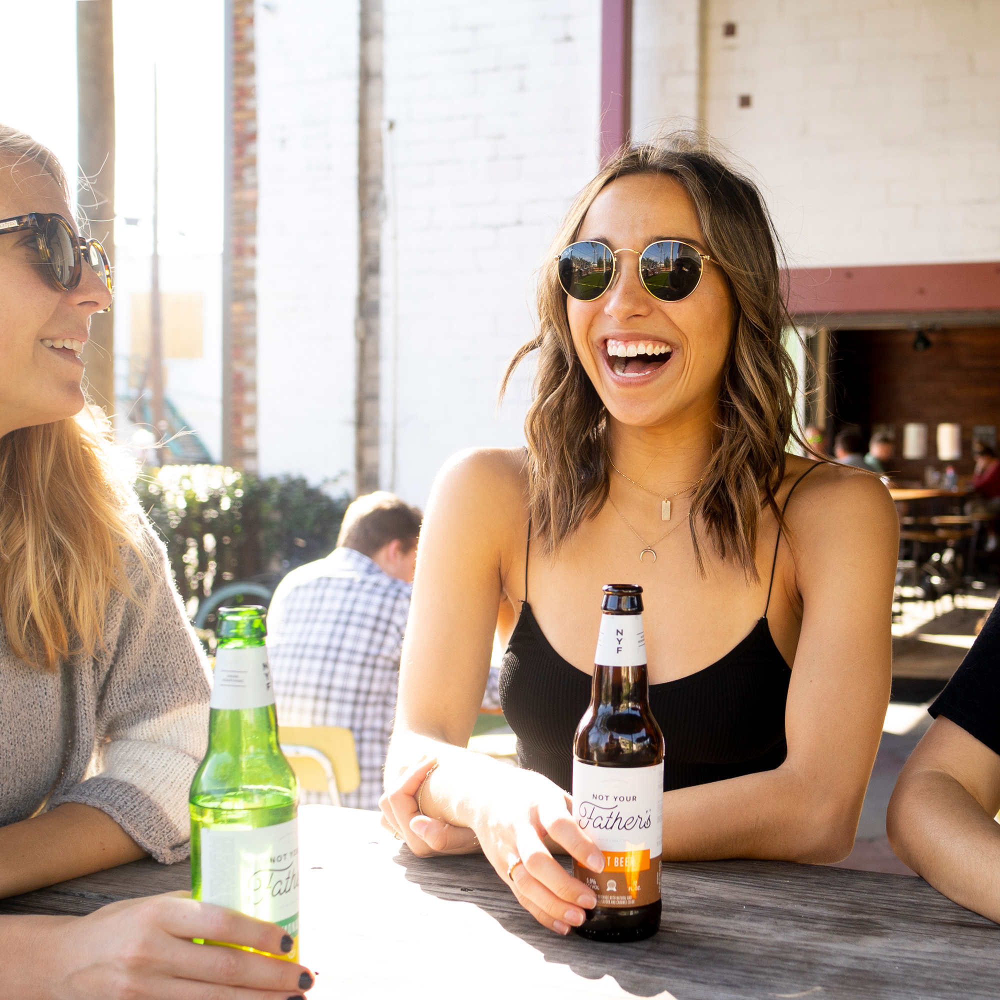
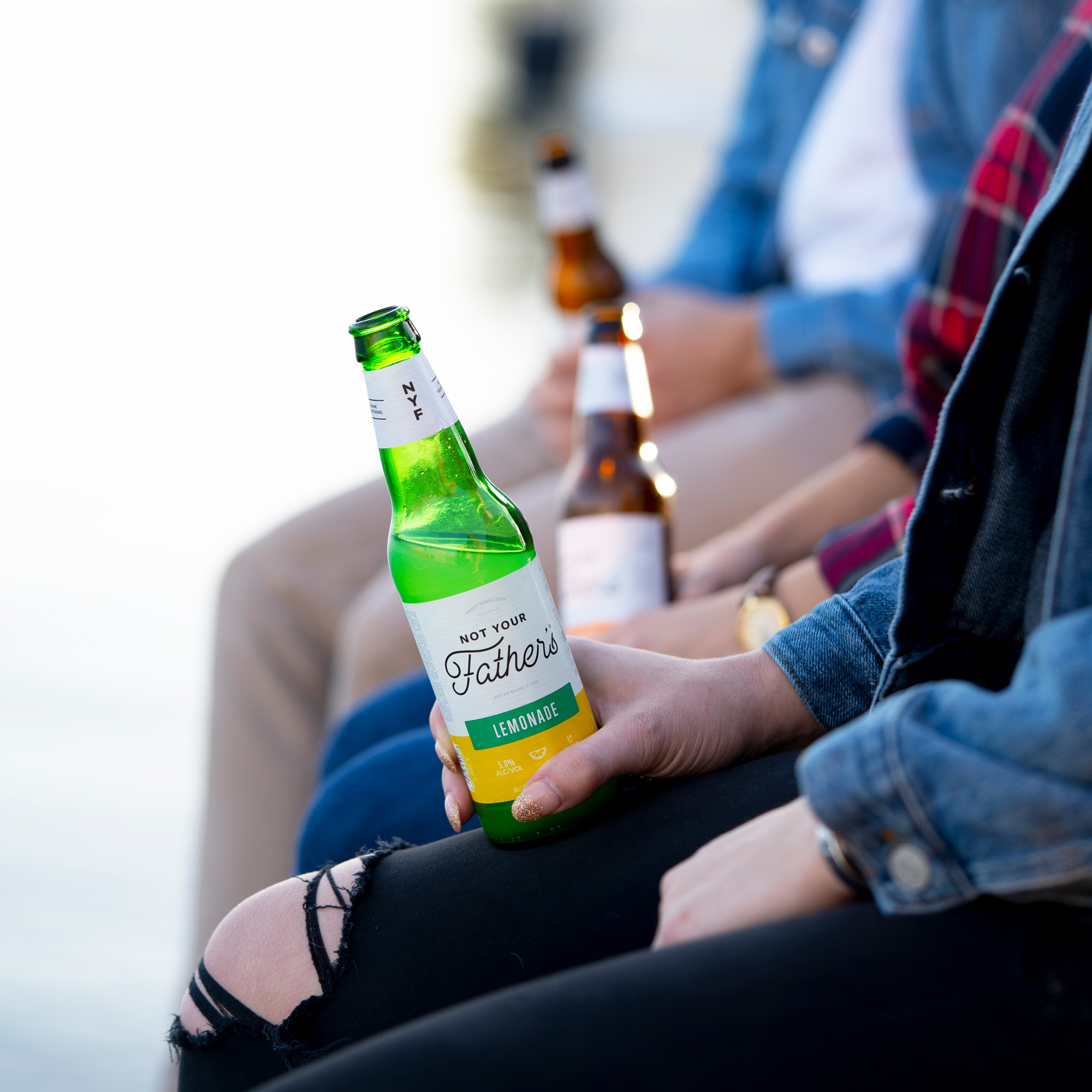
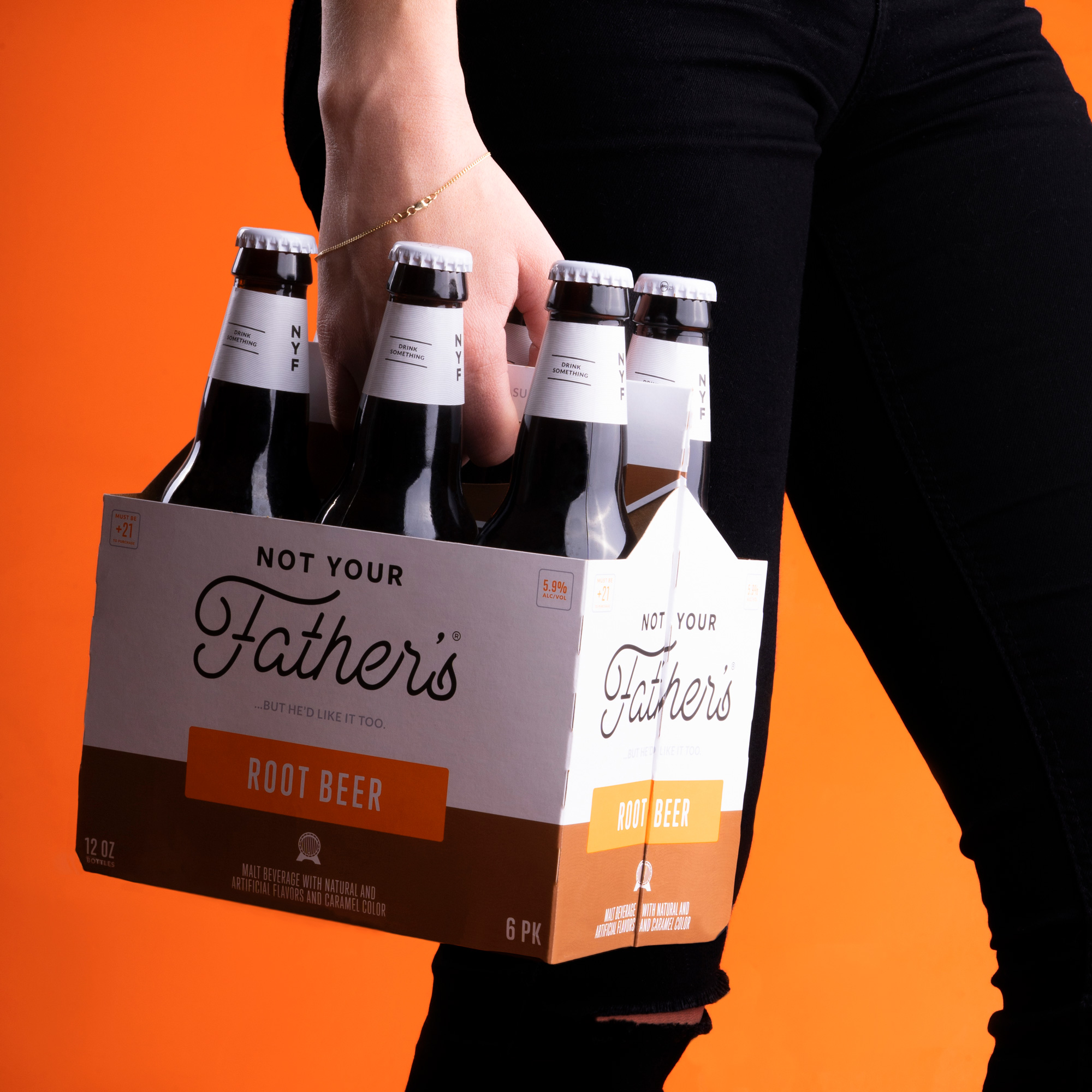
We simplified the label design by infusing it with significant white space, allowing the logotype to take center stage and be the dominant brand element across all SKUs. We split the label into thirds, locking down the primary flavor color to the bottom third of the label and overlaying a secondary color block to house the flavor name. A texture was also applied to create more dimension throughout the packaging, and is also a consistent piece of the overall brand - found on the bottle label itself, on the website, and on social media graphics. Custom icons were also designed to further delineate each flavor in the NYF suite, plus creative copy across the labels to demonstrate the personality of the brand.
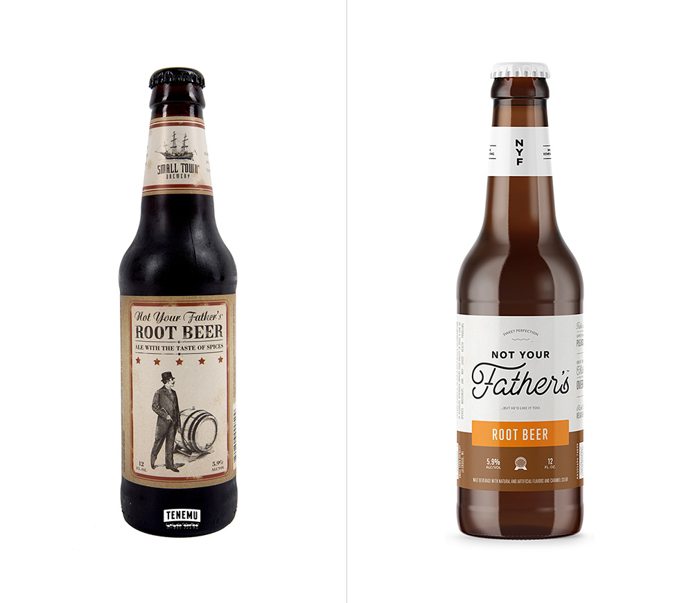
The old packaging was very heavy-handed with the old-timey-ness and while that has its own breadth of appeal it just wasn’t that interesting or well done. The new packaging may fall bluntly in the trendy, hipster aesthetic of beers (and other beverages) but it’s hard not to see it is an improvement and a more attractive consumer product in the year 2019. The hierarchy on the bottles is clear and efficient with a few pieces of flair to liven it up and support the logo, which now takes center stage.

Overall, what I think I like best is that the old packaging did look like my father’s or grandfather’s beer and this new one does pay off of the name with an aesthetic that isn’t built on previous generations’ graphic nostalgia.

 Новости Союза дизайнеров
Все о дизайне в Санкт-Петербурге.
Новости Союза дизайнеров
Все о дизайне в Санкт-Петербурге.