Обзор лучших ресурсов по разработке бренда, разработке упаковки
contact us | ok@ohmycode.ru
contact us | ok@ohmycode.ru
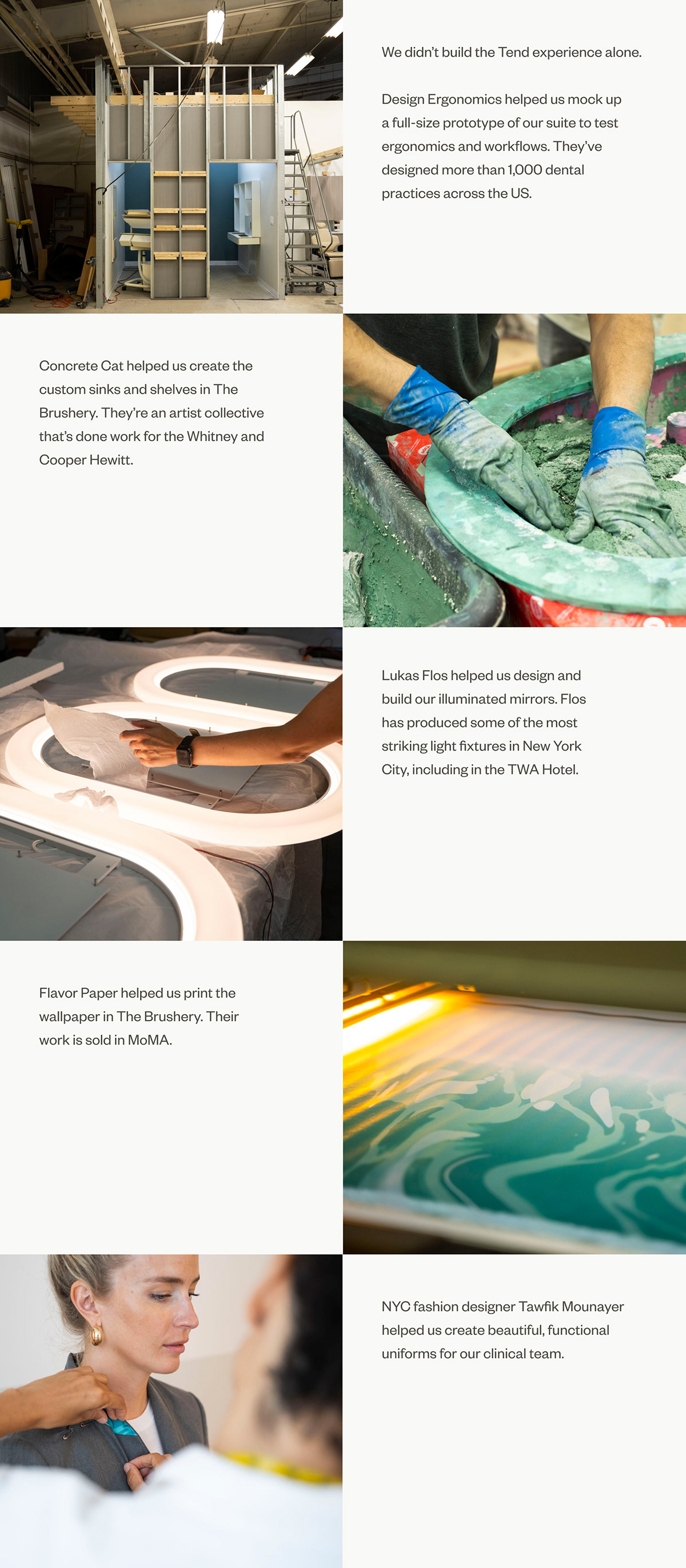
Established in 2018 and opened for business in late 2019, Tend is a full-service dentist start-up with six locations in New York, NY, created with the goal of redefining the dentist experience from beginning to end. With $36 million in seed and Series A funding — led by Redpoint Ventures and companies like One Medical and Warby Parker — Tend has invested in every touchpoint, from online scheduling, to staff training, to uniforms, to interior design, to its own fragrance that reduces anxiety. Led by their head of design, Stephan Hoefnagels, the design of the whole experience has brought in numerous collaborators across fashion, product design, and photography, with the identity designed by New York-based Mythology.
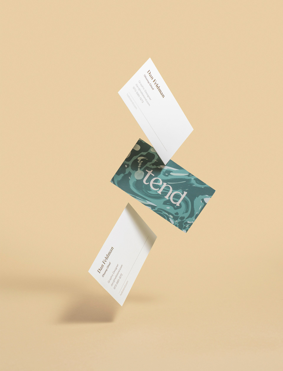
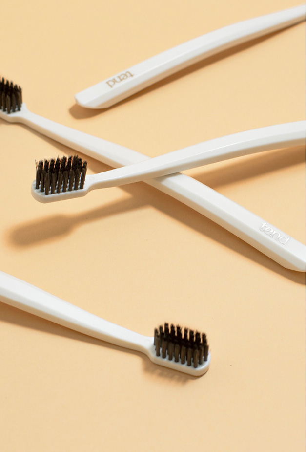
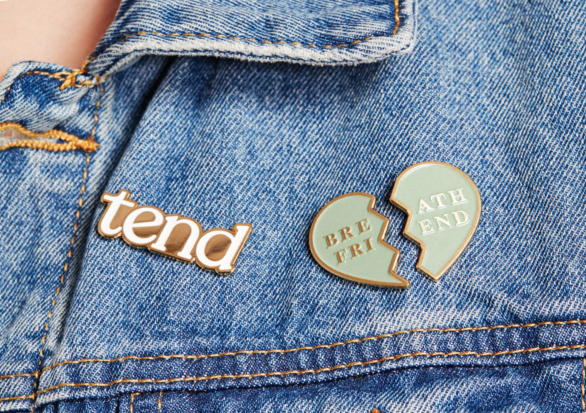
The “e” in our wordmark is tilted to look like it’s smiling. Our typefaces, Nantes and Founders Grotesk, balance warmth with elegance. And our linear key lines resemble a doctor’s script to evoke authority and earn trust.
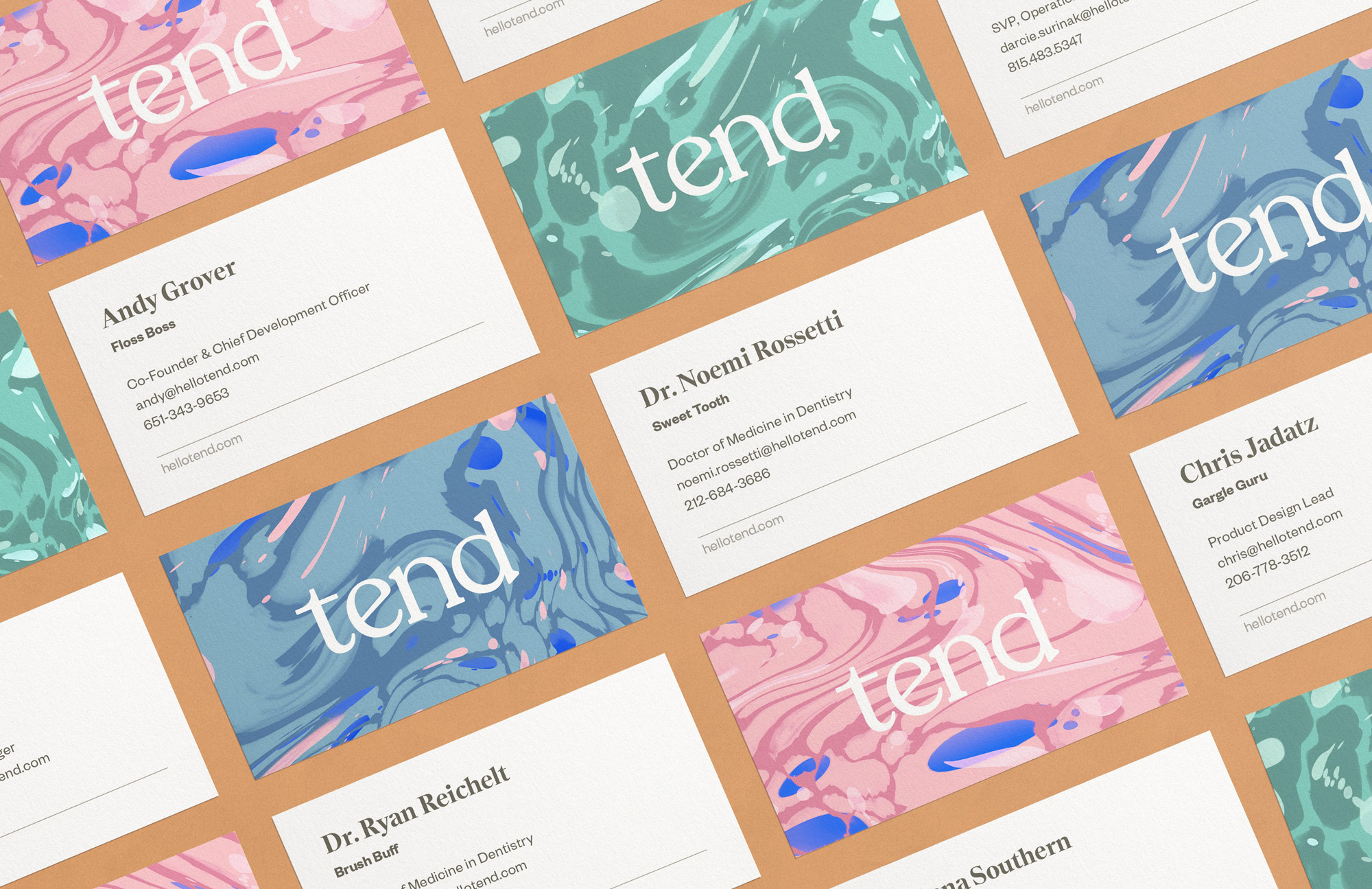
Our color palette is friendly and approachable. Warm, muted colors create a sense of calm. Our greens add credibility by evoking medicine, which has been associated with green for more than a century.
Starting with the logo, this identity exudes friendliness, approachability, and calmness. There isn’t much to philosophize about the logo: it’s a straight-up wordmark in lowercase in a very nice serif. It’s not concept- or industry-driven, it’s simply very pleasant to look at, which I guess is a concept in itself. This could easily be the logo for a lifestyle publication or artisanal shampoo, which may sound like a putdown but it’s not meant to be… I think Tend knows who its audience is — image- and experience-minded New Yorkers — and is catering well to it.
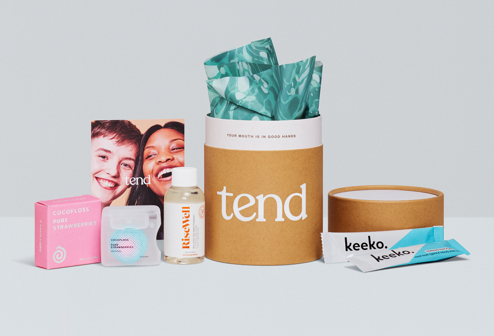
We have a unique pattern inspired by brushing, swishing, and swirling. It celebrates the sensory richness of everyday oral wellness routines.
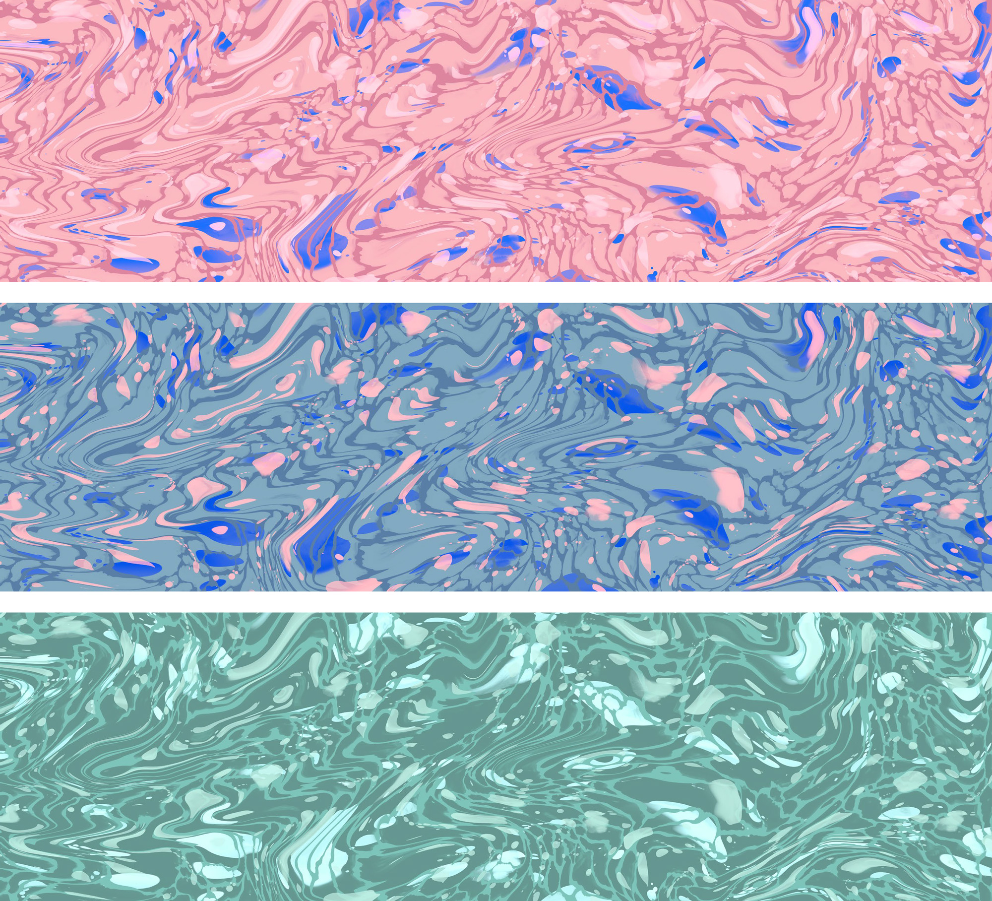
At first I wasn’t sure of the pattern. Like, the last thing I want to think about is that substance swirling in my mouth but in application, as you will see, it’s pretty cool.
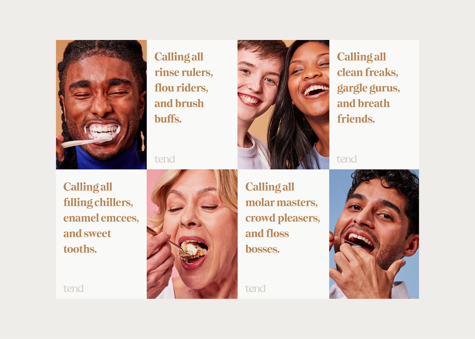
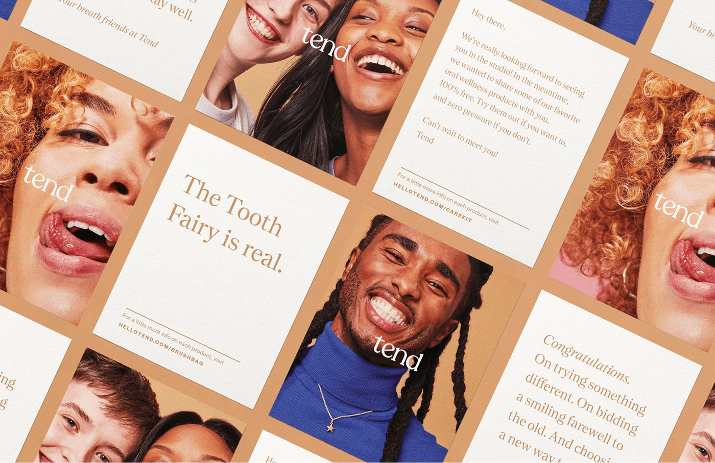
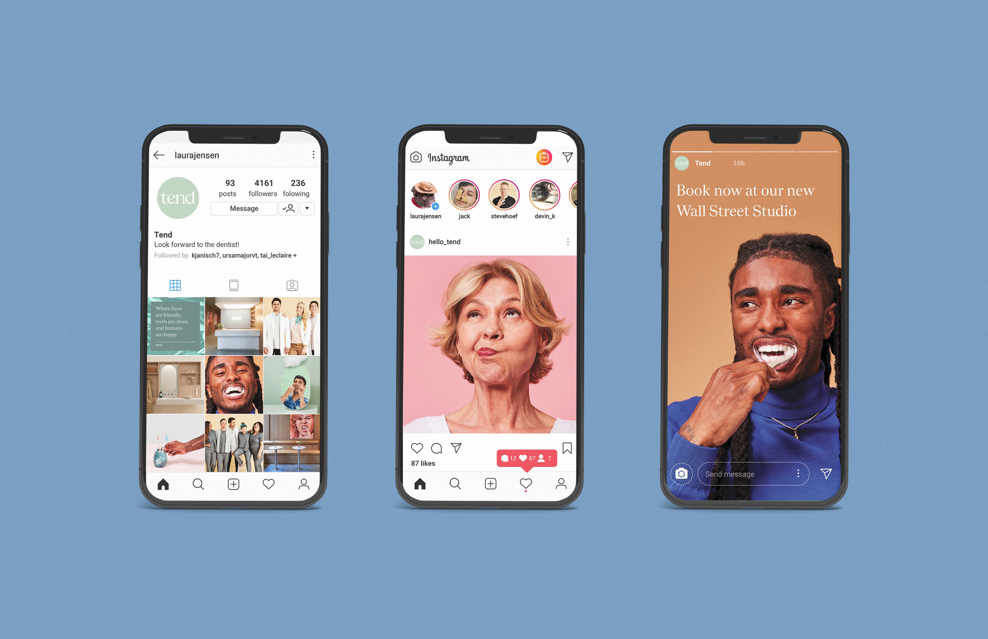
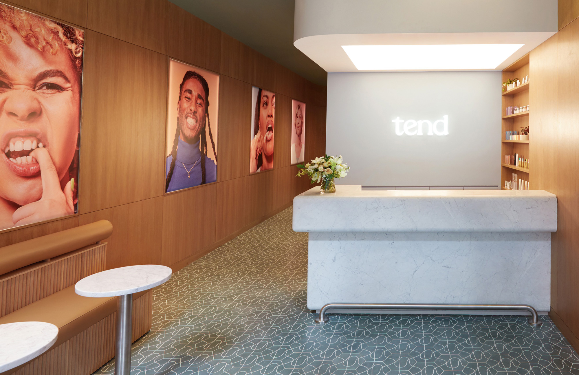
In terms of communications applications, things are fairly straightforward by big close-ups of smiling people portrayed through really good photography and simple, elegant typography. The copywriting is pretty great, making going-to-the-dentist sound like something even remotely exciting.
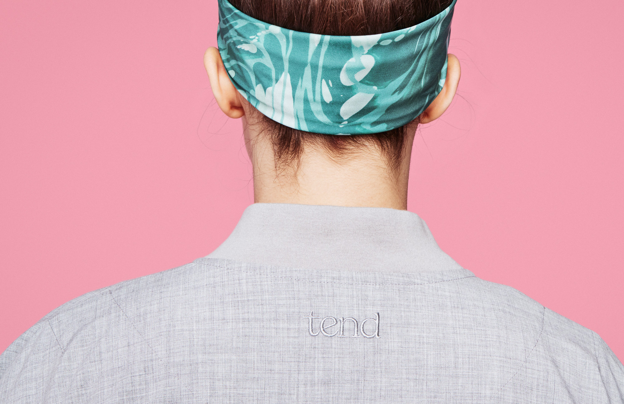
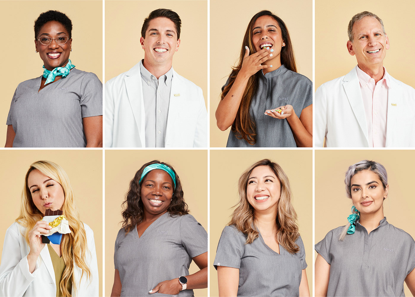
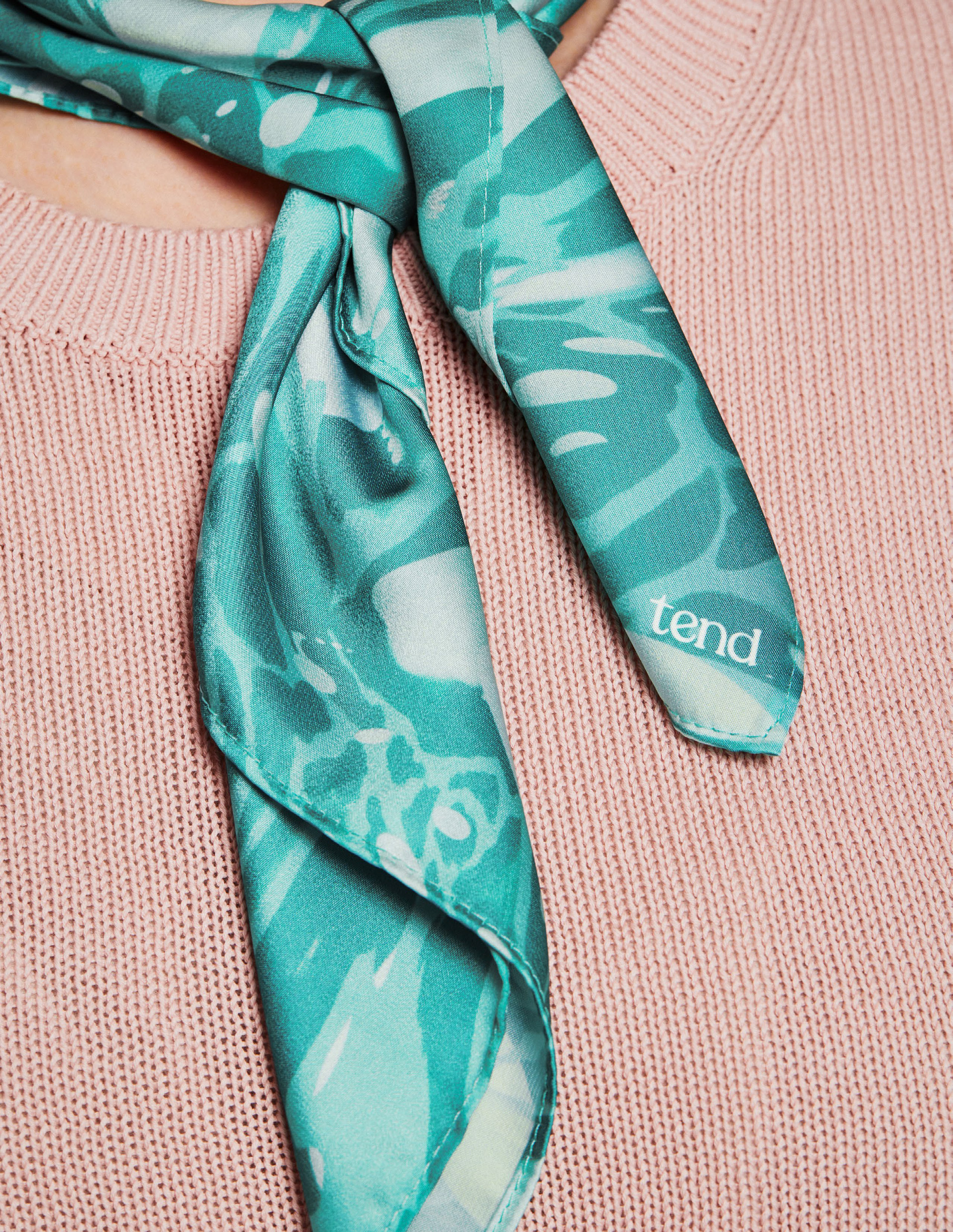
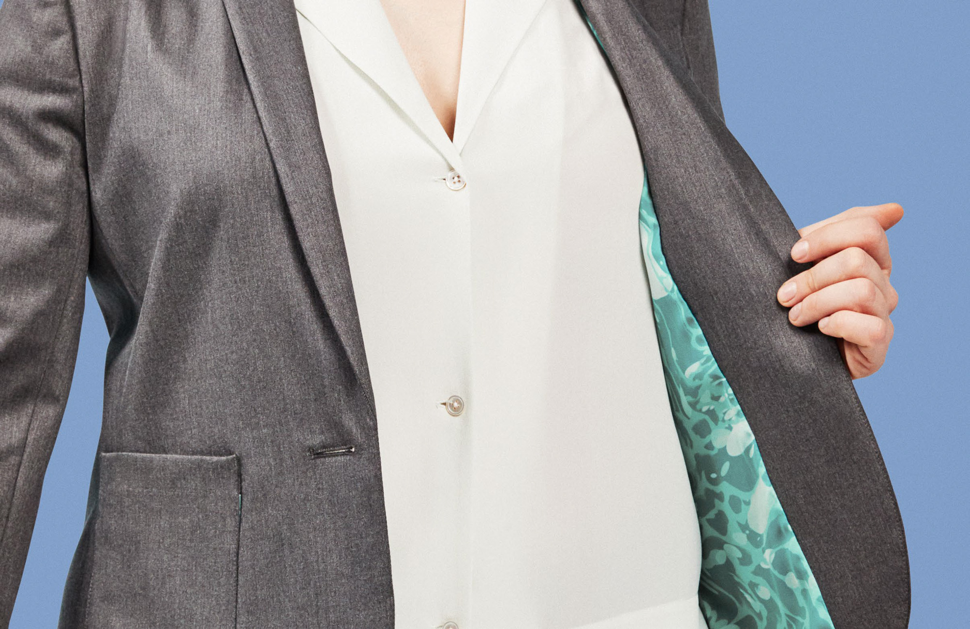
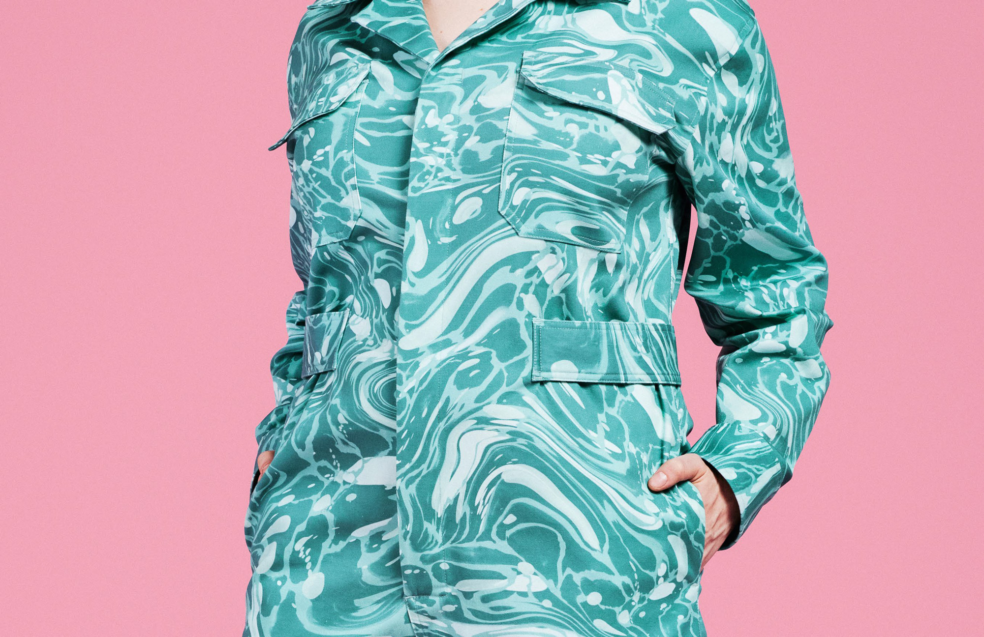
The identity gains a lot of strength in the physical experience, starting with the staff uniforms, which are absolutely great. The grey scrubs have a lovely texture and provide a neutral backdrop for the green pattern accents of the scarfs and liners. Or, as is the case above, the uniform can be a giant accent on its own with a full-on pattern jumper.
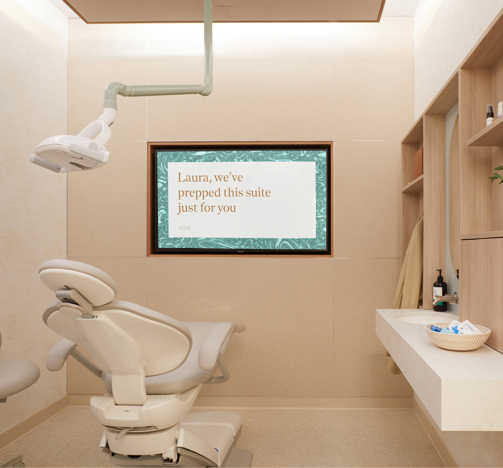
Our architectural and interior design elements are designed to ease anxiety. Green tiles with a winding, floss-like pattern. Walles with a toothpaste-like texture. A custom fragrance, “Bergamist,” calms and refreshes. The Brushery is an entirely new concept. It’s a space just for freshening up, with our pattern on the walls and blue-green sinks and shelves that play off of it.
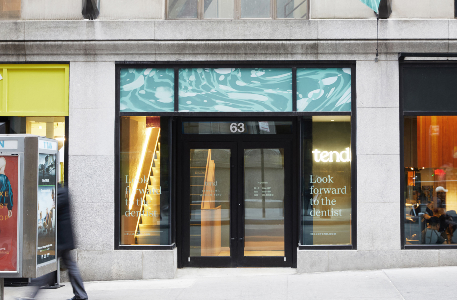
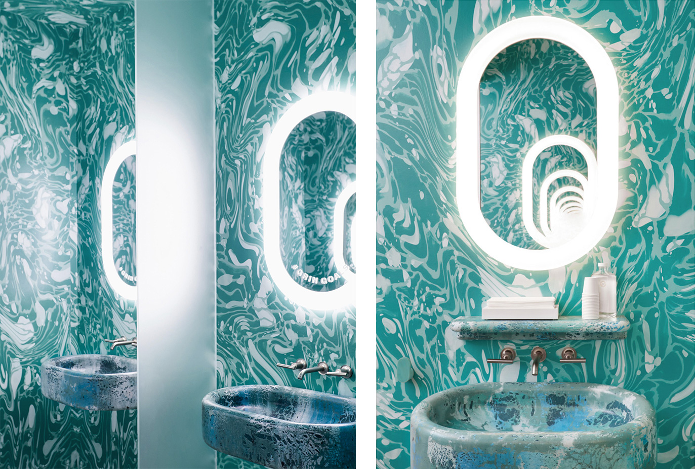
The interiors get a little pretentious for my taste — I’ll admit that my taste can sometimes be too frugal for my own good — but they are definitely attractive, pleasant, and no doubt come across as an elevated experience from your everyday dentist. The “Brushery” is just wild — I’m still undecided if it’s the stuff of dreams or nightmares but I’m digging it.
In general, I’ll admit that I roll my eyes a little bit about this because I don’t think every experience in life has to be Instagram-able but I’ll also admit that that’s MY personal view and is in no way more or less valid than anyone who does value this different kind of experience. Having said that, as a design and identity and brand experience, this is so well done and done with so much attention to detail that you can’t really fault anyone for Instagram-ing the floss out of this.
 each year since publication began in 2006

 Новости Союза дизайнеров
Все о дизайне в Санкт-Петербурге.
Новости Союза дизайнеров
Все о дизайне в Санкт-Петербурге.