Обзор лучших ресурсов по разработке бренда, разработке упаковки
contact us | ok@ohmycode.ru
contact us | ok@ohmycode.ru
Established in 1929, Mystic Seaport Museum (previously Mystic Seaport only) is the largest maritime museum in the U.S., located in Mystic, Connecticut. The Museum’s grounds cover 19 acres along the Mystic River and include a recreated New England coastal village, a working shipyard, and exhibit halls and storage facilities that house more than two million artifacts that include over 500 historic vessels, hosting approximately 284,000 visitors annually. Yesterday Mystic Seaport Museum introduced a new identity designed by New York, NY-based Carbone Smolan Agency.
The new identity and visual system sets the Museum apart from other local Connecticut attractions and broadcasts to visitors the value and importance of its exhibitions and collections. Using a combination of maritime and historical references paired with a contemporary visual style, the Museum’s identity invites new audiences to connect with the sea.
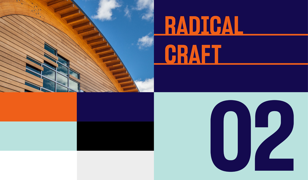
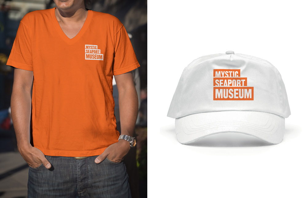
The new logo places emphasis on the word “Museum,” as the key differentiator amongst other businesses in the area. The logo shape mimics several elements present on site: the planks of a boat, waves breaking on the shore, and the shape of the Thompson Exhibition Building on the Museum campus.
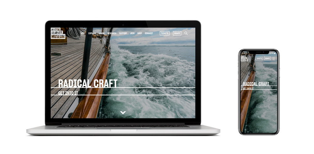
The old logo was pretty decent with a rugged, aged serif that conveyed the historic aspect of the museum and some good, red and white stripes underneath that conveyed America-ness. The new logo is a fairly drastic departure that moves away from the quaintness of the old one in favor of a much more contemporary, relatively more abstract interpretation of what the museum is about. The logo is meant to represent a combination of a boat’s wood planks and waves breaking, which it sort of does but in a way it also doesn’t at all, which I think is fine and allows people to read or not read into it. The execution is solid with a nice increase in size of type and plank as the logo moves from background to foreground. Its biggest strength and most attractive feature is its ability to work as a window (as seen on their website) with the letters letting the background in and creating a cool texture inside the logo while retaining good readability.
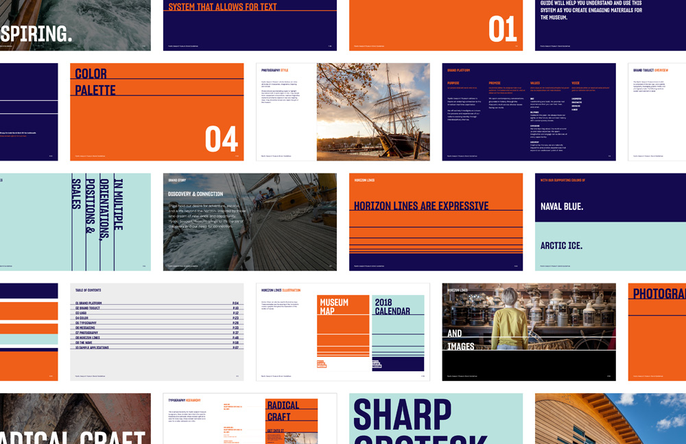
The Nautical Orange references the pop of color that ships have used historically to call attention to details and important information. The typeface, Sharp Grotesk, is a reference to 20th century American wood type with modern Swiss styling. The flexible graphic system of Horizon Lines are used to divide text, frame content, and compliment imagery.
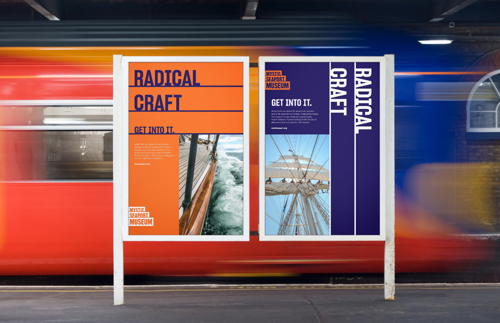
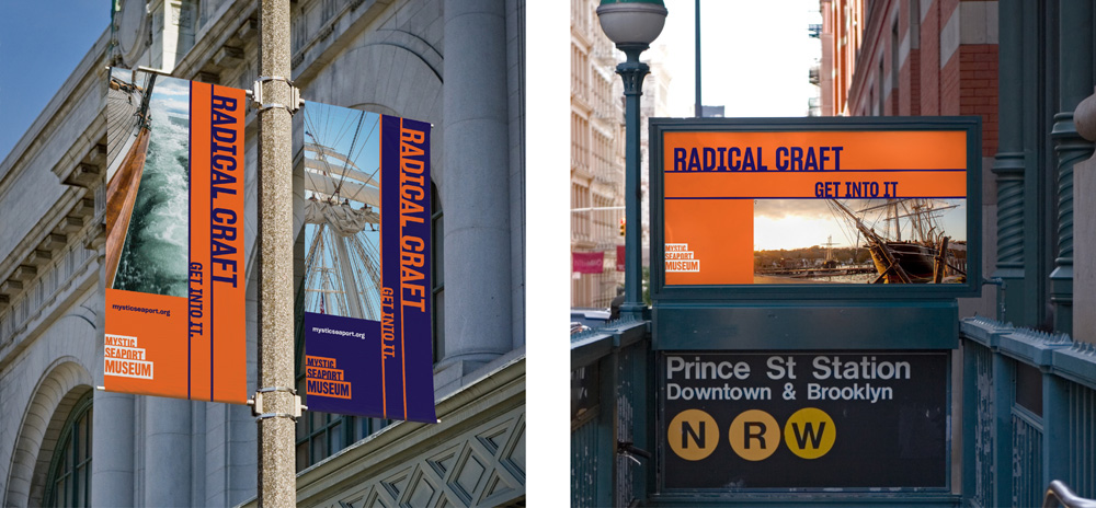
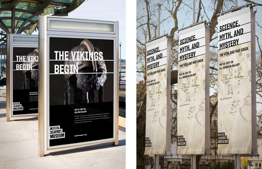
The applications rely on horizon lines as the main identity element and while that’s not a bad idea, there is something that feels dated about it while also losing the depth and layering established by the logo. The slab-serifed “I” in Sharp Grotesk is probably part of the problem for me. The main color palette of orange and royal blue is also off… I would have loved to see orange and brown (because ships). The same elements improve on the Vikings-specific ads, with a better color palette and better integration of image, type, and logo.
Overall, it’s a positive change that positions the museum less as a quaint attraction and more as a contemporary cultural destination with a strong logo and a semi flexible system that can adapt to different exhibits — the identity just needs stronger winds behind its sails… or whatever sailing metaphor makes more sense for saying that the identity could be a little better.

 Новости Союза дизайнеров
Все о дизайне в Санкт-Петербурге.
Новости Союза дизайнеров
Все о дизайне в Санкт-Петербурге.