Обзор лучших ресурсов по разработке бренда, разработке упаковки
contact us | ok@ohmycode.ru
contact us | ok@ohmycode.ru
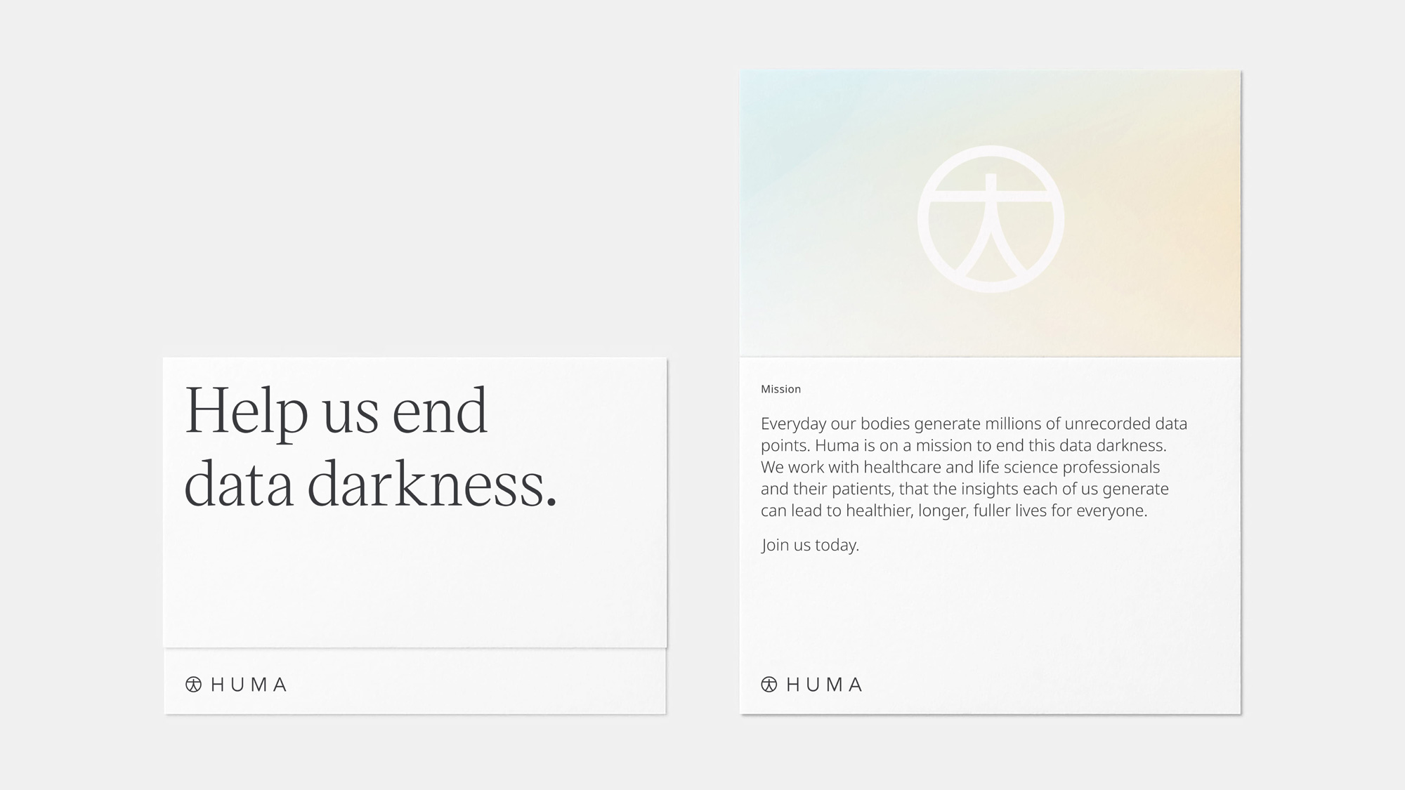
Established in 2011 (as Medopad), Huma, headquartered in London, UK, is a global health tech company that partners with scientists, technologists, healthcare, and pharma professionals to understand, treat, and help prevent poor health. Their main focus is on the collection and distribution (among doctors and health providers) of patient data captured through wearable devices and parsing of digital biomarkers through their own app into usable insights. This month, Huma introduced its new name and identity, conceived and designed by London-based Koto.
Huma is a benevolent and lucky mythological bird and symbol of Persian history. Immortal, it’s said to renew itself in fire like a phoenix. It never comes to rest, living its entire life flying invisibly high above the earth. It has both male and female natures in one body, and a glimpse of its shadow will make you happy for the rest of your life. Intentionally related to ‘human’, the brand’s name reflects our dedication to the lives of everyone.
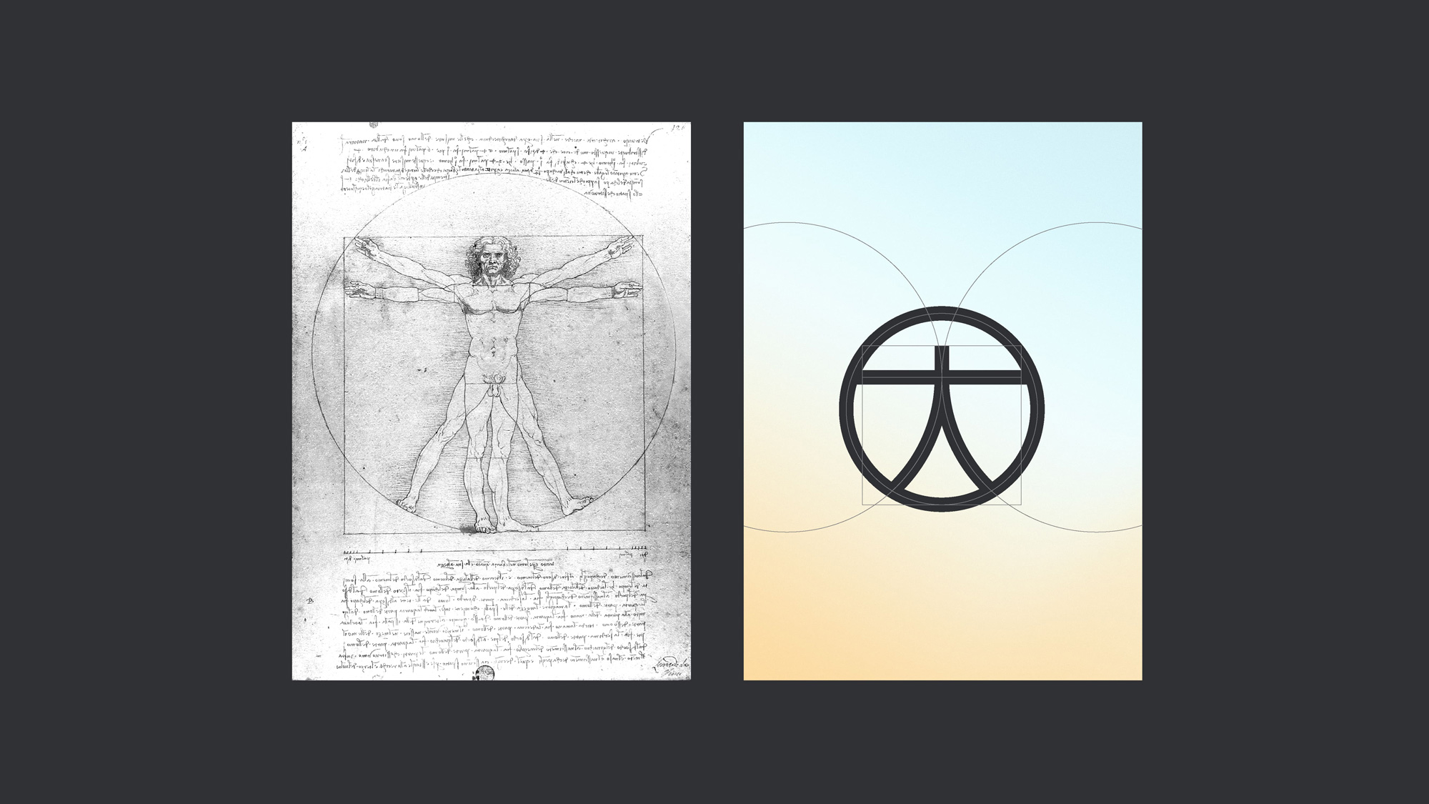
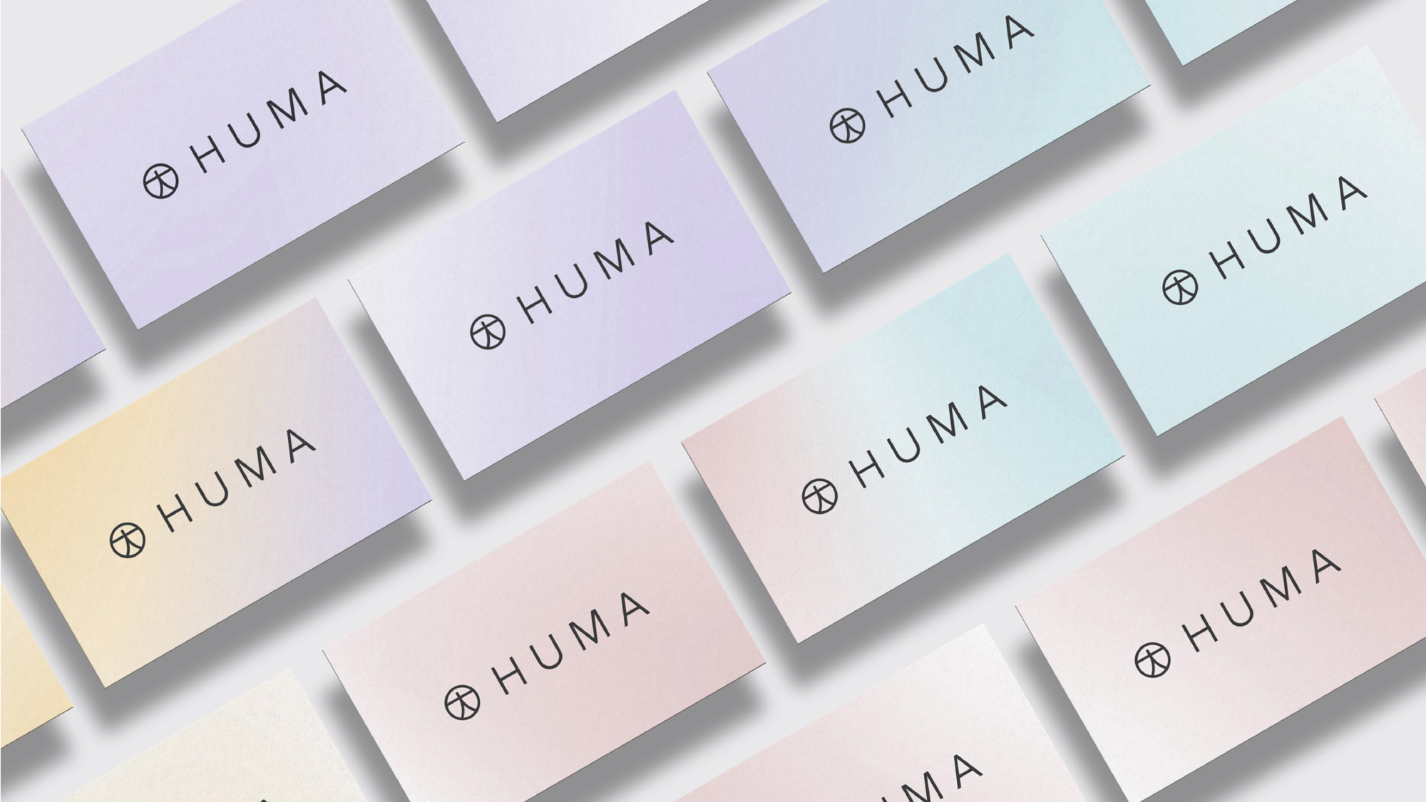
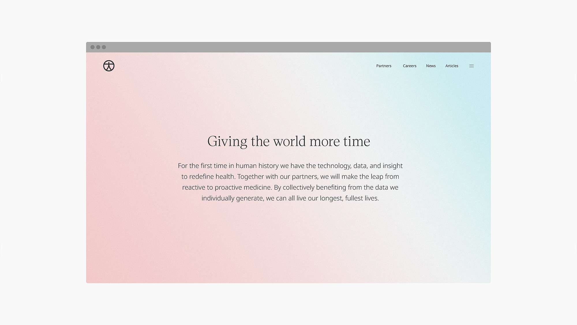
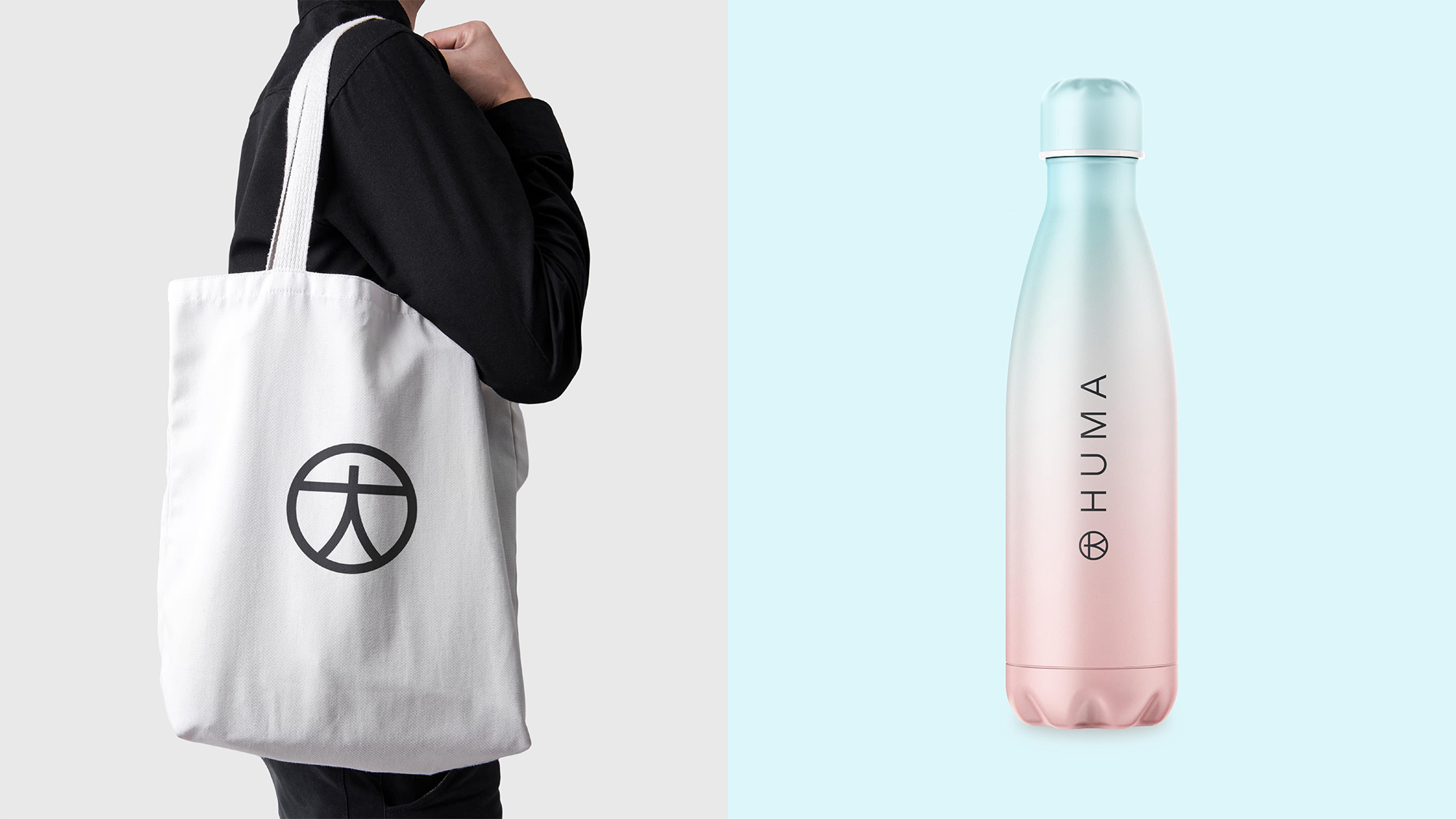
The logo reflects Huma’s focus on the health of the whole person, with a form based on the proportions of the ‘Vitruvian Man’ by Leonardo da Vinci, a universal symbol of humankind. It’s designed to work at all scales, from tiny spaces like an Apple Watch to future marketing needs.
The old logo was pretty dry and cold in its light gray, thin sans serif that had a hint of one of those Black Mirror companies that look like they are all bliss but they are actually all evil and the name didn’t help make it any more relatable. The new name proves that you can’t spell HUMAN without HUMA and aside from my lame sarcasm, it’s a great name as it instantly establishes the intended connection — that this is about humans. The additional narrative of the Persian mythology bird adds a nice layer of significance.
Sparked by the name, I immediately understood the icon as being an abstraction of the Vitruvian Man drawing — not because I’m that smart but because the icon captures the general proportion of the well-known drawing so well. It’s a very nice icon and has the simplicity of something as iconic as the peace symbol while being fairly unique. The generously letterspaced wordmark works very nicely with the icon and while it still has that same Black Mirror-esque feeling as the old logo, this at least looks like the high-end, Apple-esque version.
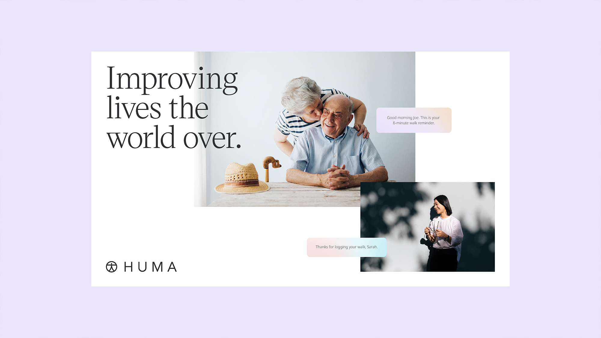
The colour palette inspired by meteorology adds warmth and a sense of calm to brand communications. The combination of warm and cool gradient hues are a breath of fresh air and a refreshing change from competitors in the healthcare space. A clear sky felt at apt metaphor for those who are returning to a life lived to the fullest.
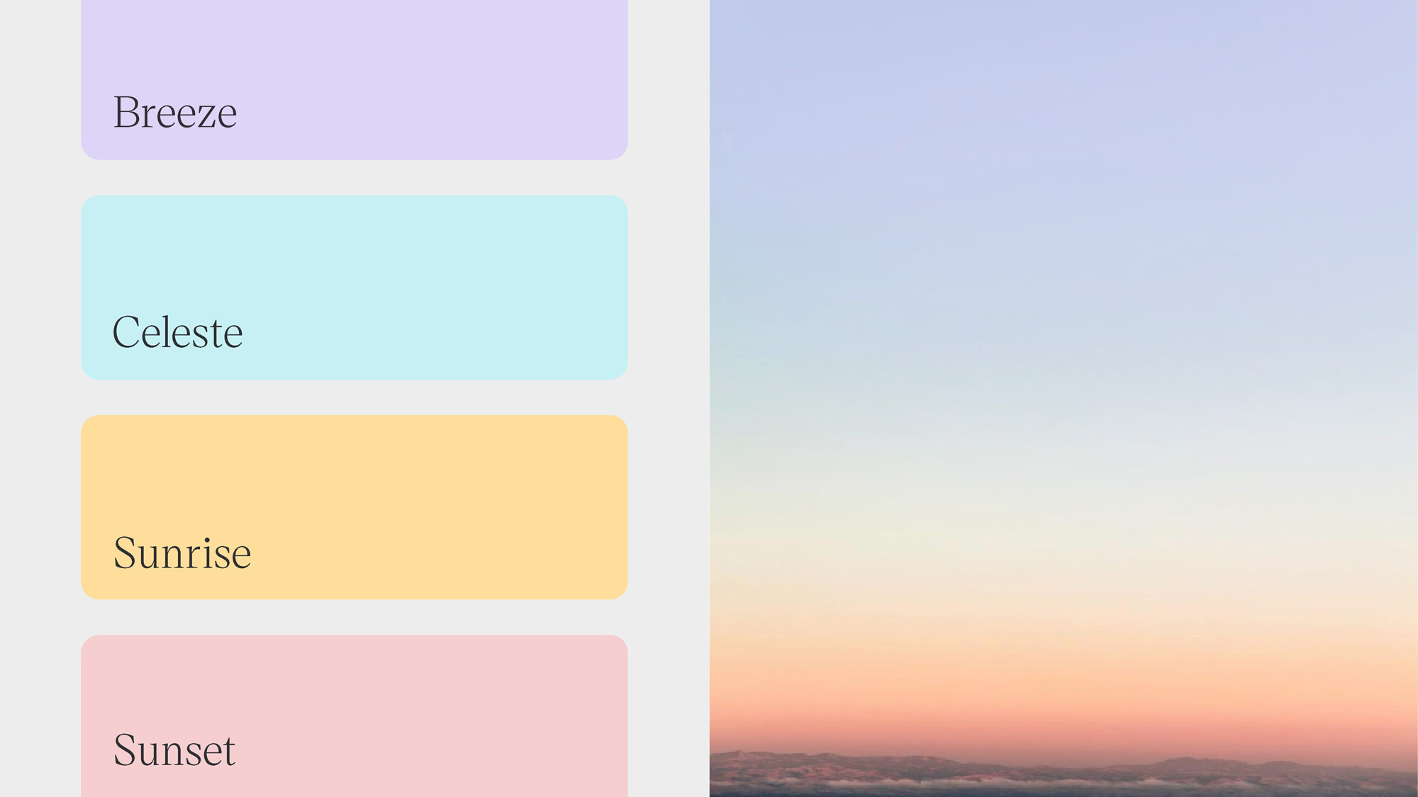
The pastel color palette is quite pleasant but I know many readers here have worn tired of it. To be honest, I’m still a fan of these kinds of color palettes, so I dig it. Turning those colors into gradients is nothing novel and it works here as well as expected.
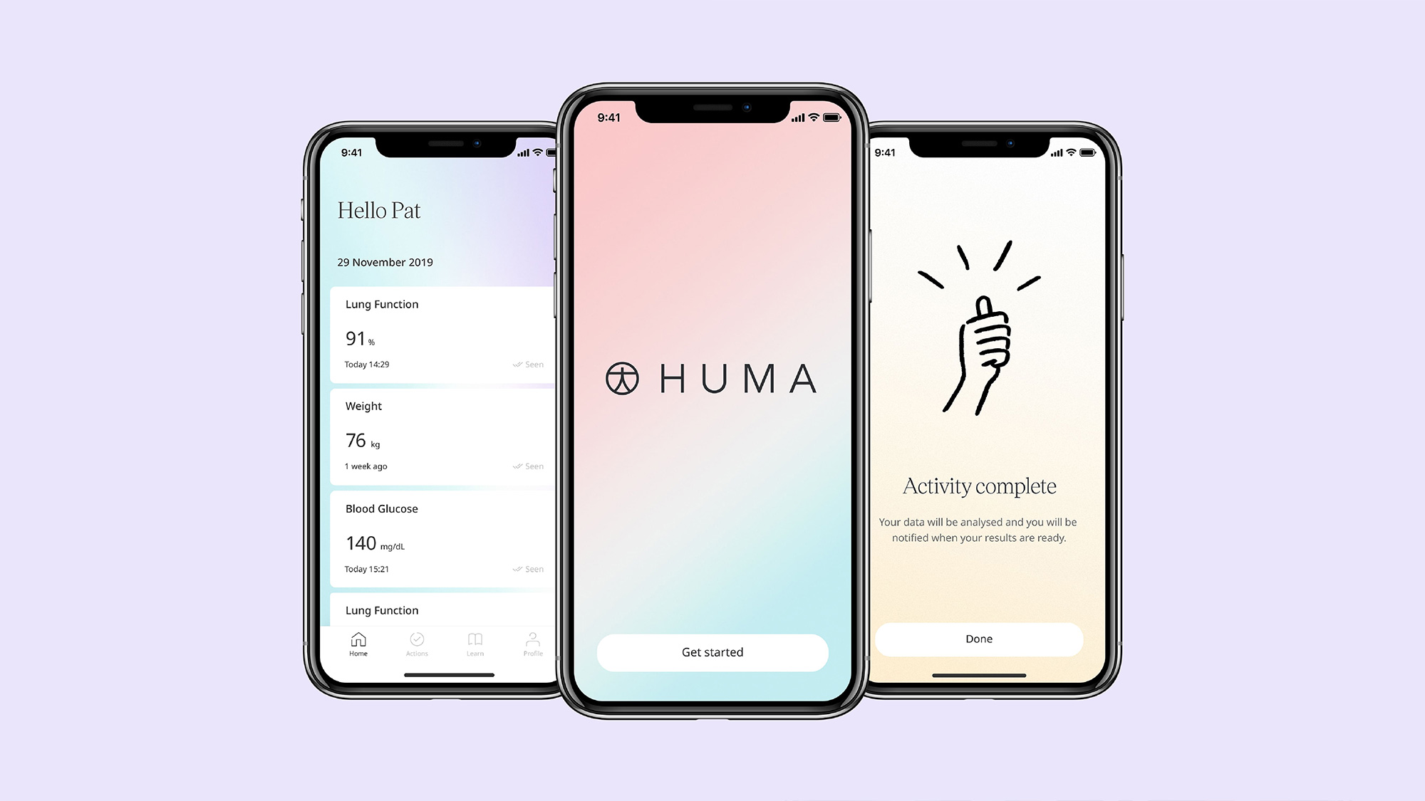
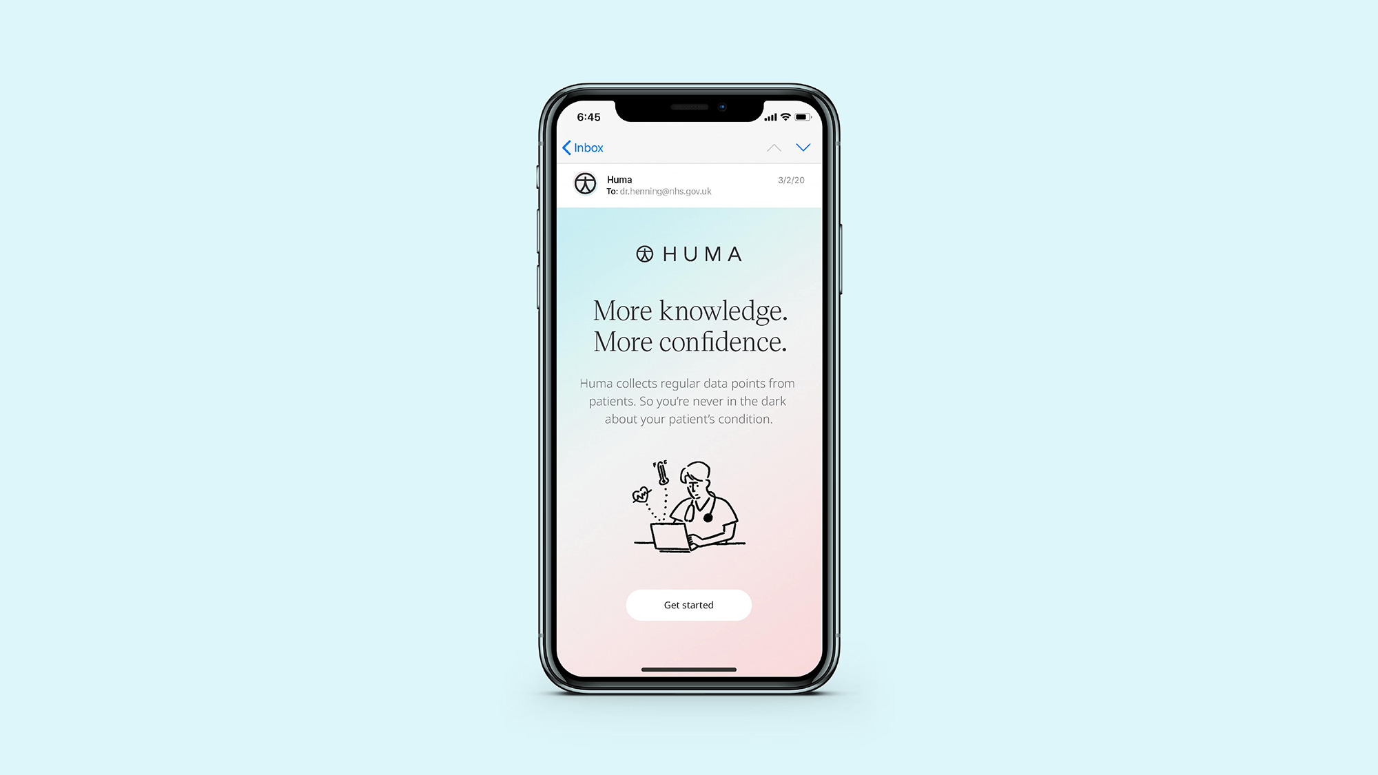
To humanise the digital experience we worked with Tokyo-based illustrator Yu Nagaba to develop some charismatic illustrations capturing clinicians, patients and their families. These characters appear throughout the app and digital experience, adding a sense of warmth, relatability and optimism.
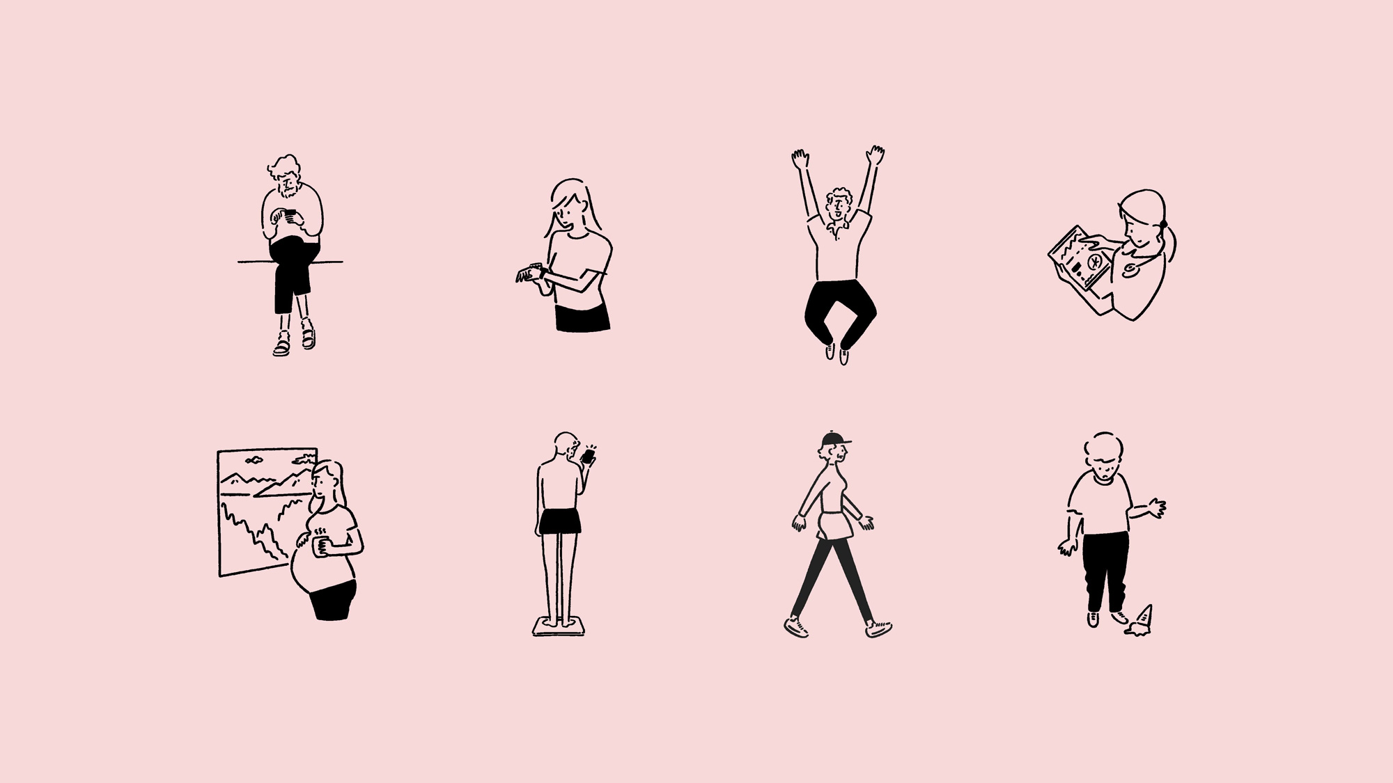
The illustrations are really charming and have some nice texture to them to make them different from the usual line-art illustrations but, as you scroll through the applications, they seem a little off from this project. Like, the identity is very crisp and precise and the looseness of the illustrations doesn’t quite blend in. Still, on their own, and particularly on the pastel colors, they look great.
We worked with Christian Janský at Kometa on a customisation of Victor Serif. The font was chosen to deliver a trusted feeling utilising the semiotics of periodicals and other sources of knowledge. Noto was used for body and general use.
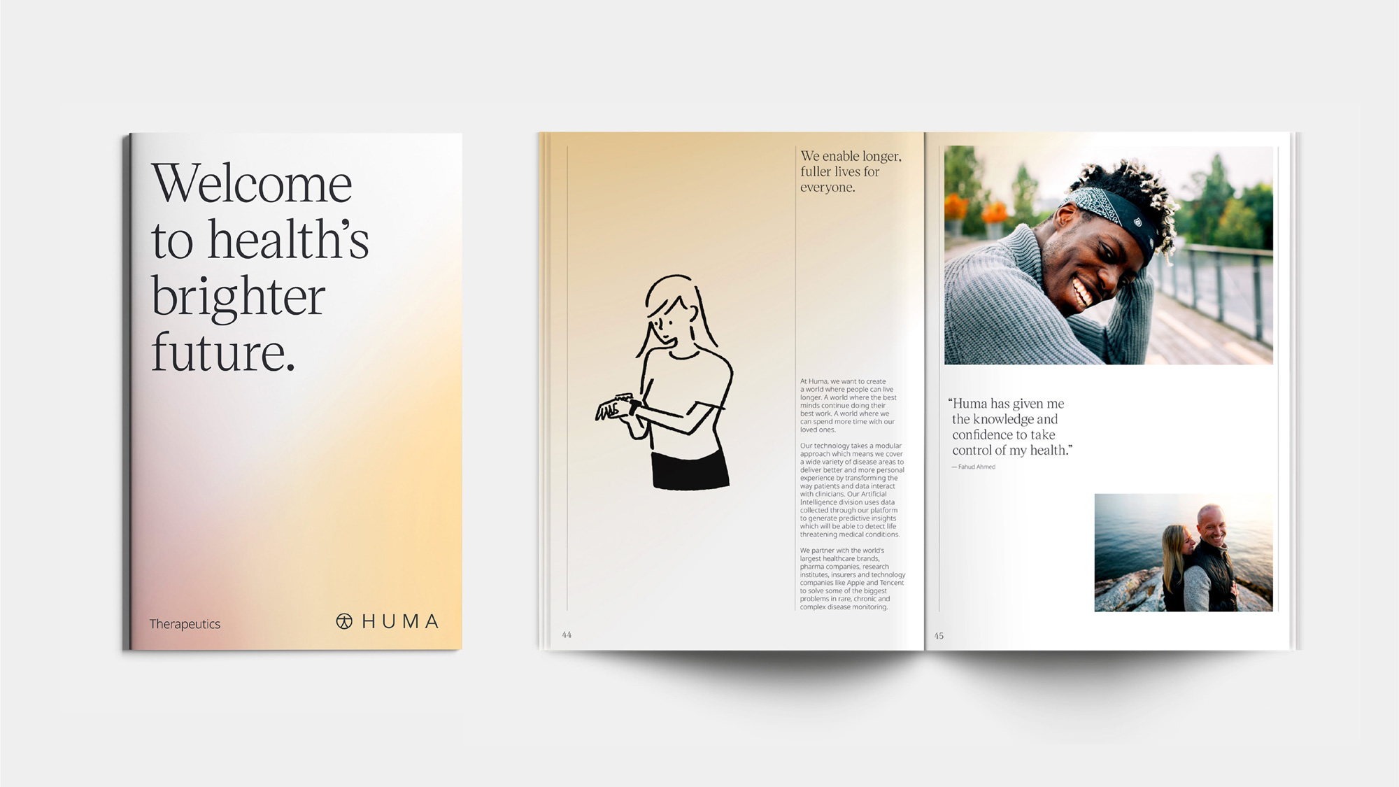
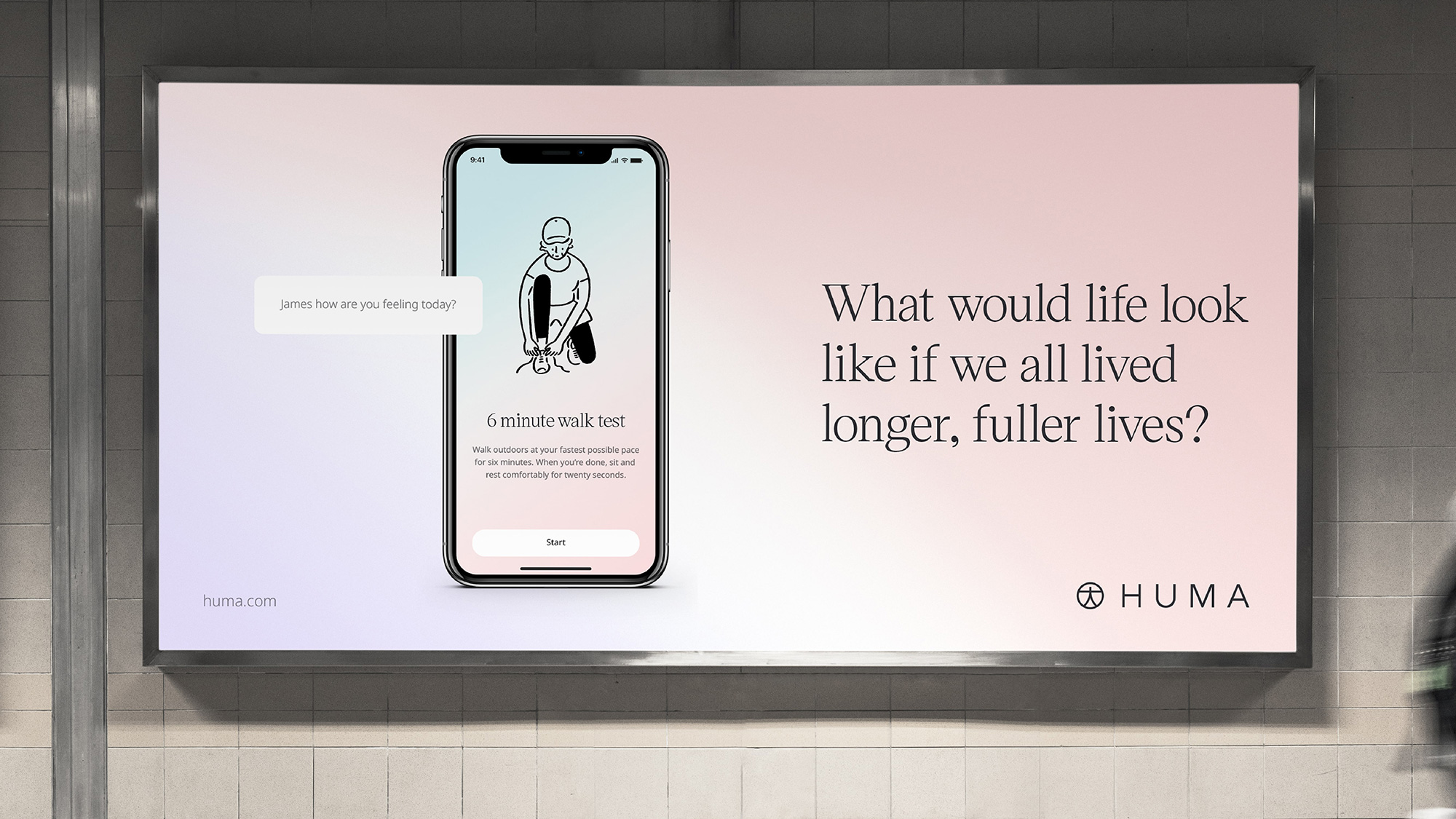
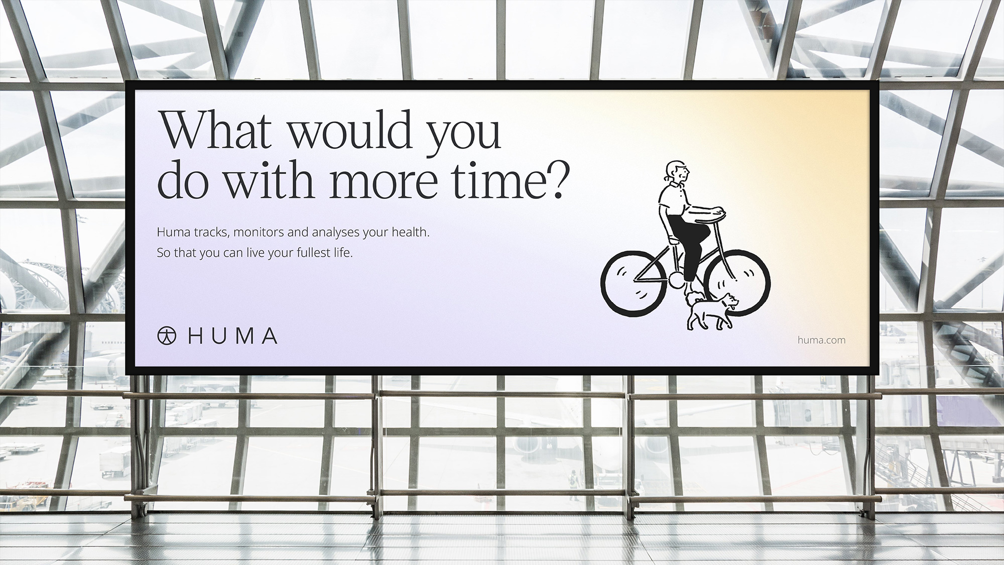
The applications look very good and convincing, especially with the addition of the sharp light serif — which sidesteps the spiky extra bold serif trend — that adds (or, I guess, subtracts) to the airy, ethereal feel of the applications. I think the applications with photography work better than the illustrations as they help, well, humanize the messaging, which can feel ambiguous at times.
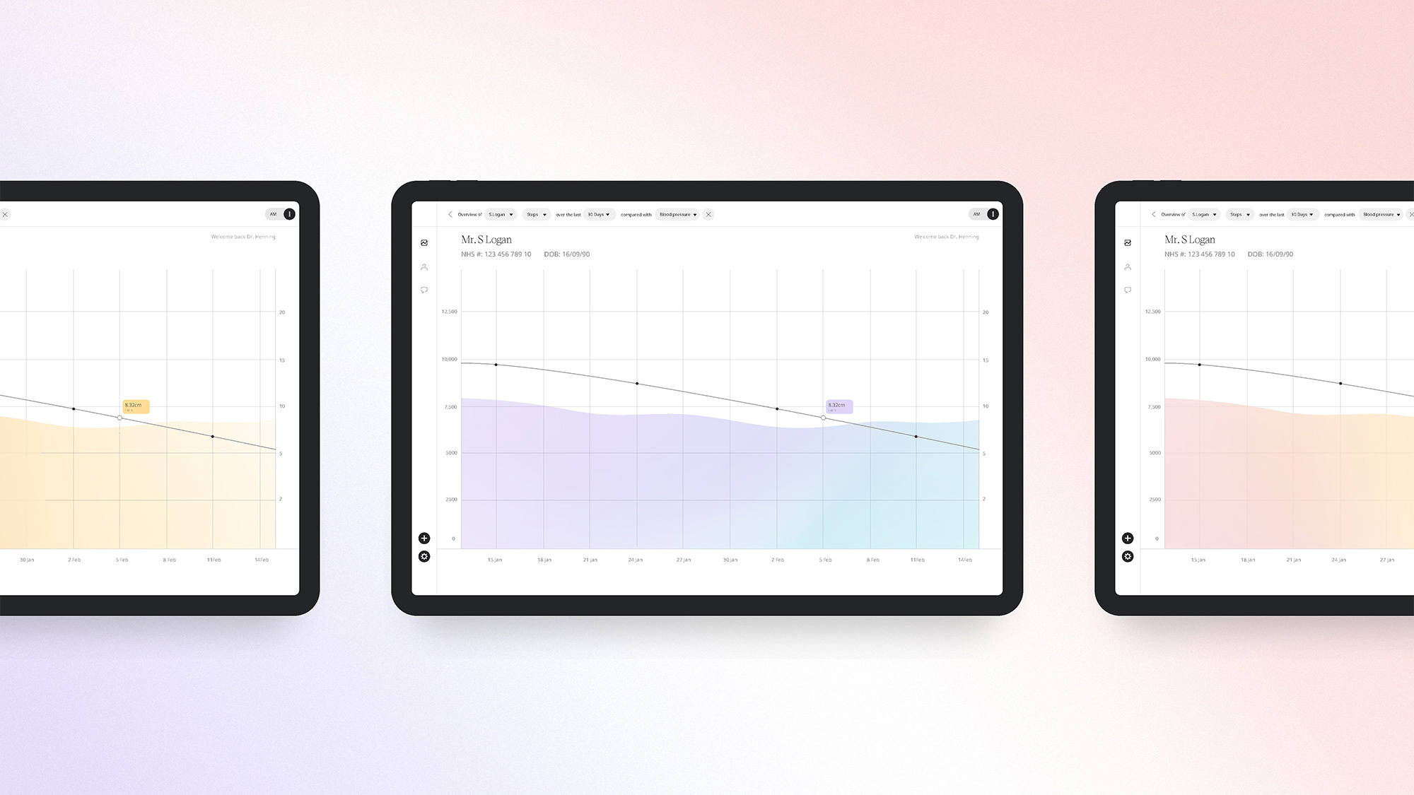
Overall, this is all expertly crafted and presented and what’s really well done is how well this identity works for both patients and healthcare providers, looking reassuring and comforting for the former and professional and innovative for the latter.
 each year since publication began in 2006

 Новости Союза дизайнеров
Все о дизайне в Санкт-Петербурге.
Новости Союза дизайнеров
Все о дизайне в Санкт-Петербурге.