Обзор лучших ресурсов по разработке бренда, разработке упаковки
contact us | ok@ohmycode.ru
contact us | ok@ohmycode.ru
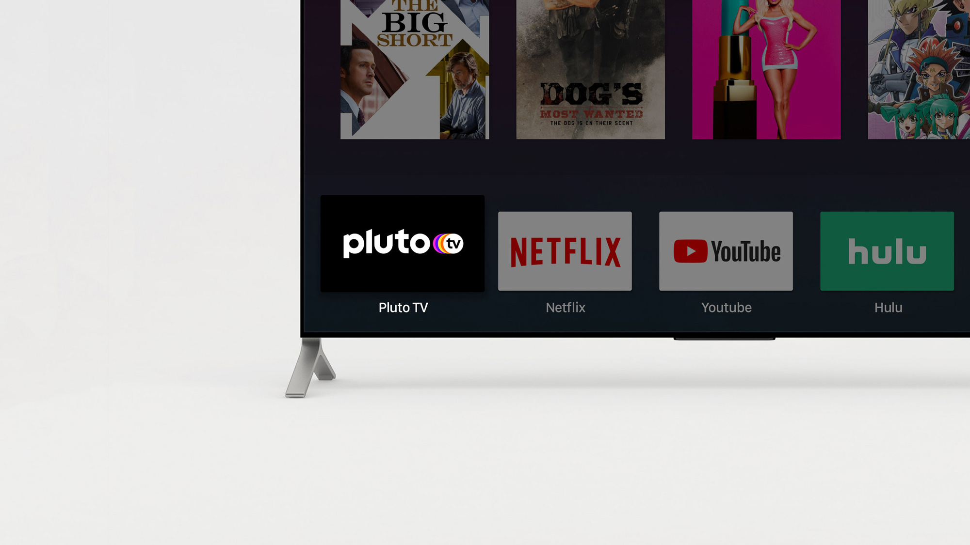
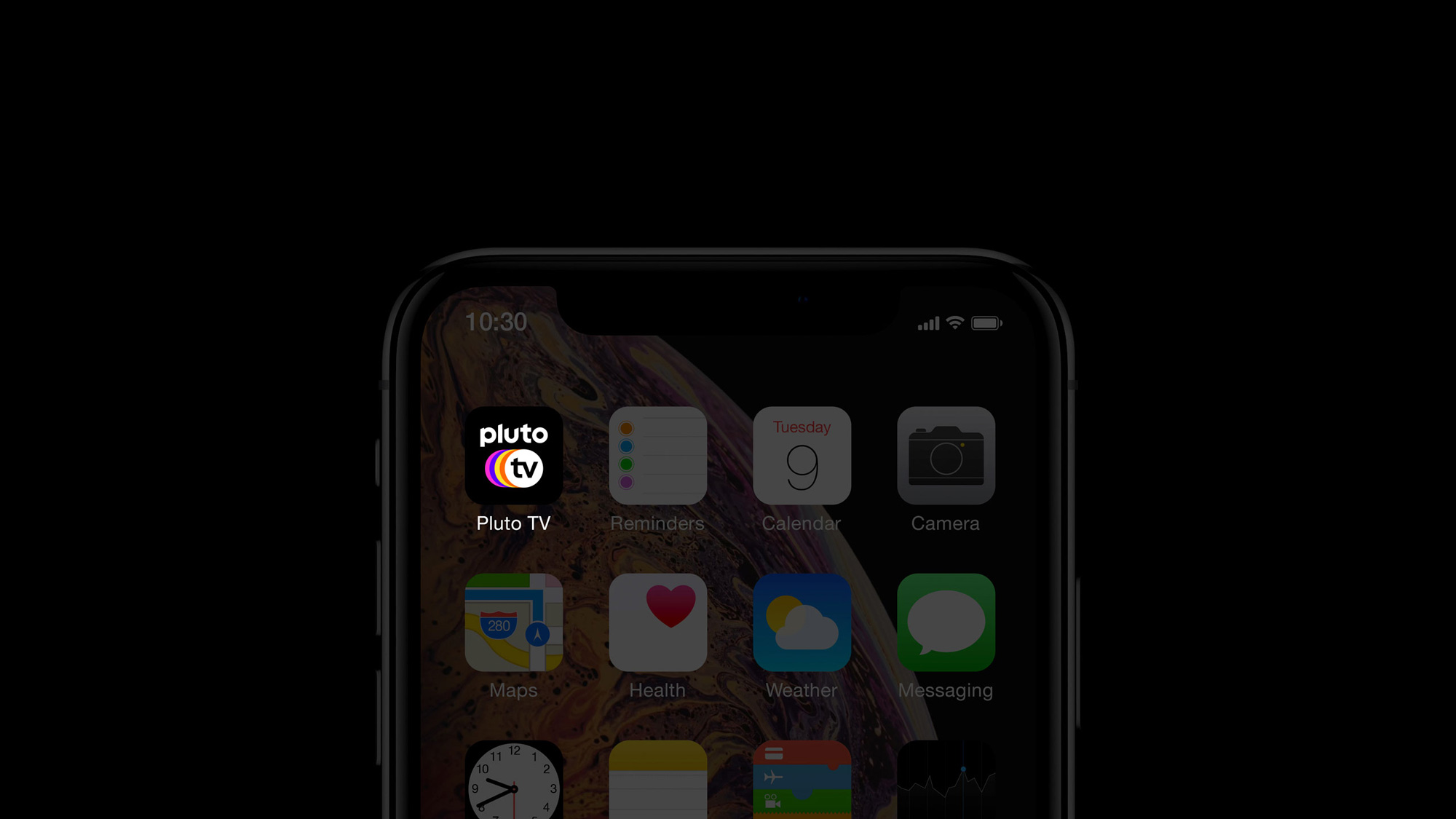
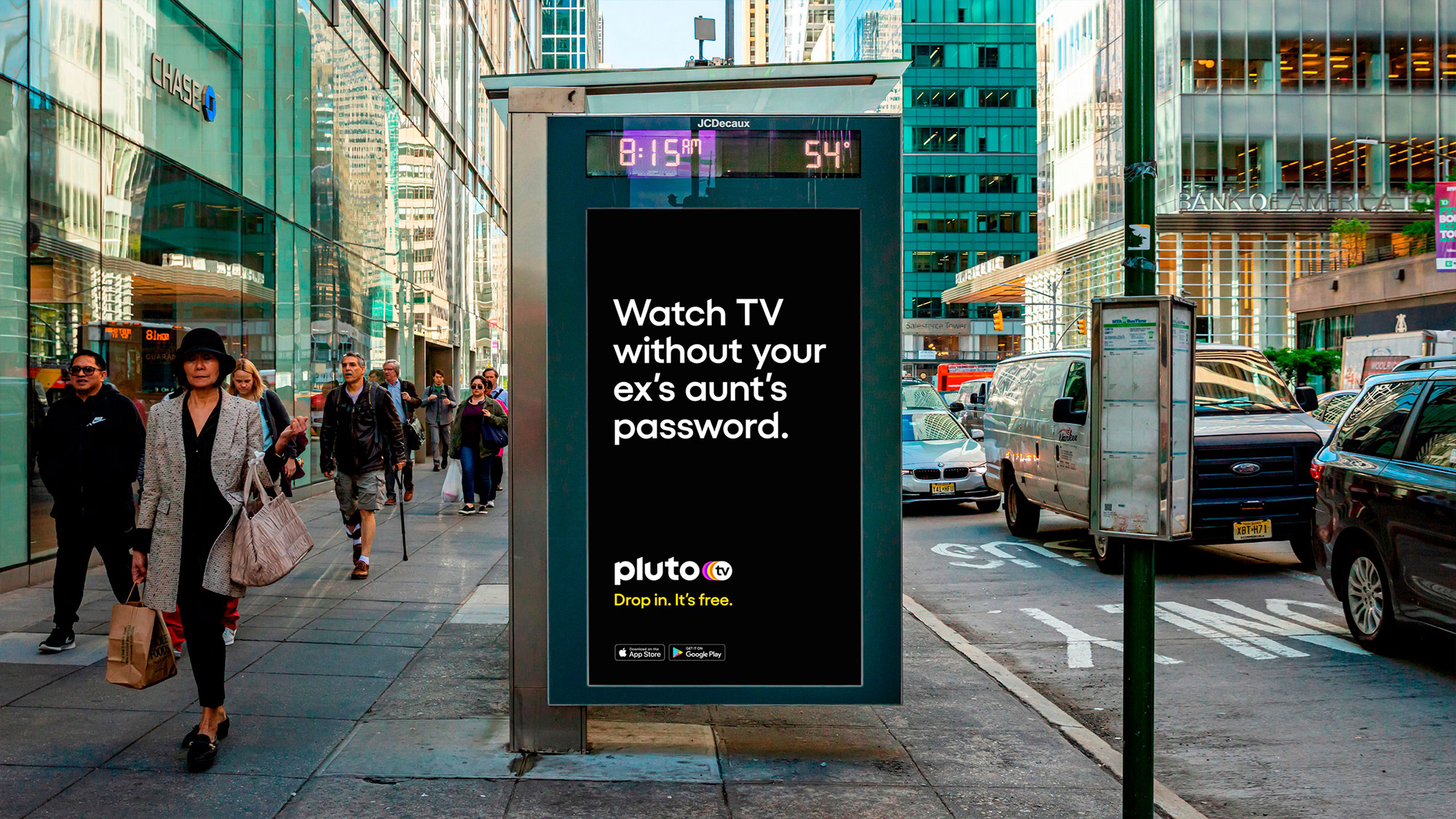
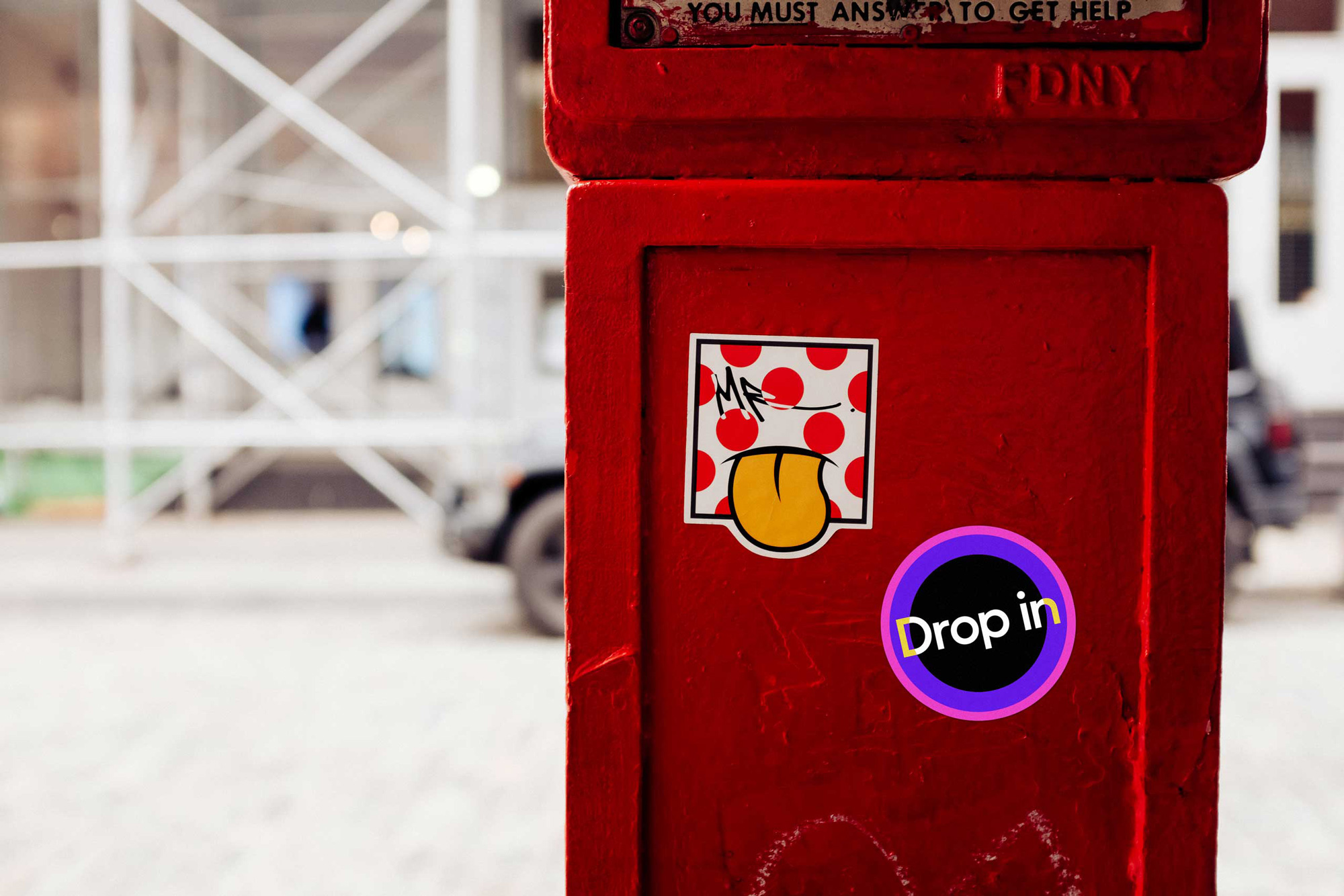
Established in 2013 and launched in 2014, Pluto TV is a free streaming television service in the U.S. supported by advertising — so no “skip ads” button on this. Pluto TV licenses its content directly from providers (movie and TV studios) and offers over 250 channels from more than 170 content partners to 20-plus million monthly viewers. One big benefit of Pluto TV is that, as its tagline prompts, you can drop in on the website and start watching without an account or logging in, you simply choose from “live” content as if it were normal TV — or, if you can’t handle living that dangerously, it also offers its content on demand. In January of 2019, the service was acquired by ViacomCBS which added popular content from properties like Paramount Pictures, Nickelodeon, BET, Comedy Central, VH1, Logo, TV Land, and MTV. Earlier this year, Pluto TV introduced a new identity designed by London, UK-based DixonBaxi.
A logo crafted to feel premium and legible. Capturing the brand’s quirky personality while still fitting neatly with many other identities across the channels (MTV, CNN, etc.), and standing out as an icon on a TV or mobile device. With angular cuts that suggest forward momentum, a vibrant colour trail and tv icon rooted in the planetary origins of the brand, the new logo is a memorable visual mnemonic.
I included the logo redesign in the Spotted section when it was first announced so there was no color commentary which I am here to provide today. The old logo was generic but fine, in a decent sans serif with the “TV” in a circle the same size as the “O”, which in my mind I keep reading as “PLUTOO” and it makes me laugh. The new logo switches to all-lowercase in a very short-ascender-descender sans serif with hard cuts in most of the letters, which makes for a slightly uncomfortable wordmark that’s very nice and round-y on the bottom but very harsh and unnatural on the top — the “p” and “u” are particularly hard to enjoy. The colorful circles behind the circle with “tv” — also uncomfortable as a ligature in lowercase — add some visual joy to the logo and it’s the one memorable aspect of the logo. A single-color variation of the logo removes the four circles, which brings us back to “plutoo” and while it’s mostly fine I kind of wish they would have found a way to translate the four circles into a single color — it’s probably the one time where some swooshes would have been in order. So, the short of it is that I am not a big fan of the logo but its application and expansion into motion is pretty great and we’ll get to it in a few scrolls.
We crafted a distinct custom typeface in eight weights, in collaboration with Martin Vácha from Displaay, allowing it to adapt to a myriad of scenarios and still retain absolute legibility. With angular cuts and clean, geometric forms that echo those in the new logo, the new typeface exudes simplicity with idiosyncratic details that reflect Pluto TV’s character.
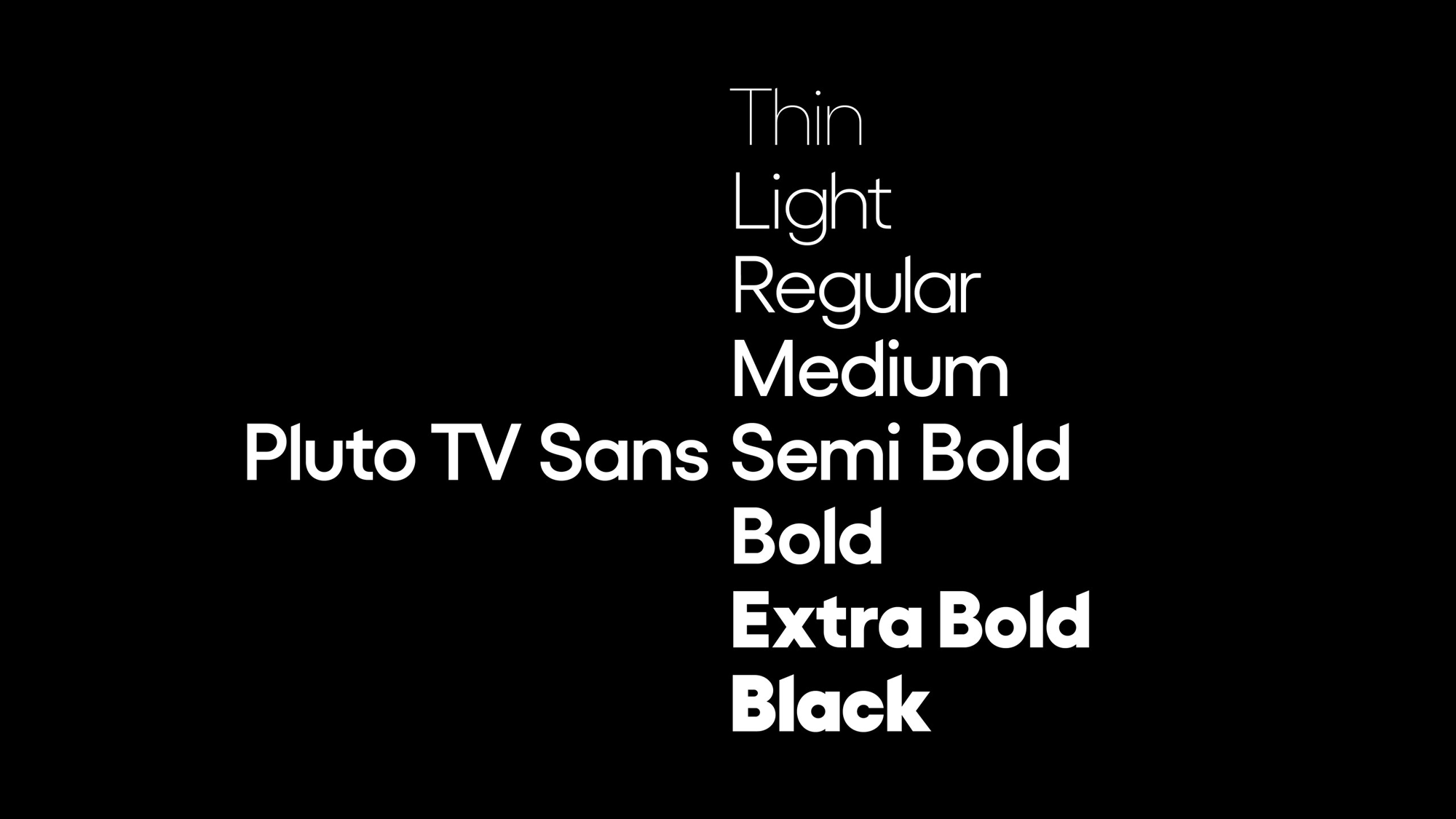
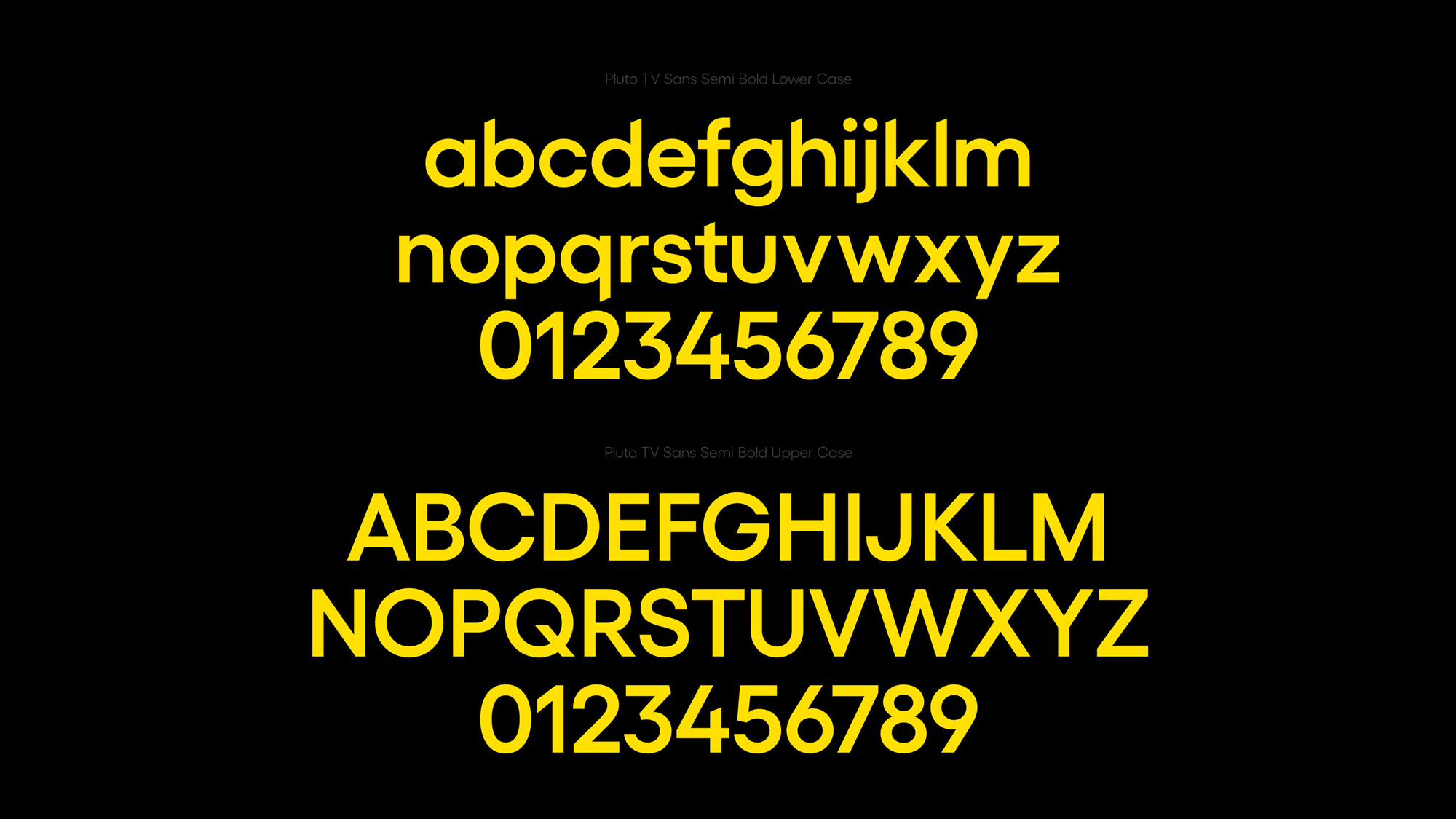
The custom type family designed with Displaay is fine — I’m not sure how distinct it is other than the cut angles in the ascenders but, yeah, it’s fine.
With a ‘retro-future’ colour palette, the Portal transports, connects and unifies the Pluto TV experience across 250+ channels, brands, and every device. At its most reductive the Portal appears as part of the UI and at its most expressive across promos on-air, advertising, third-party apps, platforms, and every touchpoint. The colours can be used in different combinations and dialled up to be more expressive, or down to be more reductive, depending on the purpose.
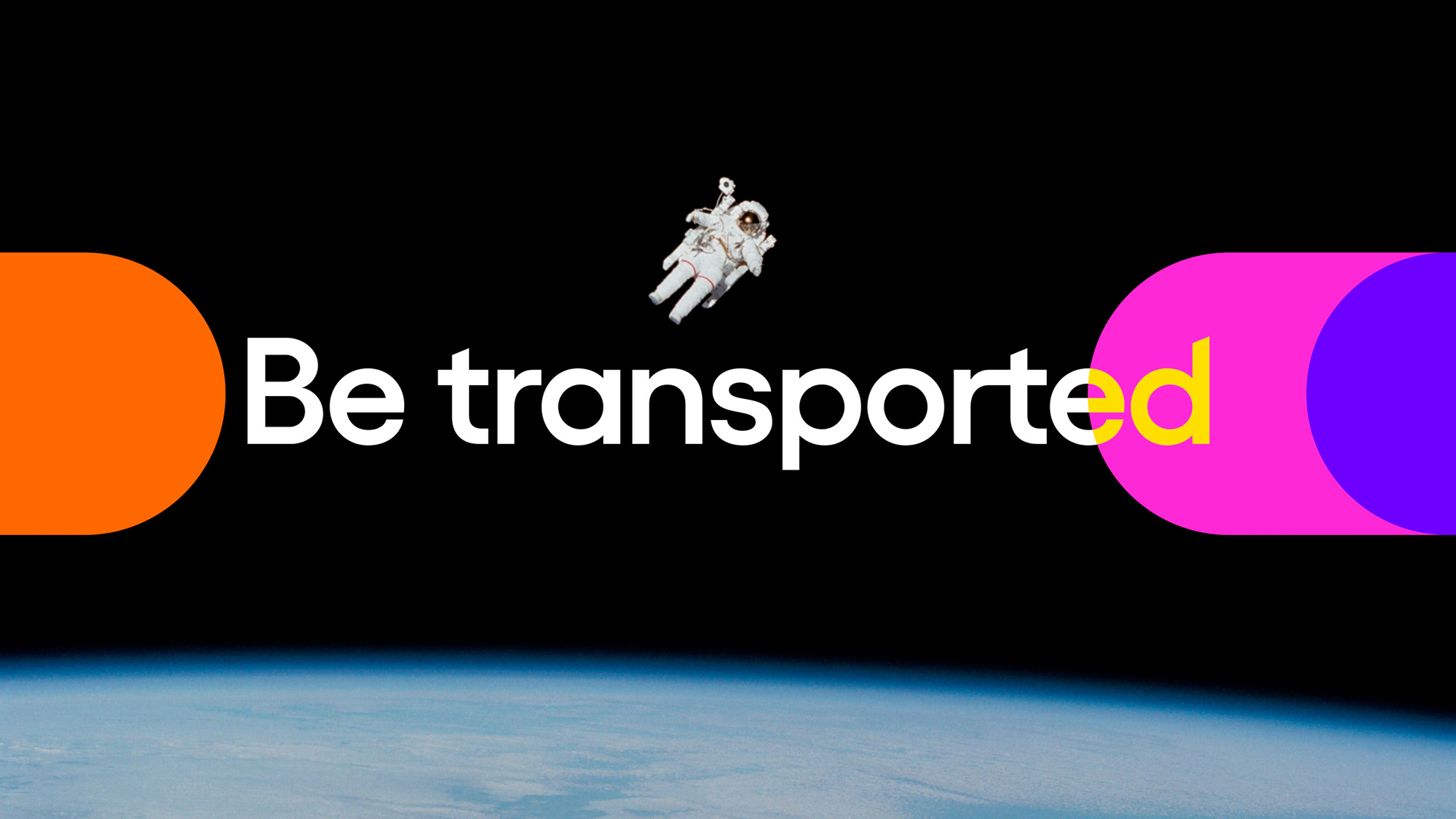
Playing off of the planetary name — even if Pluto was demoted to a lesser planet — the identity introduces a number of appropriate metaphors including the “portal” which is maybe a little heavy on the cosmic hyperbole in its little video presentation but sets up the horizontal animation of the four colored circles and the “hyper-jump” which is like the Star Wars hyperspace jump but on mushrooms, with a fun trail of colorful bars and dots zooming by. I really dig this effect and how it resolves into a logo animation. When it all comes together with programming footage and information, it’s, as expected from DixonBaxi, fun and energetic and super smooth with a lot of attention to detail like the headline typography flashing through all four colors before settling on white and all the slick animation curves on every single element.
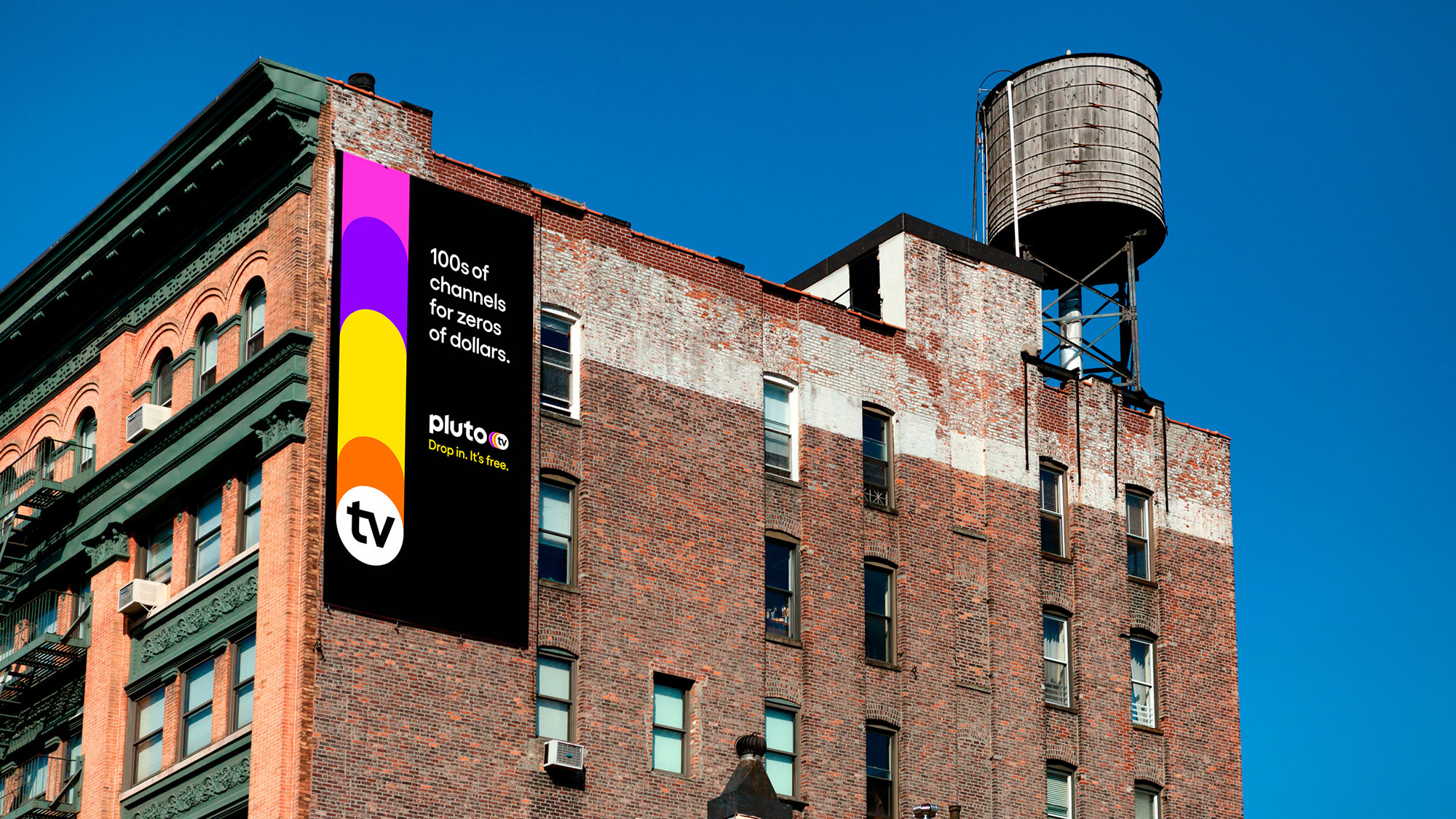
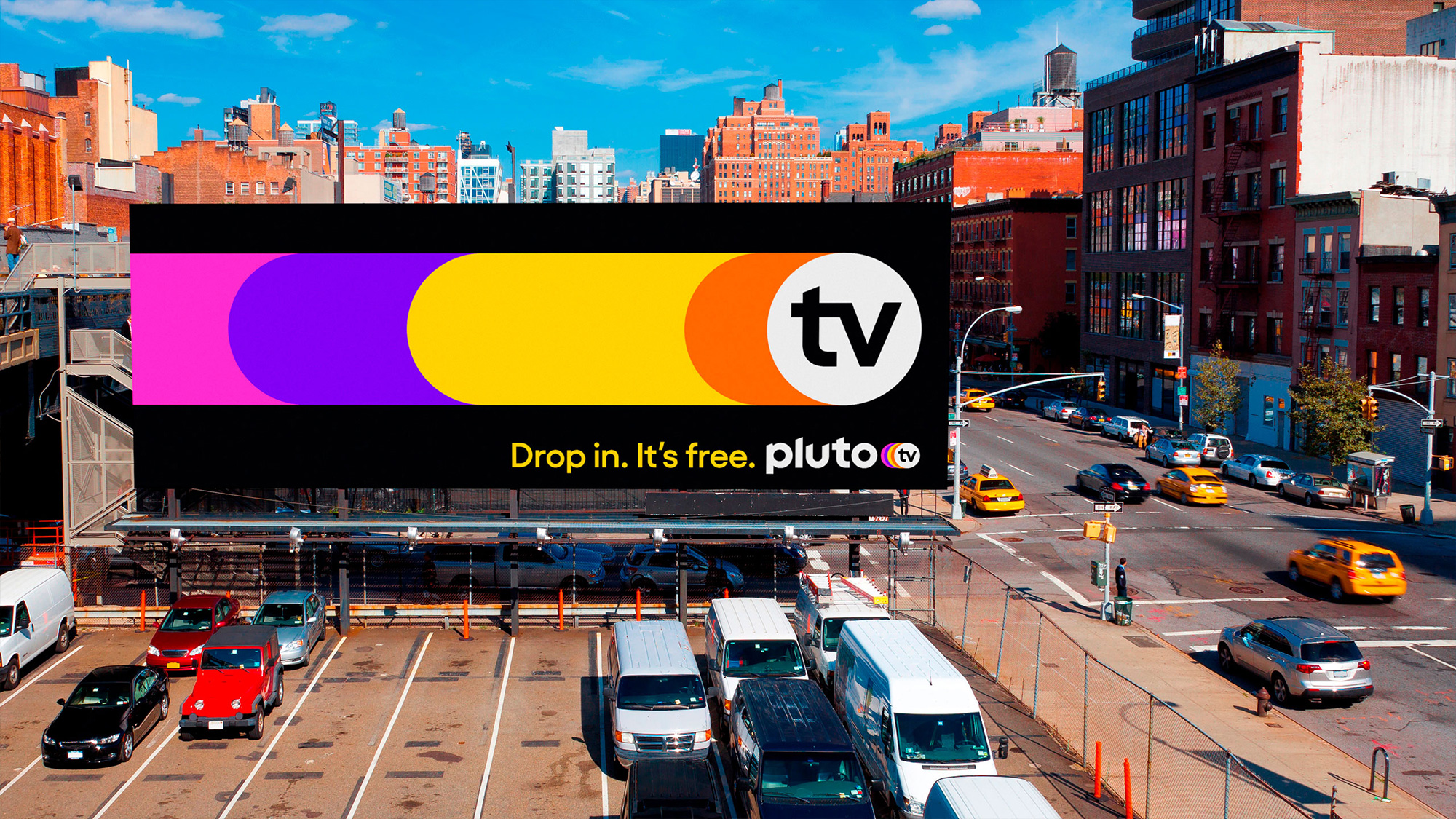
The few advertising applications shown are alright. They are very bold with the trail of colored circles on black and definitely stand out. I like the flexibility of it where it can go horizontal or vertical.
Overall, aside from my various grievances about the logo, this is all quite nice although I feel like there is something missing to place it in the same tier as the other major streaming players like Netflix and Hulu, where this looks more like a TV channel than a streaming service of other channels. But, hey, if you have watched everything there is to watch on either of those during quarantine, Pluto TV does provide a good alternative — as I was writing this, Clue (1985!) was playing live at 5:00 am and provided an unexpected moment of joy.
 each year since publication began in 2006

 Новости Союза дизайнеров
Все о дизайне в Санкт-Петербурге.
Новости Союза дизайнеров
Все о дизайне в Санкт-Петербурге.