contact us | ok@ohmycode.ru
contact us | ok@ohmycode.ru
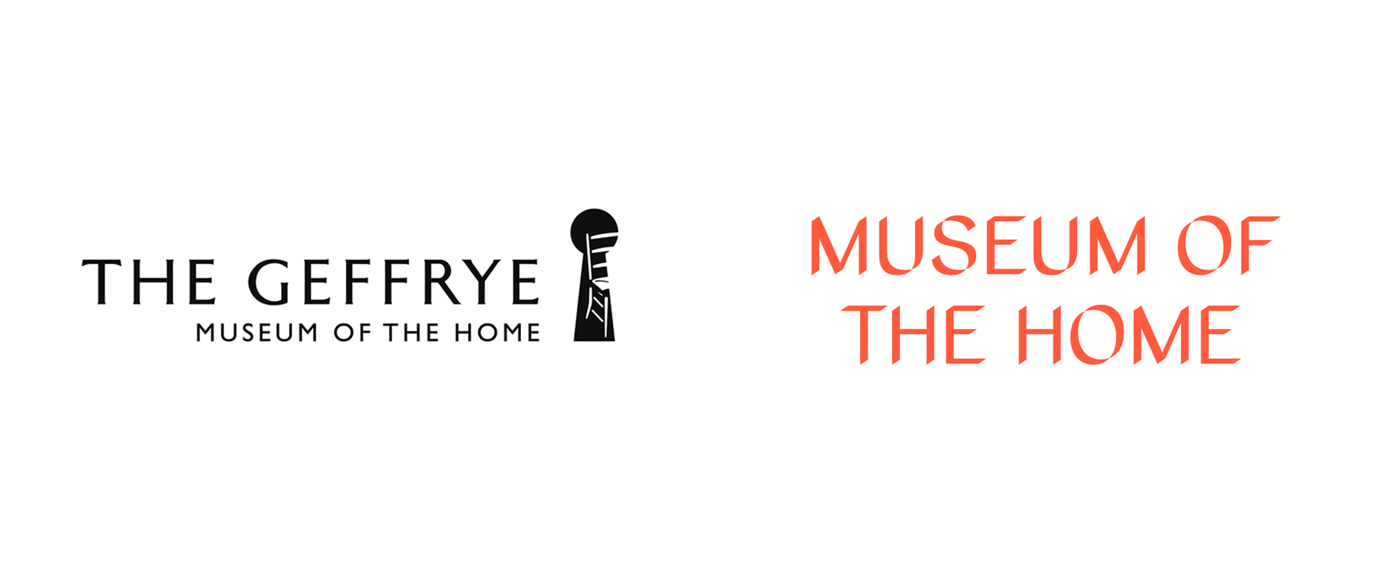
Established in 1914 as the Geffrye Museum of the Home, the newly renamed Museum of the Home is a museum in London, UK, devoted to, well, the home — more holistically, to “reveal and rethink the ways we live, in order to live better together.” Housed in the Geffrye Almshouses, built in 1714 with funding from Sir Robert Geffrye (former Lord Mayor of London and Master of the Ironmongers’ Company) as charitable housing provided to people in need, the fourteen buildings serve as exhibit spaces where rooms are decorated and arranged in different period styles, from the 1600s to today, providing a glimpse into how others have shaped their home through history. The museum closed in 2018 for renovation and expansion and in preparation for its reopening in the Summer of 2020 has introduced a new identity designed by London-based dn&co.
[The] new brand underpins the Museum’s evolution from historical displays into a platform where diverse perspectives on the idea of the home can be explored, expressed, debated and shared. The new brand positioning, strategy and name empower the Museum to widen its curatorial brief, as it shines a light on the past, present and future of how we live.
Inspired by light, and the shadows cast when focused on an object, the visual identity is flexible, yet instantly recognisable. It is designed to work across a wide range of events, exhibitions, performances and public spaces, and support the Museum as it engages with current narratives related to the home.
With a custom typeface, conceived and designed by dn&co and produced in collaboration with Colophon Foundry, distinctive diagonal layers, and a colour palette inspired by the Museum’s architecture, surroundings and gardens, the brand’s diverse graphic language invites us to reveal the places around us.
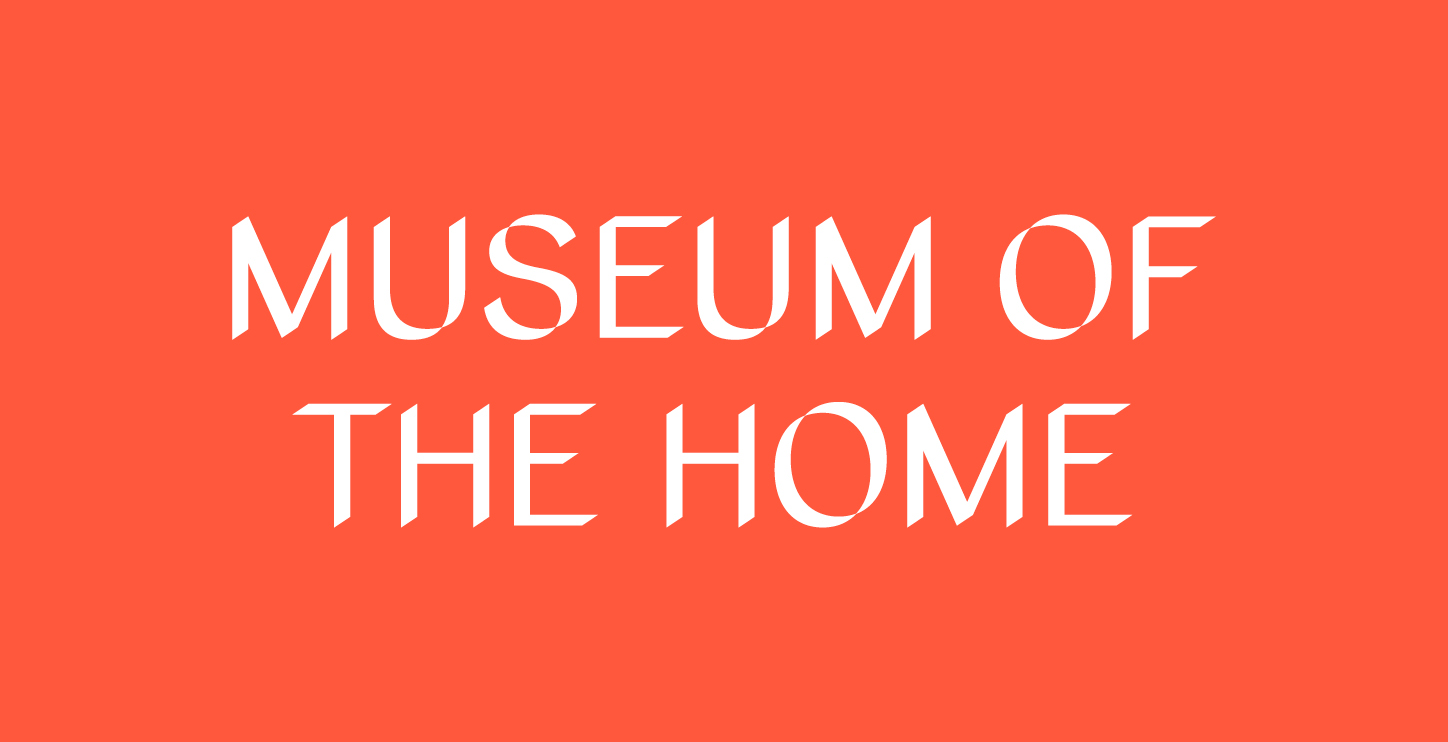
The old logo was pretty good with decent typography and a fairly descriptive icon of a keyhole where you could peep yo’ self a room — perhaps not the most creative and definitely not the most useful at small sizes but it got the point across. The idea of shadows for the new logo lies on the opposite end of the spectrum in contrast to the figurative approach of the old logo and, while certainly thoughtful and relevant, is perhaps a little too obscure (no pun intended) for any audience to get. Which is not to say that it’s a bad thing but that the concept is not instantly evident, which makes the new logo feel a little harsh with its pronounced angles and its high contrast between the thicks and the thins. It’s not exactly a “welcoming” logo to get into the mood of thinking about what “home” means and feels more like the logo for a contemporary art museum, especially when the orange logo is paired with that blue, than one about living. Having said that, visually, I do like the new logo as a typographic expression and how they approached the extrusion of the letters and the light to dark animation is pretty nice. The question remains, though, is this right for this museum? Both designer and client think so as they doubled down on it with a custom type family that expands this visual language.
At the heart of the brand identity sits a unique typeface - Home Sans - created by shadows. The typeface is dynamic and can adapt to the message you want to convey, to the audience you are talking to, or simply respond to a physical or digital environment.
The graphic language also uses layers of shadow to reveal different kinds of content - typography, illustration, photography. Conceived as a flexible system, it shares the visual cues that make it instantly recognisable as the Museum of the Home.”
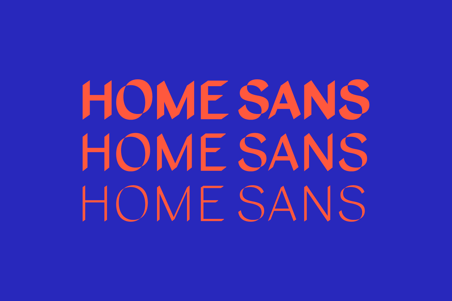
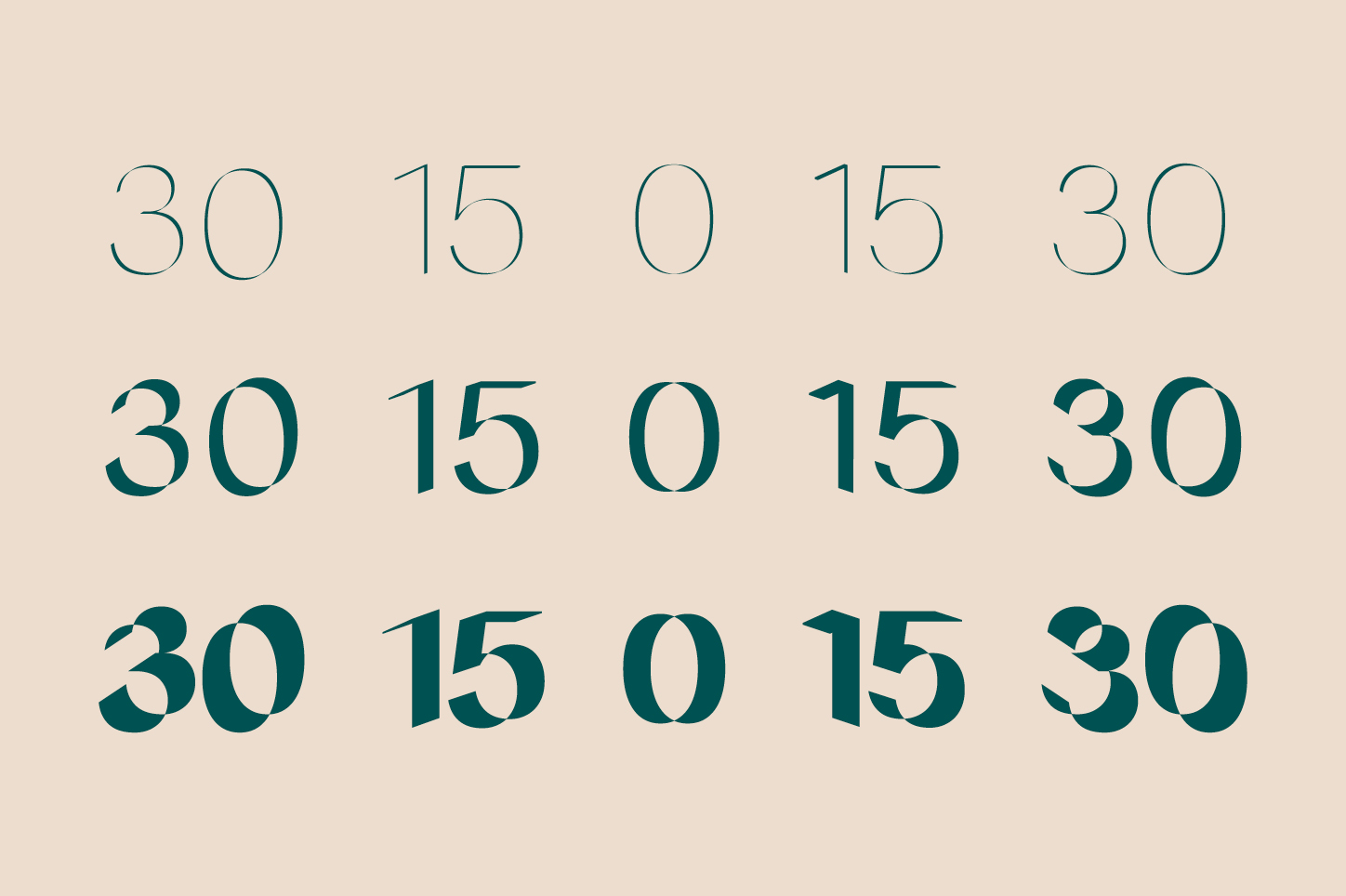
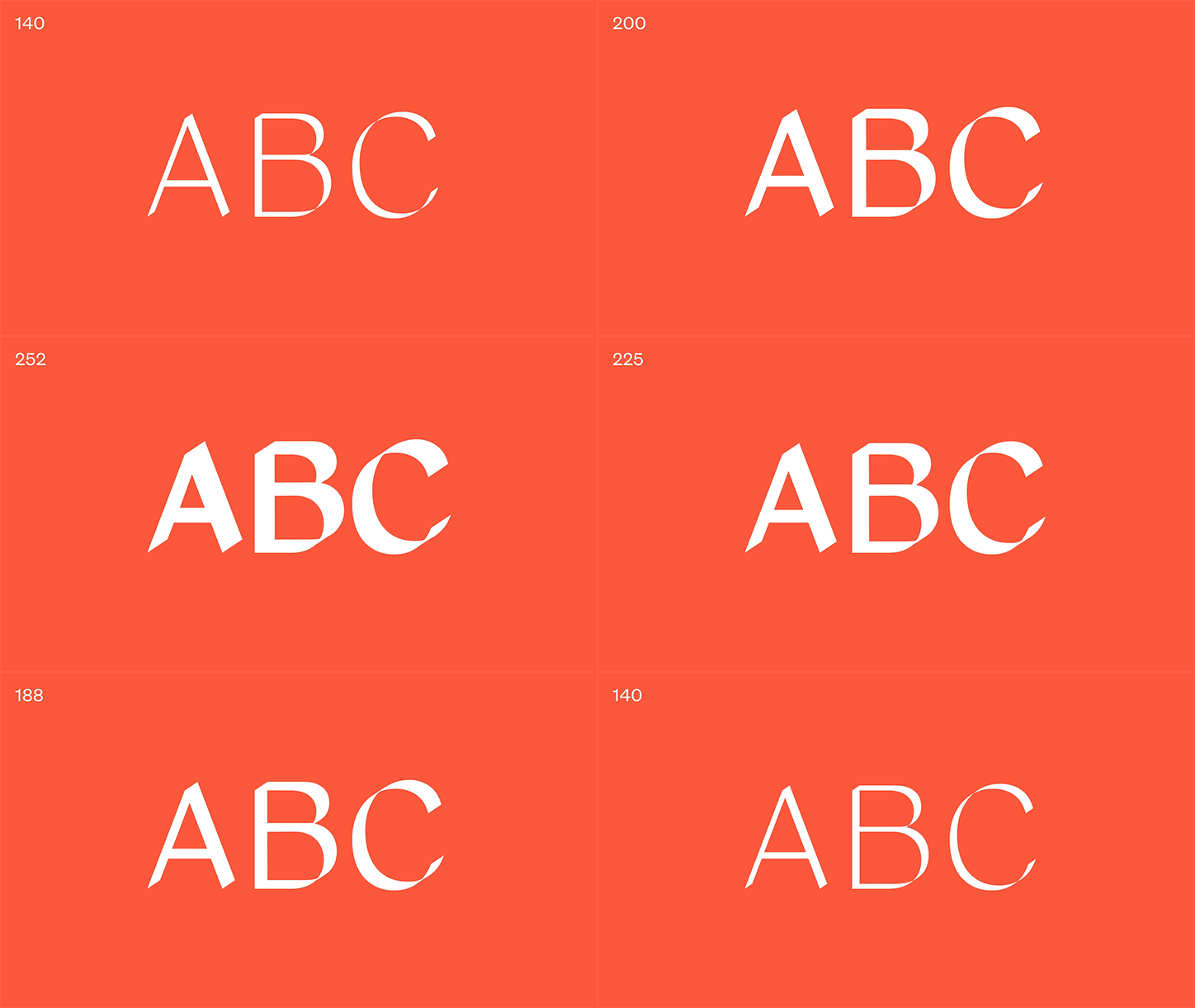
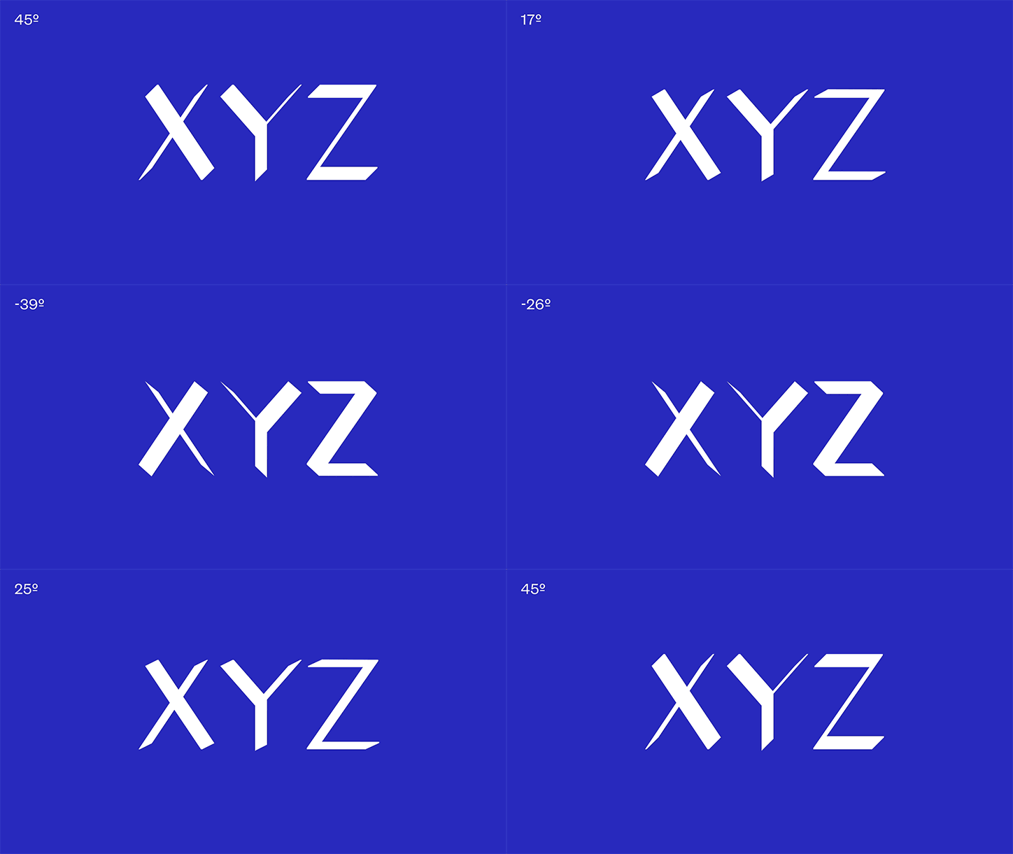
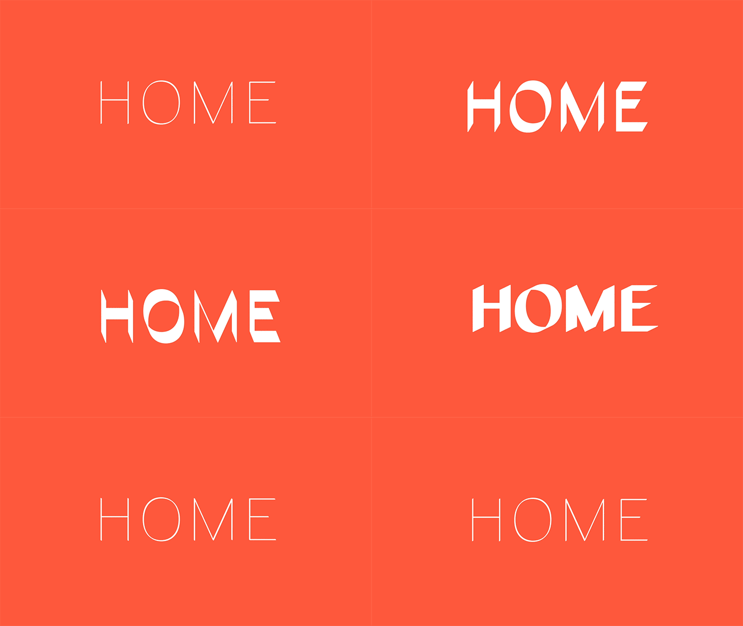
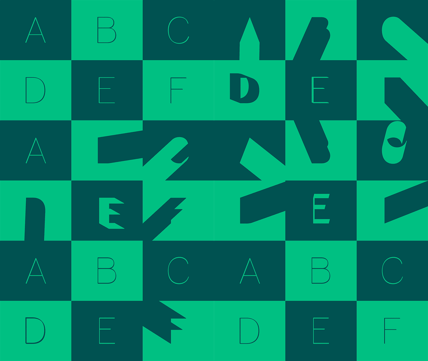
As a type family — and one that can animate — this is quite nice in a kind of Brutalist Lite aesthetic and approach that can be softened with the right color combination — the dark green and dark tan for example — but that overall is mostly very demanding and is downright jarring in the wrong color combination — blue and orange. But, yeah, it’s cool for sure… I’m just not sure if it’s cool for this museum.
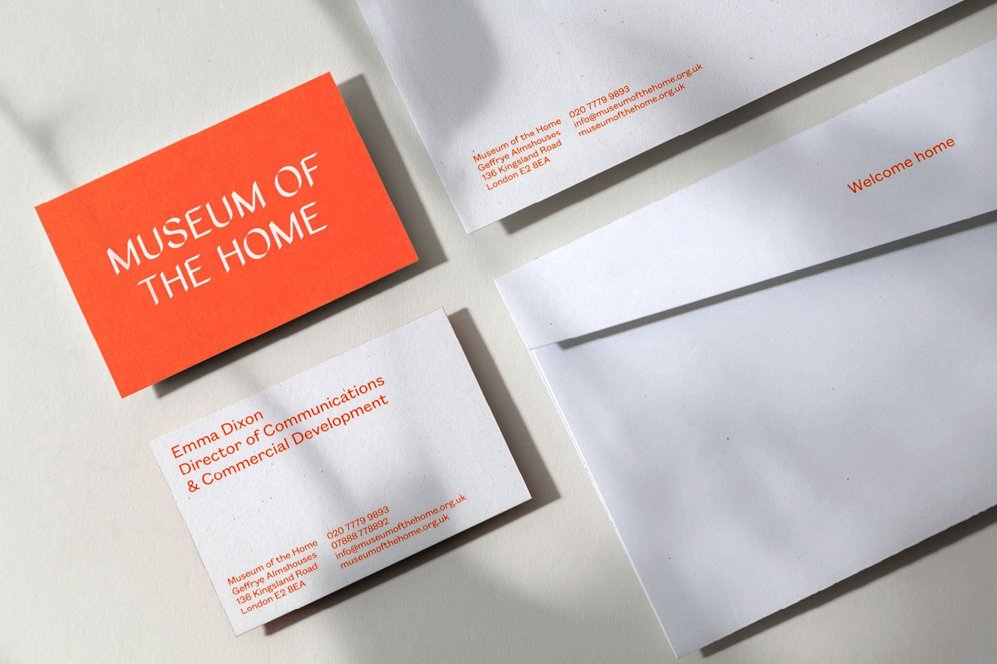
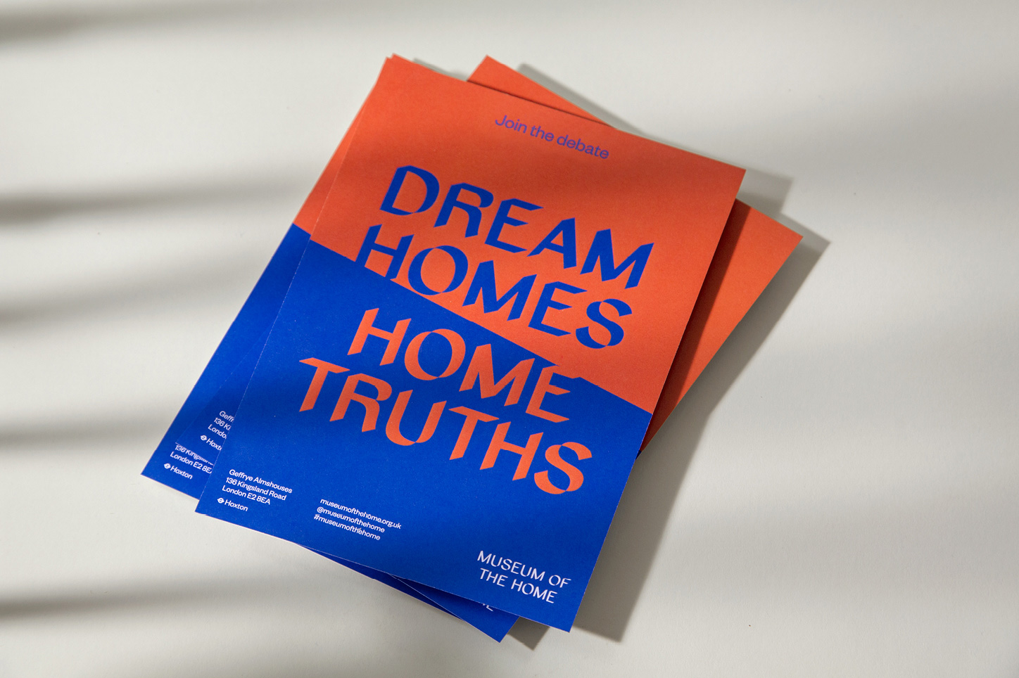
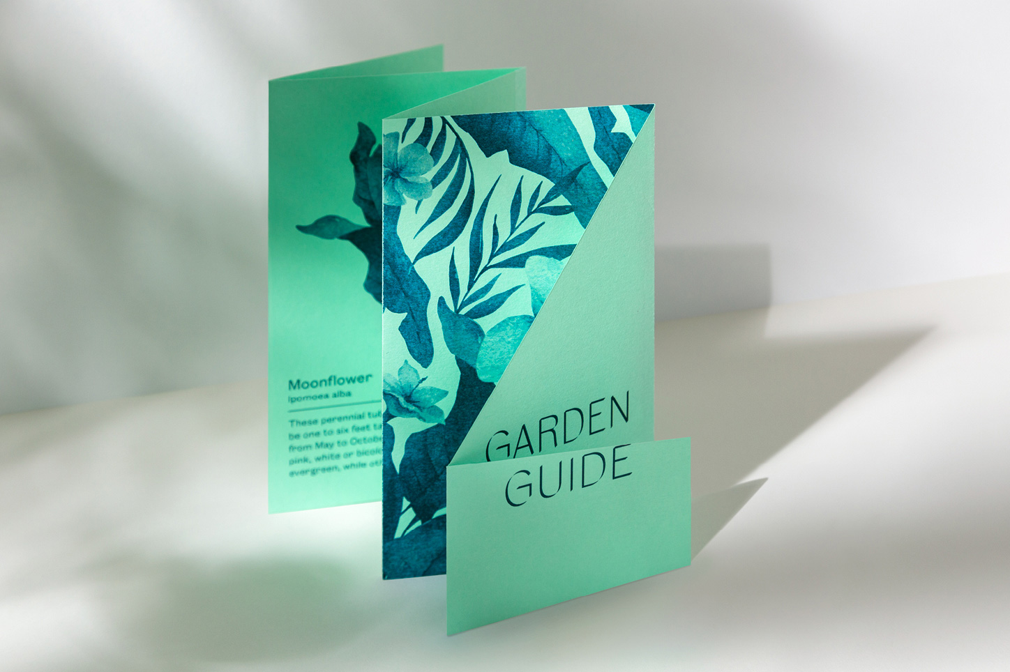
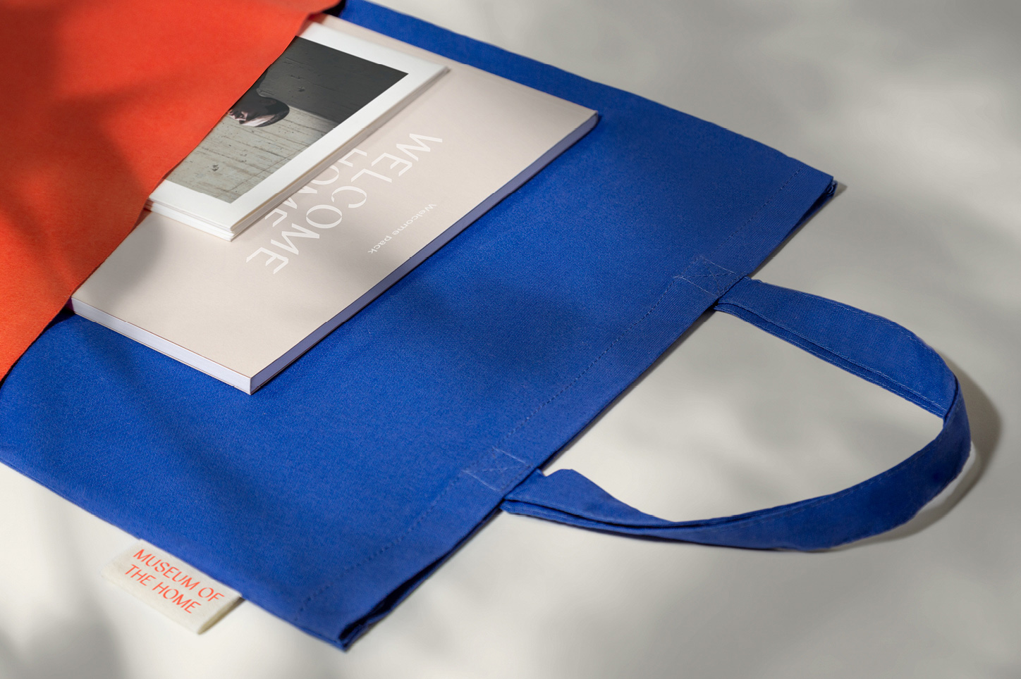
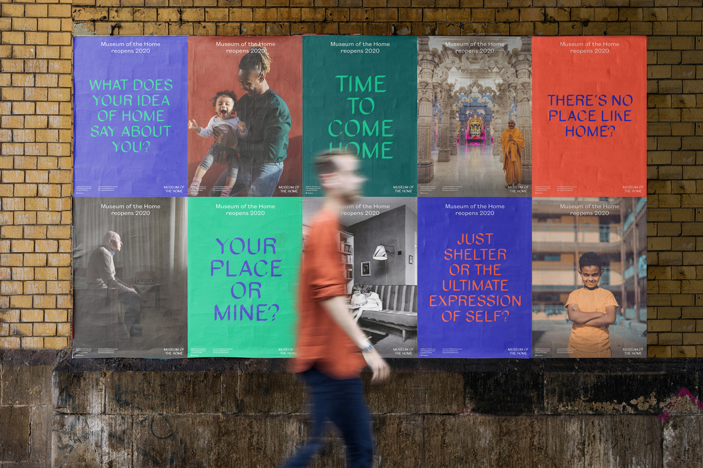
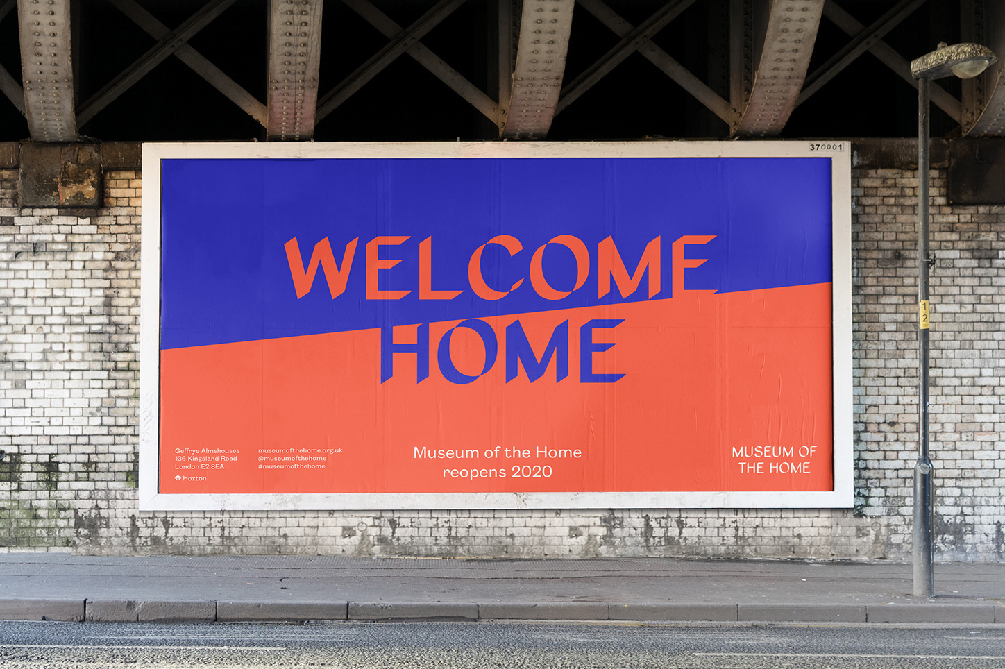
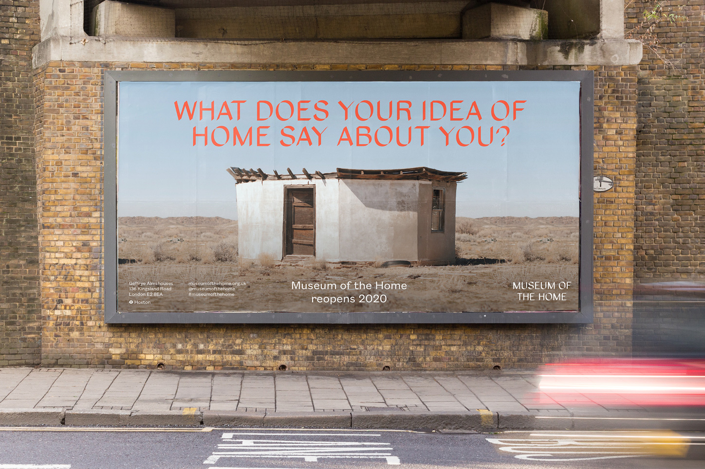
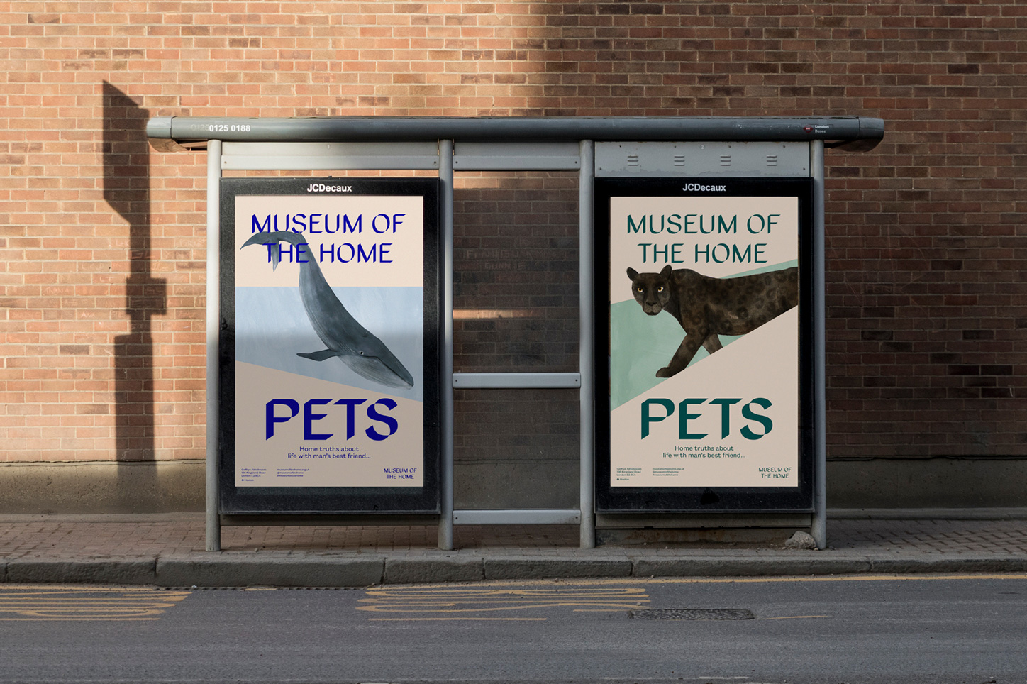
In application, there are a number of things going and the identity vacillates between trying to be edgy and approachable. Like, the bus shelter ads above, those are great with their more muted tones and integration of the type, the angles, and the illustration but then the billboards above it are more jarring and somehow feel… aggressive. There is plenty of good stuff in here, no doubt, it’s just that there isn’t a clear tone of voice.
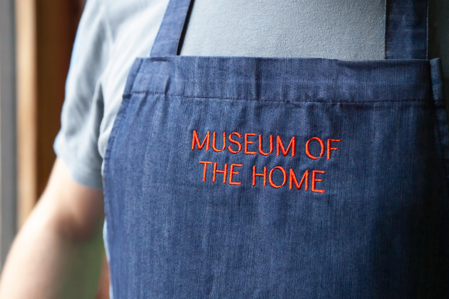
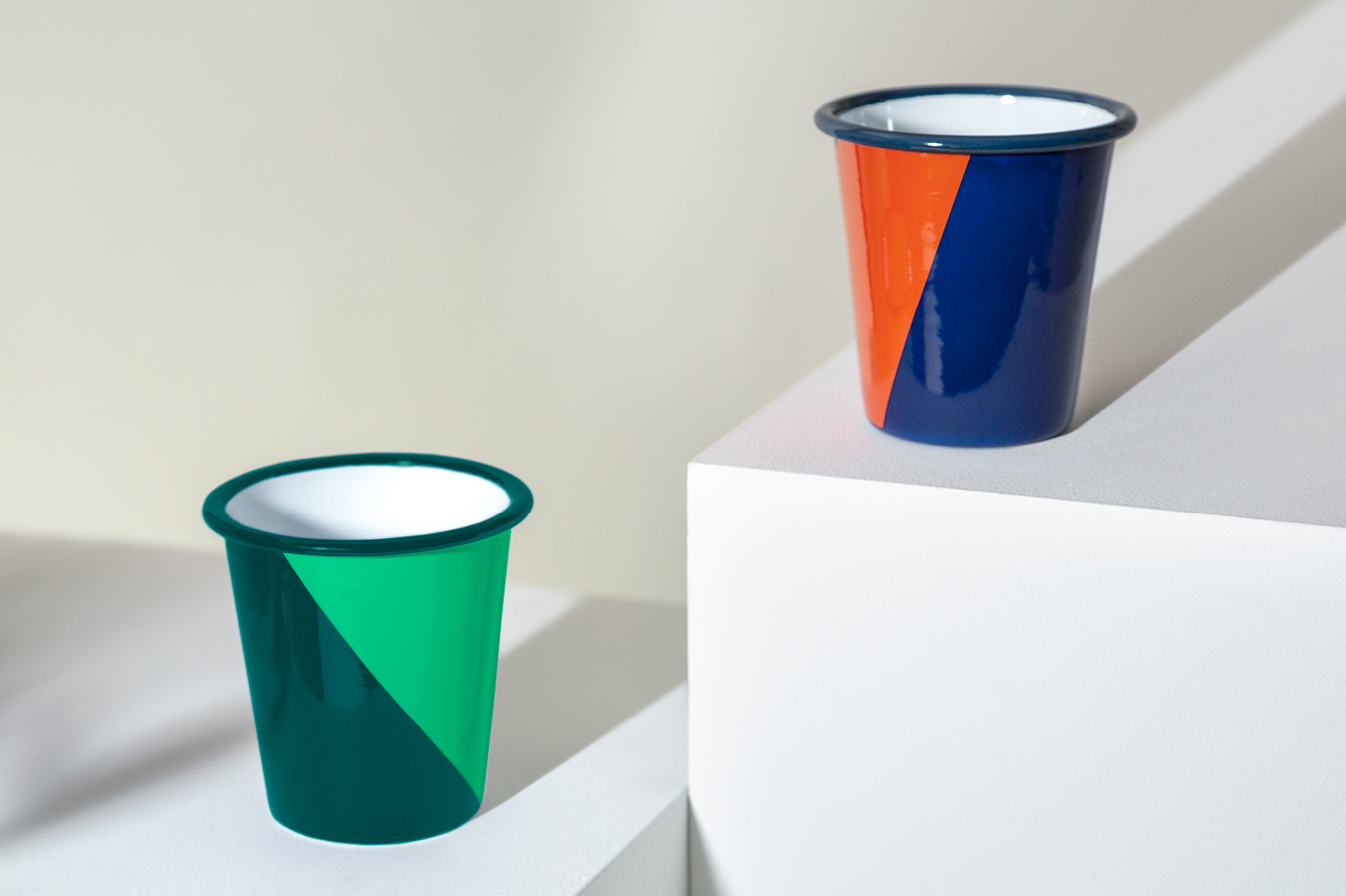
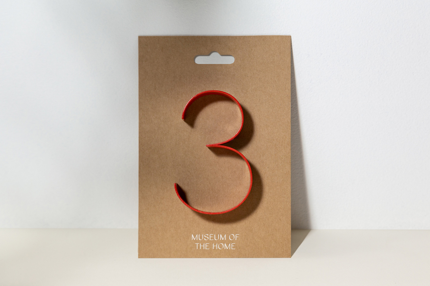
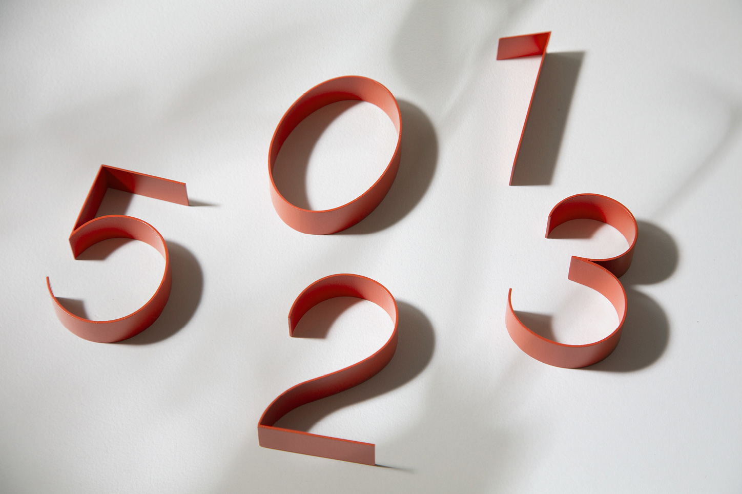
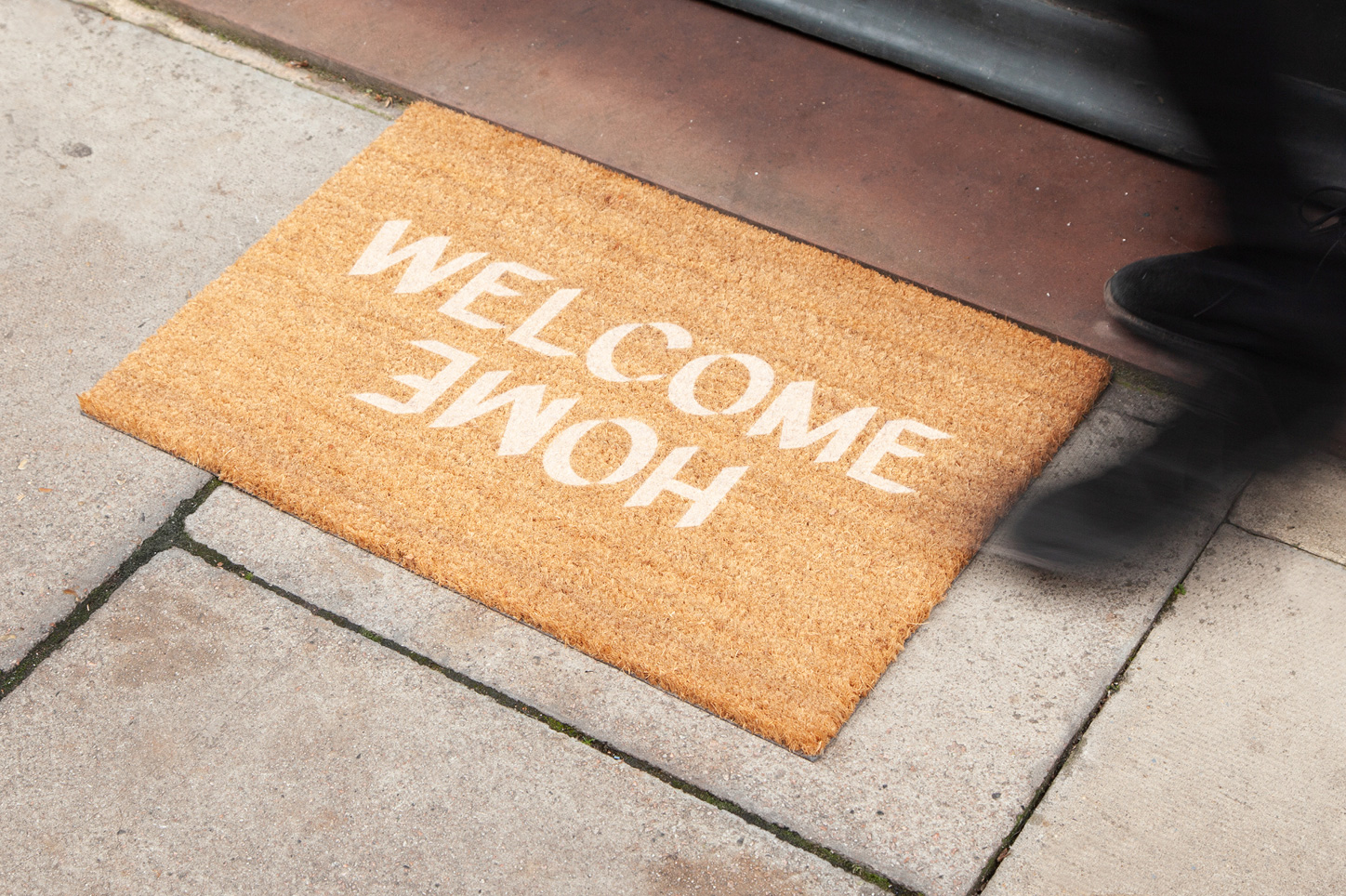
Overall, as with all the other paragraphs I have written, I’ll say that all of these things are visually good and well designed but I keep having a hard time associating it with the museum’s subject matter and its environment but perhaps that’s the whole point: to create a drastic contrast between what we think about home — our, or at least mine, preconceptions — and how we think about home through a new lens provided by the museum. In which case, well done.
Thanks to Nathan Stazicker for the tip.

 Новости Союза дизайнеров
Все о дизайне в Санкт-Петербурге.