Обзор лучших ресурсов по разработке бренда, разработке упаковки
contact us | ok@ohmycode.ru
contact us | ok@ohmycode.ru
Established in 2009 and launched in 2010, Peppersmith is a UK-based brand of chewing gum (and mints) whose main point of distinction is that it’s made with xylitol, a plant-based sweetener made from trees that, as a bonus, is actively good for teeth: The gum is approved by the British Dental Health Foundation, who accredited the brand’s claim that “Eating Peppersmith with xylitol helps reduce plaque and the risk of tooth decay”. Available online and select stockists like Waitrose, Sainsbury’s, Morrisons, BP, Holland and Barrett, and Whole Foods Market, Peppersmith has sold over 15 million packs. This month, Peppersmith introduced a new identity and packaging designed by London, UK-based B&B Studio (who also designed the original identity and packaging).
Since B&B created the original Peppersmith brand as a challenger to the mainstream gum category back in 2010, category and market shifts had caused the brand to adopt a more functional benefit-driven approach. The packaging refresh project was a great opportunity for the agency to reappraise what the brand truly stands for, what it should be communicating and how. B&B was keen to build on Peppersmith’s internal mantra of Never Settle, and carve out a more emotionally engaging platform that celebrates the brand’s commitment to being better made and better for you.
Working with the new positioning, B&B was able to reinvent the overall brand and visual identity and introduce new brand messaging that celebrates high quality, natural ingredients. Incorporating spearmint or peppermint leaves, lemons or strawberries, each element of the Peppersmith identity from the individual packs to printed and digital materials is brought to life with bold, large scale imagery and powerful colours.
The copy on each pack has been stripped back with wrap-around lettering and playful phrasing such as ‘mini but mighty’ and ‘tiny but tangy’, reinforcing the punchy flavours in each mint or gum.
In addition, Peppersmith has introduced plastic-free packaging which no longer incorporates a plastic wrapper.
The old logo had a vintage confectionery aesthetic with the use of Gill Sans “Shadowed” and, somewhat charmingly, used two peppermint leaves to create a mustache. It was fine but perhaps too cute. The new logo barely registers as a logo with a non-descript sans serif in a bold weight where the only distinctive trait is the upward angle at which the “t” and “h” end. It’s neither a bad logo nor a great logo and I think it’s main objective is to be a slightly unperceived logo, taking a step back to the bolder packaging.
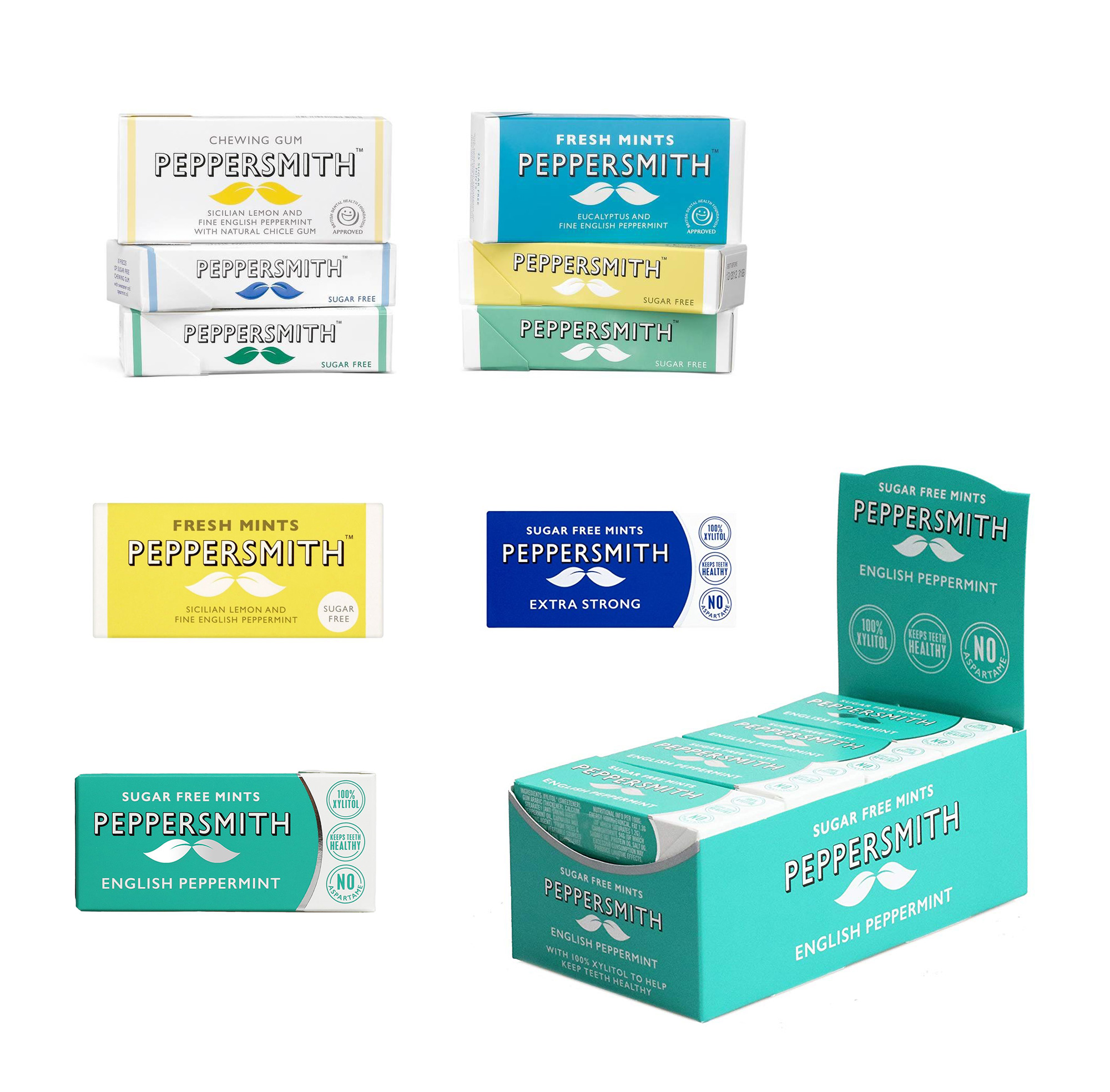
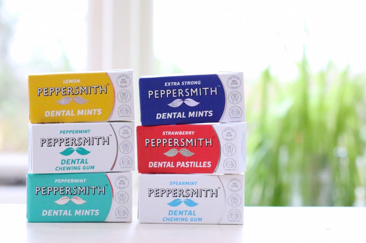
The original packaging worked well with the logo, doubling down on the vintage charm with the stripes of color and plenty more Gill Sans. At some point the packaging evolved to have a curved lid, which made it look more like a bunch of other new gum brands and clashed with the logo, especially with the addition of the silver foil swoosh — might as well be buying Trident.
In terms of [getting rid of plastic in our packaging], this has been a long work in progress. The concept was to have plastic free, recyclable packs that are tamperproof and don’t pop open in your bag, but this is much harder than you might think. We went through various prototypes of different perforated seals on the little packs, but it turns out the machine we use to pack our products is quite complicated and buying a whole new packing machine wasn’t an option. We eventually, que trumpets, came up with a tamperproof plastic free solution that works. From start to finish this has taken about a year.
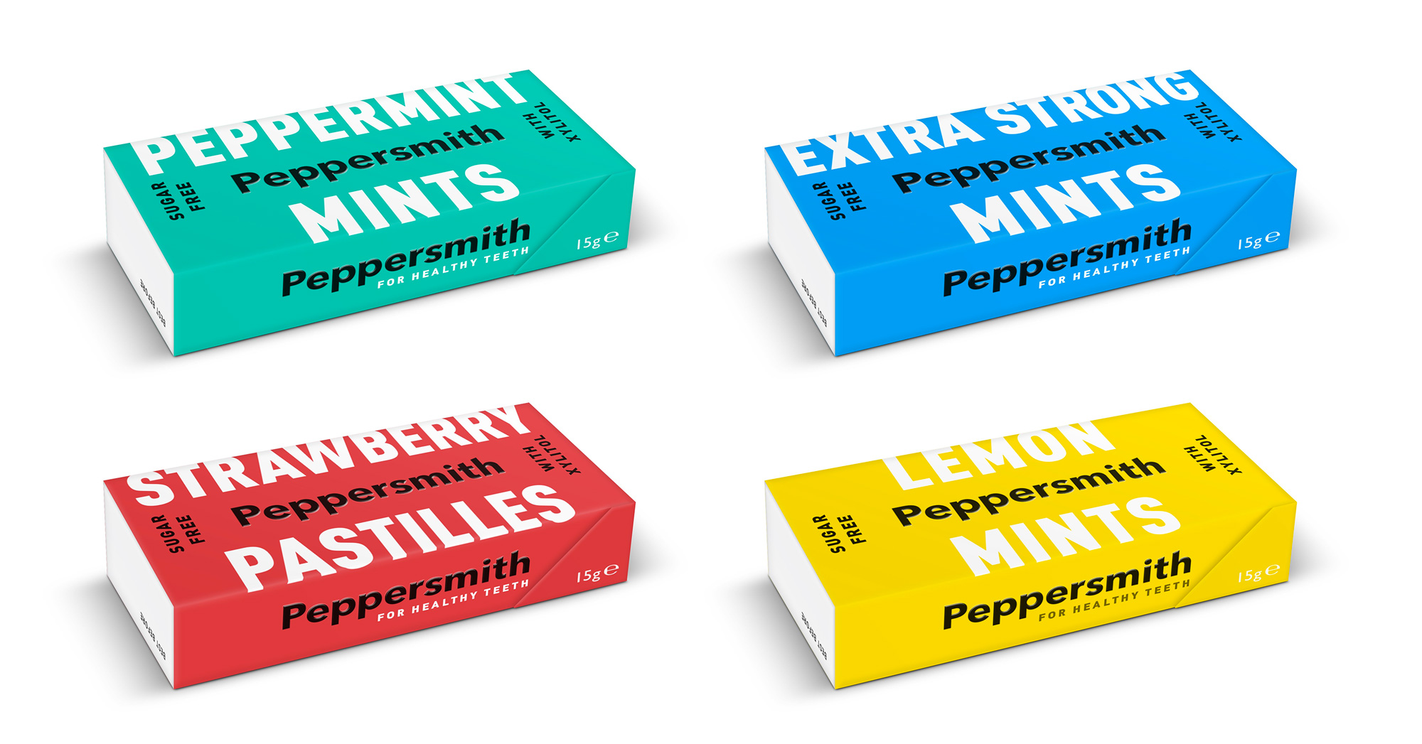
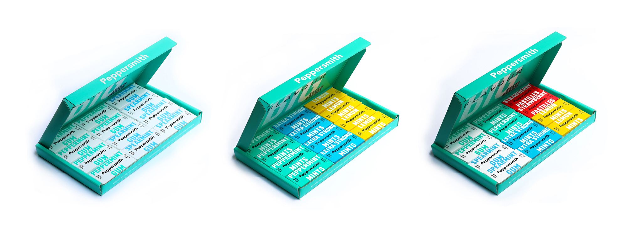
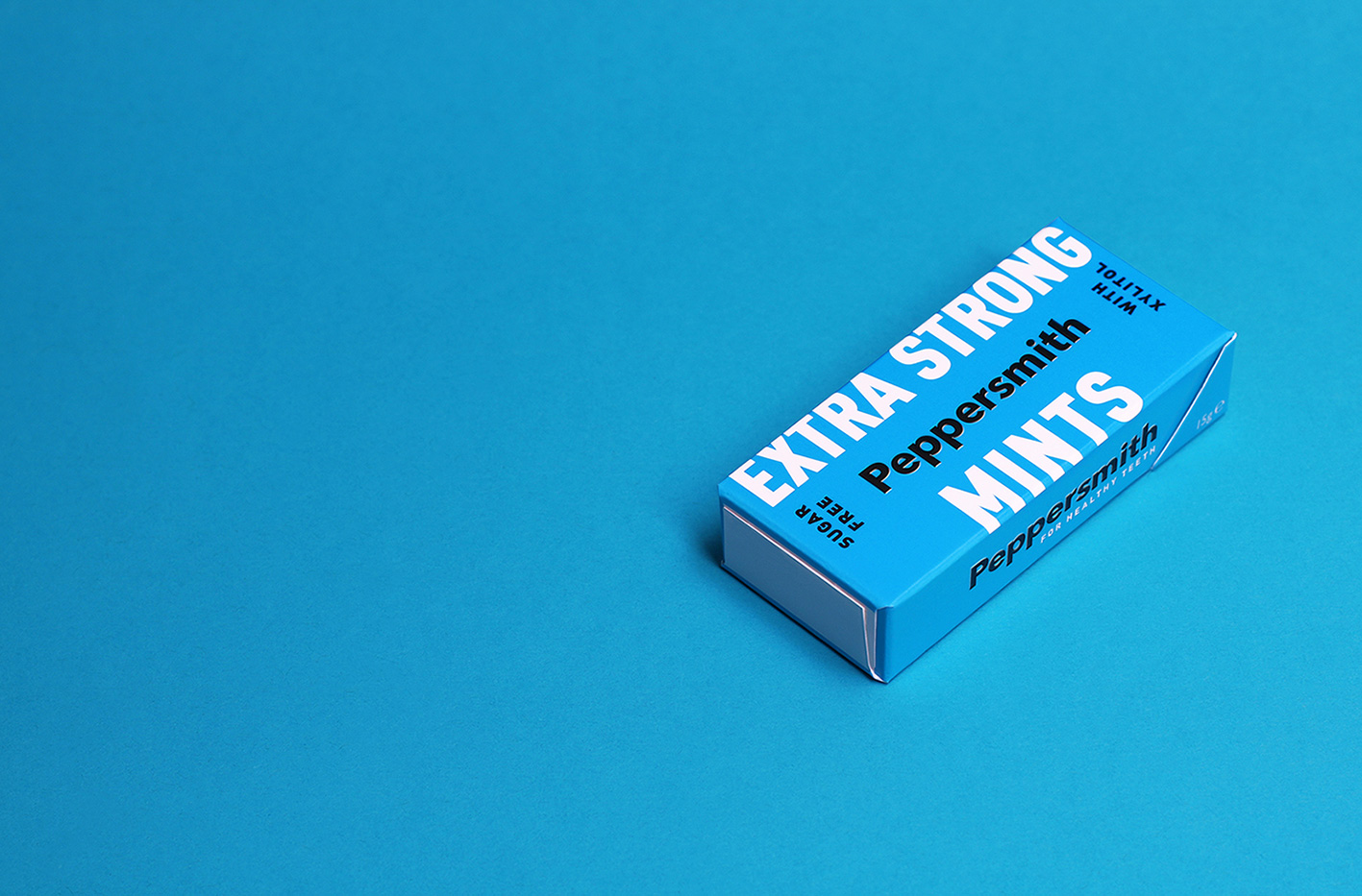
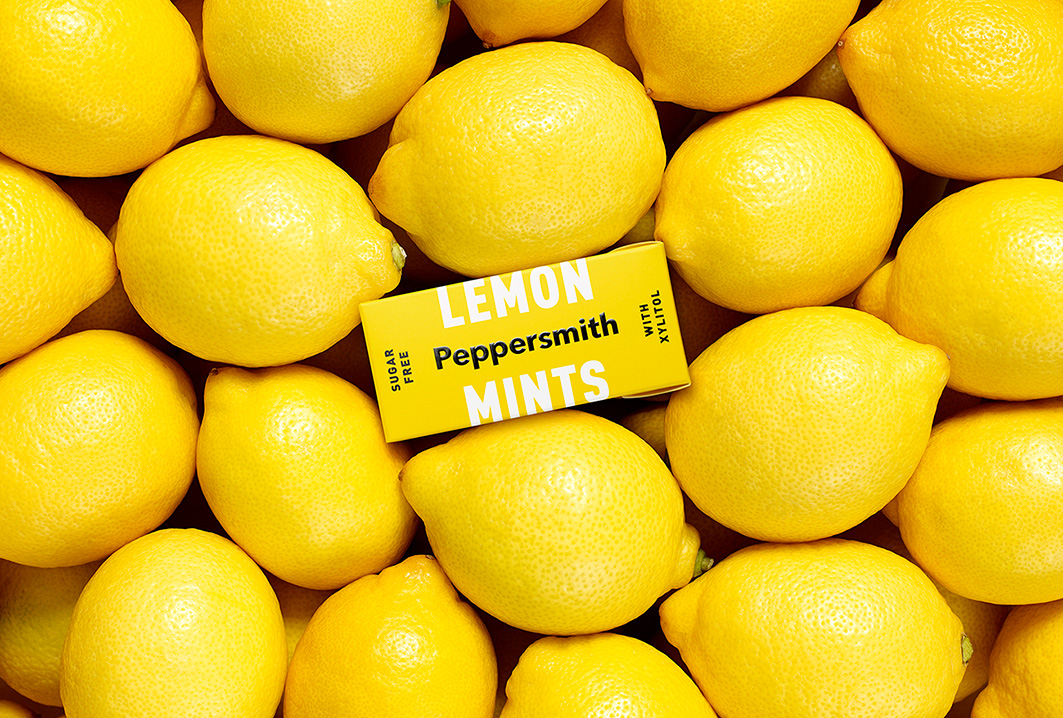
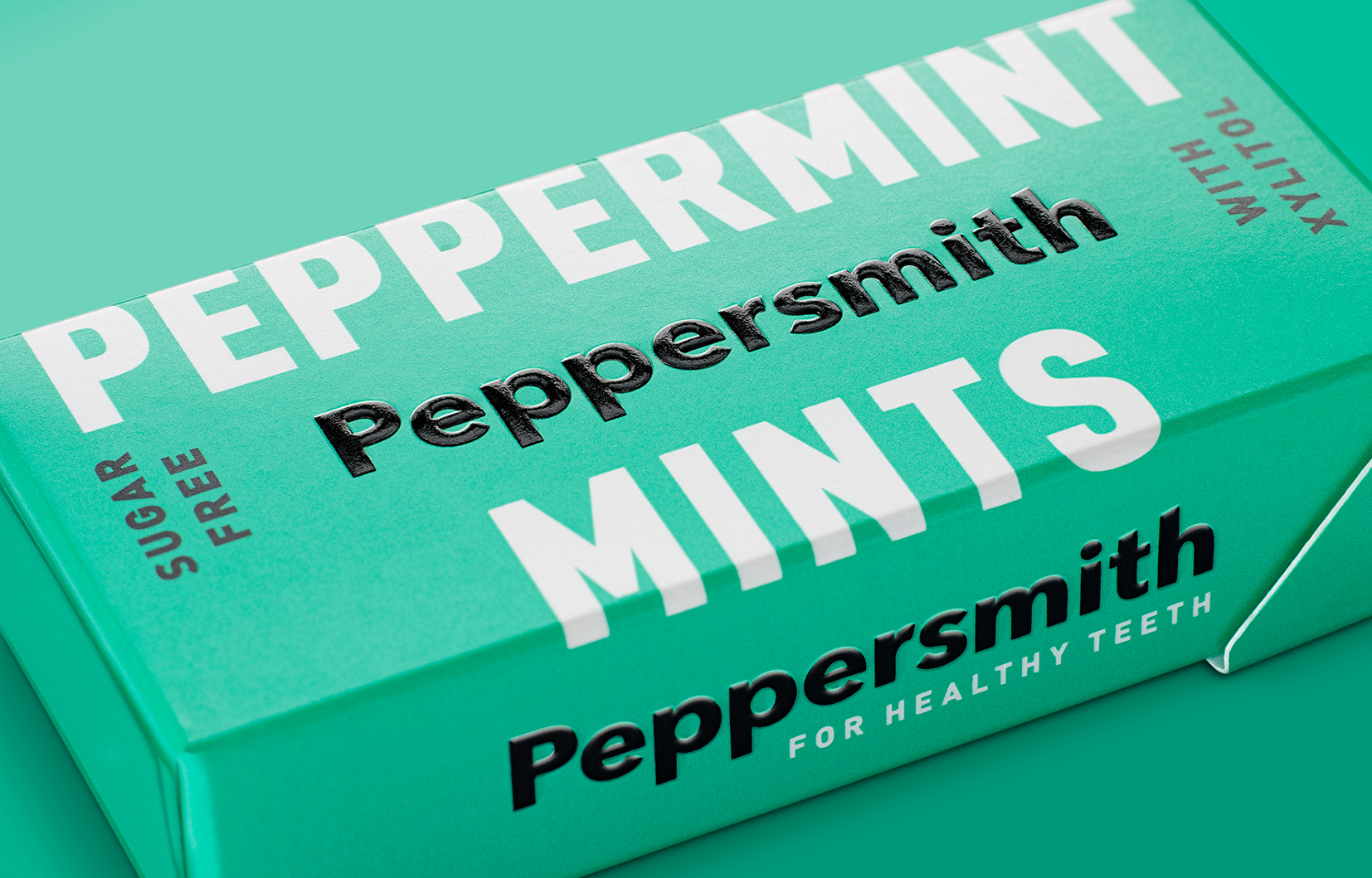
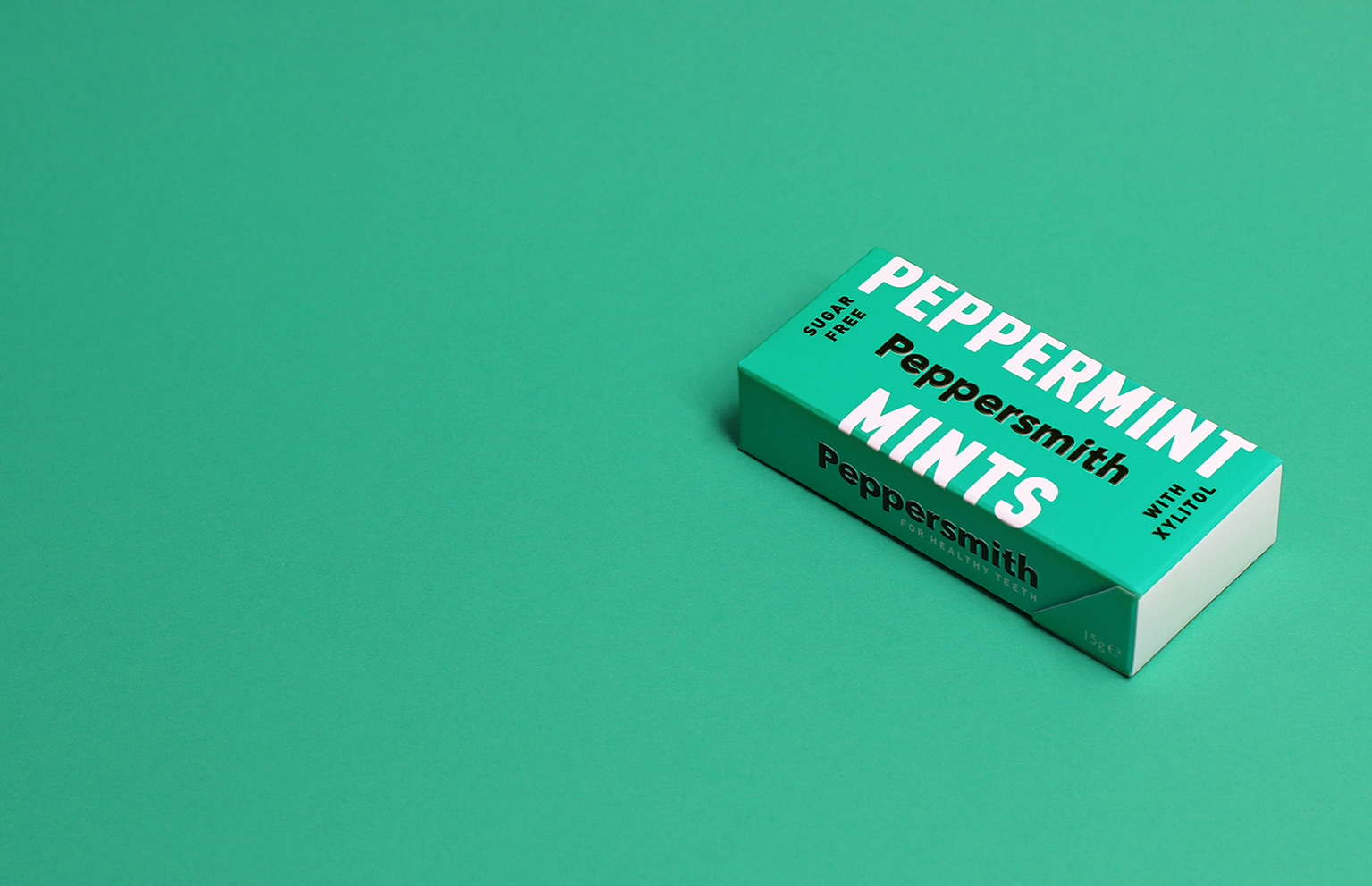
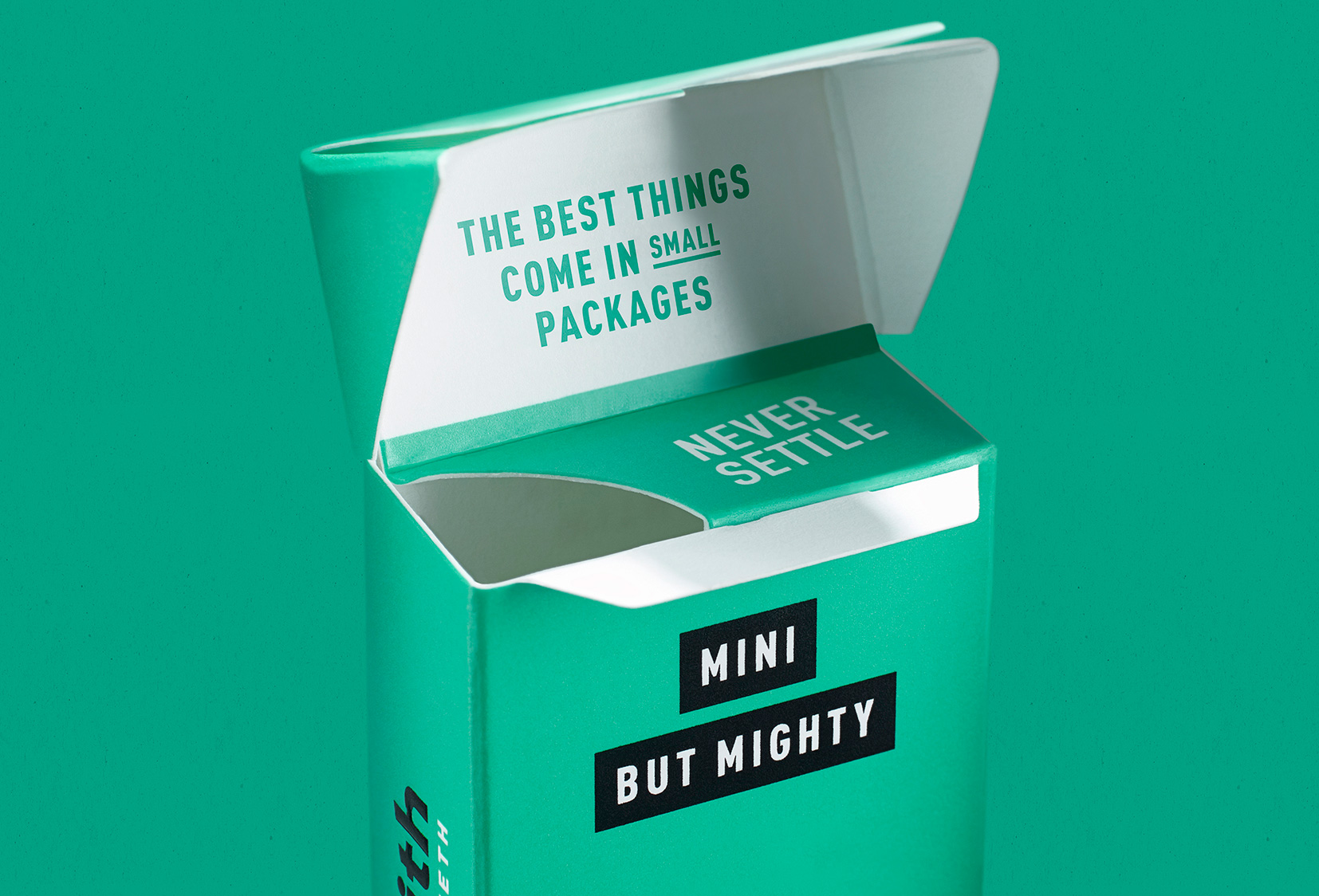
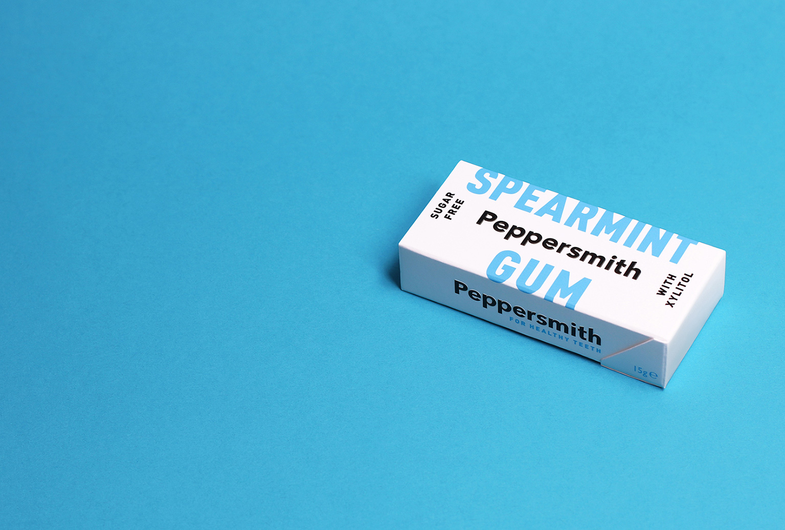
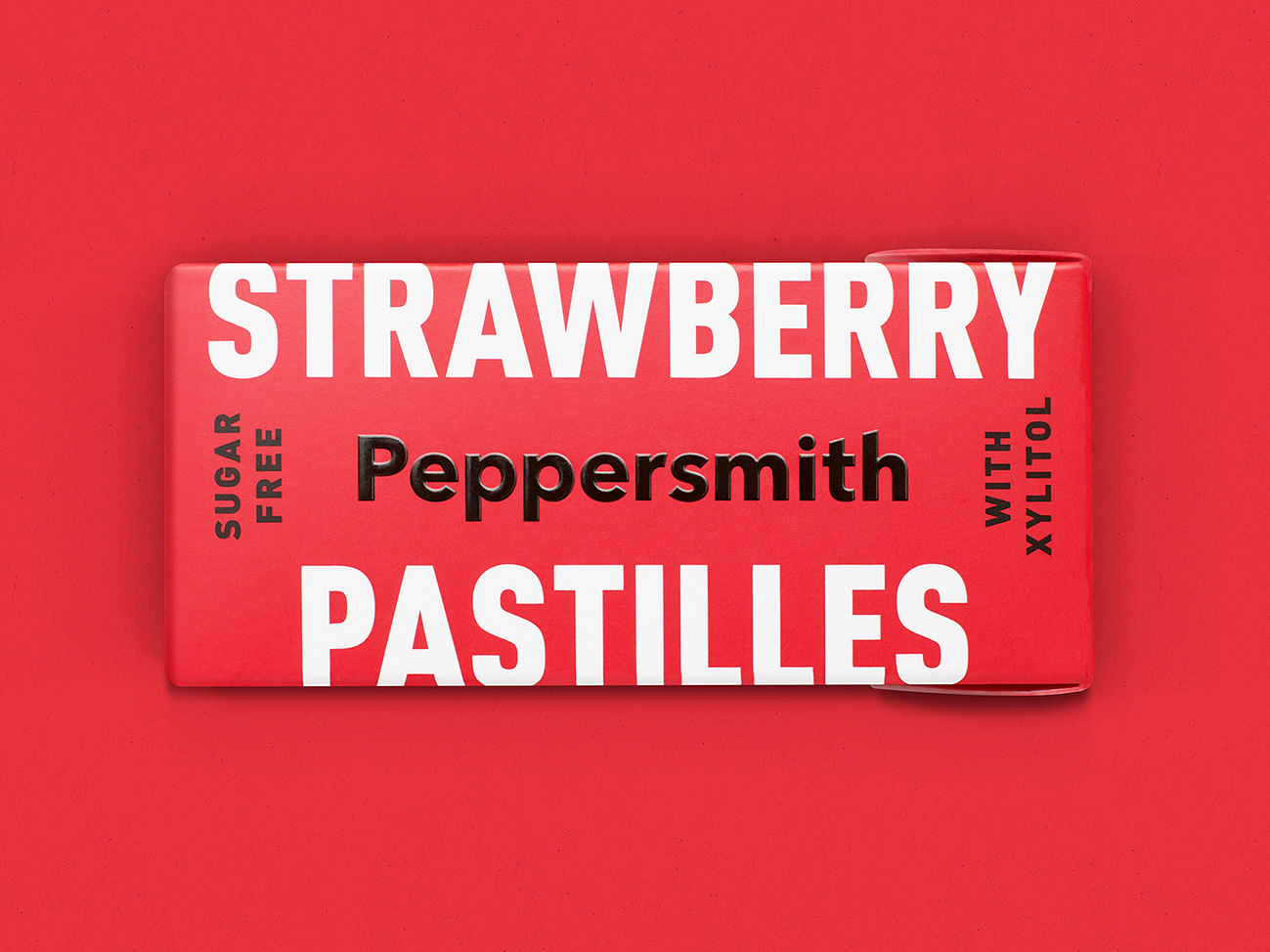
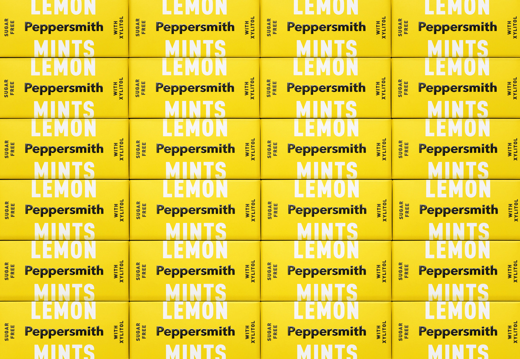
The new packaging looks really great with its tiny boxes packing a big typographic, colorful punch. The logo, in black, is paired quite nicely with a large condensed sans that appears in white for the different mint flavors and in color for the two gum variations. In this context, the logo’s non logo-ness makes more sense and its simplicity pairs very well with the bold, large condensed type. The oversize typography feels even larger as it bleeds into the top and bottom of the packs and I love how well the colored backgrounds work with the white and black combination.
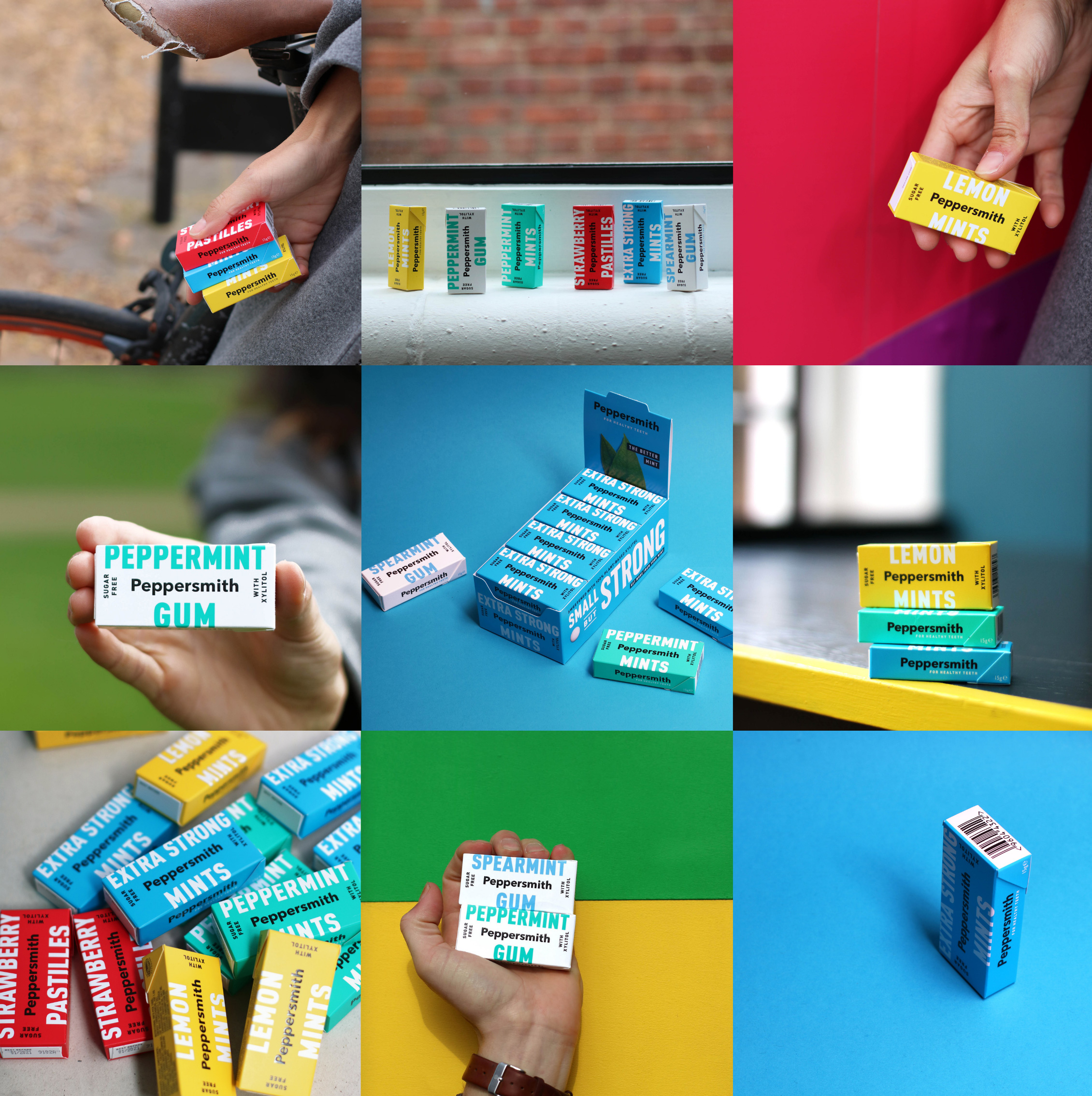
Overall, this is a great transformation for the brand, going from its original antiquated look through an awkward teenager-like phase when it introduced the curved lid to this confident, fun, contemporary, and distinct design that doesn’t rely on old tropes.

 Новости Союза дизайнеров
Все о дизайне в Санкт-Петербурге.
Новости Союза дизайнеров
Все о дизайне в Санкт-Петербурге.