contact us | ok@ohmycode.ru
contact us | ok@ohmycode.ru
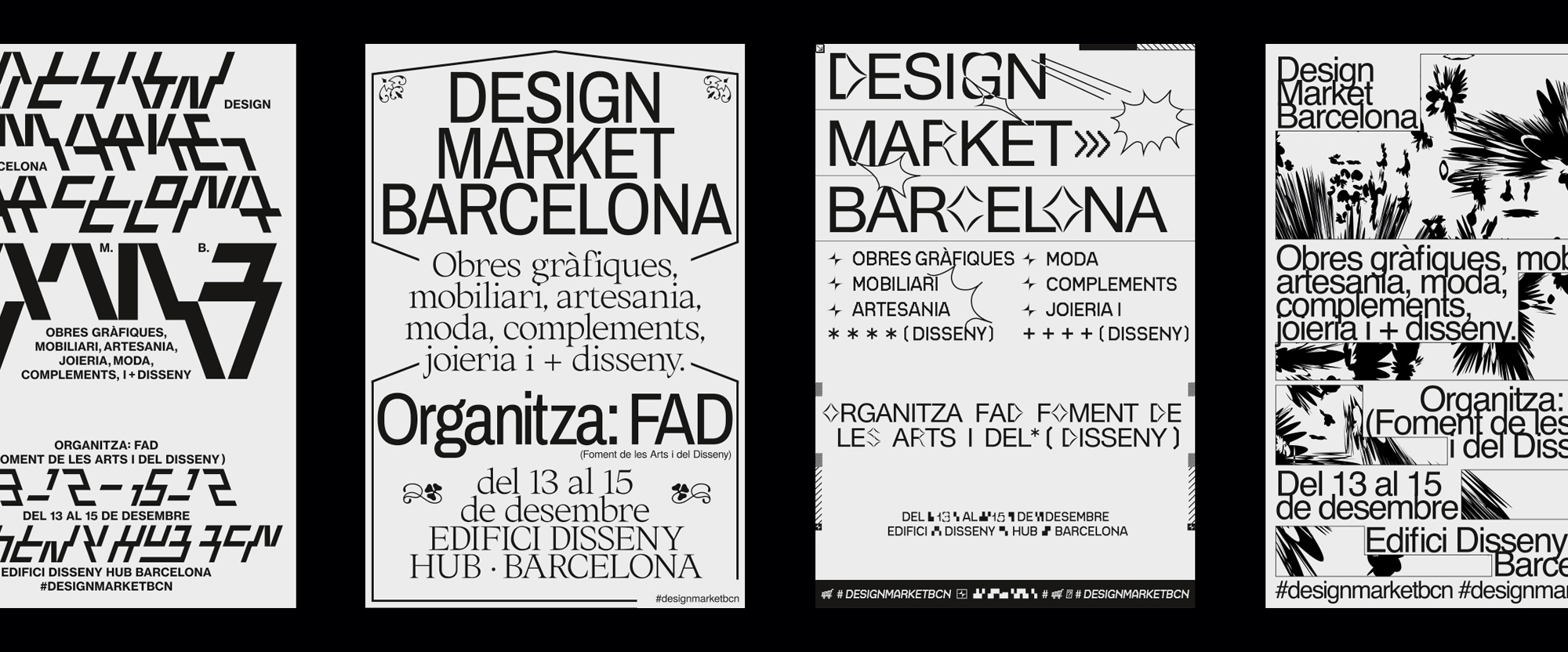
First celebrated in 2012 (under the name of Moritz Pop Up Design Market), Design Market Barcelona is an annual event at the end of year that brings together over 100 independent designers who showcase everything from decoration and objects for the home, fashion and accessories, contemporary jewelry, crafts, and graphic art, all in time for the holidays. Organized by Foment de les Arts i del Disseny (FAD), a not-for-profit association of design professionals and companies, and hosted at the immense Disseny Hub, Design Market Barcelona welcomes over 10,000 people each day in its short three-day run. The identity for the 2019 edition was designed by Madrid, Spain-based Naranjo-Etxeberria.
We wanted the campaign to be a reflection of what happens in the Design Market, the union of new talents with more consolidated designers. That is why we have curated 6 new talents of the Spanish design scene to create a collaborative campaign.
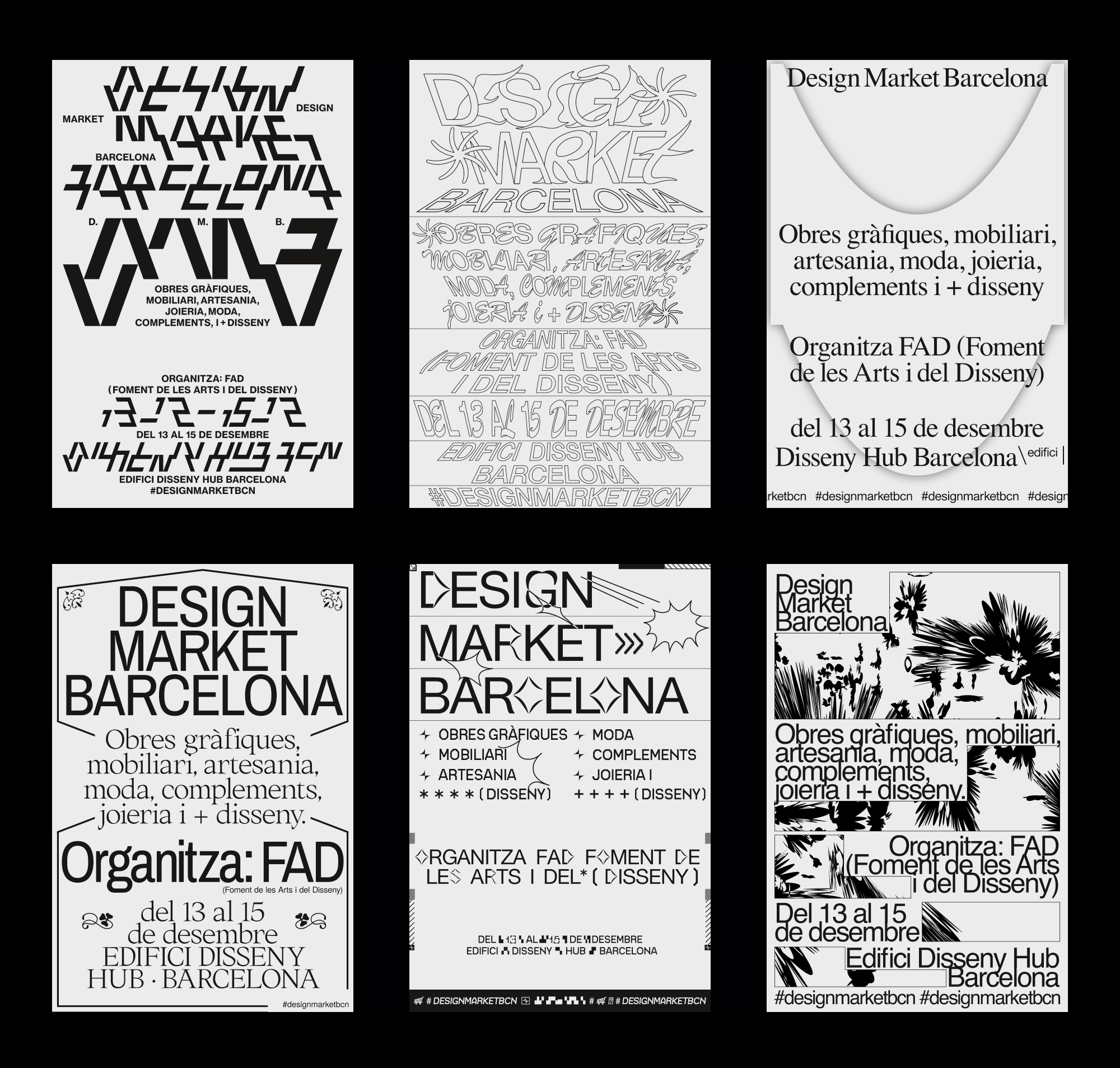
The core of the identity are the six posters above designed by six young designers in Barcelona. All the posters have the same headline, description, and information in the exact same areas of the poster and then each designer could do whatever they wanted. And do whatever they wanted they did, to varying degrees of signature Barcelona weirdness. Perhaps a little heavy on the ugly design trend but as a reflection of the free-spirited nature of the market and its independent designers on display, it’s fitting. On their own, any of these posters could, arguably, be an identity for the market but here is where things get interesting…
We decided to assume a role as art directors instead of graphic designers. The art direction of the project has been based on deconstructing and re-unifying the work of the 6 designers to create a new visual code that we built together with a mathematician who helped us mark a series of mathematical rules to create combinations that would never be repeated.
The main purpose of the campaign is to open a dialogue, to raise where the design limits are, what is design and what is not.
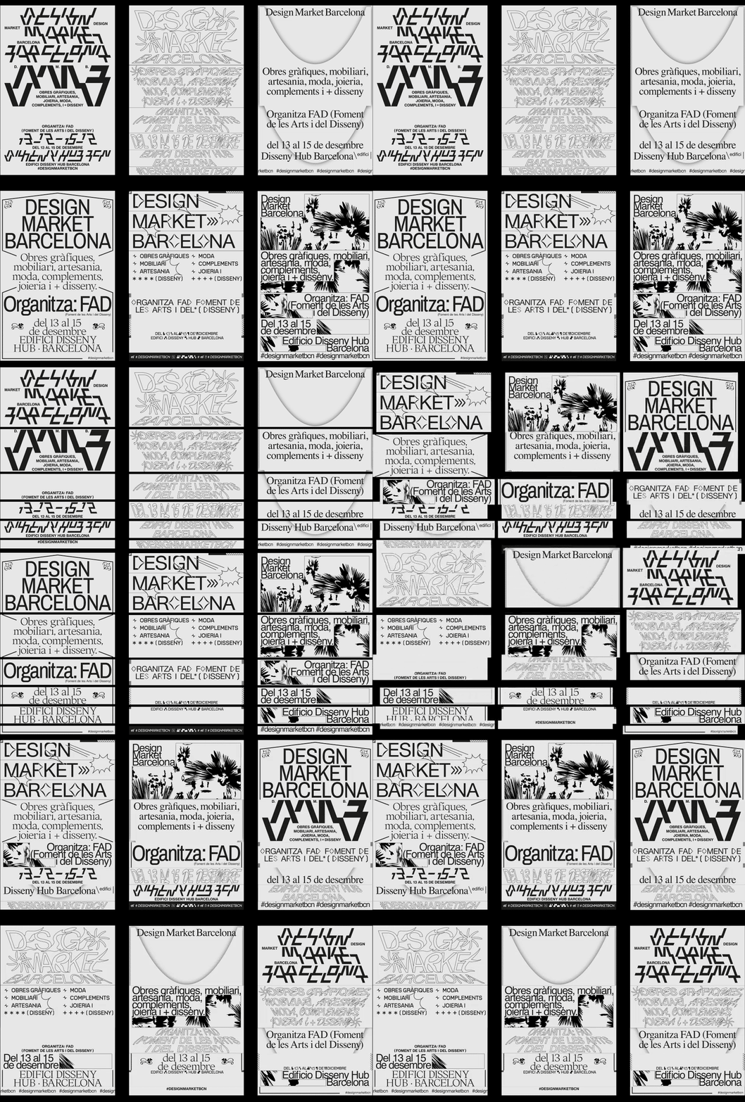
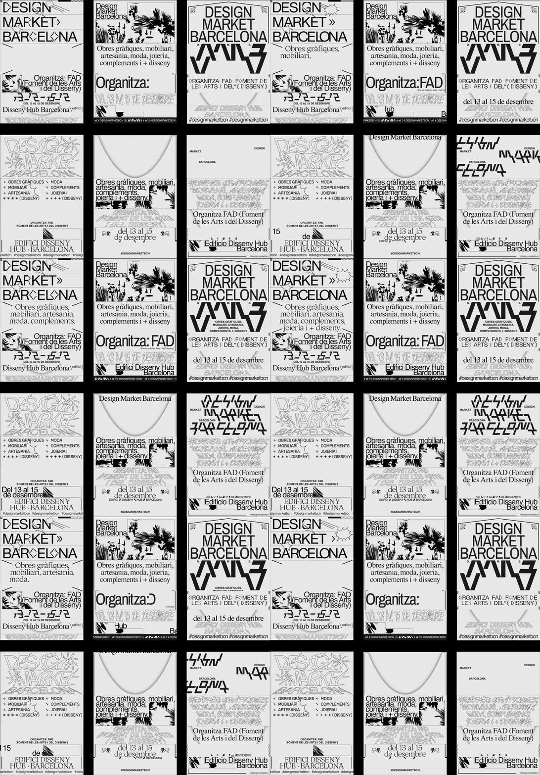
With each poster having the same building blocks, Naranjo-Etxeberria was then able to slice them at the same break points and then mix and match to their delight, creating a crazy amalgam of what were crazy-ish designs to begin with. The result can be somewhat disconcerting and I really wonder how this was received by the public but, at least when broken down here on the blog and with plenty of time to digest it, it’s pretty darn cool as it really achieves the feeling of a crafts market where a dozen different designers are piled one on top of another (or, well, one on the side of another) with an endless array of goods for sale in styles that don’t always match among neighboring stalls. Long-winded way of saying, I dig this, mostly because it’s in a style I would never do (or be able to pull off) and there is something vicarious about seeing someone else do it.
From rebuilding the posters, we created a pattern that would serve as the basis of communication. In this way, we created a unanimous language born from different individual visions.
From that pattern, we have a great variety of combinations to model each application that, added to the animations, generates the campaign universe. In this way we created a live and modular system.
Once we created the pattern and animated, it became the axis of communication for the creation of all graphic applications of the project, both static and animated.
Based on the different formats and sizes of the graphic applications we select different crops of the pattern that adapts to each application. In this way, all applications were born from one piece.
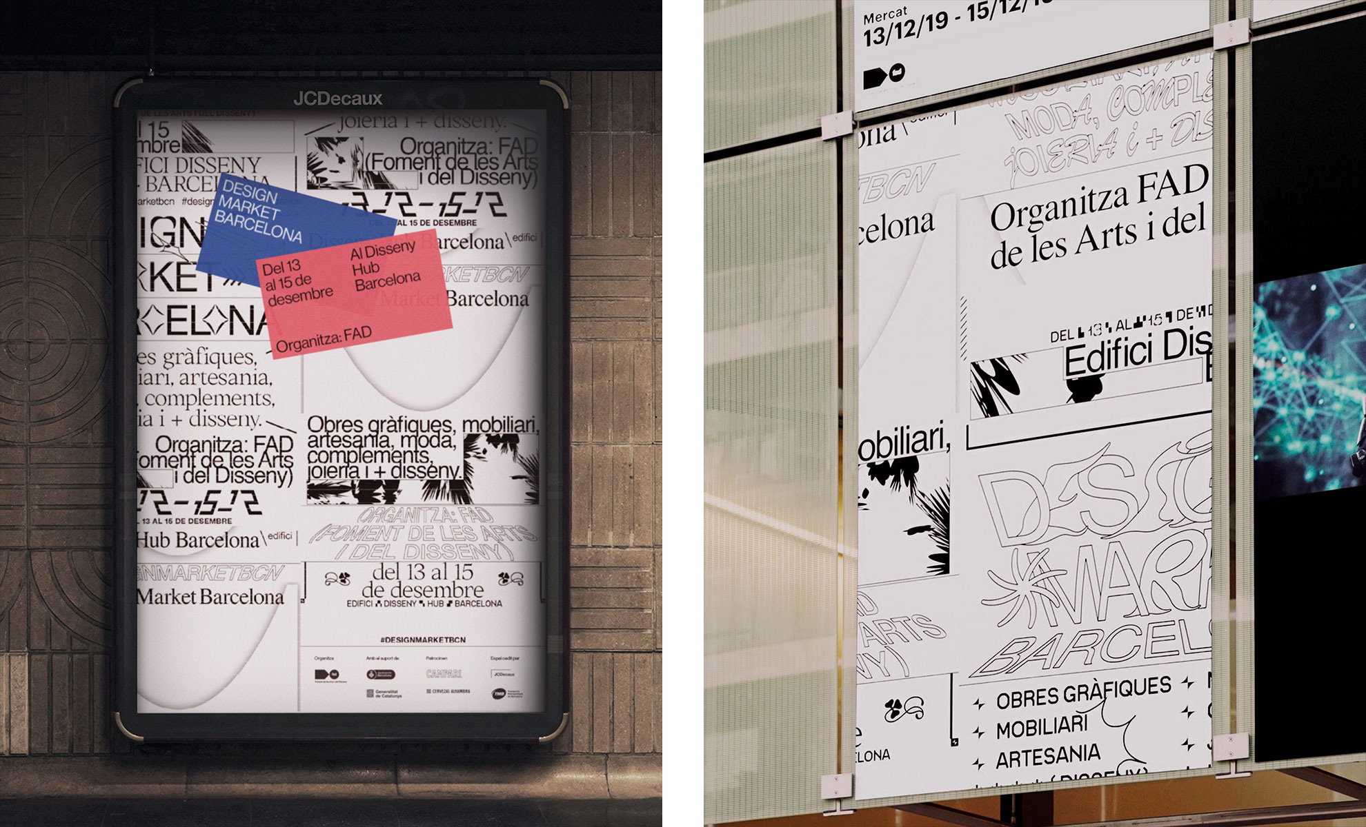
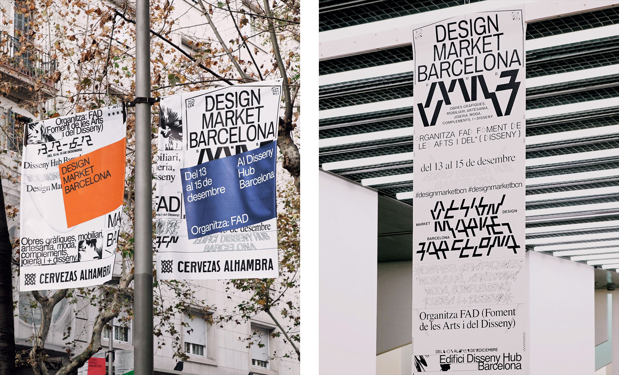
The applications can indeed be too much and I think they realized that and that’s why they introduced blocks of color, at an angle, with the title of the event and the dates spelled out in normal type, which looks cool on its own, allowing the mixed posters to become a very explosive background. Overall, this is on trend with the still-lingering Brutalist and ugly design styles but I think that by exploding it in the way that they have, it manages to add a new dimension to it and if there is any one city that can pull it off it’s Barcelona.

 Новости Союза дизайнеров
Все о дизайне в Санкт-Петербурге.