Обзор лучших ресурсов по разработке бренда, разработке упаковки
contact us | ok@ohmycode.ru
contact us | ok@ohmycode.ru
Established in 2002, Payvision is a payment processor that offers a secure platform to power transactions for businesses across the globe. Headquartered in Amsterdam, the Netherlands, the company has grown into an international team of more than 300 people with offices in the U.S., Europe and Asia. In 2018, Dutch bank, ING, bought a 75% stake in Payvision, allowing it to expand its growth and expand its innovations. Recently, Payvision introduced a new identity designed by Saffron.
As they moved from start-up to industry player, they wanted to ensure they retained their challenger spirit and strong company culture, and that this essence was perceived externally by customers and talent.
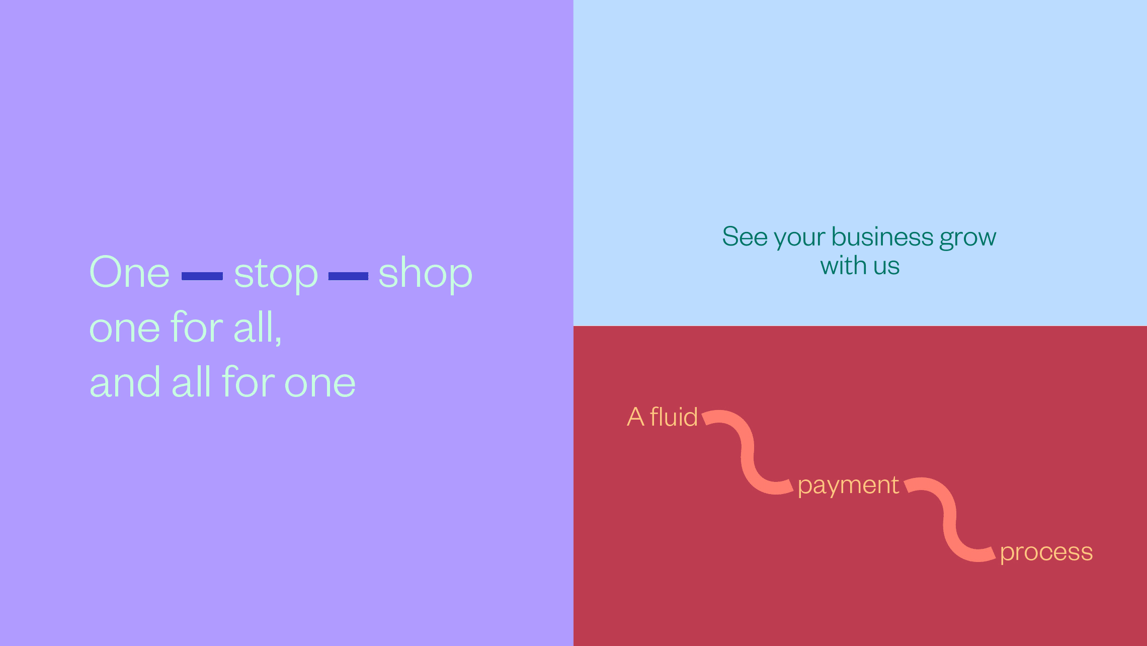
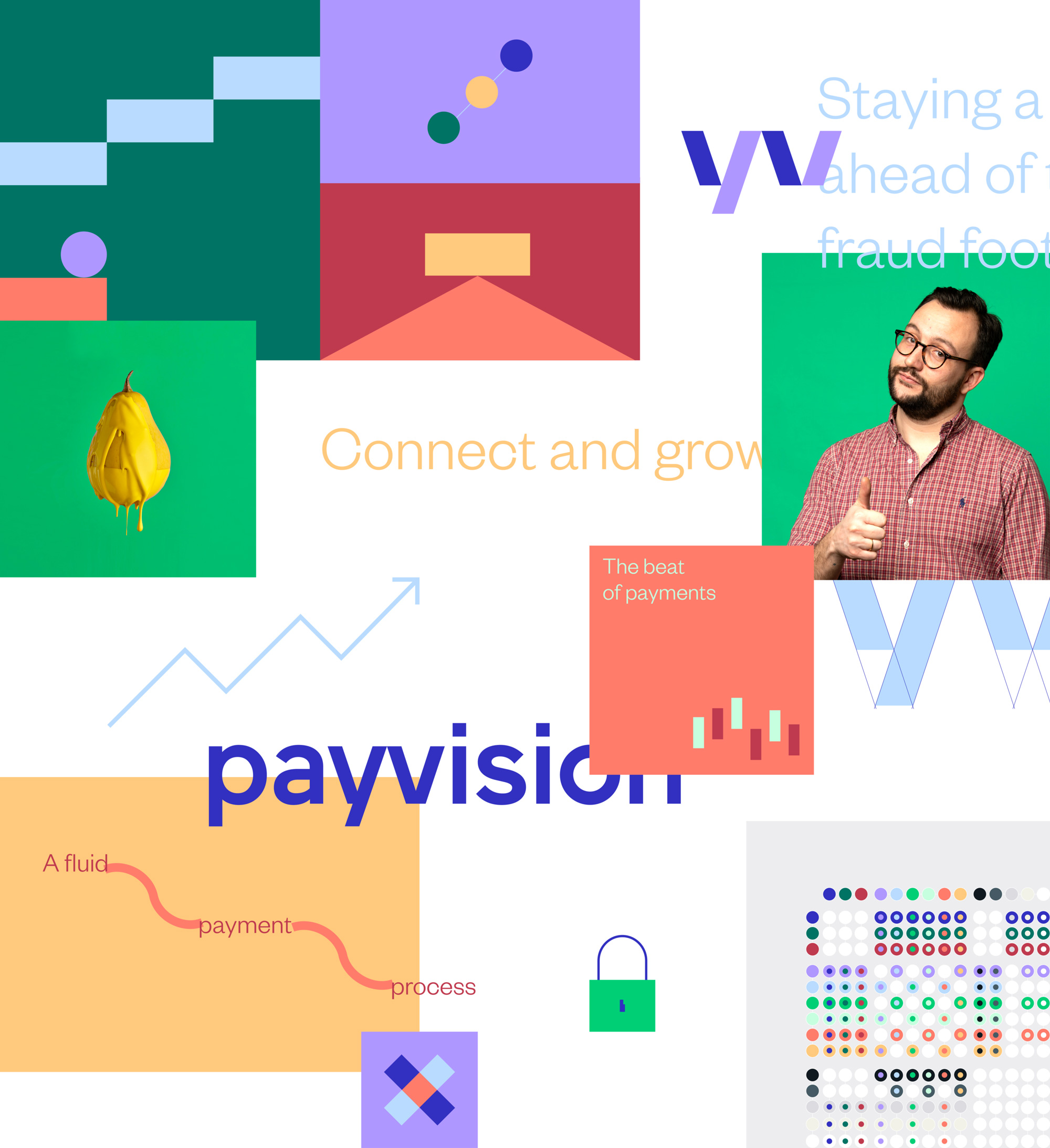
The visual identity had to reflect the energy and approachability of the company, whilst remaining as sophisticated as the expertise they hold and the technology they provide. The cornerstones of the design are simplicity and fluidity, to symbolise the value added by Payvision’s products.
The new identity reflects their character to potential customers and prospective talent: both crucial ingredients for their planned growth.
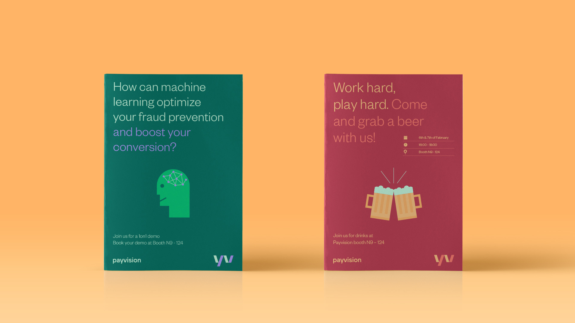
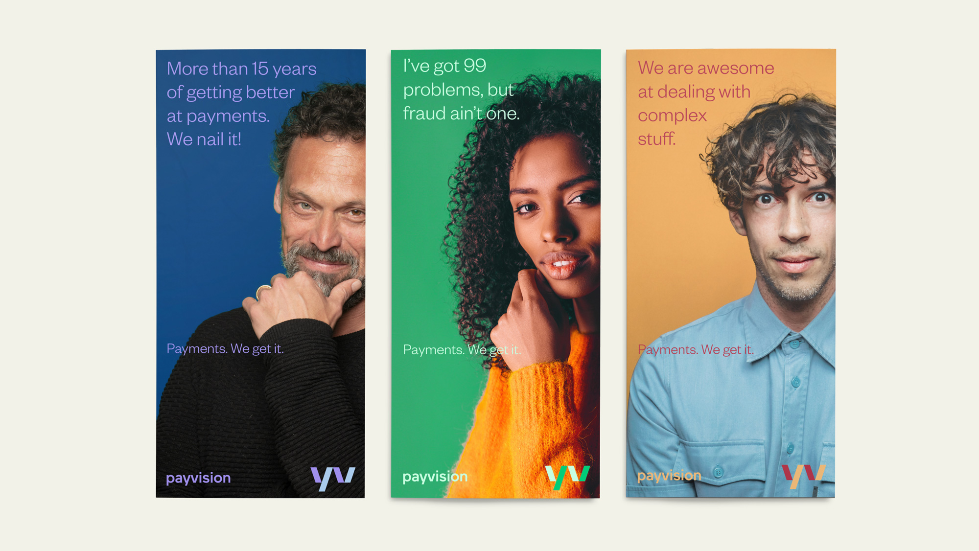
The highly coloured system was imbued with many colours so it could offer flexibility. As an empathetic brand, colour serves to create moods and express feelings effectively, allowing Payvision to tailor their communications in a sophisticated way.
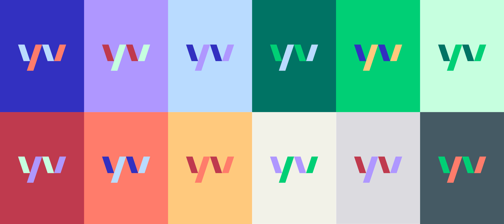
The old logo was fairly bad, with an ambiguous shape of some kind trying to look meaningful and a techie-looking typeface that, along with the name, made it all look more like a discount cable TV provider. The new logo has a more contemporary sans serif wordmark that’s mostly fine and then makes, not the “P” in Payvision, but the “yv” combo, the hero of the monogram, which is a little confusing. It’s not explained as such but in trying to have deep thoughts of my own I could interpret the choice as the “y” and “v” being the bridge from one word (“pay”) to the other (“vision”) in the same way that Payvision acts as a bridge between payer and payee. Maybe. The thing is, I kind of like the “yv” monogram visually and how the angled bars meet at the corners but, yeah, it’s a hard sell. The color combos are a little too much with some pairings that are simply not pleasant to look at. The flexibility to separate the monogram from the wordmark works well, although I think that just amplifies the oddness of “yv” being the representation for “Payvision”.
The new brand brings this vision to life, with the claim ‘Payments. We get it.’ This embodies their customer-centric and easy-going approach, simplifying complex processes as well as their professionalism and dependability.
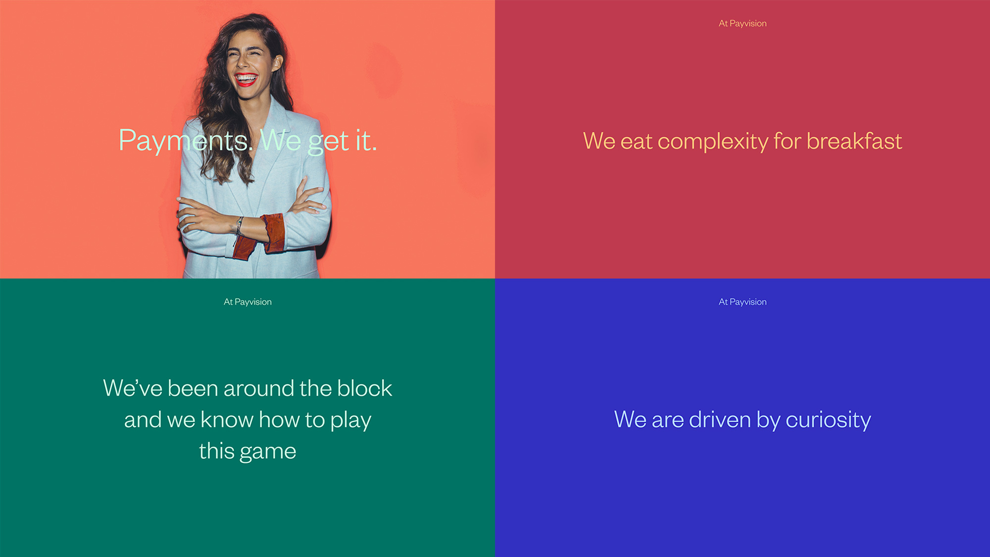
Payvision’s role is to ensure trust, security and a smooth purchasing process, concepts that are simple principles, with highly complex delivery. The design language reflects this, mirroring the role Payvision plays for their customers by simplifying communications with clear lines, uncluttered visuals and clear statements.
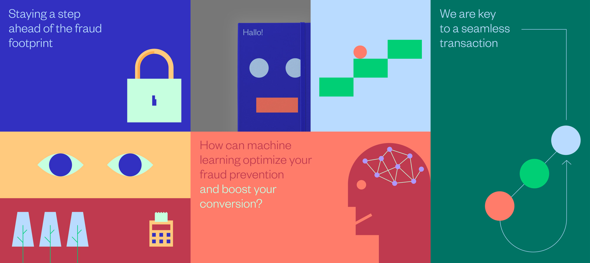
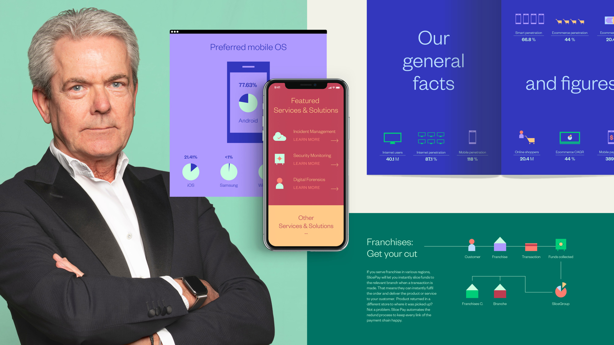
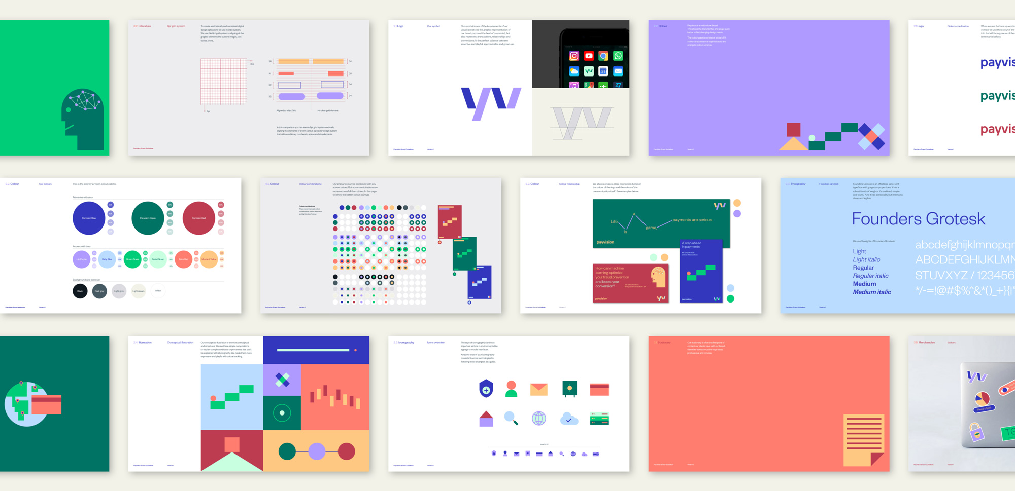
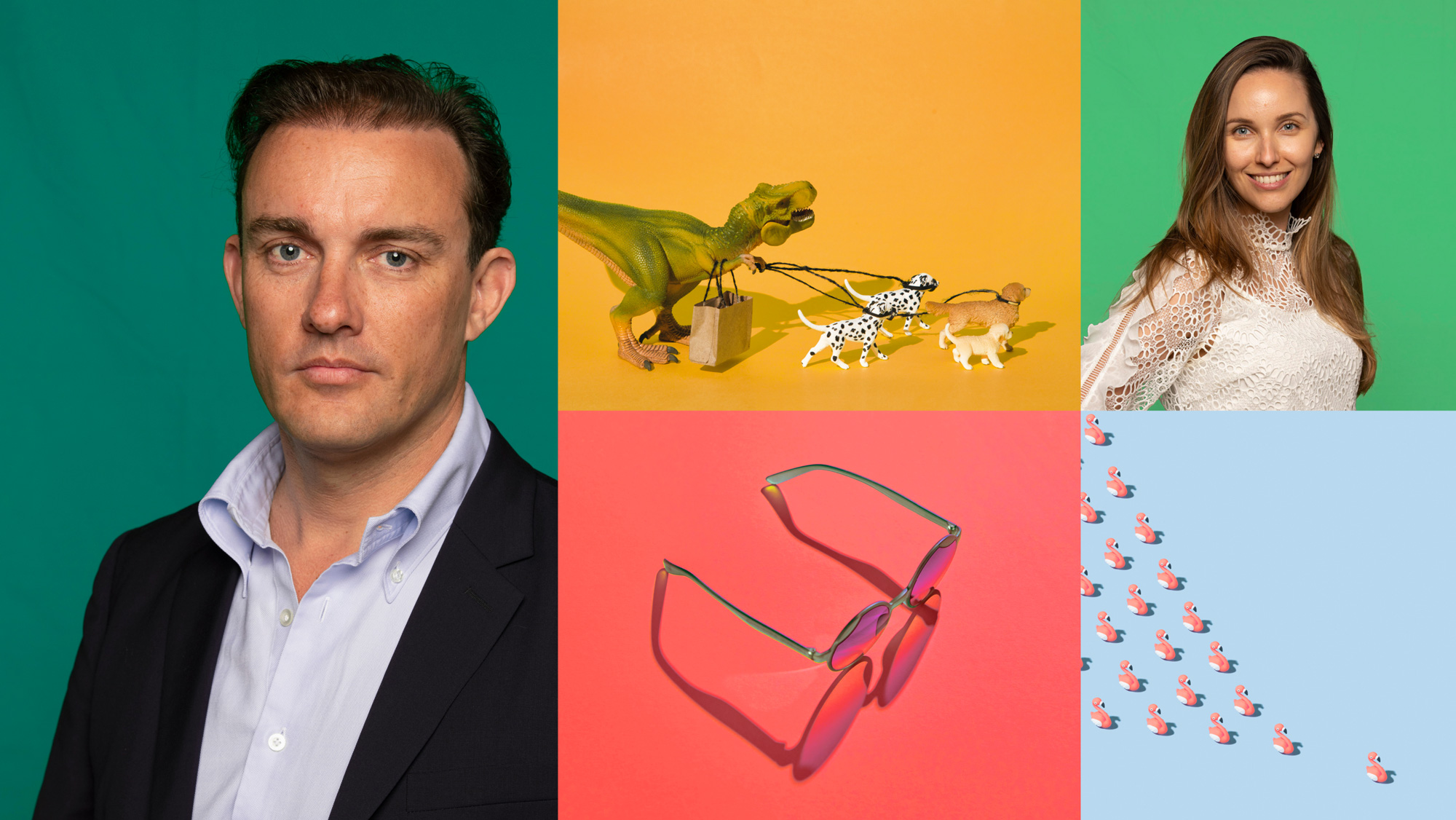
The identity and visual language is somewhat overwhelming… with too many elements in play, from the color palette, to icons, to illustrations, to wavy lines, to abstract compositions of geometric shapes, to some really odd photography (below and a lot more at Payvision’s website). Based on Saffron’s description, it seems like Payvision has a fun, quirky culture that supports this and that’s awesome but when visualized for the outsider it’s hard to tell if this is meant to be either serious or silly and whether it’s done with a straight face or in more of a satirical tone.
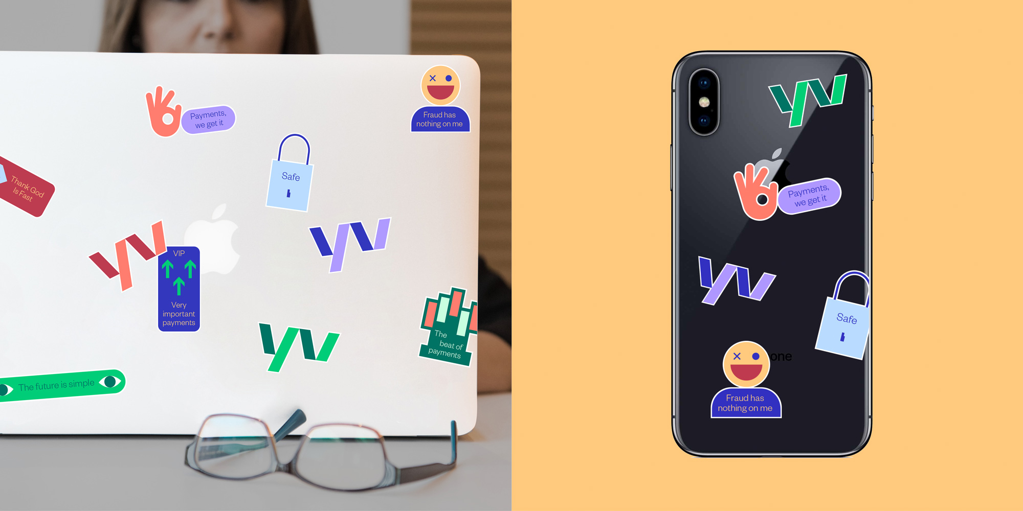
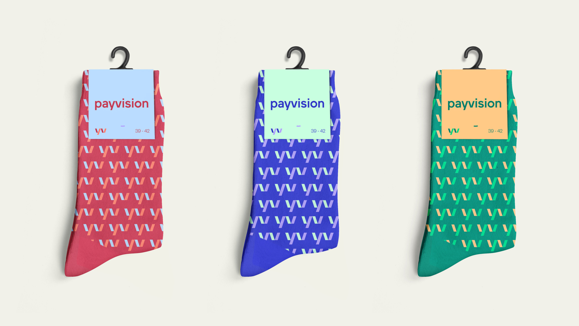
The applications all look fine, engaging, and there is an overall patina of proficiency and high energy but it’s all a little disparate and odd with no real connecting thread between something like the banners and the stickers — like, those are two different companies. Overall, I want to applaud the variety and breadth of elements to build a visual language but I think it was one or five too many things. On the flip side, based on the website, Payvision does seem to be owning the quirkiness full and well and conviction in your own identity is half the battle in getting people to see you as you see yourself. (That’s some Yoda-level zen stuff you can apply to your own life.)
 each year since publication began in 2006

 Новости Союза дизайнеров
Все о дизайне в Санкт-Петербурге.
Новости Союза дизайнеров
Все о дизайне в Санкт-Петербурге.