Обзор лучших ресурсов по разработке бренда, разработке упаковки
contact us | ok@ohmycode.ru
contact us | ok@ohmycode.ru
Established in 1998, MoveOn is an independent, public policy advocacy and activist group funded by its members. MoveOn has two main activities: MoveOn Civic Action, a 501(c)(4) nonprofit organization that focuses on education and advocacy and also manages all the petitions; and MoveOn Political Action, a federal political action committee that raises funds and supports political candidates of the Democratic party in their election runs. Over the years, over 8 million people have taken action with the organization. Yesterday, MoveOn introduced a new identity designed by New York, NY-based RedPeak.
We built an iconic brand identity designed to engage today’s audiences—across platforms—with a visual system built to mobilize members to both stand up for and resist against today’s most pressing political issues. This brand is rooted in the idea of People-Powered Progress, and positions MoveOn as the force fighting for the progressive values that unite everyday Americans.
The old logo was painful to look at. I think it was an italic font further obliqued, probably in Microsoft Word, and it was also a perfect example of how NOT to do small caps with the “ORG” part being scaled down and ending up much lighter than the rest of the letters. Not pleasant at all. The new logo uses protest signs as a reference to build a simple and bold logo with great energy. I like that it’s not a straight-up wordmark and that the name is broken up, hinting at the disruptive nature of its efforts (which may be reading a little too much into it, I admit). The execution is really good, hiding just enough of the first letter of each placard to convey the idea of depth without losing readability. The color variation of resist and support is good and not-so-subtly references the political party leanings of the organization (red = Republicans = resist / blue = Democrats = support).
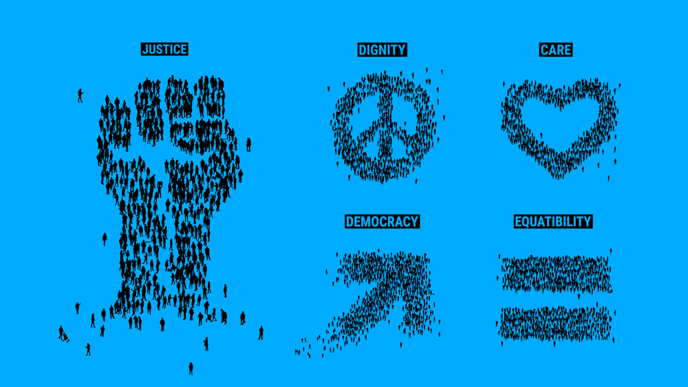
At first, the image of the little people making up different signs felt kind of cheesy but I love how they did it: filming people, then abstracting them into black and white, then digitally bringing them all together. The idea supports well the brand idea of being “People Powered” and the resulting graphics do look good and engaging in the posters below.
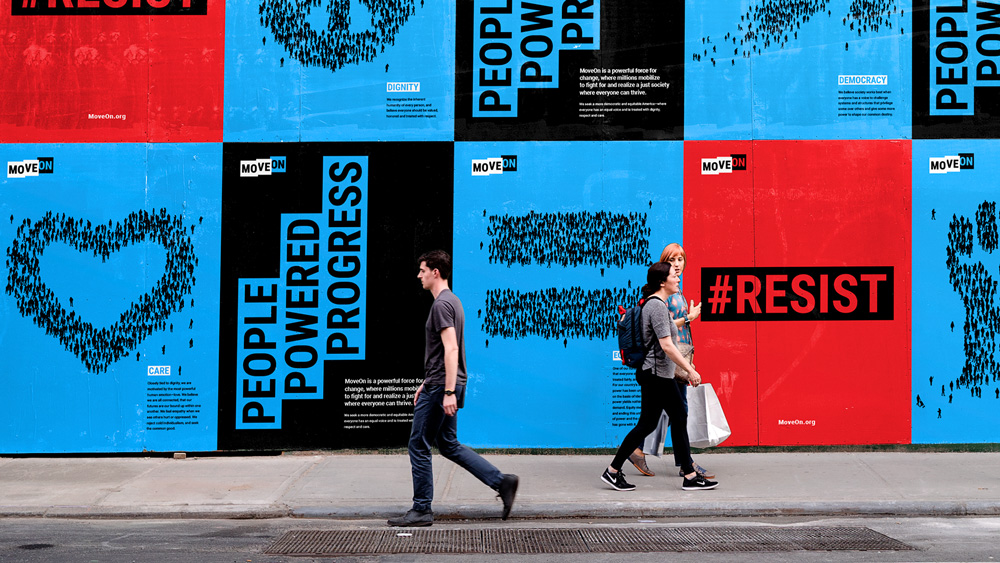
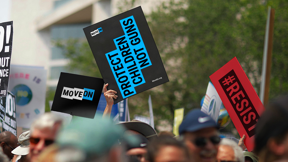
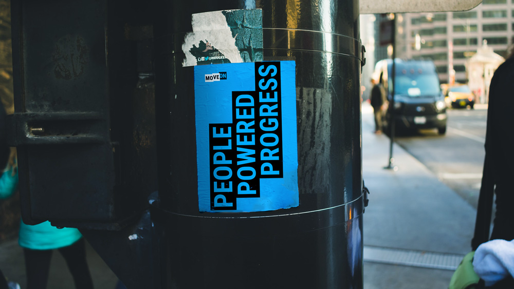
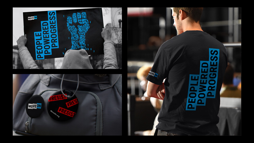
The visual language of type set inside thick bars isn’t entirely novel — in particular for organizations or causes wanting to communicate urgency — but, in this case, it all ties together well with the logo and the use of the same font throughout.
Overall, this is a strong evolution that gives the organization an identity that matches the energy of its members.

 Новости Союза дизайнеров
Все о дизайне в Санкт-Петербурге.
Новости Союза дизайнеров
Все о дизайне в Санкт-Петербурге.