Обзор лучших ресурсов по разработке бренда, разработке упаковки
contact us | ok@ohmycode.ru
contact us | ok@ohmycode.ru
Established in 2009, Venmo is a mobile payment service that allows people to quickly send each other money through their app. Unlike PayPal (although owned by PayPal since 2013) where there are multiple clicks and screens required to send money to a friend, the Venmo app makes this process relatively easier and quicker (at least once you have located your friends — the few times I have used it, finding people, the right people, was confusing and uncertain). Transactions are free as long as the money is coming from a linked bank account, with money being made by PayPal from credit card transactions and from select merchants who accept Venmo as payment. In 2018, when Venmo’s popularity began to rise, it processed $12 billion in volume in the first quarter alone. Apart from the ease of use, what makes Venmo interesting is that its home screen is a feed of other users transactions so you can see either complete strangers’ or your friends’ payment activity — no specific amounts just who they paid and for what — which, call me old fashioned, but the first time I realized that my transaction subjects were public it felt very invasive. You can opt out of making your transactions public, yet this is what makes Venmo, Venmo… officially a “social payments app”. Starting with their social media, Venmo is rolling out a new identity designed by Koto.
The new electric blue retains the heritage of the original Venmo blue. It’s been tweaked to work harder and more consistently across all applications, on screen and off. A broader palette of complementary colours now sits alongside it. With its flexibility to be either bold or controlled, Athletics is the perfect typeface for Venmo, more than matching the energy of the rest of the brand. Scto Grotesk is a more functional secondary partner that still holds its own.
No, your eyes do not deceive you, there is nothing different about the logo, which remains exactly the same. The only difference is the tone of blue, which seems frivolous but, at least as a sample audience of one person, the first time I ever used Venmo, the shade of blue gave me pause in whether I would trust the service or not — it felt like a cheap color for an app from the mid 2000s. It didn’t seem right. The new blue is obviously on trend but it now fits within the vibrant Instagram/Facebook/WhatsApp shades. In terms of the logo, it’s a nice wordmark with a distinctive curly-esque “v”.
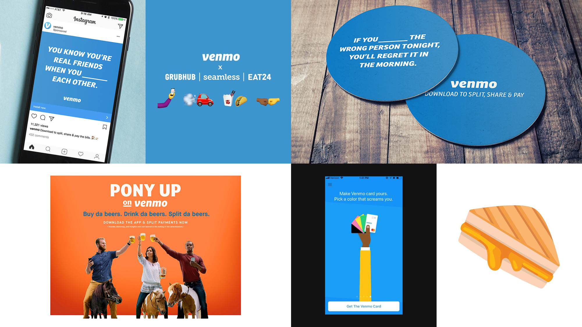
I have never seen any ads from Venmo so the above image is news to me and it does look direly boring.
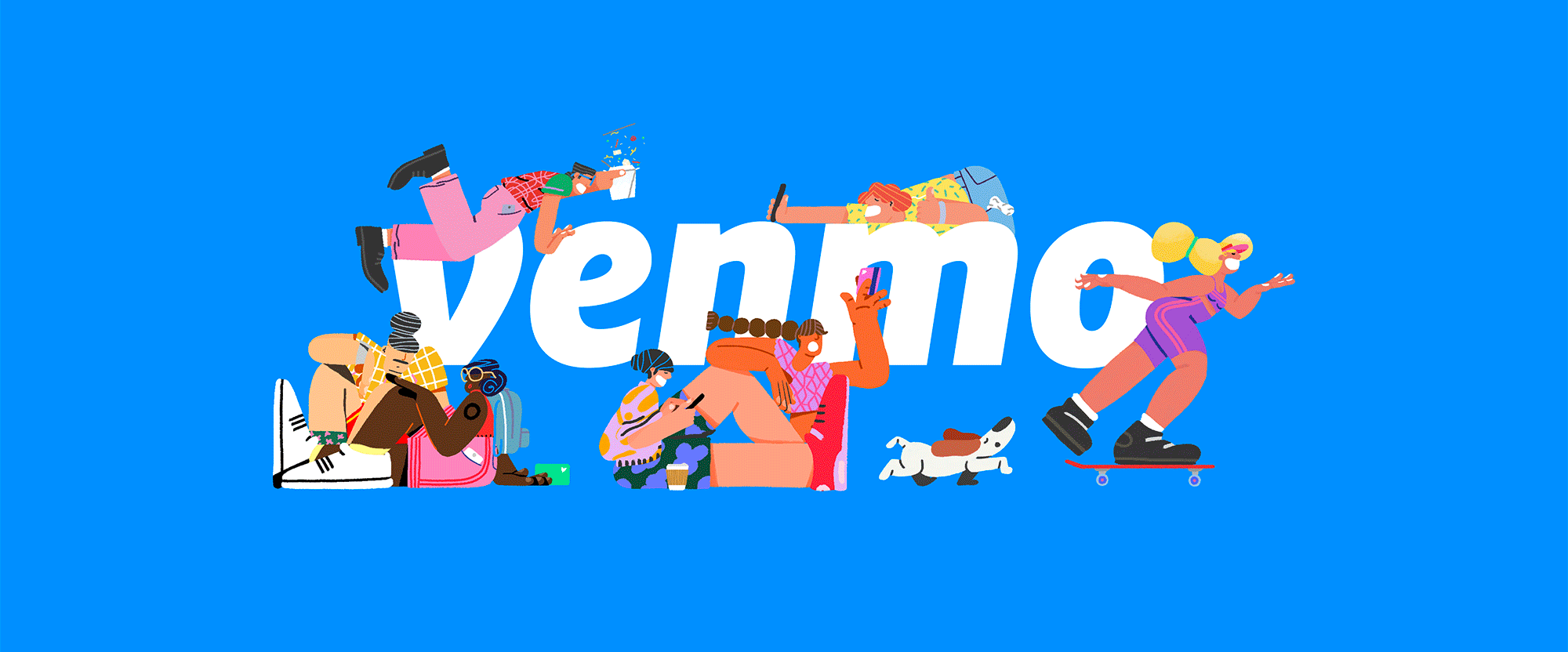
Created in collaboration with Sebastian Curi, the new set of illustrations bring to life all the many experiences behind Venmo payments, from road trips to ramen.
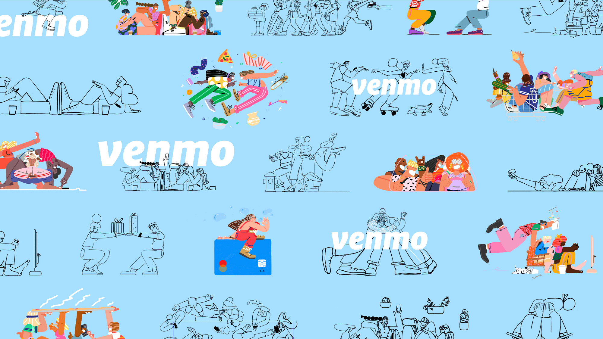
Since day one, Venmo’s users have made it what it is. That’s why we’ve evolved the brand to celebrate the story behind a payment. Dinner tabs. A dollar to say hi. Last-minute concert tickets. The $6.8M spend on

 Новости Союза дизайнеров
Все о дизайне в Санкт-Петербурге.
Новости Союза дизайнеров
Все о дизайне в Санкт-Петербурге.