Обзор лучших ресурсов по разработке бренда, разработке упаковки
contact us | ok@ohmycode.ru
contact us | ok@ohmycode.ru
Established in 2006, OLX (short for On Line eXchange) is a leading classifieds platform that allows users to buy, sell, or exchange used goods and services. Owned by OLX Group — which owns another 18 similar platforms across the globe and across industries — OLX is available in 25 countries around the world, from Brazil to India to South Africa and every month, hundreds of millions of people use OLX to find and sell everything from furniture to musical instruments, cars, houses, and more. Recently, OLX introduced a new identity designed by DesignStudio.
Our strategic proposition ‘We exist to empower everyone to make smart choices’ puts the power in the hands of the buyers, sellers, businesses and employees. It positions OLX as the savvy way to buy and sell almost anything.
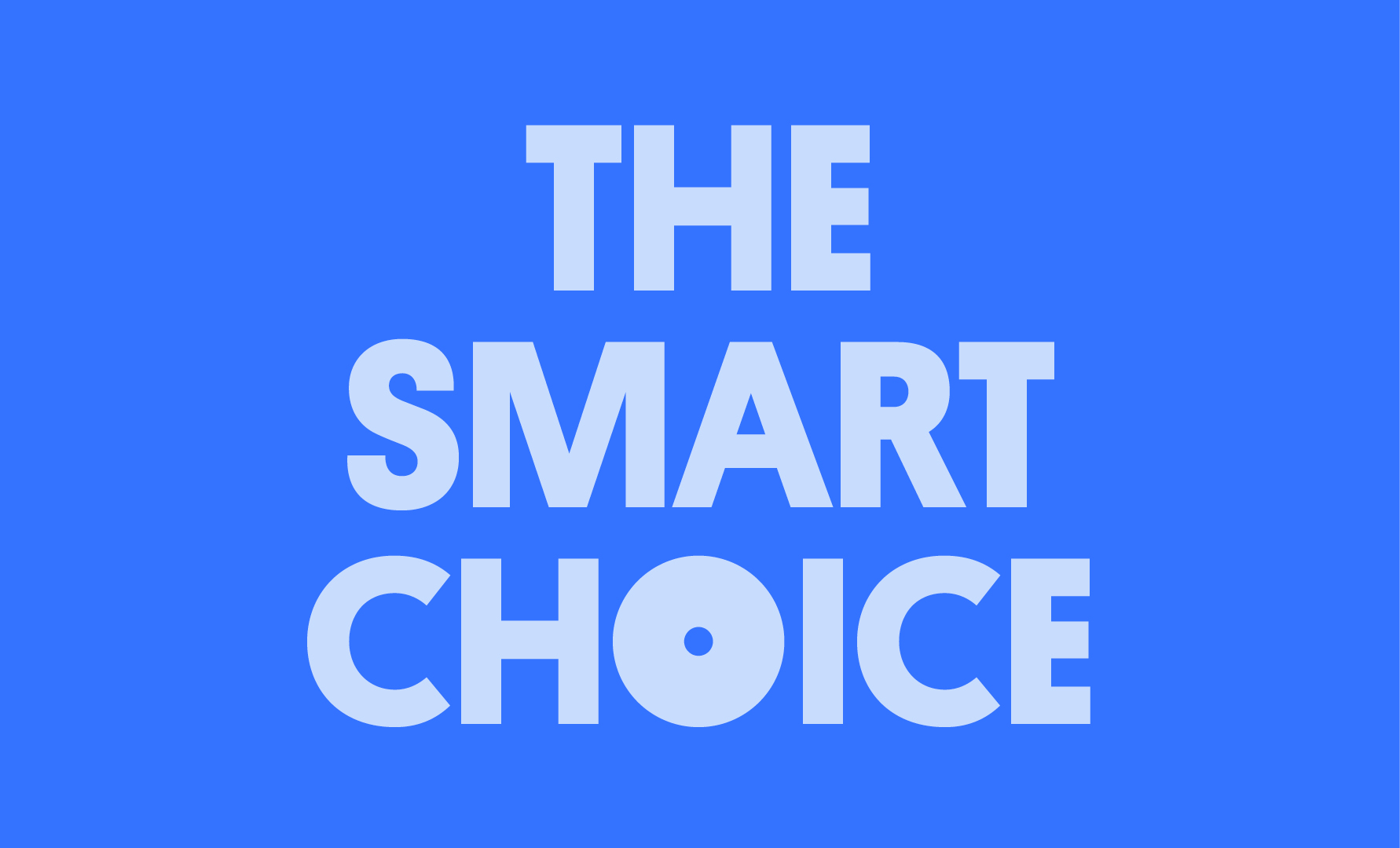
From this strategic jump-off, we created a visual design system that’s dynamic, confident and bursting with energy — expressing all the optimism and attitude that’s true to OLX. The logo itself represents the idea of choices, flexing and shifting between options.
The old logo was mostly fine*. Other than the strange color combination — which is not wrong per se, it’s just weird — it was clear and bouncy and treated the “LX” pair in a way that solved what would have been some unbalanced counterspace issues. Perhaps it did feel a little dated but could have easily stayed the same for a long time. The new logo is a more abstract representation with a hard geometric approach that turns the logo from an easy read to a complicated one and it’s only three letters. If I were seeing this logo for the first time, without knowing the name of the company, I would read it as “O|X” but under the assumption that most people will read it as “OLX” or “olx” there is something not quite right about the logo. The “O” is too big, the “L” too thick, and the “X” too small. The strange thing for me, is that I don’t dislike it… there is something strong about it and I really like how the premise of the brand position comes alive in the basic logo animation, where the letters shift weights and sizes to give the idea of choices and variety and how that extends to the typographic treatments.
* Update: I previously included the wrong “before” logo, which was only used in Brazil. This correct version is a little worse with its more exuberant “X” and tight stroke around the logo.
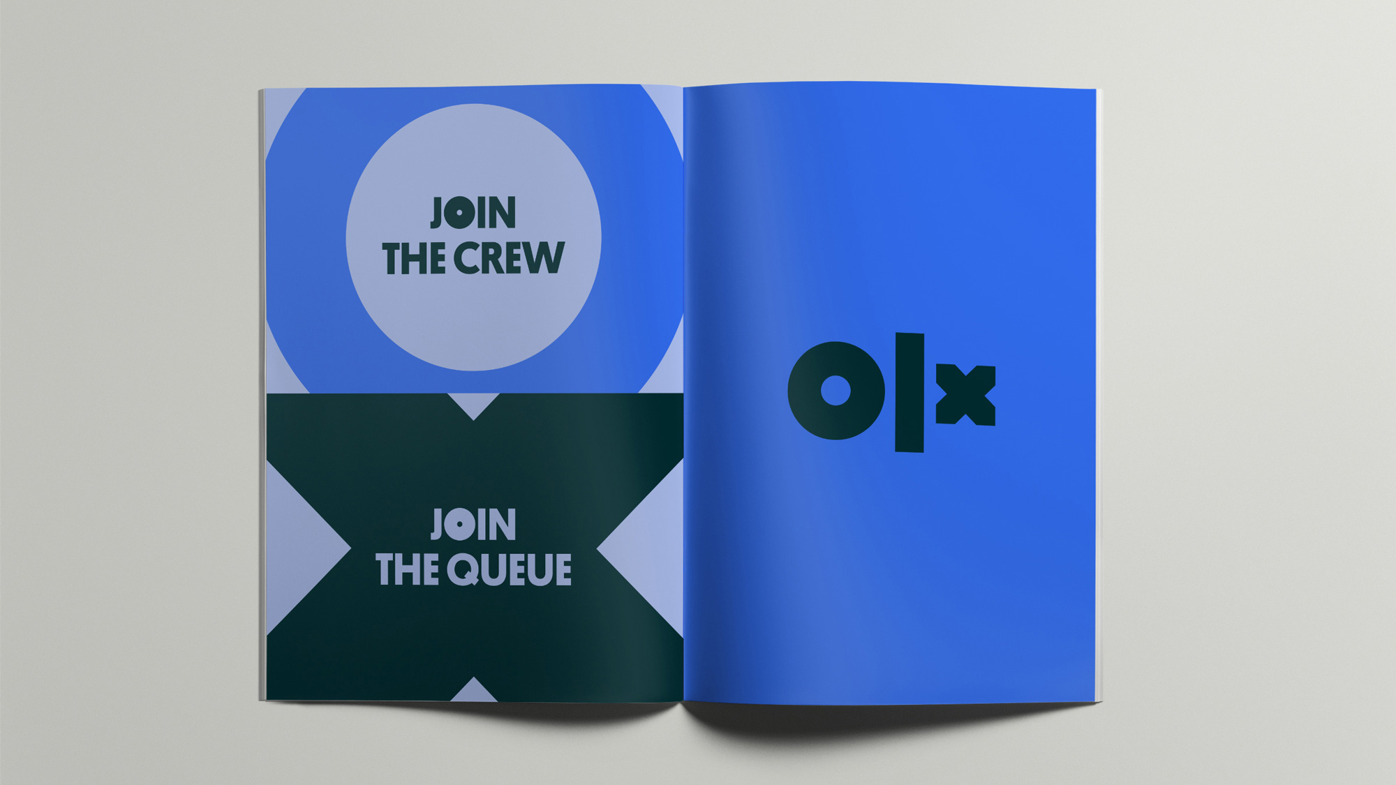
We created all the tools OLX would need to launch the refreshed brand around the world — including distinctive custom typography, a vibrant colour palette, photography guidelines featuring confident local users, and helpful yet attitudinal tone of voice principles.
This is probably the better part of the identity presentation because for as much potential as the above animation has, that same energy or cohesiveness doesn’t quite come across in application.
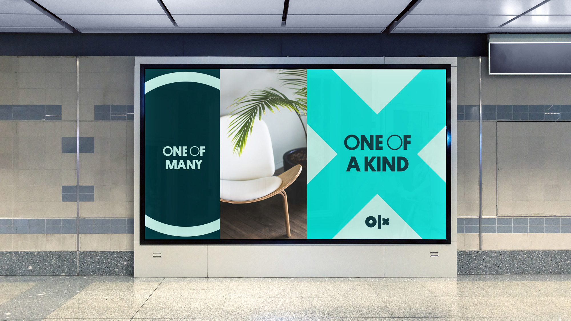
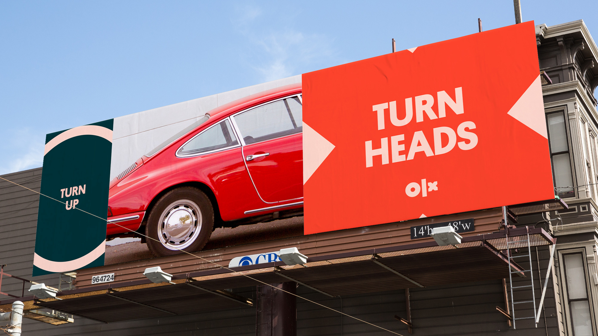
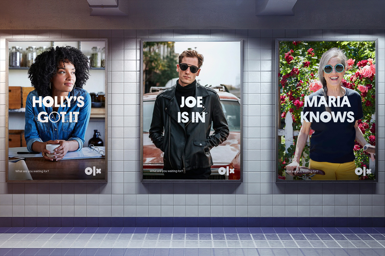
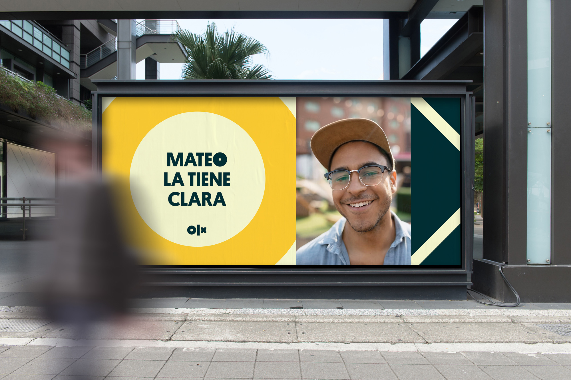
From seeing any of these posters and ads, I would have no idea what this brand is about or what it does or who it’s for. The messaging is unclear and ambiguous and while they try to be aspirational in some form I am really not sure what I’m supposed to be aspiring to. There is also a big emphasis on the “O” and the “X”, leaving the “L” out of the equation, further making the logo read as “O|X”.
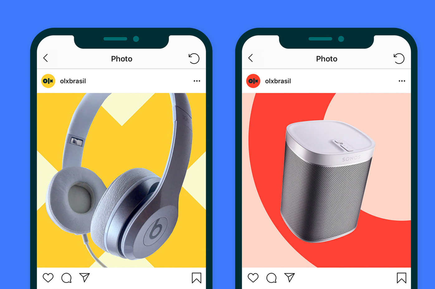
The two images above are cool, I guess. Bold and colorful. The instagram posts image is the one time any of this hints at being about “goods”.
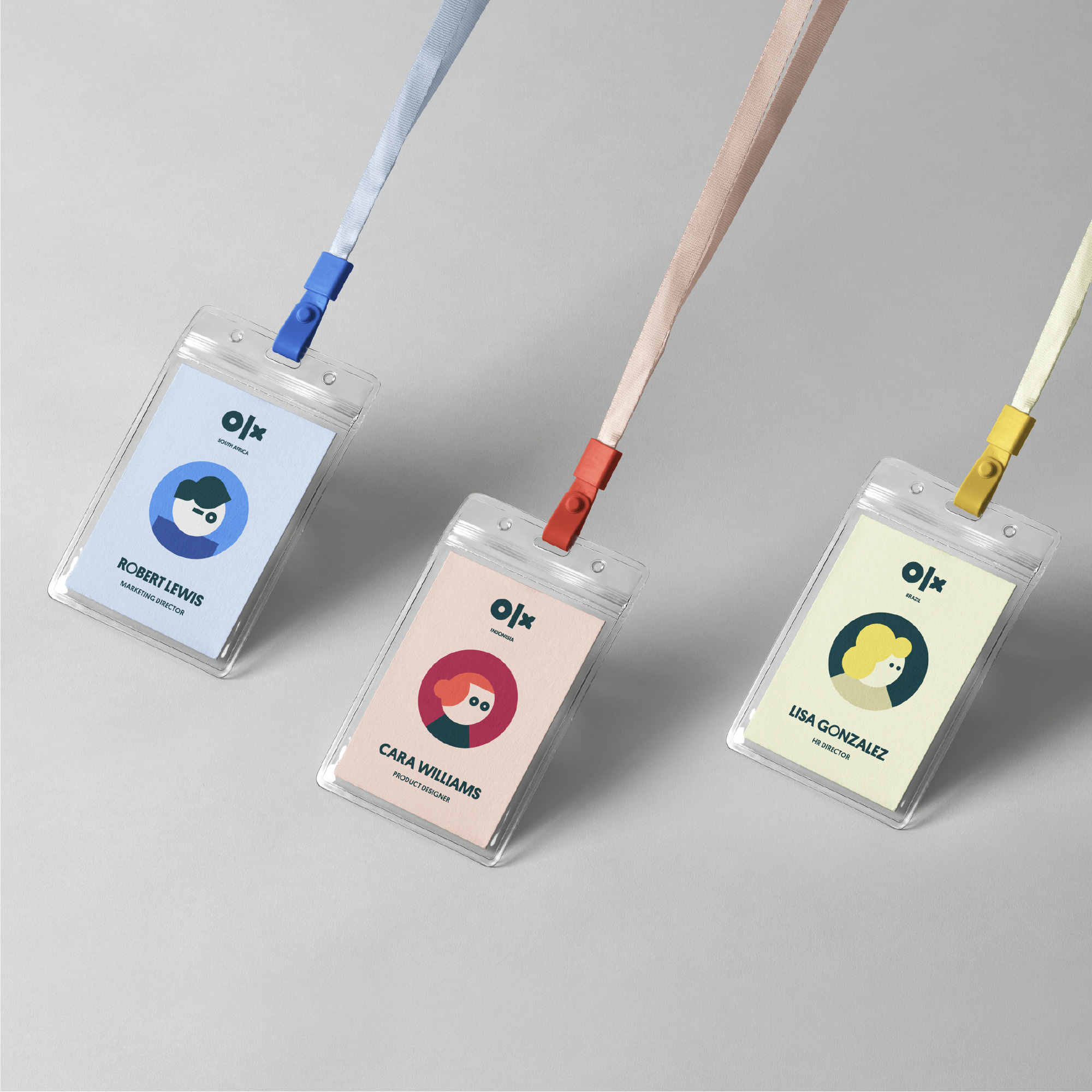
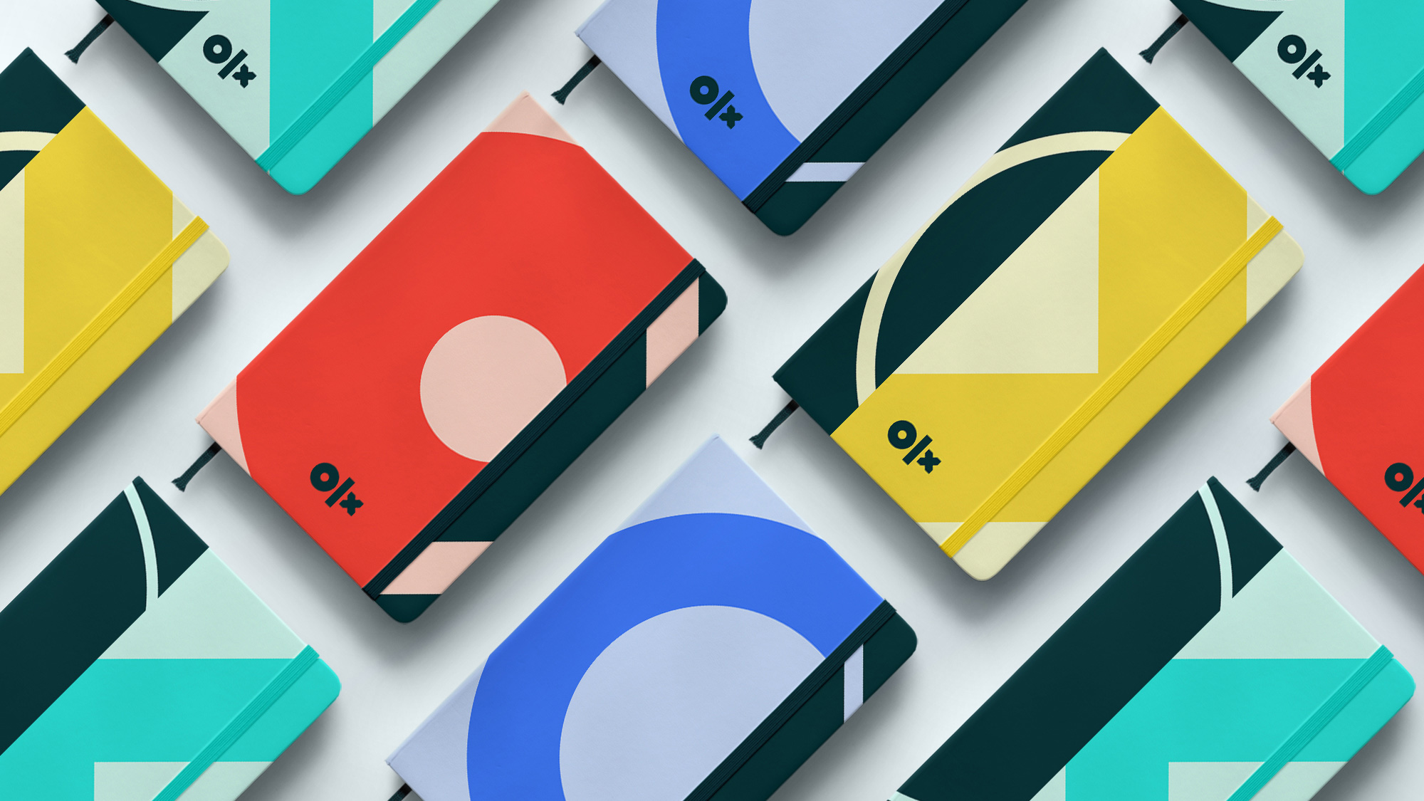
I guess the avatars are charming and their simplicity follows the cues of the logo but these seem out of place, even if they are only meant for internal use.
Overall, this feels a little confused and unsure on whether it wants to be a happy, friendly brand or a hip, lifestyle brand and I feel like it never gets to the core of things which is making it clear this is a platform for second-hand goods… like, if you look at the home page of OLX in Brazil and you look at the case study, something got lost in translation. I feel like there was a good start somewhere in here and the logo could be good with some better hints of what it’s supposed to read like but somewhere it took the scenic detour instead of just going straight.
 each year since publication began in 2006

 Новости Союза дизайнеров
Все о дизайне в Санкт-Петербурге.
Новости Союза дизайнеров
Все о дизайне в Санкт-Петербурге.