Обзор лучших ресурсов по разработке бренда, разработке упаковки
contact us | ok@ohmycode.ru
contact us | ok@ohmycode.ru
(Est. 2001) “Axway (Euronext: AXW.PA) is a catalyst for transformation. With Axway AMPLIFY™, our cloud-enabled data integration and engagement platform, leading brands better anticipate, adapt, and scale to meet ever-changing customer expectations. Our unified, API-first approach connects data from anywhere, fuels millions of apps, and delivers real-time analytics to build customer experience networks. From idea to execution, we help make the future possible for more than 11,000 organizations in 100 countries.”
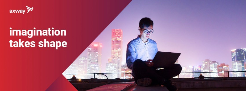
The new Axway brand identity developed in collaboration with Landor, a leading global brand and design consultancy, introduces the new tagline Imagination takes shape, an eye-catching logo, a fresh visual expression, and a redesigned website. The new tagline underscores Axway’s commitment to helping organizations capitalize on untapped potential by strengthening their capabilities and transforming innovations into real, revolutionary business results. Axway’s logo draws from the legendary griffin, a visionary creature with the rear body of a lion and the head and upper body of an eagle, to celebrate two powerful elements—Axway and its customers—uniting to achieve success. This strong symbol perfectly embodies the essence of the Axway brand, fusing stability and reliability with an open-minded, bold vision for the future.
The old logo was… something. An "x" with wings on an orb, I think. Or maybe it was an "x" desperately trying to peel itself off from whatever logo tragedy it had been made part of. In short, a fairly incomprehensible and vacuous corporate mark with pretty bad typography to boot — ITC Eras, such a conundrum. The new logo features an abstract griffin that I would have never been able to tell identify as one if it weren't for the press release. It definitely looks like a member of the avian community but making the leap to interpret it as a half-eagle-half-lion mythical creature is a big one. Despite the lack of clarity, it's an effective corporate icon that is as ambiguous as the description of the company itself. The wordmark is actually quite nice for a corporate sans serif and it pairs well with the angles of the icon. I threw in a couple of applications I found but they don't seem to be best-case scenarios and it's hard to judge. Overall, sure, why not?
Thanks to Matthew Congrove for the tip.

 Новости Союза дизайнеров
Все о дизайне в Санкт-Петербурге.
Новости Союза дизайнеров
Все о дизайне в Санкт-Петербурге.