Обзор лучших ресурсов по разработке бренда, разработке упаковки
contact us | ok@ohmycode.ru
contact us | ok@ohmycode.ru
Established in 1984, Halstead is a residential real estate brokerage firm in the New York metropolitan area with more than 1,300 sales and rental agents with offices in Manhattan, Brooklyn, Queens, the Bronx, the Hamptons, Fairfield County, Connecticut, New Jersey, and the Hudson Valley. Their properties and overall positioning are on the luxury, high end. This past April, at its annual meeting, Halstead introduced a new identity designed by New York, NY-based Pentagram partner Eddie Opara.
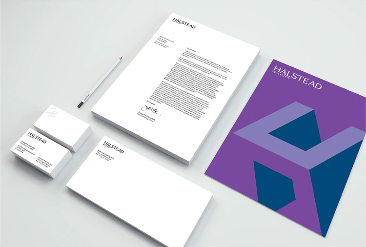
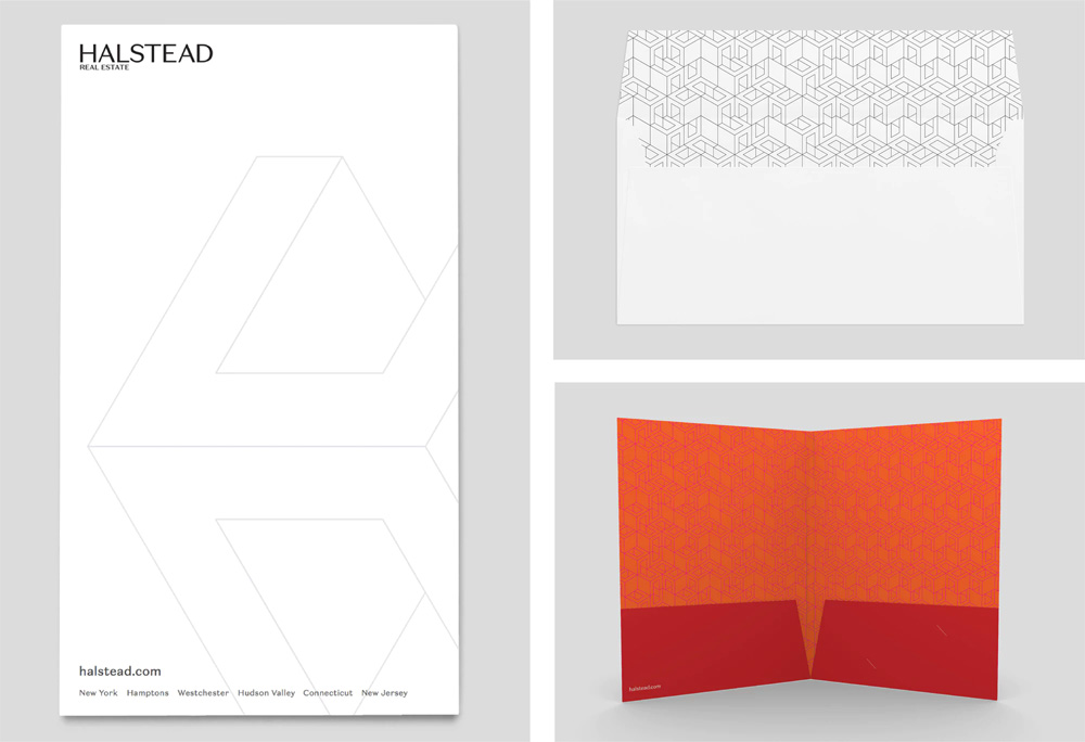
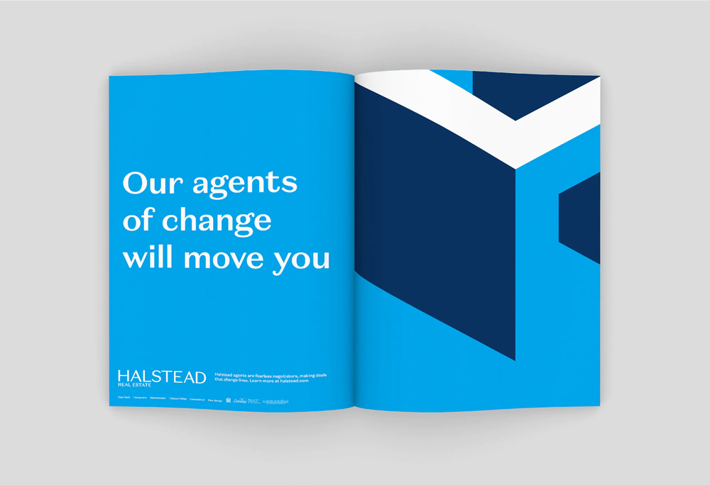
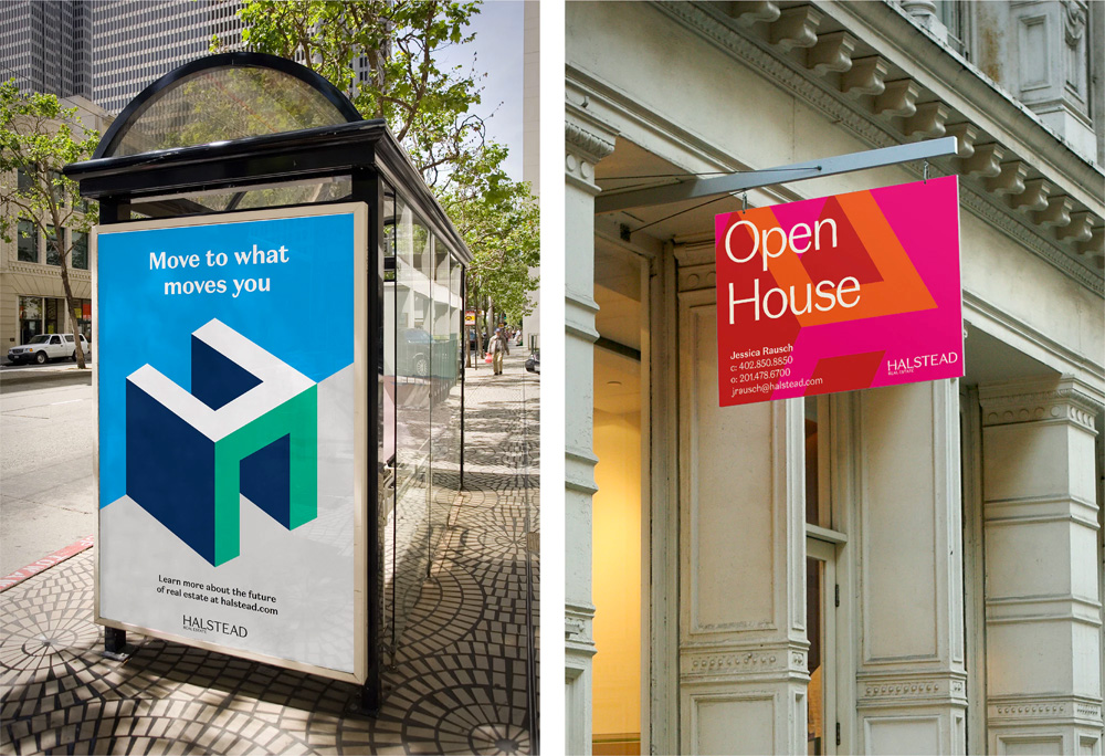
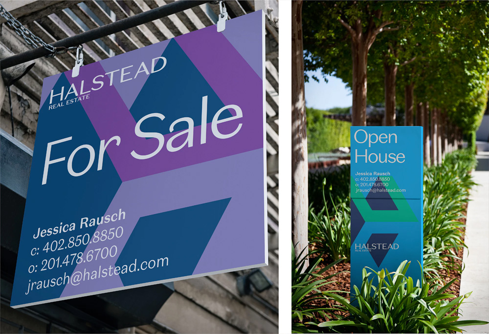
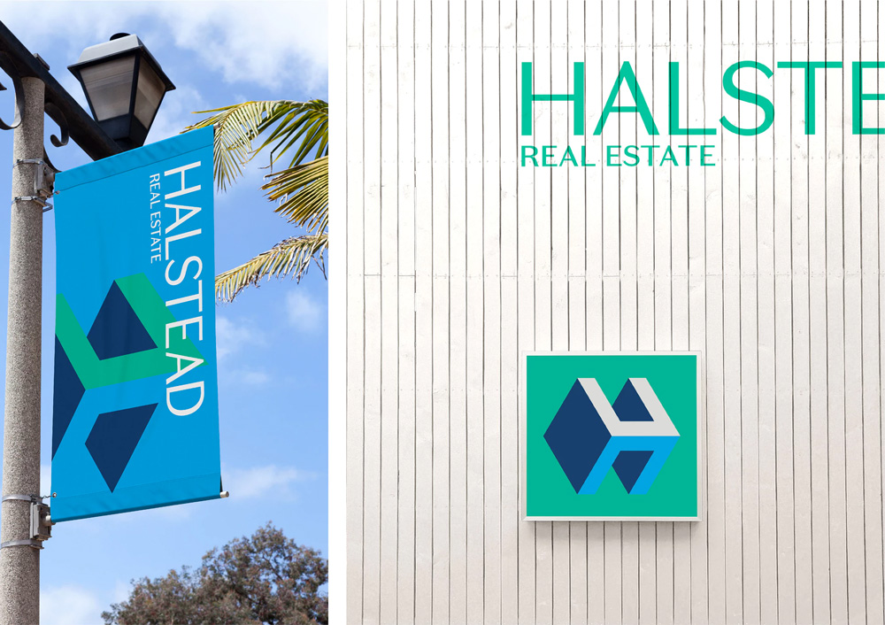
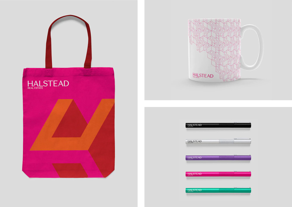
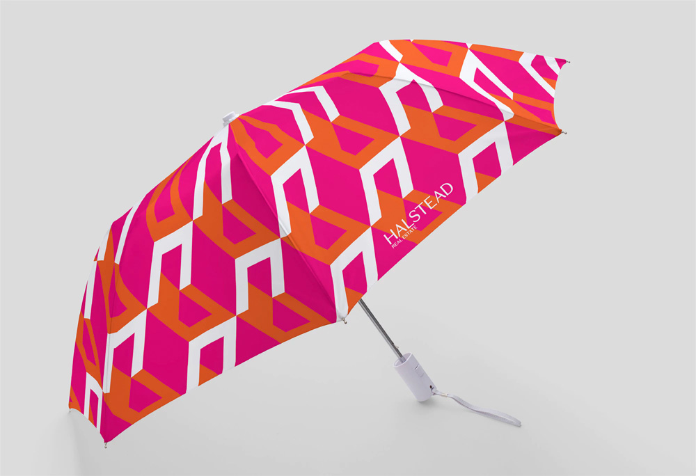
Strong, smart, robust and pragmatic, the identity’s visual language is built of a layered system of elements that can adapt and evolve for various applications and brand expressions. Like Halstead’s agents, the firm’s new logo is multidimensional and flexible. The reimagined “H” icon is architectural and spatial, offering the ability to stand alone as well as the flexibility for rotation, use in endlessly expanding patterns, and as a window for photography, or even as a directional arrow.
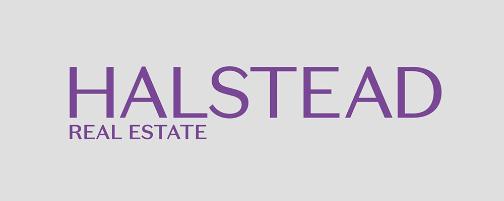
The logotype is set in Domaine Sans, a sleek, refined sans serif (designed by Klim Type) that is simultaneously historical and contemporary, bridging the past and future. The company name has been changed to simply “Halstead,” which can be accompanied by “Real Estate” to provide context when needed.
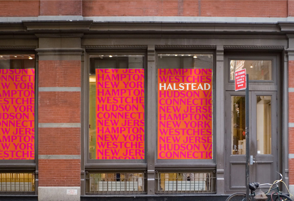
The vibrant and systematic approach to color sets the brand apart and evokes the dazzling diversity of New York and its neighborhoods. The corporate color set consists of an elegant palette of grays that anchors the brand, while three additional color sets reflect the company’s various markets throughout the tri-state region—Manhattan, the outer boroughs and the suburban areas. Each market has its own distinct character and qualities, and the different color sets allow these characteristics to shine while maintaining a strong connection to the core Halstead brand.
Living in New York it’s almost impossible to not see Halstead’s logo throughout the city, regardless of whether you are looking for a place to buy/rent or not; it’s just always there, somewhere. And that quaint “H” with windows and that bland green have always irked me, especially when you see the prices of some of the properties they manage, having a huge discrepancy in how low-end their old logo looked. The new logo is surprisingly daring and perhaps not Avant-garde in the larger context of the world but surely yes in the New York real estate world. The new “H” icon stands out dramatically from its main competition, Corcoran and Douglas Elliman, among others.
The harsh angles and relatively more in-your-face aesthetic of the icon are tempered with the use of a high-contrast sans, Domaine Sans from Klim Type, that adds a touch of Upper West Side glamour while managing to feel youthful and contemporary. It’s an odd combination of icon and wordmark but the two elements work interestingly in the applications.

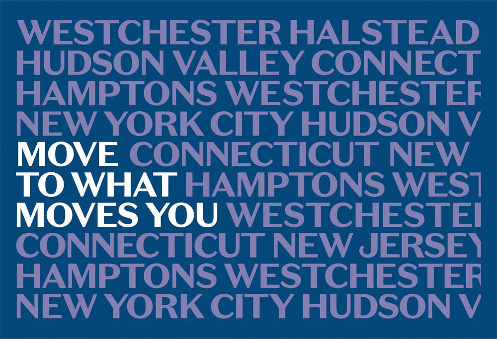
To develop the new tagline, we looked inward. We asked ourselves, “who are we as a firm?” and “who do we want to be?” Our work with customers represents so much more than just a transaction. In so many ways, we are “Agents of Change” for our buyers, sellers, renters and landlords; this is Halstead’s brand philosophy. We make significant changes and transitions in clients’ lives much easier. Every day our agents are moving people to places that move them.
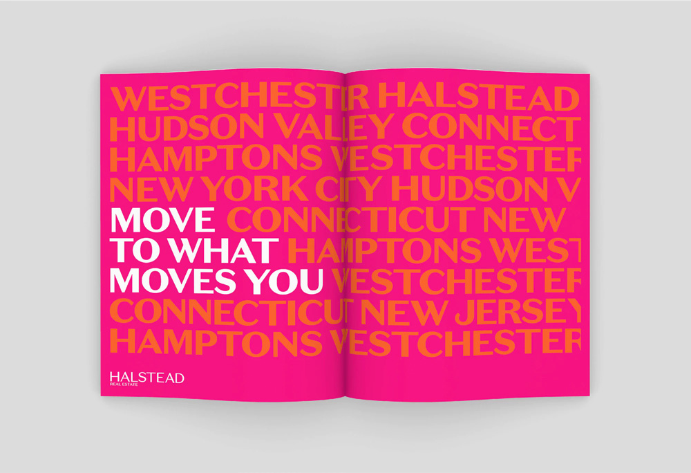
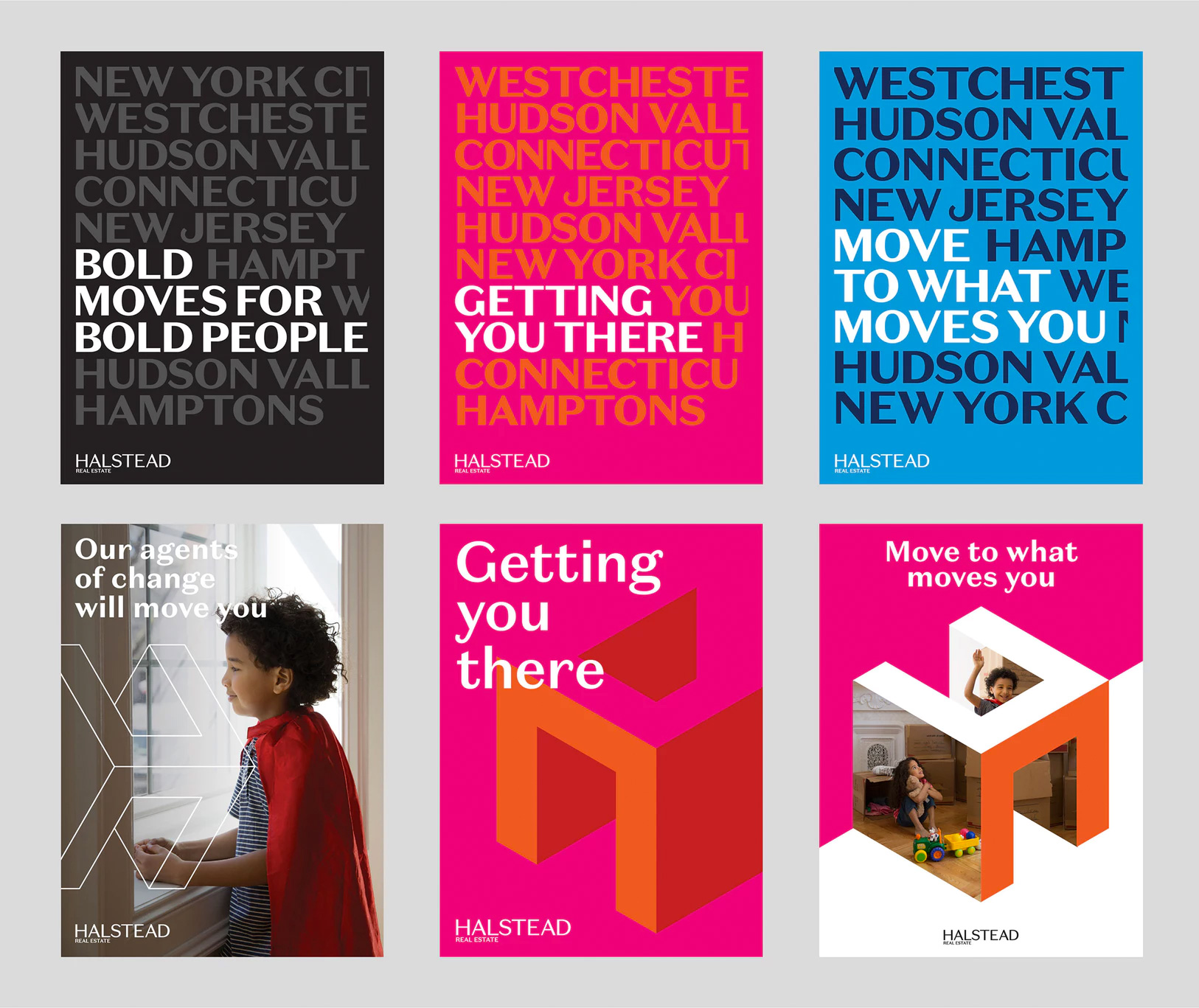
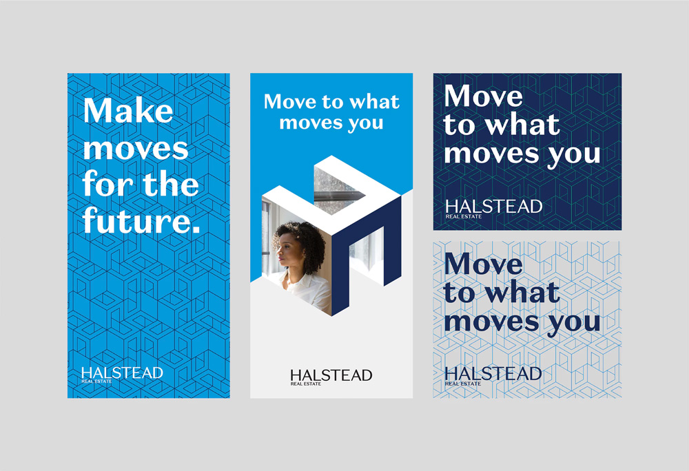
The applications have a nice range of executions with the best ones being the type-only ads and posters but that alone can’t carry the whole brand so there are more variations that include photographs, patterns, and words on top of patterns (like the ones directly above, which start to be the least elegant of the range).
The instances where the “H” icon is used large and in the background are quite nice and the “H” almost serves as an arrow, pointing the way to a Halstead office or property. The use of Domaine Sans over the colorful “H”s is attractive and effective. I like this approach a lot better than the use of the repeating pattern, which starts to feel too techie.
Overall, what I appreciate most about this is that Halstead has bravely made a relatively drastic change and — if you watch the first minute and change of the video above — have actually walked the walk after talking the talk of embarking on a big change. Again, this isn’t Irkutsk-level boldness or breaking of conventions but for its context, I feel like it makes a bold statement and it has the potential to attract a wider range of clients simply because of the new identity.

 Новости Союза дизайнеров
Все о дизайне в Санкт-Петербурге.
Новости Союза дизайнеров
Все о дизайне в Санкт-Петербурге.