Обзор лучших ресурсов по разработке бренда, разработке упаковки
contact us | ok@ohmycode.ru
contact us | ok@ohmycode.ru
Established in 1923, Warner Bros. is one of the most well-known entertainment companies with the creation, production, distribution, licensing, and marketing of content across feature films, television, home entertainment production, animation, comic books, video games, product and brand licensing, and broadcasting. Its library consists of more than 100,000 hours of programming that include over 8,600 feature films and 5,000 television programs. Among its most prized properties are the DC universe, Harry Potter, Lord of the Rings, Friends, and The Big Bang Theory. Owned by WarnerMedia (which is owned by AT&T), Warner Bros. employs between 5,000 and 10,000 people depending on what’s in production and its picture division had over $5.57 billion in worldwide receipts in 2018. Last week, Warner Bros. introduced a new identity designed by New York, NY-based Pentagram partner Emily Oberman.
The Warner Bros. shield is one of the most iconic logos in the world, visual shorthand for entertainment recognized around the globe. […] Warner Bros. wanted to build on this legacy and make the shield more functional and effective. The previous iteration, introduced in 1993, was highly detailed and hard to use at a small scale and in digital contexts, which are increasingly important.
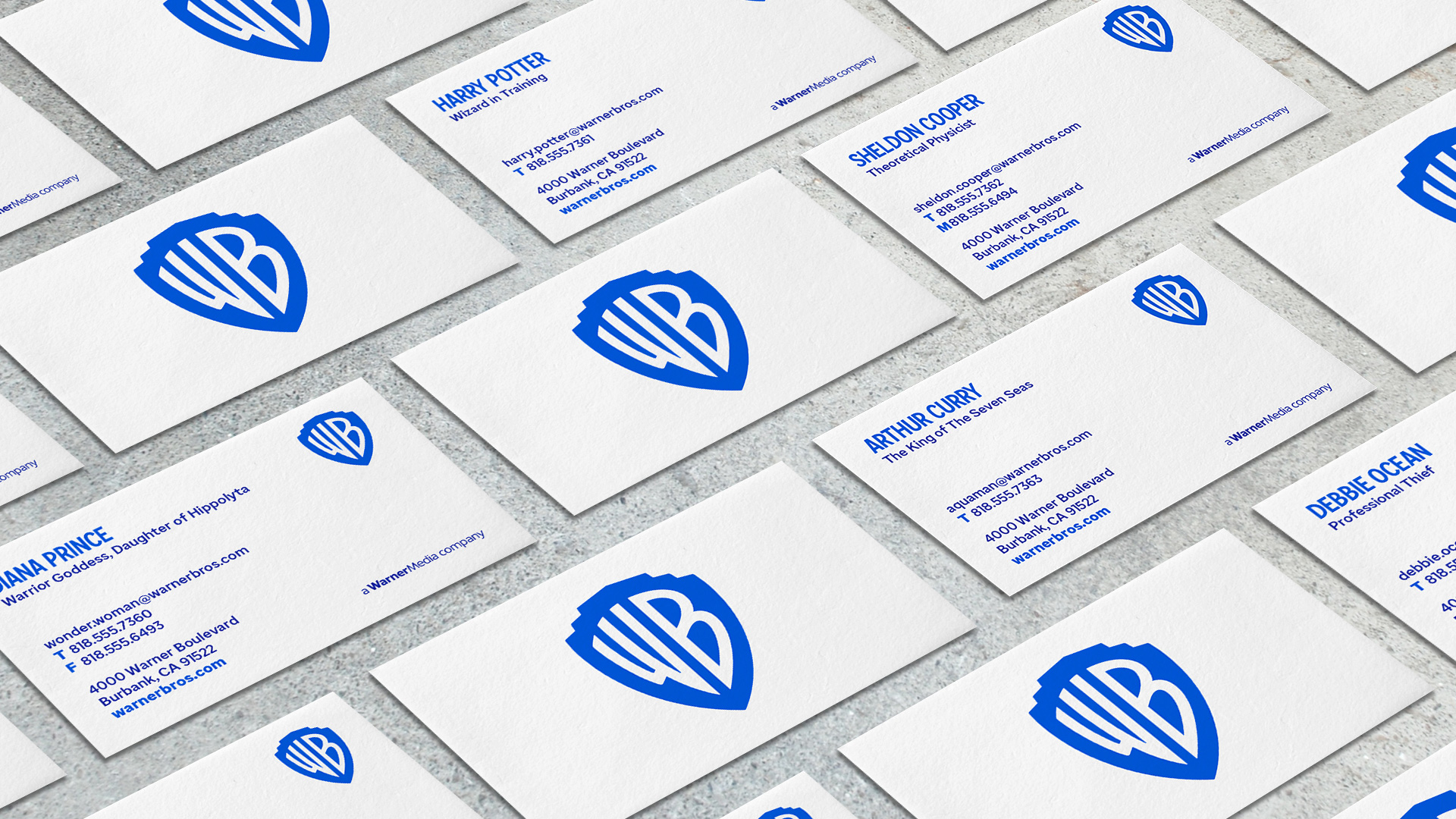
The update streamlines the logo to its key elements, returning the shield and monogram to prominence and losing the sash. The redesign refines the shield with a form based on the classical proportions of the golden ratio. The designers looked at the construction of the letterforms of the “WB” monogram, preserving their quirkiness but making them more modern. The letters of the monogram align as though made in one continuous gesture, emphasizing unity and connection.
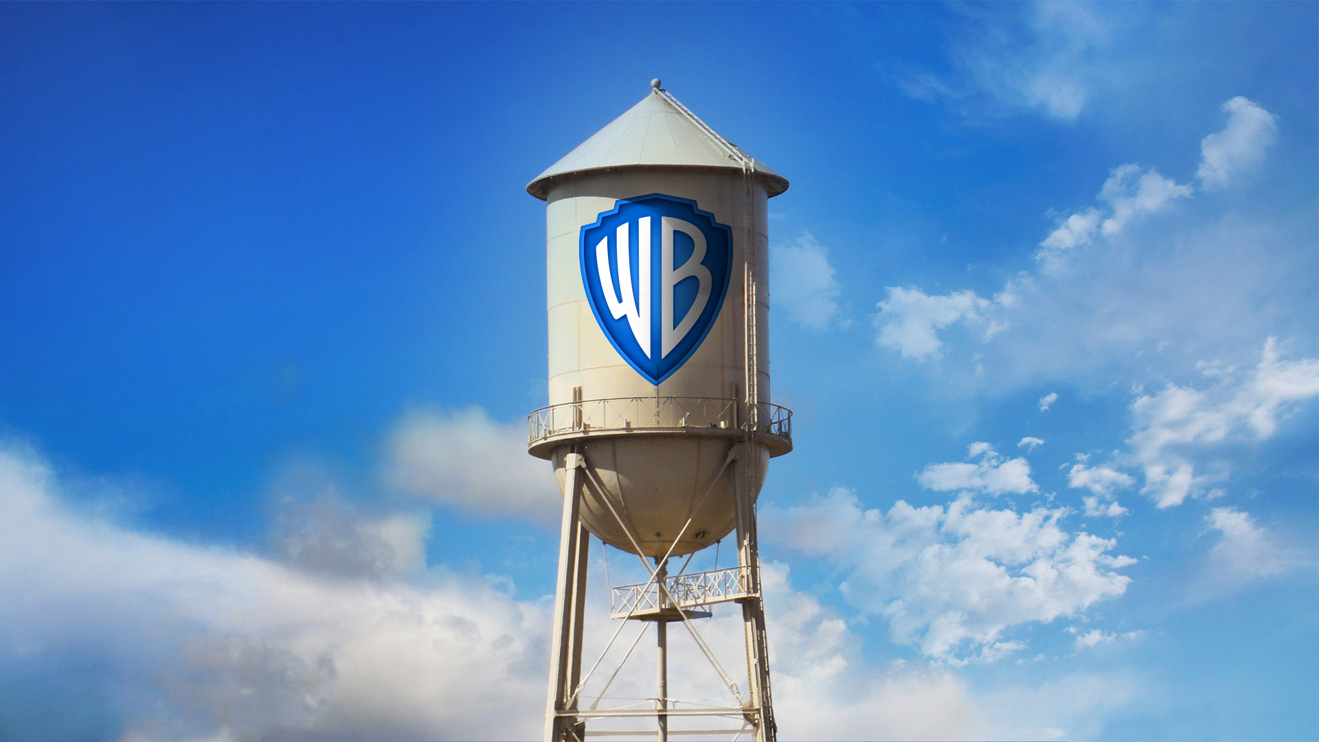
The logo has been optimized to perform across various platforms and scales, from the small spaces of the digital world to giant installations like the iconic water tower on the Warner Bros. studio lot. It also works well with a wide range of content. The logo appears in the signature Warner Bros. blue, which has been brightened to a more contemporary hue, with the wordmark set off in a slightly darker shade to create a complementary contrast.
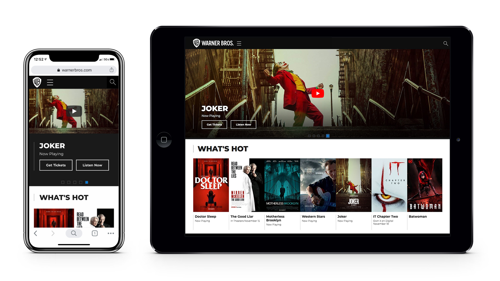
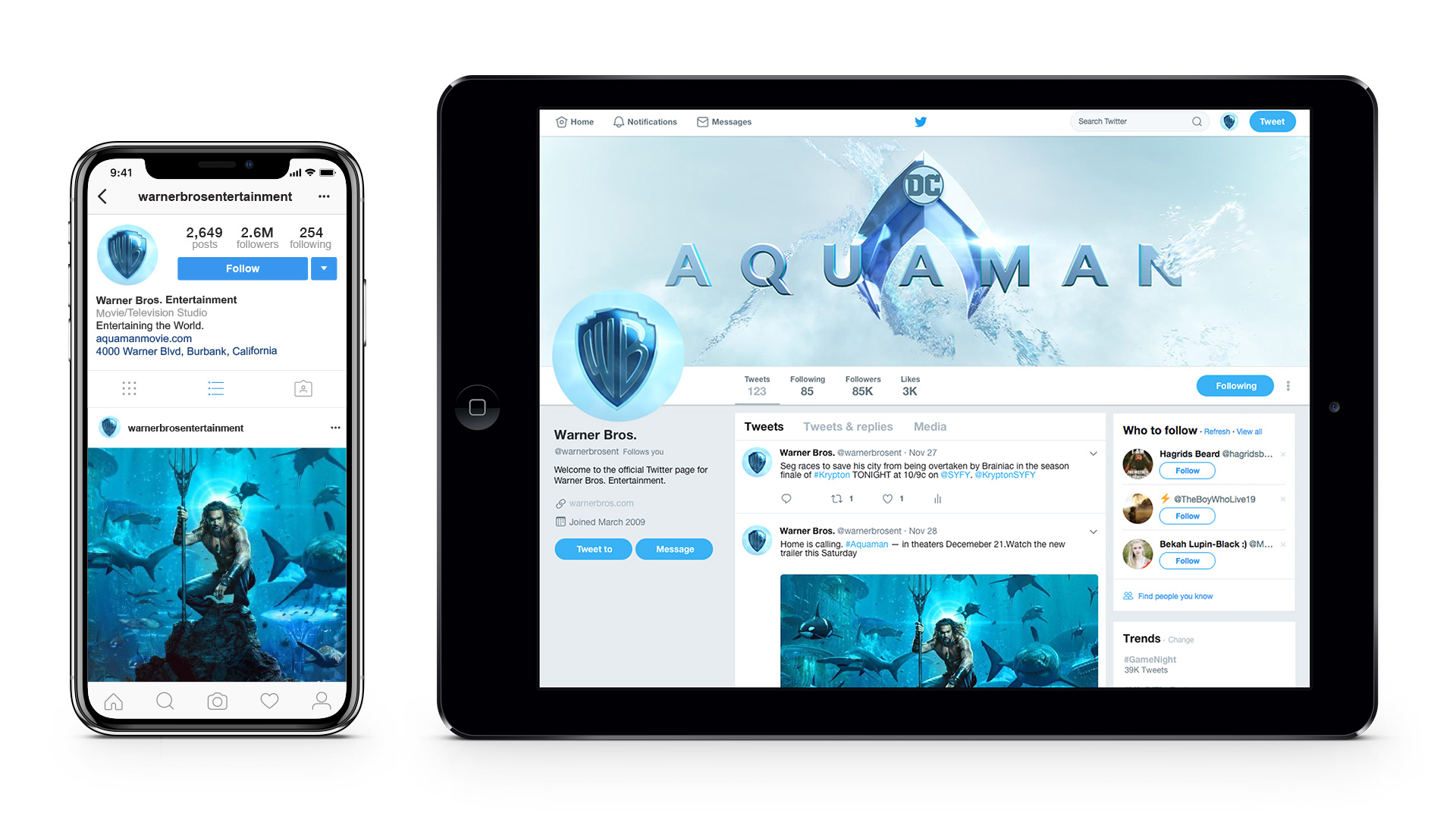
The team also created a dimensional version of the logo, to be used exclusively for on-screen content and special cases. The dimensional mark has the clean, streamlined look of the new logo, but with a depth that hints at the content experience. The logo can be customized for the opening and closing moments of individual movies and shows. It can also function as a window for imagery and sequences, using the edge of the shield as a frame.
I hadn’t realized how much I do not like the old logo — obviously it’s a classic but I think that that is thanks to its repetition (and association to entertaining entertainment) not its merits as a piece of graphic design. The gradients, the ring, the flimsy serif for the name, and the color combination were all pretty garish. Underneath all of that is the one good thing about this logo, which is the “WB” lettering and the new logo effectively brings that to the fore by stripping it away from all of the effects that have accrued over the years and creating a more interesting proportion for the shield which was awkwardly wide before. Golden ratio malarkey aside, the taller design looks so much better with the lettering and it also better accentuates the letters’ peculiarities. As much as I like the flat version I think in this case the shaded version might be better as an evolution of the logo so many people have grown accustomed to — but, certainly, having the flat version is very beneficial as a starting point for all the movie customizations that are so popular nowadays. The new wordmark is quite lovely and I really like the blue tone on tone approach.
The simplified shield can take on a number of different styles much more efficiently than the old logo and can do so across any medium, from movies to TV to print. The shield as window (above)… a little trite but undoubtedly efficient.
The distinctive monogram has been expanded into a custom typeface, Warner Bros. Condensed Bold, used for the wordmarks of the various divisions and other display typography. Designed by Pentagram and expanded into a full family of fonts by Jeremy Mickel, the typeface has a look and feel that is uniquely Warner Bros., with condensed letterforms that relate to the elongated “WB” in the shield. Details in the logo’s letterforms are echoed in the font; for instance, the curvature of the “R” references the redrawn “B.” Like the redrawn logo, the typeface carries a sense of the company’s history, but is clean, modern and timeless.
I LOVE the custom type family. It has such a great balance of corporate-ness and fun-ness that is very hard to achieve. It’s like a comic book version of Interstate and, I dunno, I just think it’s working on all fronts.
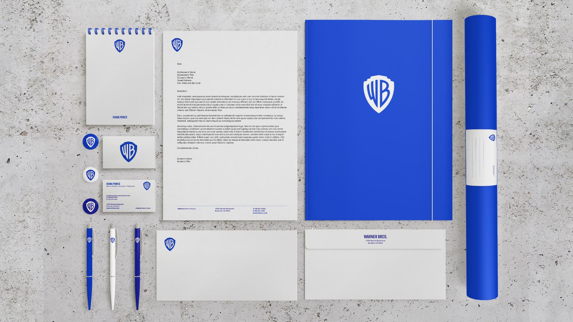
Not much in terms of application but the few institutional materials shown are quite nice. Nothing super extraordinary or fun but very lively with the use of the bright blue and the single-color new logo.
Overall, this is a great evolution that makes the new logo more easily adaptable to the different content while giving the iconic “WB” lettering a shot at lasting another 100 years, even if someone puts a ring around it again — which is bound to happen when some future designer 30 years from now thinks that that nostalgic approach was the bomb.
 each year since publication began in 2006

 Новости Союза дизайнеров
Все о дизайне в Санкт-Петербурге.
Новости Союза дизайнеров
Все о дизайне в Санкт-Петербурге.