Обзор лучших ресурсов по разработке бренда, разработке упаковки
contact us | ok@ohmycode.ru
contact us | ok@ohmycode.ru
Established in 2005, Shekulo Tov is an organization in Israel that provides various opportunities for people with mental disabilities to develop vocational abilities to be able to work in society and live independently. A service of the Israeli Ministry of Health, the Ministry of social affairs and social services, and the Israeli Ministry of Defense, Shekulo Tov offers opportunities like becoming dog walkers, working at cafés or bookstores, and working at production plants where they are involved in the end to end production of chocolate, candles, soaps, paper products, and sweets, which are sold online and at pop-up locations under the name of Erkuti, which is what we are here to talk about. Renamed TNX, short for “Thanks”, this new brand is meant to make the initiative feel less like a charity and more like a mainstream, well-rounded business that, as a major bonus, has the benefit of helping people with mental disabilities. (No website available yet.) The new identity and packaging have been designed by Tel-Aviv, Israel-based Open.
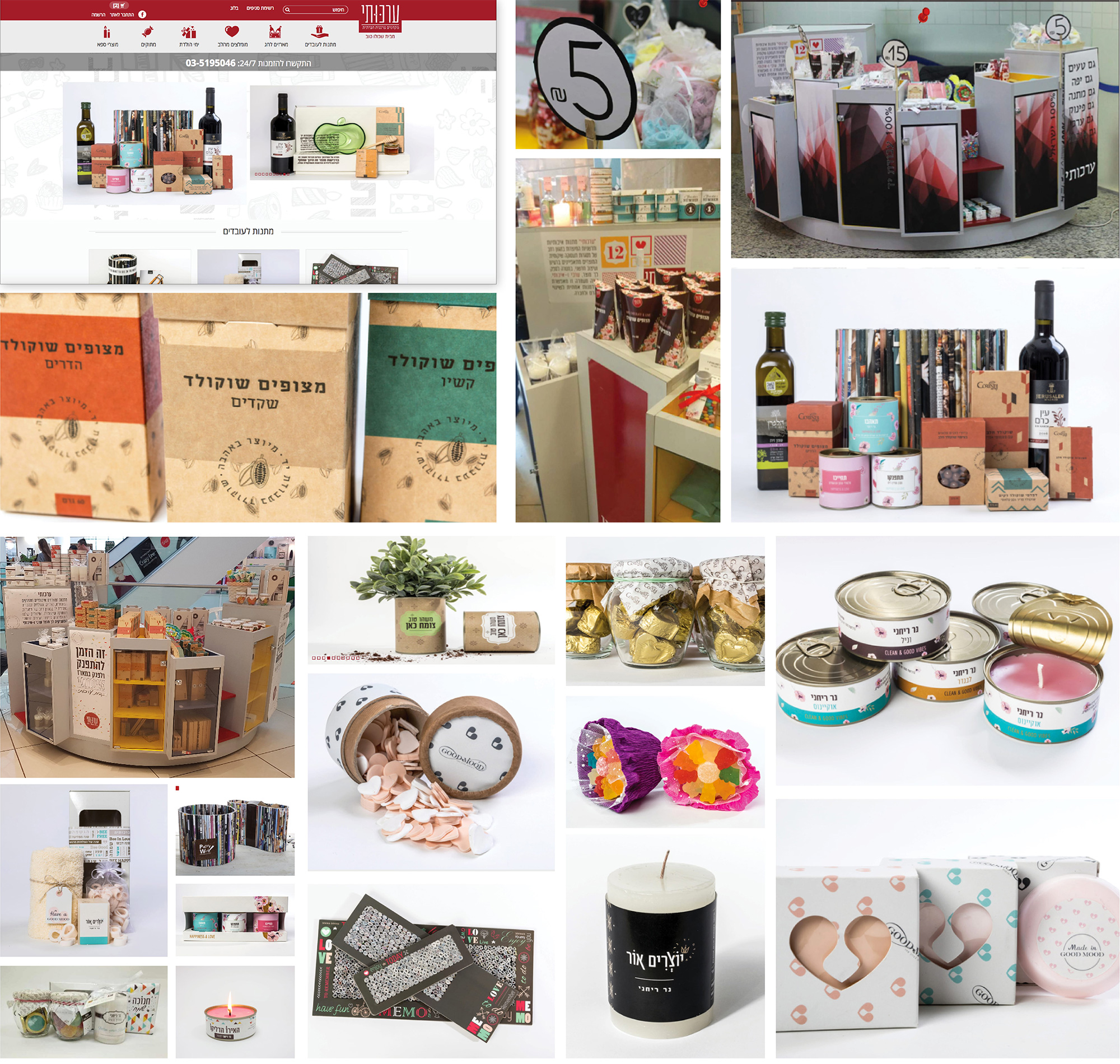
The previous look was fine, very earthy, homey, and cutesy. A little all over the place in terms of design approaches, but I don’t think brand consistency or major shelf presence was a concern. Overall, it got the job done.
The positioning conceived for TNX, small gifts with high added value, assists in clearly identifying the products sold by TNX as hand-made products created by individuals dealing with mental challenges and employed by Shekulo Tov Group’s various enterprises. One of TNX’s most significant attributes is the otherwise unlikely bond it creates between different groups such as the mainstream and stigmatized, social organizations and commerce, business and rehabilitation, quality gifts and reasonable pricing as well as hand-made items and genuine people. It was therefore only natural to define the brand essence as “unexpected connections” which authentically reflects the chain’s work.
The old logo was a thin, condensed equivalent of a sans serif font in Hebrew with some fancy equivalent of tittles as little diamonds — were it not for the overlapping one, it would have been fairly solid all around. The new name and logo, now in English and written in Latin, has a more commercial sound and look. I’m not sure how familiar “TNX” is in Israel as a shorthand for “Thanks” — I don’t even see it used that much in the U.S. — and in its all uppercase spelling and design I keep reading/seeing it as “T. N. X.”, so it’s a little confusing. The logo itself is more or less okay. I like its condensed-ness but I really dislike the lowercase “n” without a proper stem, it almost even reads as “TUX”. So… so far not exactly good, but the packaging and process behind it save the logo.
The brand concept Open developed for TNX stems from the brand essence and is expressed through products created by individuals with mental challenges in unique workshops we held with them. During these workshops, the participants were asked to express how working at TNX made them feel through color and form. Every creation was then translated to an energy of shapes, colors and general composition. The results yielded surprising shapes and combinations which could only have been achieved through this process. We made the design decision to keep the color palette unrestricted so that the product range would reflect happiness, fun and creativity.
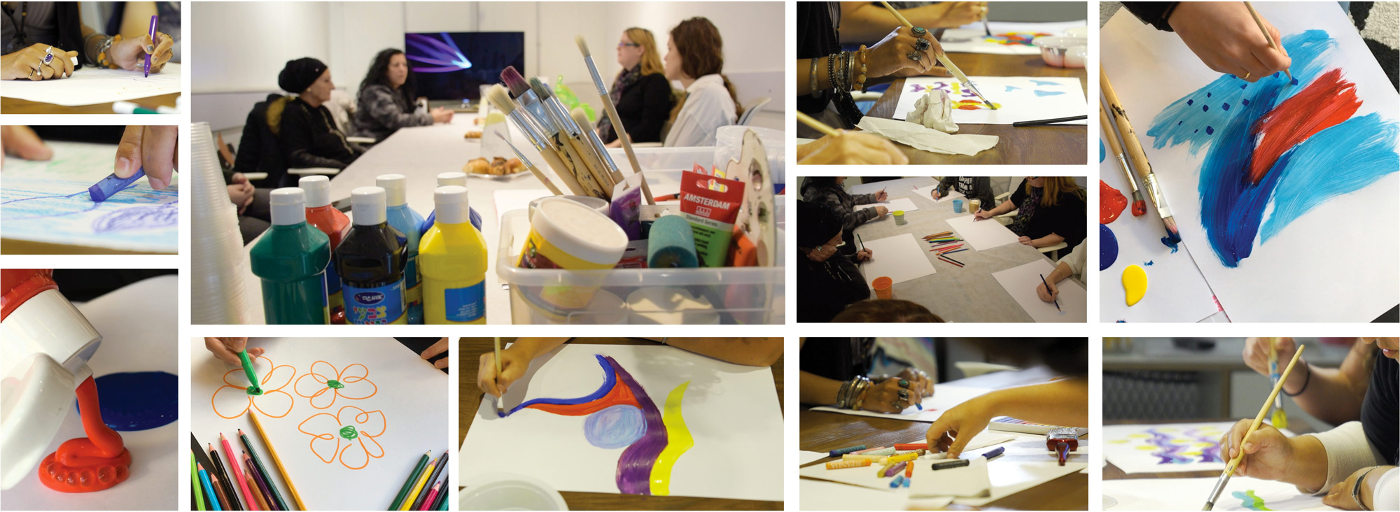
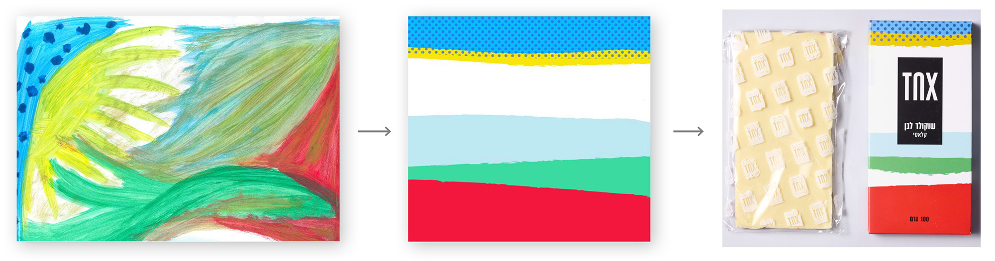
Involving the people the organization helps in the design of the packaging was a no-brainer and the appropriate thing to do given how this is all about integrating them into as many processes and challenges as possible. I really like how the original drawings were translated into more “commercial” interpretations while honoring the original design elements, colors, and energy of each one — some more successful than others but overall, it feels like a great collaboration.
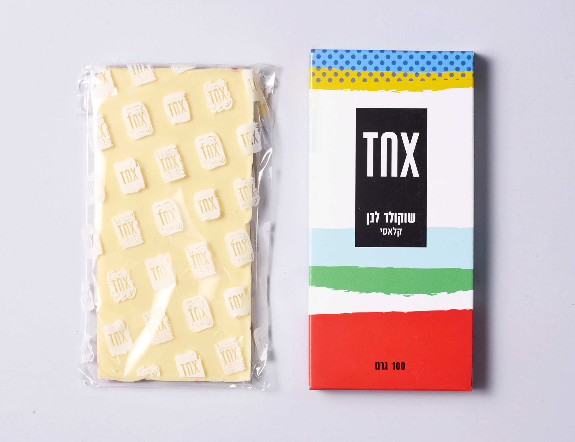
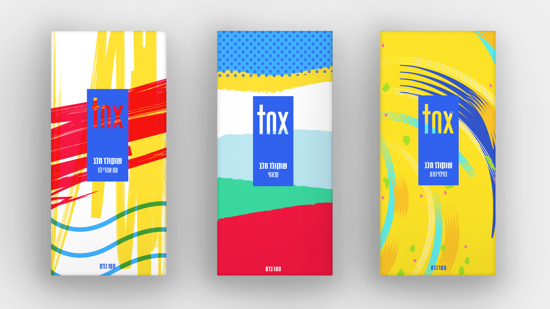
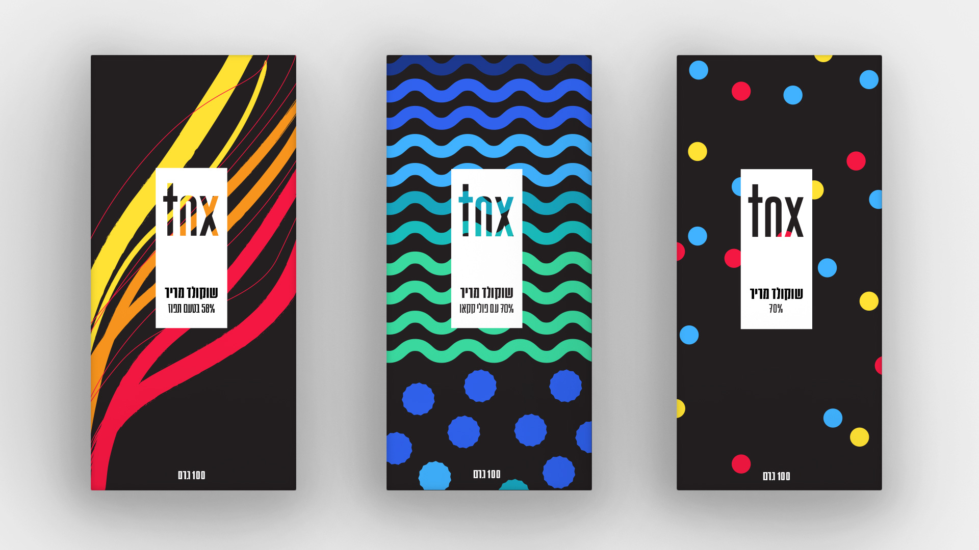
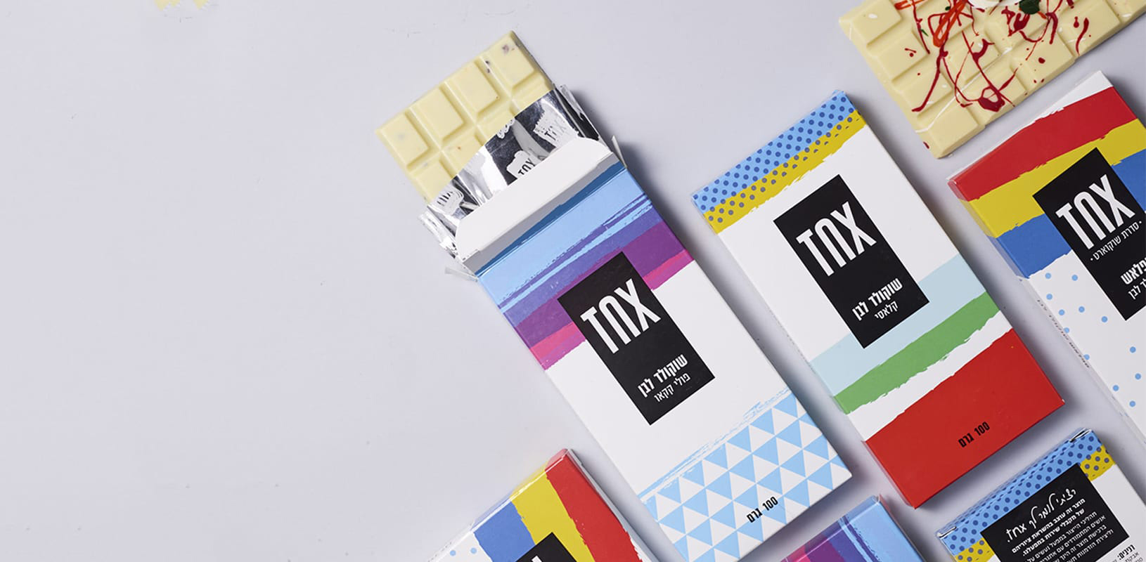
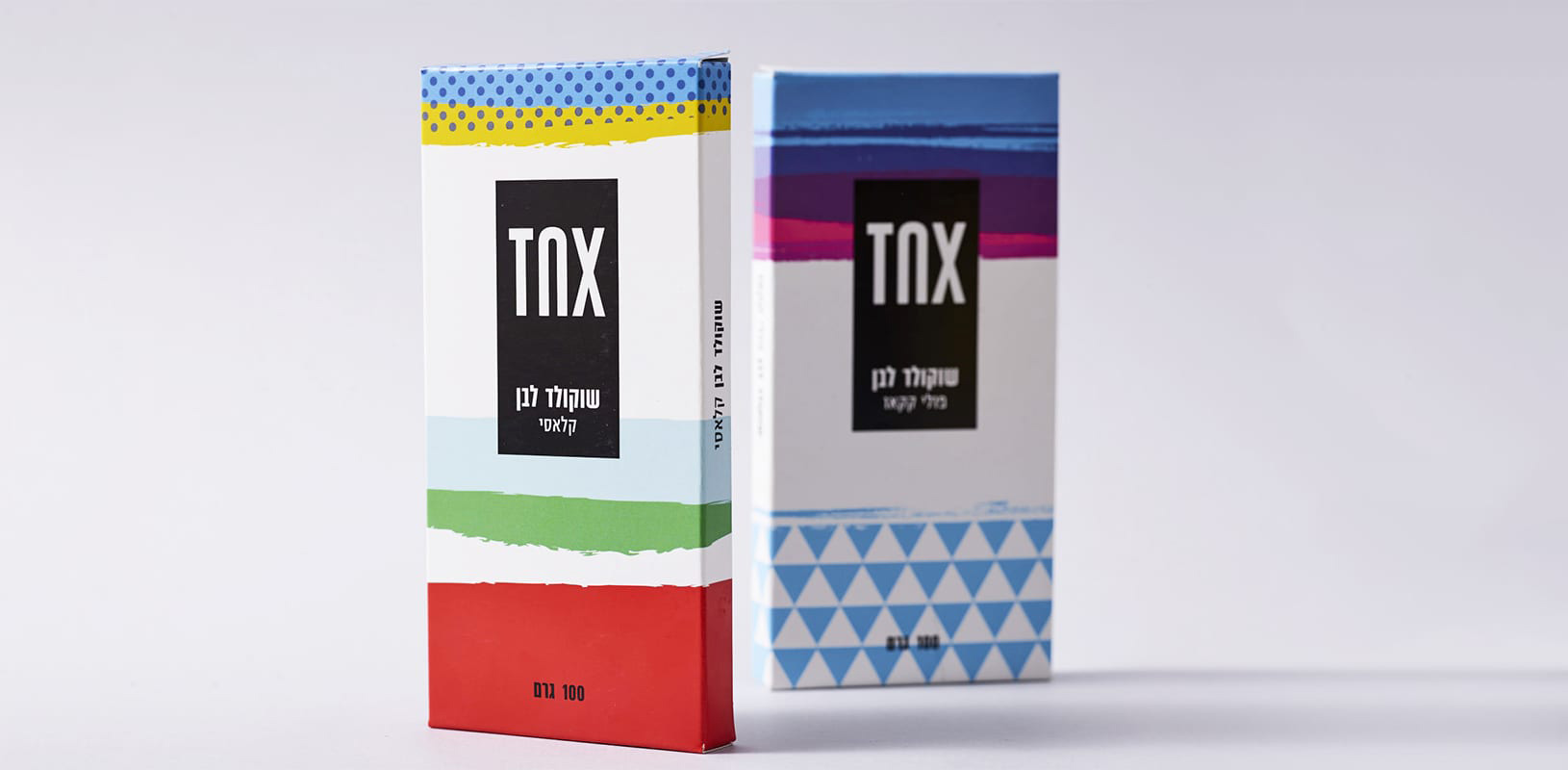
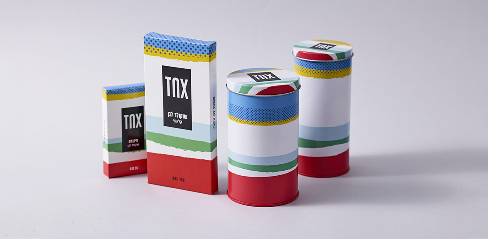
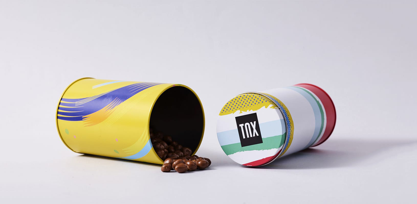
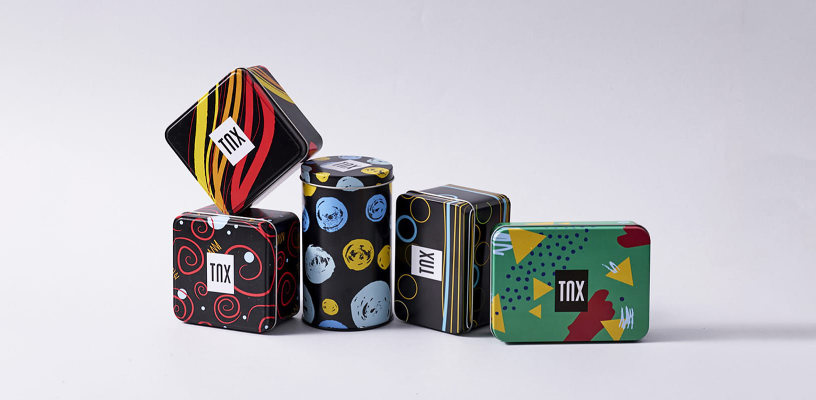
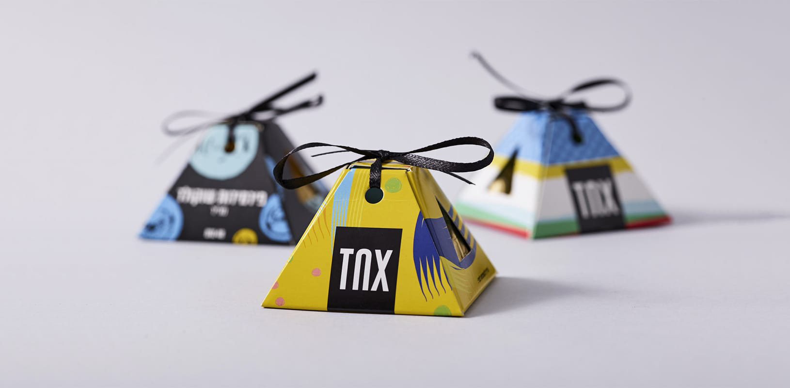
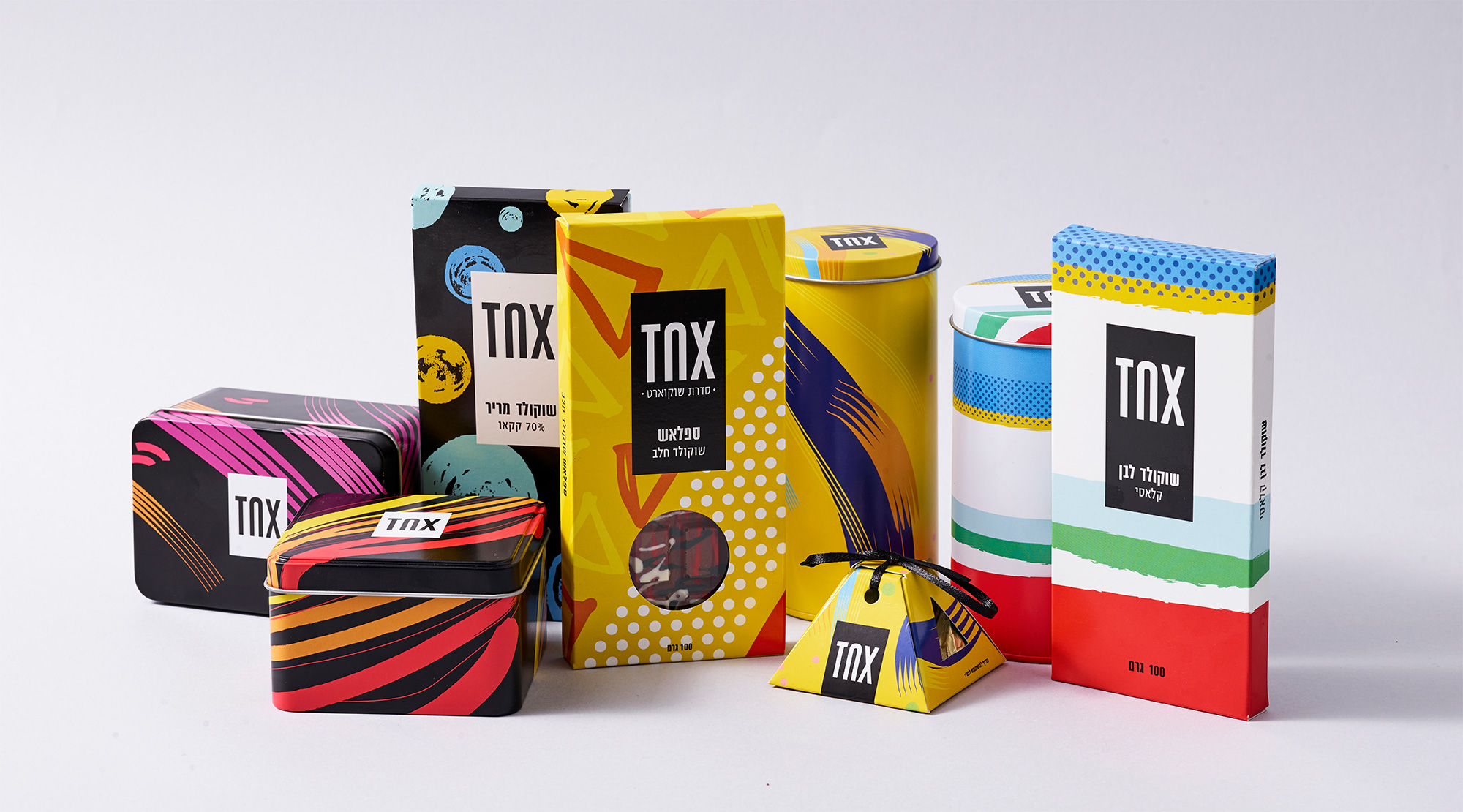
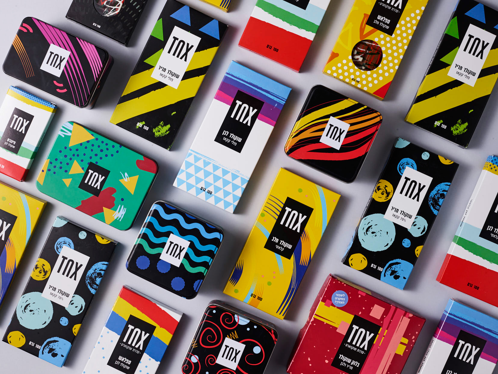
The resulting packaging is fun, energetic, and with great variety neatly unified by the logo in a black box. This is where the simplicity of its design and shortness of its name pays off, standing out strongly on top of the very active artwork and establishing a consistent brand across products but without overpowering it. Overall, this definitely looks like a confectionery brand with a groovy store in some deep part of Brooklyn, New York but with a great, heartwarming story behind the product and its design.
 each year since publication began in 2006

 Новости Союза дизайнеров
Все о дизайне в Санкт-Петербурге.
Новости Союза дизайнеров
Все о дизайне в Санкт-Петербурге.